Come along for a little “day in the life” in which we brand an apartment community. First things first: A little caffeine. Then it’s creative juices and collaboration to the max. Our client makes the first move with…a brand questionnaire.
1. Brand Questionnaire
The Brand Questionnaire is the best way of introducing the brand to us. You fill in the information, and it’s one handy place to see everything you know about your community, location, and your audience.
We’ll ask the facts, figures, goals, and details of the property and of your brand. We’ll seek out inspiration from you through the target residents as well as positives about the location of your community. History, location, and the way you are the solution to a problem all come together to inspire the next conversation.
2. Creative Kick-Off Call
REVIEW BRAND QUESTIONNAIRE
We’ll take some time with you and kick off the branding process by reviewing what you’ve said. Sometimes it’s about clarifying something you’ve noted, and other times, it’s just way more fun to have a real-life conversation. So much is revealed when we just sit down to chat about your brand.
MAJOR DOS/DON’TS
Then, we’ll check in with some deal breakers. Can’t do orange in the logo? The owner “needs” to see a concept with XYZ in it? We’ll note it and use it. If you have red flags and major dos or don’ts, now is the time to tell us!
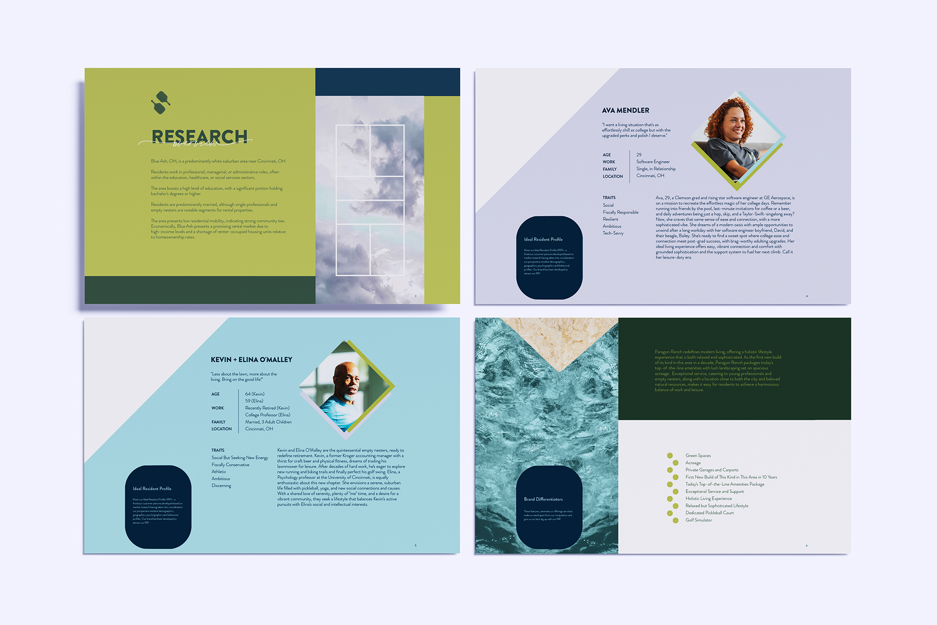
3. Research and Discovery
Now that we know the client’s hopes and dreams for your community, we commence the research portion!
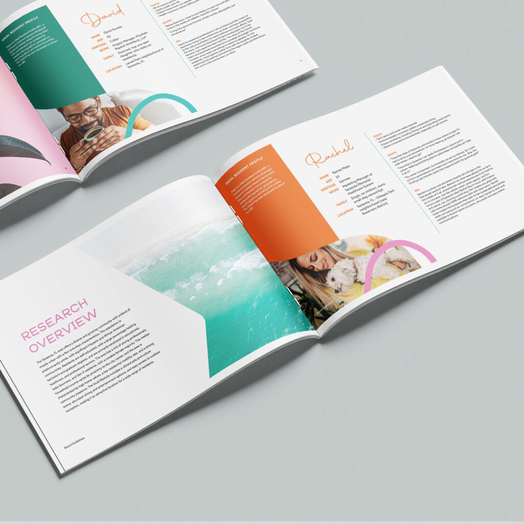
Depending on the level of brand package chosen, we go in depth in varying degrees. For our premium level brand package, our learning and discovery is in depth to the point of persona research, competitor comparison, location analysis, and plenty more detail that gives us the ultimate insight into the current landscape and the clientele that will be most interested in living in our client’s community. Wondering about those details?
We look at:
- Demographics
- Geographics
- Psychographics
- Buyer Behavior
- Generational Data
- (Probable) Customer Journey
- Location Offerings
- Competition
Each of these serve to give us a full picture of the way your community will solve a problem, beat the competition, and reach ideal residents.
4. Naming
It’s worth noting that, of course, none of this is done in a single day. But we wanted to walk through the process to show exactly how much data and details go into every brand we develop for our clients. It’s very likely that on any given day, a member of our team is working on one of these steps!
As creatives, we have to be feeling the creative juices. It can take some time to feel inspired. Sometimes we have to switch up the mood and location to find that inspiration. While it’d certainly be cool to be able to name an apartment on demand or at our client’s command—it’s not always possible.
But we take the details and data, and follow a process, and work through those creative blocks with a walk (probably to the local coffee place) or a tiny dance party. (Our mixtape playlist for your listening pleasure)
Naming an asset is a tricky one. But it’s so cool when we nail it and the client loves it. It’s worth every moment spent agonizing over spelling, inspiration, and research.
PROCESS
We brainstorm. We throw it all against the wall and see what sticks. Meaning comes first. Then: We consider the ideal resident, the type of community, the surrounding area’s vibes and history, the style of the building, surrounding street names, and local flora and fauna. We take it all into consideration, and find something that balances meaning and originality pretty darn well.
VIABILITY
Speaking of originality, we have to see if the name is as original and creative as we thought (think: success instead of cease-and-desist letters). We cross check your name with a:
- Business name search
- Trademark registry search
- URL search
- Social media handle search
- General Google search (we don’t want to name your place after a men’s hair loss cream
Too much competition = confusion.
Too difficult to spell = also confusion.
We ride the balance and find you something that works (and that you’ll be excited about)!
5. Strategy
Then, we take all of the above, add it to a magic 8-ball, shake it up and see what we get.
Absolutely not, nope! It’s strategy time. That research, the brand questionnaire, our conversations in the kick-off call, all serve as a stepping stone in the brand strategy.
Plus: we take the facts and details about a community to tailor that strategy. We consider the community’s:
- Interior design plans
- Architecture plans & finishes
- Amenity package
…and develop the perfect meld of every factor to create a brand strategy that will speak to the identified ideal resident.
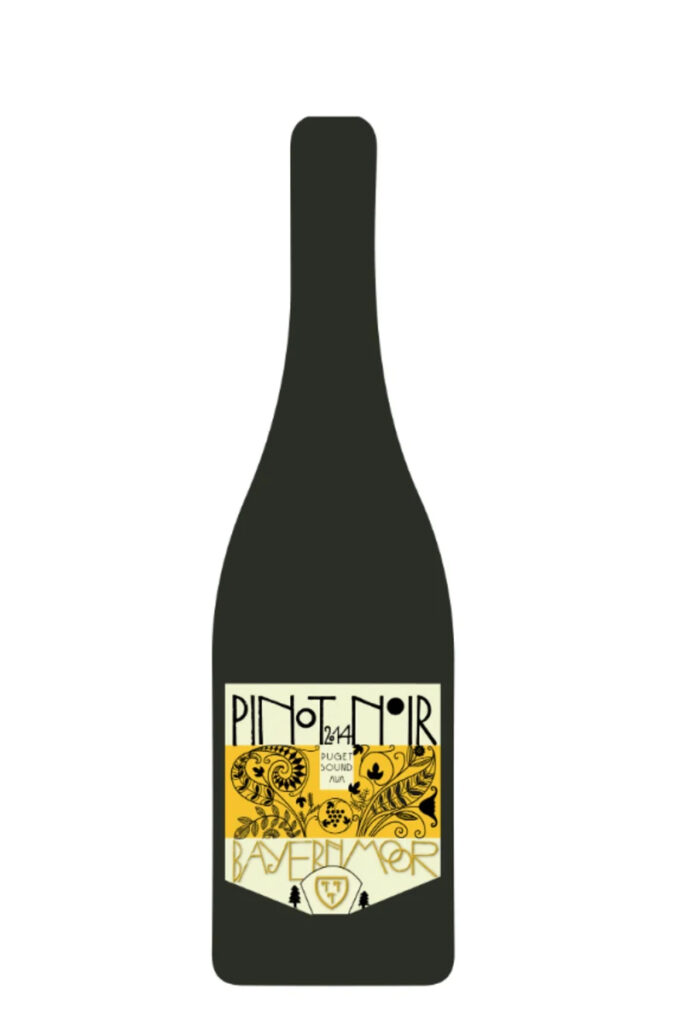
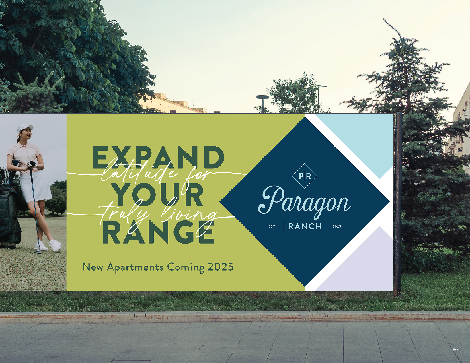
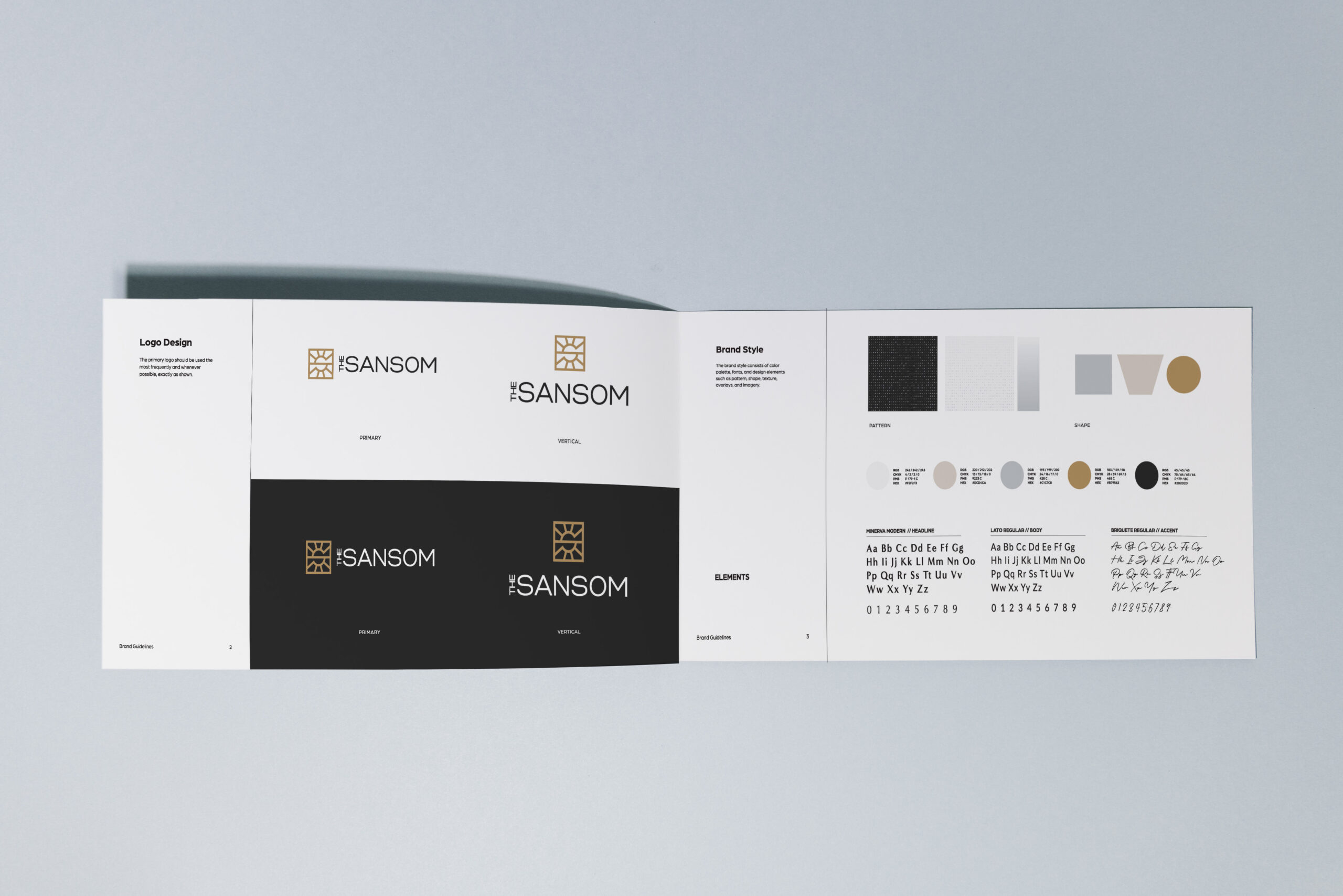
6. Logo Design
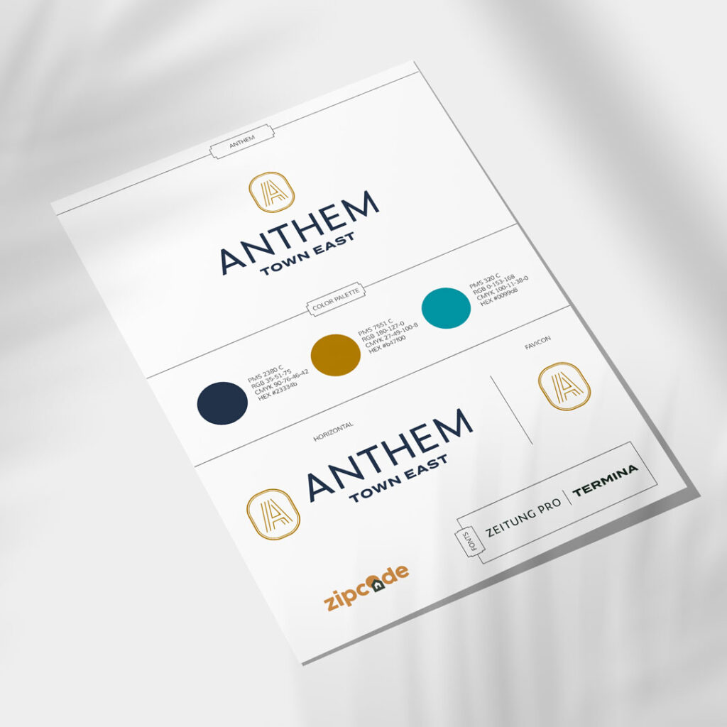
Strategy is set. We know the direction we’re headed. Time to create the face of the brand: the logo.
The logo serves as the first impression, and holds a lot of weight. We do say “The logo isn’t everything.” But: It is something. It’s meant to evoke emotion and give insight into your brand’s personality. A strong logo is based on strategy—and helps push your identity forward with colors, shapes, typography, and imagery, all combined into one.
The other bit that’s important about logos: Brand recognition. Without the golden arches, it just wouldn’t feel like McDonald’s. Without that classic swirly typeface, it just isn’t quite the same Saks Fifth Avenue.
Read more here on logo design from start to finish.
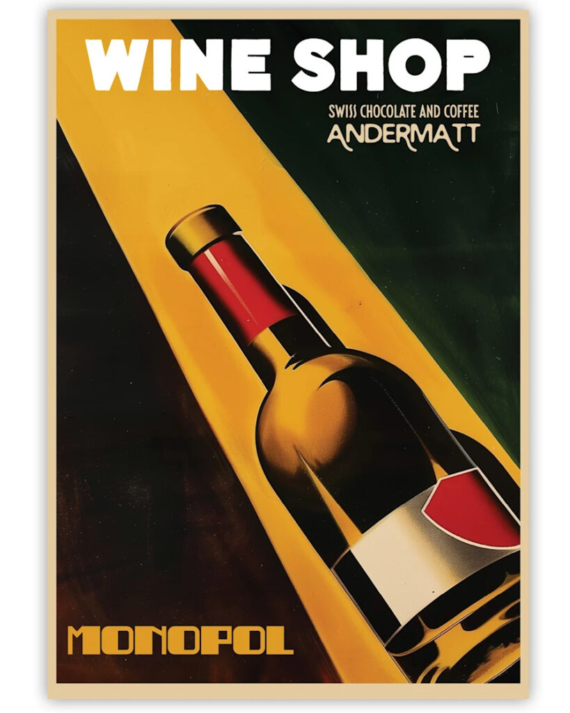
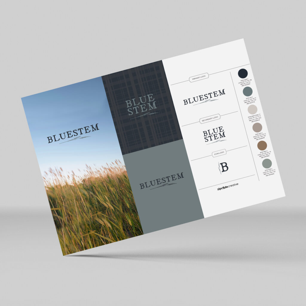
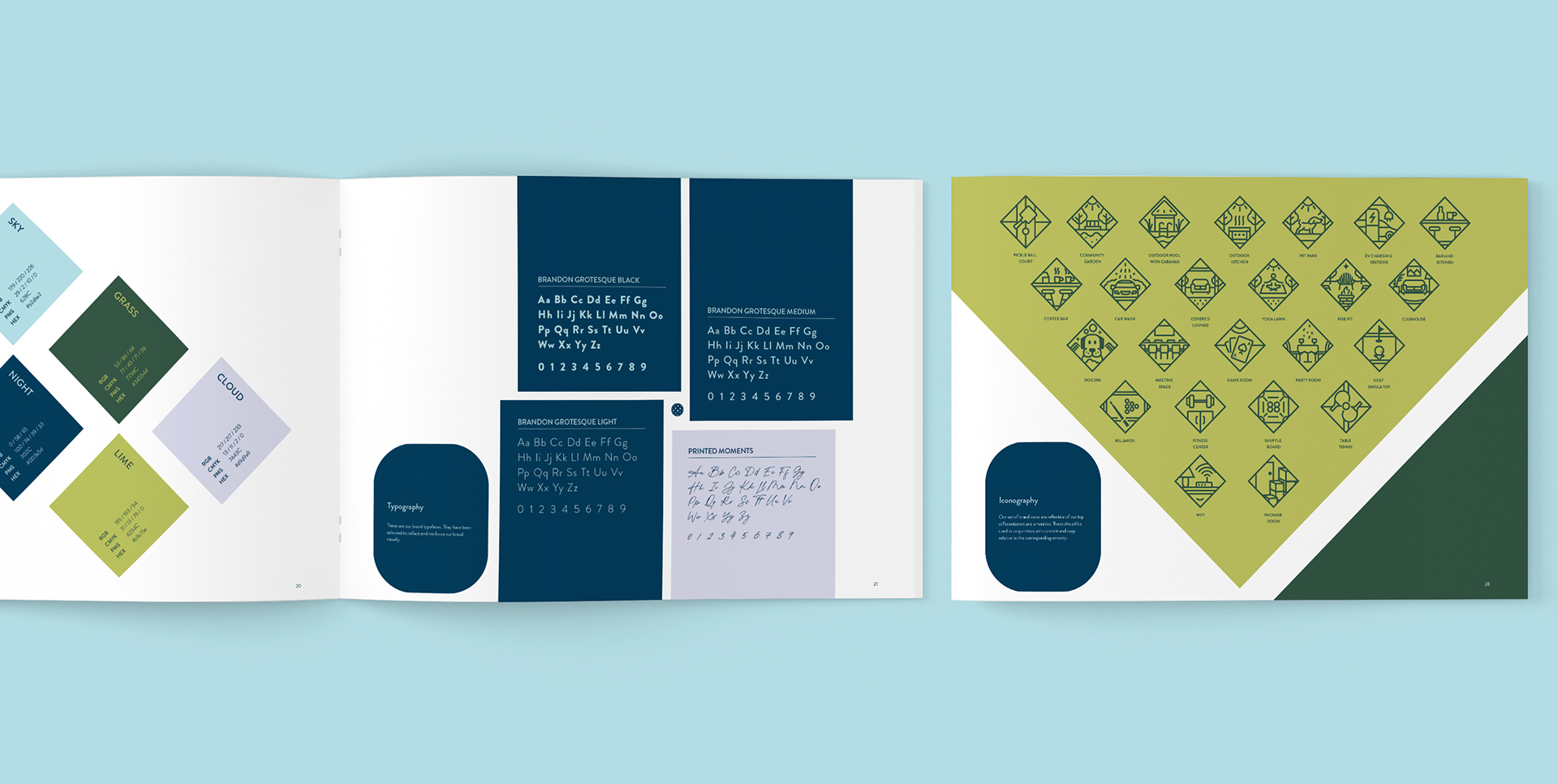
7. Visual Identity
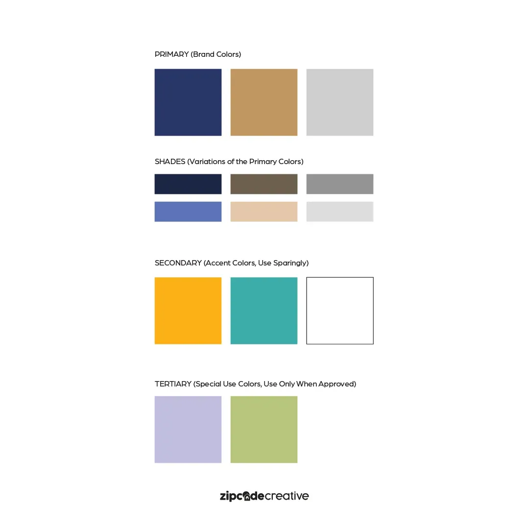
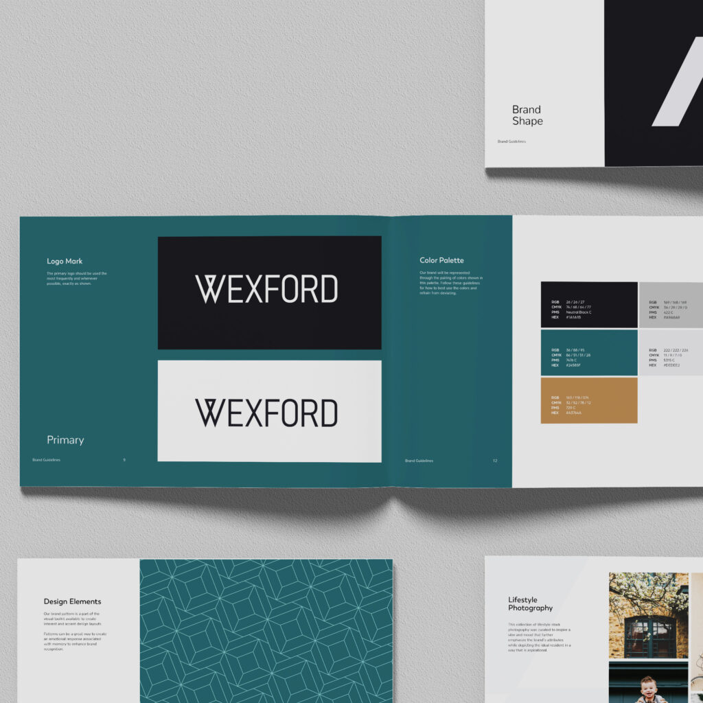
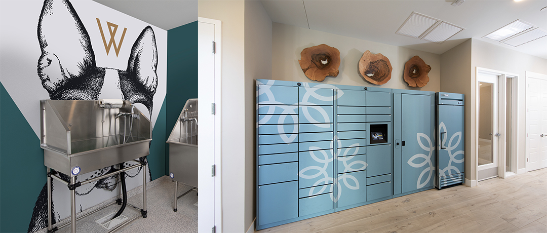
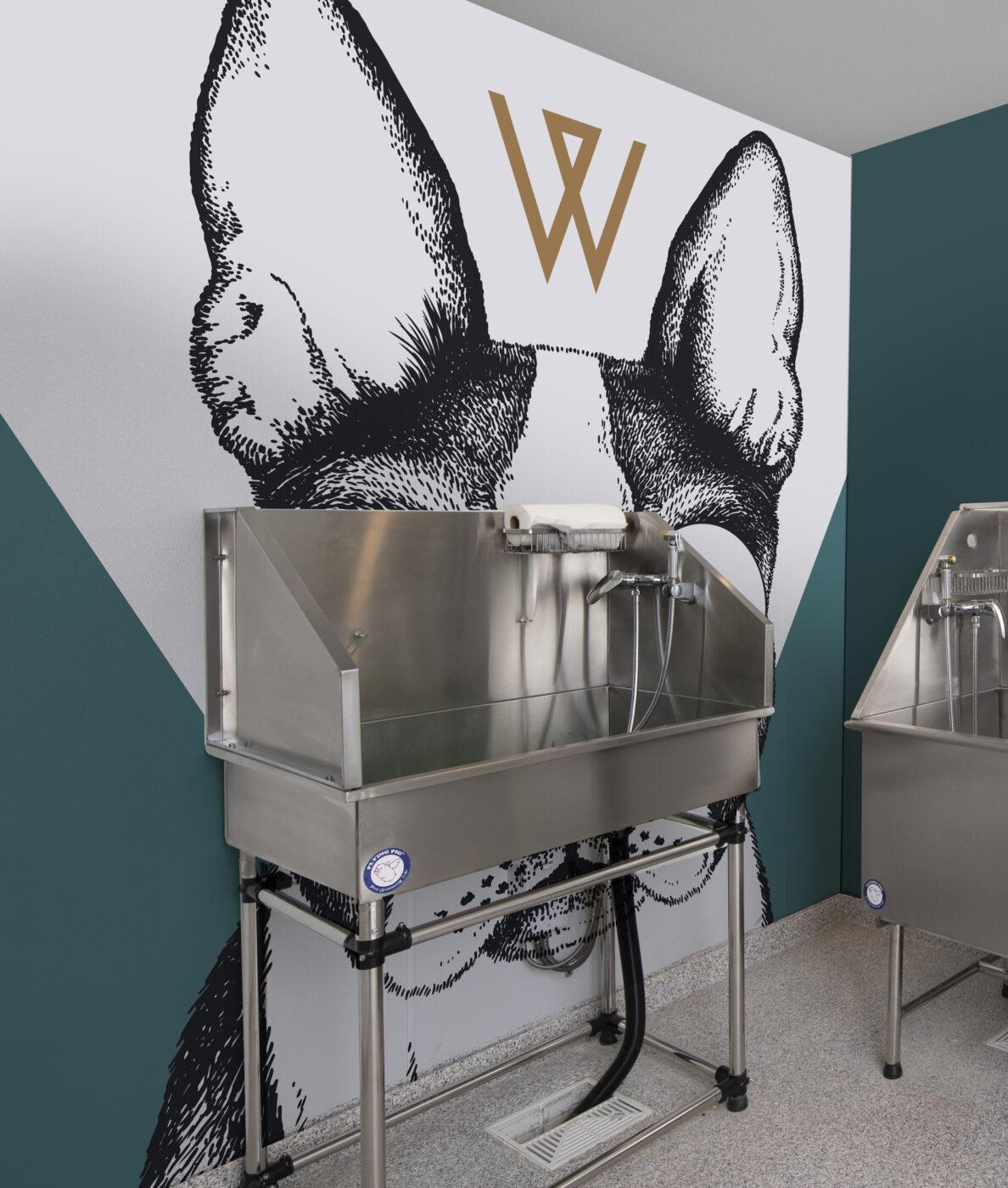
And the Oscar for Best Supporting Actor goes to: VISUAL IDENTITY! Each of the pieces of a brand’s visual identity are visual cues that become memorable to the prospects and create brand recognition. We’re talking: colors, design elements, and imagery.
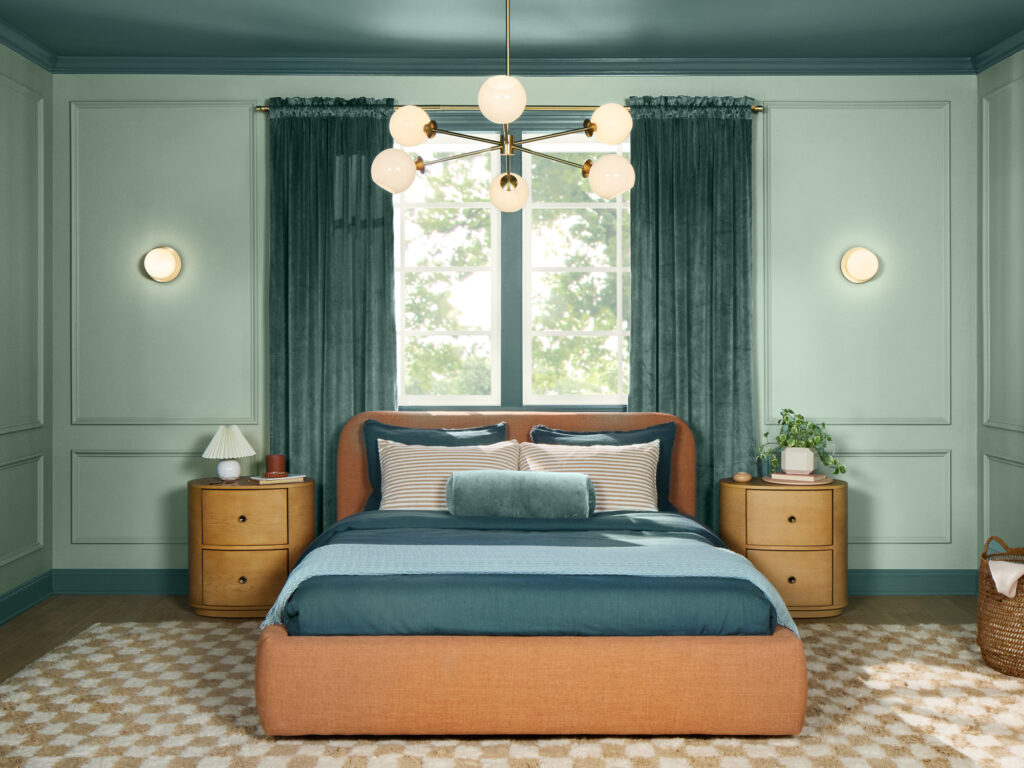
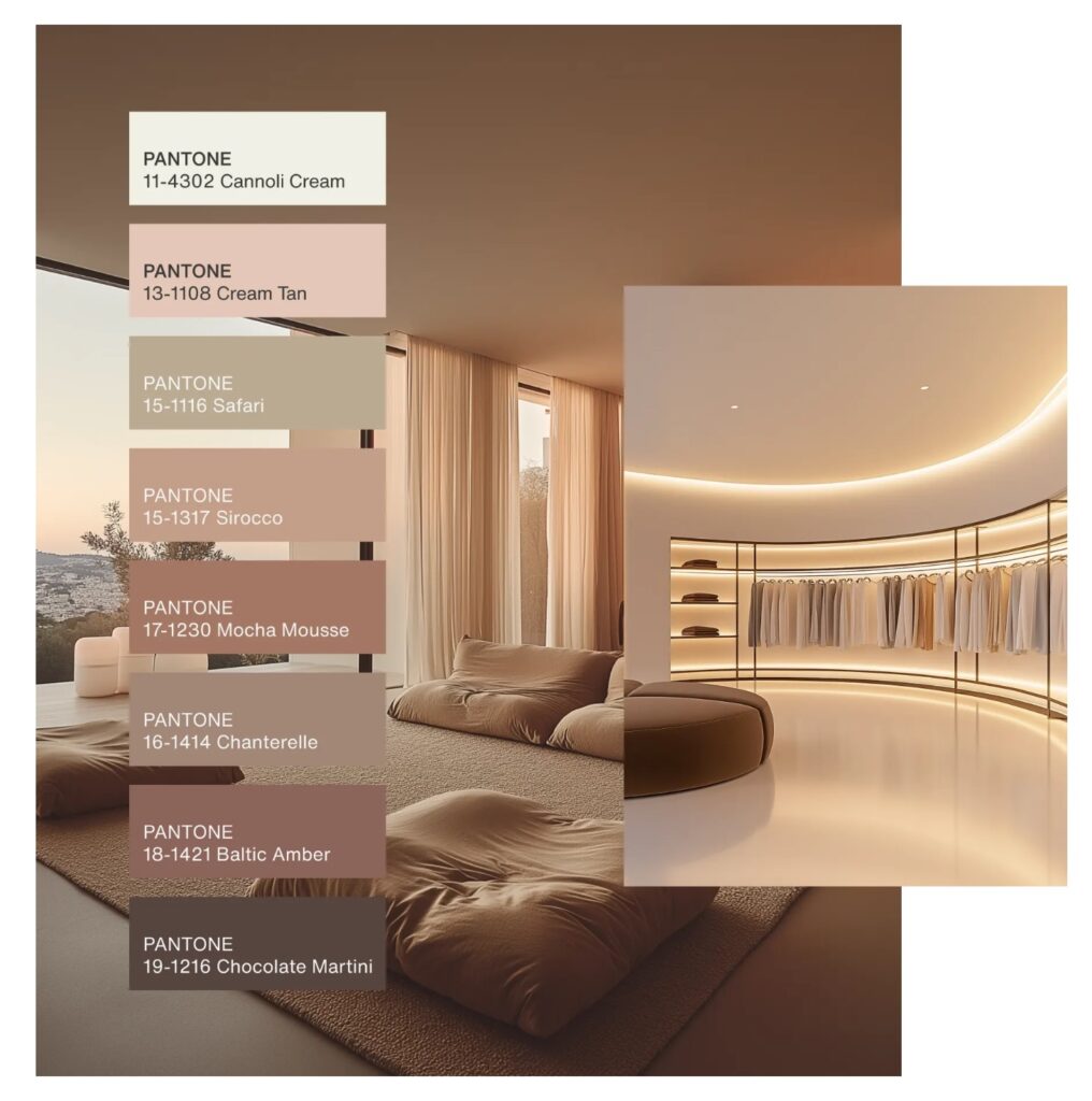
COLORS
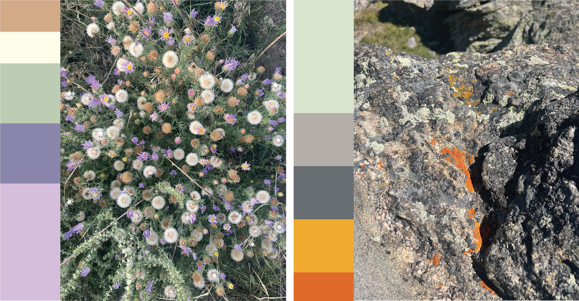
The color palette for branding apartments is far more important than one might believe. Use color psychology to your advantage, noting what each color can mean and how they work together as a group. We like to look for inspiration in the surrounding areas, in the architecture, or possibly even some of the art that will be on display at the community.
DESIGN ELEMENTS
Typography, shapes, patterns, textures, all come together to create the branding’s back-up. Every new choice and addition should work in tandem with the selections made so far.
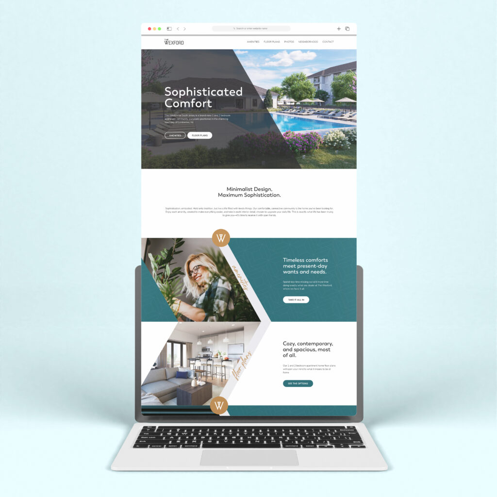
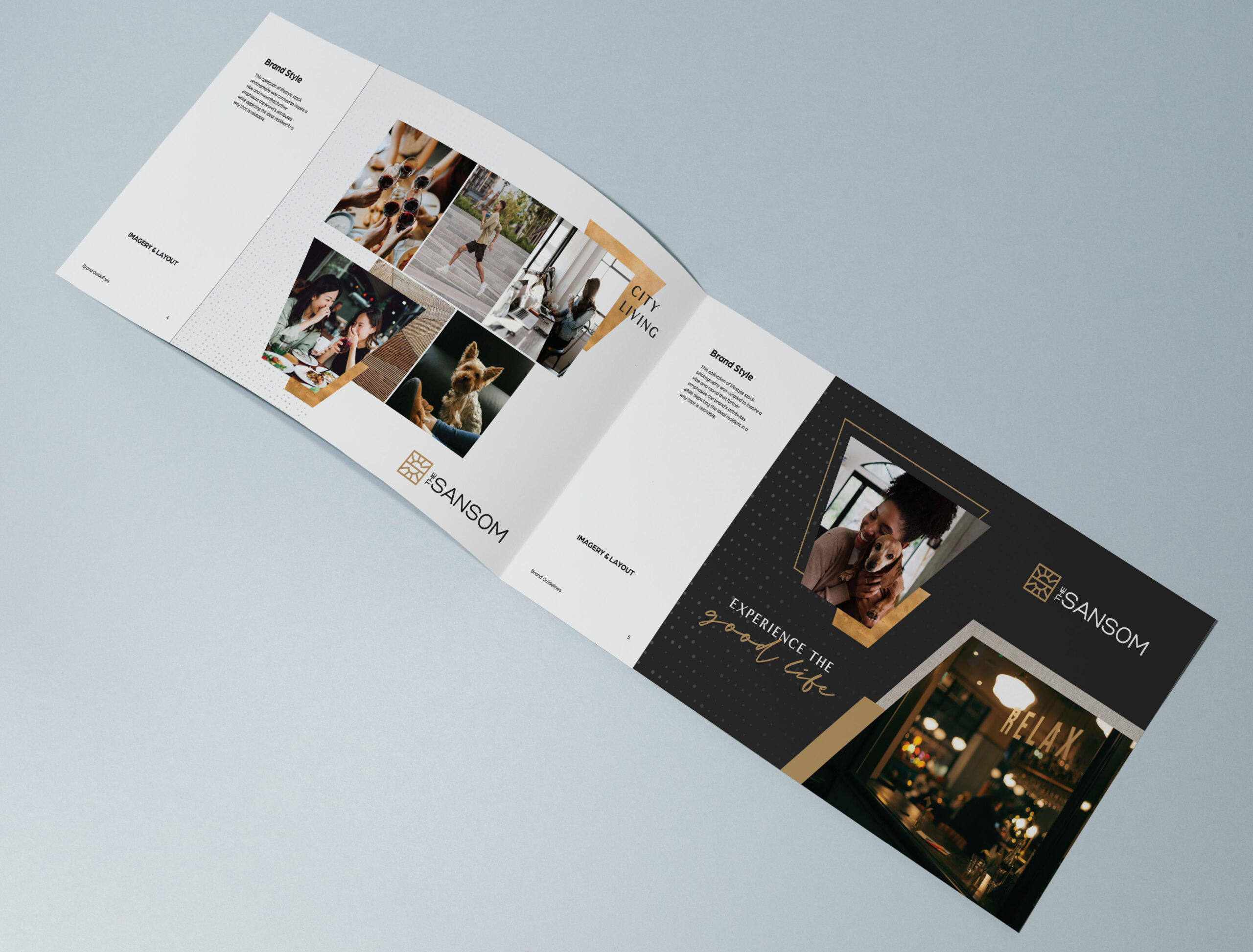
IMAGERY
Using a combination of stock photography and professional architectural photography, we can create an entire vibe with a set of images. It’s similar to creating a vision board—aspirations for what your brand is and can be.
WHY IT’S IMPORTANT
What prospects and current residents see is vital to your brand. It should align in truth with who the brand is—because every perception they come away with is like a tiny promise that you should be keeping.
The visual identity we create is made strategically to speak to the right audience. Every choice is a conscious one. Because we’re so passionate about getting it right, we create three sweet visual identity concepts (at minimum) to help you hone your desires for the brand. We know that seeing examples can help you focus in on what you want and don’t want, so having more than one choice is the best way to move forward. Kind of like at the optometrist:
Better 1
Or
Better 2?
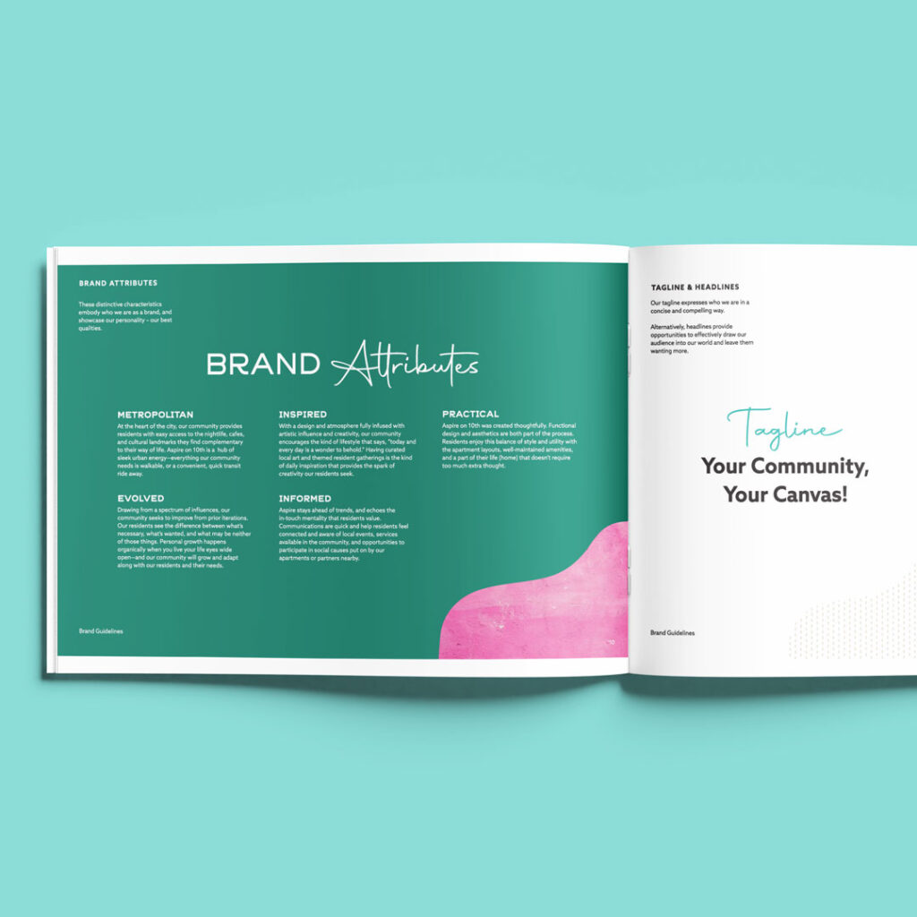
8. Verbal Identity
You didn’t think we’d end there with our work, did you? Of course not. Brands need a well-crafted verbal identity, too. Do NOT skip this.
Every factor we’ve already discussed comes into play for the verbal identity. The meaning behind the message. The context behind the content.
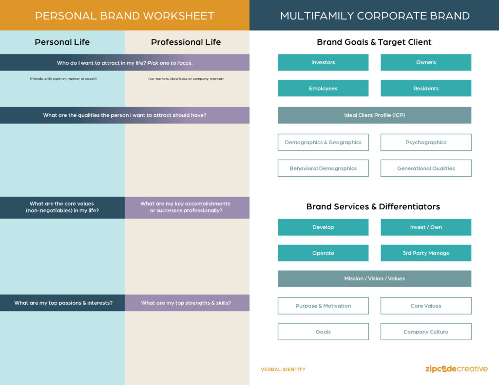
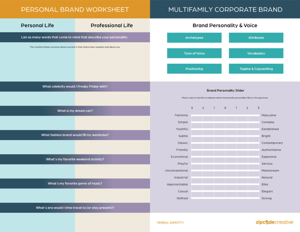
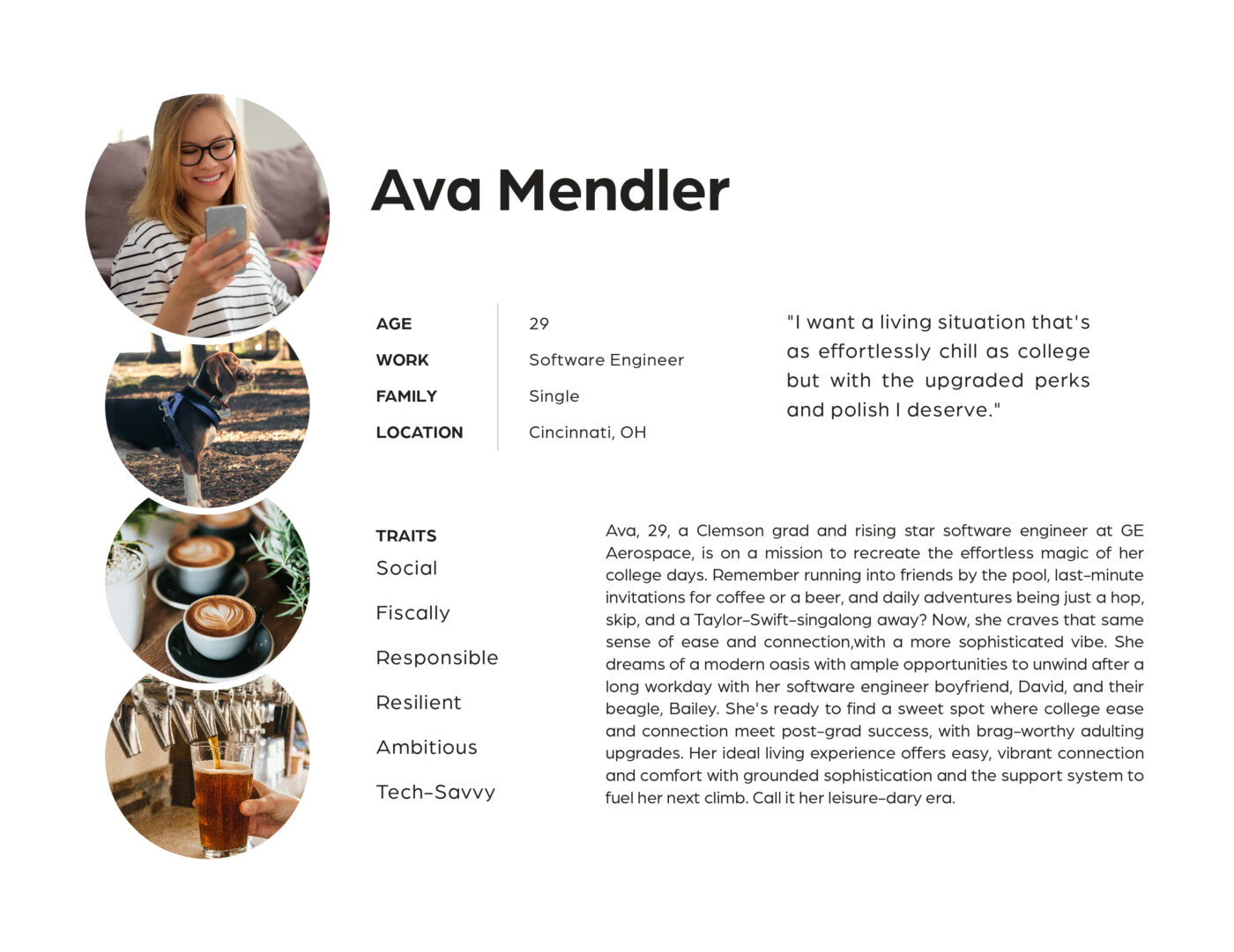
Who – If you know who you’re talking to, things get a lot easier. We create a particular Ideal Resident Profile (persona) to help tailor the brand voice.
What – When you know what to say (How a brand speaks—what the brand does and DOES NOT sound like) and what the brand archetype and personality is, then you have a clearer picture of how your brand would respond in any scenario, approach any occasion, and focus on with their messaging.
Why – Speaking of focus, crafting the mission, vision, and values along with the brand positioning statement injects soul into your brand. It’s not just about what the brand acts like, it’s about why the brand is saying specific things, prioritizing certain amenities, and creating a certain vibe with their message.
DON’T SKIP VERBAL IDENTITY
Your verbal identity comes together to create a brand that feels personal—something that your prospective and current residents can connect with on an emotional level. And creating clarity and consistency around that messaging is the ideal move. To that end, we create tagline options (“Remember Our Brand!”) plus a whole headline library for your use—in brochures, on the website, in ad campaigns. Along with that, the brand vocabulary gets even clearer with what words to use and what words not to use.
Because we love our clients and want them to succeed, we craft an overview, problem/solution, products/services, and company culture paragraph with sample writing in the brand voice. There’s nothing like longer-form copy to help hone that verbal identity.
9. Concept Presentation Call
This is the most exciting and nerve wracking bit of the branding process for us. We love to be creative and make something that will set a community apart. During the concept presentation call, we’ll spend time collaborating and collecting your feedback. We don’t do much talking—because we want to hear every one of our clients’ unfiltered thoughts and gut reactions. When the dust has settled a little bit, we work on narrowing down the best direction.
Finding the balance between your vision and our guidance is always the best way forward. While we’re the strategy and design experts, we know you’re the expert of your brand. Because we’ve done the research on your ideal resident profile (IRP), competition, and how to achieve your goals, the target audience is always part of the vision as we work and collaborate to creatively develop a community brand.
So Many Steps! What’s the Return?
When our clients ask us about ROI for branding, we feel confident when we point out brand recognition, adding perceived value, and creating a streamlined resident experience.
Is branding an apartment community the best part of our job? 1000% yes.
And it’s (arguably) the best part of marketing—because it’s the part residents relate to. It’s not the 10 billion emails you send that resonate or the ads you used to target them (however precisely).
It’s what you say in the email.
It’s the name of your apartment community.
It’s the tagline.
It’s the color palette.
It’s the logo they’ve come to recognize across your marketing channels.
It’s consistency that boils down to trust.