


Typography Casing for Good Apartment Marketing Design
Stacey Feeney
When you’re designing your marketing materials, it’s easy to get caught up in the photos and design elements. These components can make a big impact and immediately attract the viewer’s attention—but there’s another part of design that’s equally important and often overlooked: typography casing.
Your approach to typography can make or break your apartment marketing design. While font style, size, and color work together, it’s also integral that you consider your text casing. Whether you opt for all uppercase or title case for a headline, it’s a strategic decision that can define the hierarchy of information on the page, but also helps with ease of reading. Learn more about the different casing options, and when to use them, to level up your community’s marketing materials.
Types of Typography Casing
There are four main kinds of typography casing—and there’s a time and place for each. Be sure to keep the casing in mind to find the most readable and visually appealing design approach.

Uppercase
Uppercase typography is when every letter is capitalized—also known as “all caps”. This type of typography should be used sparingly, typically in headlines at the very top of a design. This style of type is perfect for drawing attention to a short—but very important—phrase. Things like “Leasing Special,” “Your Tagline,” or “Now Open” are ideal candidates for an all-uppercase treatment. It’s also a smart option for calls to action to make them stand out.
Lowercase
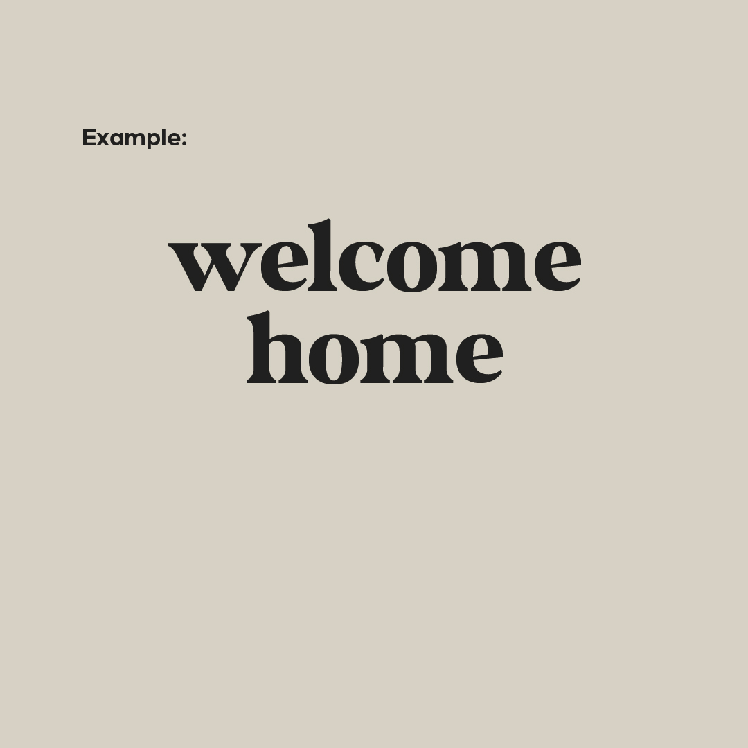
Lowercase typography is when you use all small letters for an entire word or phrase. Using all lowercase letters isn’t necessarily grammatically correct, but can be used when you’re making an intentional and stylistic design choice. This style is best reserved for a short, attention-grabbing headline (similar to those used for all uppercase). Using lowercase typography will give your designs a slightly softer look.
Sentence Case
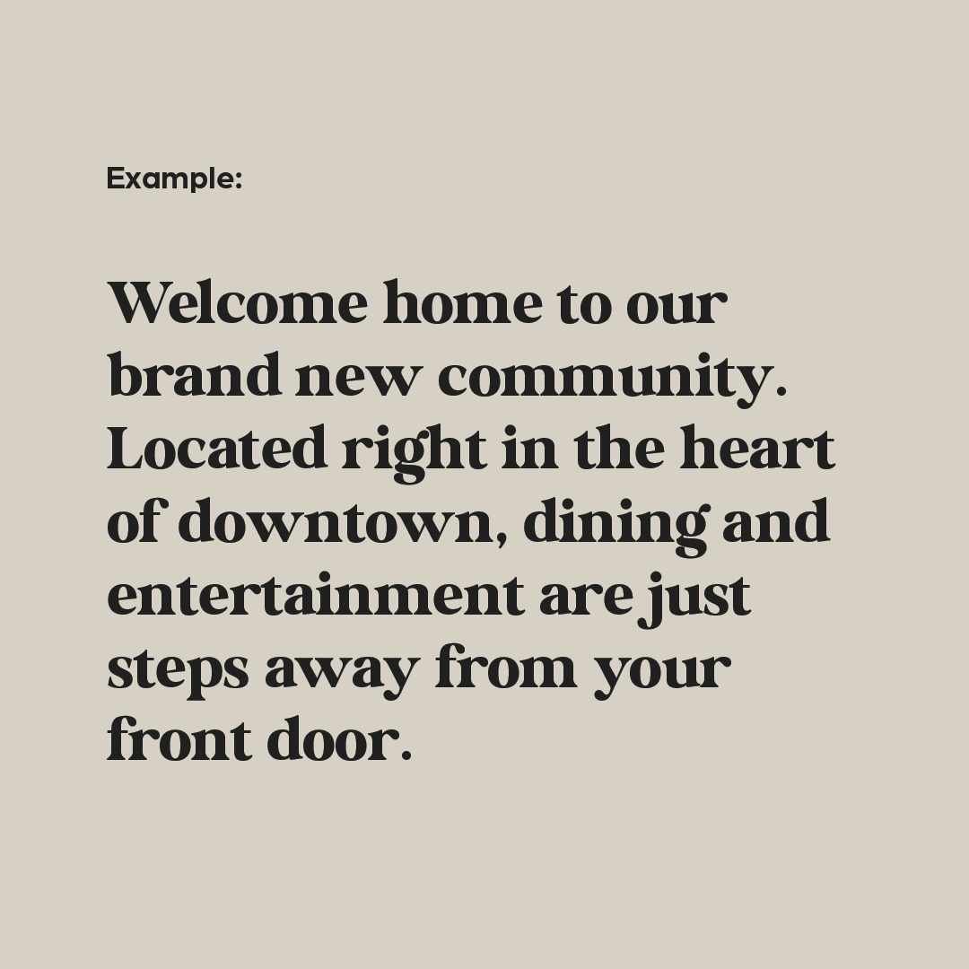
Sentence case is the style used when writing sentences—the first letter is capitalized and there is punctuation at the end of your phrase. This is most commonly used for body copy, long-form writing like blog posts, or social media captions. It’s helpful to increase readability and make your assets easy to understand. You can also choose to use sentence case for headlines or sub-headers, though they are more commonly written in title case.
Title Case
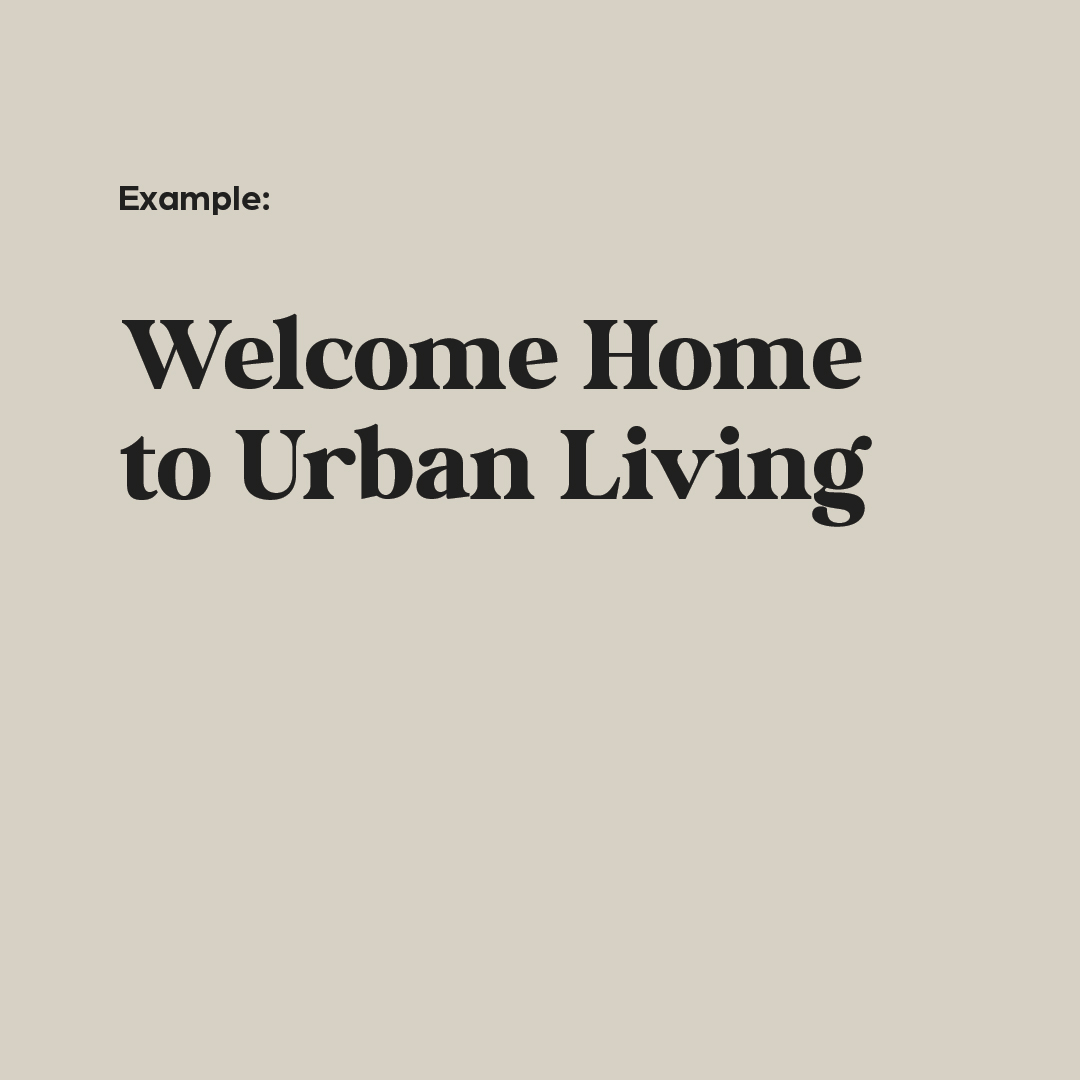
Title case is when you capitalize the first letter of all major words in a phrase or headline. Title case is most commonly used in headlines and subheaders, but is best reserved for only one or the other. When you have a headline and subhead living together in any design, consider leveraging title case for the headline and uppercase for the subhead to create a stronger visual hierarchy. Title case is also sometimes used for calls-to-action to better differentiate them from body copy.
Typography Casing Combos & Hierarchy
The best part about typography? You don’t have to choose just a single style. Mixing and matching different options can help you create a more dynamic, visually interesting design piece. Some common combinations include:
- UPPERCASE HEADLINE & Sentence case body copy
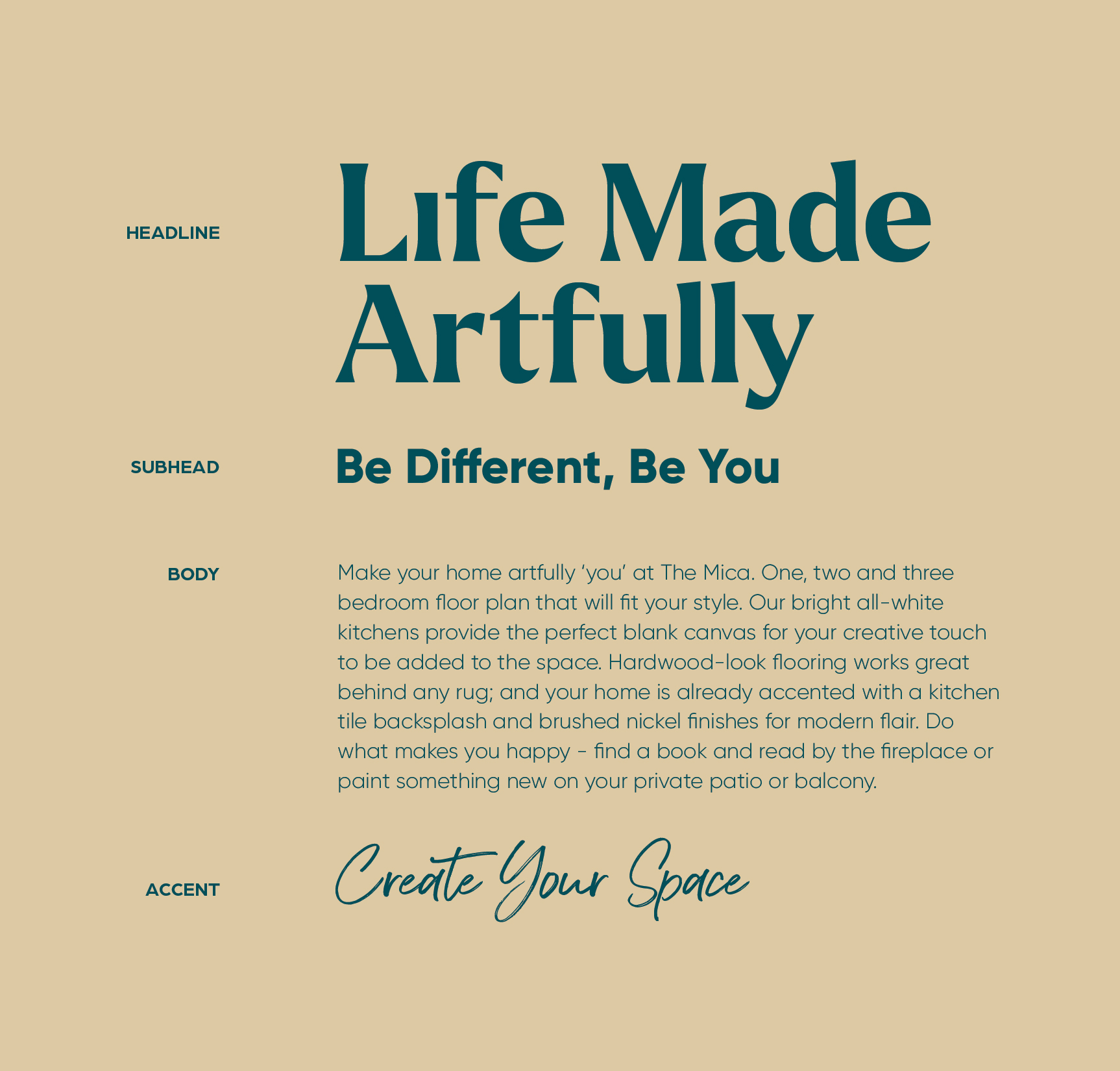
- Title Case Headline & Sentence case body copy
- UPPERCASE HEADLINE & Title Case Subhead
- Sentence case body copy & UPPERCASE CTA
- Title Case Headline & UPPERCASE CTA
Especially for designs that are text-heavy, it’s important to add variety to your typography. This will create added visual interest and create a clear separation between different types of copy. But whatever combinations you choose, be sure to strive for consistency. Every headline on the page should use the same style—same with body copy, calls-to-action, subheads, and eyebrows. This approach creates a predictable visual hierarchy, so viewers understand which copy is most important at just a glance.
Font sizing can also help you create a clear type hierarchy. Typically, your headline should be the largest font on the page, followed by the subheadline. The body copy is often the smallest. Thinking strategically about your font size will help you move the reader’s eye down the page and help get them to engage further. It also helps you to ensure that they get the most important information first.
If you need help defining your community’s visual style, it might be best to enlist the help of the experts. At zipcode creative, we have helped countless communities develop their branding, establish their visual guidelines, and craft their marketing materials. Get in touch with our team today to get started!
Lease a
