


Writing a Call-to-Action: Everything You Need to Know
Stacey Feeney
If you have a marketing strategy, a distribution plan, and your community branding all ready to go, you’re well on your way to having your marketing department up and running. But while you’re looking at the bigger picture, be sure not to overlook the smaller details that make a big difference, like call-to-action.
What is a Call-to-Action?
A call-to-action, or CTA, is an element of any piece of marketing material that tells the reader what to do next or moves them toward a particular action. A call-to-action can come in many different formats, depending on the collateral, including:
- A button
- A hyperlink
- Plain text
No matter which form your CTA takes, it’s important to include it in every single piece of marketing you create. From direct mail postcards to your website to social media, you always want your audience to have a clear understanding of what they should do next. A few examples include:
- Learn More
- Check Availability
- Schedule a Tour
- Lease Today
- Click Here
What you use as your CTA depends on the context, the materials, and the objective, but there are a few best practices that remain the same. Learn how to craft a compelling call-to-action to help increase your conversions and get your audience to move through the sales funnel.
How to Write a Call-to-Action
Though a call-to-action is typically short, that doesn’t mean they’re easy to write. Writing a CTA requires blending the right words, a sense of urgency, and clarity to get users to click.
Keep it action-oriented
The perfect call-to-action makes it clear exactly what the user should do—which usually requires some strong verbs and action-oriented language. Though you don’t want to sound bossy, a well-written CTA is very strongly ordering them to do a certain action. For example:
- Download Now
- Sign Up Today
- Book an Appointment
- Contact Us
Each of these CTAs begins with a strong verb so they’re super clear and concise.
Create a sense of urgency
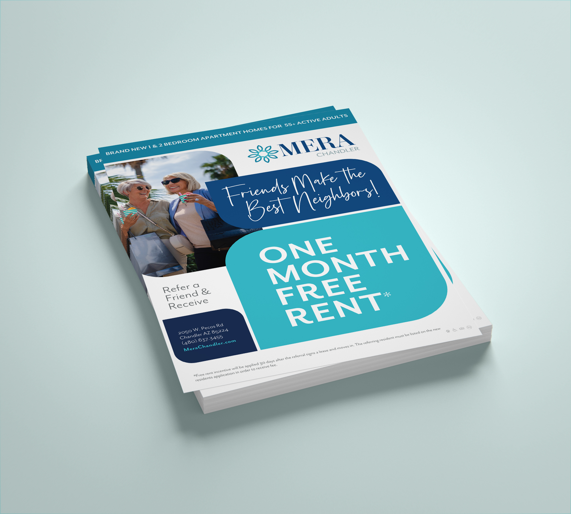
When you’re writing your CTAs, you’ll also want to try to add a sense of urgency. There’s nothing that people hate more than missing out on a good deal or opportunity, so your CTA should make them feel like they have to act fast to get in on the action. Urgent CTAs are especially relevant when you’re running leasing incentives or referral promotions because they have a firm end date. Try a call-to-action like:
- Book Now
- Visit Us Today
- Get a Month Free
Using time-oriented words like “now” and “today” helps infuse these CTAs with a subtle sense of urgency that can help prompt a higher conversion rate.
Keep it short
When writing CTAs, readability reigns supreme. You want to be sure that your call-to-action is short, clear, and concise so people know at a glance exactly what you want them to do. While two- or three-word CTAs are ideal—especially when using buttons or hyperlinks—you don’t want them to be any longer than about 10 words. Otherwise, it’s harder for readers to get a fast and clear understanding of what their next action should be, which will lead to lower performance.
On the flip side, don’t prioritize a shorter CTA over clarity. CTAs like “Go,” “Next,” or “Click here,” are ambiguous and vague, so you’ll want to avoid making them too short. It’s all about striking the right balance.
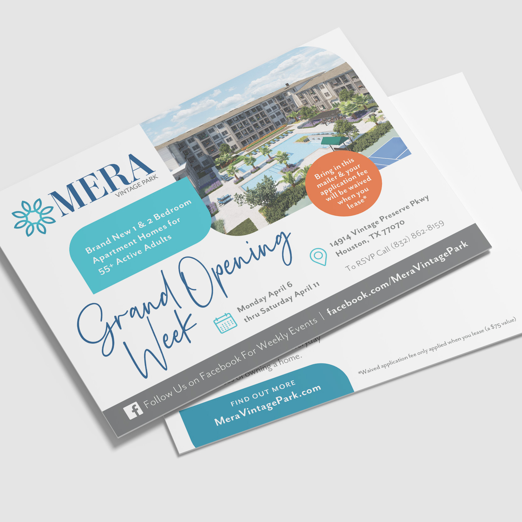
Prioritize a single CTA
While it can be tempting to throw a bunch of CTAs on one piece of marketing collateral, picking one call-to-action is vital to your marketing success. Giving your audience too many choices can cause confusion—and confusion leads to a lack of action. Pick your top-priority next step, whether that’s visiting your website, booking a tour, or downloading a brochure, and only use that CTA on your piece of collateral. That way, you’re driving everyone to the same place for more conversions and higher-performing content.
Consider Your Button Design
For digital marketing assets, like paid ads or marketing emails, you’ll also need to think about the design of your CTA buttons. Be sure the text is large and legible, so it stands out on the page. Consider the button shape—often a rectangle or rounded rectangle—the button color, and the placement. All of these factors can impact the performance, so consider A/B testing a few different options to see what works best with your target audience.
 Now that you know a few CTA best practices, try implementing them across your marketing materials and watch the increased conversions roll in.
We know that crafting the perfect call-to-action can be tricky. If you’re struggling to get it just right, it may be time to enlist some help. At zipcode creatives, we have experience in marketing strategy, copywriting, and design for the multifamily industry. From helping you get your email marketing off the ground to redesigning your website to writing a high-converting call-to-action, we’re here to help.
Avaire Email Image is ©Fairfield Residential | Work executed by Stacey Feeney, owner of zipcode creative, while under creative direction and employment at Fairfield Residential.
Lease a
