


Implementing Brand Guidelines for Multifamily On-Site
Stacey Feeney
What are Brand Guidelines?
Apartment brand guidelines are like a road map to your apartment community’s brand. You’ll be able to get where you want to go with this map in hand!
Breakdown of Apartment Brand Guidelines
Everything you ever wanted to know about apartment brand guidelines is here. But you might also be wondering how to apply it at the on-site level. So much to do, so little time. (If you want a broader take, check out our branding basics for apartments.) We’ll get right to it
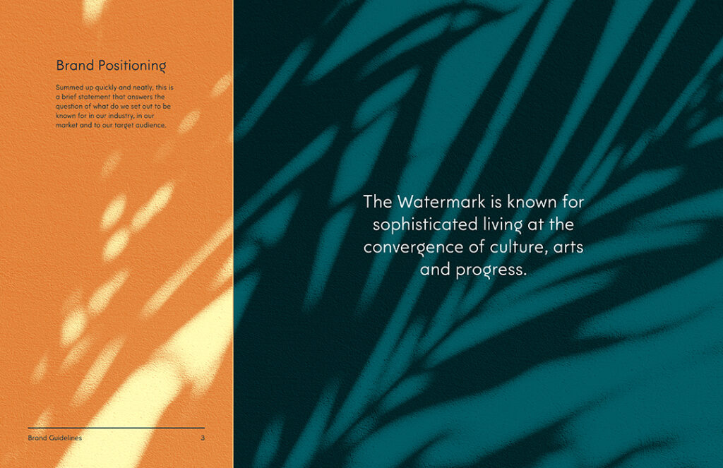
BRAND POSITIONING
Brand positioning, defined:
A short, sweet brand statement about your community that communicates what you are and what you’re known for in the industry, market, and to your ideal resident.
How to implement brand positioning:
Use the brand positioning statement as an internal guiding light for everything you’re doing. Everything should measure up to it, especially if you’re concerned about brand loyalty and brand authenticity, and creating a brand that’s based on a lifestyle.
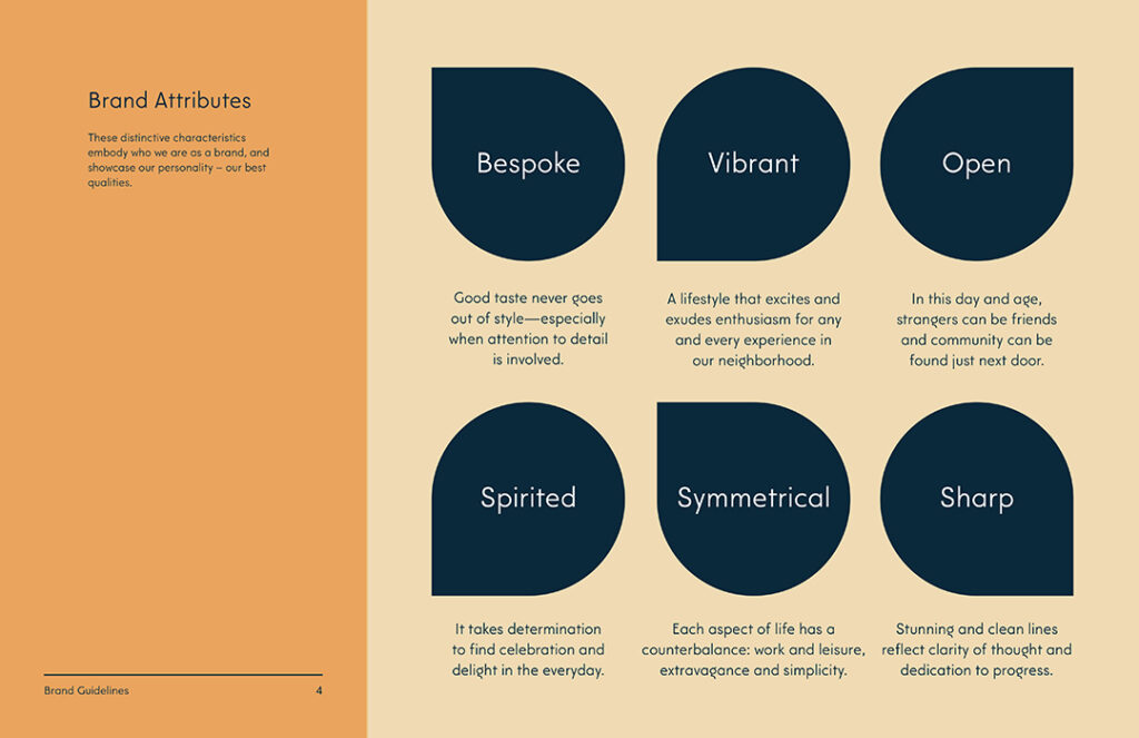
BRAND ATTRIBUTES
Brand attributes, defined:
These are the descriptors that embody your brand, as if it were a person. We like to do the “which celebrity would your brand be and why?” to get closer to the heart behind your community.
How to implement brand attributes:
On-site managers can use brand attributes to verbalize the difference of the community (useful for any social media captions) and help embody the spirit of the culture while they give tours.

IDEAL RESIDENT PROFILE
Ideal Resident Profile (IRP), defined:
Your community’s key audience. Age, Gender, Race, Income, there are plenty of things that you can identify as the “ideal” when it comes to the resident you’d like in your community.
How to implement the IRP:
Use your knowledge and data from your IRP to communicate better. It’s like a platonic version of “The Five Love Languages.” You can alter how you speak to the type of prospect you’re selling when you know more about them—resident demographics must influence your branding.
BRAND VOICE & TONE
Brand voice, defined:
Your brand, in words—showcasing your community’s personality and style. This is how others perceive you and hear you in written word. This will show up in your brand identity statement, your tagline, your headlines, and your general brand vocabulary.
Brand tone, defined:
Using your brand voice in different settings, as it’s called for. Informative tone, descriptive tone, it all depends on the occasion and audience.
How to implement brand voice and tone:
The tone you use in flyers for upcoming resident events should be a little different than your brochures for touring prospects. Use your brand voice across all your collateral, but tilt your tone to angle to the right part of the customer “funnel.” Resident announcements will also require a slightly different tone, too—a little more casual, warm, and excited…rather than 100% informative.
LOGO MARK
Logo mark, defined:
Your community’s logo with the name, or a symbol, or both. There’s typically a primary and secondary logo mark.
How to implement logo marks:
This should go on everything! The logo is the face of your brand and often what a prospect will notice first and remember last. If you’re DIY-ing any sort of design, make sure the logo is on it and used appropriately. More on that next…
LOGO MARK USAGE
Logo usage, defined:
Rules for how you can use the logo—spacing, angles, and combo rules so you don’t have crowding, stretching or skewing of something that should always be recognizable.
How to implement a logo:
Rules are rules. Follow them when you make anything with the logo included! Consistency is the name of the game. The brand guidelines are your rule book.
COLOR PALETTE
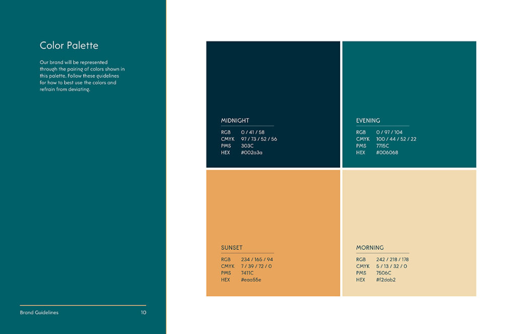
Color palette, defined:
The color palette is the exact colors that are to be used in your branding materials and not meant to be strayed from. It’s between 3-6 colors, typically, and all four color codes will be identified so you can color match no matter the program or medium (RGB, CMYK, PMS, AND HEX).
How to implement color palettes:
Royal blue isn’t the same everywhere. Use the codes to look up the exact match. Close enough isn’t good enough. Find the right one in the assortment in your email newsletter builder. Type in the code in Canva. Save it. (After all, you’ll definitely use it again.) Ordering swag? Use the codes.
TYPOGRAPHY
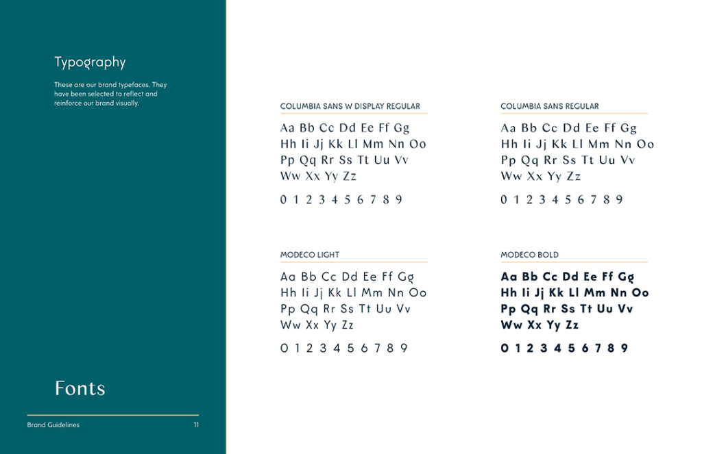
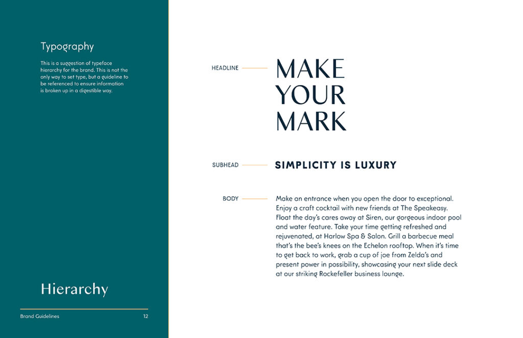
Typography, defined:
The fonts or typefaces chosen (usually 2-4 kinds) for your brand. This will show up in your logo, your headlines, your subheaders, and your body text.
How to implement typography:
Reference your brand guidelines for the hierarchy of the fonts being used, you can determine which one should be used where on your next flyer.
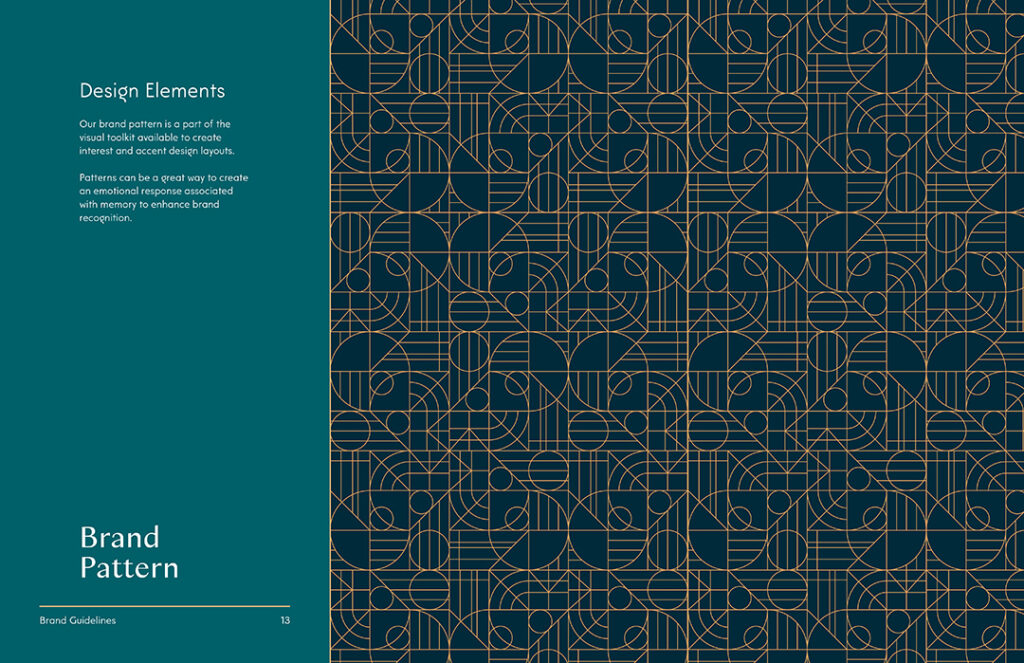
DESIGN ELEMENTS

LIFESTYLE PHOTOGRAPHY
Lifestyle photography, defined:
These are the photos that reflect the lifestyle vibe that your residents could live out in your community. They are intended to evoke a feeling in the viewer to help them imagine themselves living there.
How to implement lifestyle photography:
If you need to find additional images to supplement the ones provided with your branding, or if there aren’t any—use the color palette as your guide. Take the tones from that to select photos that will “play nice” in any marketing collateral you’re creating.
ICONOGRAPHY
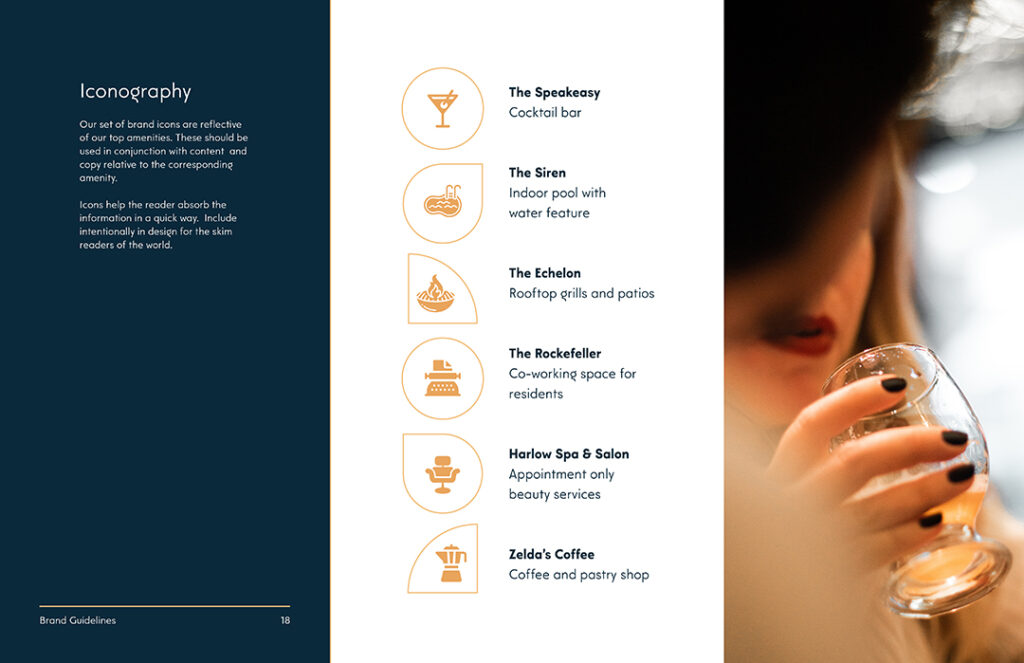
Iconography, defined:
Icons that help your audience get the gist without reading. They can be used to represent amenities, especially.
How to implement iconography:
Don’t want to crowd your design with so many words? Use icons to get to the point.
ILLUSTRATIONS
Illustrations, defined:
Brand illustrations are an additional visual cue for your residents and can be powerful aids in showing your brand’s personality. They’re less of exact representations or stand-ins like icons, but they help get an idea across more artistically.
How to implement illustrations:
Pick a wall that could do with a mural. See if you can get something on the wall to spruce up the space that works within your brand.
BRAND EXAMPLES
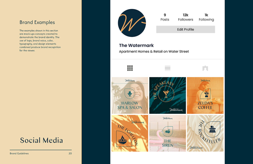
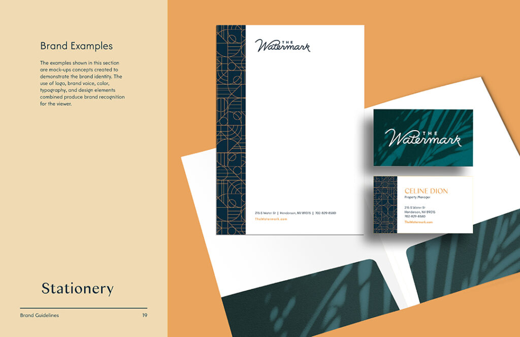
Brand examples, defined:
The part of the brand guidelines where it all comes together. You’ll typically see examples of stationery, a social media feed, or how signage could look outside your building, for example.
How to implement brand examples:
Particularly the social media feed could be helpful to see how the fonts, colors, imagery and voice come through to create one super special brand. Use these examples as inspiration!
Keeping Brand Guidelines In Line
It’s incredibly tempting to go full red and green for Christmas. Or orange and black for halloween. But do these colors work with your brand’s color palette?
HOLIDAY
Instead, choose colors that work with your color palette by using color theory. Which shade of red works? Which shade of green? Color pairing can be difficult. But: Keep things dialed in with your brand and don’t use holidays as an excuse to create something unrecognizable as your brand, even if it is fun. Wondering how colors impact our thoughts? Check out our post on using color psychology to sell units.
EVENTS
Have a resident potluck coming up? Find the one-color version of your logo and start cooking up a design using Canva. You can create something that’s worth looking at. There are plenty of templates to start with. Change out the colors using your color codes, and change out your fonts with the ones that are in your brand guidelines. Pretty soon it will look and sound like your community, with very little effort.
Branding is important at every level of the community. Maybe that’s news to you, but it holds true.
On site, the responsibility to keep to the brand guidelines still holds—you’re the closest to the resident, after all.
Lease a
