


Color Psychology: Selling a Feeling to Lease Units
Stacey Feeney
Whether you realize it or not, you have an unconscious reaction to every color you see. Color is a powerful way to subtly affect someone’s perception, making it a useful tool for companies looking to refresh and reevaluate their branding. Instead of choosing colors at random, leverage color psychology to make more strategic decisions and develop branding that makes the right impression. You’re not selling units, you’re selling a feeling with your apartment branding – or at least, you should be!
What is Color Psychology?
Color psychology is a brand of psychology that analyzes how colors impact human moods and emotions. This discipline has determined that each of the main colors on the color spectrum has a distinct set of associated feelings and perceptions.

BLACK
Black is perceived as a bold and powerful color. It also evokes sophistication, mystery, and sadness.

WHITE
White is considered a very pure shade. It also is associated with peacefulness, cleanliness, and simplicity.

RED
Red is commonly associated with strong emotions, including love, passion, and excitement. It is also sometimes viewed as the color of anger or dominance.

BLUE
Blue has a wide range of emotional reactions. Some view it as a calming or wise shade, while others feel inspired, stable, or peaceful.

GREEN
Green is often associated with nature and growth. It also evokes optimism and good luck.

YELLOW
This bright and bold hue conveys feelings of energy, cheer, and warmth.

PURPLE
Purple has long been considered the color of royalty. It’s also associated with imagination, wisdom, and rarity.
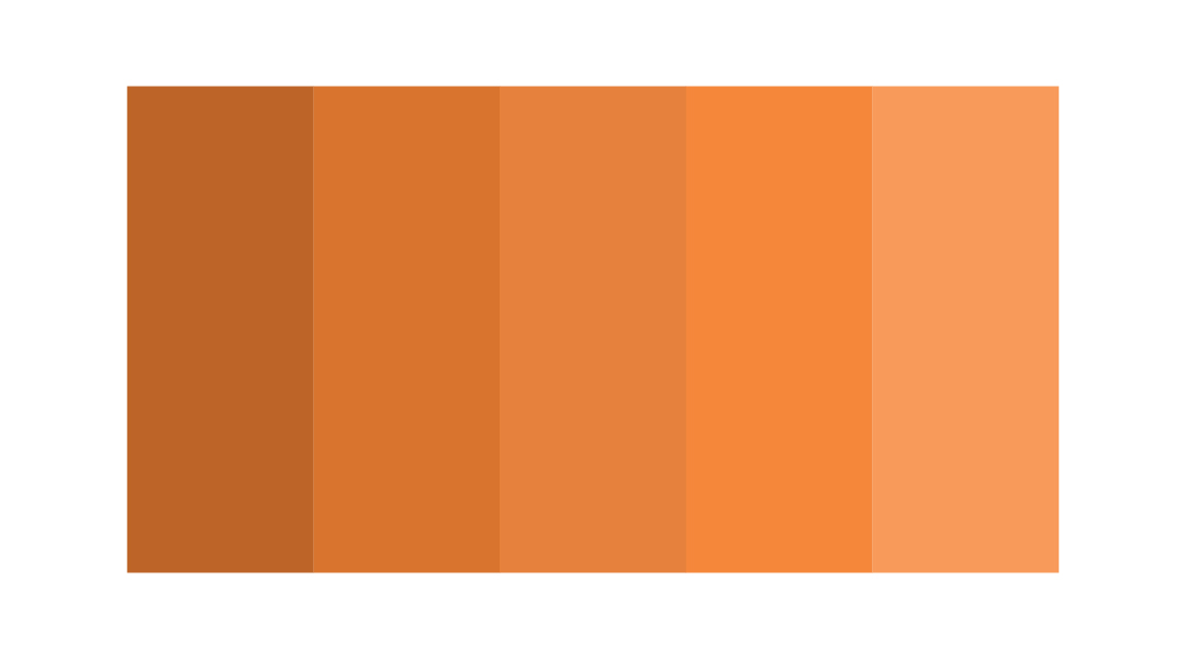
ORANGE
Similar to yellow, orange brings out feelings of enthusiasm and happiness.
Using Color Psychology to Build Color Palettes
Choosing the right color to represent your apartment community is a pivotal decision. Spend time deciding which traits and characteristics you want to be associated with your brand, and pick the hue that best lines up. If you’re unsure of what shade to use, consider pulling colors from your community’s interior design mood boards. This will help create an even more cohesive look across physical and digital spaces.
After choosing your primary shade, you’ll also need to build a color palette. Leveraging differences in hue, tint, tone, and shade can help create a well-rounded, multidimensional palette that is versatile enough to work with all of your marketing needs.
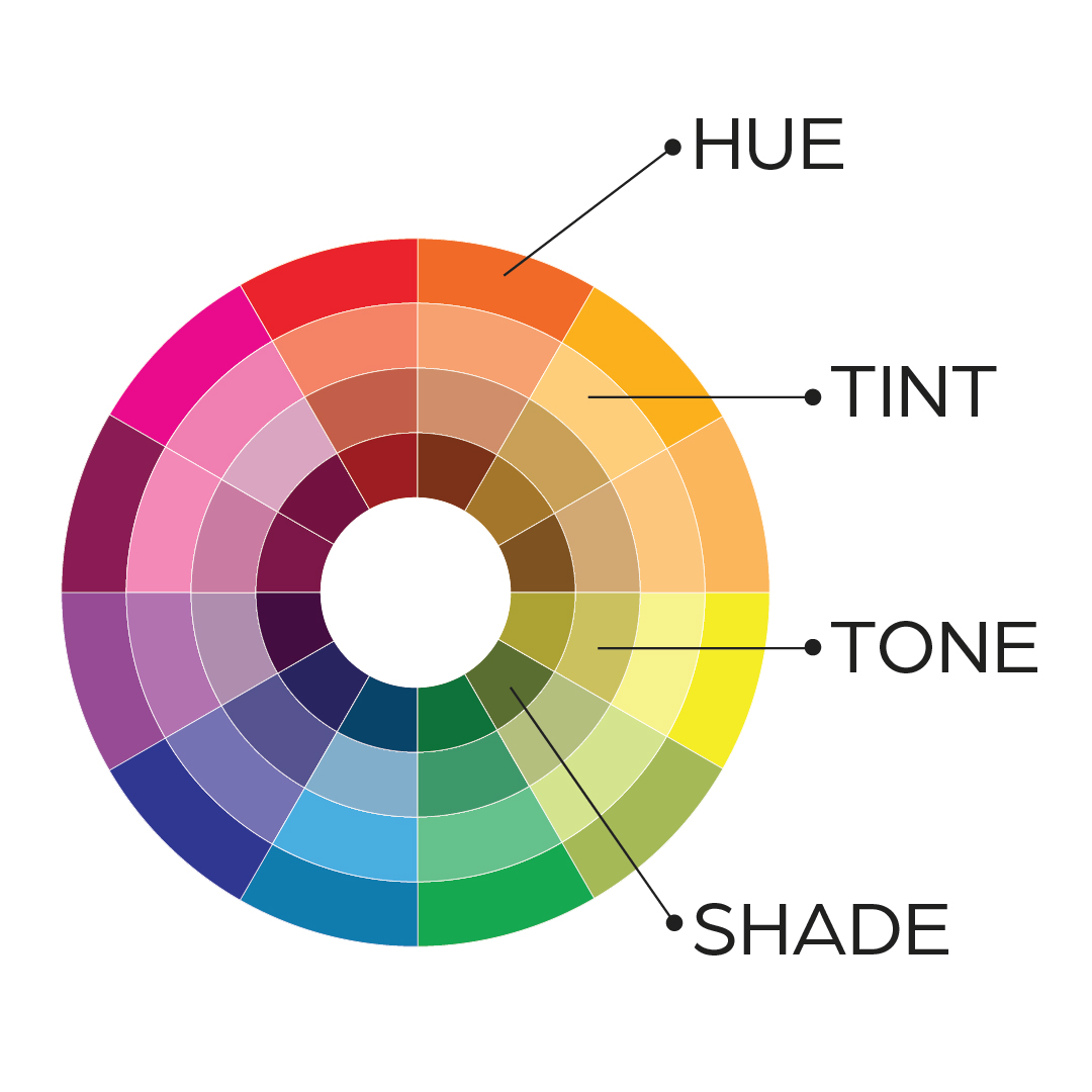
Hue
Hue is the purest form of a color.
Tint
Tint is the pure hue mixed with white to produce a lighter version of the color. For example, mixing purple with white results in a lavender shade.
Tone
Tone is the pure hue mixed with gray to produce a muted version of the color. For example, mixing green with gray creates a silvery, sage green hue.
Shade
Shade is the pure hue mixed with black to produce a darker version of the color. For example, mixing blue with black creates navy.
Creating variety in hue, tint, tone, and shade will create a monochromatic palette that gives you the perfect shade for every use case. You can also incorporate a contrasting, “pop” color that will highlight important elements of your design. Consider picking a color opposite of your primary shade on the color wheel to make it stand out.
If you’re having trouble deciding on your primary color or creating your color palette, branding experts like zipcode creative can help. As experts in apartment marketing, we can create a cohesive color scheme that represents your brand and sends the right message to prospective residents. We can even help you translate your chosen color palette across all of your marketing materials for a unified look. Get in touch today to learn more!
Lease a
