


Creative Problem Solving in Multifamily Marketing
Stacey Feeney
When it comes to creative problem solving in multifamily, creativity is key. Sometimes, it’s a struggle as a creative to come up with solutions to things that get in the way of a beautiful and effective design. But there are a few scenarios that appear regularly, and we’ve figured out the best workarounds for each.
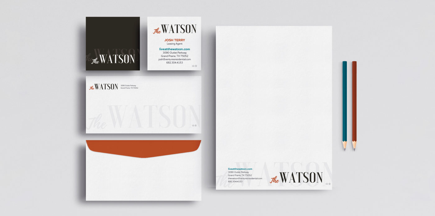
A Logo Design With “The”
Using “The ________” in your apartment brand name seems like a good idea—making a statement about how you are THE place. It’s a traditional power stance verbally. Yet visually, it’s tough. Even though it’s really short and quite small, it’s a challenge to design it interestingly without overpowering the main event (which would be “Watson” in The Watson, for example).
Example: The Watson
A special workaround we sometimes recommend—if you’re in the planning stages, you can drop the “the” (say that five times fast) for something fresh and modern. That eliminates the ugly stepchild syndrome that can happen to little articles (a, an, the) in a big design.
Creative Problem Solving A Long Brand Name
A rose by any other name would smell as sweet—we promise. Sometimes we’re so caught up with a name that we don’t consider where it has to go and how it has to work. When a name is longer, it tends to be locked into being used only as a horizontal logo, because that’s the only way it will work. Think of all the digital platforms that are square—which is most of them, honestly. Placing your logo horizontally in a square or circular space (or heaven forbid in a vertical use) as your profile pic makes everything smaller.
So, should you keep the long name? Think through the pros and cons. Is it perfect? Is it easy to say? Consider how it would land with your ideal residents. Would shortening it keep it snappy and memorable, like these famous brand names?
- Nike
- Pepsi
- Lyft
A Lengthy Tagline in the Logo
Creative problem solving in multifamily extends beyond the logo, too—to the tagline. We like to keep them separate for a reason. Please, please don’t make us put the tagline in the logo. Taglines are vital, so absolutely keep them front and center in your designs. In your flyers, on your website, plastered on your window graphics—but not in the logo. The only exception we can think of? If we need to say “Apartments” under the name.
Beyond this, designing the tagline to go with the logo everywhere is a challenge. The balance and readability is a problem (because the tagline is longer than the logo and can become tiny and hard to read). If you can’t let the logo and tagline go their separate ways—consider having two versions: a logo with the tagline and a logo without the tagline.
Brands to Stand Out (Without Making Waves)
If edgy, cutting-edge, sharp, and rugged are how you identify your brand’s personality, but your target audience or ownership group are more traditionally minded, you may find yourself in a pickle. It’s important to create a stand-out brand identity, but you also have to design with your audience in mind. What will appeal to them? Sometimes, it’s best to focus on infusing your differentiators and voice with that personality rather than the visual elements. Being creative means you can avoid being boring, and still get in front of the resident you want to attract the most (while keeping your investors and management happy).
Keeping the Brand Style On Track
Many brands we work with already have a brand style and a guide. But, they may make a design request that comes straight out of left field and doesn’t align with the brand guidelines. As professional designers, we have a duty (an unspoken oath if you want to get weird about it) that we will stay true to known brand guidelines so the brand has consistency and cohesiveness across all platforms—this should sound familiar. It’s what we’re always preaching. Why? Because without it a brand doesn’t have brand recognition. When we get a wild request, we gently push back and remind the client of the brand guidelines. Just because you’ve got a brand guide doesn’t mean your designs have to be boring—we can work within constraints and still bring all the creativity we’ve got. We typically end up compromising, or creating an addendum to the brand standards so the new approach can be captured. Just be sure that the new addition is going to be used more often, so you can keep the train rolling towards brand recognition.
When There Are Too Many Words and You’ve Asked Us To Create Something That It Just Won’t Fit Into It No Matter How Small We Make The Font
Weird heading, right? Here’s a hint: It’s too much copy. If you’re not a designer, using too much copy or content in a marketing piece doesn’t seem like a big deal. That is, until it gets to us and we’re trying to lay it out in a limited space, like the constraints of a mailer or brochure. If we put all the words in, it will look cluttered, the text will be too small (visual proportions that are suddenly unsettling) and it will risk the audience either skimming it or skipping right past it.
Less is absolutely more—take our professional design and copywriting opinion. We’ll definitely ask before we cut content down, and if you think it all needs to stay, we’ll do our best to work with it. Our humble request: audit and edit your content for clarity and conciseness (un-fluff it) before you send it over.
Ugly Photos on Beautiful Marketing Pieces
It’s a match made in…the bad place. If your branding is the absolute best, with the most creative graphic designer in the world working on it, and then you have crappy photos, you can throw that flyer straight in the trash. No one will take it seriously. You’ve lost street cred and the perception of the whole piece goes down thanks to those fuzzy, poorly lit, oddly composed photographs. Forget the lipstick on a pig attempts, and invest in an actual professional photographer or get quality renderings of the space. (Please.)
We all have opinions on what requires the most creative problem solving in multifamily. Our promise to you is that we’ll always find unique ways to solve (at best) or workaround (at worst) the biggest design problems plaguing your apartment brand.
Lease a
