
Author: Stacey Feeney

Branding and Marketing Corporate Multifamily Real Estate


Multifamily branding and marketing is fantastic. We love it. But it’s not all we do. We also work on branding corporate property management companies. All that to say: we speak your language, regardless of which side of multifamily you’re on, be it management, ownership, or development—or all of the above.

Zipcode creative is happy to serve everyone in multifamily communities, from the leasing office all the way up to the investors and owners, including the corporate side of things.

We work with:

  • Third Party Management
  • Owners and Operators 
  • Developers

Before Branding and Marketing Corporate

Your multifamily real estate company—even if it’s behind the scenes—is a brand, too. If you want to make a name for yourself, grow, and attract investors, a solid brand is key.

There are a few questions you’ll want to ask prior to branding and marketing the corporate side of your multifamily company:

Who is your target audience?

This question helps identify whether you need to speak to investors, if you need to reach the owners that are seeking third-party management, or perhaps you do it all in-house and the end customers are the residents at your communities. The answer to this question will make your message very different.


What is your goal?

When you answer this question, it can help determine the tasks and steps you need to take to achieve what you’re setting out to do. For example, if you’re hoping to develop and manage an apartment community until it’s leased up and then sell it, your tasks will vary greatly from if you’re trying to be resident-facing and be a sort of mini-ILS with your portfolio of communities on a website.

If you purchased a community to rehab it, a rebrand is the perfect way to make it very clear that it is under new ownership and management, showing that staff is helpful and interactions with residents are positive!

When we partner with the corporate marketing team at your company, we consider your audience and goals first. That sets the stage for what kind of branding and marketing you should ideally be doing—and how MUCH of it you should be doing.

How much attention do you want or need?

If you’re hoping to stay behind the scenes, then doing the whole kit and caboodle with branding and marketing may not be what you need. But if you want your brand to be known and recognized, you need to work on visibility and consistency.

At zipcode, we get your multifamily real estate company from all angles. Asking these questions can help us get you where you need to go.

Branding and Marketing Corporate-1Branding and Marketing Corporate-2Branding and Marketing Corporate-3

Details of Branding and Marketing Corporate

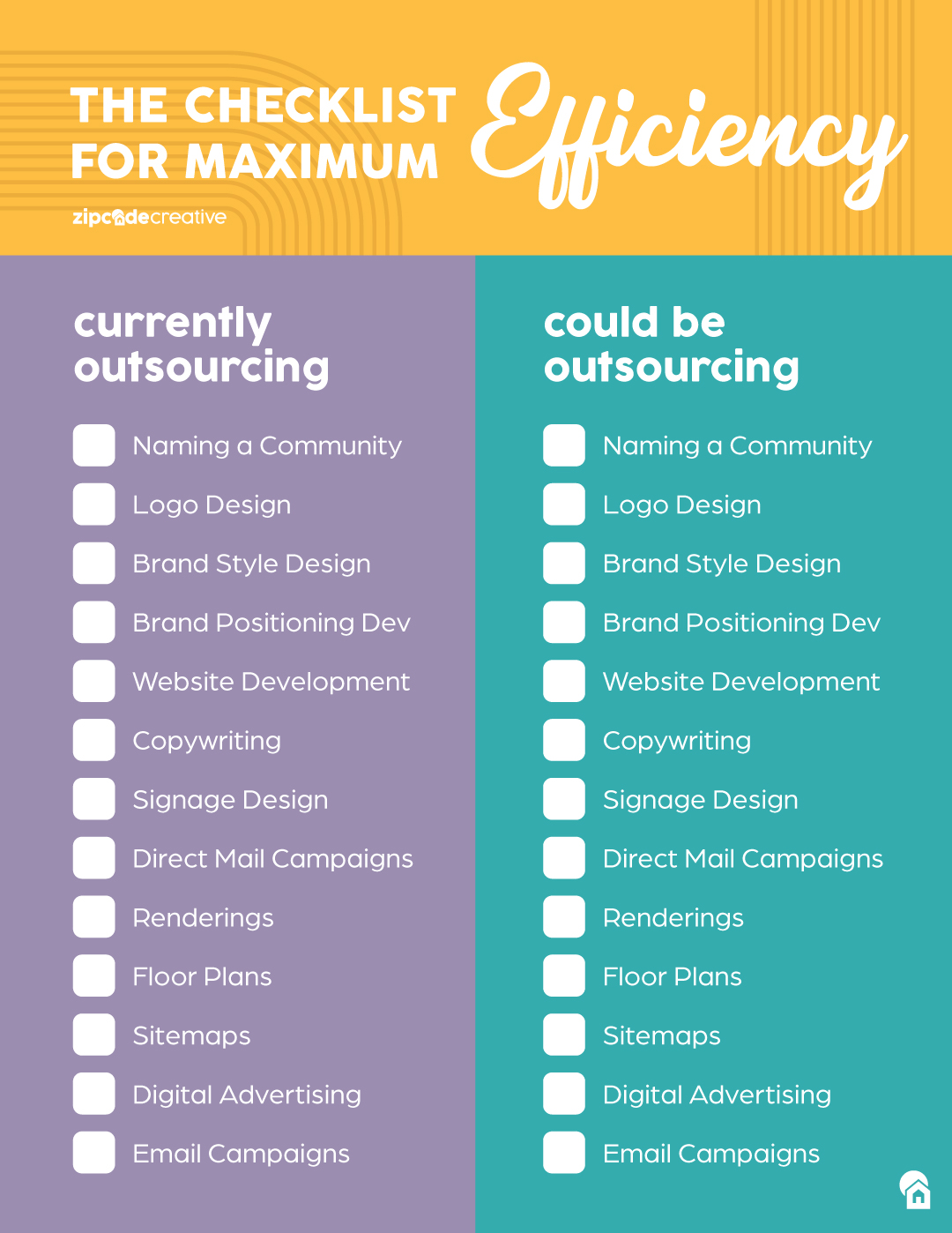
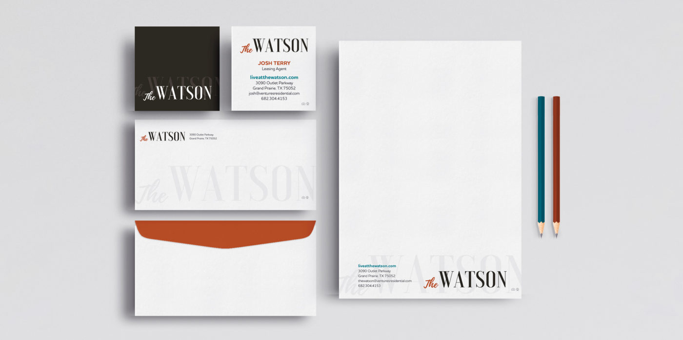
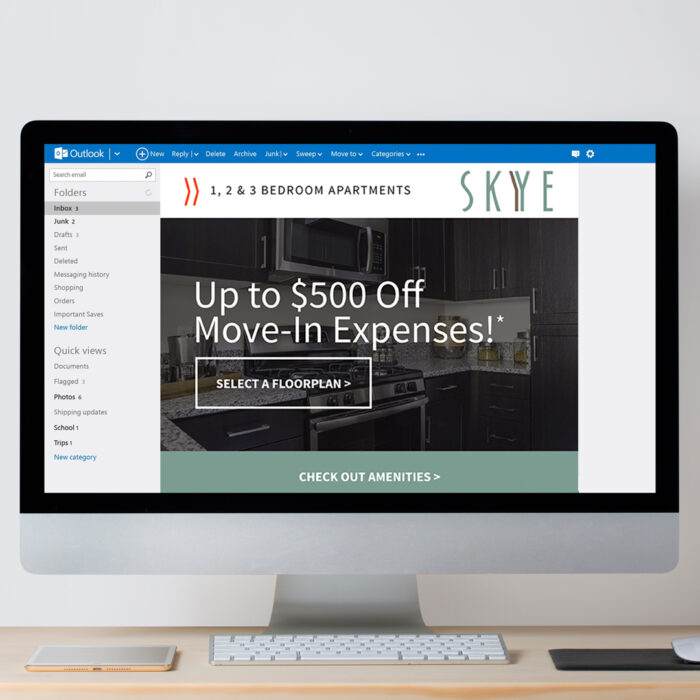
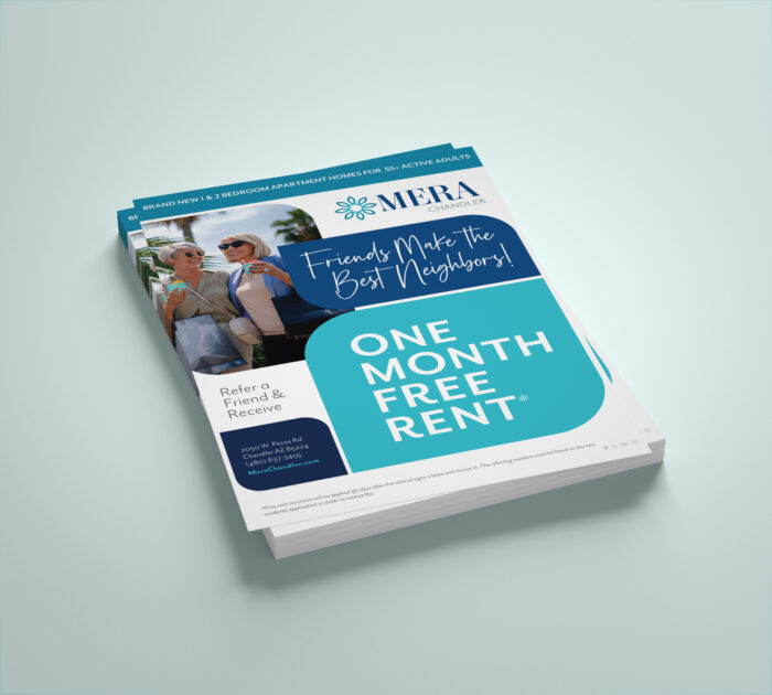
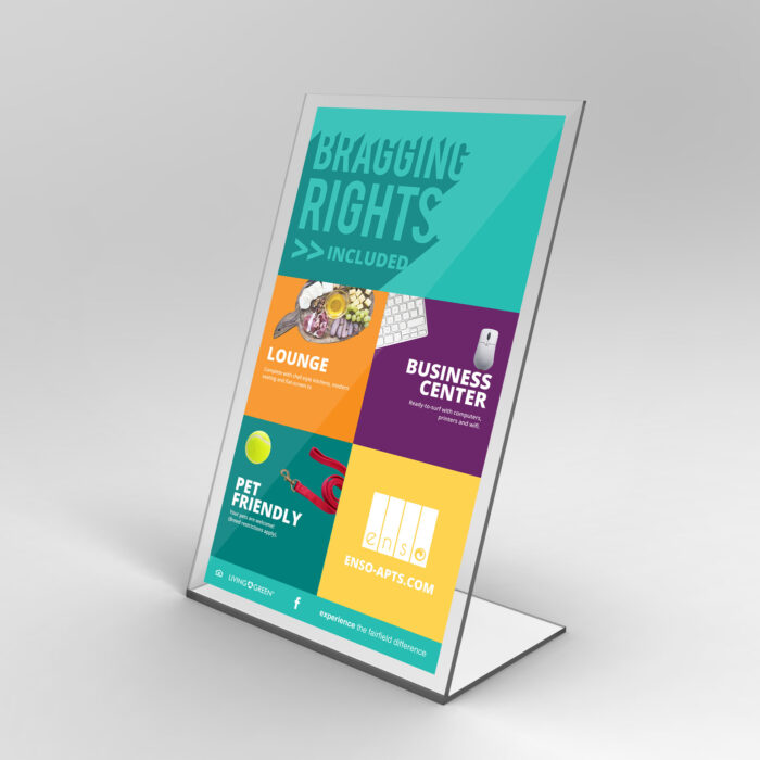
Depending on your answers to the questions above, you may have a couple of different options with your logo and usage. When you’re looking to bring your corporate brand to the community level, you’ll need to determine whether you should:


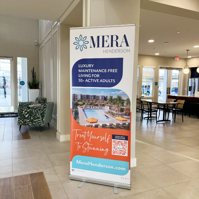
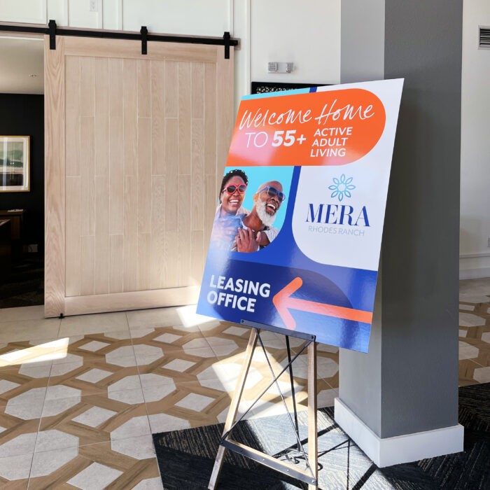
Stamp the corporate logo on all marketing materials, use your color palette, and create a standardized logo design for all your communities so they’re recognizable as “one of those Easy Street Communities” 


OR!

Simply place the corporate logo in the footer of all marketing materials, and let the communities stand completely on their own with unique branding.

It’s a choose-your-own-adventure type thing, but make a decision and stick with it.

If you want to be known for your beautifully branded communities, relocating residents can look for one of your communities—“you know, the ones with easy online leasing renewals.” Once you get to be known for something (if it’s positive) you want to keep that good thing going. 


DON’T FORGET

Branding and marketing corporate also means you need to create and brand the culture you offer to your employees (and prospective employees). You want to attract the right talent for corporate roles and roles on-site.

When Branding Your Corporate Side Won’t Work

Branding the corporate multifamily real estate company isn’t for everyone. For example, if your portfolio niche is C minus communities with less than desirable reputations, you may not have the bandwidth and budget for corporate branding (Think ROI.)

If you’re the owner/operator of a long-term hold and you’re managing your own assets, you might not feel the need to brand because you don’t have big growth goals. That’s fine, too. (Although, a beautiful brand will still be appreciated.)

Keep in mind: If you’re trying to acquire and purchase or grow and develop, you’ll want to dial in your company’s true brand, and then market the heck out of it for possible investors. When all of your communities are on the same page, it looks like it’s a tightly run ship—which is always a good sign to investors.

Depending on your needs, we can find a branding and marketing solution that pushes you toward completing your goals.

Outsourced Branding and Specialty Design for Multifamily Marketing

Is it better to get the job done or not do it at all? Consider outsourced branding, for instance. Even if you don’t typically turn to an outside agency for help, you may eventually find that your marketing team is slammed. That’s when outsourcing the work could be just the thing you need.

Why Should I Be Outsourcing Branding For Multifamily?

BENEFITS

If you’ve never outsourced branding before, it might sound a little scary. According to Hubspot, “the best time to outsource [marketing] is when internal talent is stretched thin and in-house teams are struggling to get campaigns over the line.” There are quite a few benefits to outsourcing some of your (or most or all—we’re here to help, not judge) marketing for multifamily to an outside agency.


The best reason why you should be outsourcing branding for multifamily is, at its most basic, a good business decision. It can help you:

  1. Expand coverage: If your team is slammed and there’s no one to take on extra work (see also: emails from the boss that begin with “We need to get new signage up on-site for takeover and we close on Friday!””) This means that you can say “yes” because you’ve got someone to turn to for those last-minute projects…or you can offload something else to an agency so you can tackle the things that are due sooner. Having a backup team gives you not only the capability to prioritize, but also the ability to keep saying “yes” to whatever pops up in your inbox. Here’s to a bigger bandwidth.

  2. Extend capabilities: You’ve got talent on your team, but they may not be able to complete the job in the way that it needs to be. Some skills like branding design and copywriting take time and experience to get right, and you don’t have the luxury of either. In that case, outsourcing can extend your capabilities and give you the ability to create even more beautiful things.

  3. Bolster your brand: Making things pretty is what we do at zipcode creative. We know that it takes a lot of focus and time to really make your brand shine. And when we work as an extension of your marketing team, we make sure that everything looks fantastic.

Stretch your budget: Hiring full-time creatives for your staff can’t always work out. Calculate the cost of a full-time graphic designer, copywriter, social media manager, ad specialist, plus their benefits and you’ll see some red on your bottom line. Hiring for those roles isn’t necessarily realistic for every company. We’ll step in and be an extension for whatever you need.

Best Things to Outsource


IN-HOUSE TEAM

What are your current in-house team’s capabilities? Where could they really use help? What are they constantly pushing deadlines out on? Start with the squeaky wheels—the areas where you need more time, more help, or more expertise, and outsource branding to an agency.


WHAT WE CAN HELP WITH

Sometimes, you need a list to run down and see what needs to be covered. Here’s what zipcode creative can cover when it comes to outsourced branding in the form of a checklist to help you maximize efficiency in your marketing department.


Why Outsourcing Branding Could Work

It’s tempting to avoid outsourcing your marketing for multifamily. Keeping it in-house seems cleaner, less risky, possibly cheaper. But there’s a ton you could be missing out on, if you outsource with trusted partners:

KEEP YOUR FOCUS

Now you can focus on the essential responsibilities within your role instead of being spread too thin and worrying about getting it all done on time and done well. If you have a marketing team that’s running strategies to increase occupancy, resident events, social media, managing public relations, and crafting the next campaign, they probably don’t have time to create a mailer for your lease-up special. Don’t make them do that, too. Let them keep their focus on the big picture, and outsource the graphic design of a few marketing collateral pieces.


PLAY TO STRENGTHS


Graphic design, for example, isn’t everyone’s specialty. Maybe digital ads are, though. Find what you’re good at, and absolutely nail it. For brand messaging: voice, and persona, and for graphic design: logos, palettes, fonts, and related marketing pieces (and more), let someone help you. Wherever you’re going to spend more time learning how to do it, and then doing a C+ job, hire someone else. (And stay away from Canva.) We’ve got our specialty—we make things look pretty!—and you’ve got yours. Nothing wrong with learning, but sometimes it’s faster and easier to stay in your (multifamily) lane. Bottom line here: The best work being accomplished toward your marketing efforts and goals happens when you play to your teams (and your) strengths, and you allow your contracted partners to do what they do best, as well.

BRAND CONSISTENCY

If you have a brand style guide, awesome. If everyone on your team follows it, even better. Those colors, fonts, logo options and graphic design rules are there to keep things consistent. But we’ve got even better news for you: When you partner with an outside agency, we’ll be even more strict about brand consistency, because we have no reason to do otherwise. After all, consistency and cohesiveness is our number one goal as an agency, aside from creating attention grabbing messaging and visuals, of course!


FRESH PERSPECTIVE

Maybe your marketing team can’t get it all done, and you’ve had to reach out to a partner agency to help you make it all happen. That’s totally okay, as long as your partner is good! You’ve been looking at the same palette, logos, amenities, layouts, for a little too long. But outsourcing also gives your team the opportunity to see something new—a creative vision or opinion or idea. Now, a new set of eyes can see something you might have missed all along. 

That’s completely worth it.

Brand Promise – The “Vows” of Your Apartment Community

What is a Brand Promise?

Everytime your brand shows up visually or verbally, there is a specific association with what your apartment brand offers as an experience to its clientele or residents. That’s the brand promise. Each time your brand messaging and visual representation show up, like an ad or a mailer, you’ve set up your brand to deliver an experience you have vowed (or promised!) to give residents…which they now know to expect.  It’s not always spoken or written—but it is a form of mission and values and the feeling that your residents get when they think of you. It will certainly come out in different ways through your verbal identity.

In short, it’s a public benchmark. It helps recall why you’re doing what you’re doing in the first place, sprinkled with what you value most.

I TAKE THEE, COMMUNITY

Brand promises can get tricky, though. Like a marriage vow, you might not want to go fully traditional—because that’s not unique or interesting, per se. However, if you write your own vows, things can go a little off the rails. 

Here’s some guidance for your brand promise that will have prospective residents flocking to your apartment community.

In Your Brand Promise, DON’T:


OVERPROMISE

When you overpromise and then subsequently underdeliver, that becomes an epic disappointment. It’s also a total misalignment of expectation versus reality. If you’re overpromising something, like “We’ll always make it right, no matter what” and then your service director or management staff aren’t trained with how to fix the problems at hand, you can count on a broken brand promise. Only promise what you can actually achieve—it’s not the time to be aspirational or overly inspiring. Be real. Be good. But don’t overpromise.


BE SELFISH

Wedding vows aren’t about the person speaking. Likewise, brand promises are not strictly about the brand itself. It’s what you offer. It’s what you’re promising as a service. Instead of being selfish, tell your residents what you can do for them. (A certain JFK quote comes to mind here.) Look outward instead of in, and you’ll have painted a better brand promise.


GO OVERBOARD WITH THE WORDS

Hey, here’s an idea! Make your brand promise easy to understand, read, and have it grab attention. Kind of like your other multifamily copywriting (if you followed our advice in this blog.) Don’t be flowery. Don’t be fluffy about it. Say what you mean and be clear. 


DO WHAT’S BEEN DONE

More word advice here. When you use phrases that have been seen before, they don’t offer the same weight or meaning. Your residents and prospects will skim right over it. So when you say “unique solutions” or “outstanding customer service” they hear “blah blah blah.” That’s a bad promise.


Instead, it’s best to keep the focus where it should be: On the resident

Watermark

In Your Brand Promise, DO:

HIGHLIGHT THE RESIDENT’S NEEDS

When you put the resident’s needs first, they feel drawn in. By subtly calling out your experience and differentiators, they don’t feel sold to, they feel their problem being one step closer to a solution. 

WRITE “THE STORY” TO FEATURE THEM

The resident is the main character. They’re the hero of your story. And your apartment community is just the tool to help them get what they want. Once you pull your brand out of the top billed credits, you’ll have a better shot at creating a brand promise that’s focused on the most important piece of the puzzle: The Resident.


BRING THE BEST WORDS

Break out the thesaurus and find a new way that truly underscores what you’re promising—the feeling that residents can expect whenever they interact with your brand. Using the right words helps shape perception and gives you a direction to go.

How does one do this?
Try this on:

Example: Our caring staff and beautiful grounds will help you feel at ease in your new home, so you can fully relax—your biggest worry will be what to wear to the community mixer each month.


Just like a mission explains what you do, which is mostly for internal use, a brand promise is outward-facing, to tell your residents what you’ll do for them every day of your existence. Don’t break the promise!

Your content goes here. Edit or remove this text inline or in the module Content settings. You can also style every aspect of this content in the module Design settings and even apply custom CSS to this text in the module Advanced settings.

Creating an Apartment Brand: The Secret Sauce

Look under the hood, pull back the curtain, call it what you want…we all want to know what’s behind the scenes of creating an apartment brand. Creating something that’s beautiful, memorable, and effective.

Let’s go step by step.

Brand Questionnaire

We’re asking the questions here. And the answers you provide in the zipcode creative brand questionnaire will help us catch the vision for your community’s brand or rebrand. Boxes for you to fill in with logo inspiration, color likes/dislikes, location of your community, and resident demographics give us the insight needed to work with you in achieving something spectacular.

Next up:

Client Creative Call

During a call with zipcode, you can expect to discuss your vision along with your “dos and don’ts” in regard to your ownership’s preferences—this last one is particularly important when rebranding your community. Sometimes a few things are rolled over for a brand identity, and it’s always better for us to know those specific requests up front.

In our conversation, we’ll get to know you a little more, and we’ll open it up to any questions you have about the process or about our thoughts. We’ll verbally summarize what we’ve heard, and what we’re going to do next. (We’ll be hitting the books.)

Research and Discovery

In the research and discovery phase, we get into the thick of it, and make sure you know who you want to reach, and which options would work best for your brand.

WHAT WE RESEARCH

Identify your ideal resident profile, and plan to market the heck out of it. Using geographic, demographic, psychographic, and behavioral patterns helps paint the picture of who we’re talking to. In addition to “audience” we also look closely at the community offerings in your area—we’re talking hotspots, attractions, and history. This all plays into the larger brand idea, too.

And let’s not forget competitors—knowing what you’re up against gives you the ability to meet what they offer, and then go a little further and set yourself apart in one way or another.

DIGGING DEEPER

When we dive into discovery, and start seeing the options, it helps narrow things down. Sometimes you have to chip away at something until the final idea is revealed. And then, the fine-tuning can begin.

Architecture – We love any architectural theme and style that can give us a hint of what’s to come. Branding that’s inspired by the physical building brings it all together, as though it was always meant to be.

Moodboards – If we can use the renderings and moodboards from the interior designer, fantastic. Beyond that, we’ll also create our own mood board to curate the look, feel, and, well, mood to fully capture your brand visually.

Parallel and Adjacent Industries – Looking at what others are doing is helpful. Do they have the same kind of ideal resident? How did they capture that resident with how their brand looks and feels? We also love to explore adjacent industries, like the hospitality industry—hotels make beautiful brands. The multifamily industry could learn a lot from exploring the depths hotels go to in creating an immersive brand experience.

Concept Time

Strike while the iron is hot, make hay while the sun shines, and design while creativity is flowing.

We always go to the drawing board when we’re in the flow, so we can work out concepts. Throw it all on the canvas and see what sticks. Sometimes you have to get through some less-than-good ideas to circle around and land on something great.

Brand Concept Presentation

WE MAKE THINGS PRETTY

We love this part. We take all of the pretty stuff we’ve made (in a beautiful slide deck) and present it. We include logo concepts, color palette concepts, and preliminary design elements, along with a hint of lifestyle stock curation.

VIBES FOR DIRECTION

After we show the pieces, we sit back and allow the vibes and visuals to speak for themselves. Nothing new-agey here, we just think it’s great for our clients to be able to marinate in the concepts and then converse with their own team after our meeting. That way, when they come back with feedback, they have a clear picture on the direction that feels right for their brand. It’s always fun to hear what clients have landed on!

Final Brand Style Development

Last step: When clients come back and tell us the way they want to go, we put the car in drive. We take the agreed-upon direction, and we expand on it to source the full library of corresponding lifestyle stock imagery, bringing the patterns, shapes, textures, stamps, graphics, and logo variations to life. We take it all, package it up, and create a full brand style guideline. Check these brand style guidelines we’ve recently created.

New Construction Lease-Up Branding and Marketing—By Development Phase

Four phases of development directly inform how we handle our new construction lease-up branding and marketing. 

The logic behind this? It’s optimal to align your apartment community’s branding and marketing with construction—because that’s what drives timelines. For example, you can’t create stationery before you have the final address or phone numbers for your community. Think about it: you’ve created a brochure, but you don’t have images or even a leasing office to distribute them from! Go in the right order.

Let’s break it down into each phase, so that you can see how we’re able to keep our clients on track, and drive them to the finish line. 

If we can stay ahead of construction on the branding and marketing side, we can begin pre-leasing and be that much closer to occupancy goals right at first units delivered.

Phase 1 – Early Construction

12-18 months before the first phase of completion, or at groundbreaking.


NAMING YOUR APARTMENT COMMUNITY

The perfect name for your community should embody your values, style, and audience. Make sure you’ve got a good one picked out before you begin with Phase 1. You’ll want to get legal documents in order with the city and county as you set up your web domain and social handles, too. (Beyond that, how can we create a brand identity without a name to pull from?)

FOUNDATIONAL BRANDING DESIGN

The voice, the visuals, we need to get it all dialed in. What do you look like and sound like? Once that’s nailed down (along with your brand’s taglines, headline library, logo design, color palette, typography and lifestyle stock imagery) we can get moving on your floor plans, your renderings, and a landing page that feels consistent with your brand. A consistent brand that extends to your landing page gives you a legitimacy that’s vital in the first phase of your lease-up. Also! Pair your identity with your interior: Architectural plans and mood boards motivate and inspire us. Aligning with where you’re headed helps us work together even better, narrowing our focus so we can go with exactly what you’re envisioning.

Phase 2 – Coming Soon

6-12 months before first phase of completion

YOU’RE HERE—OR YOU COULD BE

This is the moment to make marketing start-up items. Think signage design, rack cards, and maps. We love to help create a property sitemap (we make it pretty—we’re well-known for our beautiful sitemaps!) or a point of interest map that shows nearby freeways, shopping, eateries and the like. 


SIGN UPS

Launching an interest list website is also helpful in order to start developing SEO for your location. During this time, we typically encourage our clients to put “Coming Soon” on their marketing pieces and direct prospects to a landing page with a contact form as the primary CTA.

Phase 3 – Pre-Leasing

3-6 months before first phase of completion

PEOPLE, GET READY

This is when the magic happens—units get reserved, leases get signed. We can help you transition your branded marketing message from “coming soon” to “pre-leasing” as you start up your unit reservations. When you have big goals, you need better branding. During this phase, we like to create business cards for your property manager, leasing agents, and your maintenance supervisor. You’ll also want to have handy a thank you card (with a pre-written message) and a move-in gift note card. When you’re this close to opening, you don’t want to be waiting on printed pieces at the moment your residents step foot in their new home. Plenty of other pieces help bring the “welcome” for any pre-lease signers.

Most of all—get your full website ready. Websites are a huge representation of your brand; get it launched in time for the next (and final)…

Phase 4 – Now Open

At time of first phase of completion

IT IS TIME

Finally, your first move-ins are permitted! And you get to unfurl the “Now Open” banners and signage—we got you covered on that front. We’ll make sure you’ve got building banners, yard signs, boulevard banners, and enough directional signage to make even the most directionally-challenged resident find their way with no problem.

When you hold your soft opening, have marketing collateral handy. When you have your grand opening, have swag and giveaways handy. When (or if you can) do unit delivery by phase after your clubhouse and community amenities are complete, you’ll still want to have everything ready. You won’t miss a thing, if you’re using our checklist.

A checklist?

A Lease-Up Marketing Checklist for Every Phase

Oh, yes. We provide our full branding package clients with a comprehensive project brief—a live google doc that shows the scope and timelines for a new construction, lease-up community. This added benefit includes a lease-up marketing checklist that covers everything you could want to do to set your community up for success. After being in the multifamily industry (on the property management side) for many years, we know what’s most vital and what’s optional when it comes to creating a successful lease-up strategy for your community’s brand.

Behavioral Marketing for Apartment Brands

Behavioral marketing for apartment brands deserves its very own blog post. Buyer behavior (or in our case, resident behavior) is the best indicator of purchasing power and timing. It’s the thing that you can target and use to segment your audience and reach them more easily and efficiently based on where they are in the funnel.

Get ready for step one.

Identify your Ideal Resident Profile

TAKE A LOOK

Who are the perfect resident types to live in your community based on the amenities, floor plans and location you offer?  Take into account the companies they work for, their hobbies, their favorite brands, their interests, and their intentions. This goes above and beyond their gender, their marital status, age, and other typical demographic factors. Instead, it dives into their passions and desires!


HOW TO RESEARCH PROFILE DETAILS

It’s not the who—it’s the how. That sums up everything about resident behavior. You can predict what they may do based on other factors, such as shopping and spending habits. Hubspot picks out a few ways you can create an analysis of your customers to see what they might do next:

1. Segment your audience

2. Identify key benefits

3. Source resident trends

4. Compare data

The items that fall under behavioral marketing for segmentation include:

  • Benefits sought
  • Purchasing habits
  • Brand loyalty
  • Occasion or timing
  • Buyer readiness
  • Engagement level

The goods that count as psychographic segmentation are:

  • Belief systems
  • Values
  • Goals
  • Attitudes

See more on that with our blog on research and discovery for apartment brands.

Ready for step 2?

Target Your Ideal Resident

Take those behavior demographic categories and create a campaign that works around it. If they’re looking for an apartment for the future, start small. If they’re searching for an apartment community that offers fitness classes, ensure that segment is getting the message that you offer exactly what they’re looking for.

Again, you can base your apartment branding and marketing on those demographics, especially if you have identified your IRP (ideal resident profile). That sets up the structure to guide the rest of your marketing choices. 

Did that gym class example get your attention? Next up:

USE WHAT YOU KNOW

Some people love yoga. (And other people haven’t tried yoga and they don’t love it—yet.) Those yoga lovers are probably members of a local yoga studio. Perhaps they’ve purchased clothes from LuluLemon. Consider offering a yoga membership with a one-year signed lease. Advertise your onsite, all-inclusive yoga studio. Attract the demographic you want by tailoring your marketing (messaging and campaigns) to that particular resident behavioral segment.

Behavioral Marketing for Apartment Brands Helps Tell Better Stories

You are marketing to a lifestyle, and you’re selling a feeling. When you can look at the audience (your ideal resident) then you can tell a better story. If you don’t know who you’re talking to, or look at your results, it’s a little like telling a joke on zoom to black screens on mute—you’re not sure if they weren’t listening, didn’t get it, or just didn’t think it was funny. When you can see and identify who you’re trying to target, you have a much clearer picture of their problems, and therefore how you can solve it with something they need or want! Don’t make it complicated—just do the research and solve the problems.

In addition to this, when your visuals align with their favorite brands, it can fit right in with the flow of their regular life. It feels like it aligns with the brand of their life. Using behavioral demographics helps us be both better storytellers and branders for apartments. Because the #1 thing we focus on with our stories is lifestyle—what they want, and what they need, and how we can offer it to them!

Multifamily Copywriting That’s Easy to Read and Grabs Attention

Reaching your ideal resident through the written word isn’t a huge secret; it’s just knowing how to write easy to read multifamily copywriting. There are five tips that will help you get there, fast.

Speaking of fast…

1. Write for Short Attention Spans

This means short sentences. Imagine you don’t have a lot of time. Maybe 5 minutes. But you have something you want to look up, and the solution is right there, ready for you. And it’s nice and short. Great! That’s all the resident wants. 

Another good thing to remember? If you want to grab their attention, get it quickly. And then tell them the rest, quickly. (Take food blogs—they’ve become a joke for the amount of content and backstory given before they get to the actual recipe.)

Imagine you’re trying to tell a 10-year-old about your community. You don’t have to talk at them or over them. Just write easy to read marketing copy: explain it in an understandable, interesting way.

Since humans now have an average attention span shorter than a goldfish (8.25 seconds vs. 9 seconds) it’s best to get to the point—now.

2. Write Scannable Text

Not long-form prose or the next New Yorker article. Write so that it can be read quickly.

  • Bold, italicize, or underline different sections.
  • Use bullets or number your items.
  • Use the enter/return button often
  • Write brief, bold statements. (A balance of long and short sentences is okay, but lean toward shorter ones.)
  • Be absolutely clear: Don’t leave anything to the imagination. 

People spend, on average, over 3 hours on their phones every day. It’s a small screen. That’s where you’ll be reaching them, more than likely. And you only have their attention for a moment, so you need to make it worth it—whether you’re writing copy for a brochure or sending an email campaign for your newest leasing special.

Another tool? Use graphics to break your text up into digestible chunks.

3. Use Simple, Familiar Words

This is not the moment to show off your word skills. Write so your reader can understand. If you’re using a word they have to look up, that’s ineffective. And it takes their time and attention away from the main event (your message). Always write easy-to-read marketing copy, not essays or novels.

It’s okay to stretch your reader in other ways, but when it comes to work, simpler is better. Or, if you have to use a more complicated word, be sure to add plenty of context to clue them in. Reading about your community shouldn’t be a chore. It should feel like they’re getting to know you, word by word—instead of  struggling to get through the content

4. Cut the Fluff

Too much content? Sharpen your sentences to say exactly what you mean. There’s a big difference between trying to say something and just saying it. Once you write your content, get your red pen out—there will be plenty to cut, while still portraying the gist.

Not sure what to cut? Read it outloud and you’ll hear where it’s too long or too wordy. There are typically four kinds of words that go into a sentence. There are three that don’t help. Take them out.

Instead of using adjectives and adverbs, use better verbs. 

Carefully designed apartments→Crafted apartments

Instead of using words that have been around the block tell the story better.

Don’t say “unique”— give your audience the evidence of your community’s uniqueness.

Instead of using connectors, get to the point.

Therefore, those words should disappear.

5. Simplify Long Sentences

What does that mean? Understand who you’re talking to, and who’s reading your content. Another bonus of simplifying long sentences is that your content gets tighter and has more punch. 

Example
Attempt: “We would really love for you to come take a tour of our community.”
Better: “Come tour our community!”

The second sentence works better because it’s shorter and gets to the point faster without losing any meaning. Everyone can use an editor. A great editor will get your words down to the absolute essence.

Another fun trick:

You can cut the word “that” a lot of the time that you use it. Er—most of the times you use it. See?


When you have a piece that needs plenty of copy, you should write easy to read marketing content for your community. Otherwise, your verbal identity is wasted and your visual identity and entire brand can get ignored. If you’re on the lookout for punchy headlines and tight messaging for your multifamily copywriting, reach out. We can help.

Creative Problem Solving in Multifamily Marketing

When it comes to creative problem solving in multifamily, creativity is key. Sometimes, it’s a struggle as a creative to come up with solutions to things that get in the way of a beautiful and effective design. But there are a few scenarios that appear regularly, and we’ve figured out the best workarounds for each.

A Logo Design With “The”

Using “The ________” in your apartment brand name seems like a good idea—making a statement about how you are THE place. It’s a traditional power stance verbally. Yet visually, it’s tough. Even though it’s really short and quite small, it’s a challenge to design it interestingly without overpowering the main event (which would be “Watson” in The Watson, for example).

Example: The Watson

A special workaround we sometimes recommend—if you’re in the planning stages, you can drop the “the” (say that five times fast) for something fresh and modern. That eliminates the ugly stepchild syndrome that can happen to little articles (a, an, the) in a big design.

watson-stationary-2

Creative Problem Solving A Long Brand Name

A rose by any other name would smell as sweet—we promise. Sometimes we’re so caught up with a name that we don’t consider where it has to go and how it has to work. When a name is longer, it tends to be locked into being used only as a horizontal logo, because that’s the only way it will work. Think of all the digital platforms that are square—which is most of them, honestly. Placing your logo horizontally in a square or circular space (or heaven forbid in a vertical use) as your profile pic makes everything smaller. 

So, should you keep the long name? Think through the pros and cons. Is it perfect? Is it easy to say? Consider how it would land with your ideal residents. Would shortening it keep it snappy and memorable, like these famous brand names?

  • Nike
  • Pepsi
  • Lyft
  • Google

A Lengthy Tagline in the Logo

Creative problem solving in multifamily extends beyond the logo, too—to the tagline. We like to keep them separate for a reason. Please, please don’t make us put the tagline in the logo. Taglines are vital, so absolutely keep them front and center in your designs. In your flyers, on your website, plastered on your window graphics—but not in the logo.  The only exception we can think of? If we need to say “Apartments” under the name.

Beyond this, designing the tagline to go with the logo everywhere is a challenge. The balance and readability is a problem (because the tagline is longer than the logo and can become tiny and hard to read). If you can’t let the logo and tagline go their separate ways—consider having two versions: a logo with the tagline and a logo without the tagline.

Brands to Stand Out (Without Making Waves)

If edgy, cutting-edge, sharp, and rugged are how you identify your brand’s personality, but your target audience or ownership group are more traditionally minded, you may find yourself in a pickle. It’s important to create a stand-out brand identity, but you also have to design with your audience in mind. What will appeal to them? Sometimes, it’s best to focus on infusing your differentiators and voice with that personality rather than the visual elements. Being creative means you can avoid being boring, and still get in front of the resident you want to attract the most (while keeping your investors and management happy). 

Keeping the Brand Style On Track

Many brands we work with already have a brand style and a guide. But, they may make a design request that comes straight out of left field and doesn’t align with the brand guidelines. As professional designers, we have a duty (an unspoken oath if you want to get weird about it) that we will stay true to known brand guidelines so the brand has consistency and cohesiveness across all platforms—this should sound familiar. It’s what we’re always preaching. Why? Because without it a brand doesn’t have brand recognition. When we get a wild request, we gently push back and remind the client of the brand guidelines. Just because you’ve got a brand guide doesn’t mean your designs have to be boring—we can work within constraints and still bring all the creativity we’ve got. We typically end up compromising, or creating an addendum to the brand standards so the new approach can be captured. Just be sure that the new addition is going to be used more often, so you can keep the train rolling towards brand recognition.

When There Are Too Many Words and You’ve Asked Us To Create Something That It Just Won’t Fit Into It No Matter How Small We Make The Font

Weird heading, right? Here’s a hint: It’s too much copy. If you’re not a designer, using too much copy or content in a marketing piece doesn’t seem like a big deal. That is, until it gets to us and we’re trying to lay it out in a limited space, like the constraints of a mailer or brochure. If we put all the words in, it will look cluttered, the text will be too small (visual proportions that are suddenly unsettling) and it will risk the audience either skimming it or skipping right past it. 

Less is absolutely more—take our professional design and copywriting opinion. We’ll definitely ask before we cut content down, and if you think it all needs to stay, we’ll do our best to work with it. Our humble request: audit and edit your content for clarity and conciseness (un-fluff it) before you send it over.

Ugly Photos on Beautiful Marketing Pieces

It’s a match made in…the bad place. If your branding is the absolute best, with the most creative graphic designer in the world working on it, and then you have crappy photos, you can throw that flyer straight in the trash. No one will take it seriously. You’ve lost street cred and the perception of the whole piece goes down thanks to those fuzzy, poorly lit, oddly composed photographs. Forget the lipstick on a pig attempts, and invest in an actual professional photographer or get quality renderings of the space. (Please.)

We all have opinions on what requires the most creative problem solving in multifamily. Our promise to you is that we’ll always find unique ways to solve (at best) or workaround (at worst) the biggest design problems plaguing your apartment brand.

Compare Creative Agencies for Apartments in 6 Ways

It can be tough to know exactly how to compare creative agencies. There are a lot of options out there, and you just want a reliable, easy-to-communicate-with designer. And you want it cheap. Oops, there go the red flags! Does this sound familiar?: “Good design is not cheap. Cheap design is no good.” Generally that’s true. You absolutely get what you pay for, even in branding and graphic design. 

However, here’s the good news about good design: it doesn’t have to be crazy expensive. If you get three bids, you probably end up picking the middle option, because it’s not likely to be bad, and it’s less likely to break the budget. (The ol’ goldilocks effect.) Yes, budget’s important. But so is branding. Branding is what brings prospects in the door, leading to leases (and $$$ back in your pocket).

So, if you’re focused on what it will cost you, it makes more sense to compare creative agencies on more than the price. 

We can think of 6 ways you can make a better decision on your next design partner. If you take nothing else from this: The who, what, and how behind the bid is vastly more important than the money. Focus on what actually impacts good design, not just the owner’s expressed “budget”.

Here’s those 6 ways to compare creative agencies:

1 Experience

  • What have they done before? 
  • What’s their niche? 
  • How long have they been in the biz? (Always best to strike a balance between expertise and innovation—consider their fresh ideas and their know-how!)
  • Have you seen their work?

2 Knowledge

  • Are they experts in their field? 
  • Do they provide insight because they’re leaders in the space? 
  • Is their blog or news page helpful? 
  • In conversation, do they seem like they understand multifamily marketing priorities?

3 Style

  • What’s the culture of the agency like? (Happy employees make better work.)
  • Is their agency’s branding cohesive? Do they practice what they preach?
  • Do they have the eye for design, and does it show up in their body of work?

4 Quality

  • What are others saying about them? (testimonials, reviews, referrals) 
  • What are their turnaround times like? (too long, can’t wait – too short, sloppy)
  • Is anything fuzzy or stretched or out of proportion? (If yes, RUN.)

5 Personality

  • Would you want to go out for dinner or drinks together?
  • Do you find them helpful and encouraging?
  • Could you imagine working with them regularly?
  • Are you a match, personality-wise?

6 Communication

  • Do they respond in a timely manner, and ask thorough questions? 
  • Are they collaborating with you easily? 
  • What does their back-and-forth process look like?
  • Can you stay on the same page when it comes to design?

What Makes Zipcode Creative Different?


In order to properly compare creative agencies, you have to know a little more about us.

We approach multifamily branding with an eye toward everything distinctive about the property: the community’s amenities and offerings, the location, the target prospect demographics, as well as the architectural and interior design style.

Every factor influences the way we design the logo, pick the fonts, choose the colors, draw in brand design elements and select lifestyle stock imagery. The brands we create fit the neighborhood vibe so you can draw the attention of prospective residents.

multifamily focusedflat project ratesexceptional lead times

WHY WORK WITH US

Beyond that process, we have a few other tricks up our sleeve:

We’re a boutique creative agency.

Small but mighty, we love to give our clients our full attention and extra care. And we have more skin in the game!

We’re multifamily focused.

There’s inspiration everywhere we look, and we tie that into our work in multifamily branding to push the envelope with every project. We consider location, resident demographics, and differentiators as we design and position your apartment community/company.

We’re female-owned and operated.

Women in business = detail-oriented, creative results, every time. We’re proud to be a bunch of multitasking queens.

WE KEEP THINGS SIMPLE


We give clear turnaround times.

During a takeover, you don’t have a lot of time to waste. No problem. We work efficiently, divide and conquer to our strengths and get it done.

We offer a la carte services.

Packages are fun (we have those, too!)—but they’re not for everyone. Sometimes you just need one thing. Which we can do. Just here to help!

We offer project rates.

No tracking hours. No surprise costs or fees. Just easy investment in good branding, sharp copywriting, and beautiful graphic design. Simple invoices are a win-win!

We communicate really well.

We know it’s key, so we make it a priority. We stay in touch and respond quickly so it always feels like we’re just a remote extension of your marketing team.

How Our Creative Agency Works

At zipcode creative, our approach to branding is based on the view that every single community and company is different. We spend a lot of time in research and discovery when we position and design an apartment brand or a property management company.

Our process requires that we get the full view of who you are, who you want to attract, and what you have to offer through:

  • understanding the community in full:
    • Architecture
    • Interiors
    • Amenities
    • Location
    • competitors in the market
    • target resident

    • OR understanding the company in full:

    By fully diving in, we’re able to get the information that will inform a brand that will be 1) set apart from the competition, and 2) will provide its residents with a sense of community. 

    The branding and design aspects stem from the knowledge of every nook and cranny of your property and the people you want to live there.

    Get in touch. We’re ready to work alongside you.

    Creating a Sense of Community with Design in Multifamily

    Gather around the fire, and we’ll tell you a tale of how creating a sense of community can be done through branding design at your apartment communities.


    THE ROLE AND IMPACT OF DESIGN

    A community should be just that. A place where people feel like they’re home. But where does it start? The first interaction. And it probably won’t be in-person. Perhaps they’ll see a digital ad. A window sign. A flyer. A mailer. Whatever they see, it will be designed. And it will either beckon them in to learn more, make them ambivalent, or will give them cause to never think of it again. That’s the role of design for your multifamily community.


    Let’s take a mailer that your prospects receive. Maybe they like the design, it speaks to them. And if they do decide to learn more, they’ll find “more where that came from” and it will be aligned, organized, and will tell one visual story (ideally). Guess what else? Predictability typically means comfort, and where someone is comfortable, that has the ability to become home. AKA a lease that gets signed.


    THE ROLE OF BRANDING

    The resident experience is the ultimate in feedback. Just like design has its place, it also has a vital impact. After you’ve attracted prospects, and they’ve signed a lease, you want to keep them—because it’s way more cost-effective to keep the residents you already have (no empty units)! Resident retention is a pretty good indicator of how well you’re leveraging branding in your community. How can you leverage it? What makes the most sense? When you create a sense of community with design, first up is cohesive and consistent good apartment branding, which builds trust. Trust equates to satisfaction and open communication. And even better, you get to tell the story of your brand—so you can define the problems it solves, the solutions it provides, the way it’s different from your competitors.

    Pairing Identity with Interior

    LEAD INTO COMMUNITY

    Just like excellent packaging hints at what’s inside with typography, spacing, shapes, and color, multifamily communities should lean into integrating the brand’s visual identity with the actual physical space. It’s the ultimate inspiration to take interior design and draw it through to your visual identity. Making this cohesive, from the real/physical, to the portrayed/branded ends up reinforcing the space and relaying the full intention: everything was designed for the resident. Typically, taking the common amenities and the clubhouse design is the best place to draw inspiration, because it’s the most heavily designed. (Units will be left a little more customizable, to the residents’ tastes.) Creating a sense of community through branding design that integrates with the space itself is something you can absolutely do!


    CREATE A CULTURE

    Tell the story of your brand using color. Optimistic brand? Use green. Passionate brand? Use red. Sophisticated brand. Go for black. If your multifamily community is near a sports team or university, match or blend with their color scheme for an even bigger-feeling community. (Roll tide!) Additionally, use design elements that you see in the common spaces and clubhouses. Find lifestyle stock photography that aids in telling that story to give a better sense of community. Just like you use messaging to tell about the way you’re different from your competitors, you can use visual identity to create a culture around your brand—one that prospects will want to be part of, and will be attracted to.


    GO FURTHER WITH AMENITY NAMES AND BRANDED WALLS

    Getting creative with naming your amenities is a fun way to draw in your prospects as well. Forget “rooftop patio”—try “The Echelon” instead! Use the names to fully extend your brand to every corner of your multifamily community, so everything feels intentional, fun, and fully meshed. Additionally, creating a branded wall or window art, making your brand larger-than-life can help excite your community’s prospects, applicants, and residents.

    Mera-BannerstandMera-Sign

    (Un)Common Spaces

    Imagine a theme park without the overpriced snacks and massive lines (with its super fun different “worlds” all over the park). Your community can have just as fun of a vibe. In the theme park, everything within each world is named and designed to fit within a specific mold, for fun and for a type of consumer immersion. You, multifamily marketer, can do the same!


    EXTRA SPECIAL AMENITIES

    They’re not special just because you say they are, though that’s one part of it. They’re special because of the thoughtful branding you’ve put in place. The common spaces in your community don’t have to be old hat, boring, run-of-the-mill things. You can boost them to an extra special level by branding the heck out of everything you have. Special names. Special design. Tie it in with the broader picture, and the resident gets the sense that these are no ordinary amenities—they’re extra special, because time was taken with the branding, and each piece was well-thought-out and intentional. Residents are way more likely to value what you tell them to (subconsciously through branding). When you are intentional in creating a sense of community with design, people will be attracted to that.


    USE BEHAVIOR TO MARKET

    When you know your ideal resident profile (IRP) and what they’re most likely to be doing during the day, night, weekend. What their desires and fears are and what their problems and goals are, you have a clear indicator of probable behavior. Use your IRP’s behavior demographics to pinpoint exactly which amenities you should draw attention to (and spend time on branding heavily). Ensure you’re reaching them with authenticity and storytelling to simply show them the amenities that will

    1) Help them reach their goals 

    2) Aid in solving a problem

    3) Fit into their routine


    When you can fit into your IRP’s life a little more seamlessly, signing a lease seems like the easy and right choice. And that’s the power of creating a sense of community with design!

    Fair Housing Act Compliant Marketing for Multifamily

    Make sure you have fair housing act compliant multifamily marketing. It’s vital that it follows all the rules that are put forth in the Act—especially so you don’t end up redesigning or reprinting your marketing collateral and adding in extra expenses. Some portions of the Fair Housing Act are much easier to follow than others, but it’s best to review the fair housing compliance regulations specifically around marketing and branding for apartments.

    The Fair Housing Act

    QUICK OVERVIEW

    The Fair Housing Act was introduced originally as part of civil rights. It helps prevent discrimination against protected classes.

    WHO ARE FAIR HOUSING ACT PROTECTED CLASSES?

    The protected classes under the fair housing act are the following: Familial status, disability, religion, race, skin color, nationality, sex.

    Some regulations vary by state, so please check your local resources (your state government  website, i.e. ca.gov) to see if there are additional classes that must be considered for protection against discrimination locally. Sometimes that includes marital status, military status, student status, source of income, age, sexual orientation, and creed.

    At its most basic, the Fair Housing Act helps provide equal treatment to all for housing. Making sure you have fair housing act compliant multifamily marketing is common sense.

    Avoid Fair Housing Act Violations

    DIVERSITY

    Every diverse situation should be represented in your marketing and branding materials. In photos, in messaging, ensure that your resident images run the gamut in race, age, ability, and familial status and type. Even when it comes to the photos that are hung up in the leasing office or in any handouts, it’s important to keep those updated and diverse, as well.

    EQUAL HOUSING ICON USE

    Use the equal housing icon on everything, not just some of your marketing. For example, if you print a brochure with a lease special with no logo, and then later print a brochure that includes the logo, you might be flagged for attempting to charge more money for someone in a protected class. Make sure it appears in the footer or corner of everything you put out.

    INCLUSIVE MESSAGING

    Whenever you’re creating content for your apartment community, it’s always better to describe the amenities and the services instead of the ideal resident that would live in your community. That is, describe what you do have and what is permitted rather than saying “No ____” or “No ____.”  That is, unless it’s pets. Quick note there: Service dogs are not pets, and saying “No service dogs permitted” is the opposite of inclusive and could create a lawsuit.

    SPREAD THE SUPPORT

    Giving is good! Supporting different causes is great. Having transparency about where your donations go can be helpful to show you support a variety of groups and causes and aren’t just looking to donate to Christian-only organizations. If you hold fundraisers, advertise for them equally. Put the same amount of effort into each. And be sure that the organizations you give to are inclusive in the way they aid the community and reach different populations.


    TREAT PROSPECTS EQUALLY

    Prospects as well as applicants and residents are considered in fair housing act compliance. They’re all protected. This goes for in-person, over the phone, and via email. Anyone that walks in the door should get the same (high) level of attention and service. Ensure your staff is well versed and well trained in this.

    Final Reminders for Fair Housing Act Compliant Marketing


    QUICK TESTS

    Short on time but you still want to make sure your multifamily marketing is fair housing act compliant? Use these quick guidelines to help:

    • Use FHA logo in all ads
    • Try to vary people in your photos
    • Describe amenities, not the resident you want to live in your community
    • Make every part of your marketing welcoming to all


    REMINDERS

    1️⃣ Describe the property, not the resident—it’s okay to have internal very specific ideal resident profiles, but those shouldn’t show up anywhere outward-facing.

    2️⃣ Keep materials consistent so that what you say is the same as what you have on your brochures. Never ever say “no children” or “a place for professionals.” Both are 100% discriminatory.

    3️⃣ Use neutral words when talking about residents: “people” good “elderly” or “family-friendly” might be a little too identifying / could be considered discriminatory in extreme circumstances.

    4️⃣ Be mindful of how you give directions—using landmarks that are neutral is best (not a country club, not a church, etc.)

    5️⃣ Senior living and 55+ communities have special exemptions. See more about their fair housing act exemption.


    FHA RESOURCES

    If you’re still seeking out more FHA compliance answers for your marketing, check out the hud.gov sites. They’ve made multiple resources available, including fair housing advertising overviews, HUD advertising guidance, and they’ve also created equal housing opportunity graphics in varying sizes for use on all of your multifamily marketing collateral.

    Authentic Branding in Multifamily in 6 Steps

    Authentic branding in multifamily can truly create a difference in your resident retention and loyalty. Like most things in life, the proof is in the pudding. That means: the goals you set, the relationships you build, and the people that you bring in as part of your staff are actually what makes residents’ dreams come true. Delivering on promises made is authenticity.

    Marketing (and research and discovery) gets you to a certain point in preparing for success, but it can only take you so far. How does authentic branding in multifamily come about?

    1. BE REALISTIC

    Create attainable goals for your brand. Make a mission you actually believe in—not just one that sounds good. And whatever apartments or lifestyle you’re “selling”, make sure you’d buy into it, too. When you convince yourself first of the value of your community, you’re better positioned to speak to those exact values to someone who needs to hear it. 

    Scripted or not, reality TV is a booming business. Because people want reality—or at least some form of it. A voice, a personality, a brand they can relate to (or see something of themselves in) is ideal. In fact, reality and authenticity is expected. The FleishmanHillard 2021 Authenticity Gap study showed a significant gap between what consumers expect of companies and what they provided: 95% of the industries studied aren’t meeting expectations when it comes to providing customers better value. And when residents find something out of alignment, it’s more noticeable. Be honest. Be realistic. Be transparent. Follow through.

    2. FOCUS ON RELATIONSHIPS

    It can be an arduous journey to get to this point in your brand building. You’ve worked hard on creating long-term goals, an aligned mission, vision, and values, and messaging and visuals that work hand-in-hand. What’s next? People over profits. Community over competition. Be genuine with the way you start and maintain relationships with your residents—or really anyone who comes in contact with your brand. (More info on good apartment branding here.)

    3. GO LONG

    Have you ever met someone who knew exactly what they wanted to do since they were young, and then did it—and didn’t let anything stop them? Be like that, but in brand form. Taking a long hard look at your brand goals (1, 5, 10 years out) is helpful to pinpoint what your priorities are and where you want to go. Your community shouldn’t be treated as here today, gone tomorrow. Put down some roots and invest in those around you. By building relationships over time, you have a better shot at creating a full 360-degree brand that looks consistently authentic from all angles.

    4. LEAD NURTURING

    People like to be wooed and pursued (within reason). The market is saturated with options and everywhere they turn, there’s an ad that feels tailored to them. The internet is full of research and search engine results, and finding authentic branding in multifamily will stand out and offer transparency and grab attention. And once you have that attention, nurture, nurture, nurture. Figure out your best “prospect” journey, and stick with it. (Relationship building, remember?)

    5. HIRE “BRAND AMBASSADOR” EMPLOYEES

    You have to hire the right people. Get current staff aligned with your brand message (post it, say it, bring it up in meetings). Create trainings around how to treat residents and prospects—your bread and butter. Ensure that every opportunity is taken to deliver fantastic customer service, along with honesty and transparency in interactions. Keep your reputation nice and clean. Encourage your staff to play the long game, and get to know the people they’re talking to on the phone, via email, or in person. Remembering details adds the authenticity of a human touch to your apartment brand.

    6. AVOID SALES-SPEAK

    You can close sales without being “salesy.” Instead, seek to provide value through:

    • Helpfulness – “Here’s our most popular floor plan. Folks love the open concept kitchen and living space. But we do only have a few of these left.”
    • Encouragement – “Moving can be so stressful! Let me know if there’s anything I can help with.”
    • Patience – “Whenever you’re ready to talk move-in dates, let me know—I’m available via phone or email.”
    • Kindness – “Is this your first apartment? How exciting!”
    • Gentle reminders – “Just wanted to quickly remind you that our leasing special is over at the end of the week. I’d be happy to give you another tour. Let me know how I can help!”
    • Tours are key for excellent first impressions.

    Friendliness and genuine interest from staff shift your apartment brand into Authentic Mode. That’s the space where sales happen and leases get signed.

    Authenticity in Branding

    That certainly covers the customer service portion of your brand, which is essentially your messaging proven true. Branding with consistency is key to authenticity, because it makes something expected, predictable, and worthy of your residents’ trust.

    Branding is the starting point of those promises, those relationships and the solutions you offer. When you begin with knowing your audience, you can tailor your brand voice and tone to reach the audience you want to build said relationship with. When you create messaging that’s helpful, you can start solving problems. When you create imagery, fonts, colors that are a visual representation of your brand, your staff can extend that “brand” to every interaction your resident has with your community.  Authentic branding for multifamily starts from the very beginning, when they first see your sign or contact you, all the way through to their maintenance request as a resident.

    Apartment Brand Research and Discovery: Don’t Skip It

    The Apartment brand research and discovery phase is vital to a successful launch. It sets the stage. Just like you wouldn’t buy a house without doing an inspection, you wouldn’t launch a brand without going through the steps of research and discovery. It carefully lays the foundation for what you need to do next with your name, your logo, and your messaging.

    It’s smart.

    Apartment Brand Research & Discovery Includes

    TARGET RESIDENT MARKET

    For both the community and the market, it’s vital to identify your target resident market. When you know who you’re trying to reach, that greatly impacts both your verbal and visual identity pieces as a brand. In market segmentation, break it down into four pieces, and break it down further to get super-specific about your IRP.

    Geographics – This includes where they are. Demographics – These are data points around who they are. Psychographics – This information relates to your ideal residents’ ethos and hobbies—how they spend their time and energy. Behavioral – This indicates where they are in the “funnel” and what they like to spend their money on.

    GEOGRAPHICS

    DEMOGRAPHICS

    PSYCHOGRAPHICS

    BEHAVIORAL

    Country Age/Generation Lifestyle Benefits Sought
    State Gender Activities Purchasing Habits
    City Ethnicity Interests Brand Loyalty
    Neighborhood Income Opinions Usage Frequency
    Density Education Concerns Occasion or Timing
    Population Social Class Personality Buyer Readiness
    Climate Marital Status Values Engagement Level
    Language Family Size Attitudes
    Life Stage Political Affliation
    Occupation
    Religion

    LOCATION

    It really is all about location, right? Our internal team will take a look at where your building is (or will be, for new construction)—what’s around it, what’s nearby, what are the local hotspots, conveniences, attractions, and history, and how the area is perceived.

    COMPETITIVE MARKET

    Investigating who you’re “up against” can be key for determining what makes you special and different: do you have a gym on site? More community events? Bike storage? Looking at what the competitors are lacking (and making sure you’re not missing what they have) will be helpful for figuring out how to tailor your messaging to fully identify your offerings.

    COMMUNITY DETAILS

    The really fun stuff that makes up your actual physical community can be wonderfully inspirational while we go through apartment brand research and discovery. It helps us understand the community itself in order to create a brand that flows out from what’s already determined.

    • Architectural design – Art deco? Adobe style? Allowing the details of the building to come through in the font, the colors, even the brand tone can make a brand absolutely POP. 
    • Interior style – The details of stylistic choices can impact your brand in a big way. We’ll often be inspired by mood boards, whether they’re from you or from us. Color palettes, pattern and texture, design elements—everything comes together to make a big, beautiful brand.
    • Amenities – Your amenities go hand in hand with your brand. You could be simple, standard, elevated, or luxurious. Work with what you have, and be realistic about what you’re offering. (i.e. Don’t claim luxury if you’re offering simpler student housing.) And then: tweak your brand messaging to align with it!

    COMPANY VISION

    Sometimes the ownership of the up-and-coming brand comes into our discussions with something particular in mind. We love that! If you have something vital that must come through your brand (and/or your community name) we are all ears. We’ll add it into our research and discovery phase, making sure that you have a few branding options that work within your ideal parameters. For example, if you are hoping to name an apartment building after one of your founders, we’ll try every possible angle to include that vision—sometimes when you have more choices, the winner becomes more clear.


    Remember: Every unique service or offering you have is a differentiator, to put you higher up on the list of possibilities for your future residents.

    How does Research & Discovery Impact Brands?

    Your name, your logo, and your messaging have to come from somewhere. If you’re a new construction, dream big. If you’re taking over as new management and going through a rebrand, look closely at what you’re working with. Either way, you need to come up with some solid pieces of your community that will inform your brand in both the visual and the verbal sense. When you’ve put the work in (the ol’ apartment brand research and discovery phase) your residents should be able to say, “If I live there, I’ll be X or feel Y.” That’s the power of excellent branding. And when a resident trusts you, they’re more likely to stay—because you’ve done what you said you would. The power of positive research, in branding, is better for leases than any amount of positive thinking.

    How to Prep for Branding Projects

    When it’s time for apartment brand research and discovery—make sure you’re fully prepped. Typically, we ask for quite a few pieces from our clients because we want the full picture (not just half of a jigsaw puzzle with a couple of key pieces missing). When we have it all, we can start formulating a brand strategy that will dazzle and delight—instead of fizzle and fail.

    NEW CONSTRUCTION BRANDING

    When we do a new construction branding project, we want it all (cue Queen) including:

    • Architectural Files
    • Interior Design Mood Board
    • Color and Finish Schedules
    • Renderings, if they’re available
    • List of Amenities: (both unit amenities and common area amenities)
    • Pitch Deck/Equity Book/GEO Study: This investor research paves our way.

    It’s like the start of a brochure. Or…a dating profile of sorts. Speaking of which:

    BRAND PERSONALITY PROMPTS

    Play a quick game of Get To Know Your Brand, with a few prompts to give you a stack of personality traits to weed through (Maybe 20-30). Mark up your favorites (5-6) and now you have a handful of your top personality traits—perfect for providing direction to your marketing team and branding providers and graphic designers (us)!

    • On a first date—how does your brand act?
    • At a cocktail party, what’s your brand wearing (outfit and attitude)?
    • If your brand had a dream home, where would it be? Country? Top-floor Penthouse? Yacht?
    • When your brand feels totally comfortable, how does it interact with others? Shy? Introverted? Outgoing? Extroverted?
    • What’s on your brand’s “bucket list”?

    Every one of these Dating Game-style questions help us to get to know your brand a little better. See the style, the passion, the goals, the priorities, and the values. Plus, it might be the most fun you’ll have in the midst of your apartment brand research and discovery phase.


    OUR BRAND QUESTIONNAIRE

    Our favorite questions to ask of apartment brands are similar, but a little bit more pointed, to get you thinking hard about what’s most important to your brand’s success. Every one of these questions helps us cut to the chase—to see the inner workings of your brand now, or your eventual, aspirational brand. See more of our brand questionnaire here.

    Zipcode Creative Provides Apartment Brand Names

    We’re the Jacques Cousteau of apartment brand names—we take a deep dive so you can enjoy the wonderful treasures of a clearly and cohesively named apartment community: more signed leases, and higher resident retention rates.

    We work to cover all the bases, so you can be sure that you’ve got a solid choice for a name. We’ll give you name concepts along with the logic behind them. We’ll search for meaningful inspiration for the name from the project, the locale, the company, or the owner. We’ll also research the name for viability of use in these areas:

    • US trademark search
    • Online reputation search
    • Website domain availability
    • Social handles availability (IG, FB)
    • Digital impact (SEO)


    Imagine if you’d picked out the perfect name, but there were 0 social handles available, and all the good website versions of the name were used up! You’ll also want to make sure that every bit of energy you’re putting into the name doesn’t land you in a tough SEO spot—competing with a lot of other “Aston apartments” search results, for example.

    Along with these services, we give recommendations for best choices among the name concepts we provide you and answer any questions you might have. There’s so much to a name—and plenty of research is par for the course. For good names, anyway.

    Through hiring a pro team of researchers, designers, copywriters, and marketers, (hey, like us!) you’ll be able to confidently proceed with your brand strategy (and name)!

    Color Psychology: Selling a Feeling to Lease Units

    Whether you realize it or not, you have an unconscious reaction to every color you see. Color is a powerful way to subtly affect someone’s perception, making it a useful tool for companies looking to refresh and reevaluate their branding. Instead of choosing colors at random, leverage color psychology to make more strategic decisions and develop branding that makes the right impression. You’re not selling units, you’re selling a feeling with your apartment branding – or at least, you should be! 

    What is Color Psychology? 

    Color psychology is a brand of psychology that analyzes how colors impact human moods and emotions. This discipline has determined that each of the main colors on the color spectrum has a distinct set of associated feelings and perceptions.

    Color Psychology_Black

    BLACK

    Black is perceived as a bold and powerful color. It also evokes sophistication, mystery, and sadness.

    Color Psychology_White

    WHITE

    White is considered a very pure shade. It also is associated with peacefulness, cleanliness, and simplicity.

    Color Psychology_Red

    RED

    Red is commonly associated with strong emotions, including love, passion, and excitement. It is also sometimes viewed as the color of anger or dominance.

    Color Psychology_Blue

    BLUE

    Blue has a wide range of emotional reactions. Some view it as a calming or wise shade, while others feel inspired, stable, or peaceful.

    Color Psychology_Green

    GREEN

    Green is often associated with nature and growth. It also evokes optimism and good luck. 

    Color Psychology_Yellow

    YELLOW

    This bright and bold hue conveys feelings of energy, cheer, and warmth.

    Color Psychology_Purple

    PURPLE

    Purple has long been considered the color of royalty. It’s also associated with imagination, wisdom, and rarity.

    Color Psychology_Orange

    ORANGE

    Similar to yellow, orange brings out feelings of enthusiasm and happiness.

    Using Color Psychology to Build Color Palettes

    Choosing the right color to represent your apartment community is a pivotal decision. Spend time deciding which traits and characteristics you want to be associated with your brand, and pick the hue that best lines up. If you’re unsure of what shade to use, consider pulling colors from your community’s interior design mood boards. This will help create an even more cohesive look across physical and digital spaces. 

    After choosing your primary shade, you’ll also need to build a color palette. Leveraging differences in hue, tint, tone, and shade can help create a well-rounded, multidimensional palette that is versatile enough to work with all of your marketing needs.

    Color Psychology_hue-tone-tint-shade

    Hue

    Hue is the purest form of a color. 

    Tint

    Tint is the pure hue mixed with white to produce a lighter version of the color. For example, mixing purple with white results in a lavender shade.

    Tone

    Tone is the pure hue mixed with gray to produce a muted version of the color. For example, mixing green with gray creates a silvery, sage green hue. 

    Shade

    Shade is the pure hue mixed with black to produce a darker version of the color. For example, mixing blue with black creates navy.

    Creating variety in hue, tint, tone, and shade will create a monochromatic palette that gives you the perfect shade for every use case. You can also incorporate a contrasting, “pop” color that will highlight important elements of your design. Consider picking a color opposite of your primary shade on the color wheel to make it stand out. 


    If you’re having trouble deciding on your primary color or creating your color palette, branding experts like zipcode creative can help. As experts in apartment marketing, we can create a cohesive color scheme that represents your brand and sends the right message to prospective residents. We can even help you translate your chosen color palette across all of your marketing materials for a unified look. Get in touch today to learn more!  


    Brand Voice for Apartments: What It Is and How to Use It

    What is Brand Voice for Apartments?


    DEFINITION

    Show your brand through words. Connect to your audience. Bring in your:

    • Personality: through tone; your
    • Style: through descriptions; and
    • Clarity: through explanations. 


    Brand voice for apartments is the hidden string that ties your content together, to create a seamless, connected experience across channels and all content (and all verbal identity pieces). Brand voice brings your multifamily brand to life through words, and is one part of the full verbal identity. There’s that phrase again: verbal identity—keep reading if you’re wondering what that is.

    PARTS OF THE VERBAL IDENTITY

    You’ve heard of visual identity. Maybe. That’s what a brand looks like. The verbal identity is what it sounds like: words, content, messaging.

    Brand Statements – What you do and why (and why you’re so special).
    Brand Voice – We just told you, but no worries: it’s how others hear you and perceive you in written word.
    Brand Tone – This is how you say it, depending on the occasion or the audience
    Brand Story – This is the behind-the-scenes, get to know us for real, part of your verbal identity
    Brand Vocabulary – Semi-style guide; this adds different word usage rules—especially proprietary or made-up words, plus how you use grammar and punctuation, and what’s off limits or definitely discussed in your content.

    More Important Than The Logo

    The logo seems important. It absolutely is. You’ve heard us say this before, but it bears repeating: Your logo can’t do everything for your brand. In fact, brand voice is more important to your apartment community because it is directly communicating your brand to your current and prospective residents. 


    BRAND NAMES ARE KEY

    The part of your brand voice that tops the list of importance here: apartment community brand names to accompany that logo. While both are essential, the name holds more importance. Here’s why…

    • The verbal identity (the apartment name) informs the visual identity (the logo design)
    • Words can create imagery that speaks volumes
    • A good name with a bad logo is painful
    • A bad name with a good logo is absolutely tragic

    Bring them both together, and you can thoroughly explain who you are, define first impressions, form brand recognition and leave a lingering flavor. The question you most need to answer when you’re creating that brand voice is: What do you want your communities to “taste” like?

    This can be done through brand personality choices that are portrayed through your voice and in your tone.

    Brand Voice vs. Brand Tone vs. Brand Style

    What’s the difference? It’s subtle. But it’s there. 


    BRAND VOICE

    This is what your brand talks about. It’s your brand, through words. Brand voice is what you always use to relay the core, most foundational aspects of your brand—the soul (through your mission, vision, and values.) It’s consistent and reliable. It tells your audience who you are, what you do, what you believe, what we stand for, and what you have to offer.

    BRAND TONE

    Brand tone is how you say things. It can vary based on the audience, the channel, and the subject. Brand tone allows you to ramp up emotion or connect on a deeper level with your ideal resident. Tone can keep your brand flexible in its verbal identity. According to Forbes, “When communicating, there is a necessary balance for brand voice to bring consistency and tone to create a relatable space.” Residents who relate are residents who remain in the community.


    BRAND STYLE

    Brand style is what the eyes (instead of the ears) take in. Up for a quick game of word association? Let’s go with “style.” We’d say “fashion, looks, couture, tailored.” Right? So, brand style is how the brand looks: logo, colors, fonts, designs, images. We use our eyes first—and that’s when the first impression comes in. And we love a good first impression. But that’s not the only bit apartment brands need.

    VOICE IS OF EQUAL IMPORTANCE

    Go deeper: Your brand voice counts just as much. After you grab the attention of your ideal residents with a sweet logo, then the viewer slows down to read just a quick headline, for instance. And these words can penetrate their minds more deeply and provide greater understanding of who your brand is and what you do. That’s if you’ve taken the time to create an engaging brand voice full of personality that will draw them in with useful, relatable content.

    Where and How to Use Brand Voice

    BRAND STATEMENTS

    Use your brand voice in your brand statements. This includes your mission and vision statements. Your values. Your purpose statement, your brand positioning statement, and your brand attributes. Bring out the voice there and make sure it aligns with the personality traits you’ve identified as part of your brand.

    BRAND VOICE FOR APARTMENTS

    But how do you incorporate that? You’re going to have to write how people speak. Why do I have to write that way? Because that’s exactly who’s reading it. People. (And sometimes Google bots.) A quick test for this is to literally read your copy and content outloud. Does it sound natural? Does it sound like a conversation you could have with a friend? Most of all: does it sound the way you want your brand to sound—does it use the personality you’ve set aside for your exact brand? Here are a few personality spectrums to get you started:

    • Trendy vs. Classic
    • Casual vs. Elegant
    • Matter-of-Fact vs. Enthusiastic

    BUDGET FOR STRATEGY AND COPYWRITING

    Finally, are you putting enough weight behind your apartment’s brand positioning? We mean strategy and professional copywriting when you’re branding or rebranding an apartment community. (Wondering what makes a good apartment brand? Read this blog next.) If strategy and copywriting are not in the budget, get it in there now—it will be worth the amount you spend on it.

    Pro-tip: When you get a professional copywriter (like the ones here at zipcode creative) make sure your strategy is clear. If you don’t have a strategy, get one. That will save you a lot of time when it comes to aligning all the copy around your super magical, one-in-a-million brand voice for your apartments.

    Apartment Logo Design Best Practices

    Designing a logo for an apartment community is vital to getting the visual part of your branding dialed in. The key is to make it good. But what does a good logo look like? What goes into the process of creating an effective multifamily logo? First, we’ll clear up some misconceptions around logos, then we’ll identify logo types and show you how to put your logo to the test to make sure you’re hitting the target with your next apartment logo design. (Or redesign!)

    Logo Myths

    MYTH 1: DIY IS EZ

    With the advent of Canva and now Adobe Express, it feels like anyone can be a designer. That’s a little bit different from saying everyone can design something. When we hear apartment community managers say, “We can design it in-house” but they don’t actually have a designer, we get a little concerned. Putting text over a photo or selecting different colors or “move to back/front” layering actions are more accessible than ever. But will that apartment logo design look good? Will it stand the test of time? Even the logos that seem super simple are complicated in terms of design rules and what looks best. Heard of the golden ratio? Do you know what kerning is? Use a professional to get professional, longer-lasting results for logo design.


    MYTH 2: MY FAVORITE COLOR IS THE BEST OPTION

    You’re not your brand. So your favorite color could never…well, not never, but shouldn’t always be representative of what your brand is. Color theory is helpful in creating something that will stand out, and will align what you’re saying with what your residents are seeing. Think about what colors would make your residents feel. Class? Warmth? Elegance? Vivacity? (More on color usage in a bit.)


    MYTH 3: FONTS ARE WHATEVER

    Font Psychology. Subliminal messaging. Emotional connection. Fonts are so not whatever. They are crucial to connecting the dots for your residents. Legibility and keeping with your brand’s personality are crucial to keeping your brand cohesive in its visual aspects to go with its verbal aspects (messaging and content). Beyond this, you’ll also have to figure out what kind of typography casing to use for your brand name when you’re in the midst of apartment logo design.

    MYTH 4: I HAVE TO PORTRAY MY BIZ EXPLICITLY IN MY LOGO

    There’s no rule that says you must show what your company does in your logo. You can if you want, but: Your name might hint at it. Your colors may give it away a bit. Maybe your font suggests some ideas about who you are and what you do. It’s okay to use your name and build your community brand so that your prospective and current residents know who you are without those added hints. Think: Saks Fifth Avenue. There’s not a shopping bag in sight in that logo. Not a clothes hanger. No hat boxes. Zero shoes. But people know what they do. You’re allowed to keep your logo simple. There’s no rule that says if you’re a flower company you have to dot your “i” with a daisy. Cute, but not required. Or maybe you have an image stand in fully for your logo. That happens, too.

    Logo Types

    Logo-Types_Apple

    IMAGE MARKS

    Take an image of something and super simplify it—now you have an image mark. Apple is a good example of this. They don’t even need their name on their products anymore.


    Logo-Types_Pepsi

    ABSTRACT MARKS

    Take a big idea and boil it way down. Make it into something representative of that idea—but don’t use an actual recognizable object. Voila! An abstract logo mark. Pepsi has one of these—started one way and started getting boiled down over the years.

    Logo-Types_Saks-Fifth

    WORD MARKS

    Remember Saks Fifth Avenue? There’s nothing to it besides a scrolly, swirly script that overlaps with itself. No pictures. Simple as that. If you consider a script font, simple, I guess. Another big one? Facebook. No symbol. Just the word in a very particular typographic style. Instantly recognizable. A bonus point for facebook: They could put just an “f” on a blue square and folks know what it is.


    Logo-Types_Burger-King

    BADGE MARKS

    The word and the image are one—image and brand name work together to create one thing: a badge. Burger King craftily combined their name with a bun—their name is the meat. These are tricky to do, but simplifies things when you get to creating branded gear—really only one option and it covers all your bases.

    Logo-Types_McDonalds

    SYMBOLIC LETTERFORMS

    That “F” from Facebook is a type of symbolic letterform. That’s when a letter is stylized and designed to convey a certain message—McDonald’s “M” is another example. Those golden arches can be spotted miles away. Think what that could do when you bring that energy next time you’re designing a logo for an apartment community.

    SMART LOGO EXAMPLES

    Some brands had logos designed that contain hidden messages or meanings that aren’t apparent at first glance. 

    • FedEx has an arrow.
    • Beats by Dre—is a “B” but also depicts a profile of headphones on a head. What?!
    • Amazon has an arrow that runs from A→Z. Which feels fitting.

    Not every brand needs to come up with something this clever, but we’d be remiss if we skipped over these awesome examples of simplicity combined with smarts in logo design.

    Test a Logo Design

    Designing a logo for apartment community isn’t one and done—it takes time and tests:


    LOGO TEST #1: SIZE

    Make it small. How does it look? Make it big. How does it look? Is everything still sharp? Readable? Identifiable? You’ll need to be able to resize your logo without losing the overall clarity or making things unreadable.

    LOGO TEST #2: BLACK AND WHITE

    This is a structure and shape test. How does it look when it’s black and white? Can you still recognize it? Does it still look pretty good in black and white? Some designers even start with the design phase in black and white for better overall visual alignment before they introduce color. Color cannot save a bad design. An additional bonus: Your brand guidelines will likely call for a one-color logo, so you might as well have it handy anyway! (Bonus: if you’re ordering swag, it’s cheaper in one-color.)

    LOGO TEST #3: VERSATILITY

    Can this logo go on everything—absolutely everything—and still look good? A hoodie? A brochure? A hat? A sign? A photo overlay? Think of every possible brand asset and make sure it will work—easily. Having a variety of logo marks also helps: type only, logo mark only, and a combo.

    LOGO TEST #4: FEEDBACK LOOP

    Ever stare at a word so long, it starts to look misspelled and weird? Designing logos for apartment communities can have that happen, too. Bring in the feedback loop: test it with a small audience to get opinions and fresh eyes on it. They’ll see things you don’t—we promise.

    Bottom Line with Apartment Logo Design

    THE WORTH OF A LOGO

    Logo design is not the place to cut your budget. Find a good designer. Look at brands that inspire you. Create a logo that will last and will complete your brand: not as the foundation, but more like glue, bringing it all together in one tidy package to show who you are visually. A professional designer—like zipcode creative—can do exactly that. If your goal is to market your communities well and lease up your building, apartment logo design should not get the short end of the stick. Give it time, give it energy, give it attention.


    Beyond that: You’ll have to look at it every day. Make it pretty. Make it good.

    Using Storytelling in Multifamily Branding

    We’re all for using storytelling in multifamily branding. So many brands (beyond apartment communities) are already focused on telling a compelling story to connect with their audience emotionally. Maybe this is through the brand’s history, values, or mission, through a marketing campaign, or by highlighting the people behind the brand. But the multifamily branding market has so many good stories to tell; it’s time to put them front and center. 

     Let’s start designing brands with better storytelling as a focus (to help prospective residents visualize living at your community). But how? A couple of different ways:

    Identify Your Audience

    THE AUDIENCE MATTERS

    Think of it in terms of telling a joke. You have to know who you’re talking to, and what they’ll understand—generationally, culturally. As for content and brand voice, think through their problems. Their fears. Their goals. Their desires. Bonus points if you can think forward to desires they don’t even know about yet.

    REACH YOUR IDEAL RESIDENT PROFILE

    Build up your appeal visually and in your content: Apartment branding should speak to the community’s Ideal Resident Profile (IRP) both with voice and visuals. But who is that?

    The IRP is determined based on data driven target audiences, user personas, and current resident demographics to identify the ‘who’ your branding is appealing to. Remember: The IRP doesn’t have to be one type of person, it can identify multiple people or have variations of a persona. The IRP shouldn’t exclude or discriminate against any protected classes, but rather it paints a picture of who is most likely to become residents at a given community.

    You’re Not Selling Units, You’re Selling a Feeling

    Think through what tops the list of your residents deepest desires. When you determine that, you can write a story that solves the problem, offers a solution, or satisfies those deep desires—all emotional benefits alongside your very real, tangible offerings of homes and apartments and community. Bottom line: Serve, don’t sell. Or, if you must “sell”—sell a feeling.

    Here’s what we mean:

    EXAMPLE
    Allison leases a two-bedroom apartment. But actually, she’s leasing her first home away from home. But then, she’s leasing a space to offer guests when they visit her. She’s also leasing the feeling of joy in hospitality. And maybe she’s leasing some sense of independence when she buys things to make her apartment feel homey. Or the independence that only comes from leaving home, knowing that she’ll find community in the welcoming neighbors surrounding her.

    The example above included zero amenities. And certainly not in a list format. Sure, amenities could be part of another story, but this one is one of independence. Branding should be so much more than looks and descriptions of amenities—it’s knowing your audience and serving their wants, needs and desires. Now, how to do it.

    Storytelling Techniques

    IDENTIFY KEY ELEMENTS

    Of the brand story, that is. Think of the “we’ve always done it this way” crew—challenge it. Figure out what issues surround things staying the same. Figure out a way to work around it and re-work it completely, to the benefit of your residents. Now you’ve just identifies the key elements of a brand story:
    1) Status Quo
    2) Conflict
    3) Resolution

    CREATE A NARRATIVE ARC

    If you want to get a little more literal, we can go by the book:
    Exposition. Rising action. Climax. Falling Action. Resolution. Happily Ever After.

    You get the picture. Think of using storytelling in multifamily branding more in terms of books or movies. Set it up (but not for too long), create a sense of urgency, hit them with some intensity or problems, bring it to the heights, and then resolve (obviously with your community as the solution).

    STORY TYPES

    Not every story is for every audience. But there are four main story types you can use to reach your audience. Each one serves a slightly different purpose:

    Value – This tells the story of what your community offers to a future resident; how it will change their life.
    Founder – This tells the story of the company’s beginning—who started it, who’s running it (makes it personal)

    Purpose – This is the “big meaning” you portray, and helps bring your staff/company together around values.

    Customer – This is what it means to a specific resident that found your community and is now living their best life—thanks to your multifamily community.

    Use these four types for bringing storytelling into multifamily branding—and portray your brand through and through. In fact, one of the questions we suggest you ask yourself before a rebrand is: “Are we telling the right story—the story we want to tell?”


    BRING THE STORY TO LIFE

    Details are your BFFs for this. You need to bring in these four pieces of detail that will get ‘em every time:

    • Specific, relatable characters
    • Real emotions
    • Specific time or moment
    • Imagery and descriptions

    Without these details, your story doesn’t feel quite real. Add in details to paint the picture you most want to convey and your audience will “get it”. Especially if they’re an audience you’ve already identified…

    Why Storytelling Works

    SHIFT THE FOCUS

    Storytelling in apartment branding is a different approach. It’s a mindset shift.
    You’re not leasing vacant units, you’re ______________

    • Providing a fresh start for a young professional
    • Opening doors of stability for a young family
    • Creating a sense of independence for a student
    • Surrounding the oft-lonely with community

    USING STORYTELLING IN MULTIFAMILY BRANDING

    Where should you use these stories—and how is it woven through your brand? Brand storytelling can be key to your marketing efforts, but you have to be consistent:

    1. Build Trust – through honesty and behind-the-scenes stories
    2. Don’t Sell – solve problems instead
    3. Identify Value – show them how you make their life easier
    4. Paint a Picture – give them an idea of what it would be like to live there!

    Conclusion

    If you’ve gotten this far and you’re still asking: What is the point of using storytelling in multifamily branding? 

    It’s to connect. To make things real. To be memorable. To rise above the competition and offer something of substance—not just things, but feelings.

    Font Psychology and Identification for Apartment Brands

    While selecting fonts many seem like a straightforward, easy choice, the opposite is true. Typefaces an integral part of any design, making them a decision that needs to be made with thought and care. But with hundreds of thousands of fonts to choose from, it can sometimes be a daunting choice. How do you choose the best font to convey not only your message but also more about your brand? Learn more about font types, font psychology, and how to pick the right font for your apartment marketing design.

    What is Font Psychology?

    Each font and typeface conveys a message—whether you intend it to or not. Subconsciously, your reader will draw conclusions about you and your brand just from your font choice. Choosing fonts strategically based on their innate characteristics can help you hit home your message even more clearly. 

    Certain font families are associated with certain traits, which can help you narrow in on your choice.

    Serif

    Serif fonts are defined by the small stroke attached to the end of the larger stroke in each letter. Commonly used serif fonts include Times New Roman, Georgia, and Garamond. These fonts are considered quite traditional and tend to convey a more formal tone. They are also associated with sophistication, trustworthiness, and respectability. 

    Serif fonts are often used in long-form text like books, magazines, and other printed materials because they help improve legibility—especially in smaller font sizes. They may also be used in more creative assets, like brand logos, that align with the fonts’ traits. 

    Sans Serif

    Sans serif fonts are those that do not have serifs, the small stroke attached to the ends of each letter. Common sans serif typefaces include Arial, Helvetica, and Calibri. These fonts have a more modern aesthetic and are considered more straightforward, efficient, and simple. 

    Sans serif fonts are more common in web-based and digital assets, like websites, blogs, social media, and PDFs. It’s also best for spaces where there is short copy, like a headline, subheadline, or caption. Like serif fonts, they are also often used in branding elements like logos. 

    Script

    Script fonts are designed to mimic cursive handwriting. They are usually more fluid, with letters connecting in elegant strokes. This sophisticated style is often associated with creativity, whimsy, and happiness. 

    Because they are harder to read at a glance, script fonts should be used sparingly and only in places where there are short lines of copy, like a headline or tagline. They have also become popular for brand logos because they stand out easily.

    Decorative

    Decorative fonts are very unique and were originally designed for advertisements like posters. These typefaces were designed only for decorative purposes, so like script fonts, should be used sparingly.  Decorative fonts, like Cooper Black or Gazpacho, are original, quirky, and fun compared to the other font types, making them perfect for headlines, titles, and logos

    How to Choose the Right Typeface

    Understanding the different font types and what they communicate is important to ensure you can choose the font that fits your brand. It also allows you to more effectively partner with your graphic designer or creative agency partner when making font choices. 

    Serif, sans serif, script, and decorative fonts all have a time and a place based on the message you want to portray and the audience you’re speaking to. When choosing a font, ask yourself the following questions:

    • Does this font match my brand’s spirit and personality? 
    • Is the font legible and easy to read?
    • How many other fonts will this be mixed with?
    • Do this font’s traits align with my audience’s? 

    Answering these questions can help you narrow down the right font for every situation. But if you’re feeling unsure, a seasoned creative agency like zipcode creative can help you identify the fonts that are the right fit for your brand and ensure that you’re mixing and matching them in the best ways to bring out your personality and resonate with your audience. Font selection is always part of our brand style development process!


    Better Apartment Branding – The Old vs The New Way

    Better Apartment Branding Should’ve Happened By Now—Why Hasn’t It?

    Better apartment branding should’ve happened by now—why hasn’t it gotten there yet? First, there’s confusion over brand versus identity. That means there are entirely different schools of thought around how to actually “do” branding. Second, there’s an old way—think Mad Men—and there’s a new way—think Google—which thrives on creating hyper-successful solutions that its consumers will come back to again and again. Drawing in, calling, beckoning in, instead of reaching out, hoping for a bite.

    Yet, some are stuck in the old way. Because it used to work. It’s true that some of us are still out here going, “What makes a good apartment brand?” 

    Let’s dive in.

    The Old Way of Apartment Branding

    TOUCH OF VISUAL BRANDING

    Mad Men had a whole creative team that worked on things that were advertisement driven. The logo. The colors. The fonts. The brand was relegated to become only the visual identity. (We will say: Don Draper did manage to get some more depth into some of the brands.) Once the visual identity was determined the marketing was considered done.

    SUBPAR WEBSITE

    With the onset of the internet, websites began popping up for different brands. They were pretty terrible at first. And some are still stuck in that Times New Roman, poor photo quality, sharp gray gradient box pop up style, with no thought about user-friendliness or mobile-responsiveness or aesthetics!. “Just get the info on there and it’ll be good enough.” Not quite.

    ADVERTISE AT ALL COSTS

    Print, radio, TV ads—they all cost a pretty penny. And not every company has the advertising budget to even try to touch the competition. Just imagine if you freed up a percentage of that advertising budget for something else!


    THE SHORT OF IT:

    Advertising only works well today if you’ve already built an audience. Yet, so many apartment communities are still stuck in this old way—with bad websites and only a logo, fonts and a color palette to show for their entire brand. There are many things an apartment logo can’t do for your brand. Work towards freshening up your apartment branding approach. Go new school.

    The New Way of Apartment Branding


    DETERMINE OBJECTIVES AND VALUES

    “Start with why” – Simon Sinek’s golden circle marketing theory isn’t about making a profit. Instead It’s why you got into the business in the first place.

    Why→ Make every day living luxurious.)  

    What→ Provide a community for young professionals that’s elegant and easy

    How→ Build a brand that echoes elegance from every corner, from fabric choices to font choices to new staff onboarding.

    From the inside out, you have to drive your apartment community branding with values. Add in work on your mission, your vision, and get everything else built on that—or it will all crumble. Start. With. Why.


    GET YOUR IDENTITY TOGETHER

    Sometimes brands come to us and ask us for copywriting help, but they don’t have their identity together—this is like baking without a recipe. You might get something good, but unless we’re taking notes along the way, it won’t be replicable, and it might not be what you expect!
    Do yourself (and us) a favor, and work towards getting your identity tidied up. We’re talking: voice, name, logo, colors, fonts, images—anything that can identify you. Get it squared away.
    In fact, creating a brand identity is step #1 (of FIVE!) in Masterclass’ brand marketing guide


    ATTRACT THE RIGHT RESIDENTS

    After your identity is determined, work toward:
    Brand Awareness: creating an ideal resident profile helps with that

    Brand Positioning: figure out why you’re different from the competition and *work it*

    Telling Your Brand Story: we love a brand we can connect with!
    and 

    Brand Loyalty: your loyal residents can be your best bit of marketing—they’ll tell their friends and leave good reviews, helping boost online perception, too.


    THE SHORT OF IT:

    Better apartment branding (“new school”) is focused on making awareness the top of the sales (or leasing) funnel. When you build up your organic audience (residents in this case) before you go to market, you get to spend less on advertising. Go for inbound marketing—create content your audience wants, and draw them in. Get on social media to be accessible, to entertain, build awareness and brand recognition, and build up your audience. And when you launch your new community, it will already be in front of the people you most want to target.

    Better Apartment Branding Now

    GET CLEAR ON IDENTITY VS. BRAND

    Let’s explore a little phrase. When someone says “well that’s on brand for them” it means it lines up with what they know to be true about the company or about the person—it was expected. Their name is their identity. But: It’s not 100% who they are—that comes in with how they act, what they put forth, what they embody and value. Brand is the part that draws your ideal residents in, particularly around mission, vision, values. Creating these helps make your brand you, because you’ve started from the inside, out. (Remember the golden circle that starts with “why”?) 

    • Your brand is your tagline (identity described) actually played out!
    • Your brand is the reason you’re the top choice—not just a different option.
    • Your brand is the feel, while identity is only the look.


    MORE THAN LOGOS

    Logos do not equate to brand. It’s part of the visual identity. A logo is one tool in your entire branding toolkit. One part of…

    BRAND DEVELOPMENT

    One of our favorite things at zipcode! Strategy within apartment brand development is everything when it comes to marketing multifamily communities. You get to build trust, pride, and feature your favorite parts of your apartment brand. Research your audience (create that ideal resident profile) and take a look at the competition. Get your mission, vision, and values lined up. Tell your story. Make things pretty (we can help with this, 100%). Assess everything. Track all your marketing moves.

    Hey, visual identity folks: Eyes up here—start branding with your heart and everything will get a little better.

    AI Copywriting for Apartments is Only for Zero Dollar Budgets

    AI copywriting for apartments sounds intriguing, doesn’t it? Ah, think of all the money we could save. And that’s where the savings end. Sure, you may save money on the copywriting, but what are you sacrificing? 

    We dug in and tried out Chat GPT for you, testing out its AI copywriting for apartment branding. The verdict: It’s missing key pieces of the puzzle; particularly in spaces where you need to stand out from your competition and actually differentiate your apartment community’s brand from your competitors.

    In Terms of AI Copywriting for Apartments, Here’s What ChatGPT Did OK

    WEBSITE AND BROCHURE COPYWRITING

    It responded with a grammatically correct listing of exactly what we asked. It didn’t forget to add any of the amenities we asked it to include. And…that’s mostly it. It’s cookie-cutter, but it gets the job done. If you want anyone to actually read the copy, try to avoid ChatGPT. It won’t win any branding awards with its lack of personality and brand voice. If you’re looking for filler, and you have a zero-dollar budget for your B-C and below communities, hit up ChatGPT.

    This is Where ChatGPT Fell Short

    COMMUNITY NAMING CONCEPTS

    Every option it came up with was super basic. Not in a cute way. There was no depth and there was no originality. It gave us vanilla, surface-level, boring apartment brand names—and there would be no way it could identify overlapping ideas to strengthen the rationale behind any name it suggested or offered. It spat out the naming concept “Prairieland” because the state the apartments are located in is known for its grassy fields. Good one. (Not.) Could be a good starting point if you’re completely missing inspiration and need to show up to a brainstorm later that day.

    If you hire a non-robot copywriter at zipcode, we look for unique names (so you don’t have to go into any major trademark battles) that actually mean something to your company and to your ideal resident. Speaking of ideal residents…

    IDEAL RESIDENT PROFILE

    IRP—also known as your customer avatar in the multifamily industry—this was an interesting concept for our little robot friend. The research felt limited and its generic and typical responses told us that this was not the way to create a resident profile that would be useful in any part of apartment marketing. The tip off? There was zero personality and very few details. Without those two pieces, you don’t get to dive into decision-making processes and pain points for your IRP (and create content that speaks to and solves those pain points). We will say: it managed to give relevant—albeit average—demographic info when we asked, so you could start there.

    If you hire a non-robot copywriter at zipcode, we go whole hog on the IRP—indicating every detail that could help you better make a marketing decision. And: we can do more than one. Empty Nesters? Nailing it. Young Professionals? You got it. We’ll cover the deets, and then some, so you can feel confident in your next apartment marketing campaign.

    APARTMENT BRAND VOICE AND TONE

    This was the biggest gap in Chat GPT’s AI copywriting for apartments. We asked for a “western chic casual” brand voice. There wasn’t a hint of personality or brand voice or anything that remotely resembled a casual vibe or western wording. The only idiom it included was “And the cherry on top…” While widely used and understood, it’s not western in the least. Or chic. This doesn’t make us want to saddle up and ride into the sunset with this robot. You’d think this would be easy enough to deliver on with related words, access to thousands of synonyms on the world wide web, but it couldn’t quite get it right. It even took our prompt words “western chic casual” and dropped them in the response—as if we wouldn’t notice. For this, consider using ChatGPT to create a rough draft that you can later inject with your brand’s personality and voice at will on your own.

    If you hire a non-robot copywriter at zipcode, we’ll nail the brand voice and tone every time. We like to dial it in—literally—to find where you land in the spectrum of several personality traits. This informs how we write every piece of content for you. Sophisticated or silly? Cutting edge or classic? If you’re like most of our brands, you’re always somewhere in the middle. This is a nuance that robots just can’t compute. Not yet, at least!

    The Proof

    Just to prove we’re not being salty, here’s the prompt we submitted and Chat CPT’s response when we tested its copywriting chops.

    OUR CHATGPT PROMPT

    Write a summary in a western chic casual brand voice and one of dog friendly, 1 and 2 bedroom apartments in Fort Worth, TX that have amenities such as wood-look floors, quartz countertops, white shaker cabinets, a pool, fitness center, co-working space, and are within walking distance to the stockyards.


    THE CHATGPT AI RESPONSE

    “For our western chic casual brand, we’ve got the perfect spot for you in Fort Worth, TX! Our 1 and 2 bedroom apartments are not only dog friendly, but they also come with top-of-the-line amenities like wood-look floors, quartz countertops, and white shaker cabinets. Plus, our complex features a pool and fitness center for all your exercise needs. And if you’re in need of a place to get some work done, we even have a co-working space available. And the cherry on top? These apartments are within walking distance to the historic stockyards. Don’t miss out on this opportunity to live the ultimate chic, western lifestyle.”


    ChatGPT is honestly pretty cool and impressive. AI has come a long way. But human copywriting is, so far, superior. And copywriting for apartment brands at zipcode creative is our (totally biased) favorite. Definitely recommend.

    Apartment Branding – What Makes it Good?

    Developing good apartment branding is just like creating a solid relationship—it takes time, trust, and effort. While you can create a beautiful logo, eye-catching website, and other impressive marketing materials, developing strong bonds with your target residents should always be your top priority. Keep reading to learn more about how building a strong apartment brand is like a relationship.

    Be Trustworthy and Honesty

    A solid reputation is everything to an apartment brand. And the only way to develop a stellar reputation is to be trustworthy and honest at every turn. It’s important to never overpromise and underdeliver. Instead, you should always be true to your brand, your services, and your level of quality when communicating with residents and prospects. 

    Over time, this will help you build a high level of trust and confidence with your audience. Instead of second-guessing or feeling skeptical, residents and prospects will know that you stick to your promises.

    Be Consistent and Clear  

    Consistency is key when developing any brand. The reason that customers know and love certain brands is because they know exactly what to expect. 

    In N Out Burger, for example, always tastes the same—which is why customers come back again and again. They can rely on the high quality of the food and the overall experience; the brand always behaves in a way they understand and expect.

    It’s important to create that same consistency within your apartment community. The level of customer service, aesthetics of your apartments, and dedication to quality should always be at the same high level so every customer, resident, and prospect receives the same experience. 

    Share Your Beliefs and Values 

    Help people connect with your brand on a deeper level. Sharing what drives you and what you’re passionate about can help prospective residents and partners more interested in what you have to offer.

    Defining your vision, mission, and values at the very beginning of your brand building is integral to creating a strong brand. This helps to ensure that you’re not only creating a product that prospects will love, but also one that they can understand and feel good about supporting. Include your brand statements, like values, on your website, and in your brochure to make them easily available for your residents, staff, and prospects. That way, they’ll know what you stand for from the start. 

    Be Considerate, Listen, and Anticipate Needs

    Friendships are a two-way street—and developing a strong brand is the same way. You need to understand and listen to your resident’s needs and help deliver exactly what they’re looking for. To go above and beyond, you can even anticipate their needs before they do themselves. For example, if you live in an area with a lot of young professionals, a business center or resident lounge would be the perfect place for those working from home. Offering this amenity ahead of resident demand shows that you’re considerate of their wants and needs. 

    Good apartment branding is also judgment-free and supportive. Offering equal opportunities to housing for all is vital to creating a strong brand that sticks to its values. 

    If you need help creating apartment branding that resonates trust and reliability and are looking to create beautiful, consistent marketing materials, a seasoned creative agency could be the right partner for your community. At zipcode creative, we have worked with countless communities to help them not only create their visual branding, develop marketing materials, and establish effective strategies, but have also helped them gain—and maintain—the trust of their target audience. Reach out today to learn more! 

    2023 Apartment Branding Trends

    Your crystal ball just called! These 2023 Apartment Branding Trends are must-haves for your multifamily community’s future branding and design choices. Take the zipcode creative trend challenge, and pick 3 to work on this year!

    #1: Storytelling

    Get ‘em right in the feels. A well-written story connects to your audience on an emotional level—and they can start imagining themselves in place of “Kara, 29, with a dog and a marketing job who found the perfect apartment to make friends and build community.” Try sharing your brand’s history, values, and mission through every channel you can: social media, email campaigns, even print brochures. Residents can smell a sales pitch a mile away, so resist that urge, and beckon them in with a hint of “Once upon a time…” When apartment brands tell a story, they can count on getting a rapt audience. Not a storyteller? Get a copywriter. (Pro-tip: We have those at zipcode creative.)

    #2: Authenticity

    But don’t get too “fairytale” on us. Those same residents that can smell a sales pitch can also suss out if your brand is being authentic. Latch onto content that doesn’t originate in your own office—get reviews, get testimonials, get real people who live in your apartment community, and ask to share. Another way to pull back the curtain is to integrate your resident events and your prospect events, and help residents experience the community with every one of their five senses. Doesn’t hurt to plant a few extra-happy residents in the mix, too. Also: Social proof is totally a thing. Rentgrata offers a way for current residents to connect with prospects, helping you get an inside scoop on what they’re looking for, and helping seal the deal with a real person—not just a chatbot.

    #3: Experience Branding

    Feels like everything’s becoming robotic these days. In-person events and customer service that knows your name can feel suddenly one step closer—like a friend. Try out experience branding with your leasing apartments through personalized emails, online content that’s tailored to them (different UX pathways!) or a resident event that brings your brand to life. Make sure your staff is an extension of your brand, too—a handwritten note from maintenance (on a branded card) can let them know who was there and what they fixed up. Associate your brand with a positive experience, and your residents will keep coming back for more—that’s one of the best 2023 apartment branding trends worth exploring.

    #4: Purpose-Driven Branding

    Take this trend to heart. According to Forbes, 45% of Gen-Zers want to work for a company that’s making a (positive) difference. So, it’d make sense that they’re more willing to spend money when they know their apartment community holds similar values. Even if your target resident isn’t just Gen-Z, bring your mission, vision, and values to the surface in a real way through your 2023 apartment branding. Highlight how you give back to the community, show your green side (do an energy-efficient campaign) and be vocal about who or what you support and how. The next generation demands it—but be sure it falls within our 2023 apartment branding trends #2 above: Authenticity. Make it a habit, call it out, and they’ll notice.

    #5: Micro-Moments

    Get quick on your feet. Split-second decisions add up, and with smartphones, everyone is looking for the answer to their needs in real time. Make sure you’re there when the need arises, providing value and capturing your prospective residents’ attention (because you are the apartment community with the answers). Try this idea with your website by integrating an FAQ, having a well-informed blog with timely topics, or simple video that shows off your favorite areas of the community—forgo a professional filmmaker and get super authentic with a smartphone video that’s decently edited. According to Statista, video has an online usage reach of over 90%. No wonder it continues to trend for marketing.

    #6: Audio Branding

    “Alexa! Play Spanish guitar dinner music.” Today’s consumer asks a lot of brands—out loud. How can you capture this segment of your prospective residents in your branding efforts, though? Develop content on your site that is optimized for voice search—Hubspot recommends doing this by targeting longtail keywords. Get specific and focus on high conversion so that you have the definitive answer to your audience’s specific need. Having an attractive brand is great. But also make sure your residents can find you, whether they’re typing in their query or wondering aloud, “Hey Google, where can I find a two-bedroom apartment that’s dog-friendly in Atlanta?” Show up where they are and talk back.

    #7: Interactive Content

    It’s nice to have someone tell us all the answers for a change. Offer your prospective residents a bit of valuable help through a poll, a game, or a quiz, and with their engagement, you’ll be rewarded with valuable insights, brand loyalty, and an increase in signed leases. Understand what your prospective residents are looking for by creating a quiz (ooh, fun!): “Which floor plan is best for you?” or “When is it time to move?” Here at zipcode, we like to ask, “Is it time for a rebrand?” or “Do you need professional graphic design?” Having content with interaction built in is helpful—and gives your prospective residents a reason to believe you’ll continue to be helpful.

    #8: User-Generated Content

    Remember what we said about reviews? And authenticity? Build it up with user-generated content. It’s easier than ever by leveraging social media—encourage your residents to create and share content about their experiences (that just happen to feature your community) thereby building brand awareness and driving signed leases. This can happen via social media challenges, asking for shares or tags within competitions, and provides a good amount of content you can funnel through your own social media to create an inside look. Feeling stuck? Check out zipcode creative’s blog on social media ideas around pets here.

    #9: Transparent Branding

    This is similar to authenticity and purpose-driven branding. Today it’s more important than ever to be upfront about your practices—where you’re sourcing your supplies, how you treat your employees, what materials and processes you use to build and maintain (or renovate) the community. Because your residents will be spending much of their time in the apartments, they may want to know that the materials being used are safe for the environment, made sustainably, and that the people who work there are from a local company, and treated ethically. You can post on social media about it, provide information via email to your residents, and let them know that you’re available for additional questions about any new projects. Transparency = trust.

    #10: Niche Branding

    More and more brands are learning that you can’t be everything to all people. Pick something and represent it well. Stand out in your field and build up a loyal following. First, do careful research, and develop a brand voice and tone that will stand out and attract your dream residents. Next: Target that specific demographic, interest group, or geographical group; it may be more likely that you narrow down into a particular resident avatar and approach “solving problems” for that avatar specifically. While you’re narrowing the funnel, you’re also making the conversion rate a little higher—if you’re doing it right.

    Thanks for the 2023 Apartment Branding Trends—Now What?

    In this economy? We get it. You’re worried about balancing the apartment marketing trends of 2023 with the tried and true. It’s good to be on the cutting edge of things, but it takes time (that you might not have.) The zipcode creative crew consistently looks to many of these trends when we’re developing property management company and apartment community brands. Reach out, and we’ll help you sort through what will work best for you right now.

    Apartment Taglines and Headlines That Grab Your Residents

    Writing apartment taglines or headlines isn’t as tough as you might think. All it takes is a touch of creativity and a few tried-and-true guidelines. Work within our handy tips and you’ll be writing memorable taglines and headlines for your community in no time!

    Before you dive in, a few things to keep in mind about taglines: Make sure it still communicates clearly and concisely and it stands out. For headlines, the most important role is telling the reader what the content is about—and it should draw them in to read more.

    Determine your Headline or Tagline Goal

    Are you aiming to educate, solve a problem, enumerate for easy reading, grab attention with your weirdness, or ask a question everyone is asking (and give an answer)? These are different headline types that can amp up your audience’s attention: 

    • Solve a problem: “How to Hit 100% Lease Up Before Your Doors Ever Open”
    • Educate: “How to Manage Your Resident Events Using SignUpNow”
    • Make a list: “10 Ways Your Signage Stops Lease Signing”
    • Get a little controversial: “The Good Housing Market is Great for Rental Communities”
    • Give a “how-the-sausage-is-made” heading: “The Marketing Team: Behind the Scenes”

    Each of these serve a distinct purpose, and it will be up to you to determine what will keep your desired audience reading from the title and into the content. 

    Clever or Clear or Both?

    Ever wondered what would happen with your content if your headline was too clever? Get too tricky with your headline, and you could sacrifice the time and energy you put into content that will never be read by your ideal audience. Always make sure your message can come across. Seek to draw in, but also to push forward into the main content.

    Figures of Speech in Apartment Taglines and Headlines

    Idioms are a fun way to grab attention. Metaphors can help paint a picture. Proverbs can help your reader feel like they’re in the know. Using a catchy figure of speech can enhance your brand message, and inject a dose of personality into your content (see what we did there?) When you do use a fun figure of speech for your apartment marketing tagline, make sure the message is still able to come across!

    Tip #1: Alliteration

    This is one of our favorite tagline tips. Alliteration is a pattern of speech that uses the same letter or sound at the beginning of two or more words that are close together in a statement or a phrase. Many companies or authors use it to etch a reminder in their consumers’ minds. Think: Mickey Mouse, Coca-Cola, Severus Snape, Gilmore Girls. These are all catchy in their own right, and remarkably easy to remember. Aim for subtle alliteration. More than two words with the same beginning sound in a row, and it becomes silly rather than sleek.

    Example: “A Lifestyle for Real Residents Like You”

    This tagline example imbues personality and a touch of memorable luxury into the phrase. If you have a phrase you’re already keen on, break open the thesaurus and see what might work instead to amp up your next apartment taglines with alliteration.

    Tip #2: Anaphora

    Similar to alliteration, anaphora is a language tool that takes it one step farther—it repeats the first word or group of words at the beginning of each phrase. This makes it easy to read, and rolls off the tongue. Apartment taglines and headlines that are easy to read will be even easier to understand and believe. Anaphora is widely used in writing because it stops us in our tracks and makes us pause. “Get busy living, or get busy dying.” “Go big or go home.” “I wish I may, I wish I might…” These are all perfect examples of anaphora. If you can use it well in your apartment marketing headlines, you’ll certainly catch the attention of any reader.

    Example: “Live Actively. Live You.”

    This tagline example eases into anaphora with a semi-generic phrase, and then drills down into a more call-to-action style statement with “Live You” beckoning the reader/prospective resident to find out more about how they would be able to live their life in their own way. Use anaphora to create opposing thoughts, or to create big picture/small picture ideas for your residents.

    Tip #3: Hyperbole

    If you don’t follow this tip, everything you do will fail! Just kidding, that’s just hyperbole. Hyperbole (pronounced high-PER-buh-lee) is an exaggerated statement for effect, and isn’t meant to be taken literally. Similarly “I’m starving!” or “My feet are killing me!” or “I’m the king of the world!” are all hyperbole and are just emphasizing a point. Sure, they could have said “I’m hungry” or “My feet hurt” or “I feel successful and super important” but where’s the fun in that? Turn up the passion and bring the point home using hyperbole in some of your next apartment taglines.

    Example: “Kitchens that Promote You to Executive Chef

    This example is hyperbole that gives an aspirational call out—haven’t you always wanted a kitchen that has ample countertops and storage, a big, beautiful sink, and a convection oven? It’s a great way to win over those who might be on the fence by showing up in their daydreams. Try it for yourself, and make sure your hyperbole is a positive one.  

    Tip #4: Personification

    Personality and charm go hand-in-hand with this figure of speech. Personification is the art of giving human-like characteristics to non-human or non-living things. Like: “The sunshine dances over the water in the pool, and the shades shimmy in the gentle breeze.” Personification endears specific aspects of your apartment community to your prospective and current residents. It’s fun to create descriptions of your spaces, making it really come alive with hints of personification sprinkled throughout.

    Example: “Living Spaces that Hug You Back”

    In this apartment marketing tagline, the reader gets to assume what “hugs” mean to them: cozy, soft, inviting, and warm. When you apply that human characteristic to what could be simply “cozy” and “inviting” the personification calls out to the resident to fully engage with the idea more deeply.

    Tip #5: Similes

    This is a popular one. It’s as easy as pie. Similes compare two different things using “like” or “as”. Can you float like a butterfly and sting like a bee? Probably not—there’s only one Muhammad Ali. But you could certainly brag like The Greatest. When it comes to your apartment community, marketing it with taglines and headlines that offer up similes is going to be your bread and butter. Take the familiar and put it in a new context.

    Example: “Do Home Like You’re on Vacation.”

    Again, take the familiar and put them side by side in comparison. Your resident knows home. Your resident knows vacation. But a home that’s like being on vacation? Maybe too good to be true—but certainly a claim interesting enough to make it worth taking a tour of the community.

    Think outside the Box with New Taglines

    Often, coming up with a creative tagline doesn’t have to mean starting from scratch. A few of our favorite methods from POP! By Sam Horn are:

    1. Contraband – State the opposite of whatever is true / go against the grain: “There’s no Way it’s as Good as it Looks.” -The Other Guys
    2. OnoNAMEopeia – Think Pop-Tarts or Roomba or Ziploc—the sound and the action go together
    3. Meaningful Metaphors – Think of ways your community’s qualities can give it meaning to your residents: “Our community opens new doors.” (See our section on Personification)!

    Create apartment taglines that bring something new to the table, and watch as residents start lining up. Need help sounding professional – we’ve got you covered. Copywriting is one of our primary services at zipcode creative.

    What Makes a Strong Apartment Brand Name?

    Your apartment brand name is one of the most important decisions you’ll make. The brand name is featured in your logo, on every piece of marketing material, and will be used in everyday conversion by your residents, staff, and prospects—so it’s important to put a lot of thought and consideration into the naming process.

    But choosing the perfect name can be easier said than done. Use these tips and tricks to help narrow in on the name that best represents your brand.

    Keep it Short and Sweet

    Some of the most iconic brands like Nike, Disney, Target, and Netflix all have one thing in common: short, easy-to-pronounce names. Brand names with eight characters or fewer and one or two syllables tend to be the most memorable. As a result, shorter names help you increase brand awareness and recognition in the long run. Whether you opt for a newly created word or leverage existing vocabulary, make sure the name is easily understandable and easily recognizable.

    Make it Memorable

    Standing out in a competitive housing market is vital to success for your community, and choosing a memorable brand name will help you separate yourself from the start. Using variations or twists on industry terms or common phrases can be a good place to start brainstorming to help you arrive at a name that is both unique and unforgettable.

    While you want something original, don’t stray too far from the familiar. Changing spellings of common words, choosing hard-to-pronounce words or phrases, or choosing something that’s too niche can all lead to confusion among your audience. Avoiding these common pitfalls can help you settle on a name that will grow with your brand in the long run.

    Use it to Tell a Story

    Even if you opt for a fabricated word, your brand name should be more than just a word—it should also have a deeper meaning. Whether it’s a word that ties to your founding story or something related to your brand mission, having a name grounded in your positioning helps create cohesive community branding from the start.

    You can also choose a name that evokes a feeling or emotion that you want to be associated with your brand, creating a stronger connection with your target audience. Try first identifying a brand trait or value that you want to emphasize, and use those words or phrases as a starting point to develop a brand name that’s grounded in a meaningful way.

    Represent Your Community

    Above all, your apartment brand name needs to authentically represent who you are as a community. Think about your community’s unique characteristics, your brand values, or important differentiators that you want to highlight. These factors are all unique to your brand, making them the ideal foundation for your community’s name. If your brand is modern and sleek, traditional and familiar, or cutting-edge and high-tech, your name should embody those traits and give your audience an immediate sense of who you are. That way, they’ll know what to expect from the start.

    Keep Your Audience in Mind

    While your brand name needs to represent your community, it also needs to resonate with your target audience. If you’re trying to attract Gen Z students, choosing a traditional and formal brand name may not be the best option. On the other hand, if you’re trying to target empty nesters or active seniors, a trendy, modern name may not hit the mark. Keep your prospects in mind and put yourself in their shoes—if you heard this name and had their values and priorities, would it be something you’d gravitate towards? Once you have your final list of potential names, consider conducting a few focus groups to help figure out which is the best option.

    If you need help narrowing in on a name, expert marketing advice might be just what you need. At zipcode creative, our team has experience developing all aspects of apartment community branding, from naming to visual identity to website creation. We’ll partner closely with you not only to understand your brand, but identify the perfect name to embody your values, style, and audience. Get in touch today to get started.

    Apartment Marketing Campaign Strategy and Concepts

    It’s time to stop flying by the seat of your pants and design an apartment marketing campaign that perfectly communicates the best you have to offer—to your target audience. Here are our favorite ways to develop and design a campaign to best market your apartment community:

    The Basics of Designing an Apartment Marketing Campaign

    First off, you need to identify your desired result. Is it to:

    • Create awareness?
    • Maintain resident loyalty?
    • Sign more leases? 

    Once you have that set, you can set your sights on your target audience, create a message that will resonate, and you can determine which channels will get you to your goal. 

    Be sure to measure your stats before and after the apartment marketing campaign to properly analyze your results—then you can replicate your successes and learn from everything else. Do this by using tracking numbers, QR codes, or a unique URL that goes to a campaign landing page. A (good) before-and-after is like a proof point for the next time you ask for a marketing budget increase or media spend!

    Before Your Campaign Launch

    Before you think about launching your apartment marketing campaign, be sure it’s clear and direct (and attractive). But how?


    GET THE MESSAGE

    What are you trying to tell your audience? Make that shorter. Make that snappier. And then you should have a well-crafted mini piece of copy that will work across multiple channels. Smart messaging is your bread and butter.

    MAKE A LOGO

    This might be our favorite part—creating a logo that works with the apartment marketing campaign. Take your message and turn it into a logo. This makes it feel real (because suddenly it is) and amps up the recognition so that anywhere it turns up (social media, brochure, leasing office signage) the reader might put two-and-two together. It’s like a limited-time-only type of brand recognition—exactly what you want for your next apartment marketing campaign.

    Change the Campaign Channel

    As we mentioned above, it’s vital to determine which channel is going to be the most effective for your apartment marketing campaign. Our favorites are a combination of two or more, but that’s up to you (and depends on your audience)! For your multi-piece campaign, you can pick and choose from:

    • Social media
    • Campaign Landing Page Website
    • Email Marketing Series
    • Paid search
    • Digital Ads
    • Physical Signage
    • Direct Mailers

    Finding your Next Campaign

    Still feeling a little lost? Try a few different methods to get the creative juices flowing:

    B IS FOR BRAINSTORM

    Gather the troops for a quick brainstorm session. Guide the conversation by asking: What are our biggest weaknesses and how can we reasonably turn those into revitalized apartment marketing campaigns? Alternately, what are our biggest strengths and how can we highlight those even more? Are there any marketing trends that would be timely to capitalize on through a resident event or giveaway? Write it all down and see what sticks. Put in order of priority and what you can do right now.

    C IS FOR COMPETITION

    Take a look at your competitors (both in your area and outside of it)—put yourself in current or prospective residents’ shoes: what sticks out to you? What’s appealing? What could feasibly work to market your apartment community? See if you can model a new apartment marketing campaign after what they’ve done or show up where they’re lacking to stand apart.

    D IS FOR DIG INTO THE PAST

    Hindsight is 2020 (don’t throw anything at us; it’s still true.) What have you created in the past that was successful? What parts of it can you replicate? What can be tweaked to fit your new audience, or your new goal? You don’t have to reinvent the wheel every time. Efficiency counts for something, too.

    Apartment Marketing Campaign Ideas

    If you’re still wandering in the wilderness when it comes to creating a campaign for your apartment marketing that will set your community apart, keep reading. We want to get you on the straight and narrow so you can make something that resonates with your residents (current and future). Working within particular parameters / categories can also help narrow the options down:

    corporate apartment marketing campaign

    CORPORATE INITIATIVES CAMPAIGNS

    Are your apartments pet-friendly? Is your community energy efficient or eco-friendly focused? Make sure corporate initiatives don’t get overlooked when it’s time to create your next apartment marketing campaign, as these are great selling points to draw attention to!

    leasing apartment marketing campaign

    LEASING SPECIALS CAMPAIGN

    Using every channel available to you, break out the bullhorn and shout that you’re offering something special at your community for any newly signed leases. Anytime you’re running a lease incentive campaign, make sure you’re communicating consistently and clearly and pushing it through every channel that’s applicable. No one in your prospective audience should say “How did I miss that!?”

    moving apartment marketing campaign

    MOVING IN CAMPAIGN

    Moving into a new place can be exciting, overwhelming, and bring up all kinds of emotions. Helping your residents feel like moving in is easy with a move-in campaign or an accent wall program (pick your paint color!) may just be the “cherry on top” they need to make the move and sign a new lease at your community. Graphics (and signage) to accompany these were vital to communicate exactly what was being offered.

    giveaway apartment marketing campaign

    PRIZE/GIVEAWAY CAMPAIGN

    This is a classic, and if you’re running stuck, grab a gift card to a local spot, and encourage your followers to like, share and tag friends in social media posts, or do a competition with unique hashtags:  “Post a photo using #LoveLivingRanchoDelSol and tag us in it to be entered to win an OC outing!”

    event apartment marketing campaign

    EVENT-BASED CAMPAIGN

    There’s a touch of childhood glee that comes with any countdown, so when you have an event coming up, it’s a wonderful trick to build up excitement and anticipation, with a few sneak peeks thrown in for good measure. You can try this with a Grand Opening campaign or a Resident Appreciation event.

    referral apartment marketing campaign

    REFERRAL PROGRAM CAMPAIGN

    Who doesn’t want to be neighbors with their friends? Add a special bonus with a referral program campaign that gives successful referrals a cash reward.

    lifestyle apartment marketing campaign

    LIFESTYLE CAMPAIGN

    Is your community the best one on the block? Or in the neighborhood? Or city? Capitalize on it, and don’t beat around the bush. This “Bragging Rights” campaign helped this apartment community highlight particular amenities (in a fun way) that visitors and family and friends alike would be impressed by.

    Bottom line: Make your apartment marketing campaign fresh, fun, and new—make it attractive (AKA professional design services with zipcode) and choose the best channels to optimize your reach. When your campaign is complete, track your results and make a plan for the next one. Keep a good thing going.

    If you need more ideas, reach out. We’re always happy to help.

    Turn Down the Upkeep, Pup Culture, Skye Moving Incentive, Win an OC Outing, Baseball Game, and Bragging Rights are ©Fairfield Residential  |  Work executed by Stacey Feeney, owner of zipcode creative, while under creative direction and employment at Fairfield Residential.

    The Golden Ratio in Design for Apartment Marketing

    Professional designers, like us, have many tools in our toolkit. From understanding color theory to strategically type-setting text, we are experts at creating designs that are aesthetically pleasing. And there’s also a few tried-and-true theories that we put to use, too—the Golden Ratio is one of the most pivotal to creating well-designed marketing collateral for apartment communities.

    This all-important number allows designers to create attractive designs that will catch the eye of any prospect. Learn more about the Golden Ratio and how you can incorporate it into your next project.

    the golden ratio

    What is the Golden Ratio?

    To understand the Golden Ratio, you must first understand the Fibonacci sequence. The Fibonacci sequence is a series of numbers created by adding the sum of the two previous numbers beginning with 0 and 1. When adding 0 and 1, the sum is 1. The sequence then becomes 0, 1, 1, then 0, 1, 1, 2, then 0, 1, 1, 2, 3, and so on infinitely. 

    Ancient Greeks developed the principle of the Golden Ratio to better explain the Fibonacci sequence. The formula to calculate the Golden Ratio is A/B + (A+B)/A = 1.618. 

    When you plug in the values from the Fibonacci sequence into the Golden Ratio formula, it creates a logarithmic spiral called the golden spiral. This swirling shape naturally creates a guide that can be used when designing anything from buildings to sculptures to paintings. It was even the basis of some of the most iconic works of art around the world, from the Great Pyramids to the Taj Mahal and from the Mona Lisa to The Birth of Venus.

    Though it may seem like a man-made creation, the golden spiral is also commonly found in nature. Seashells, leaves and petals, and even clouds feature this distinct, swirling shape. Even faces follow the Golden Ratio—those considered conventionally beautiful typically have features that adhere to this mathematical principle.

    But the Golden Ratio isn’t only reserved for awe-inspiring masterpieces—design experts and agencies like zipcode creative can also leverage these principles to create a variety of marketing materials that help apartment communities attract prospective residents and lease up faster.  

    the golden ratio in naturethe golden ratio in design

    Web Design

    By creating a balanced page and strategically sizing elements using the Golden Ratio, designers can create an eye-catching web page that is beautiful, informative, and effective at converting leads. Using it to inform the placement of images, text, forms, call-to-action buttons, and other page details helps to create a balanced and unconsciously pleasing design—and it also helps guide the viewer’s eye around the page. This ensures that they read your messaging in the right order, allowing apartment communities to better articulate all of the best benefits and perks to prospects.

    Signage Design

    From stand-up signs to building banners, designers can use the Golden Ratio to create a wide range of different signage for your property. It can be used for both vertical and horizontal layouts to create a clear, concise, and high-converting design. Whether you’re trying to drive prospects to book a tour, promote a leasing incentive, or generate brand awareness, we leverage this proven design principle to create a sign that helps you achieve your goal.

    Flyers & Direct Mail

    When we’re creating full-page flyers or direct mail postcards, we also leverage the Golden Ratio. We not only use it to structure the different zones on the page, but also use it to help determine where to put photos, headlines, and body copy, along with the CTA. It can even be used to inform text size, ensuring that the headline, body copy, and any other text all look proportional and work well together to promote your property or portfolio.

    Brochure Design

    The Golden Ratio principles can be applied to multi-page materials, too. Whether we’re creating single-page layouts or working on multi-page spreads, using the same approach helps to create a brochure that’s not only packed with important information but also beautiful. From designing the cover to laying out a clear contact page at the end, the Golden Ratio helps designers create a well-balanced and elevated brochure that will help your community stand out from the competition.

    From creating new landing pages to developing your brochure, zipcode creative can utilize the Golden Ratio to create these assets—and more!—to help you attract your target prospects. Get in touch today to learn more!

    How to Choose the Best Color Pairings for Apartment Branding

    Color is so essential to branding and design, that brands are often recognized by just their chosen hues—even before our brains can process the logo shape or words. The cherry red of the Coca-Cola logo or the red and yellow that signify McDonalds are as distinct—if not more recognizable—than some of their other branding elements. Be sure to prioritize color pairings for your apartments to help make your mark. Before you design your logo or create your community website, start with finding the best combinations for your community using these tips and tricks. 

    Understanding Color Theory

    Color harmony is one of the main tenets of color theory that assesses which colors work well together—and which don’t. There are three main approaches to color harmony: complementary colors, analogous colors, and triadic colors.

    Complementary Colors

    Complementary colors are those that are opposite on the color wheel. For example, red and green, purple and yellow, and blue and orange are all complementary color pairings. The reason these colors work so well together is that complementary colors pair together a warm and cool color to create contrast. The opposing hues help the colors appear brighter for a more eye-catching combination. 

    Complementary color pairings are often found in nature, which also makes them naturally pleasing to the human eye. For example, purple flowers with a yellow center, an orange sunset over the blue ocean, or green leaves with bright red berries are all beautiful combinations that you can find on almost any nature walk. 

    Analogous Colors

    Unlike complementary colors, analogous colors are those that are next to one another on the color wheel. Red, orange, and yellow, or blue, green, and yellow are examples of analogous color combinations. When creating an analogous color scheme, one color should be the dominant shade, while the others serve as accent colors. Though these color palettes aren’t as attention-grabbing as complementary color schemes, they are still very pleasing to the eye and are a good, more subtle option when choosing your brand colors. 

    Triadic Colors

    Triadic color schemes are combinations of three separate shades that are equal distances apart on the color wheel. Red, blue, and yellow, for example, is one of the most common triadic color palettes. Green, orange, and purple is another triadic combination. While this approach is less common than complementary or analogous color schemes, it’s a vivid option that can help your brand’s logo and marketing materials stand out.

    color pairingscolor pairings

    Choosing Your Color Scheme

    Because there are nearly infinite color combinations to choose from, it can be a challenge to pick your brand colors. To make it simpler, start with the favorite or must-have color. Take that shade and create a few different color palettes to see what works best with your brand.

    Combine your chosen shade in a complementary, analogous, and triadic color pairing. This will help you see your favorite hue in several different combinations, making it easier to visualize what your brand colors and logo might look like.

    Be sure to also take a look at color psychology to ensure your chosen shade speaks to your brand values. Each shade has intrinsic effects on people, whether they realize it or not. Blue, for example, tends to have a calming effect while red creates a sense of urgency. Green is associated with wealth, while purple is often associated with respect and wisdom. Before finalizing your palette, evaluate your chosen primary color and make sure that the meaning aligns with what you want your brand to be known for.

    Once you’ve nailed down your palette, don’t forget to expand your hues by adding both light and dark shades—to create a well-rounded palette that allows you to develop any marketing asset your community may need.


    If you’re struggling to find the perfect pair of colors to represent your apartment community, we can help. As design experts in the multifamily space, we know exactly how to curate brand colors to make your community stand out. Get in touch today to get started!

    The Top 3 Complaints About Creative Agencies from Apartment Marketers

    There’s a missing link between property management companies and your average agency. And it’s a big deal. So, when we first got into the creative business, as fixers and doers—we wanted to help property management companies by doing what the typical agencies weren’t: understanding you needs, connecting the dots of property management, and giving you a beautiful product of any size for any creative project; one that would make your marketing team sing.

    We hear a few common complaints with regular marketing agencies from some of our prospective clients. Not only are we sympathetic—we’re here to be that missing link. Read on for how zipcode creative does things differently!

    Complaint #1:

    “We’re forced into big branding packages and can’t get help easily or affordably with smaller one-off needs.”


    FLEXIBLE PROJECT SIZES

    It stinks when you get sold something that you just don’t need. (Winter air in your tires, anyone?) That’s not what we do—we work with you to get what you need done. You can think of us as an extension of your own marketing team. We pride ourselves on communication and our ability to take any size project. We know every client is different, with different needs, different budgets, and we’re here for it all.

    Let’s say, for example, you need just one thing: a property sitemap. We’ll do it. Or, let’s say that you need a full rebrand—we’ll happily do that too. And it will all look amazing. We’re here solely to support you with beautiful branding and industry-leading graphic design.

    COMPETITIVE PRICING

    We’ll provide you with lots of options to get your project done, and we make sure that we’re on the same page so that the process isn’t painful in the least. We’ll also make sure that you feel like you’re getting good value on the items we’re creating for you—project rates are our jam. Forget the hourly tracking. Transparent pricing means it’s easy for you and easy for your finance office (and easy for us, too). Certainly, We Make Things Look Pretty!…and—we make pricing and projects simple.

    Complaints About Creative Agencies

    Complaint #2:

    “Extremely long turn around times, even for revisions! I sometimes have to do it myself in canva to get the design out in time.”


    FAST

    We know you need things—like yesterday—in this industry. Our turn around time is always surprisingly quick (and consistent). We have a roster of creatives, ready to go, and with that comes extreme flexibility, making sure you get what you need when you need it. Just ask our clients—they’ll tell you all about it.


    VALUABLE

    Just because it’s fast doesn’t mean it’s bad. Quite the opposite. We get hyper-focused on giving you a product that jibes with what you already have, so it’s not going to stick out. (Unless it’s supposed to, of course.)


    EFFECTIVE

    In the same vein, we’ll make sure you feel like you can offer opinions, comments, feedback and guidance at the right time, so we can keep things efficient—and avoid all those extra feedback loops, which stink for everyone. You’ll feel heard, we’ll feel guided, and the product will be beautiful and useful. In short, you’ll want to hire us for everything—be warned!

    Complaints About Creative Agencies

    Complaint #3:

    “The deliverables we receive are often not to the level they should be; it’s clear they don’t fully understand the multifamily industry.”


    THE HISTORY

    We’ve been in multifamily for a good, long while—from all sides. We understand the needs, the pressures and the nuances of industry terminology and equal housing. This translates into our projects by giving us unique insight to capture residents’ attention through fonts, colors, and taglines, or by highlighting particular amenities, or through capitalizing on specific resident events. Those years in multifamily marketing have been spent with some of the bigger names in the industry, and our knowledge and expertise are part of everything we do. If it doesn’t cut muster, it’s not getting passed on to you, the client.

    MAKING THE CONNECTION

    These missing links between property management and the typical agency model can become stressors. (Exactly what no one needs.) zipcode creative was founded to bridge the gaps! We speak “renterese” and we’re ready to translate for you. Rest easy, knowing that you’ve hired a marketing agency that actually gets you and gets your industry. Now—what was that new construction we were talking about?


    HELP US HELP YOU

    Like we’ve said before, every client is different, and every community needs something customized. We can do that.

    But first, we have a question:

    What is your biggest complaint with your current agency partners?

    [et_pb_contact_form _builder_version=”4.19.0″ _module_preset=”default” _unique_id=”7a50378b-a6aa-4ec9-b952-95a5c604f8f9″ success_message=”Submitted! ” submit_button_text=”SEND” email=”[email protected]” custom_message=”Complaints/Thoughts on Creative Agencies||et_pb_line_break_holder||%%Message%%” use_redirect=”on” redirect_url=”https://zipcodecreative.com/services/” hover_enabled=”0″ sticky_enabled=”0″][et_pb_contact_field field_id=”Message” field_title=”Submit your thoughts and complaints about working with outside creative marketing agency partners.” field_type=”text” fullwidth_field=”on” _builder_version=”4.19.0″ hover_enabled=”0″ global_colors_info=”{}” button_text_size__hover_enabled=”off” button_one_text_size__hover_enabled=”off” button_two_text_size__hover_enabled=”off” button_text_color__hover_enabled=”off” button_one_text_color__hover_enabled=”off” button_two_text_color__hover_enabled=”off” button_border_width__hover_enabled=”off” button_one_border_width__hover_enabled=”off” button_two_border_width__hover_enabled=”off” button_border_color__hover_enabled=”off” button_one_border_color__hover_enabled=”off” button_two_border_color__hover_enabled=”off” button_border_radius__hover_enabled=”off” button_one_border_radius__hover_enabled=”off” button_two_border_radius__hover_enabled=”off” button_letter_spacing__hover_enabled=”off” button_one_letter_spacing__hover_enabled=”off” button_two_letter_spacing__hover_enabled=”off” button_bg_color__hover_enabled=”off” button_one_bg_color__hover_enabled=”off” button_two_bg_color__hover_enabled=”off” required_mark=”off” sticky_enabled=”0″][/et_pb_contact_field][/et_pb_contact_form]

    Brand Vocabulary Defined for Apartment Communities

    You probably notice that you use similar words and phrases often—you may even have some that are a bit of your signature style. Did you know that your apartment community should, too? When it comes to defining your apartment brand, try thinking beyond branding basics like vision, mission, and values. Once you’ve established those foundational brand pillars, it’s time to add a bit of personality and pizazz. That’s where your brand vocabulary comes in.

    What is Brand Vocabulary?

    A brand vocabulary is a set of select words or phrases used regularly in describing your community and in all of your copy. Creating defined brand language at the brand development phase helps you create a consistent and recognizable brand that looks and feels consistent across touchpoints. 

    Why Do You Need Brand Vocabulary?

    Your brand is more than just your logo or your signature colors. How you speak, the words you use, and your style are just as important—and recognizable—as your visual branding elements. 

    Similar to how individuals favor different terms, phrases, and sentence structures, brands can leverage language to create a distinct and easily identifiable personality. Some of the world’s most successful brands, like Disney or Apple, use strong brand vocabularies to create immediate associations with their brand. 

    When you hear the words, “magic,” or “kingdom,” for example, Disney is one of the first brands that comes to mind—and especially when the words are paired together. Apple has also developed its own style. When you see a word that starts with a lowercase “i,”  like “iHome,” most people instantly recognize it as part of the Apple ecosystem. The brand has expanded this format, using it not only across product names but also incorporating it into advertising to create a thriving and distinct brand vocabulary.  

    When done properly, your brand vocabulary will also begin to build an association between particular words and your community. Over time, this helps to generate heightened brand awareness and recognition, while also allowing you to differentiate yourself from your competitors.

    brand vocabulary

    How to Create Brand Vocabulary

    Once you understand what a brand vocabulary is and why it’s important for your community, it’s time to start developing your own. Just keep these tips in mind to ensure your vocabulary is as effective as possible. 

    Keep it simple

    When you’re developing your brand’s vernacular, don’t overthink it. Some words and phrases that you use often are naturally tied to your community and your industry. For example, apartment communities often use some variation of:

    • Studio
    • 1-bedroom
    • 2-bedroom
    • Amenity spaces
    • Lease
    • Resident

    To set yourself apart from your competitors, it’s important to expand your vocabulary beyond industry terms. Look to your brand’s vision, mission, and values to determine other words that might be a good fit. For example, if your brand is more forward-thinking or modern, utilize words with that same feeling and tone. If you’re more traditional and classic, lean toward words that evoke that same feeling. You can also try thinking up creative ways to phrase typical industry-standard words for a more creative spin.

    Make it unique

    Using unique words or phrases to describe common amenity spaces can help you create intrigue and be more memorable. For example, instead of calling it an on-site dog park, opt instead for “The Bark.” Instead of calling it the business center or resident lounge, you can opt for something punchier and more modern, like “The Hive.” Thinking outside the box helps you develop more memorable names that help to create a strong community culture and make your spaces stand out more to prospective residents.

    Stay consistent

    Above all, staying consistent with your brand vocabulary is key. Once you’ve developed and defined the different words and phrases you’ll use, be sure that everyone is aligned. If you decide that you always want to call them “residents,” for example, it’s important that marketing materials never use the word “renter” or “tenant.” Similarly, your leasing staff or resident-facing teams like maintenance or the concierge should always call prospects “residents,” on tours or during other interactions. Creating a consistent vocabulary across touchpoints is what will help set you apart from your competitors.

    Developing a brand vocabulary from scratch can be tough. If you’re struggling to find words and phrases that feel right for your community, it might be time to enlist the experts. At zipcode creative, we have a team of seasoned marketing professionals that can help you nail down the exact right terms to add to your repertoire to help your community stand out. Book a consultation with one of our experts today to get started!

    ORA is ©Fairfield Residential  |  Work executed by Stacey Feeney, owner of zipcode creative, while under creative direction and employment at Fairfield Residential.