Multifamily marketers, the 2024 AIM (Apartment Innovation & Marketing) Conference is almost here! In Huntington Beach, CA, it’s one of our favorites to attend—and to sponsor. Heading to a conference is definitely a big chunk of your marketing budget, so it’s best to plan ahead, make your schedule work for you, and prioritize the things you need to see and the people you need to speak with.
And, as much as the CA coast is basically heaven, the pull of magical multifamily collaboration is only slightly stronger than the scent of the salty air. (Or is that In-N-Out we smell?)*
With that in mind, we pulled together our top topics, speakers, and sponsors we think you should add to your own list. It’s just our opinion, but we figured it’s at least a starting point for you!
With multiple sessions happening at the same time, you’ll want to stay focused on what you need to hear most. We went with marketing topics, because…that’s our jam! Without further ado:
AIM 2024 Top Topics
The AIM Conference (besides being fun!) is focused on helping attendees do their work better, helping make apartment living more valuable to residents.
This year, AIM 2024 falls on May 5-8, and has a big focus on customer experience, AI, innovation, and ethics. We also noted a few sessions on pulling inspiration from other industries—sounds like a win!
Here are our top topics at AIM 2024, broken down by day:
MONDAY, MAY 6, 2024
Breakfast Roundtable: What Multifamily Can (and Should!) Steal from Single Family — and Vice Versa
7:45 AM – 8:45 AM
Speaker(s):
Benjamin Burns, Vice President of Digital Marketing Amherst
Brianna Massas, Director, Digital MediaIrvine Company Apartments
Brian Miller, Director, Partner Experience and Engagement, Zillow Rentals
Discussion on:
- How multifamily can think outside the box
- What Multifamily is getting right
- How Multifamily could do better with single-family industry strategies
Why It’s Our Pick:
We’re always harping on about pulling inspo from somewhere else. Keeping an open mind is key for growth.
Opening Keynote: The Investment Case for Branding and Customer Experience: Hotelier Lessons from Hampton by Hilton
1:10 PM – 1:50 PM
Speakers:
Shruti Buckley, Senior VP & Brand Leader, Hampton by Hilton
Michelle Moriello, GID/Windsor Communities, VP, Digital Marketing
Expected Takeaways:
- Investing in branding in a real estate context: How Hampton Inn uses brand as a marketing differentiator, and how Hilton uses quantifiable metrics to induce owners to invest in their brand standards;
- Making customer experience tangible: defining, limiting and proving out a desired customer experience – hard and soft items, training, value, feedback mechanisms;
- Creating multi-stakeholder support for ongoing investment in brand and customer experience (and knowing when a company is off-track)
- Market segmentation as a path to understanding how to create real value that is perceived and appreciated
Why It’s Our Pick:
Again, parallel industries have a wealth of knowledge that multifamily hasn’t quite tapped into. Investing in solid branding could be a huge way to create a differentiator for your communities.
Building a Differentiated Brand to Captivate Owners: Strategies for B2B Marketing
3:15 PM – 4:00 PM
Speakers:
Sydney Webber
Sharon George, MIG Real Estate, Director of Multifamily Asset Management
Tina Miserendino, Avenue5, Vice President of Corporate Marketing and Communications
Expected Takeaway:
- Explore marketing and business development strategies from a NMHC Top 50 management company
- Understand what owners are seeking in a management company partner
- Learn how to attract, convert, and retain ownership groups as long-term partner
Why It’s Our Pick:
When you brand a property management company, the goal might be to attract ownership groups. Plus, when you know what they’re looking for, that can streamline your process. Get busy growing!
Branding…….It’s NOT a Game(show)
4:15 PM – 5:00 PM
Speaker:
Elizabeth Carton, Rangewater Real Estate, Vice President, Marketing
Jerry Norman, Pedcor Companies, Director of Multifamily Marketing
Barrie Buckner, GTMA, CEO
Sarah Johnson, Willow Bridge Property Company, National Director of Marketing & Brand Strategy
Expected Takeaways:
- What goes into branding
- Successful brands/rebrands
- Timeline Guides
Why It’s Our Pick:
First: It’s a game show! Plus, they delve into branding for any and all scenarios, including property management companies. Sounds like a win-win-win to us.
TUESDAY, MAY 7
Breakfast Roundtable: The Evolution and Anatomy of a Brand: Building a Compelling Brand in 45 Minutes
7:45 AM – 8:45 AM
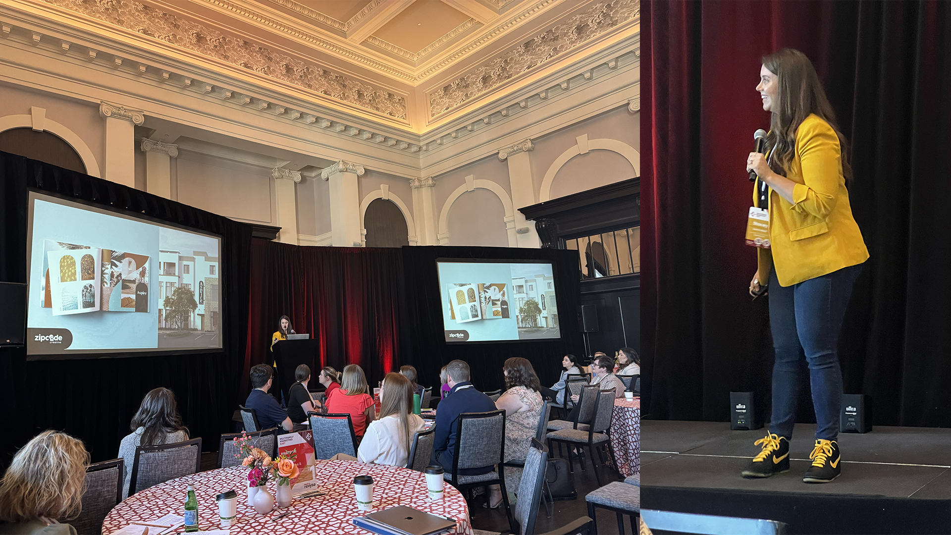
Speaker: Stacey Feeney, Founder & Creative Director, Zipcode Creative
Discussion Around:
- Branding is more than a logo
- A new BFF in the Multifambam
Why It’s Our Pick:
We’re biased. Stacey, our founder, is pretty great at what she does. And she’s super fun. Plus, building a brand is our bread and butter—perfect for breakfast!
#2
Tuesday, May 7th
Jack, Barbie and Cinderella: Fluent Devices in Strategic Brand Marketing
9:00 AM – 9:45 AM
Speaker: Suzanne Schlundt, Cox Communications, Vice President of Marketing
Expected Takeaways:
- The benefits of relatable brand personas
- Attract customers, talent and investors with emotional brand strategy
- How fluent devices (and their retirement) impact your insights
- Learn how to elevate your brand’s impact
Why It’s Our Pick:
Learn from a Barbie marketer? Yes! Brands should get emotional. Otherwise, you won’t make an impact. We’re excited to hear about the ways charm and familiarity with your brand can be used to reach and retain.
Keynote: Using Humor to Sell
10:15 AM – 11:15 AM
Speaker: Jon Krevolin, Cronin Advertising Agency, President, Chief Creative Officer
Moderator: Tina Mortera, Bozzuto Management Company, Vice President, Business Development
Expected Takeaways:
- Amplify your reach without spending MORE
- Create a memory link between brand and audience
- How to build a repeatable emotion-first story
Why It’s Our Pick:
Humor is one of our love languages at Zipcode Creative. So we’re curious to find out more about how our bad puns and knock-knock jokes can be turned into a lasting connection between brand and prospect.
Perception is Reality: Study Results on Leasing and Living
2:00 PM – 2:45 PM
Speakers:
Margette Hepfner, Willow Bridge Property Company, Chief Operating Officer, Residential Management
Merideth Bunting, The Dinerstein Companies, Vice President of Marketing and Management Services
Expected Takeaways:
- Prioritize data-driven decisions over gut feelings
- Understand Gen Y’s vs. Gen Z’s preferences (and stop generalizing them)
- Align strategies to current trends
Why It’s Our Pick:
The ideal resident for every brand is different. Having the facts (and changing your strategy) about renter preferences through data will get your brand further—to the audience it needs to reach most.
Roundtable: How to Stay Ahead of Generational Shifts in Apartment Marketing
3:15 PM – 4:00 PM
Speakers:
Elizabeth Carton, Vice President, Marketing, Rangewater
Kasey Munsch, Vice President of Marketing, The Preiss Company
Sarah Gencarella, VP of Marketing, Olympus Property
CJ Edmonds, Chief Revenue Officer, Conversion Logix
Discussion Around:
- Catering to unique generational preferences in marketing
- Embracing technology to enhance apartment hunting/leasing
- Building stronger connections with prospects and residents
- Collaborating with all teams (marketing, leasing, management) to stay cohesive
Why It’s Our Pick:
The IRP (ideal resident profile) should dominate your marketing research. Find out who they are, and that will likely tell you what they like, don’t like and how they want to be approached. Can you say “marketing gold?”
WEDNESDAY, MAY 8
Differentiating Your Communities in a Rapidly Evolving Market
10:15 AM – 11:15 AM
Speakers:
Kaley Rafferty, Olympus Property, Senior Marketing Manager
Kyra Lambo, EQR, AVP, National Marketing
Lauren Carpenter, UDR, Inc., Sales Initiatives Manager
Jesse Stein, Airbnb, Head of Real Estate
Carol Enoch, Enoch & Co., CEO
Expected Takeaways:
- Explore vendor-driven strategies to stand out
- Enhance resident satisfaction through rewards programs
- Optimize space and amenity rentals
- Boost loyalty through tech engagement
Why It’s Our Pick:
If you want to survive, you have to stand out. Differentiation isn’t just a fun word. It’s vital to stay in the game!
Your content goes here. Edit or remove this text inline or in the module Content settings. You can also style every aspect of this content in the module Design settings and even apply custom CSS to this text in the module Advanced settings.
Bees and Biodiversity: The Future of Multifamily ESG
11:15 AM – 12:00 PM
Speaker:
Noah Wilson-Rich, The Best Bees Company, Co-Founder and CEO
Expected Takeaways:
- How to attract residents that care about sustainability and the environment—through bees
- Bring ESG to life in commercial real estate
- Honey from a hive maintained in commercial real estate (!)
Why It’s Our Pick:
The next generation of residents cares deeply about the earth. Bees are key in keeping it going, producing food, by pollinating our fruits/vegetables. Plus: HONEY!
AIM 2024 Speaker Picks

Michelle Moriello – VP, Digital Marketing, GID/Windsor Communities
Speaking on:
May 6, 2024
1:10-1:50pm
Opening Keynote: “The Investment Case for Branding and Customer Experience: Hotelier Lessons from Hampton by Hilton”
Why we picked this speaker:
25 years in multifamily? Incredible. Michelle’s our pick not only because she’s one of the keynote speakers, but also because she’s making a case for branding. We’re stoked to see what she says!

Elizabeth Carton – VP, Marketing, Rangewater Real Estate
Speaking on:
“Branding…….It’s NOT a Game(show)”
May 6, 2024
4:15-5:00pm
Why we picked this speaker:
As VP of Marketing for Rangewater, Elizabeth Carton is The Boss for creative and strategic marketing. Additionally, she’s worked in healthcare and property management, which gives her breadth of knowledge—from parallel and outside industries—a little more complexity.
2024 Must-Visit Sponsors

Zipcode Creative – Besides coming to see us at the Zipcode Creative lounge, there are few other folks we think you’d enjoy talking with—not only are they friendly, but they also have awesome solutions for apartment marketers. (P.S. Our services partner really well with theirs.)
*Will You Sign My Yearbook?!*
Our lounge at AIM is going to be totally boring. NOT!
???????????? Get ready to get 90s up in here! ????????????
Stop by our booth (25) at the Ocean Lounge to take an instant photo, paste it in the book, and sign your name with gel pens. Check your email or LinkedIn to nominate people for “most likely to” and other superlatives awards! We’ll be taking votes for awards through April 30!
OTHERS TO VISIT
Engrain – Their interactive sitemaps are awesome—many of our clients supply our beautiful 2D map files to them as a starting point. (It’s all coming together.)
HyLy – Email and templates to reach your ideal resident? Hyly’s got it—and the branding we design for you is easy to fold in with their CRM system.
Connect
and
Apartment Geofencing – After we’re done making your branding beautiful, you can get on the advertising train with super-smart digital ads, getting in front of exactly who you want.
LCP Media – Visual branding—beyond your shiny new logo from us—needs beautiful photography to round out your marketing collateral. Enter: Show My Property.
Social Kapture – Steadily creating your community brand is easier with Social Kapture, with custom content and smart social media strategies. Establish your brand here and it will work hand-in-hand with your digital and physical collateral.
FOR WEBSITES
Branded sites (with brand style that we help you establish) can make way for gorgeous websites with any of these partners. Plus, they’ll play nice with PMS!
30 Lines
Digible
Resi – our go-to partner for *custom* sites (with our branding expertise)
Repli
Organizing Your 2024 AIM Schedule
Feel a little overwhelmed? Just grab a pen, and start circling what you need to see and who you need to talk to. It’ll be okay.
- If you’re a first-timer, go to the First Timer Meet Up (Sunday, 4-5pm and Monday, 7:45-8:45am) with Tamela Coval.
- If you’re hungry, head to a breakfast roundtable each morning (7:45-8:45am) and grab lunch from 11:45am-1pm.
- If you’re a night owl, definitely don’t miss the hosted vendor partner entertainment Monday evening (plus networking from 9-11pm)!
- If you’re itching for a connection, check out the networking breaks each day from 9:45-10:15am.
There are a few breaks built in, so you can gather your thoughts and check those emails in between sessions. Just pace yourself and make a plan!
Special Evening Events
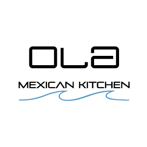
Sunday
Ola Mexican
Cinco de Mayo Celebration / Annual Open Networking Dinner
7pm
Seating Limited, Email or DM Kristi Fickert to RSVP
Within walking distance of the hotel, join in for a non-sponsored Cinco de Mayo networking dinner!
This is open to ANYONE attending AIM – supplier, marketer, trainer, operator, c-suite exec, owner…we have zero requirements to attend because we know the best conversations happen when we all have a seat at the table!
Monday
Bear Flag Fish Co
6-10pm
Come and go as you please, drop in for a drink and apps before your other events OR hang for the night with us at this low-key patio with a view of the beach!
Contact Stacey if interested in attending.

Tuesday
Nautical Nights – Yacht Party
By Invite Only!
6-9pm
Contact Stacey if interested in attending.
Hop on and sail in style on the Motor Yacht Mojo, departing from Newport Beach. Enjoy passed appetizers and dinner, and don’t forget to pose for the perfect influencer photo while aboard the Mojo.
*There will be an In-N-Out Food Truck Tuesday for lunch at AIM from 12-1pm. Don’t miss it!!