Author: Stacey Feeney

Apartment Staging for Fall Marketing

Fall is the perfect time to think through your apartment staging strategy. As the days get shorter and the smell of autumn lingers in the air, you’ll need to prepare your model suite for the other changes the season brings: adults moving into active adult housing, empty nesters downsizing, and college graduates finally landing a new job, looking for the perfect apartment.

There are countless advantages to staging a model apartment for your prospective residents. For one, it’s plain and simple (good) marketing—selling what life could look like for those considering living in your community. If you’re going through the process of apartment staging for fall, be sure to follow our tips. If you’re not, consider this small fact: an unstaged home often has visitors tour for 5 minutes. But a staged home, on average, has a visitor/prospective resident or buyer in the house for 40 minutes. Every one of those 35 minutes counts a little more towards getting your lease signed.

Apartment Staging for Fall, Helps Marketing

SHOW VALUE

Having a higher cost of rent when the home is staged doesn’t feel as exorbitant, when they see the way the apartment is laid out. It’s a helpful sales tip that works. The pricing then can reflect the effort you’re putting in. When you show off what you can do with one model unit, your future resident may assume that this level of effort may extend across all of your community (showing that you care about more than rent coming in on time).

FOCUS ON THE GOOD

According to apartmenttherapy.com, elevating the exact characteristics the prospective buyer (or in this case, renter) will fall in love with, can help in a number of ways. Just as staging can help homes sell faster, staging apartments helps them lease up faster. When your prospective residents can picture the place being home, they’ll want to move quickly to secure it. When you put in the effort and show the value, your prospects will be attracted to the little touches of luxury and home you’ve added in.

Apartment Staging for Fall, Best Practices

DISTRACT (A LITTLE)

Without anything in the room to look at, visitors have trouble visualizing exactly how the room should be laid out, or if the space is big enough for their favorite chair and side table. Instead of checking out the room and details, they’ll likely be looking everywhere you don’t want them to—including out the window. Keep their attention in the space and disguise any imperfections or areas that are less desirable with something beautiful, soft, or handy. Help it feel a little closer to home with some added touches of the autumn season:

  • Decorative gourds and pumpkins (real ones can last a few months if kept whole!)
  • Twig wreath
  • Light rain or leaf or moss-scented candle (nothing too heavily fragrant; avoid pumpkin scents—not everyone likes super sweet smells)
  • A stack of leather-bound books
  • A cozy throw pillow and/or blanket over the sofa, chair, or bed
  • Floor and table lamps, to give levels of light

THIS COULD BE YOU

When you put in all of the furniture and details, make it a little bit aspirational—have prospective residents saying, “Ooh, we could sit in this corner and read when it rains, and have a mug of tea on this table.” When you show use of the space, inspire your visitors to do the things they would love to do (and be the people they want to be) with interesting, beautiful art, sculptures, fresh flowers, and even some live plants, if possible!

KEEP IT SIMPLE

When decorating, don’t lean too heavily into a super strong style. Keep it a little generic, so that any visitor can imagine themselves living there. Keep it inviting. Keep it uncluttered. Keep it clean. Avoid anything that could invoke strong reactions.

GET OBVIOUS

Do you have beautiful new energy smart or app-controlled appliances? Place little call-out signs near them to show them off and give a little fact about them. Make sure to have your apartment colors and logo on it—it will look more official that way. (Contact us if you need a little branded sign or a booklet brochure. We have your back!)

LIGHT IT UP

Shed a little light on the best spaces in the model unit. Use mirrors to your advantage, helping the room look bigger and more well-lit (especially as the days get shorter towards winter). Place light-colored and/or sheer curtains around the windows, placed higher above the frame; the light curtains let in more sunshine, and the high placement gives the effect of larger windows.

WORK WITH THE ROOM

Not every community has the same style. Work within the bounds of the architectural style you have. Minimalist? Eclectic? Hacienda? Mod? Be careful to choose furniture that works with your apartment style (and don’t get too funky, even if it’s fun). Overwhelming the resident with style can repel them from seeing themselves in the space—the exact opposite of what you want.

KEEP AUDIENCE IN MIND

In keeping with the architectural style of your community, you’ll also want to carefully consider the audience you’re trying to reach. If you’re modeling a suite for an active adult community, find comfortable chairs, cozy spaces, places to play card games and drink tea, and maybe, (if you’re pet-friendly) a little staged doggy bed and doggy dishes in a corner. However, if you’re trying to reach a studious resident, be sure to carve out a space that looks perfect for reading and studying. They’ll be able to picture themselves perfectly in the unit.

Apartment Staging for Fall, Additional Benefits

Something not often discussed—there are even more benefits for staging beyond resident tours. You can also use the staged model unit for photo shoots. These photos can be placed on any of your marketing collateral, and if the staging is “lightly” seasonal, you can use some close-ups for your social media posts: instagram, facebook, and the like for any seasonal specials you have, or fun posts you want to do. Be sure to hire a professional photographer for the best shots. They’ll get all the angles you’ll need.


Ready, set, start your staging!
Lifestyle Stock Photography for Your Apartment Brand

They say a picture is worth a thousand words—and it’s true. An image quickly portrays a certain attitude, vibe, and emotion, all in just a glance. So when choosing lifestyle stock photography for your community’s marketing materials, it’s important to pick wisely. 

Prospective residents begin to associate what they see in imagery with what it must be like living in your community. Choosing photos that accurately represent your community’s lifestyle is vital to authentically depicting what it’s like for residents—while also portraying an aspirational lifestyle that quickly catches viewers’ attention. 

Use one of these tried-and-true approaches to find the right lifestyle stock photography for your community. 

People-Focused Lifestyle Stock Photography

Though it’s not a hard and fast rule, it’s not uncommon to see lifestyle stock photography that depicts smiling, happy, beautiful people. When curating photography for your community, it’s important to choose images that evoke an elevated, coveted lifestyle. 

From a family relaxing by the community pool while enjoying the sunshine to a fit young man hitting his goals in the fitness center, the right photography can help people imagine what their life would be like in your community—and including people is an important part of that. To take it a step further, specifically select photos that represent your target demographic. If your target market is families, active seniors, or young professionals, we can curate a selection of photos that feature people in a similar demographic so they can even more easily imagine themselves as a resident – all while keeping the entire gallery diverse to stay compliant with fair housing, of course!

People-Focused Lifestyle Stock Photography 2People-Focused Lifestyle Stock Photography 1

Real People & Real Residents in Photography

Instead of using generic lifestyle stock photography you can take it to the next level and use images of your real staff and residents. Though this is slightly more complex, it helps you stay totally true to your brand and your community. It also gives you the opportunity to hand-select each image that you want and capture the exact angle, area, or person that you’re looking for.

To start, find a photographer in your area whose work you love. You can then arrange for residents and staff to be on-site to capture your dream photos. Try including your graphic design team or bring on a third-party agency to ensure that the photos align with your branding and creative vision. Just be sure to collect photo releases from everyone involved, so you can freely use the images in all of your marketing collateral. 

People-Free Lifestyle Stock Photography 1People-Free Lifestyle Stock Photography 2

People-Free Lifestyle Stock Photography

You could choose to avoid people completely and still curate elevated and sophisticated lifestyle stock photography that perfectly represents your community. Select photos that leave details and people up to the imagination. Showing a coffee cup and a book on a table in the business center or a towel and sunglasses on a lounge chair by a pool, for example, hint at the amenities and lifestyle that your community offers—all without showing them directly.

This is an amazing option for communities that are undergoing renovations or have some planned in the future. It’s also a smart option for new developments that don’t yet have spaces to photograph. You can use these lifestyle stock photos in addition to renderings to portray your community’s best elements, all without limiting your target audience to a certain demographic.  

Whether you’re looking to orchestrate a full-scale photoshoot or simply need an expertly curated collection of lifestyle stock photography, having added expertise on your side goes a long way. At zipcode creative, we’ve created marketing materials for communities of all shapes and sizes. From developing websites from scratch to refining your branding to developing printed collateral like postcards or brochures, we can help you select the right photography to make your community jump off the page.

Get in touch with our team today to get started.

Neighborhood Recommendations to Sweeten the Leasing Process

The VIP type experience doesn’t have to be limited five-star hotels and 24-hour concierge service. With your apartment community, you can attract residents by having every bit of neighborhood knowledge at your fingertips. By showing your investment in the community and the area you’re (working) in, your residents, both current and prospective, will feel more at ease sticking around and staying for a while. And they’ll be excited to live there. Why? Because you have the most trustworthy neighborhood recommendations!

Inside Scoop

Any multifamily community can handle giving basic info to its residents: trash/recycling schedule, upcoming maintenance work, seasonal pool dates. But you’re not basic—you’re the best community in the area. Or at least you can be, if you think beyond. Provide the best neighborhood recommendations, with insider knowledge, and your residents will come to rely on you not only for the roof over their head, but they’ll also credit you for telling them the best burger joint in the area. Consider yourself their guide, because improving resident-management relationships will boost morale and resident retention and your google review ratings.

Walkability

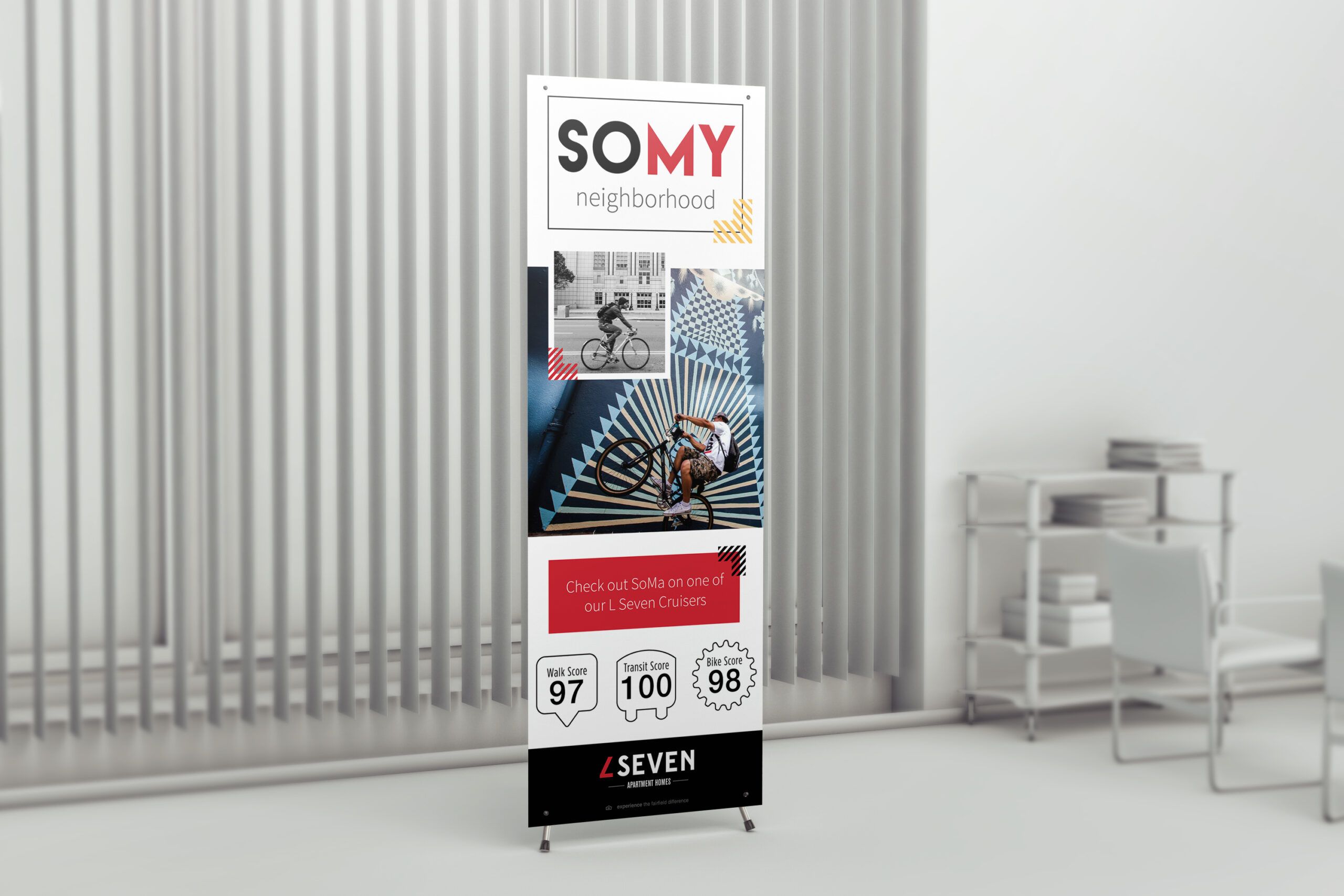
Knowing your walkscore and showing it off in your marketing materials (if it’s a good one!) can be helpful. Quick reminder: a Walkscore is a numbered “walkability” score that ranges from 0-100 for a location. It shows how easy or far routes are from the resident location to specific amenities a person may need on a typical day (shopping, food, drink, transit). Having a walkable neighborhood is important for residents who are not car-reliant, or who prefer to have a lively neighborhood with plenty of things to do and see within walking distance. Note: Having usable sidewalks is helpful for the score, as well—some more suburban or rural locations might not have these, and the walkability score will be affected.

School Information

If your community is home to families, you’ll certainly want to have the neighborhood’s school information on hand. Check greatschools.org to see which schools are nearest you, who they serve (elementary, middle or high school students) and how they’re rated. It will also be helpful if you have start and end dates for the school district (or bookmarked at the front desk, along with the school schedules). If you have preschools and daycares (or private schools) in the area, ask if you can help by having paper applications at your front desk to give in your welcome packet for new residents. They might be happy to know that you’ll be sending them some inquiries, too! 

It will also be helpful for your community families to know which of these schools have before- and after-school care. If the schools have a brochure for that, keep that handy as well. At the very least, having a listing of local schools on your community’s “area” page will be very helpful.

neighborhood recommendations

The Best Recommendations

When moving to any new community, it’s super helpful to receive neighborhood recommendations from those who are “in the know”—especially from someone you may see on the regular. Take, for instance, the best items on a menu that might not be obvious to the new kid in town. (Does Al’s Pancake World somehow have the best egg rolls? Tell them!) 

HOBBIES

It’s also worth noting where the best shopping is, and having a few nearby parks—including dog parks—noted. If there are hiking or running trails, keep those in mind for the runners and hikers in your community when they ask.

FOOD

As far as food recommendations, you can almost count on being asked where the best: burgers, pizza, Mexican, Chinese, and Thai places are. Take note, and if possible: have a few menus handy.

ATTRACTIONS & TRANSIT

When family or friends are in town visiting, have some recommendations for local attractions, and the best way to get there (Ride share? Subway? Walk? Bus?) Give tips on how to take transit, and what the options are for rides (single use, day pass, multi-use, etc.) and where they can find those transit cards/that information.

NECESSITIES

For those not-as-fun recommendations, it’s good to know where the closest emergency room or 24-hour clinics or pharmacies are located. When you have a resident who needs medical attention (not a medical emergency) be ready to point them in the right direction.

DELIVER YOUR RECOMMENDATIONS

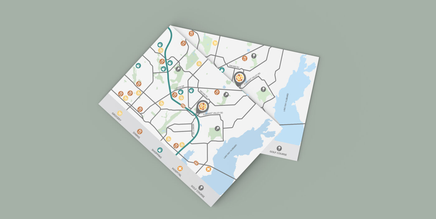
While we’re in the age of “I’ll just look it up on my phone” it’s even better to anticipate the needs of your residents and have tailored recommendations at the ready—both while you’re at the desk, over the phone, and in your marketing materials in a beautiful neighborhood map (made by zipcode creative!)

Connections

You’ve got the connections. As the apartment manager, you might know some other business managers, so work on building up your partnerships. Cross-market the others. Trade flyers, host pet adoption events, or consider offering a rent incentive program for the employees of large local companies or organizations. You can even work on putting together a neighborhood fair in your community with local cafes, eateries, and local businesses—and advertise it all for current residents, while advertising and opening up the event to prospective residents, too. If you’re lost on where to start, check out our blog on marketing your multifamily community through local partnerships here.


PARTNERSHIPS

Talk to the businesses around you, and see if you can snag a coupon specifically for the residents in your community, say 10% at the pizza place just around the corner. When you score a deal for your residents, advertise it in your resident newsletter and at the front desk to make sure everyone who wants to take advantage can. That’s a win-win-win. Residents get a deal, local businesses get patronized, and you improve your recognition around town and get to keep making the community go ‘round.

If you aren’t manning the front desk all hours of the night, make sure you have this information in a spot where your residents can find it: on your social media posts, in your facebook resident group, on your community board, and especially in your beautiful resident welcome packet! The best part about being in a community is the food—er, rather, it’s the people. Showing off every gem in your neighborhood is one of the biggest selling points you can make—so study up!

LSEVEN artwork is ©Fairfield Residential  |  Work executed by Stacey Feeney, owner of zipcode creative, while under creative direction and employment at Fairfield Residential.

Brand Style Guides for Multifamily

Brand style guides are the ultimate way to create brand recognition. For your community, that’s just one piece of the success puzzle. When your internal team knows your brand (thanks to a super clear and beautiful brand style guide) they’ll keep things consistent. And that consistency equates to brand recognition from the inside, out—to your residents.

Create a style guide and get ready to go on branding cruise-control…most of the time, anyway. First you might be wondering:

What’s a brand style guide?

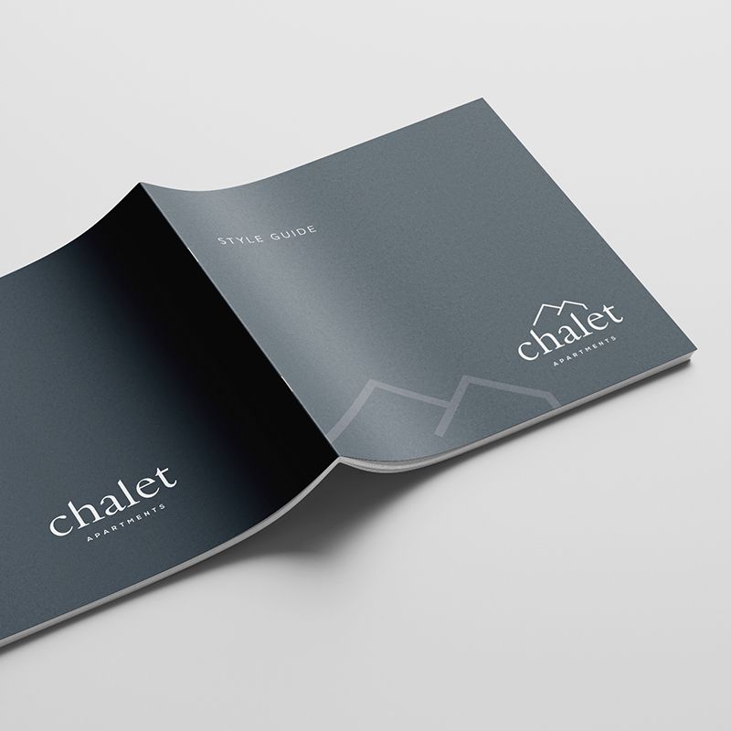
A brand style guide keeps your visual identity intact. All your branding elements are gathered together into one (beautiful) package. It can be stored online as a pdf, or printed in booklet format. The style guide lays out every one of the visual and verbal pieces of your brand including:

  • Brand Story
  • Brand Voice and Tone
  • Logos
  • Colors
  • Typography
  • Design Elements
  • Imagery

With a cohesive branding package, you’re able to both lay down the law and function as a neutral party (think Switzerland) for when a colleague wants to go against the grain and use a color or font that isn’t remotely representative of your brand.

brand style guides

Why do I need a brand style guide?

The brand style guide for your community will help you update existing marketing materials, or design new ones. It allows you to create consistency across channels and media: social, digital, print, anywhere your brand shows up.

As we mentioned above, it’s a tool for beautiful consistency. A guide for everyone on your team to know and feel your brand when they hear it and see it. Everywhere your brand appears is an opportunity. Don’t miss it. 

Externally, you can develop or deepen brand recognition with your residents and partners through consistency. 

Internally, you (and your colleagues) can be more efficient in your marketing and branding decisions. 

The brand style guide should be developed by your marketing team and/or a professional creative agency, like zipcode, and be accessible to everyone at the company. This will minimize any “I didn’t know the right color to use” issues down the line. Providing a clean, clear brand style guide will easily create brand clarity, no excuses.

brand style guidesbrand style guides

How do I create a brand style guide?

BRAND STORY

Set the stage. Tell what your community does. Tell about your history, goals, values, mission, and vision. 


BRAND VOICE & TONE

If your brand was a person, what kind of attributes would they have? Identify this in the brand voice and tone section—especially in regards to how they use language and emotion.

LOGO

Show all the variations that are acceptable for use with your logo—your primary logo, your secondary logo and any submarks. Tell the user exactly how to use the logo and exactly how not to use it: No rotation, no stretching, no different color applications, and no weird color fill.

COLORS

Show your true colors (ha). And identify the colors using the Hex number, the RGB color codes and CMYK or Pantone color codes. Identifying all four of these will help the reader apply the correct color whether they’re working in print or digital.

TYPOGRAPHY

Get technical here. Choose your font styles, the sizes, and the spacing. Show how and where each would be used, especially as headlines, sub-headers, body copy, and accent fonts.

IMAGERY

Define your photographic style—bright and colorful? Moody and deep? Stark and modern? And give plenty of examples.

Once you’ve compiled all the pieces, put it together in an easy-to-digest format, using your fonts, your colors, and plenty of examples. Distribute it far and wide within your company and keep it handy in your brand’s internal files for reference.

Extra Brand Style Guide Tips

  1. If you have a brand style guide already, consider updating it.
  2. If you don’t know where to start, use this as a guide.
  3. Include as many details in the brand style guide as you think are needed. 
  4. List out Dos and Don’ts. 
  5. Provide plenty of examples.
  6. Every so often, take a close look at your style guide. Make sure your branding is still tracking right alongside it. If you need to make updates, whether in the style guide, or rerouting some ill-advised branding choices, do so.


Brand recognition is reliant on a successful understanding of your brand from the inside out. It starts with a clear brand style guide being consulted and used internally; once you have that, your consistent brand can now stretch as far as you need it to, without getting warped. Contact zipcode creative to get your brand style guide updated or created. Check out our brand questionnaire to get a head start.

Email Marketing for Multifamily Communities

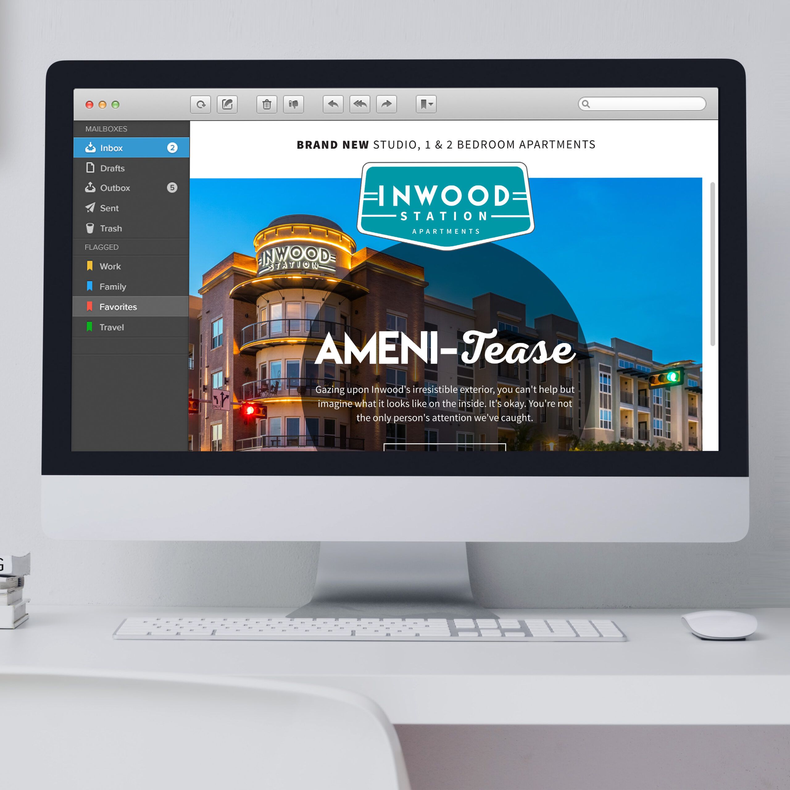
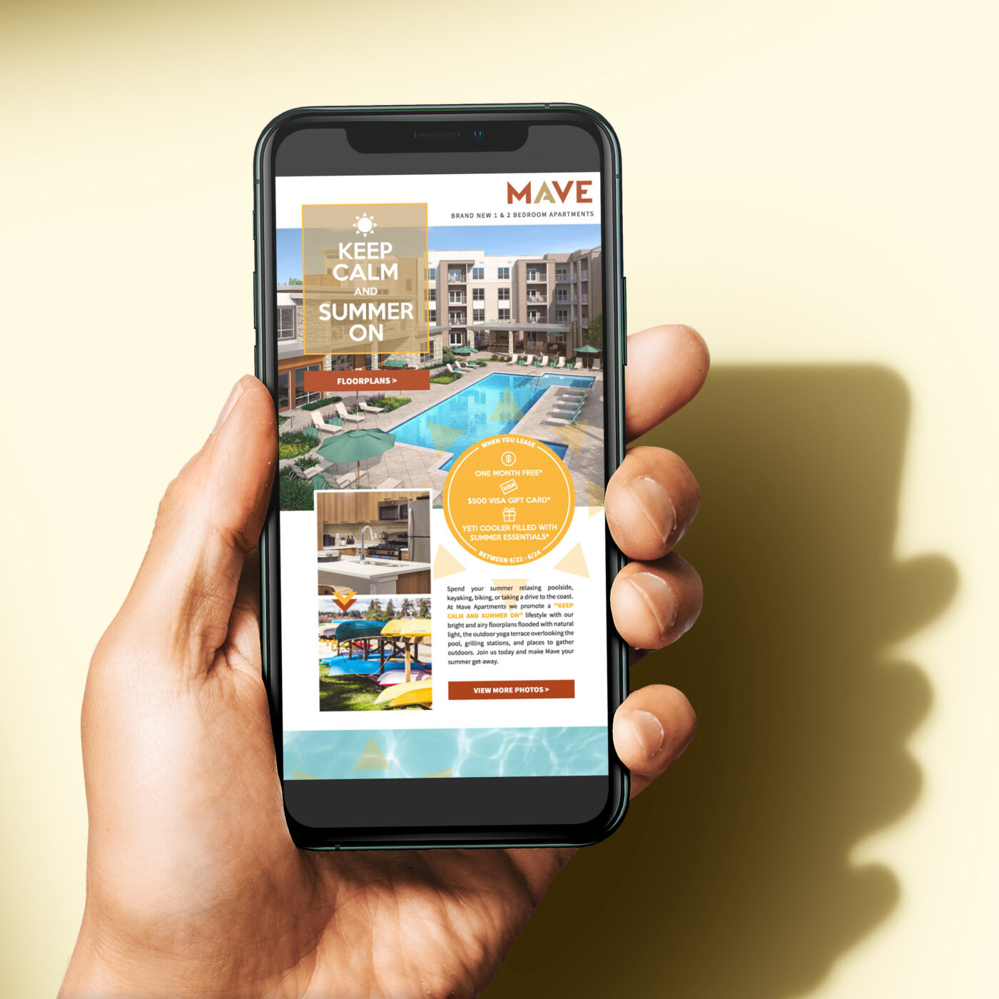
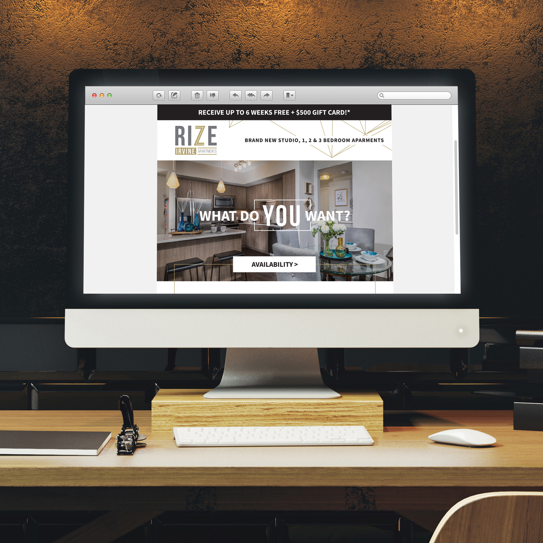
Email marketing: It can all feel a little mysterious. If measuring your “open rate” is about as scientific as you get, it’s time to take a closer look at your email marketing, especially as it relates to your sales funnel. From leads to residents, it’s important to know what to send when. (You don’t want to send an introduction email to your current residents, right?) Make it easier on yourself by creating an email marketing funnel. Pick your funnel section, and start crafting an email that they’ll want to open.

The first step is to outline your process. Then, set up some email templates and keep a focus on personalization. The more your prospective resident feels seen, the more likely they are to: 1) open the email; 2) take action; and 3) share the email.

And that’s what we all want. Opened emails, follow-through, and brand advocacy. When you’re able to create a pathway or journey for your leads from Point A to Point B, it means more leases signed (and renewed). Check out the tips we’ve created so you can create the ideal marketing email for each section of your funnel, whether you choose to automate, or set up triggered emails for your apartment community.

Emails for Awareness


THE AUDIENCE

This email is for the “I’ve never heard of you” crowd. The reader of the email might be someone who was referred to you, someone who found you through a web search, or maybe they’re part of a prospect email list you’ve purchased with the hopes of converting a handful of leads. They may have also found you through a blog post or, even more likely these days: through social media.

WHAT TO SAY

In this email, you’ll want to clearly introduce yourself. Include a link to your About page, and show off your best sides. Don’t get too granular, but create a little intrigue. This is your opportunity to solidify your branding—the same branding that you’ll need to keep consistent throughout your email marketing funnel. It’s also a good time to give them an option to learn more about what you have to offer. Add in calls to action that lead to your website for a low-barrier-to-entry CTA: “Explore our floor plans” is an easy one.

FOR EXAMPLE

If you’re having a grand opening, for example, this is a good time to let them know when you’ll begin accepting lease applications, and what you have to offer, in terms of type of community, and number of bedrooms and bathrooms in your units.

Emails for Consideration


THE AUDIENCE

Emails for consideration are the natural next step after your awareness-building email. They are for the group of leads that might say “Oh, yeah, this community! I wonder what their apartments include.” Now, you get to answer their questions that might have come up between the previous email and this one. Remind them who you are, what you offer, and make sure that you are clear about your differentiators. It’s time to stand out. For more tips, check out our blog post on brand differentiation here.

WHAT TO SAY

When it comes to consideration, you’ll have to add in some social proof. Bring in the reviews and the testimonials, and sprinkle in some of your biggest selling points. The point is to throw your hat in the ring, and show your community not only as a competitor, but as the best option for the lead reading your email.

FOR EXAMPLE

Outline your market, make your case, and show off the best that you have. Embed reviews, and place a few short-and-sweet testimonials to drive home your point. Place in a call to action to Learn More and make sure your landing page is chock-full of good stuff, like photos, floor plans, site maps, and all the things that attract residents the most.

email marketing

Emails for Conversion


THE AUDIENCE

You’re so close. It’s time to close the deal. This email is for the crowd who’s thinking “Okay, I really need to make a decision about where I’m going to live.” They’re ready to choose, and they should be choosing you.

WHAT TO SAY

Keep their attention. Put your amenities and biggest selling points front and center and make the calls to action (with the buttons and links) super clear. As you tell your lead more about you, make a point to also be learning about them and their needs. Use quick surveys, and offer up customer service contact information, too. At this point, they don’t need more information, they need to get the lease application filled out and submitted to you, so they can make it official.

FOR EXAMPLE

Make it easy, and get them to follow through. When they click on “apply today” or “book a tour”, make sure it goes straight to the page that they need. For more help with calls to action, read our blog on CTA best practices.

Emails for Loyalty

THE AUDIENCE

Why is your best friend your best friend? You spend time together. You know each other. You probably have their coffee order memorized. This is the goal with your email marketing funnel, too, especially when you get down to the loyalty aspect. You want to not only attract your residents, you also want to retain them. These emails are meant to make your residents say, “They know just what I’m thinking.”

WHAT TO SAY

Send out emails about community events. Create a social media competition and build your email campaign around it. This portion of your email marketing funnel may last a little longer than the others, because you’re building up your relationship through keeping the lines open. Your goal is also to stay front of mind. (Out of sight, out of mind—let’s not even go there!)

FOR EXAMPLE

Keep bringing helpful information and every once in a while, toss out a lease special or a giveaway (free gift cards to local shops, for example) so that your email readers feel a little more like VIPs, getting the special deal. 

email marketing

Emails for Advocacy


THE AUDIENCE

This email is for your resident who thinks “I wish all my friends were my neighbor. I wonder if they have lease openings.” Well, luckily for you, you’ve built a relationship with your resident, and now it’s time to take it to the next level: turning your loyal resident into a brand advocate. They love living in your community.

WHAT TO SAY

Jump in and let your happy resident know that you’re accepting new lease applications. Give them extra “points” for sharing—offer a gift card or referral bonus for successful referrals. Encourage them to post on social media about their experience, or to share one of your posts—it’s fun to reward social media advocates of your brand.

EXAMPLE

Try offering up a reward for leaving reviews. The reward can be a small gift card, a gift basket of local goodies, or just plain cash. Note: Offer this only to residents that you’ve confirmed are happy with your community. You can use a satisfaction survey prior to this offer, and streamline your reviews successfully. When you make the ask via email, you can see who’s clicking on it, and use that info to follow up as needed.

Email marketing can feel complicated, but breaking it down into sections of the funnel will help you prioritize your methods and reach your audience with the right words and visuals. 

Still feeling overwhelmed? That’s understandable. Reach out to zipcode creative to get our help with a custom-designed email blast (one or multiple) so we can take care of the pretty parts for you. If copywriting is where you’re getting stuck, we can help with that, too! Bottom line: We make things pretty—whether it’s words or design. Get in touch.

Images in this post are ©Fairfield Residential  |  Work executed by Stacey Feeney, owner of zipcode creative, while under creative direction and employment at Fairfield Residential.

Outdoor Amenity Spaces for Summer Marketing

During the warm-weather months, there’s nothing as relaxing as enjoying the sunshine and soaking up some vitamin D. Reframe your marketing to give your outdoor amenity spaces a leg up—since it’s what prospects and residents are thinking about! 

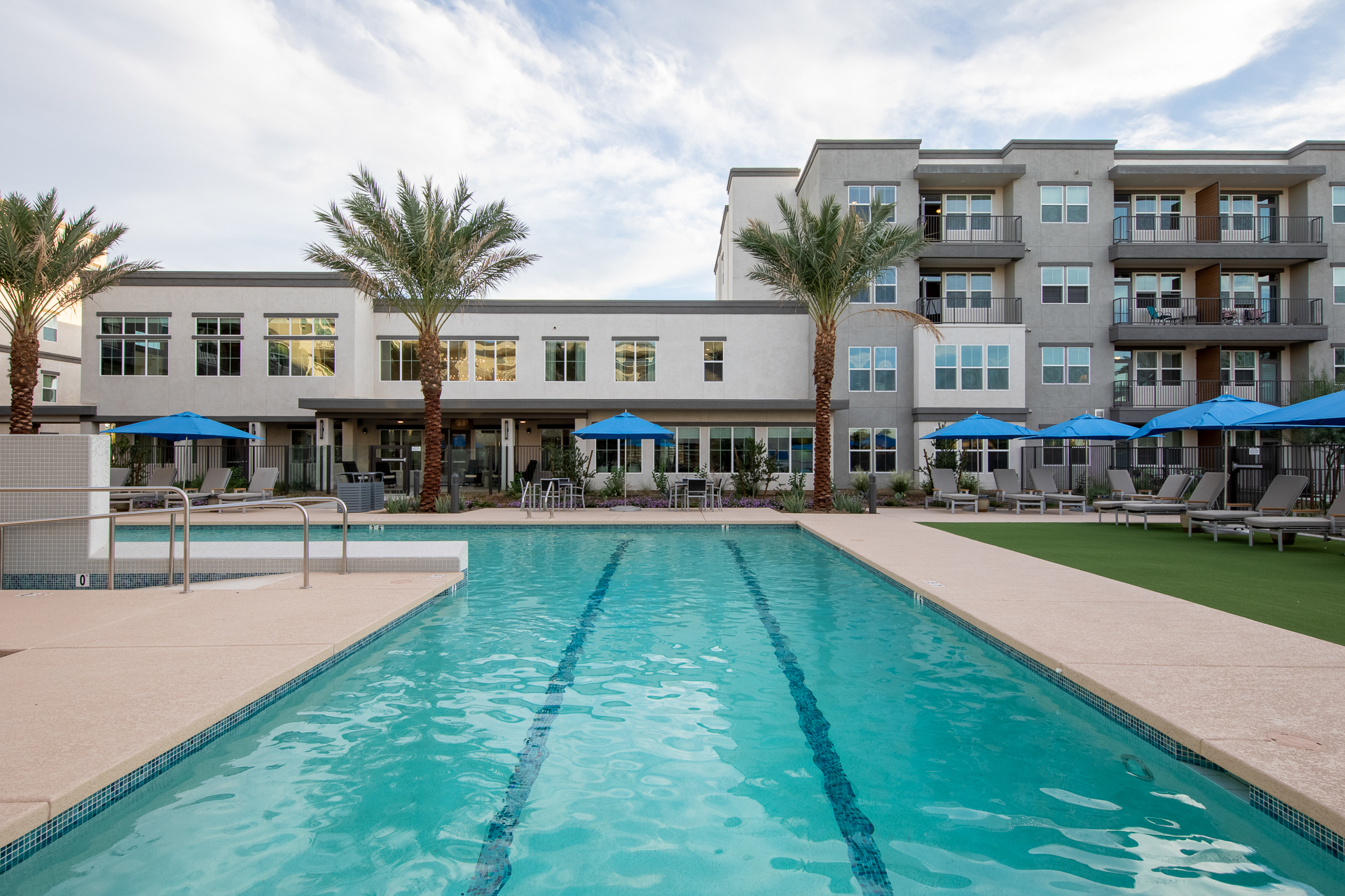
If your community has outdoor amenity spaces like event lawns, a pool, or grilling areas—or even private outdoor areas like patios—it’s important to weave these elements into your summer marketing strategy so that prospective residents can see everything you have to offer. From lounging by the pool to picnicking on the common lawns, the outdoor lifestyle they could lead in your community is an important differentiator. Try using these tips and tricks to focus on summertime seasonal amenities to make your community feel irresistible amongst the competition.  

Summer Swag

Developing seasonal swag is an amazing way to highlight specific outdoor amenity spaces. If you have a pool, for example, consider creating beach towels as a move-in gift to enhance their experience If you have a grill area, you could create outdoor dining accessories in your brand colors and accented with your logo. Similarly, tennis courts pair well with branded tennis balls, and outdoor dog runs are the ideal opportunity to create pet-friendly swag like leashes or portable dog bowls. While prospects are evaluating their future living situation, these pieces showcase not only your community’s amenities but also your thoughtful approach to resident engagement.

Local Partnerships

If you want to branch out and reach new prospective residents, partnering with local businesses can be an amazing way to expand your audience. Consider teaming up with local bars or restaurants to host events in your outdoor space. From a concert series to weekly food tastings to happy hours, it will allow you to solidify yourself as a staple in the community—and it also allows you to showcase the beautiful amenity spaces you have to offer. While not everyone who attends may be looking for a new place to live, it’s an amazing way to generate positive word of mouth and get the word out there about your community. 

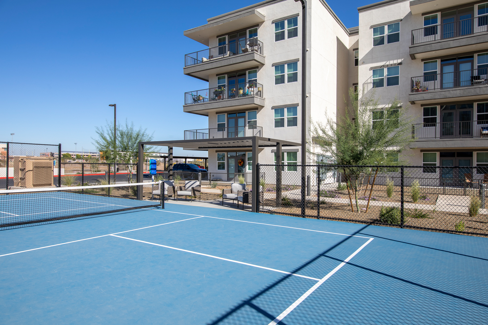
Outdoor Amenity Spaces - PoolOutdoor Amenity Spaces - Pickleball

Prospective Resident Events

Hosting prospective resident events, like happy hours or cookouts, at your outdoor amenity spaces allows you to not only answer all of a prospect’s questions but also show off your outdoor area at the same time. You can even combine these events with existing resident events to allow prospects to mingle with your current residents. This will allow interested parties to get a feel for the lifestyle and demographic of your community and gauge whether it’s a good fit for what they’re looking for. The best part? Instead of doing dozens of individual apartment tours, you can host a large number of prospective residents at once to generate a higher volume of warm leads. It also helps to keep existing residents engaged for a win-win way to market your amenities.

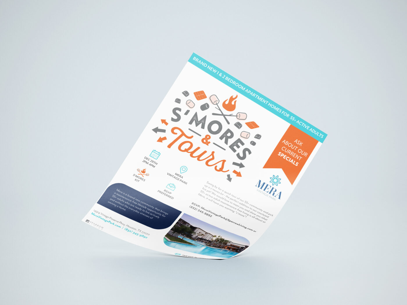
seasonal marketing event flyer

Seasonal Marketing 

While you likely have evergreen marketing assets like a brochure or direct mail postcards, why not change it up for the summer months? Revisit both the copy and design elements of your existing marketing materials to give them a summer spin. Feature eye-catching photos of your outdoor amenity spaces, like your pool or barbecue area. Be sure to also infuse your copy and content with summer-themed language, like “Make a splash!” or “Fun in the sun.” These small changes will help set your marketing apart from local competitors and help to re-engage prospects that may have gone cold. If it’s in your budget to do so, create a leasing incentive and turn it into a summer campaign!

No matter how you choose to showcase your outdoor amenities, now is the time! This peak warm-weather season marks the most popular time of year to move, so highlighting all of your outdoor amenities can help distinguish your community from your nearby competitors.

If you need help crafting your materials or figuring out where to start, our expert team at zipcode creative can help. From developing distinctive branding to overhauling your direct mail materials, we can give your marketing a polished, professional look. Reach out today to learn more about what our team can do.