“Luxury” In Multifamily Has Gotten Tired

We’re tired of luxury in multifamily. What once meant exclusive and the best-of-the-best, now seems surprisingly standard.

When multifamily overstates their offerings and over-inflates the descriptions of their usual or typical amenities, they’re not being truthful. And it doesn’t justify a super ridiculous rent increase, just because you’ve painted the cabinets and put in new countertops.

Problems with Claiming Luxury in Multifamily

Similar to the word “natural” in food packaging and marketing, there are no guidelines or rules around the use of the word “luxury” in the multifamily industry. It’s like hearing a movie is “must-see”, you go see it, and you come away from the theater annoyed and $15 poorer. When claiming an apartment community is “luxury”, there are no parameters, and suddenly it’s the dealer’s choice as to whether the community they’re advertising is actually luxury. There are at a handful of reasons using the term “luxury” for your apartments (when it’s not) is problematic; among them:

  1. Prospect Distrust
  2. Price Misalignment

PROSPECT DISTRUST

What they see (advertised) isn’t what they get? That sounds like a case of false advertising. When the prospect is shopping for a home, is attracted by the term “luxury” and comes to find an entirely different property class, quality level, and offering, there’s huge misalignment. The word “luxury” cannot be used for anything and everything. Being aware of your property class and branding accordingly will help your prospects get what they want, because it’s what they expect.

False advertising undercuts any rapport you can develop with your leads, and does not start the prospect relationship off on the right foot. Be upfront about what you offer. Be self-aware and be truthful. This doesn’t mean you can’t be creative—but you should still be clear on what kind of community you really are.

PRICE MISALIGNMENT

With everything costing a bit more than it used to, from groceries to housing—folks are on the lookout to find better deals and save money. If you use the term “luxury” there’s a decent chance that you’re either:

  1. Driving away people who could afford you—because they didn’t even get far enough to see the monthly lease cost; OR
  2. Attracting a clientele with very high expectations who will be disappointed with your offerings—because it’s not luxurious.

Work on reaching your ideal residents by being authentic with your brand, and telling the truth (by knowing what exactly you are and what you offer.)

Defining Luxury Properties

But what if you are a luxury apartment building? What if you do offer a lifestyle that goes far above and way beyond the typical?

Let’s figure out what luxury really means. (And while we’re at it, we’ll do a quick review of Class-A properties, too, to see how they align or compare.)


LUXURY

In general, luxury apartments offer high-end amenities, top-of-the-line finishes, and often expansive views from spacious balconies. They’re both conveniently located and bring convenience to the resident. Amenities of all sorts are found in the community that go above and beyond a pool and a clubhouse. If you have a pool and a clubhouse, you don’t get to automatically claim “luxe living”.

CLASS A

Typically Class A includes the highest-quality buildings on the market. This standard can vary depending on the city—but the buildings have typically been constructed within the last 15 years. The modernizing of a building through renovations may also help it become classified as Class A.

In short, luxury is more about the finishes, location, amenities, and square footage.

Class-A properties are merely defined by:

  1. Age of the buildings—constructed less than 15 years ago;
  2. Significant updates to an older building; and
  3. Quality (top-tier) building materials.

Instead of Saying “Luxury” in Multifamily…

As a creative agency, it’s basically our job to tell you: be more creative. Multifamily, we can do so much better than saying “luxury”. Instead of saying “Luxury apartments” because the community is nice, use other methods.

USE ACCURATE DESCRIPTORS

Let’s kick the age-old “luxurious” and “sparkling pool”. Don’t even think about using “unique.” That doesn’t tell me anything different than the next community. Pivot. Focus on the special things you offer to your target resident.

Instead of “luxury” say “grand” or “indulgent”—if it really is.

Instead of “sparkling” pool, try describing it by the actual shape— “geometric” or “lap” or “oversized” to paint the full picture.

Instead of “state-of-the-art fitness center” be truthful—you don’t have 20 Pelotons in a row—or focus on the positives, like the fact that it’s open 24 hours or offers classes.

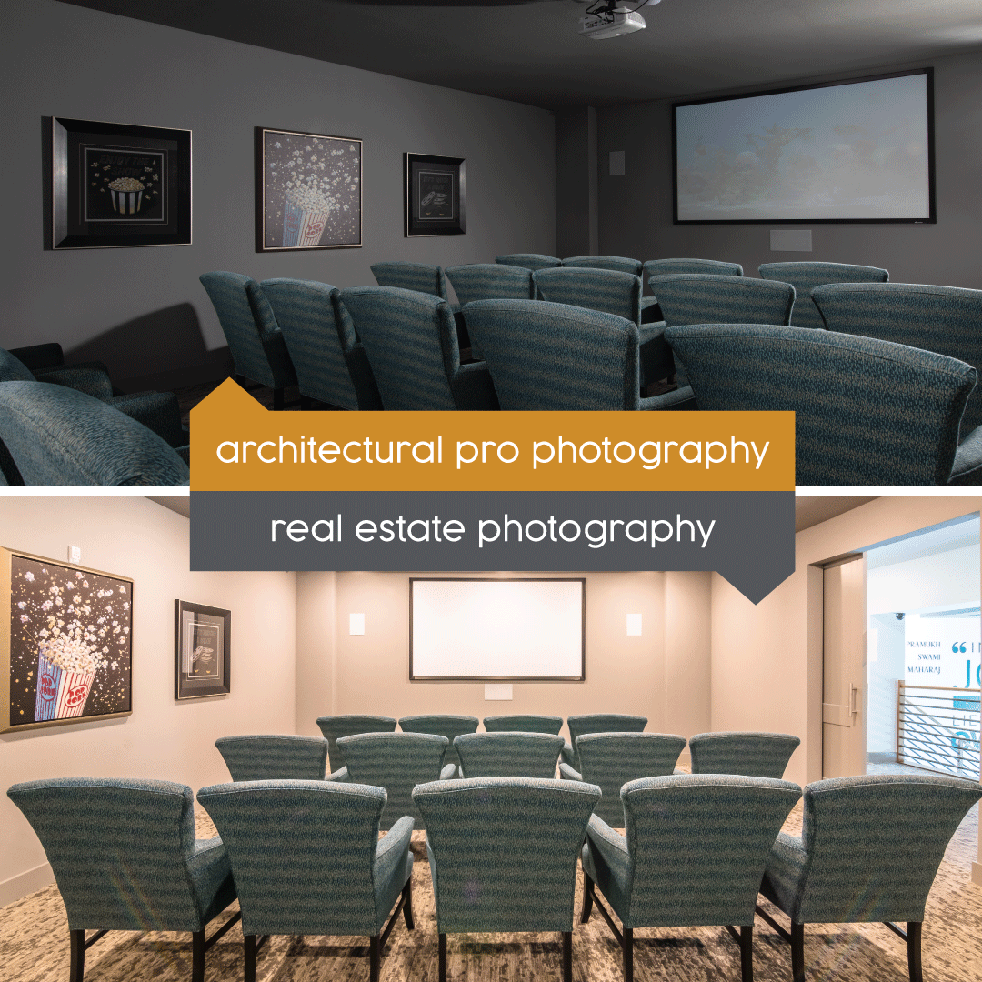
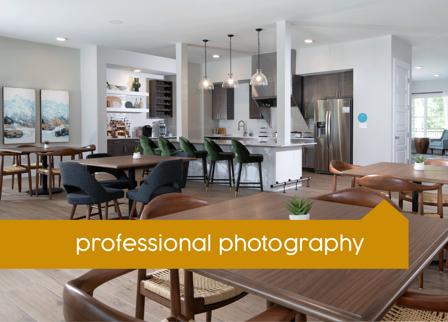
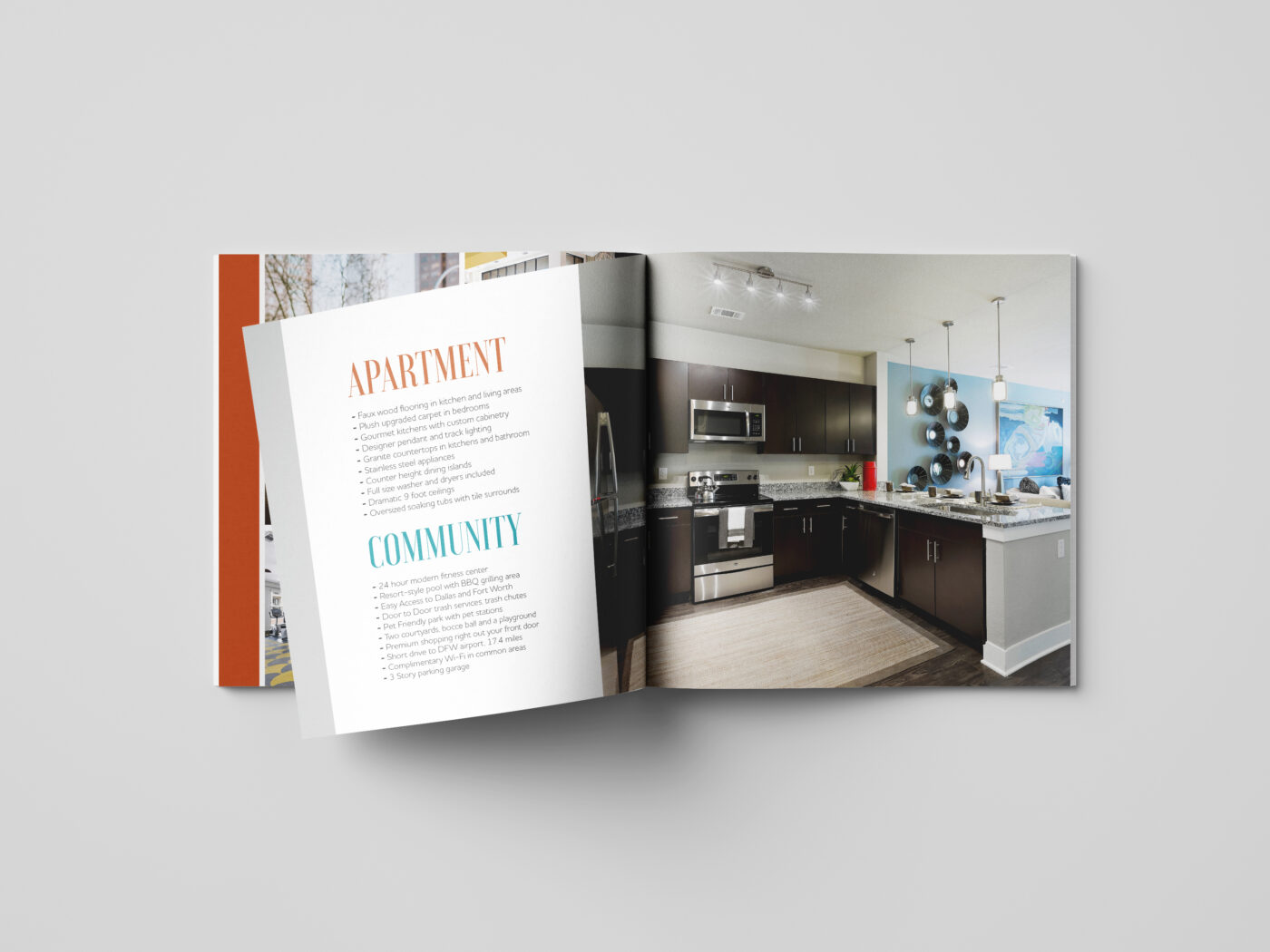
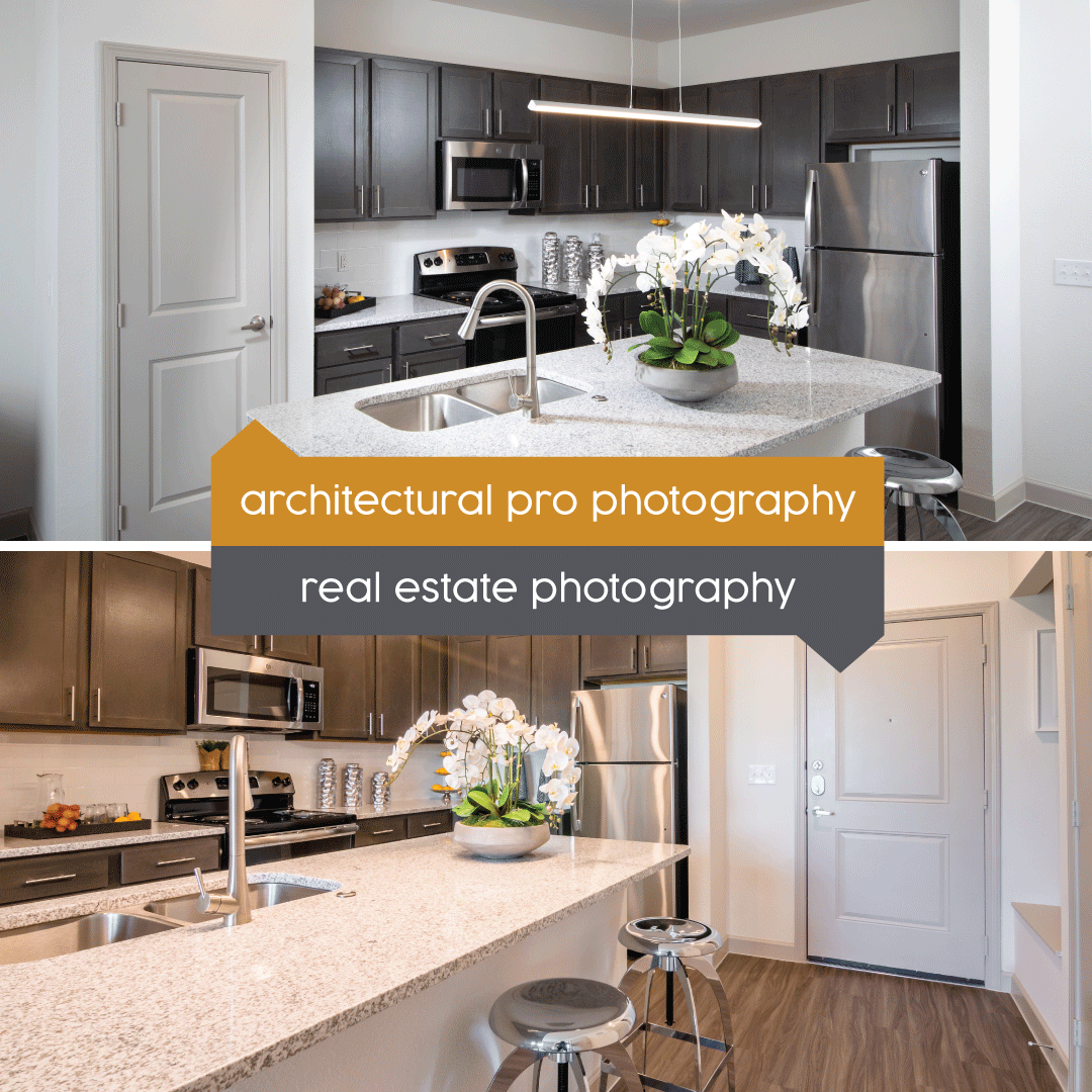
Most of all, use your messaging to create a picture for your leads. Beautiful photos help, too. (Show before telling.)

EMPLOY SOCIAL PROOF

Don’t just take our word for it. You’ll need to include other voices in your marketing, too.

Testimonials – Get a few residents that you know love your community. Have them share their favorite parts about the community. You’ll see amenities make the list here, and that will help leads latch on to what’s important for them, too.

Reviews – One-star and two-star reviews are a scary thing for any business—keep an eye on your review sites and see what kind of five-star reviews you can garner and share on your printed materials as well as on your website. When leads are concerned about finding “the truth” this is where they’re going to look.

Social Media – When everyone else goes “fake” you can go real. Give a few behind-the-scenes glimpses, and put some of your staff on camera to help answer FAQs. Repost photos and videos you’re tagged in. Participate and respond to connect with leads and current residents, and to give a better “concierge style” that extends beyond the front desk or leasing office.
CREATE A TRUE LIFESTYLE BRAND

Going for an “It’s super nice and you should live here!” vibe? Figure out how your brand would say it. In its brand voice. To its ideal residents. Creating a lifestyle brand apartment community can extend out to how you look and how you talk about yourself.

Community Sitemaps: The Most Beautiful and Compatible Solution

Are community sitemaps glamorous? They certainly can be. A well-designed property sitemap is a beautiful and useful tool for your multifamily community. At Zipcode Creative, we’ve mastered the art of community sitemaps, knowing they’re key for communities to secure leases and show their professional side.

Why Our Community Sitemaps Are the Best

Not all community sitemaps are created equal. Some are basic and can lead prospects on an unintentional scavenger hunt. (Where is that dog park?) Others are clear, colorful, beautiful, and can be used in partnership with other helpful options, like interactive web-based solutions. Let’s dig into why choosing Zipcode Creative for your community sitemap might be the best choice you make for marketing your units.
BEAUTIFUL

There’s something about a well-drawn, beautifully colored sitemap that makes us feel at ease. A map that’s well labeled, correct, and attractive draws the eye, and will likely draw in your prospects, no matter where you put it, from the leasing office to the welcome packet. What’s our secret sauce? We’re a team of designers—so we know how to choose colors that work, icons that are clear, and fonts that are just right.

COMPATIBLE

Our 2D sitemaps are best printed as handouts or signage. They aren’t an interactive web solution, BUT they ARE compatible with providers who do create interactive sitemaps. For example, Engrain or Beans.ai can take our vector-based design files and pull out exactly what they need to work their magic in making the sitemap interactive. These interactive sitemaps can work wonders on your property website or on a tablet or touchscreen in your leasing office.

USEFUL

We’ve talked about how useful sitemaps are, right? The best way to help both your prospect and your new residents feel at ease is to give them the literal lay of the land—through a sitemap. By providing a comprehensive view of the way the property is laid out, they’re more likely to explore everything that’s available to them. (Not just a pretty picture anymore, is it?)

How Sitemaps Are Helpful for Leasing

Your prospect is about to sign a lease. They pause, pen on the line, and look at the sitemap. They see where their apartment is. They see how close the pool is. They see the clubhouse and the tennis courts. They scribble their signature and voila, you have a new resident.

FOR PROSPECTS AND NEW RESIDENTS

For both prospects and new residents community sitemaps help them understand the property layout at a glance and give an overview of the property. Things like how many units there are, how far away the dumpsters are, or where their parking spot is are all revealed with a sitemap. Have it on hand for lease signings to help close the deal, too.

TOUR ASSISTANT

As self-guided tours continue and in-person tours resume, a sitemap helps guide the touring prospect to the available unit. For both guided and independent tours, knowing where they are in relation to the clubhouse helps them focus on other important bits, like how often one can expect resident events. The sitemap should point out the leasing office, and other relevant areas (the BBQ area, the basketball court, the garages, the dog park, the pool)—any area amenity that might have drawn them to your community should be listed and identified.

A sitemap creates a sense of welcome for your new resident—when you provide a printed version, you can circle their unit, their parking spot, and how best to get to the leasing office or clubhouse from their door. It’s similar to arriving at a resort—the front desk always gives you the lowdown on where things are and when they’re available.

Community Sitemaps: The Perfect Marketing Tool

Sealing the deal, yes—but also getting them in the door to begin with? An excellent use of a sitemap.

SHOW THEM THE STUFF

Sitemaps are an ideal visual representation of your multifamily community. With the easel set up, community sitemap on display, you can show visually which units are leased or reserved—this is perfect for pre-leasing (set up a little supply-demand) a new construction. Use the sitemap in your:

  • On a 2’x3’ sign 
  • In your welcome packet
  • Brochures or handouts

Use it on your website, too. That’s where prospects are going to find out more. Everytime you put the sitemap out, you’re showcasing everything (external) that’s good about your space: Green areas, trees, community amenities, ample parking, and accessibility.

By helping visualize the overall appeal of the property, you can generate interest from prospects. Get their attention and increase the number of inquiries that you may get from potential residents.

Zipcode Creative Sitemap Options

We at Zipcode Creative offer two distinct property sitemap options. Both in full color, they differ in where the details are drawn from; one’s high-end and one is more basic. They are both beautiful—but we’ll let you see that for yourself.

COMMUNITY SITEMAP (GOOGLE MAPS)

Our (satellite view) Google Maps-based property map showcases building units, the clubhouse, your interior and outdoor amenities, parking, landscaping and more.

Community Sitemaps Simple

COMMUNITY SITEMAP (ARCHITECTURAL)

This one is based on your architectural plans or blueprints. It showcases building units, the clubhouse, your interior and outdoor amenities, parking, landscaping, and more. If we can, we’ll include the interior layout of the clubhouse, too.

Multipurpose A4 format minimalist flat lay Mockup

Is Zipcode Creative “The Sitemap Agency”?

Well, yes and no. You might be tempted to start thinking of us as the “sitemap people” but that’s far from everything we do. We’re capable of so much more. Why do so many people come to us for sitemaps? It’s our designer eye. It translates into technical maps just as well as logos and social media graphics.

But sitemaps are the least of what we do. We’re realllllllly into branding. If your apartment community isn’t a brand, we are here for you.

BRANDING IS OUR MAIN JAM

The branding work we do begins and ends with multifamily. It’s our jam.
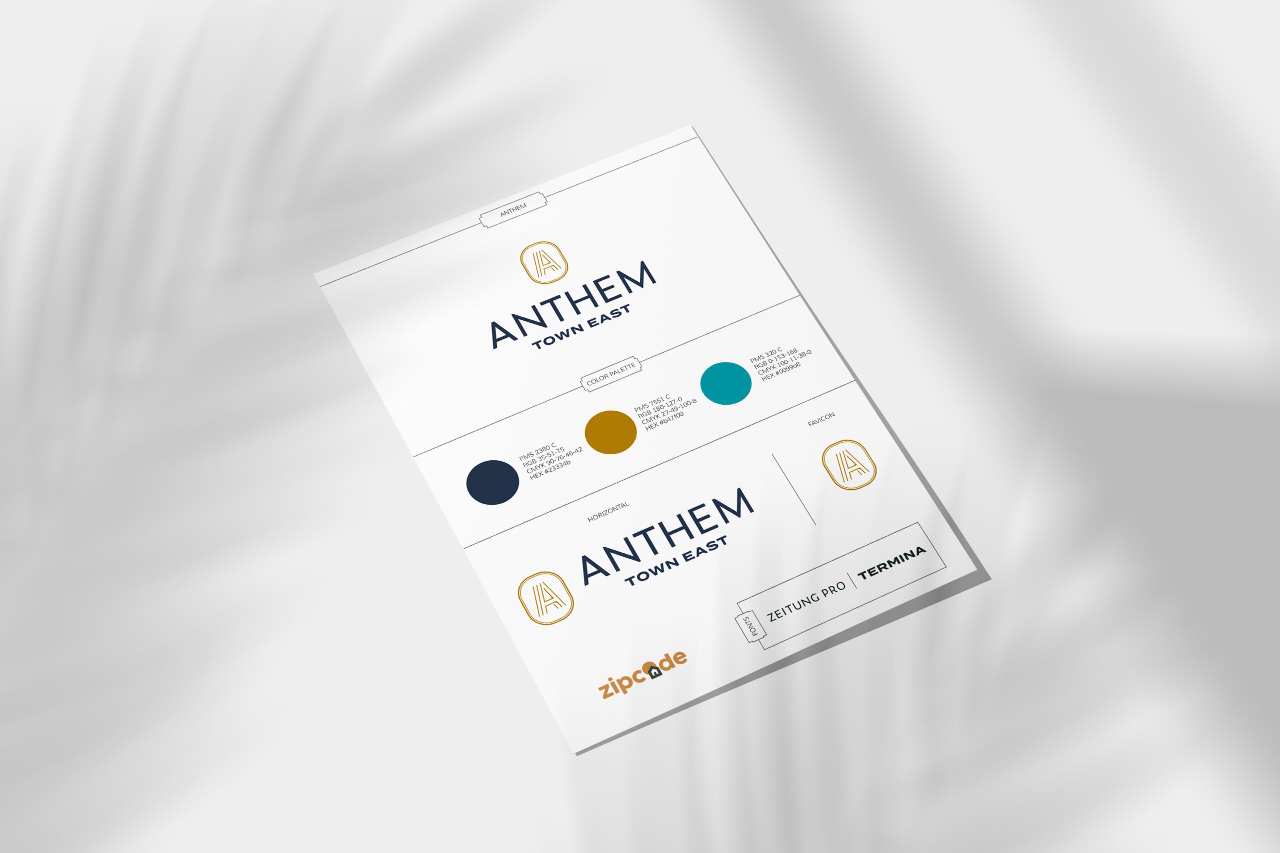
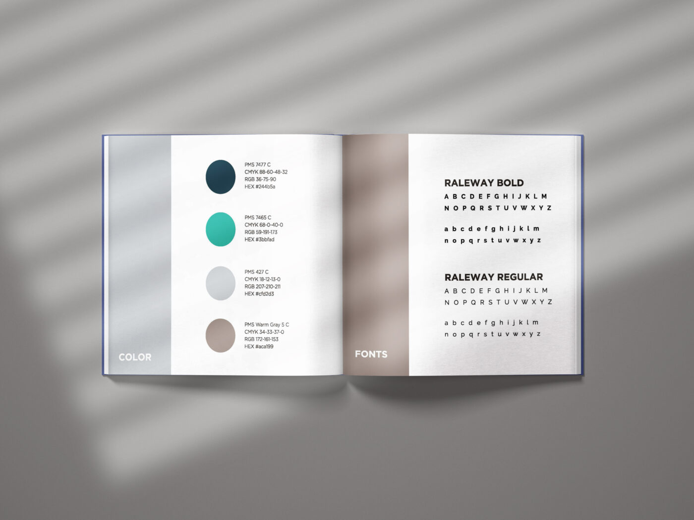
Naming apartments? Absolutely. Coming up with brand identity statements? Of course. Crafting color palettes, fonts, and logos that signify all that is Your Brand? Our favorite. We love to take apartments and help guide them into becoming a full-on lifestyle brand. Let’s get busy creating. 

And if you need a sitemap in the mix, we’ll do that too.

Ways You’re Breaking the Graphic Designer’s Heart

Every time you open a word doc to create a design, a graphic designer knows and sighs. Unbreak every graphic designer’s heart by knowing the rules, best practices, and really, the greatest guidance for your multifamily designs.

With graphic design, it’s easy to make “mistakes”—but the worst part of making those mistakes is that a whole lot of other people are going to see those mistakes as well, when you put them on your flyers, your mailers, your postcards, and your banners. (Let’s hope they don’t end up on a billboard.)

Here are the mistakes we most commonly see. Don’t get down if you’re doing these, but…definitely commit to either fixing them or finding a graphic designer who already knows how to avoid these mistakes.

Image-Choice

#1: Poor Image Choice

Whether stretched, squished, or cropped improperly, forcing a photo to fit in a space it can’t is bound to look strange. It looks unprofessional and will turn off the viewer pretty quickly.

DISTORTION/STRETCHED IMAGES

Stretching the image because you don’t know how to crop? Start learning! Often an email builder requires a specific image dimension. Stretching an image to fit is never a good look.

Do this instead: Crop or use clipping masks to help it fit into a space or shape. No distortion, no problem. Be sure to follow the rule of thirds as you crop, too.

BAD STOCK PHOTOS

This one isn’t hard to fix. But it’s sometimes hard to avoid if you’re not experienced with the wide set of options for stock. There are so many better stock photo options now. Avoid becoming a meme-worthy brand—avoid the stock photos that look like stills of the “Before” videos in infomercials..the woman opening a cabinet full of tupperware lids, the man cutting his hand on a can lid, the elderly lady getting tangled in a blanket. 

Do this instead: Find better stock photos by paying for them and finding ones that look like natural people—i.e. not a white backdrop in front of an overly emotive person. Out with the ‘cheese’, in with the authenticity.

Typefaces

#2: Too Many Typefaces

Repeat after us: The typefaces you use should be no more than three in number, and should visually complement each other when used in the same design. Again, no more than three types of font.

Your content goes here. Edit or remove this text inline or in the module Content settings. You can also style every aspect of this content in the module Design settings and even apply custom CSS to this text in the module Advanced settings.

FONT PSYCHOLOGY

This one is so complicated, we did a whole blog post on font psychology. There’s plenty to consider when choosing a font. Serif, sans serif, script, decorative. And choosing one that will align with your brand (and what you want to communicate) is vital. When you have more than three fonts, it may make the viewer feel a little ill at ease.

Do this instead: Choose three fonts max. One of our favorite tips is to use one font and choose a few different weights (thin, semi-bold, extra bold, and the like). And pay attention to how you’re using the fonts—with a proper hierarchy of headline, sub-heads, and body text.

Color-Contrast

#3: Bad Colors

Certain color combinations remind us of specific types of things. Red and yellow? Fast food and hotdogs. Green and yellow? Cheeseheads.

Colors impact what we feel, pretty easily. Did you know, for example, that red is associated with strong, passionate feelings—cupid’s hearts (or depictions of the devil) anyone? Color psychology is very real and should definitely be a factor when you’re creating any of your graphic designs. And make sure they fall within or work well with your community brand’s color palette.

BAD CONTRAST

Beyond color choice, the contrast must also be considered. The text on the background must be readable—it can’t be dark if the background is dark, and it can’t be too similar to the color in the background.

TOO BRIGHT/JARRING

Think neon’s fun? Make sure you’re using something to offset it. If you use too many different colors (kind of like using too many fonts) it will cause visual chaos.

Do this instead: Take some time to understand the color wheel and make smart color pairing choices, ensuring that you keep the variety to a minimum and include varying shades of light to dark to accomplish your goals.

#4: Busy Busy Busy

Speaking of visual chaos, you also have to determine which elements you’re going to use and which ones should be the most important. You must create a visual hierarchy in order to broadcast the message you need to.

NEGATIVE SPACE

Leave a little room for imagination. This can help you give the viewer a sense of relief—there’s room to breathe. Negative space also makes the important things stand out more. Similar to the idea of contrast, the empty space highlights the things that are there.

WORDS VS. IMAGES

Use both words and images, allowing images to speak plenty, and keeping the text to the minimum of what’s required to tell your message.

Do this instead: If you’re creating a piece with both typography and imagery, the images should take precedence. As they say, they’re worth a thousand words. Much more space-efficient, right?

#5: Wrong Again

Designing in a bubble? Pop the bubble and make sure someone else sees it before it goes to print to prevent any easily edited mistakes to be fixed

THAT’S JUST WRONG

You forgot to proofread? Oh, no. Now your whole design is for nothing. When folks find a typo, that’s all they can think about. Make sure you have a second and third set of eyes on it. Sometimes it’s not even that a word is misspelled or misused, but rather that a letter has a design effect on it that has made it appear like something else. Get a second opinion, always.

TRENDS OR TIE IT ALL TOGETHER?

Trendy is fun. Not necessarily timeless. However: all designs must work with the brand identity. (If you don’t have a brand identity, be sure to get one!) If you have a trend that could work with your brand identity and it’s not super distracting, by all means—catch the ideal resident’s eye!

Brightly colored minimalism is fun, and asymmetrical layouts are intriguing. There’s certainly a right way and wrong way to use these—use your designs to tie everything together.

Do this instead: Working through your visual identity and ensuring it all aligns will be best for your visual identity’s longevity. Find your style, and do your best to stick with it.

Bottom line here is, if you’re DIY-ing your designs, any mistakes you’ve made…you did it to yourself. 

Let us save you from poor design choices by guiding you in the right direction; we’ve been doing it long enough to spot mistakes a mile away! 

Contact Zipcode Creative for graphic design without breaking anyone’s heart.

Resident Appreciation Month is Here and it’s Marketing

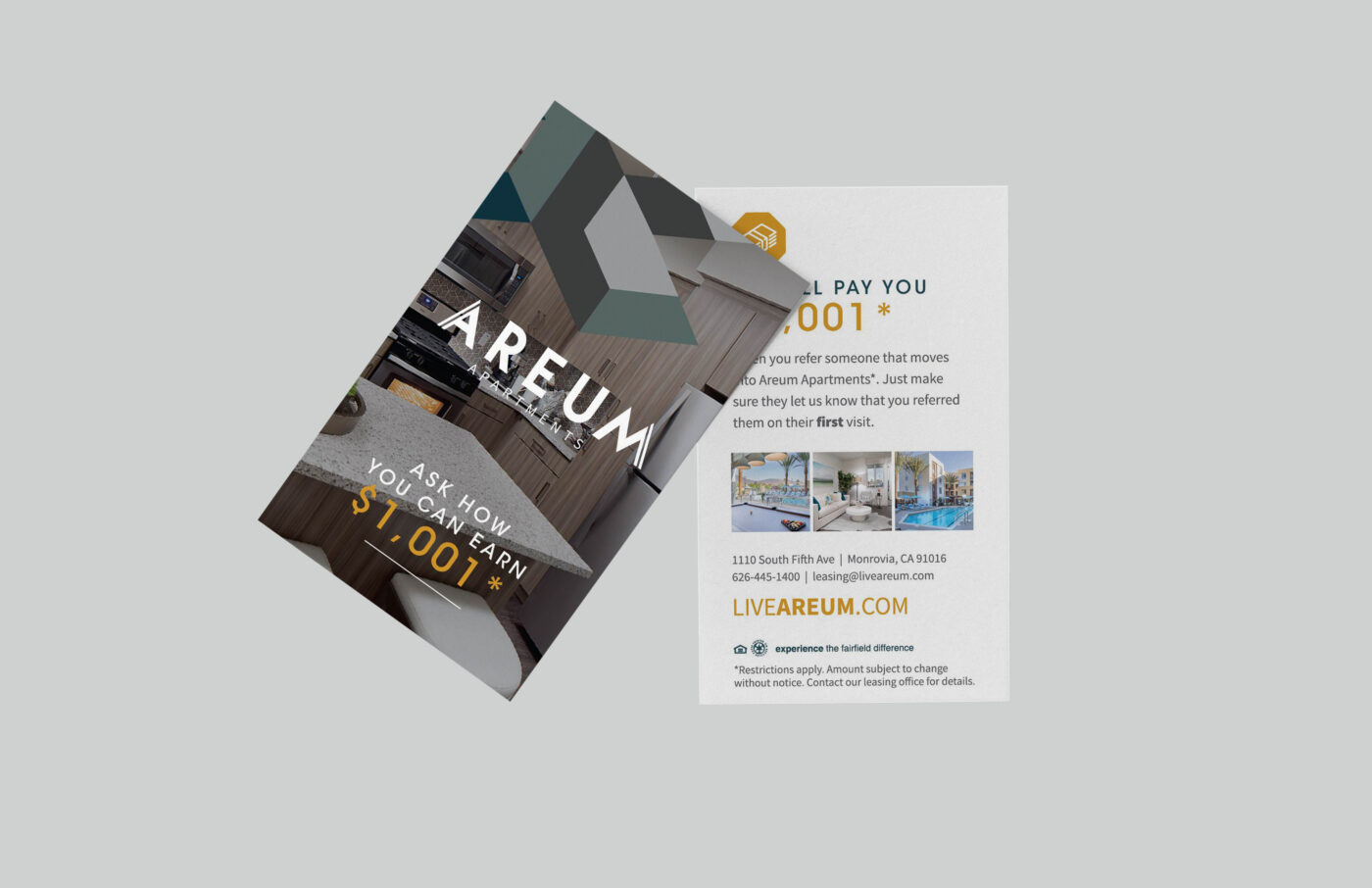
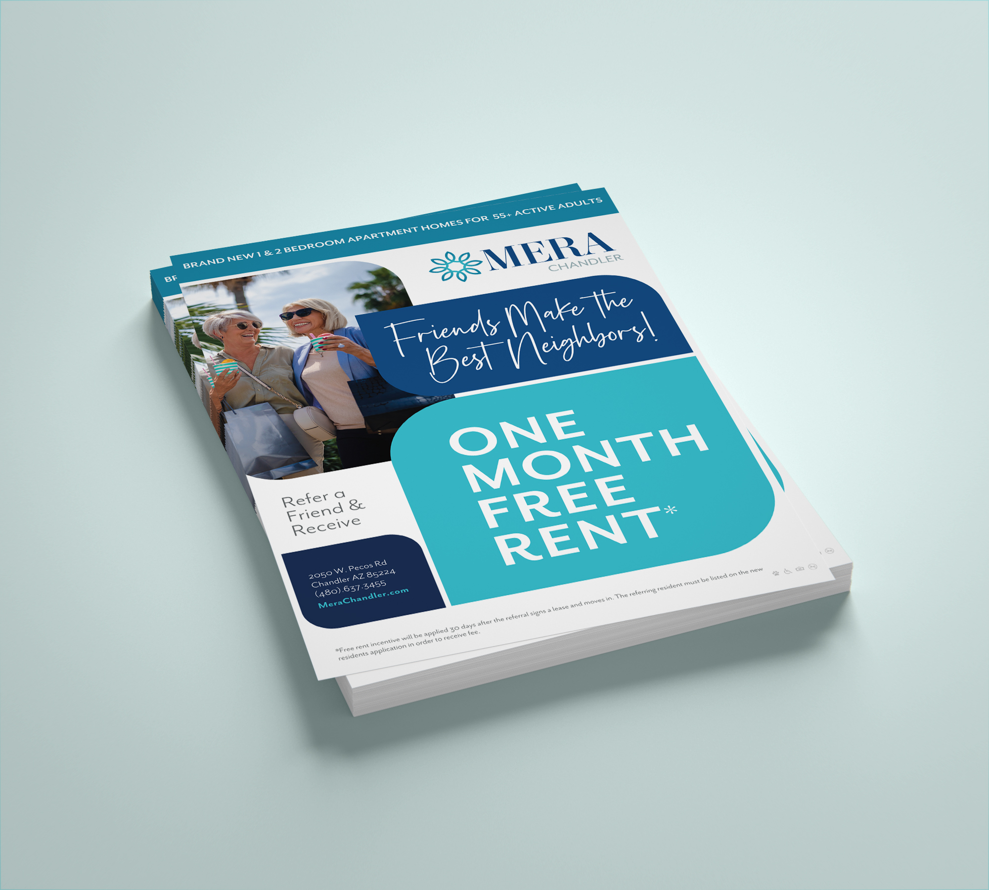
February is Resident Appreciation Month! Fewer people are buying homes, so while staying in a community is the path of least resistance—it should be more than that. Residents renewing their lease should be filled with comfort! Multifamily communities everywhere should be preparing for this (and have some portion of their budget to dedicate to it, as well.) 

The truth? Without your residents, you’d be an empty building—so it’s time to bolster your resident experience and boost your resident referral program. And give a few gifts while you’re at it! Have fun with it and make this a month to remember, and set the tone for the way you appreciate residents the rest of the year.

The Rationale Behind Resident Appreciation

You might be thinking: They live here, we fix what needs fixing, we have an easy-to-use online portal—why do we have to do more for them? Remember—your resident appreciation costs are marketing expenses! This is because it’s all part of your big genius marketing ploy to retain residents and attract new ones. Still want some ideas? We got you:

REMIND YOUR RESIDENTS

This is home for your residents—not just a unit! You were the community of choice for some reason or another. The hope is that your multifamily brand attracted them and your customer service (rooted in your brand’s mission and vision) kept them there. This is an opportunity to help them remember why they chose to live at your community, and you can sweeten their “remembering” when it comes time to renew the lease.

You can also remind your resident of you who are at your core. Your brand is gentle, eco-conscious, and modern? That zero-waste-experimenting resident will appreciate being reminded that your “Fix It Group” is gathering in the clubhouse later that week.

How to Show Your Residents Appreciation

GIVE A GIFT

This doesn’t have to be something exorbitant. But thoughtfulness is great. You can communicate appreciation for your residents through gifts. Get creative, but try to give them something they would want. From a gift card to a local coffee shop to a little treat, here are some simple and effective ideas:

#1 Locals Only – Gift Card to Local Spot

A gift card to the coffee shop around the corner? Perfect. It helps you nurture your neighborhood relationships, and spotlights the best things in your community.

#2 Sweet Things – Grab-and-go Goodies
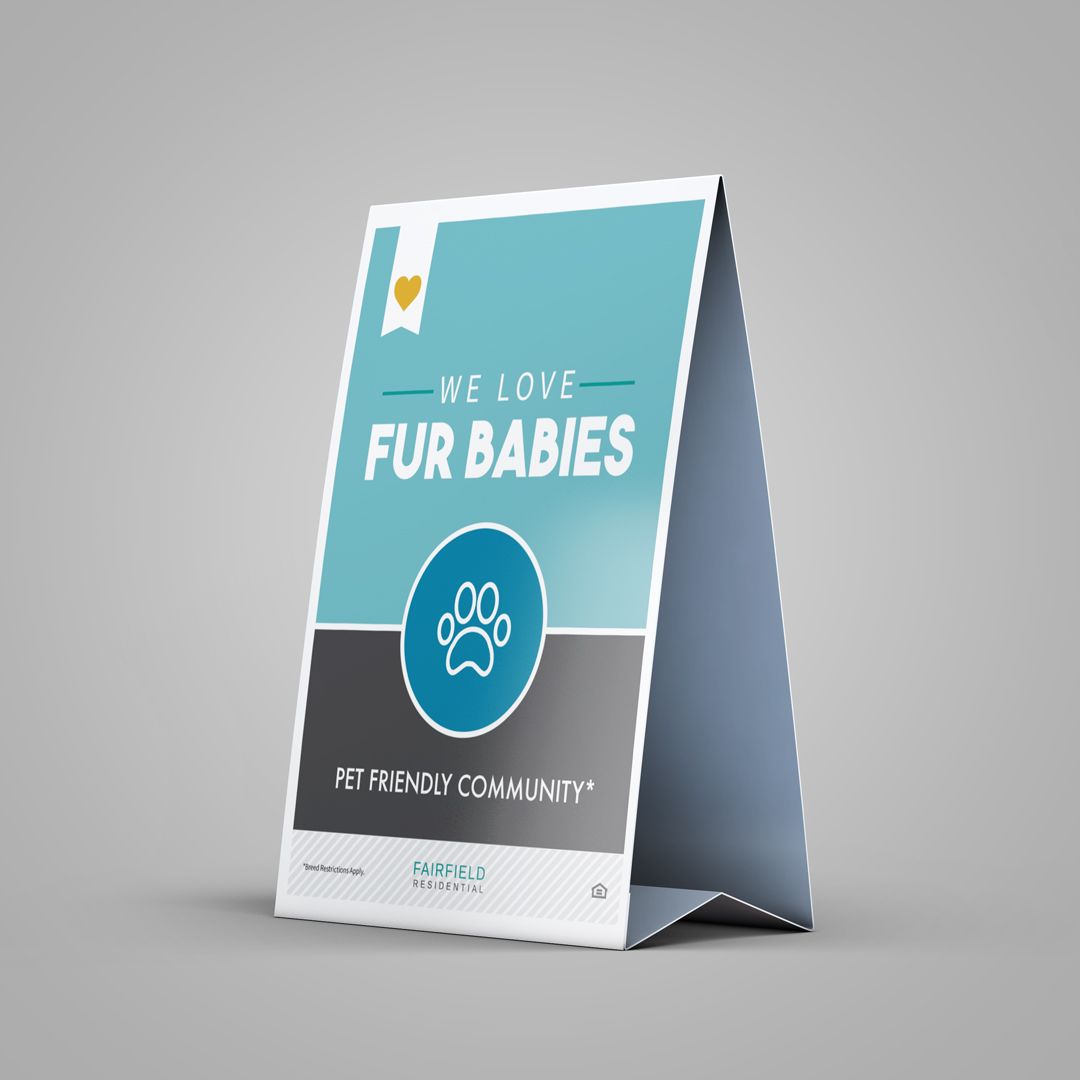
Valentine’s Day is also in February, so put out a self-serve candy bar with cute bags in the lobby. Brand the bag with your logo, and add a note that says, “Having You Here Sure is Sweet!”

#3 Taking Care of Business – Small Plant
And taking care of a small succulent or little plant in a pot is an adorable way to add life to an apartment for your residents, and remind them that you hope they’ll thrive in your community, too.

Resident-Appreciation-Month-Referral-Flyer

BETTER EXPERIENCES = BETTER RENEWAL RATES

It’s not a like-for-like comparison, but wouldn’t you rather do business with a brand that is well-known for its responsiveness and outstanding customer service? Taking your residents into account when you make updates and launch initiatives is going to create a kind of “gift that keeps on giving”. Consider a few value adds:

  • Streamlining a maintenance system, creating an option that’s less intrusive
  • Retrofitting the apartments for energy efficiency (great for eco-conscious and budget-conscious residents alike)
  • Upgrading to smart home tech with doorbell cameras and touchless key entry systems
  • Adding or upgrading the dog park (if Fido’s happy, everyone’s happy)

 Everything we listed above can and likely will be added to the “Pros” side of the pro-con list they may be making when deciding to renew! Tilt it in your favor.


1: You have a resident referral program and it’s working well.
Nice! Keep it up. And remind your residents what they can get from you when they refer a friend successfully.

2: You have a resident referral program and it’s not really working.

Time to revamp. Offer something a little better and market the rewards with branded materials. Include plugs for the program in your emails to residents, and in flyers for welcome packets.

3: You don’t have a resident referral program.
This is a perfect opportunity for you. Hone your brand message and try kicking off the referral program with an event. “Bring a Friend for a Barbecue!” or “Happier Hour With Friends.” (The trick is to plan an event that residents and their friends would want to attend.)

When you have events or advertise your program, ensure there’s enough reason to support the resident’s referral (they must love it there and/or the reward must be great!) and there must be reason enough for the referred friend to want to live there, too. Referral programs aren’t one-size-fits-all, but you can check our blog for more detailed ideas behind expanding your word-of-mouth.

Resident Appreciation Recipes for Success

Equal parts brand consistency and clarity will get you to the next level with your resident appreciation. This means that everything—giveaways, events, and reward flyers must be branded and tell the same story lof how your community has solved the problems of its residents and it will continue to do so. And when your research leads you to a specific IRP you can get that much more specific with your branding and your messaging.

Need extra help? Reach out to Zipcode Creative—we appreciate your residents, too. 

Apartment Brand Design—Behind the Scenes

Apartment brand design is a perfect combination of creative magic and being meticulous. From research to concepts to construction, your careful apartment brand design will help your company inspire while it innovates. And, with any luck, you’ll have fun doing it.

Bring function, creativity and artistry to your apartment community through the precise steps of brand conceptualization.

In one creative call, we listened to our client tell the history of the company’s late founder—his family’s background, his passions, his sayings. As we asked more questions, each of these details that we helped draw out created a well of inspiration. Of course, before we landed on a name that referenced the founder’s family ties, which makes for great storytelling, we had to ensure the rest of the brand could keep up. We’ll show behind-the-scenes of every step, so you can see what this looks like in a real-life brand.

Research & Discovery

LET THE IRP INFORM IT

Without research, you’re walking blind. Without discovery, you’re taking chances. Do the work not just behind the scenes—but even deeper. Find out who you want to attract by determining your IRP, your ideal resident profile. When you can identify who you want to reach, and get to know “who” they really are, you can tailor your brand to attract and retain them!

What does this research look like? Look at geographics, demographics, psychographics, and behavior.

CREATE BRAND VOICE CONCEPT

How are you speaking to your IRP, and how do you engage with them? The research you did to find their psychographics and demographics will help you choose properly here, too. What problem is your apartment community solving? Why do you exist? What are your mission, vision, and values statements?

When you create your brand voice, you also get to pick out the brand personality to help flesh out your brand, making everything about your brand easier to explain. Styles, habits, goals, priorities, and values all come to light with the mission and the personality outlined.

1-Brand-Voice

Logo Concepts

Collaborating on apartment brand design is a careful dance. Working with client preferences and using our expertise, we came up with a variety of logos for their team to review. (We’ll get to the corresponding color palettes, lifestyle stock photography, and textures/patterns in a second.) We always have our favorite apartment brand logo design—but we know we won’t make the final decision!

2-Logo-Concept-1

This concept had a solid, signet ring appeal to it. Classy and classic.

2-Logo-Concept-2

This logo concept offered a softer touch, with a breezier angle.

2-Logo-Concept-3

This concept felt a bit like “conventional, with a twist.” It’s fun to color inside the lines for a time, go a little wild and come back to order. A touch of fun.

2-Logo-Concept-4

Situated in the city of Wheaton, the logomark called out the location while keeping the typography modern and stately.

2-Logo-Concept-5

This one says “expect much more from your apartments—and we’ll be ready.” Serious and stylish.

2-Logo-Concept-6

Light, simple, easy, and beautiful. A sans serif with sweet curves attracts those looking for ease of living.

Each of these logo concepts, paired with brand visuals and brand style concepts is created with a slightly different vibe.

This approach offers so much more than only a logo could. A logo cannot bring out a full color palette. A logo cannot give insight into the lifestyle that your apartment brand (and its) design offers.

Brand Visuals and Brand Style Concepts

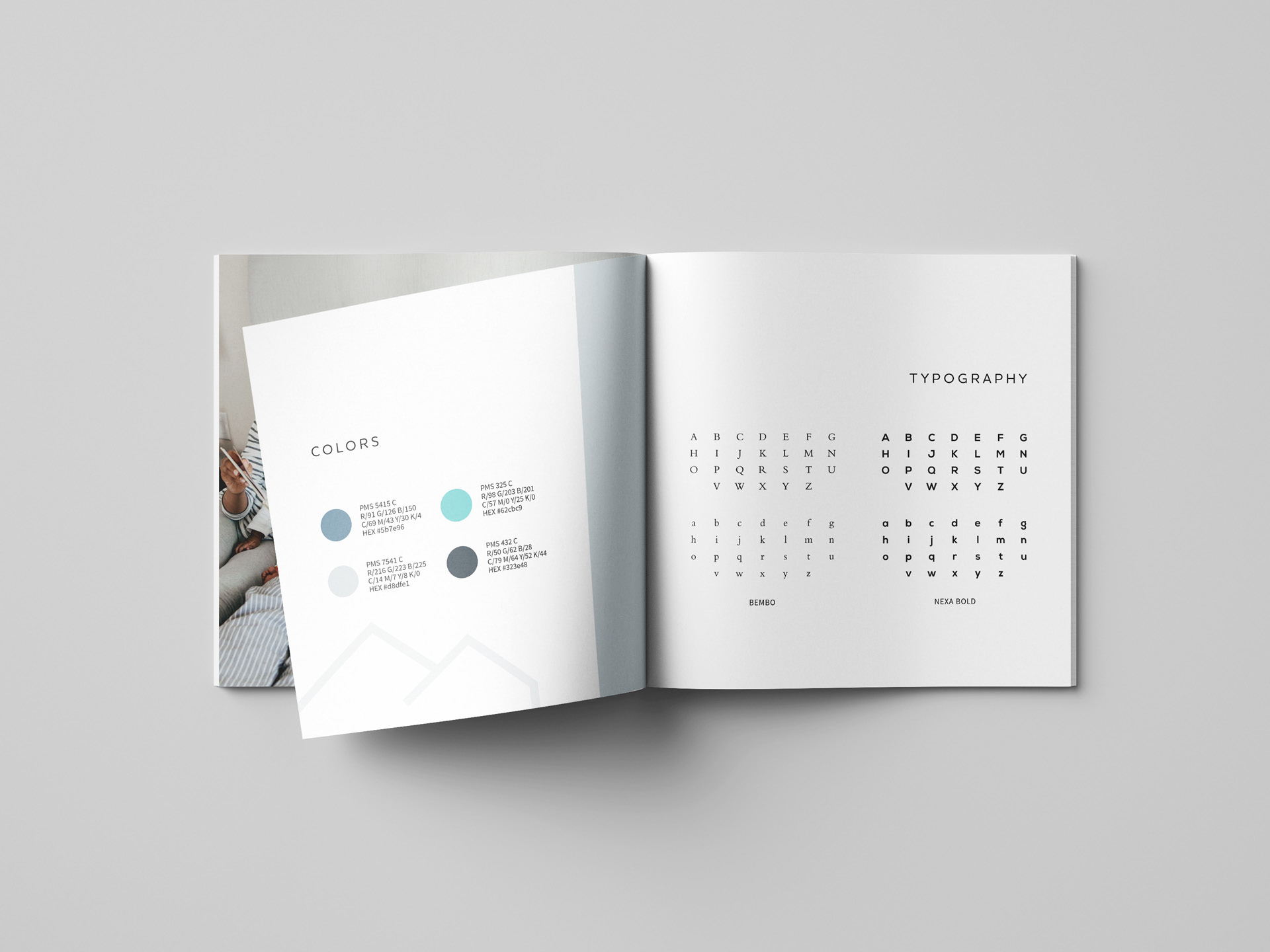
Visually, brands have to make an impression. To accompany the logo concepts, our team put together beautiful stock photography, corresponding color palettes, and textures and patterns that work with the possible architecture, interior design, and typography details. Each concept works with the interior design—so the color palettes are a little bit similar. Additionally, every concept is created with the IRP in mind.

Each of the brand visual concepts that we created for the team at The Faywell was made to attract working professionals with discerning taste. With patterns and with photography, we further focused the vibe, whether eco-friendly, street chic, or totally hygge-homebody. See for yourself:

THE BRAND STYLE VIBES BREAKDOWN

3-Style-Concept-1

Concept 1

The leaves and the bicycle and the natural sage green featured in this concept tell the viewer: Embracing the calm of nature is still possible in the suburbs of Chicago.


IRP factor: Our IRP desired the calm of outer city limits while still staying stylish. 

3-Style-Concept-2

Concept 2

The rich tones of this brand style concept are focused on enjoying friends, going for scenic drives, and sinking into velvet sofas. The repeating pattern of subtle, soft, geometric leaves feels equally mesmerizing and soothing.

IRP factor: Suburbs for city dwellers can feel like social isolation—turning the focus to gathering and experiencing nature reframed the idea of getting out of town.

3-Style-Concept-3

Concept 3

Nothing to see here but cozy, creature comforts. With soft neutral tones, this warm concept is welcoming, cushy, and appealing in a Danish sort of way (pastry or country, you decide).

IRP factor: Our IRP is likely a city commuter. Home should be a haven for them.

3-Style-Concept-4

Concept 4

Welcoming city-smart commuters and appreciators of strong, sturdy patterns and structure, this concept is as sleek as it is sweet. Muted earthy tones along with shiny steel train cars offer a perfect balance between city and home.

IRP factor: Predictability should come standard for the resident who needs the train to run on time and wants an unfussy home, so we kept things strong and clean.

3-Style-Concept-5

Concept 5

Totally classic like a Fender hollow body electric guitar. White linens, wood walls, tailored pants all go together to create a scene that’s ideal for the keep-it-cool crowd.

IRP factor: Just because the IRP isn’t living in the city doesn’t mean they’ve lost all their street smarts. Creating a luxuriously beautiful.

3-Style-Concept-6

Concept 6

An easy going, enjoy-every-day vibe is happening here. Planning out your day with podcasts and enjoying a small glass of wine with your new pageturner, simple joys are the foundation in this take on The Faywell.

IRP factor: The hustle and bustle of the city isn’t for everyone, but having a predictable, reliable, and comfortable home is for this IRP.

Conversations Around Concepts

COLLABORATE AND CONVERSATE

After we presented each brand concept with the team at The Faywell, there were plenty more conversations to be had. Using the concepts, visual or verbal learners among the stakeholders (VP, marketing director, or owner) could easily process each concept and collaborate in conversation with us, the creative agency.

After you speak with the stakeholders, you can unite behind a singular concept when you determine which one will speak to your target resident while you represent your company (and its vision) clearly. The name, the logo, the photos, the color palette, the typography, it must all work harmoniously to give your prospects the most idealized version of your brand and your company’s priorities for their future residents.

THE POINT OF APARTMENT BRAND DESIGN CONCEPTS

Everything you’re investing time into now is meant to be a shortcut for you in your marketing, and to help you become a fully fledged apartment brand. When you start with the idea behind the vibe, the trajectory of the brand you’re building is a lot less bumpy. Branding involves a lot. Put in the work now to create a solid brand today and in the future.

We look forward to seeing how The Faywell continues in their brand journey.

Naming Apartments for SEO and Intrigue

Naming apartments is a tricky game—and creating it to be one-of-a-kind is the NAME of the game, pun completely intended.

What Can an Apartment Name Do?

The purpose of a name? It’s shorthand for who your brand is. It gives a snippet of an idea. A name is the first thing that can grab attention (if it’s a good one), keep attention, and if it’s interesting enough, it can allow the prospect to ponder its meaning a little bit.

Your apartment name can tell a story, evoke a feeling, and emphasize your branding—when you follow our guidance.

TELL A STORY

Names that make for the most fun in the process are the ones with a story. If there isn’t one, we create it within the brand guidelines. Have you ever met someone with such a unique name that you wanted to say, “Wow, that’s cool! Can you tell me more about your name?” There’s typically something even more interesting than the name—and it’s the story behind it.

EVOKE A FEELING

The vibe of your community—whether for retirees or for young professionals—will be bolstered by a solid name. There are certain sounds, colors, words that create ideas and stir up emotions within us. The emotions that come to the surface should be positive. Positive and fun. Positive and elegant. Positive and avant-garde. Positive and peaceful. How you name it helps bring your reader/prospect/resident to that frame of mind.

EMPHASIZE BRANDING

The vibe of your community again can be paired up with your branding through your apartment name. The name is the starting point, and then the brand is built up around that. It’s likely that you’ve already had the ideas of the design, style, audience and more, but the name is the first piece of the verbal branding. This aspect is foundational, setting off the rest of the branding: your logo, your style, your voice, so it can be seen and appreciated in its ideal form.

Why One-of-a-Kind Names for Apartments?

Naming your apartment buildings is not a decision you can make easily and forget about. It will impact your brand perception, how prospects find you online (or don’t) and whether your brand will stand out among your competition. Be careful in your approach to naming apartments for both SEO and intrigue.

SEO

If you want to be found through search engines, consider how many other things, even beyond apartment communities, may be named the same. How much competition will you have? A lot? This is the time to get inventive, because it won’t always go the way it did in Field of Dreams (“If you build it, they will come.”)

Now, does it have to be a completely new word? Not necessarily. But for higher ranking in Google, it must be more creative and outside of the norm.

Please don’t call it Oakview or Oakhill or Oakridge or Oak Grove Apartments. It’s been done.

INTEREST

Look for something more interesting about the property to inspire its name. Perhaps the history of the area, the street names, important figures in the city’s community, or a particular vibe that you want to create with these apartments.

MEMORABILITY

If it’s top-of-mind status you want, you’ll have to go a little off the beaten path. Not too strange, and not too un-spell-able or un-pronounce-able, but something that’s creative. So instead of Oakhill Apartments, you could go for CenturyWood Place, for example.

Apartment Name Examples

Now that we gave you one example, you’re probably hoping for a few more. We got you. (Keep in mind that these are all made up and we aren’t picking on anyone with these examples, good or bad.)

BORING

That Oak Anything Apartments example falls into this boring category. Not imaginative. Sounds peaceful and completely…forgettable. Here are a few more apartment names that you can forget about completely after reading them:

31st St Apartments

Oak Glen
Shady Lane

Laurel Estates

We get it: There’s shade. You’re on a street. There’s trees. For the love, get more interesting!

UNIQUE

Take inspiration from the management’s founder. The history of the area. Or the style of the building. Don’t be too on the nose, like Brickhouse Lofts, but consider using a red color in the name, like Vermillion Views.

THE STRANGELY FAMILIAR

Today, there are plenty of made-up words that have become household names—even regular, daily verbs. Why? Because they’re memorable. Just Google it! 

Google was a re-spelling (which was more phonetically appealing) of googol, which just means the highest number in existence. This works great for the vast number of search results you can receive with a few keystrokes.

Etsy was a made up spelling after the founder closely watched (and listened to) a Fellini film. Having heard “et si” multiple times, he decided this combo of words that means “oh, yes” was the perfect term for his new website.

Zillow is a little more out there. This massive house listing giant has combined the idea of comfort and vast amounts of options (“zillions” and “pillows”—where you lay your head) would be the ideal name for a space to find your next property.


What to Consider When Naming Apartments

As we’ve seen above, some brand names are more thought out than others. It’s okay if it’s stumbled upon, but it’s stronger and more relatable if there’s a good story to go with it.

MEANING

Why is it called that name? If it’s chosen at random, that’s not going to initiate very good conversations. If you can come up with history, inspiration, or reasoning, that will go a lot farther in your branding guidelines than “it sounded cool”. However, we know that sometimes, that does lead to success. But it might be easier to have a goal to create a name based on some deeper meaning—it’s at least an easier starting place.

BRAINSTORMING PROCESS

At Zipcode Creative, when we’re thinking through naming apartments, we go for broke. We write down anything and everything that comes to mind, and then have a thesaurus handy. (You never know when you’ll come up with something that will spark interest and be super-original.)

While we’re going about the naming process, we consider things like:

  • Your ideal resident profile (IRP): what are they looking for? 
  • The type of apartment community it will be
  • The vibe of the surrounding area
  • The history of the town/city/area you’re in
  • The history of the building
  • The architecture style of the building
  • The names of the surrounding streets
  • The local flora and fauna

Take all of these into account, and we’re sure to find something that will strike a chord that will please the SEO gods and the future residents of your homes. We’ll also try out different sizes, lengths, and formats of the winsome ones to land on something worthy of your community. Most of all, we’ll aim for meaning and originality.

RESEARCH

However, before you get too deep into the weeds of apartment naming, make sure it’s actually viable. Look at your competitors. Consider your audience. Google the name and see what comes up. At Zipcode Creative, we have a few considerations (or tests, if you will) to find out whether the name could possibly work:

  • Business Name Search
  • Trademark Registry Search
  • Available URLs and social media handles
  • General Google search

Again, this is where due diligence and uniqueness will help you out. The hard work of building your apartment brand will be undercut by other brands if it’s not a standalone idea (or has too much competition).


Need help with your apartment naming? Reach out today.