Author: Stacey Feeney

Social Media Apartment Marketing—Three Ways

Social Media Apartment Marketing—Three Ways


It’s time to post on social media to market your apartment community. But you’re not feeling it. Here are three social media content pillars that you can go to every single time.

Before prospects tour, they’re probably checking out your social media accounts. Get it cleaned up and consistent (with your brand) with high-quality photos and interesting content.

1- Show the Property on Social

First step: Show off the property on social media. This is what they really, truly want to see. (There’s so much content here!) Keep it real and authentic, though!

TYPES OF PHOTOS

It’s likely you already have oodles of professional photography of your space. Use those photos. Put in creative captions. Using what you already have will help with quality control, and will give your followers a (beautiful) idea of the spaces.

Taking photos with your phone is also fine—make sure they’re in focus, clear, and well-lit.

Capture photos of the following to vary the textures, colors, and content in your posts:

  • Inside common spaces (the gym, the lounge, the leasing office)

  • Outside areas (barbecue area, pool)

  • Inside various apartments—you can get up close to beautiful countertops, drawer pulls, updated shower fixtures, pretty lighting, and plenty more that will show your attention to detail, and the modern selections or updates you’ve chosen for your residents)

  • The surrounding neighborhood hot spots

SHORT TOURS (SNEAK PEEKS)

It’s always fun to watch a quick video of something you’re interested in. With the average person now glued to their phones, video content is a great way to capture attention and keep it. Keep every video short and sweet, and consider making content only for one space at a time (the pool) or for one room at a time (the primary bathroom of a 2 bed, 2 bath apartment) for example. Quick tours can leave the prospect wanting more—and may help bring them in for a full tour soon enough.

Camera-shy? No problem. You don’t have to be filmed performing a junior high dance on camera. The trick here, again, is to be real and show the property off.

2 – Share the Culture on Social

An apartment community, with an emphasis on community, is an intriguing and appealing concept to prospects. Get them on site by showing off the culture of the community through your social media posts.

DAY IN THE LIFE

Show off what it’s like to live at This Place. Friendly neighbors? Fun events each week or month? Easy lease payments? Smooth maintenance requests and service? Tell it all! (All the good stuff, of course.) This could include a quick walk to a local coffee shop, or setting up a doggy play date at the dog park!

INSIDE EDITION


For easy content, do a quick Q&A and with some of your staff. This makes things personal and creates heartwarming content that helps prospects and residents connect with staff at the community that they may interact with.

TESTIFY

Having testimonials be part of the regular content rotation is a great idea. It’s like boosting a five-star review on your google page—only you can shorten it, tighten it and pick your favorites. When your prospects are scrolling, they’ll be able to see the best of the best from your happy residents. This can be particularly good or effective if you use an example from an efficiently resolved maintenance request.

WHAT’S HAPPENING

Show off your events, parties, and contests. There’s likely always something going on, so be sure to advertise it well. Use your logo and craft a clear caption. When the prospect heads to your profile to scroll, they’ll be able to see just how fun it could be to live there!

3 – Lean into Local on Social

Don’t be afraid to go “beyond your borders” and get out into your community’s neighborhood. There’s so much to do and see—right? Pick a few restaurants, shops, and parks to show off. If you can, rent a bike and ride around to make a fun reel on IG. By visiting these local places and showing them off on social media, you’ll also get a feel for what your favorite spots are. This makes your recommendations to new residents that much more authentic. For example, you could say, “Yes, this is my favorite groomer in the area!” and it would be accurate information (instead of just a Yelp-based answer.) Pretend you’re Rick Steves for a second, but be a tourist in your own town, hunting down the best cup of coffee and the perfect spot for a picnic.

Showing all these places and activities can give prospects a clearer understanding of the local vibe.

Final Social Media Apartment Marketing Tips

BE SEASONAL ABOUT IT

Don’t be afraid to decorate for fall. And post about it. (Everyone else is, so you’ll fit right in.) In summer, you can pot a tomato plant on your patio. In fall, you can create some fun soup recipes to share, perfect for anytime your residents have an autumn gathering. Quick reminder: Doing seasonal stuff sometimes makes us lose our heads and our focus on the brand. So…

DON’T FORGET YOUR BRAND

You thought we might get through this whole post without talking about Your Brand? No way. Make sure you’re still maintaining every bit of your brand guidelines with your posts. Colors, fonts, and brand voice in the captions will help associate you with your brand again and again. When you create a community brand as a lifestyle brand, it can drive signed leases because your prospects want to be a part of something that looks like THAT! Everything should stay aligned—beautiful social graphic templates are a great place to start for your regular content, like testimonials and “around town” type posts.

Whatever you do, have fun with it and that will come through in your posts.
Owners and Developers and Apartment Branding

Why Should Owners and Developers Be Involved in Apartment Branding?


Good business sense will help us let owners and developers in on a little secret: branding is a huge component of how your community is perceived. And if we know anything about reviews, testimonials, websites and logos, perception accounts for a whole lot of decision-making. The owner is the one with the hands on the pursestrings. This is their “baby” and they must have a say in the branding.

In short, it’s their company and it’s their money, so if the branding fails to impress, your community may not meet its goals in obtaining and retaining residents.

Why is branding important? Owners create a community with your blood, sweat, and tears. The branding is a prospect’s shortcut to how they’ll identify that hard work in building this branded community. But ultimately, the customer (prospective resident) will determine if it’s visit-worthy—based on the branding you put out there—and it will leave a lasting impression, good or bad.

Why’s Branding Important for Multifamily Owners and Developers?

The company behind the apartment building should be reflected in every bit of its branding. Represent your community well with branding that looks good and sounds good and makes residents feel good about where they live (or where prospects might live).

WHAT MAKES GOOD BRANDING?


Branding’s more than a logo. It creates recognition within your neighborhood, it builds trust and loyalty with your customers, and it creates a sense of community with your residents—particularly when you lean into location and understand the audience you’re trying to attract and the vibe you’re trying to fit in with. You can bump up your branding even further when you marry it with architecture and interior design

This is particularly true when you’re building a new construction or doing renovations, but you can also take cues from the existing design and patterns to help form a brand around something that’s recognizable. If your community has gorgeous Doric-style columns, see if you can incorporate a roundness to your fonts, and make your community stand out in a way that only you can.

NEW CONSTRUCTION VS. VALUE ADD

As we mentioned new construction properties above, branding is vital in the different phases of construction. Make sure you have outlined the brand before it all begins, because it should all work together, seamlessly. As far as your budget, tread carefully. It’s always a good idea to identify your property class and brand accordingly. Your C-class property doesn’t need everything the A-class property requires.

However, if you’re doing a value-add through renovations, you may be able to consider a bigger branding effort. Anytime you’re updating a property, that’s a great opportunity to dive in and rebrand or do a refresh of your brand. It may even be expected from some of your residents and in-the-know prospects. (Kind of like an “Under New Management” sign, or “Pardon our Dust” sign—this signifies that something better is coming.)

How Involved Should They Be?

GIVE THE VISION

When the owner or developer of a new community starts on their journey of construction or renovation—they have a vision. Of quality and appeal. Of full occupancy. And most of all: a vision of profits. To get there, branding will help. Most owners and developers have been in the market for some time, and they know what needs the community meets. They understand the market and how to angle the branding to differentiate the community from other competitors. By sharing the vision with your managers, and everyone who’s on the journey with you, you can create a brand that feels authentic instead of totally derived.

INVESTMENT

Investing in apartment branding is absolutely worth it and typically falls to ownership to foot the bill. It doesn’t cost $0 but when developed thoughtfully will provide great ROI even though it may be hard to track. How so?

Great branding sets you apart from your competitors.

Great branding helps gain trust and credibility with your prospective residents.

Great branding helps keep current residents through loyalty and culture-making.

Great branding can increase perceived value (making a higher price point seem reasonable).

When your branding’s on point, you can generate more signed leases and diminish turnover. As an owner or operator, that’s more than worth it. Ensure branding is in the budget this year and every year—because you’ll see if affect your bottom line either way. It might as well be in the good way. (Spend money, make money.)

When Should Owners and Developers Deal with Branding?

EARLY

At the beginning, owners and developers cast the vision, as we’ve said. It must start early in the process of the community, particularly if it’s a new construction, or if it’s a brand repositioning of an asset that they’re trying to revamp or get more leases in.

If a new construction—this branding should be dealt with before the groundbreaking event. (We’ve even broken down our branding by construction phase to make it easy for you.) If you don’t have time to read the full blog, here’s the general gist of it:


  • Construction drives timelines, so be prepared with your branding from the outset.
  • There are four phases:
    • Early Construction – This is when you come up with the foundational branding aspects and your apartment community’s name
    • Coming Soon – Get the marketing startup items in line with the branding!
    • Pre-Leasing – Business cards and other stationery should be ready to go now.
    • Now Open – Banners and signage should let everyone know they can move in!

OFTEN

Along with establishing your mission and vision, it’s good to do a little community brand check up every once in a while. Help your corporate-level operators all the way down to your on-site leasing agents know what to use and when to use it. Consistency is key because consistency fosters recognition in the larger community. Be clear about what is and isn’t your brand. Having your marketing team outline bad examples could be just as useful as good ones. The more specific, the less excuse there is for putting something out that’s off-brand.

Apartment Branding for Corporate-Level Operators and Marketers

Apartment branding for corporate-level operators and marketers can have a huge impact. Much of the branding that’s used in the community comes from the top down, and it’s your responsibility to create and keep a positive brand reputation. And that’s not all, really. Picture this: You’ve invested in professional branding development with a creative agency (like Zipcode Creative) or your talented in-house design has crafted a killer apartment brand. But what’s next?

Well, you’re also responsible for ensuring the branding tools are being used correctly and consistently by the on-site managers and agents. Put that beautiful new apartment brand to work!

Why Should Corporate Care about Apartment Branding?

REPUTATION

We’ve already mentioned reputation. In order to see growth in your community, you’ll need to create a brand that your residents can identify with. Branding is necessary to create something recognizable. In working with owners and stakeholders, branding can create something that’s achievable—something that can be grasped, even if only in parts at a time (logo, colors, etc.)

INVESTOR-READY

Your branding, if used effectively, can help sell your community as a package to investors. Seeing professionalism through a full branding package gives the impression that you’re ready to roll, and will help the investors trust you, and put a little more faith in you.

LEASING

Alternately, whatever you’re doing for this apartment building is about getting leases and keeping leases. And before that? Marketing and generating leads. Creating benefits for the property management company is the impetus for all that you do. Branding can help you get closer to getting the place leased up.

Bottom line: Branding creates a vision you can share with anyone—whether they’ll live there, or want to make a profit with a successful business.


Helping Teams Get Set

NEW PROPERTY MARKETING SET UP

Your team needs a lot of help, particularly with setting up property marketing. This is true of both new constructions or of takeovers. Branding items, from business cards to stationery to brochures to digital versions of the logo are necessary so everyone can do their job and do it well.

ON-SITE WORK

It’s a bustling community—and branding guidelines for your on-site leasing agents and managers will keep up appearances like no other tool in your belt.

Take a pulse and go through our mini-checklist here:

  • Stationery
  • Brochures
  • Welcome packets
  • Event Invites
  • Announcements
  • Email blasts
  • Mailers
  • Signage

Struggling to keep brand consistency with your onsite teams? Check out our blog on implementing on-site branding guidelines here.

Police-Branding

Chain of Command in Brand Consistency

TOP TO BOTTOM

If regionals are the deputies of brand “policing” (well, consistency) then you’re the chief of police! You have to, from the corporate marketing level, control as much as you can. All the outputs that require design should be ready to go, with the tools you provide. The bottom—or, the on-site management team, should be getting their marching orders from you. Make it easy for you and for them by using the brand assets and guidelines to allow them to DIY the things they’re responsible for, like social media, or last-minute flyers.

You’re at the top. And from the top down, there has to be clear, consistent branding for your community.

AT THE CORPORATE MARKETING LEVEL

Everything that goes out design-wise should have your go-ahead. Onsite, use brand assets, DIY as necessary, and make it easy for everyone on your team. The tools come from the top, and the brand look and feel should be aligned all the way down.

When you make it easier on everyone with solid, beautiful branding, you’ll be surprised at how well everyone falls in line. Easy color palette, easy fonts, consistency and clarity add up to brand development and recognition—something that will set you apart among other apartment communities.

Regional Property Managers and Multifamily Branding

Regional managers have a lot on their plate, from budgets to facility maintenance to resident satisfaction. But is branding really part of your job description as well? Absolutely, because marketing is. Read on about how multifamily branding should be one of your concerns as regional manager, to help create a robustly branded community.

Curb Appeal 

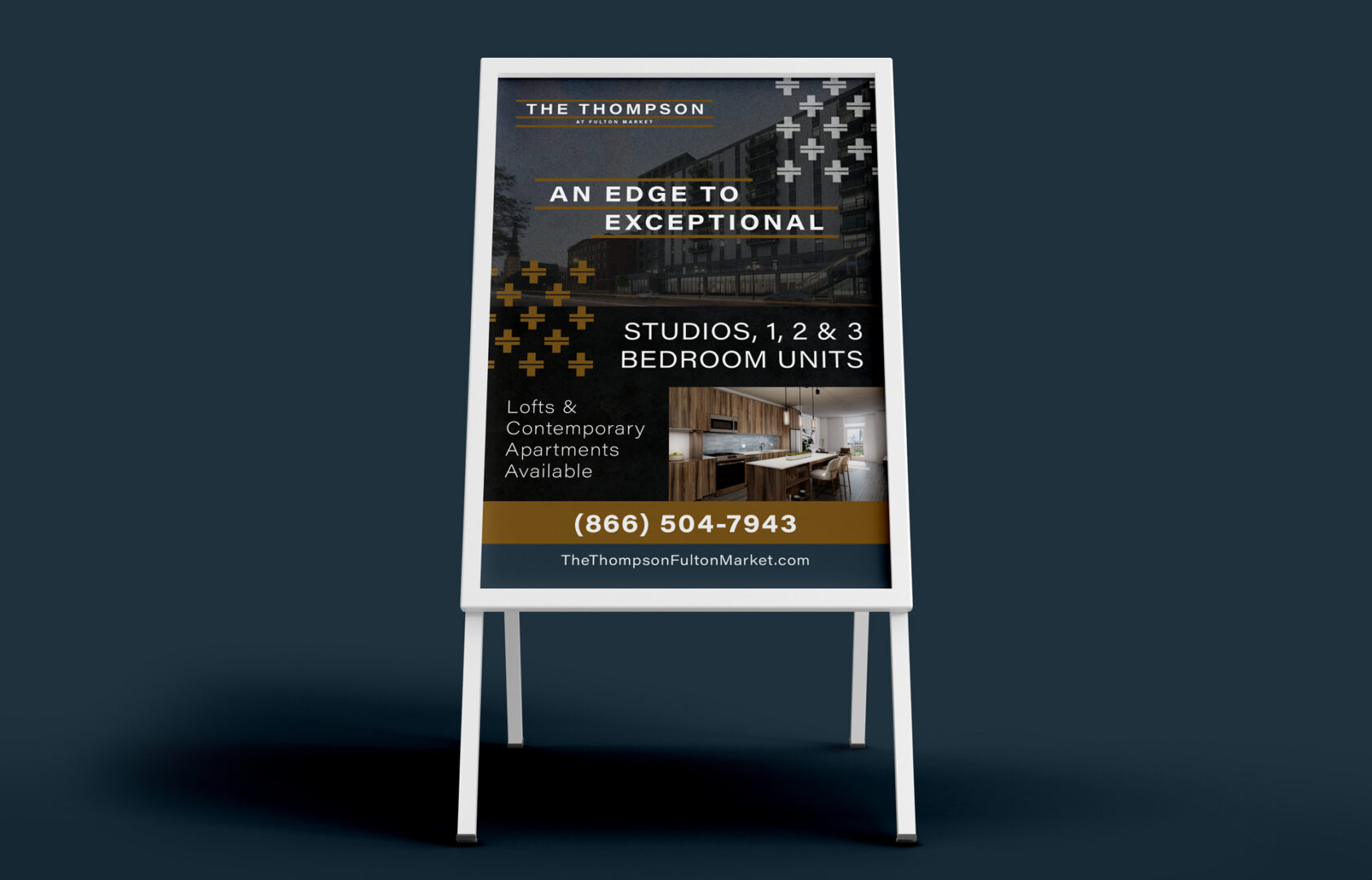
For multifamily and far beyond, signage is the perfect way to capture traffic going by—whether on foot or in a car (or on a bike) and branding your curb appeal. Through using your marketing message on your signage you can get attention. At the root of your signs—is your brand. Make it a real showstopper.

Signage Design 1

MARKETING SIGNAGE

What kind of exterior signs work best for curb appeal? Well-designed and thoughtfully positioned ones. As a regional property manager, you may be responsible for determining what type of signage would help drive leads to your properties during site visits.


Flags – Single or double-sided, this style of sign works well as a quick call-out to get attention. A row of 2-3 flag signs can help display even more information, used more as a series.

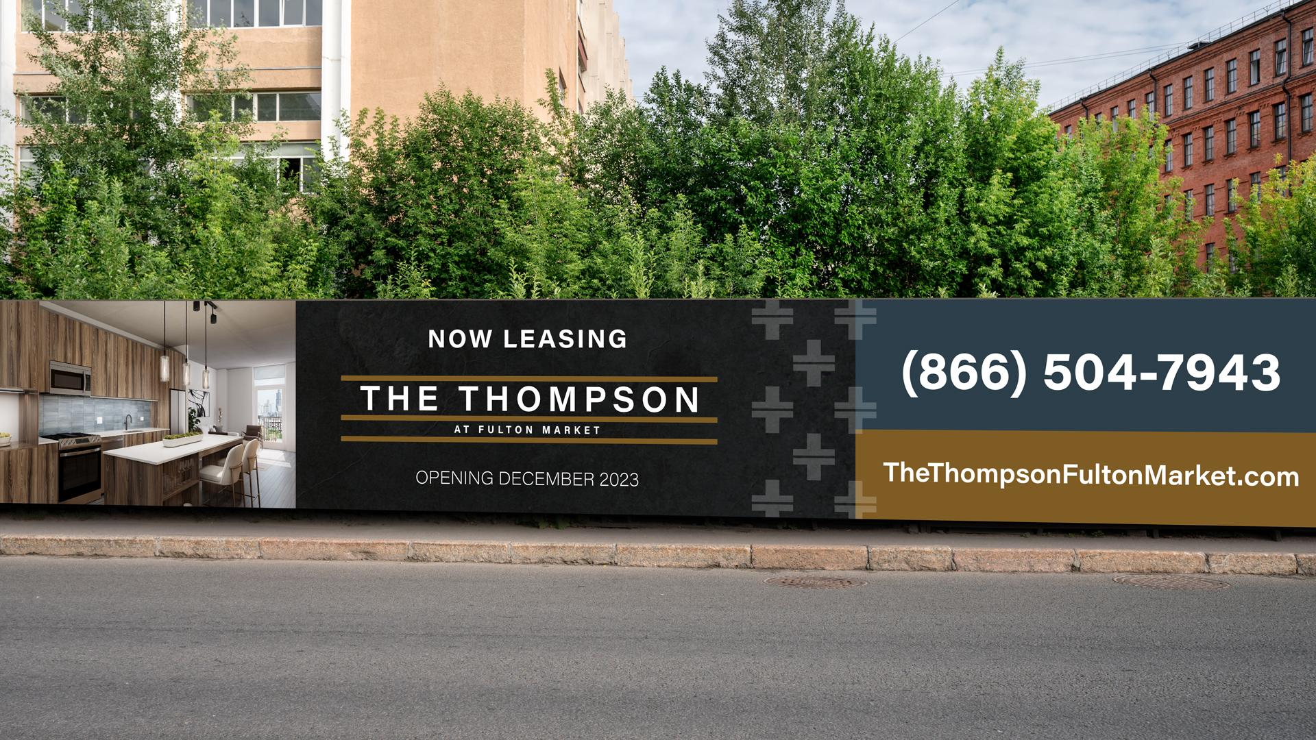
Banners – Elegance! Capture the attention of passersby with banners on your building, fence or garages—whichever surfaces face the major roads.

Bootlegs – Yard signs are short and sweet and best for walkers-by since they’re on the smaller side. Be sure to get to the point.


Boulevard Banners – Light pole signs are a great way to show off who you are with permanent exterior signage that tells your brand story as they drive in.

Signage-Design-2

SIGNAGE DESIGN

Make sure everything you put out is on brand! Signage should be these three things to fully capture the attention of passersby:

Well-Placed – Strategic placement is key. Likely exterior marketing signs will be viewed at a distance as people pass by in a vehicle. Make sure they can see and read it well.

Clear Messaging – Don’t share too much on one sign; it has to get the point across quickly and concisely.

Brand Consistency – Use the same typography, textures, and color palettes from your brand guide – even signage is an opportunity for establishing brand recognition (so they remember you!)

Marketing Needs and Implementation

The regional property manager has much to do with identifying needs for the community. This includes determining marketing needs or problems and the best ways to solve them.

FOR THE LEASING AGENT

Helping out with the sales process means you’re going to provide a lot of guidance for the onsite leasing agent. Marketing collateral: print outs, brochures, floor plans, help with ordering business cards and “Thank you” notecards will probably need a little extra oversight from you. Get the brand guidelines in order and provide them to your supervisees. Look at what your onsite agents most need and help them get those designed and printed to be on-brand.

DIGITAL MARKETING

Driving leads through digital marketing is an important aspect of your “marketing mix.” Use digital marketing with your brand guidelines handy so you don’t stray far from what’s recognizable as Your Community. Social media graphics should reflect it well. Google Ads should clearly communicate your brand. Digital ads should look like your brand, and no other. Using fonts and colors and stock photography that are drawn from your brand guidelines is a foolproof way to keep the brand intact, even when you have multiple marketing channels running at once. Email marketing will require a close review, too.

BRAND ACCURACY

As the regional manager, you’re the enforcer of the community brand as the liaison between corporate and the on-site teams. We’re not calling for micromanagement, but ensure you’re providing the brand guidelines (and easy ways to use them) for your on-site leasing managers. 

You’re the gatekeeper of the brand—keep an eye out for cohesion and appropriate logo use. And don’t be afraid to give compliments to an on-site manager for following the guidelines to a “T”!

Leasing Agents Onsite and Multifamily Branding

What does multifamily branding have to do with leasing agents onsite? Loyalty built on trust built on recognition. Your branding has to be dialed in for that to happen. Where does branding show up for onsite leasing agents? Marketing collateral, signage and any printed hand out given to prospects and new residents.

Leasing agents onsite have a fair amount of DIY to their job. There are tons of pieces and plenty of marketing collateral that rely on strong branding. If these pieces aren’t consistent, the multifamily brand can lose out on brand recognition, trust, and loyalty.

Let’s break it down by the process of lead to lease. Every step in the leasing “funnel” has something to do with your ability to maintain brand consistency.

Start-with-Signage

Start with Signage

This is your first chance at a good impression. Leave a good one. Signage should reflect your brand with its colors, font choices, and messaging.

WALK BY OR DRIVE-BY

Curb appeal is a thing with multifamily communities as well. When someone walks by or drives by, they should know exactly what you’re offering, and what your style is.

DIRECTIONAL (LEASING OFFICE THIS WAY)

Make sure visitors can get to where they need to go. And ensure that the directional signage aligns with your other branded items, too. We don’t need any brand whiplash to happen as they’re walking to the leasing office!

INFORMATIONAL (ON THE INSIDE)

Clubhouse? This way. Leasing Office? Over here. Rules for the clubhouse? Here they are. Make sure posted rules, informational signage and other interior pieces look official, like they’re from the front desk. Easy way to do this? Use your colors, your fonts, and your brand voice to communicate all those rules.

SELF-GUIDED TOUR OF MODEL UNIT

Letting your prospects go on a self-guided tour? Ensure you have all your ducks in a row. Place table tents near special features. Put up framed designs that show off your smart home features, for example. Call out boutique countertops. Identify where the in-unit washer and dryer are located.

Next Up, Marketing Collateral

TOURING PROSPECTS

Your prospect has now told you they’re interested! Great. Now is the time to hand them an info packet. This will have your business card, brochure, a rack card, an amenity sheet, and floor plan sheets—either all in a branded folder, or clipped together. The beauty of this packet is seeing how everything looks all together. These collateral handouts are essential for the touring prospect sales process. It shows you have everything they need while you answer any other questions they may have.

P.S. If you’ve gone fully digital—that still requires great design! We can help make sure your designs for your floor plans and e-brochures are good to go, wherever and however they’ll be viewed.

WELCOME NEW RESIDENTS

“Welcome to our community, here’s our gorgeous welcome packet with maintenance contact, policies and procedures, and a little “welcome” note (on our very own branded stationery).” When you brand everything well, it just works. Again, this is one more signal to the resident confirming their correct choice in signing the lease. If done well, it helps answer any lingering questions, too.

Staying On Brand—Now That They’re Here

All this work to stay consistent isn’t just for prospects and future residents. It’s for current residents, too. Enabling loyalty through consistency and predictability can help your residents feel more comfortable renewing their lease and staying at your community.

If it’s not provided from corporate, use the tools that you have at your disposal to create items that work within your brand guidelines. Using Canva, you can upload your specific color palette, your fonts, and your logos to use in pre-made designs. If you’re rusty on your design rules, check out our post on the basics of multifamily graphic design here.

That—or you can hire a pro to help you with different pieces. Whatever you need, we can help. There are so many things that you’ll need design and branding on—and not just once, but every time you have a resident event!

RESIDENT EVENTS

You’re going to want to stick with your branding—even in the smallest ways—for any resident events you’re planning—and then advertising with flyers and email marketing. Place your logo in the corner, use some of your brand colors. A potluck, a pool party, an ice cream social—all of these should look like something you’re putting on.

ANNOUNCEMENT AND NOTICES

Speaking of being official—when you change the regulations around swimming hours, or if there is a planned water shut off for maintenance, ensure the letterhead yells “This is serious and official business” without yelling. Logo and proper colors will tell your residents just that however you are delivering the announcement.

SOCIAL MEDIA

Posting about resident events, planned water shut offs, and doing a few giveaways here and there? Again: keep it all on brand. Check in to see if corporate has created social templates that you can tailor—maybe an agency (like use at Zipcode Creative) has designed them. If these aren’t available (which are preferable) you may be able to use a program like Canva to create quick social posts and maintain your brand on Instagram and Facebook.

Brand-Guidelines

Last Thing About Brand Guidelines

You’re not a designer, but you’re expected to do a lot on-site. Sometimes it’s last minute. What are brand guidelines and what’s the best way to use them as an onsite leasing agent?

  • Get comfortable with the use of your logo—the one-color, the logomark, or just the name. Of course, branding is more than a logo—it’s visual and verbal; try to understand both.
  • The visual elements of brand guidelines will be used more than any other parts when you need to create something:

We know as an onsite leasing agent, your job isn’t easy. But you’re the boots-on-the-ground guard of the community’s brand. Stay within the guidelines and you’ll reap the benefits.


Implementing Brand Guidelines for Multifamily On-Site

What are Brand Guidelines?

Apartment brand guidelines are like a road map to your apartment community’s brand. You’ll be able to get where you want to go with this map in hand!


Breakdown of Apartment Brand Guidelines

Everything you ever wanted to know about apartment brand guidelines is here. But you might also be wondering how to apply it at the on-site level. So much to do, so little time. (If you want a broader take, check out our branding basics for apartments.) We’ll get right to it

The-Watermark-Brand-Guide

BRAND POSITIONING

Brand positioning, defined:
A short, sweet brand statement about your community that communicates what you are and what you’re known for in the industry, market, and to your ideal resident.

How to implement brand positioning:

Use the brand positioning statement as an internal guiding light for everything you’re doing. Everything should measure up to it, especially if you’re concerned about brand loyalty and brand authenticity, and creating a brand that’s based on a lifestyle.

Brand-Attributes

BRAND ATTRIBUTES

Brand attributes, defined:
These are the descriptors that embody your brand, as if it were a person. We like to do the “which celebrity would your brand be and why?” to get closer to the heart behind your community.

How to implement brand attributes:
On-site managers can use brand attributes to verbalize the difference of the community (useful for any social media captions) and help embody the spirit of the culture while they give tours.

Ideal-Resident-Profile

IDEAL RESIDENT PROFILE

Ideal Resident Profile (IRP), defined:
Your community’s key audience. Age, Gender, Race, Income, there are plenty of things that you can identify as the “ideal” when it comes to the resident you’d like in your community.

How to implement the IRP:
Use your knowledge and data from your IRP to communicate better. It’s like a platonic version of “The Five Love Languages.” You can alter how you speak to the type of prospect you’re selling when you know more about them—resident demographics must influence your branding.

Brand-Voice-Tone

BRAND VOICE & TONE

Brand voice, defined:
Your brand, in words—showcasing your community’s personality and style. This is how others perceive you and hear you in written word. This will show up in your brand identity statement, your tagline, your headlines, and your general brand vocabulary. 


Brand tone, defined:

Using your brand voice in different settings, as it’s called for. Informative tone, descriptive tone, it all depends on the occasion and audience.

How to implement brand voice and tone:
The tone you use in flyers for upcoming resident events should be a little different than your brochures for touring prospects. Use your brand voice across all your collateral, but tilt your tone to angle to the right part of the customer “funnel.” Resident announcements will also require a slightly different tone, too—a little more casual, warm, and excited…rather than 100% informative.

Logo-Mark

LOGO MARK


Logo mark, defined:

Your community’s logo with the name, or a symbol, or both. There’s typically a primary and secondary logo mark.

How to implement logo marks:

This should go on everything! The logo is the face of your brand and often what a prospect will notice first and remember last. If you’re DIY-ing any sort of design, make sure the logo is on it and used appropriately. More on that next…

LOGO MARK USAGE


Logo usage, defined:
Rules for how you can use the logo—spacing, angles, and combo rules so you don’t have crowding, stretching or skewing of something that should always be recognizable.

How to implement a logo:
Rules are rules. Follow them when you make anything with the logo included! Consistency is the name of the game. The brand guidelines are your rule book.

Color-Palette

COLOR PALETTE


Color palette, defined:
The color palette is the exact colors that are to be used in your branding materials and not meant to be strayed from. It’s between 3-6 colors, typically, and all four color codes will be identified so you can color match no matter the program or medium (RGB, CMYK, PMS, AND HEX).

How to implement color palettes:
Royal blue isn’t the same everywhere. Use the codes to look up the exact match. Close enough isn’t good enough. Find the right one in the assortment in your email newsletter builder. Type in the code in Canva. Save it. (After all, you’ll definitely use it again.) Ordering swag? Use the codes.

Fonts

TYPOGRAPHY


Typography, defined:

The fonts or typefaces chosen (usually 2-4 kinds) for your brand. This will show up in your logo, your headlines, your subheaders, and your body text.

How to implement typography:
Reference your brand guidelines for the hierarchy of the fonts being used, you can determine which one should be used where on your next flyer.

Design-Element-1Design-Element-2Design-Element-3

DESIGN ELEMENTS

Design elements, defined:
Brand patterns, shapes, stamps, and collage styles are all design elements for your brand. They’re visual cues to your audience and/or resident.

How to implement design elements:
Think of design elements like the piping work on your cake. Beautiful. Eye-catching. Adds a little extra touch to visually show the brand’s personality.

Lifestyle-Photography

LIFESTYLE PHOTOGRAPHY

Lifestyle photography, defined:
These are the photos that reflect the lifestyle vibe that your residents could live out in your community. They are intended to evoke a feeling in the viewer to help them imagine themselves living there.

How to implement lifestyle photography:
If you need to find additional images to supplement the ones provided with your branding, or if there aren’t any—use the color palette as your guide. Take the tones from that to select photos that will “play nice” in any marketing collateral you’re creating.

Iconography

ICONOGRAPHY

Iconography, defined:
Icons that help your audience get the gist without reading. They can be used to represent amenities, especially.

How to implement iconography:
Don’t want to crowd your design with so many words? Use icons to get to the point.

ILLUSTRATIONS

Illustrations, defined:
Brand illustrations are an additional visual cue for your residents and can be powerful aids in showing your brand’s personality. They’re less of exact representations or stand-ins like icons, but they help get an idea across more artistically.

How to implement illustrations:

Pick a wall that could do with a mural. See if you can get something on the wall to spruce up the space that works within your brand.

Brand-Examples-1Brand-Examples-2

BRAND EXAMPLES


Brand examples, defined:

The part of the brand guidelines where it all comes together. You’ll typically see examples of stationery, a social media feed, or how signage could look outside your building, for example.

How to implement brand examples:
Particularly the social media feed could be helpful to see how the fonts, colors, imagery and voice come through to create one super special brand. Use these examples as inspiration!

Keeping Brand Guidelines In Line

It’s incredibly tempting to go full red and green for Christmas. Or orange and black for halloween. But do these colors work with your brand’s color palette?

HOLIDAY

Instead, choose colors that work with your color palette by using color theory. Which shade of red works? Which shade of green? Color pairing can be difficult. But: Keep things dialed in with your brand and don’t use holidays as an excuse to create something unrecognizable as your brand, even if it is fun. Wondering how colors impact our thoughts? Check out our post on using color psychology to sell units.

EVENTS

Have a resident potluck coming up? Find the one-color version of your logo and start cooking up a design using Canva. You can create something that’s worth looking at. There are plenty of templates to start with. Change out the colors using your color codes, and change out your fonts with the ones that are in your brand guidelines. Pretty soon it will look and sound like your community, with very little effort.


Branding is important at every level of the community. Maybe that’s news to you, but it holds true.
On site, the responsibility to keep to the brand guidelines still holds—you’re the closest to the resident, after all.