Grand Opening Marketing Campaign for Apartments
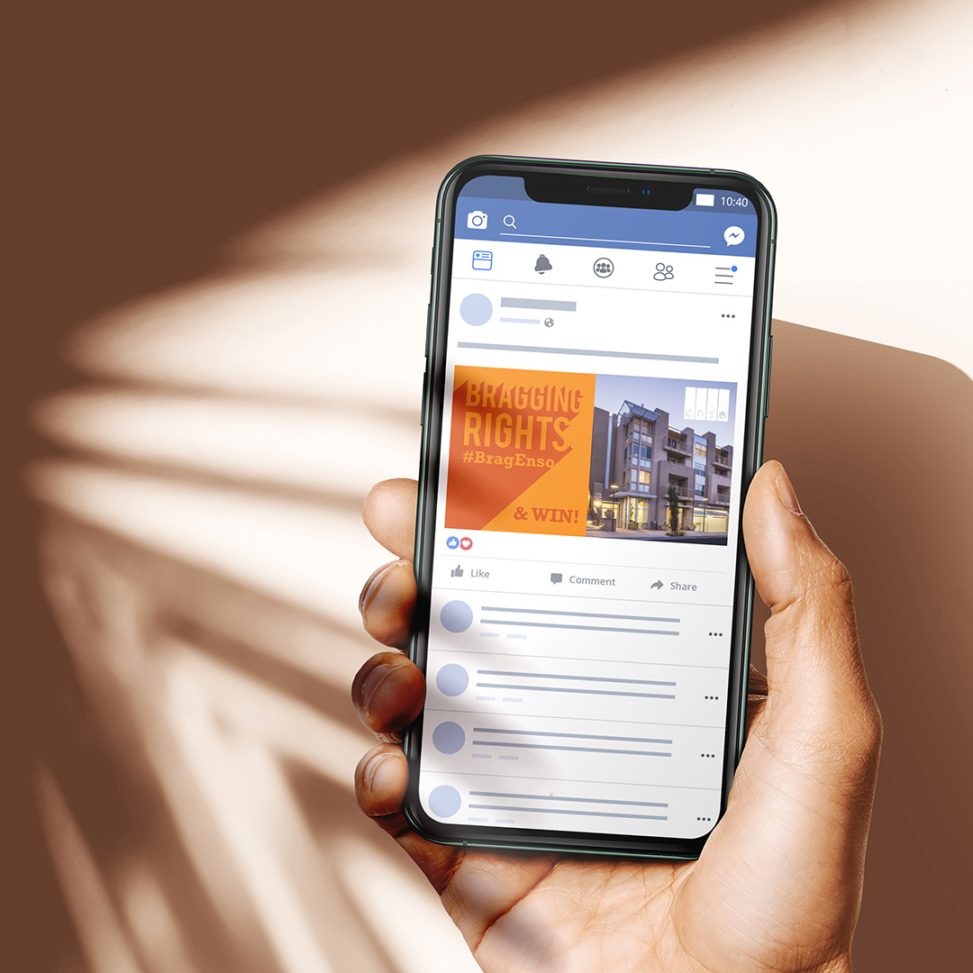
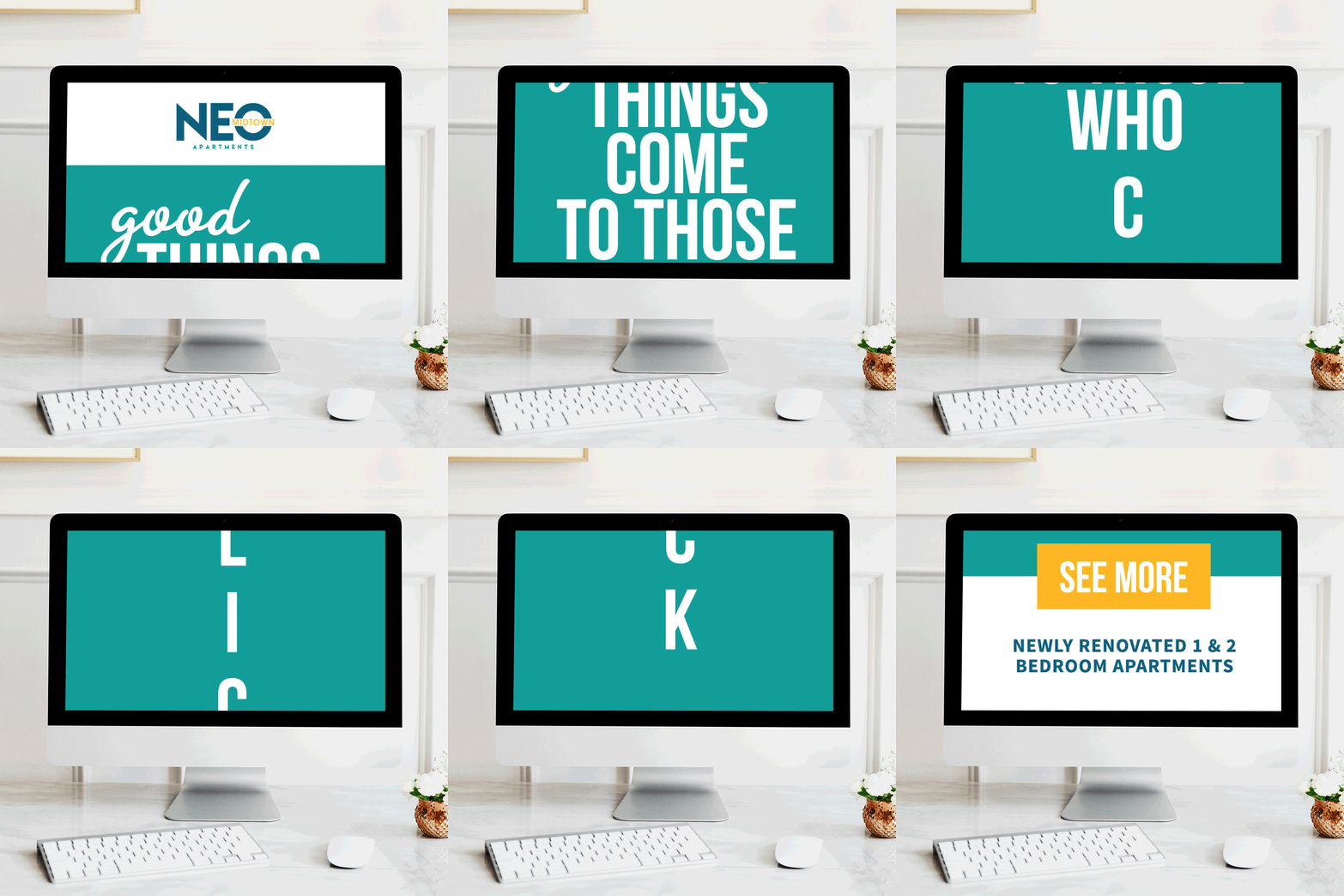
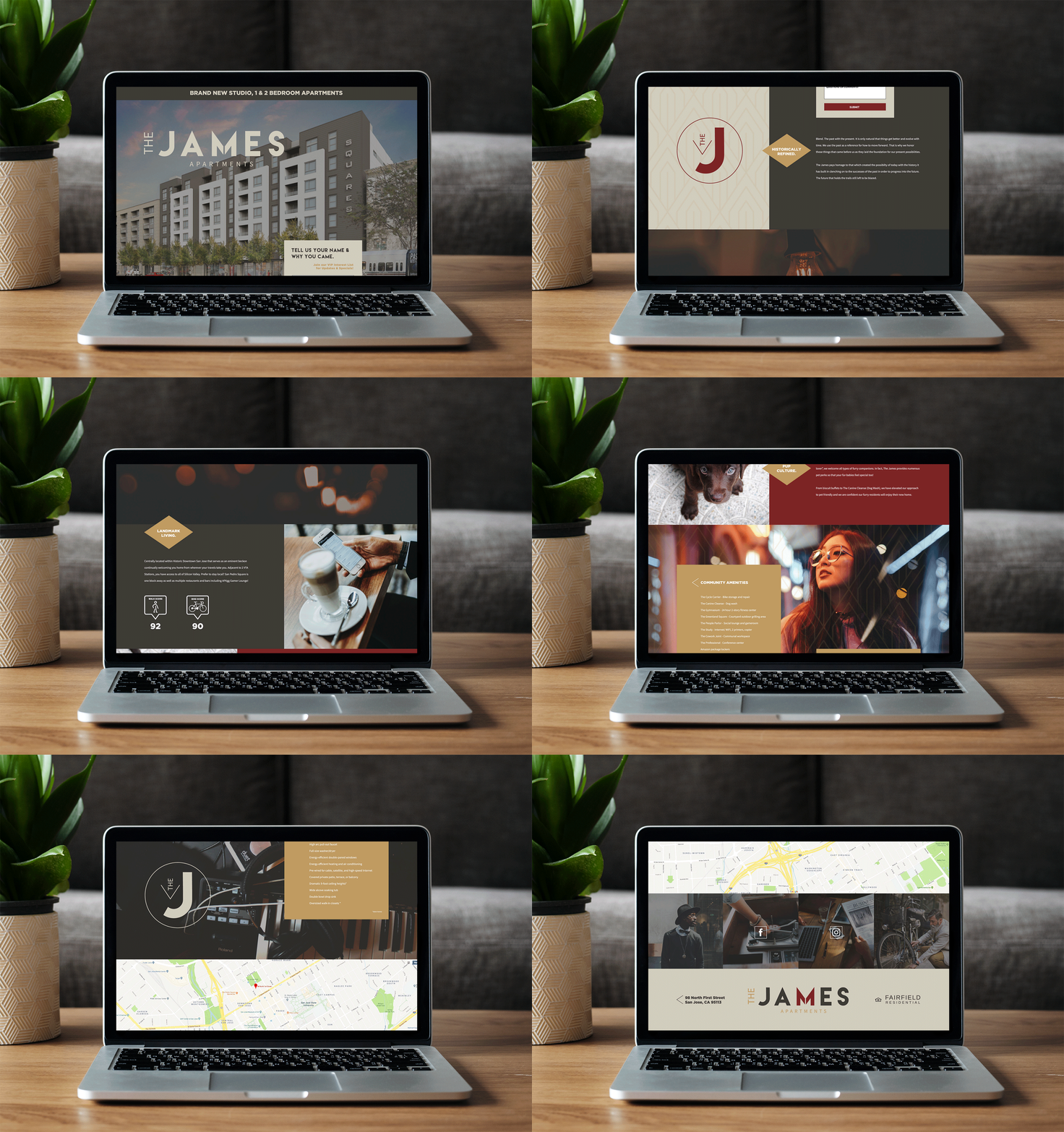
When your community is first opening or reopening after a renovation, it’s time to celebrate! It’s an important milestone and an exciting time to show off everything you have to offer to your local neighborhood and prospective residents. Instead of flying under the radar when you open, make an impact with a thoughtful grand opening marketing campaign. By generating excitement, offering incentives, and broadcasting the event across different marketing channels, you’ll make your mark early on to increase brand awareness and name recognition.
Creating Your Campaign
Your grand opening isn’t the time to hold back. Think big to create a can’t-miss event that will have your entire local community buzzing.
Invite Your Community
To generate even more excitement around your event, invite people from across the local community. From politicians like the mayor or city council members to local business owners and their staff to residents of the surrounding area, welcome a wide range of people from across the community to your opening celebration. This will help you generate word of mouth and increase brand awareness, all while also ensuring that everyone has a great time!
Information Booth
Make it easy for those interested in learning more to get the additional info they need. Set up a booth or table at your event with flyers, brochures, and other information about your community. It’s also the perfect opportunity for staff meet-and-greets. From your property management staff to the building maintenance team, have everyone attend the event to build relationships and showcase the top talent your community has to offer.
Food & Drinks
Who doesn’t love a good spread of food and drinks? Be sure to cater your event with enticing food that will have people clambering to attend. Whether you opt for a theme or just offer light bites and cocktails, having food encourages people to linger and engage with your community even further.
Swag
You worked hard on your community’s branding, so it’s time to show it off. Create free swag giveaways for the event that help spread the word about your opening. From tote bags to pens to umbrellas, create different items with your distinctive logo or branding that attendees can take with them. That way, they’ll get to leave with some freebies for a win-win way to spread awareness!
Early Leasing Incentives
If prospective residents attend your event, incentivize them to their lease right then and there. Grand opening leasing promotions are a great way to increase urgency and help you lease up faster. From signage at the event to flyers you tuck into the swag bags, make sure you actively promote the incentives to encourage prospects to make the leap. Consider offering a free month, discounted amenities fees, and other cash incentives or other perks to sweeten the deal.
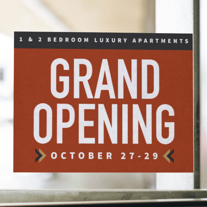
Marketing Your Campaign
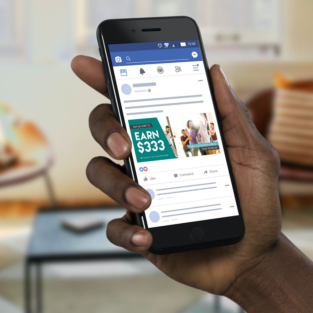
Before hosting your event, you need to make sure you shout it from the rooftops. Leverage strategic marketing materials to generate buzz and amplify the event for a few weeks before it happens with a grand opening marketing campaign. That will help to maximize attendance and encourage local partners, prospects, and the general public to stop by.
When it comes to marketing, it’s time to think big! Don’t limit yourself to just one or two marketing channels. Instead, opt for a 360-degree campaign that includes:
Email Marketing
Leading up to the event, be sure to send a blast to your email list with all the details. Consider sending a formal invitation and at least one follow-up reminder to make sure people mark their calendars.
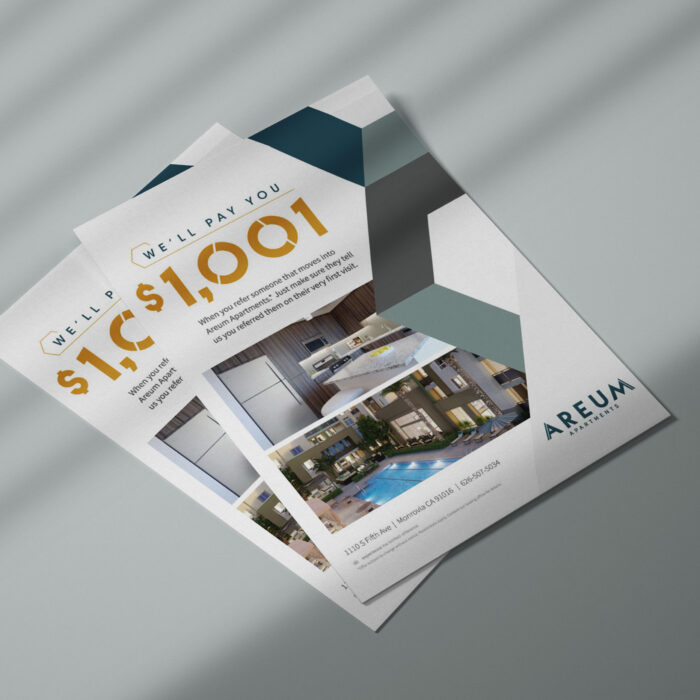
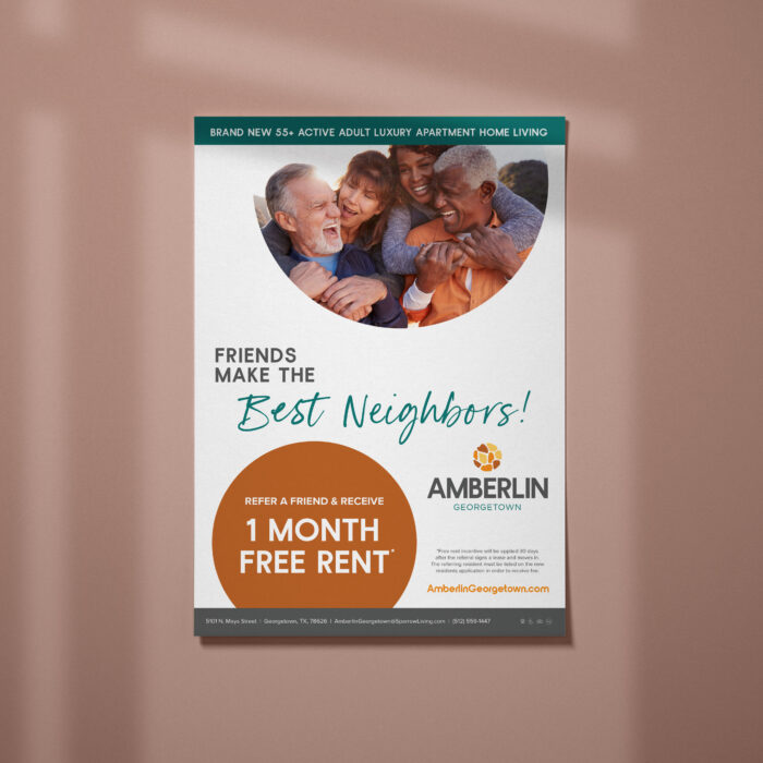
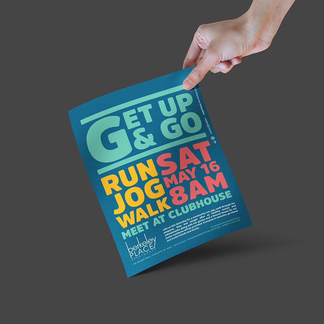
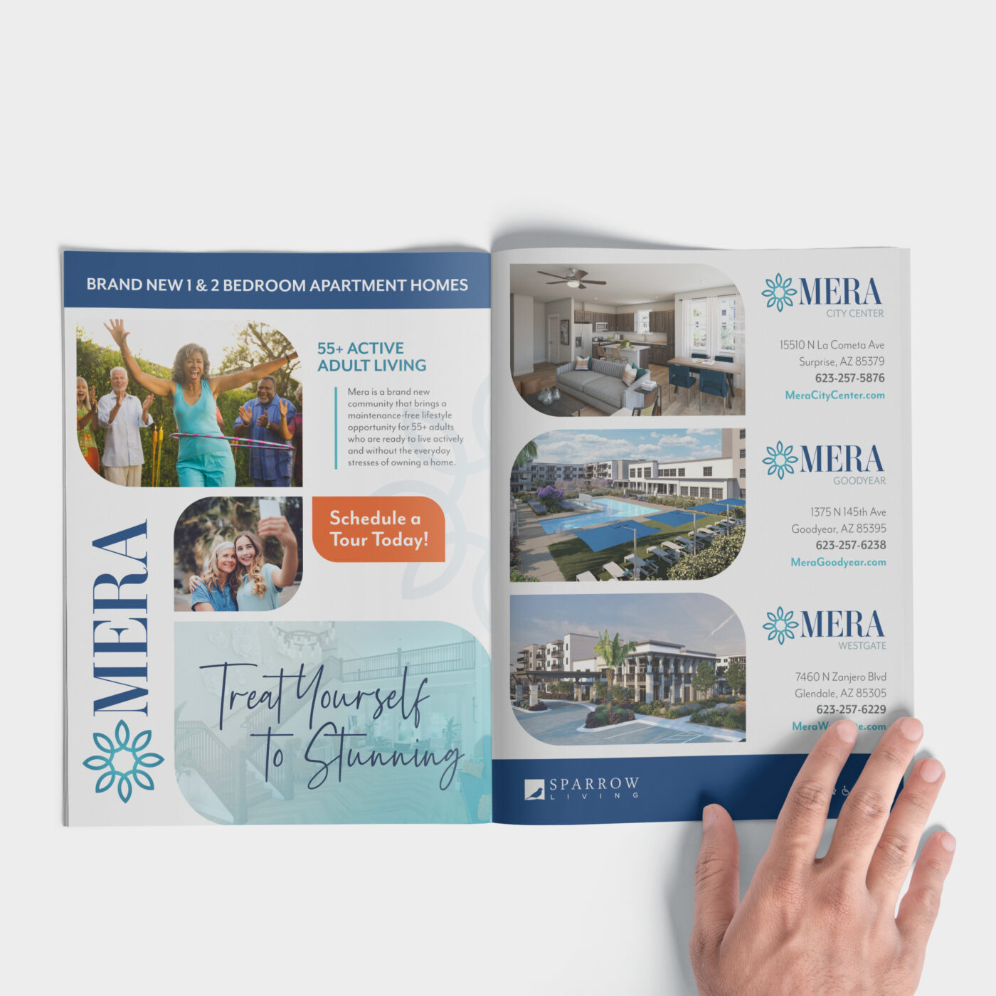
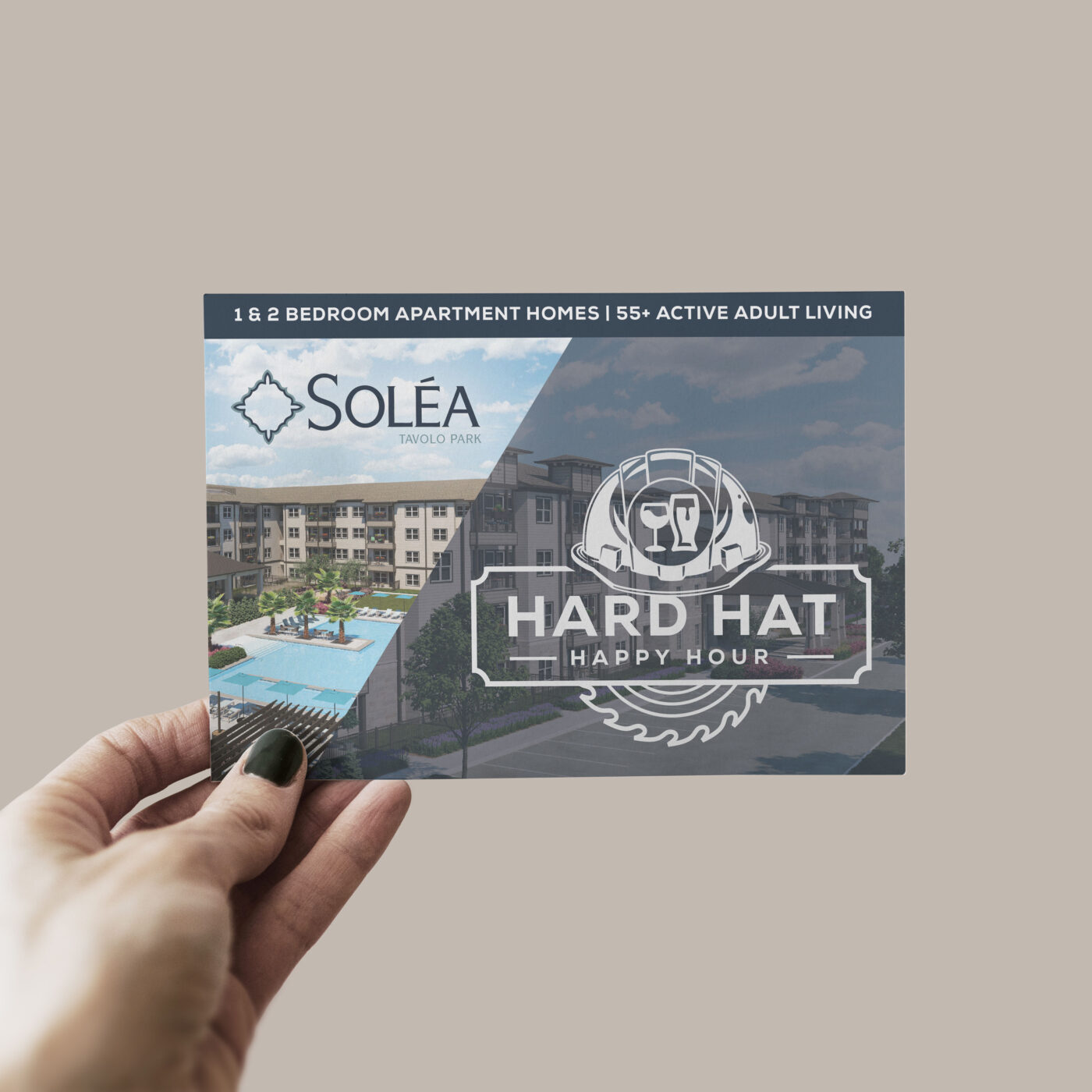
Mailers & Flyers
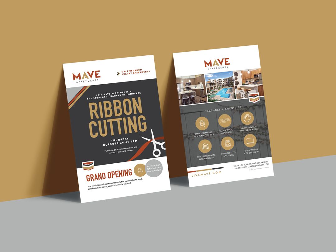
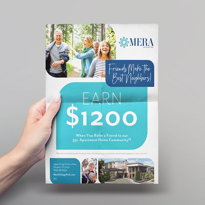
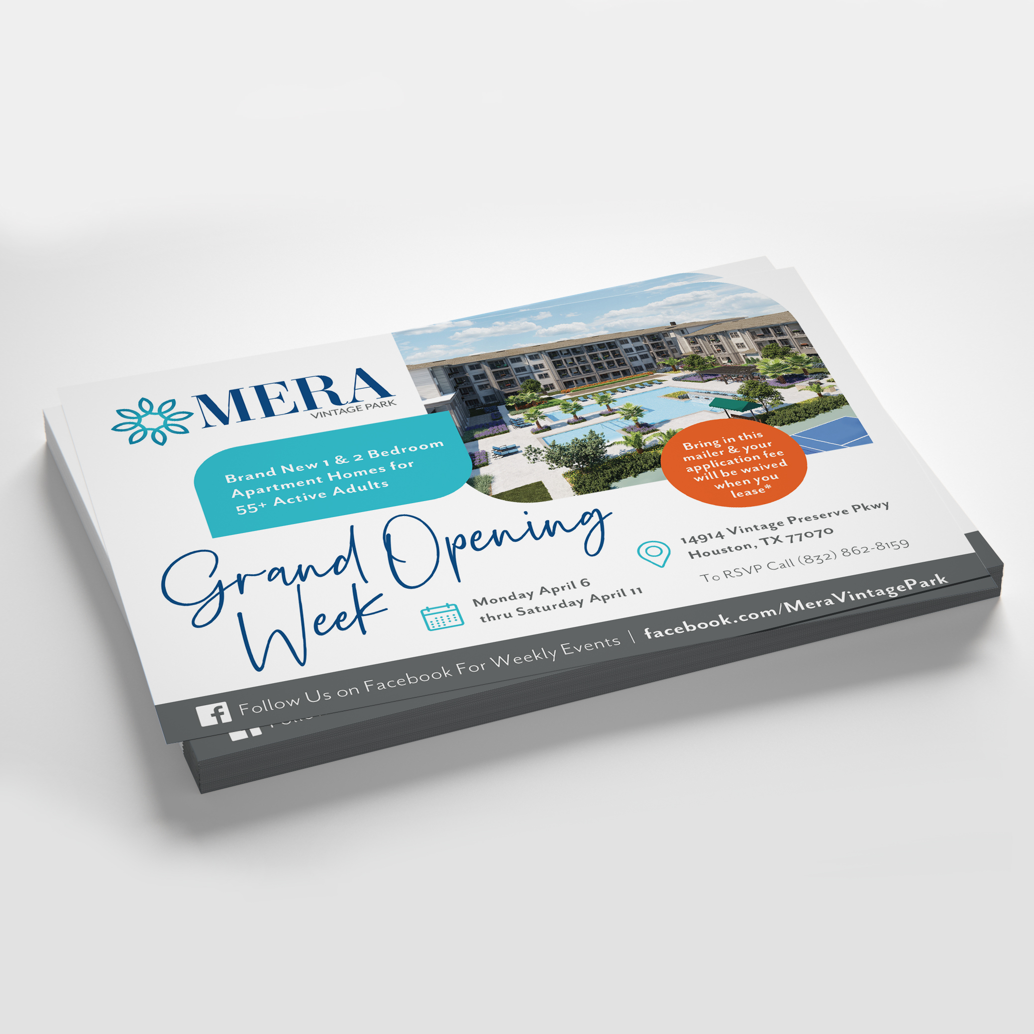
Don’t rely on digital marketing methods alone. Printed mailers and postcards are a great way to reach your local community and can even be distributed in local shops and restaurants for a two-pronged approach.
Signage
Create signs specifically for the event, but also outdoor signage leading up to the event. From flags and boulevard banners to large building banners, the sky’s the limit to the type of signage you can create.
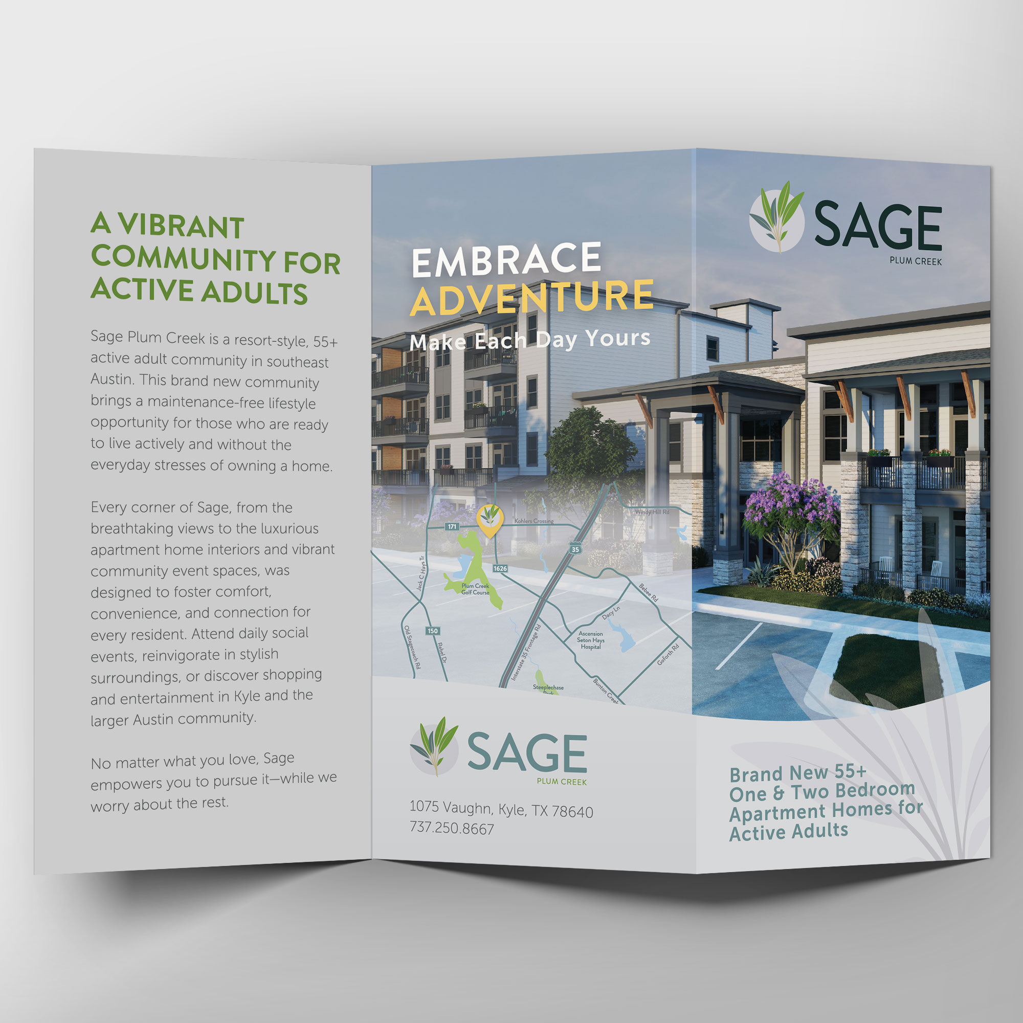
Handouts & Brochures
Don’t let those who attend the event leave empty-handed. Be sure to have brochures, property sitemaps, and other relevant handouts handy for people who are interested in learning more about living in your community. You can even tuck them into the swag bags to be sure people will see them later.
If you’re ready to get started on your grand opening marketing campaign, consult an expert like zipcode creative. We’ll work with you to create a cohesive and holistic approach to your event for the best possible experience for everyone!
MAVE Design are ©Fairfield Residential | Work executed by Stacey Feeney, owner of zipcode creative, while under creative direction and employment at Fairfield Residential.
