Author: Stacey Feeney

Apartment Marketing Campaign Strategy and Concepts

It’s time to stop flying by the seat of your pants and design an apartment marketing campaign that perfectly communicates the best you have to offer—to your target audience. Here are our favorite ways to develop and design a campaign to best market your apartment community:

The Basics of Designing an Apartment Marketing Campaign

First off, you need to identify your desired result. Is it to:

  • Create awareness?
  • Maintain resident loyalty?
  • Sign more leases? 

Once you have that set, you can set your sights on your target audience, create a message that will resonate, and you can determine which channels will get you to your goal. 

Be sure to measure your stats before and after the apartment marketing campaign to properly analyze your results—then you can replicate your successes and learn from everything else. Do this by using tracking numbers, QR codes, or a unique URL that goes to a campaign landing page. A (good) before-and-after is like a proof point for the next time you ask for a marketing budget increase or media spend!

Before Your Campaign Launch

Before you think about launching your apartment marketing campaign, be sure it’s clear and direct (and attractive). But how?


GET THE MESSAGE

What are you trying to tell your audience? Make that shorter. Make that snappier. And then you should have a well-crafted mini piece of copy that will work across multiple channels. Smart messaging is your bread and butter.

MAKE A LOGO

This might be our favorite part—creating a logo that works with the apartment marketing campaign. Take your message and turn it into a logo. This makes it feel real (because suddenly it is) and amps up the recognition so that anywhere it turns up (social media, brochure, leasing office signage) the reader might put two-and-two together. It’s like a limited-time-only type of brand recognition—exactly what you want for your next apartment marketing campaign.

Change the Campaign Channel

As we mentioned above, it’s vital to determine which channel is going to be the most effective for your apartment marketing campaign. Our favorites are a combination of two or more, but that’s up to you (and depends on your audience)! For your multi-piece campaign, you can pick and choose from:

  • Social media
  • Campaign Landing Page Website
  • Email Marketing Series
  • Paid search
  • Digital Ads
  • Physical Signage
  • Direct Mailers

Finding your Next Campaign

Still feeling a little lost? Try a few different methods to get the creative juices flowing:

B IS FOR BRAINSTORM

Gather the troops for a quick brainstorm session. Guide the conversation by asking: What are our biggest weaknesses and how can we reasonably turn those into revitalized apartment marketing campaigns? Alternately, what are our biggest strengths and how can we highlight those even more? Are there any marketing trends that would be timely to capitalize on through a resident event or giveaway? Write it all down and see what sticks. Put in order of priority and what you can do right now.

C IS FOR COMPETITION

Take a look at your competitors (both in your area and outside of it)—put yourself in current or prospective residents’ shoes: what sticks out to you? What’s appealing? What could feasibly work to market your apartment community? See if you can model a new apartment marketing campaign after what they’ve done or show up where they’re lacking to stand apart.

D IS FOR DIG INTO THE PAST

Hindsight is 2020 (don’t throw anything at us; it’s still true.) What have you created in the past that was successful? What parts of it can you replicate? What can be tweaked to fit your new audience, or your new goal? You don’t have to reinvent the wheel every time. Efficiency counts for something, too.

Apartment Marketing Campaign Ideas

If you’re still wandering in the wilderness when it comes to creating a campaign for your apartment marketing that will set your community apart, keep reading. We want to get you on the straight and narrow so you can make something that resonates with your residents (current and future). Working within particular parameters / categories can also help narrow the options down:
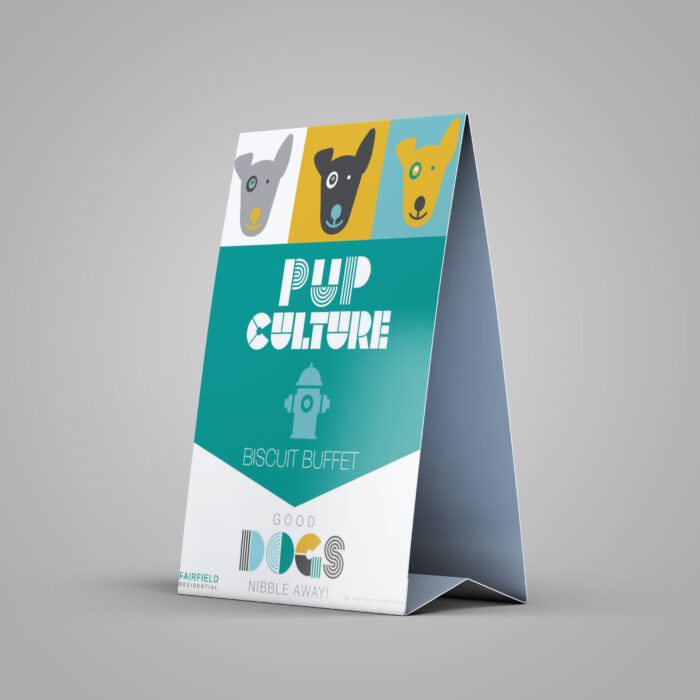
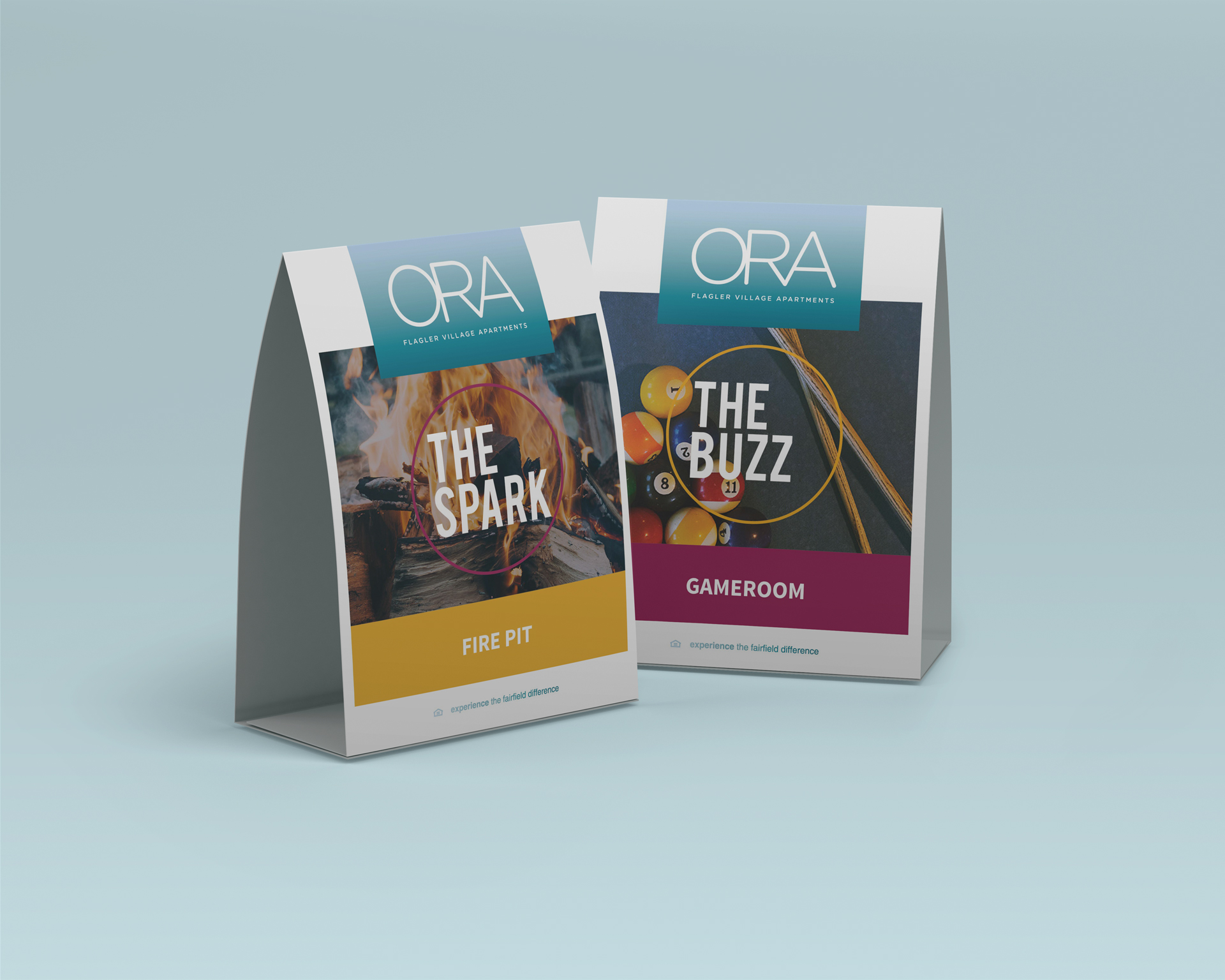
corporate apartment marketing campaign

CORPORATE INITIATIVES CAMPAIGNS

Are your apartments pet-friendly? Is your community energy efficient or eco-friendly focused? Make sure corporate initiatives don’t get overlooked when it’s time to create your next apartment marketing campaign, as these are great selling points to draw attention to!

leasing apartment marketing campaign

LEASING SPECIALS CAMPAIGN

Using every channel available to you, break out the bullhorn and shout that you’re offering something special at your community for any newly signed leases. Anytime you’re running a lease incentive campaign, make sure you’re communicating consistently and clearly and pushing it through every channel that’s applicable. No one in your prospective audience should say “How did I miss that!?”
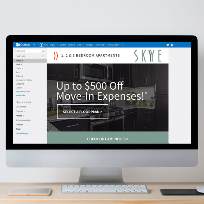
moving apartment marketing campaign

MOVING IN CAMPAIGN

Moving into a new place can be exciting, overwhelming, and bring up all kinds of emotions. Helping your residents feel like moving in is easy with a move-in campaign or an accent wall program (pick your paint color!) may just be the “cherry on top” they need to make the move and sign a new lease at your community. Graphics (and signage) to accompany these were vital to communicate exactly what was being offered.
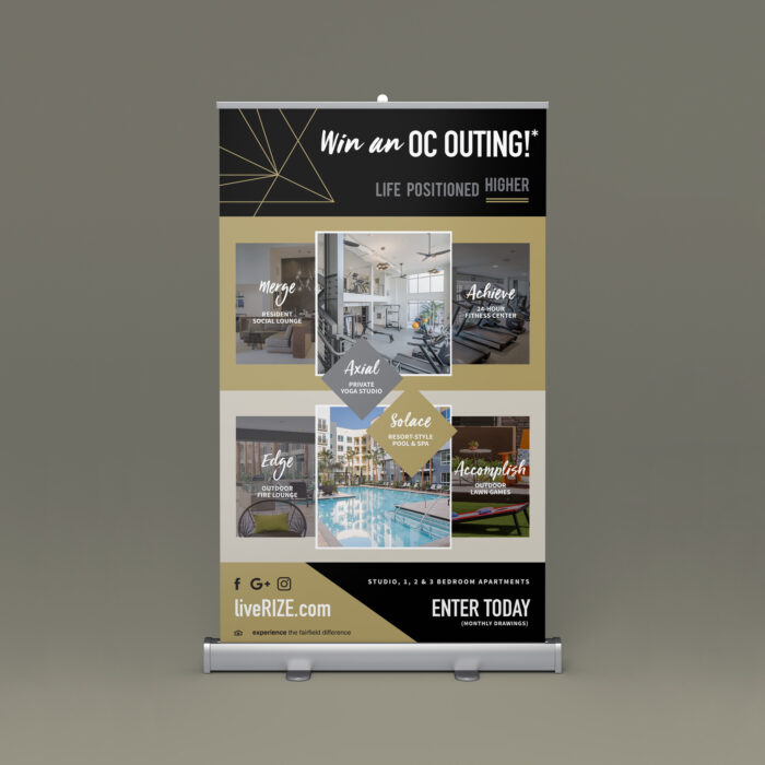
giveaway apartment marketing campaign

PRIZE/GIVEAWAY CAMPAIGN

This is a classic, and if you’re running stuck, grab a gift card to a local spot, and encourage your followers to like, share and tag friends in social media posts, or do a competition with unique hashtags:  “Post a photo using #LoveLivingRanchoDelSol and tag us in it to be entered to win an OC outing!”

event apartment marketing campaign

EVENT-BASED CAMPAIGN

There’s a touch of childhood glee that comes with any countdown, so when you have an event coming up, it’s a wonderful trick to build up excitement and anticipation, with a few sneak peeks thrown in for good measure. You can try this with a Grand Opening campaign or a Resident Appreciation event.
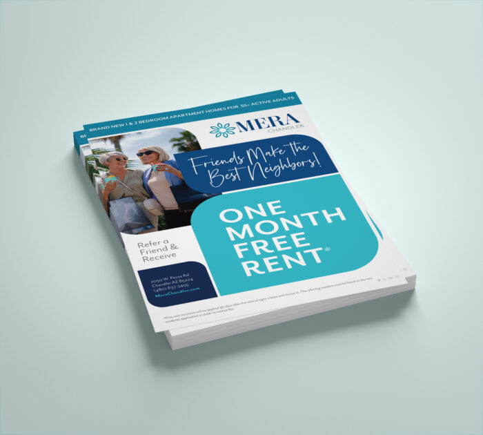
referral apartment marketing campaign

REFERRAL PROGRAM CAMPAIGN

Who doesn’t want to be neighbors with their friends? Add a special bonus with a referral program campaign that gives successful referrals a cash reward.
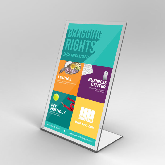
lifestyle apartment marketing campaign

LIFESTYLE CAMPAIGN

Is your community the best one on the block? Or in the neighborhood? Or city? Capitalize on it, and don’t beat around the bush. This “Bragging Rights” campaign helped this apartment community highlight particular amenities (in a fun way) that visitors and family and friends alike would be impressed by.

Bottom line: Make your apartment marketing campaign fresh, fun, and new—make it attractive (AKA professional design services with zipcode) and choose the best channels to optimize your reach. When your campaign is complete, track your results and make a plan for the next one. Keep a good thing going.

If you need more ideas, reach out. We’re always happy to help.

Turn Down the Upkeep, Pup Culture, Skye Moving Incentive, Win an OC Outing, Baseball Game, and Bragging Rights are ©Fairfield Residential  |  Work executed by Stacey Feeney, owner of zipcode creative, while under creative direction and employment at Fairfield Residential.
The Golden Ratio in Design for Apartment Marketing

Professional designers, like us, have many tools in our toolkit. From understanding color theory to strategically type-setting text, we are experts at creating designs that are aesthetically pleasing. And there’s also a few tried-and-true theories that we put to use, too—the Golden Ratio is one of the most pivotal to creating well-designed marketing collateral for apartment communities.

This all-important number allows designers to create attractive designs that will catch the eye of any prospect. Learn more about the Golden Ratio and how you can incorporate it into your next project.

the golden ratio

What is the Golden Ratio?

To understand the Golden Ratio, you must first understand the Fibonacci sequence. The Fibonacci sequence is a series of numbers created by adding the sum of the two previous numbers beginning with 0 and 1. When adding 0 and 1, the sum is 1. The sequence then becomes 0, 1, 1, then 0, 1, 1, 2, then 0, 1, 1, 2, 3, and so on infinitely. 

Ancient Greeks developed the principle of the Golden Ratio to better explain the Fibonacci sequence. The formula to calculate the Golden Ratio is A/B + (A+B)/A = 1.618. 

When you plug in the values from the Fibonacci sequence into the Golden Ratio formula, it creates a logarithmic spiral called the golden spiral. This swirling shape naturally creates a guide that can be used when designing anything from buildings to sculptures to paintings. It was even the basis of some of the most iconic works of art around the world, from the Great Pyramids to the Taj Mahal and from the Mona Lisa to The Birth of Venus.

Though it may seem like a man-made creation, the golden spiral is also commonly found in nature. Seashells, leaves and petals, and even clouds feature this distinct, swirling shape. Even faces follow the Golden Ratio—those considered conventionally beautiful typically have features that adhere to this mathematical principle.

But the Golden Ratio isn’t only reserved for awe-inspiring masterpieces—design experts and agencies like zipcode creative can also leverage these principles to create a variety of marketing materials that help apartment communities attract prospective residents and lease up faster.  

the golden ratio in naturethe golden ratio in design

Web Design

By creating a balanced page and strategically sizing elements using the Golden Ratio, designers can create an eye-catching web page that is beautiful, informative, and effective at converting leads. Using it to inform the placement of images, text, forms, call-to-action buttons, and other page details helps to create a balanced and unconsciously pleasing design—and it also helps guide the viewer’s eye around the page. This ensures that they read your messaging in the right order, allowing apartment communities to better articulate all of the best benefits and perks to prospects.

Signage Design

From stand-up signs to building banners, designers can use the Golden Ratio to create a wide range of different signage for your property. It can be used for both vertical and horizontal layouts to create a clear, concise, and high-converting design. Whether you’re trying to drive prospects to book a tour, promote a leasing incentive, or generate brand awareness, we leverage this proven design principle to create a sign that helps you achieve your goal.

Flyers & Direct Mail

When we’re creating full-page flyers or direct mail postcards, we also leverage the Golden Ratio. We not only use it to structure the different zones on the page, but also use it to help determine where to put photos, headlines, and body copy, along with the CTA. It can even be used to inform text size, ensuring that the headline, body copy, and any other text all look proportional and work well together to promote your property or portfolio.

Brochure Design

The Golden Ratio principles can be applied to multi-page materials, too. Whether we’re creating single-page layouts or working on multi-page spreads, using the same approach helps to create a brochure that’s not only packed with important information but also beautiful. From designing the cover to laying out a clear contact page at the end, the Golden Ratio helps designers create a well-balanced and elevated brochure that will help your community stand out from the competition.

From creating new landing pages to developing your brochure, zipcode creative can utilize the Golden Ratio to create these assets—and more!—to help you attract your target prospects. Get in touch today to learn more!

How to Choose the Best Color Pairings for Apartment Branding

Color is so essential to branding and design, that brands are often recognized by just their chosen hues—even before our brains can process the logo shape or words. The cherry red of the Coca-Cola logo or the red and yellow that signify McDonalds are as distinct—if not more recognizable—than some of their other branding elements. Be sure to prioritize color pairings for your apartments to help make your mark. Before you design your logo or create your community website, start with finding the best combinations for your community using these tips and tricks. 

Understanding Color Theory

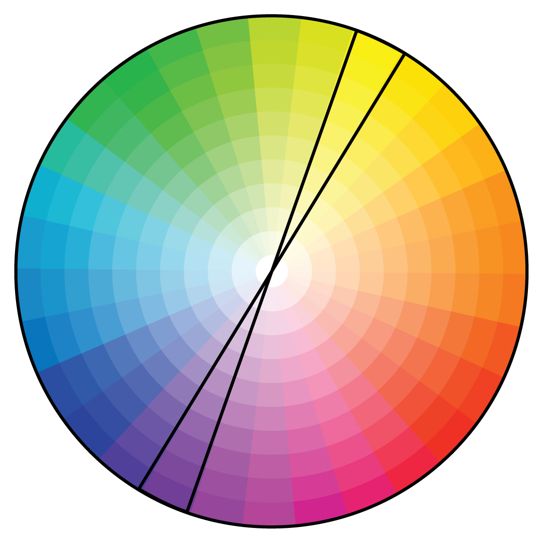
Color harmony is one of the main tenets of color theory that assesses which colors work well together—and which don’t. There are three main approaches to color harmony: complementary colors, analogous colors, and triadic colors.

Complementary Colors

Complementary colors are those that are opposite on the color wheel. For example, red and green, purple and yellow, and blue and orange are all complementary color pairings. The reason these colors work so well together is that complementary colors pair together a warm and cool color to create contrast. The opposing hues help the colors appear brighter for a more eye-catching combination. 

Complementary color pairings are often found in nature, which also makes them naturally pleasing to the human eye. For example, purple flowers with a yellow center, an orange sunset over the blue ocean, or green leaves with bright red berries are all beautiful combinations that you can find on almost any nature walk. 

Analogous Colors

Unlike complementary colors, analogous colors are those that are next to one another on the color wheel. Red, orange, and yellow, or blue, green, and yellow are examples of analogous color combinations. When creating an analogous color scheme, one color should be the dominant shade, while the others serve as accent colors. Though these color palettes aren’t as attention-grabbing as complementary color schemes, they are still very pleasing to the eye and are a good, more subtle option when choosing your brand colors. 

Triadic Colors

Triadic color schemes are combinations of three separate shades that are equal distances apart on the color wheel. Red, blue, and yellow, for example, is one of the most common triadic color palettes. Green, orange, and purple is another triadic combination. While this approach is less common than complementary or analogous color schemes, it’s a vivid option that can help your brand’s logo and marketing materials stand out.

color pairingscolor pairings

Choosing Your Color Scheme

Because there are nearly infinite color combinations to choose from, it can be a challenge to pick your brand colors. To make it simpler, start with the favorite or must-have color. Take that shade and create a few different color palettes to see what works best with your brand.

Combine your chosen shade in a complementary, analogous, and triadic color pairing. This will help you see your favorite hue in several different combinations, making it easier to visualize what your brand colors and logo might look like.

Be sure to also take a look at color psychology to ensure your chosen shade speaks to your brand values. Each shade has intrinsic effects on people, whether they realize it or not. Blue, for example, tends to have a calming effect while red creates a sense of urgency. Green is associated with wealth, while purple is often associated with respect and wisdom. Before finalizing your palette, evaluate your chosen primary color and make sure that the meaning aligns with what you want your brand to be known for.

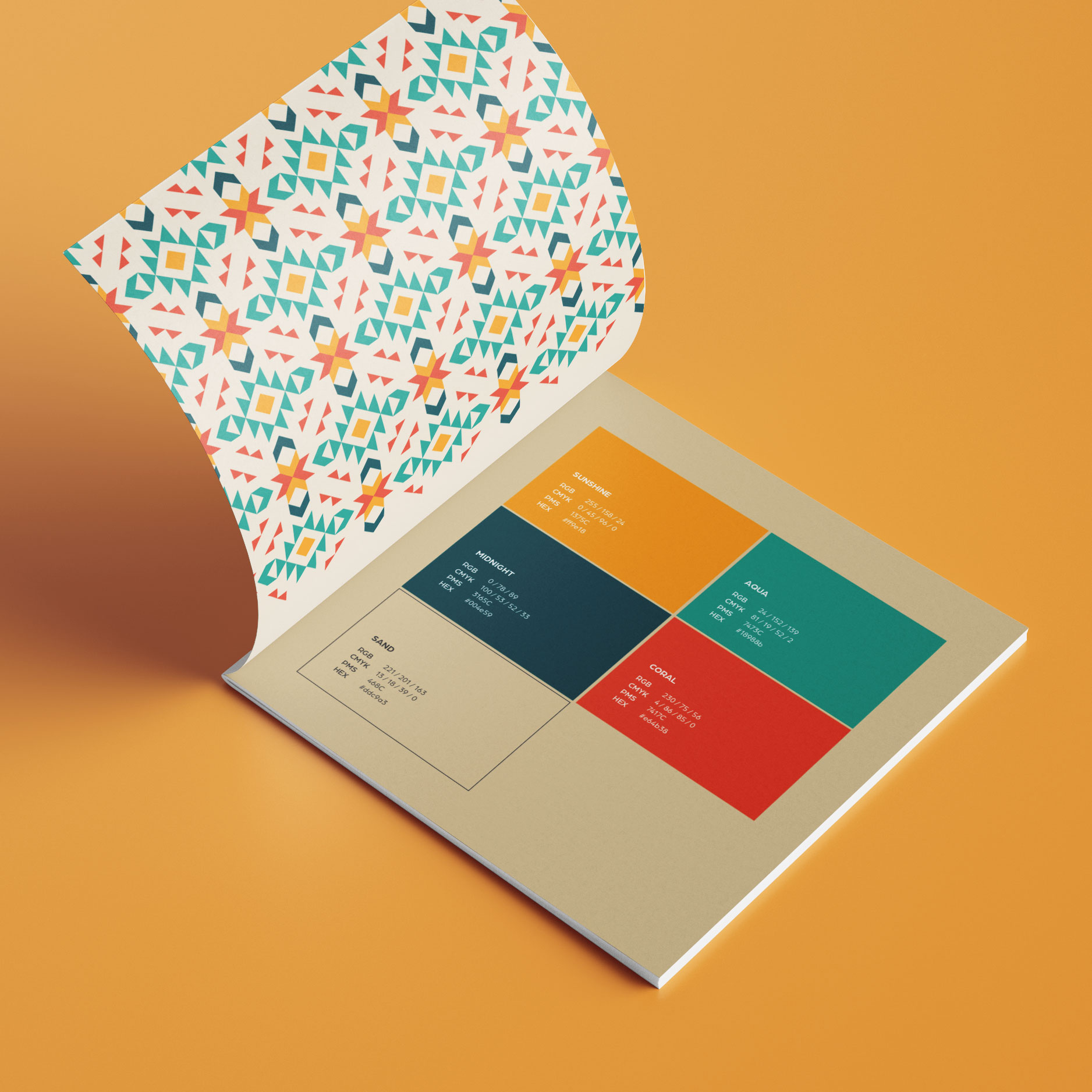
Once you’ve nailed down your palette, don’t forget to expand your hues by adding both light and dark shades—to create a well-rounded palette that allows you to develop any marketing asset your community may need.


If you’re struggling to find the perfect pair of colors to represent your apartment community, we can help. As design experts in the multifamily space, we know exactly how to curate brand colors to make your community stand out. Get in touch today to get started!

The Top 3 Complaints About Creative Agencies from Apartment Marketers

There’s a missing link between property management companies and your average agency. And it’s a big deal. So, when we first got into the creative business, as fixers and doers—we wanted to help property management companies by doing what the typical agencies weren’t: understanding you needs, connecting the dots of property management, and giving you a beautiful product of any size for any creative project; one that would make your marketing team sing.

We hear a few common complaints with regular marketing agencies from some of our prospective clients. Not only are we sympathetic—we’re here to be that missing link. Read on for how zipcode creative does things differently!

Complaint #1:

“We’re forced into big branding packages and can’t get help easily or affordably with smaller one-off needs.”


FLEXIBLE PROJECT SIZES

It stinks when you get sold something that you just don’t need. (Winter air in your tires, anyone?) That’s not what we do—we work with you to get what you need done. You can think of us as an extension of your own marketing team. We pride ourselves on communication and our ability to take any size project. We know every client is different, with different needs, different budgets, and we’re here for it all.

Let’s say, for example, you need just one thing: a property sitemap. We’ll do it. Or, let’s say that you need a full rebrand—we’ll happily do that too. And it will all look amazing. We’re here solely to support you with beautiful branding and industry-leading graphic design.

COMPETITIVE PRICING

We’ll provide you with lots of options to get your project done, and we make sure that we’re on the same page so that the process isn’t painful in the least. We’ll also make sure that you feel like you’re getting good value on the items we’re creating for you—project rates are our jam. Forget the hourly tracking. Transparent pricing means it’s easy for you and easy for your finance office (and easy for us, too). Certainly, We Make Things Look Pretty!…and—we make pricing and projects simple.

Complaints About Creative Agencies

Complaint #2:

“Extremely long turn around times, even for revisions! I sometimes have to do it myself in canva to get the design out in time.”


FAST

We know you need things—like yesterday—in this industry. Our turn around time is always surprisingly quick (and consistent). We have a roster of creatives, ready to go, and with that comes extreme flexibility, making sure you get what you need when you need it. Just ask our clients—they’ll tell you all about it.


VALUABLE

Just because it’s fast doesn’t mean it’s bad. Quite the opposite. We get hyper-focused on giving you a product that jibes with what you already have, so it’s not going to stick out. (Unless it’s supposed to, of course.)


EFFECTIVE

In the same vein, we’ll make sure you feel like you can offer opinions, comments, feedback and guidance at the right time, so we can keep things efficient—and avoid all those extra feedback loops, which stink for everyone. You’ll feel heard, we’ll feel guided, and the product will be beautiful and useful. In short, you’ll want to hire us for everything—be warned!

Complaints About Creative Agencies

Complaint #3:

“The deliverables we receive are often not to the level they should be; it’s clear they don’t fully understand the multifamily industry.”


THE HISTORY

We’ve been in multifamily for a good, long while—from all sides. We understand the needs, the pressures and the nuances of industry terminology and equal housing. This translates into our projects by giving us unique insight to capture residents’ attention through fonts, colors, and taglines, or by highlighting particular amenities, or through capitalizing on specific resident events. Those years in multifamily marketing have been spent with some of the bigger names in the industry, and our knowledge and expertise are part of everything we do. If it doesn’t cut muster, it’s not getting passed on to you, the client.

MAKING THE CONNECTION

These missing links between property management and the typical agency model can become stressors. (Exactly what no one needs.) zipcode creative was founded to bridge the gaps! We speak “renterese” and we’re ready to translate for you. Rest easy, knowing that you’ve hired a marketing agency that actually gets you and gets your industry. Now—what was that new construction we were talking about?


HELP US HELP YOU

Like we’ve said before, every client is different, and every community needs something customized. We can do that.

But first, we have a question:

What is your biggest complaint with your current agency partners?

[et_pb_contact_form _builder_version=”4.19.0″ _module_preset=”default” _unique_id=”7a50378b-a6aa-4ec9-b952-95a5c604f8f9″ success_message=”Submitted! ” submit_button_text=”SEND” email=”[email protected]” custom_message=”Complaints/Thoughts on Creative Agencies||et_pb_line_break_holder||%%Message%%” use_redirect=”on” redirect_url=”https://zipcodecreative.com/services/” hover_enabled=”0″ sticky_enabled=”0″][et_pb_contact_field field_id=”Message” field_title=”Submit your thoughts and complaints about working with outside creative marketing agency partners.” field_type=”text” fullwidth_field=”on” _builder_version=”4.19.0″ hover_enabled=”0″ global_colors_info=”{}” button_text_size__hover_enabled=”off” button_one_text_size__hover_enabled=”off” button_two_text_size__hover_enabled=”off” button_text_color__hover_enabled=”off” button_one_text_color__hover_enabled=”off” button_two_text_color__hover_enabled=”off” button_border_width__hover_enabled=”off” button_one_border_width__hover_enabled=”off” button_two_border_width__hover_enabled=”off” button_border_color__hover_enabled=”off” button_one_border_color__hover_enabled=”off” button_two_border_color__hover_enabled=”off” button_border_radius__hover_enabled=”off” button_one_border_radius__hover_enabled=”off” button_two_border_radius__hover_enabled=”off” button_letter_spacing__hover_enabled=”off” button_one_letter_spacing__hover_enabled=”off” button_two_letter_spacing__hover_enabled=”off” button_bg_color__hover_enabled=”off” button_one_bg_color__hover_enabled=”off” button_two_bg_color__hover_enabled=”off” required_mark=”off” sticky_enabled=”0″][/et_pb_contact_field][/et_pb_contact_form]

Brand Vocabulary Defined for Apartment Communities

You probably notice that you use similar words and phrases often—you may even have some that are a bit of your signature style. Did you know that your apartment community should, too? When it comes to defining your apartment brand, try thinking beyond branding basics like vision, mission, and values. Once you’ve established those foundational brand pillars, it’s time to add a bit of personality and pizazz. That’s where your brand vocabulary comes in.

What is Brand Vocabulary?

A brand vocabulary is a set of select words or phrases used regularly in describing your community and in all of your copy. Creating defined brand language at the brand development phase helps you create a consistent and recognizable brand that looks and feels consistent across touchpoints. 

Why Do You Need Brand Vocabulary?

Your brand is more than just your logo or your signature colors. How you speak, the words you use, and your style are just as important—and recognizable—as your visual branding elements. 

Similar to how individuals favor different terms, phrases, and sentence structures, brands can leverage language to create a distinct and easily identifiable personality. Some of the world’s most successful brands, like Disney or Apple, use strong brand vocabularies to create immediate associations with their brand. 

When you hear the words, “magic,” or “kingdom,” for example, Disney is one of the first brands that comes to mind—and especially when the words are paired together. Apple has also developed its own style. When you see a word that starts with a lowercase “i,”  like “iHome,” most people instantly recognize it as part of the Apple ecosystem. The brand has expanded this format, using it not only across product names but also incorporating it into advertising to create a thriving and distinct brand vocabulary.  

When done properly, your brand vocabulary will also begin to build an association between particular words and your community. Over time, this helps to generate heightened brand awareness and recognition, while also allowing you to differentiate yourself from your competitors.

brand vocabulary

How to Create Brand Vocabulary

Once you understand what a brand vocabulary is and why it’s important for your community, it’s time to start developing your own. Just keep these tips in mind to ensure your vocabulary is as effective as possible. 

Keep it simple

When you’re developing your brand’s vernacular, don’t overthink it. Some words and phrases that you use often are naturally tied to your community and your industry. For example, apartment communities often use some variation of:

  • Studio
  • 1-bedroom
  • 2-bedroom
  • Amenity spaces
  • Lease
  • Resident

To set yourself apart from your competitors, it’s important to expand your vocabulary beyond industry terms. Look to your brand’s vision, mission, and values to determine other words that might be a good fit. For example, if your brand is more forward-thinking or modern, utilize words with that same feeling and tone. If you’re more traditional and classic, lean toward words that evoke that same feeling. You can also try thinking up creative ways to phrase typical industry-standard words for a more creative spin.

Make it unique

Using unique words or phrases to describe common amenity spaces can help you create intrigue and be more memorable. For example, instead of calling it an on-site dog park, opt instead for “The Bark.” Instead of calling it the business center or resident lounge, you can opt for something punchier and more modern, like “The Hive.” Thinking outside the box helps you develop more memorable names that help to create a strong community culture and make your spaces stand out more to prospective residents.

Stay consistent

Above all, staying consistent with your brand vocabulary is key. Once you’ve developed and defined the different words and phrases you’ll use, be sure that everyone is aligned. If you decide that you always want to call them “residents,” for example, it’s important that marketing materials never use the word “renter” or “tenant.” Similarly, your leasing staff or resident-facing teams like maintenance or the concierge should always call prospects “residents,” on tours or during other interactions. Creating a consistent vocabulary across touchpoints is what will help set you apart from your competitors.

Developing a brand vocabulary from scratch can be tough. If you’re struggling to find words and phrases that feel right for your community, it might be time to enlist the experts. At zipcode creative, we have a team of seasoned marketing professionals that can help you nail down the exact right terms to add to your repertoire to help your community stand out. Book a consultation with one of our experts today to get started!

ORA is ©Fairfield Residential  |  Work executed by Stacey Feeney, owner of zipcode creative, while under creative direction and employment at Fairfield Residential.