
Tag: multifamily branding

Creating Neighborhood Content That Sounds Like Your Brand

Pull up the neighborhood page on your community website. Read it top to bottom.

If it’s like most of them, you found a Walk Score, a map with pins, four chain restaurants, one park, and a sentence about how the area offers “something for everyone”. Probably a Whole Foods callout. Definitely a commute time.

Now cover the logo and show someone who doesn’t work with you. Could they name your community? Could they name your city?

That page is doing one job when it should be doing three. Right now it only proves you have an address. It should also prove you know the place, help a prospect picture their average Tuesday, and give Google and AI answer engines something specific enough to quote. A real local content strategy handles all three at once. And it doesn’t require a staff writer, a photo crew, or an extra budget line item.

The Part That Comes After “Know Your Neighborhood”

So, we’ve written about location a few times around here. Why the area should shape your brand in the first place. How local partnerships build genuine ties with the businesses around you. Why local beats bland every single time. All strategy, all important still.

This is the layer after. You did the research. You know the vibe, the history, the hot spots, the people. You built a brand that fits the block instead of ignoring it. Now you have to publish something. But knowing your neighborhood and deftly communicating it (on brand) are two different things. Let’s see what we can figure out.

What Neighborhood Content Is Supposed to Do

Your area content has two audiences, and lucky for you, they typically want the same thing.

Audience #1: A person deciding where to sign a 12-month lease. They’re not reading your neighborhood page to learn that a grocery store exists. They’re trying to run a simulation of their own life in your zip code. Where does coffee happen on a Saturday? Is the walk home at 10pm the kind of walk you want to take? What does this place feel like on a random Wednesday when nothing special is going on?

Audience #2: A machine. Google, and increasingly ChatGPT, Perplexity, and Google’s AI Overviews, which all get asked some version of “what’s it like to live in [neighborhood]” every day. These machines want specific, verifiable, first-hand claims they can pull into an answer.

Vagueness isn’t helpful. “Something for everyone” tells a prospect nothing and gives an answer engine nothing to lift. Specificity serves both at once, which is good news! You don’t have to choose between writing for humans and writing for search.

Filter the Neighborhood Through One Person

Every neighborhood has a few 100 true facts about it. Your job isn’t to list them. It’s to pick the 40 that matter to the person you’re trying to lease to.

That’s what your Ideal Resident Profile is for. Not just brand colors and messaging, but content selection.

Say your IRP is a mid-career nurse working nights at the hospital six minutes away. Suddenly your neighborhood content is about what’s open at 8am when a shift ends. Which grocery store is empty at 10am. Where you can get real food at 11pm without a drive-thru. Maybe even blackout curtain recommendations….

Nobody in your comp set is writing that guide. They’re all writing the one about the farmer’s market.

Or your IRP is a family relocating from out of state, and your content is about school boundaries, pediatricians taking new patients, which park has shade, and which streets get loud on game days. Also nobody’s writing that.

The generic neighborhood page exists because nobody made a choice about who it was for. Make the choice and the content writes itself.

The Four Formats Worth Your Time


Not all local content is worth writing. But these four categories are.

The area guide page. Your evergreen anchor, living on your own domain, structured and thorough. This is the one that ranks and gets cited. It deserves the most effort and the most voice.

The recurring roundup. A short post every month or quarter covering what’s new, what opened, what closed, what’s happening. Low effort, high freshness signal, and it gives you something to say on social that isn’t a rent special.

The named social series. Give it a title and a repeatable format so the on-site team knows exactly what to do next. “Six Minutes From Home.” “The Block Report.” Whatever fits the brand. A format beats a one-off every time.

The tour handoff piece. Printed or digital, handed to a prospect at the end of a tour. A curated map with your actual opinions on it (maybe every staff’s fave spot nearby with specific recs). It’s the cheapest brand asset in the building and it walks out the door with them.

Making It Sound Like You

Here’s where most neighborhood content fails: It’s not written in anyone’s particular voice.

Have an opinion. “Three coffee shops within a mile” is a directory listing. “The one on Fifth is where you go to actually get work done, the one on Elm is where you go to be seen” is a brand talking. Opinions are the whole product. A prospect can get the list from Google Maps. They can only get your take from you.

Use your brand’s vocabulary. If your verbal identity leans warm and a little wry, the neighborhood page should be warm and a little wry. If it’s quiet and grown-up, don’t suddenly write “the vibes are immaculate” because it’s a social post. Same brand, same words, every touchpoint.

Name real things. Streets. Businesses. The school district. The bus line. The specific mural. Vague nouns like “nearby dining” and “convenient access” mean nothing to a person and don’t solve anything for a machine.

Know what you’d never say. A brand voice is defined as much by its exclusions as its inclusions. If your guidelines don’t already have a “we never say this” list, that’s a gap worth closing.

Let a person sign it. Content attributed to a leasing manager who’s lived there four years beats an anonymous page. Google advises leaning hard on first-hand experience, and readers can feel the difference too.

Writing So Search and AI Can Both Use It

The technical part is less complicated than it sounds.

Answer the question in the first sentence of the section, then explain. Answer engines will pull the direct answer and skip the wind-up, so put the goods up top.

Use the question people type as your section header. “Is [neighborhood] walkable?” outperforms “Neighborhood Amenities” for both search and extraction.

Name your entities generously. Neighborhood name, adjacent neighborhood names, street names, business names, school district, transit lines, landmarks. Search engines and language models resolve entities and build relationships between them. You want your community sitting inside that web.

Then resist the urge to stuff “apartments in [city]” into every third sentence. It reads badly and it doesn’t work anymore.

And remember what you’re up against. The ILS neighborhood pages on Zillow and Apartments.com are generic because they have to be, since they’re describing thousands of places by formula. But you? You’re describing one place, and you’re standing in it. That’s the entire advantage. So use it.

What to Leave Out

Know when to stop, folks!

Leave out the whole city. Your community is in a neighborhood, not a metro area. A guide that covers everything within thirty minutes is a tourism brochure, and tourism brochures don’t help anybody choose an apartment. Draw a radius you can honestly claim, probably a mile, maybe two, and back it up.

Leave out the oversell. If the block is quiet and a little sleepy, say so. Some people are shopping for quiet and sleepy. Overselling an average neighborhood gets you a tour where the prospect’s face falls in the parking lot, and you can’t recover from that.

Leave out anything you can’t verify. No inherited claims from the original lease-up brochure. No “minutes from” numbers nobody has driven. No school ratings from four years ago. If you didn’t check it, don’t publish it.

Leave out the things every listing already covers. Walk Score is on the ILS. Commute times are in Google Maps. Repeating them buys you nothing and takes up space where your point of view should be.

Leave out the fair housing landmines. Describing who lives in a neighborhood, rather than what’s in it, is a fast way to a problem. Write about places, businesses, and experiences. Not demographics. When in doubt, run the copy past whoever handles compliance for your portfolio, because a beautifully written area guide that opens you up to liability is a big issue.

Please please make sure you check that last one. Local content is one of the few places where marketing copy drifts toward describing people, and it needs a second set of eyes before it goes live.

Keeping It Current Without a Full-Time Writer

Local content has a SHELF life.

One closed restaurant on your area guide costs you more trust than five good recommendations. A prospect who drives to your top pick and finds brown paper on the windows starts doubting everything else on the page.

So build in a check. Quarterly, have someone specific verify every business you’ve called out is still open. Put it in a calendar and give it an owner, because “everyone’s responsibility” means nobody’s.

Batch the work. One afternoon of walking the neighborhood with a phone gets you notes, photos, and enough material for a quarter of content. Way more efficient than trying to write it from a desk in a regional office three states away.

And use your on-site team. They know which coffee shop residents complain about, where everyone orders lunch from, which park fills up on Sundays. That’s a content calendar sitting in the leasing office. Go ask for it.

How to Tell Whether It’s Working

Pageviews are the wrong metric here. Neighborhood content helps with trust, so it shows up in indirect ways.

Watch time on page and scroll depth. If people are reading to the bottom, the content is doing its job. Watch Search Console for neighborhood queries you never targeted showing up, which usually means the specificity is landing. Ask your leasing team whether prospects mention it on tours, because that will tell you the most. And start checking whether AI answers about your area cite your content, since that’s fast becoming the front door.

Give it two quarters before you judge it. Local content compounds slowly and then all at once.

One Last Thing

The neighborhood is the one asset your comp set down the street can’t copy. Different corner, different walk, different noise at 9pm, different everything. 

Most communities are handing that advantage away with a Walk Score widget and a paragraph about how there’s “something for everyone”. Sigh.

If your area content reads like a directory and you’d rather it read like your actual brand, that’s copywriting work, and it happens to be the kind we love. Let’s talk about what your neighborhood sounds like.

Competitive Analysis for Apartments: What Your Comp Survey Can’t Tell You

Every multifamily team I talk to says they do competitive research. Then I ask what they found, and someone opens a spreadsheet with all the details.

Rents by floor plan. Concessions. Square footage. Amenity checkboxes. Occupancy, if they could get their hands on it. It’s usually a beautiful spreadsheet, and somebody put serious hours into it. But this isn’t really competitive research. It’s a rent survey with nicely color coded boxes that only answers a single question: What’s everybody charging?

That question matters. But it’s not what’s keeping your lease-up flat while the property two blocks over is signing.

The question a comp survey can’t answer

The question a community needs to ask:

Why would someone touring two communities on the same Saturday pick yours?

Price is a tiebreaker. It comes into play at the end, after a prospect has already narrowed things down to two or three places they can picture themselves living. The narrowing began on a phone, in a search result, on a website they gave about 11 seconds. Whatever happened in those 11 seconds doesn’t get tracked by your “competitive research”.

We’ve written a good bit about the other half of this. Our earlier pieces on brand research and discovery and on building an Ideal Resident Profile cover the audience side thoroughly: demographics, geographics, psychographics, behavioral patterns, and how all of it feeds a brand that residents recognize themselves in. That work still holds up, and if you haven’t defined your IRP, definitely start there instead of here.

This piece is the other half. Not who you’re talking to. Who else is talking to them.

Your official comp set and your brand comp set are two different lists

This one trips up a lot of marketing teams, no matter how smart.

Your official comp set was built for revenue management. Assembled around rent bands, unit mix, vintage, and a radius, it’s a perfectly good list. It does its job.

But prospects have never seen that list. They don’t shop by radius. They shop by whatever three tabs are open, whatever the ILS filter served them, whatever a friend mentioned, whatever came up when they searched a string of words with hope in their hearts at 11pm.

Your brand comp set is anybody competing for the same person’s attention. Sometimes that’s a property outside your radius. Sometimes it’s build-to-rent on the edge of town, or a condo they’re not really going to buy, or the apartment they’re already in and could just renew. If you only study the properties your revenue model flagged, you’re researching a market your residents don’t live in.

Build the second list. It’s more useful and it’s usually more uncomfortable.

Start with what they’re promising, not what they have

Amenity lists are the least interesting thing about a competitor.

Everyone in a given class has roughly the same stuff (give or take a dog wash). The inventory isn’t what separates. Look instead at the promise: What each one says your life will look like once you live there.

So the first pass isn’t a feature audit. It’s a promise audit. Pull up each competitor and answer one question about each: what are they claiming this place will make you feel or become?

Then line the answers up next to each other. Nine times out of ten you’ll see three claims repeated across an entire market: elevated, convenient, connected. Everybody promising the same three things is the single most useful finding in the whole exercise. You don’t want your promise to be the same as everyone else. Those three things as a promise should just be a given instead.

Read their words out loud, then read yours

Verbal identity is where the sea of sameness gets truly embarrassing.

Take the first two sentences of each competitor’s homepage and read them out loud. Then read yours. If you could swap the logos and nobody in your office could tell which was which, you’ve learned something important about both of you.

Watch for the vocabulary that shows up everywhere: curated, elevated, thoughtfully designed, your urban oasis, where modern living meets…. Those words felt fresh once. Now they’re blah furniture. When every property in a market reaches for the same twelve adjectives, none of those adjectives are doing any work, and the property that stops using them stands out by subtraction alone.

You’re not looking for good copy or bad copy. You’re mapping which words are already spoken for.

Look for where the whole market agrees

Same idea, applied to the visuals.

The instinct is to judge each competitor’s identity one at a time. Nice logo, dated logo, that color palette is a choice. Resist it. The individual verdicts don’t matter much. What matters is where the entire set agrees without meaning to.

You’ll see it fast: the same warm neutral palette, the same thin geometric sans-serif, the same photograph of an empty clubroom at golden hour with a throw blanket arranged at a diagonal. They didn’t all get together, shake hands, and agree to do this in some version (we think). They just tried to imitate what was working.

But this shows you exactly which visual territory is crowded, which means it shows you where your brand is crowded by other brands. You can’t be distinctive inside a consensus.

Find the white space, then find out why it’s empty

Gaps are the fun part. They’re also where teams get overconfident.

When you finish the promise audit and the vocabulary map and the visual scan, you’ll spot open ground. Nobody in this market is speaking to a specific kind of person. Nobody is claiming a particular feeling. Nobody’s using a certain palette, tone, or point of view.

Yet an empty space isn’t automatically a valuable one. Some gaps are empty because a dozen operators already tested that ground and found no demand behind it. Positioning as the market’s only ultra-formal luxury option is not a good strategy if nobody in that submarket wants formality.

So every gap needs a second question before you plant a flag: is there anything you have, or could credibly build, standing in that space? Differentiation has to be true. A promise your property can’t deliver on will only become a complaint generator with a marketing spend.

Compare how they present with how they’re perceived

Now, hear me: Do NOT skip this. It’s the part I’d keep at any cost.

Every competitor has two brands. The one they publish, and the one their residents describe. Reviews, resident social posts, comment sections, the way people talk about the place when the property isn’t “in the room”. Read enough of it and the gap between the two brands gets very clear.

Two things come out of that gap.

First: A warning. If three properties in your market get consistently dinged for the same failure, and you can credibly claim the opposite, you’ve found positioning that’s grounded in something real rather than something aspirational. That’s the strongest kind there is.

Second: A mirror. Run the same comparison on yourself. Your published promise versus what your residents say. If those two things have drifted apart, competitive insight won’t fix your leasing, because the problem is the gap (not the market).

The trap that turns good research into more sameness

So, the sea of sameness. It didn’t get built by lazy people.

A team does thorough competitive research. They find out the property down the street has a coworking lounge, a slicker website, and a smarter Instagram. They report the findings. Leadership says: let’s get those things.

Six months later, they’ve caught up. They also look exactly like the competition, which was the whole problem they were trying to solve.

Competitive research is supposed to make you more different, not more similar. Every finding should be tested before making a choice. Does acting on this make us more distinctly ourselves, or does it move us closer to the middle? Matching a competitor is occasionally the right call, usually for table-stakes items you can’t skip. It should never be the default response to a finding.

You’re studying the market to find out where nobody’s standing. Not to find out what you’re behind on in order to catch up.

When it’s worth doing, and when it isn’t

You don’t need to do this quarterly. Competitive positioning doesn’t move that fast, so save your money for when you can act.

Do it at inflection points. A lease-up where you’re setting positioning from scratch. An acquisition rebrand, where you inherited a brand built for a market that’s since changed. A repositioning after renovation. New supply delivering nearby. Or maybe most importantly: a persistent occupancy dip nobody can explain with pricing, which is almost always a positioning issue.

Between those moments, a light annual look is plenty. What changed, who’s new, what’s everybody saying now.

Research that makes you more like you

The best outcome of a competitive analysis isn’t a list of things to fix. It’s getting clear about what your community truly offers.

That clarity is what makes every downstream decision easier. Naming. Color. Voice. The photography brief. What your leasing team says on a tour when a prospect asks why here instead of there. You stop guessing, because you know exactly which ground you cover.

Competitors are genuinely great teachers. They’ll show you what the market has already decided, what it’s tired of, and where it isn’t looking. Just don’t fall into the trap of trying to sound like them.

Looking at your market and seeing a whole lot of the same thing, including your own community? That’s usually a positioning problem, not a marketing budget problem, and it’s a good one to solve. Let’s talk about what makes yours different.

The 25-Point Brand Audit Checklist for Multifamily

I gave a session at the Multifamily Strategic Marketing Summit (MSMS) with Lauren Turner, Marketing Manager at The Bainbridge Companies, called “From Disconnected to Unforgettable.” We nicknamed it “The Brand Break.”

Lauren built the Brand Audit Checklist at the end of this post. She built it because she’s lived this problem from the property side, and I’ve watched it from the agency side, and we both got tired of watching good brands simply fall apart over time.

Here’s what we presented, in case you missed it.

Your brand isn’t broken. It’s breaking.

Let’s be honest a minute. Think about the brands you’ve had a hand in. You invested time, money, and energy into building them. Beautiful guidelines, compelling brand story, yet something falls apart on its way from corporate to the leasing desk.

But the brand itself usually isn’t broken. It’s breaking in the handoff. That’s a very different problem, and it costs a very different amount to fix.

We asked, and you answered

Before the session, Lauren surveyed our LinkedIn networks and asked: “Where does your brand break most often?”

The answers came back, and nobody pointed to design. Not one person said the logo was ugly or the colors were wrong. They said things like this: 

Interactions with onsite staff members do not align with the brand promise.

Execution was the problem, every single time.

Guidelines tell you WHAT. Nobody tells your teams HOW.

Brand guidelines are excellent at one thing. They tell you WHAT the brand is: how it looks, what the messaging sounds like, the personality behind it.

They don’t tell your property teams HOW to use it in daily work.

Think about it. Your brand attributes might be “bespoke, vibrant, and spirited.” Lovely. But how does that translate into a follow up email a leasing consultant is writing on a Tuesday afternoon or building a social post because content has to go out *today*?

We’re asking people who aren’t designers to design on-brand. We’re asking people who aren’t copywriters to write on-brand. (And we never hand them the playbook!)

The translation layer

The fix is what we call the translation layer, and it sits at the intersection of the WHAT of your guidelines and the HOW of implementation.

Your guidelines define the visual identity and the brand voice. That’s the WHAT. Your property teams also need the HOW:

  • tour scripts that use brand language
  • email templates
  • social caption formulas
  • design templates, and even…
  • event ideas that fit the brand personality.

Corporate marketing has to build that bridge. Without it, there’s no guarantee prospects and residents will ever hear the brand story or experience the brand promise you paid to create.

There’s one question that tells you whether your translation layer exists: Could a brand-new leasing agent use this tomorrow without calling marketing for help?

If the answer is no, you don’t have a translation layer. You’re just crossing your fingers.

What a surprise visit to a lease-up revealed

This is Lauren’s story, and it’s the one that landed hardest in the room.

She decided to make an “oh so fun” surprise visit to one of their brand-new lease-ups. And she’s glad she did, because the brand was already starting to drift.

It wasn’t from lack of caring. The team was working hard, leasing, doing their best. The drift happened because everyone was interpreting the brand differently. Without clear guidance on how to apply it day to day, consistency broke down on its own.

So they brought the entire onsite team together, from maintenance to manager, and hosted a two-day brand immersion. They pulled in operations, development, training, and marketing to help the onsite team understand what makes the community unique, who it was designed for, and how that story should guide daily decisions.

On day two, they walked the community together through the resident’s eyes. They talked about describing amenities through lifestyle instead of features. They aligned on tour language, resident communication tone, and marketing consistency.

More than training, that’s alignment.  And the impact showed up where you’d want it to: conversion ratios, easier objection handling, and a team that finally felt confident telling the story.

In today’s world, the modern renter is drowning in choices. Yes, we need to get their attention, but we must also make prospects feel confident in their choice calling our place their home. And that’s up to the onsite team—they have to sell the experience and tell the story, delivering the lifestyle promised through our marketing.

Your brand wasn’t chosen by chance

Something Lauren says in every brand immersion: your brand wasn’t created by chance.

Long before a logo or a color palette existed, there were years of planning behind the community itself. Selecting the right piece of land. Defining the target resident. Designing the building and the experience it was meant to deliver. Every decision was made to support long-term value, not short-term demand with high turnover.

On our side of it, before we ever choose a font, we’re deep in location analysis, asking why a resident would want to live in this area at all. We’re doing competitive research so the community can be positioned as different from its comps. We’re profiling the target resident, and not just demographics. Psychographics matter more: how they like to spend their time, what they value, what their life really looks like. We study the building itself, from architecture to interior design to amenities and services. We even look at the property management company as the operator, because culture and customer experience are part of the product.

All of that happens before logos, fonts, and colors.

Skip the implementation guide, and risk an off-brand social post (or worse). Without it, you undermine every bit of strategic work that went into building the brand in the first place.

A brand isn’t finished when the guidelines are approved. It’s finished when teams know how to consistently deliver it.

Recognize the break before it goes off the rails

Quick show of hands, mentally. Picture your portfolio right now. Can you name at least ONE property where the brand broke down somewhere in the handoff?

Most of us can, immediately. So let’s talk about what to look for.

Brand breaking points don’t typically appear as one big, obvious mistake. It’s a small drift away, in everyday moments each time there’s a quick decision made without the brand guide.

A team prints its own flyers because the approved collateral ran out. A social post goes up that doesn’t match the aesthetic because content had to be published today. Tours start sounding generic, describing any community in the submarket. Events get planned that don’t align with the lifestyle the brand was built around, and residents stop showing up.

The most common breaking points we see, and the ones our survey confirmed:

  • Inconsistent onsite materials: DIY brochures, flyers, or signage when collateral runs out
  • Off-brand social posts created without guidance
  • Leasing teams describing the community differently person-to-person
  • First impressions (lobby, models, curb appeal) not matching the brand promise
  • Events that don’t align with the brand personality
  • Website or ILS details not matching what’s said on tours
  • Generic tour language that could describe any community
  • Maintenance or service interactions that don’t reflect brand tone
  • Inconsistent photo quality across marketing and social

Individually, nothing major here. But over time, they slowly rewrite how the brand is perceived and experienced.

People care, but onsite teams are moving fast, juggling residents, tours, vendors, and deadlines. When the brand isn’t fully embedded, it becomes something teams reference after the fact (whoops, that’s the font we have to use?)—instead of something that guides decisions in real time.

Why cohesion and consistency win

Think for a second about brands you know, love, and trust. H-E-B if you’re in Texas. Delta when you travel. You know exactly what you’re going to get, every single time. That consistency of promises delivered builds trust.

Cohesion builds the story behind your community. Consistency reinforces that story at every touchpoint. Deliver the story consistently and the brand becomes memorable, and your residents become loyal.

In multifamily, that means delivering the brand promise across the whole leasing journey. First click, to tour, to renewal.

The 25-point brand audit

So how do you find out where you’re losing it? You walk your own community like a stranger and you score it.

Two questions guide everything below. Does this look and sound like our brand? And does it feel like what the brand promised?

Digital curb appeal. Start where a prospect starts, which isn’t your website.

  1. Do your ads visually align with your website and social presence?
  2. Does your ILS description reflect your true brand voice, or does it read like generic apartment copy?
  3. Do your photos reflect the lifestyle and personality of the community, not just floor plans and amenities?
  4. Would a prospect understand what makes this community different within seconds?

Overall website experience. Interest turns into intent here.

  1. Does the homepage clearly communicate what makes this community different?
  2. Do the photos and messaging reflect a lifestyle, instead of just listing amenities?
  3. Is key information easy to find, like pricing, availability, and how to tour?
  4. Does the website accurately reflect what someone will experience when they arrive onsite?

First impression onsite. Lobby, leasing office, model units. Walk in like a first-time prospect.

  1. Does the lobby feel like the brand you marketed online?
  2. Is signage cohesive, updated, and aligned with brand standards?
  3. Are printed materials professionally produced, or DIY and outdated?
  4. Do scent, music, lighting, and ambiance work together to create the experience the brand promises?
  5. Would a prospect say, “this feels exactly like what I saw online”?

The human element. How the brand is spoken and lived.

  1. Does the leasing team use brand-aligned language on tours, centered on lifestyle instead of features?
  2. Can staff clearly articulate the story behind the community?
  3. Does the energy of the team match the brand personality?
  4. Are email drips and text responses consistent with brand tone?

Social media. For many prospects, this is where they go to find out who really lives here.

  1. Does the feed align with your brand colors, photography style, and aesthetic?
  2. Are captions written in your brand voice, or do they sound generic?
  3. Are you showing lifestyle moments and resident experiences, not just amenities and promotions?

Resident experience. They’re living inside the brand every day, and they’re the ones who renew.

  1. Are resident events aligned with the brand personality, or totally generic?
  2. Do move-in gifts reflect the brand, or are they random swag?
  3. Would a current resident describe the community the way you market it?

The forgotten moments. Where brands come apart when nobody’s watching.

  1. Do maintenance communications and renewal emails carry the same tone and care as leasing?
  2. Do vendor partners understand and support your brand standards when they interact with residents?

And then finally and most importantly: 

If the logo disappeared tomorrow, would the experience still feel unmistakably yours?

How to score it without lying to yourself

The full checklist Lauren built goes deeper than the 25 above, with a scored section for each category and a total worth knowing:

40 and above means you’re fully immersed in your brand, with consistency across the entire consumer and resident journey.

30 to 39 is early brand drift, where small inconsistencies are starting to appear. Catch it here and it’s less expensive to fix.

20 to 29 is inconsistent, noticeably, and you need realignment immediately.

Below 20 is a brand break. Rebuild the translation layer and get back to basics.

Now the hard part. You can’t score your own brand honestly. You’ve been staring at it for three years. You know what the copy was supposed to mean. Prospects have none of that context. They have eleven seconds and four other tabs open.

So bring in someone who isn’t you. Someone from another region, a friend outside the industry, or a partner who does this for a living. Compare their score to yours. That gap may be the most useful thing you’ll produce all quarter.

And run it quarterly. Make brand alignment a regular habit, not a panicked, knee-jerk reaction to a bad month.

Build once, use forever

If the audit says your brand is breaking in the handoff, get your tools out (four of them, to be precise). They all do the heavy-lifting, and once you’ve got them built, you can use them practically forever.

A brand reference card. A 5×7, double-sided card with the logo, colors, fonts, patterns, textures, stock image style, tagline, and brand personality. It’s like The Greatest Hits from the full guidelines. Onsite teams keep it on the desk and grab it whenever they need to make something branded.

Brand immersion training. Ideally two days, in person, like Lauren’s. At minimum, a 30-minute video from marketing, operations, or development covering why the brand matters, what the guidelines mean, and how to embody the brand. Film it once and it plays forever, which matters a lot in an industry with our turnover. Pair it with tour script templates, social caption formulas, and an event planning guide.

Canva templates. Create templates with preset parameters, or have your creative agency partner take it off your plate. Lock the colors, fonts, and logo placement. Build templates for the things they’ll always need: social posts, flyers, event invites. Teams customize the photos and copy inside the guardrails. They get ownership, marketing gets its calendar back, and the brand stays intact.

A voice guide with AI prompts. Your teams are going to use AI, so work with them to keep it on-brand. Show them what on-brand copy looks like for emails, captions, and announcements. Then build prompts that coach the tool to pull from your verbal identity and write in the right voice.

The brand ambassador approach

One more thing worth doing, and it costs nothing: name a brand ambassador onsite.

Don’t go thinking this is the branding police. It’s someone who helps bring the brand to life! (Doesn’t that sound so much better?) Someone who walks the walk and talks the talk, who catches the drift early because they’re looking for it, and who other team members can ask before they improvise.

Your 30-day challenge

Brands don’t break overnight. They drift when the story stops translating into daily decisions.

And fixing the break doesn’t happen through good intentions. It happens when you give your teams the tools to bring the brand to life every single day. What makes a brand unforgettable isn’t how beautiful the guidelines are. It’s how consistently the brand gets lived across the entire customer journey.

So here’s the challenge we left the room with. If your brand is breaking, pick ONE thing from this post and build it in the next 30 days. One reference card. One training video. One set of templates.

Your brand doesn’t live in the marketing department. It lives in moments, and your teams create those moments every single day.

Get the Brand Audit Checklist

 The full quarterly brand health check, created by Lauren Turner. Score every touchpoint from digital curb appeal to the forgotten moments, and find your brand break before it costs you a lease.

Start by finding out where you stand. Download the Brand Audit Checklist, run it this quarter, and score it honestly. If the results have you staring at a longer list than you expected, you haven’t failed. It’s a place to start. And it’s exactly the kind of thing we love helping teams fix.

What Makes Luxury Apartment Branding Actually Feel Luxurious

Skim five competitors’ websites in your submarket. How many used the words “luxury” in the first 10 seconds of scrolling? Yikes.

Our industry isn’t always the best with words—and “luxury apartments” branding is the perfect case in point. A 2004 garden-style community with, say, new quartz countertops claims luxury. A brand new Class A high-rise with a rooftop pool and a dog spa calls itself luxury. A B-minus asset calls itself luxury after swapping carpet out for LVP. Same word in every listing means it’s white noise. Everything is luxury? Yeah, right.

That word’s worn out and it’s costing you trust and unqualified leads who got there ‘cause you claimed something you weren’t. But there’s another problem here.

But if the word is dead, how can you revive the idea?

Instead of going for your thesaurus full of synonyms (swapping in “indulgent”—no!) and instead look to design. That’s where you can visually set your brand apart. Instead of whether or not to say luxury, you can ask how you can help your brand feel luxurious instead of sound luxurious, especially to someone who’s heard the word a thousand times and stopped listening.

The Word Luxury Broke, and We All Helped Break It

Can we pin this issue on any one person or brand? Not really. It used to be a serious signal in multifamily; shorthand for better builds, nicer finishes, leveled-up amenities. Then it got adopted all over by brands of a variety of asset classes and years that really couldn’t keep that “luxe” promise.

Instead of being confused, residents are numb. They move past it, like it’s another “artisanal” item on a menu. They’re saving their focus for the photography, floor plan names, and website loading speed. They’re looking closely at the type to see whether it’s an old template or not.

This is exactly what anyone does when they step into a hotel lobby: Read it all (not the sign, the customer service, the cleanliness, the greeting) and make an assessment. 

Luxury Is a Feeling, and Feelings Come From Signals

Marketing academics have written entire books on this. Nerd out with me here. Jean-Noel Kapferer and Vincent Bastien, in “The Luxury Strategy,” argue that luxury doesn’t work like other categories, because it isn’t built on comparison. Premium says “better than that one.” Luxury says “in a category of its own.” If you’re justifying yourself against a comp, you’ve left the luxe room.

Avoiding comps feels like uncomfortable territory for multifamily. That’s our whole dang industry! But that tells us plenty about why “luxury” apartment branding has fallen flat. If your brand is using up energy claiming “better than that guy” rather than being standalone, that’s a competitor. Not the desirable destination.

How can you get that feeling? Restraint. Confidence. Knowing when to say when after the choice is made. Luxury brands don’t fill every inch of the page, they don’t shout, they don’t overexplain. The most expensive stores leave blank space in the window.

The Signals That Actually Read as Luxury

None of what follows involves adding gold. This is what we look at when we’re building a premium apartment brand.

Restraint in the visual system. Space is expensive. That’s true in real estate and it’s true on a page. Generous white space in a brochure, an unhurried website, a monument sign that isn’t crowded with taglines and disclaimers. That says: “We can afford to not use this space.” That’s flex, and everybody’s brain knows it.

Typography that behaves like it went to finishing school. Type does more heavy lifting in premium branding than almost anything else. Tight, intentional letterspacing. A typeface with real range, not a free download. Consistent hierarchy that never gets sloppy, not even on the third page of the collateral. Renters can’t necessarily pinpoint bad typography, but they feel it.

Materials and production quality. This is where a lot of budgets betray a brand. You can design a beautiful leasing brochure and then print it on thin stock with a glossy coating that makes it feel like a takeout menu. Paper weight, finish, ink, and binding are brand decisions, not procurement decisions. The same goes for signage substrates, the leasing packet folder, and the resident welcome kit. A brand is a physical experience before it is a strategic one.

Photography that respects the intelligence of the viewer. Premium imagery has quiet in it. Fewer people. Real light. Details instead of wide shots of everything at once. Pro tip: Not every photo should be of a smiling couple toasting on a rooftop at golden hour. That’s just a cutie niche stock library, and definitely not a brand.

Color that isn’t trying so hard. Rich, restrained, and often quite dark. Deep neutrals, warm blacks, a single confident accent. The metallics trend right now runs matte and brushed rather than shiny, which tracks. High shine reads as costume. Matte reads as considered.

Copy that doesn’t oversell. Short sentences. Fewer adjectives. The confidence to say what something is instead of piling on descriptors that beg you to be impressed.

What Your Copy Says vs. What Your Copy Proves

Try this. Take the “About” or “Community” page of your highest-rent asset and delete every adjective. Elevated. Curated. Sophisticated. Refined. Unparalleled. Now read what’s left.

If there’s nothing left, that’s the finding.

Adjectives are claims. Claims are cheap, and renters know it. And the fix isn’t a better adjective, because a better adjective is still a claim. Instead, get specific. This lets the reader draw the conclusion themselves. “Elevated finishes” tells me nothing. Telling me the kitchen has a 36-inch range and honed stone does the whole job, and it does it without ever using the word luxury.

This is the single most fixable thing in most luxury apartment branding. The visual identity is usually decent. The copy is doing all the bragging.

The Comp Set Problem, or Why Everyone Looks the Same

Walk your comp set’s marketing side by side and you’ll usually find the same warm neutral palette, the same thin serif or geometric sans, the same lifestyle photography, the same amenity list in the same order, and the same three adjectives. This is the sea of sameness, and it’s the strongest argument for brand as a differentiator in this biz.

Think about it from the leasing side. Your finishes can be matched. Your amenities can be matched, and probably will be by whatever delivers next year. Your rents are a number on a screen next to four other numbers. What can’t be copied is a brand with an actual point of view: 

  • a name that means something
  • a voice that sounds like a person
  • a visual system that isn’t identical to three other lobbies in the same city.

Brand may be the only thing in your stack that a competitor can’t just build.

When Luxury Positioning Is the Right Call (And When It’s Not)

Luxury positioning is the right call when the product can back it up. New or substantially reimagined construction, a finish level that holds up under scrutiny, an amenity set that’s differentiated, a service model with staffing to match, and rents at the top of the submarket. If that’s you, position accordingly and stop hedging.

If it isn’t, we’ve written at length elsewhere about what overclaiming does to prospect trust and to the leads you attract, so I won’t rehash it all right here. The design version of it is simpler: Claiming an asset class you’re not…is like putting on a costume, it doesn’t look right up close. 

So what do you build instead for a well-located, well-run, honestly mid-tier asset? A real identity, not a borrowed one. Character. Warmth. Design credibility. A sense of humor. A neighborhood point of view. The most charming building on the block will out-tour the fake-luxury building on the block because the charm is real and the renter can feel that in the first six photos.

Positioning down isn’t losing. Positioning falsely is.

The Mistakes We See Most in Luxury Apartment Branding

Gold everything. Gold is not a strategy. Gold plus a thin serif plus a marble texture will for sure have you dressed like a bunch of other properties.

“The Residences at” as a naming crutch. It signals nothing except that the naming conversation ended early.

Loading the name with the word. If you have to put luxury (or its cousins: The Reserve, The Estates, The Grand) in the name to communicate the tier, the rest of the brand isn’t doing its job.

Amenity lists as personality. Every Class A property has a fitness center. The list tells a renter what you have. It doesn’t tell them who you are or why they’d want to be the kind of person who lives there.

A gorgeous brand and a broken execution. Beautiful brand guidelines, and then a leasing team posting flyers in Comic Sans because nobody gave them usable templates. The brand is only as premium as its weakest touchpoint, and residents see the weak ones daily.

The Brand Has to Survive Contact With the Property

The last one deserves its own moment, because it’s where premium positioning goes to die.

Luxury is a promise, and promises get tested. Every email from the property, every maintenance notice taped to a door, every package room sign, every social post, every voice on the phone. If the visual identity is refined and the resident emails read like a citation notice, the brand cracks. If the website is quiet and confident and the Instagram is chaotic, the brand cracks.

Consistency is the most underrated luxury signal there is. Not because it’s exciting, but because inconsistency is how a renter learns that the polish was superficial. The properties that succeed with luxury apartment branding don’t necessarily have the biggest creative budget. They’re the ones where somebody made sure the brand made it all the way to the front door and beyond.

What to Do With All of This

Go audit your own community with fresh eyes. Look at your website, your brochure, your signage, and your last five resident emails, and ask what a stranger would guess about your rent from those alone, without reading a single price. Then ask whether the answer matches what you’re actually charging.

If there’s a gap, the fix isn’t more adjectives. (Step away from the superlatives, sir.) It’s usually less of everything, done better.

Trying to position a high-end community in a market where everyone claims the same thing? That’s the fun part of our job, and we’d love to hear what you’re working on. Let’s talk about your community.

Real Estate Brand Strategy in Action: The Curated Group Case Study

A name stands in as a promise—and only works well if that promise is kept. 

When Curated Group came to us, the ink on that promise was already drying. The founder had worked on building the business for close to two years, having named the company and designed the CG mark before ever meeting us. Typically, our branding projects have a blank page and a naming exercise. This one had a (weighty) word already selected, with a founder waiting to see it get fully fleshed out. So instead of inventing, we got to interpret.

So while we didn’t name Curated Group or design the logo, we got to help the founder build everything around it: the strategy, the verbal identity, the full visual identity system, website copy, and company brochure to make it a fully operating brand. The founder’s clear point of view, strong idea, and ambitious brief helped us build the platform that made it all work. 

A Name That Writes a Check

“Curated” is a bold word for real estate. (Say it out loud in a category full of “premier” and “luxury living,” and you’ll hear how different it sounds.) The founder chose it on purpose. The idea is that this firm curates properties, people, investors, and vision the way one would curate art. He loves art, and he meant it.

Yet, a word like that makes a promise the brand must deliver on. If the identity was somehow a standard navy rectangle, stock skyline, tagline about excellence, like any other corporate real estate company, “curated” would have become empty. The main creative challenge was to bring curation across every touchpoint, not just have it sitting in the name.

The Real Problem Was Trust

So, we had a name and a logo—but we needed to dig deeper. Discovery surfaced something that reframed the entire project. The firm’s biggest customer problem wasn’t awareness or price. It was trust. 

Owners have been burned. Managers they’ve hired have overpromised and underdelivered, given conflicting opinions. So by the time they’re moving on and shopping for a new partner, they want someone who will do what they say.

Knowing this made us pivot the whole verbal identity brief. If the brand is to be believed (which it must be)—it has to speak in a way that can be understood plainly. Transparent and confident without salesy speak. Restraint rather than theatrics in the brand voice. (More on how we carefully built that voice in a minute.)

The Whitespace Nobody Was Standing In

Curated Group sits in a bit of an awkward, wide-open middle.

On one side: Small shops, often run by a single agent. They’re personal and hands-on but lack institutional muscle. On the other: The national management giants that typically will not touch anything under about 150 units and treat smaller owners like an insignificant distraction. Plenty of owners sit between those two, wanting real sophistication and real attention at the same time.

That gap presents an opportunity. Institutional-quality operations plus boutique-level care and aligned incentives. Since Curated is an owner-operator (not just a third-party manager) it’s believable. With their experience as owners, they can build trust with clientele because they’re shoulder-to-shoulder, taking on the risk of asset management themselves.

The Tension That Unlocked Everything

Then, the founder casually handed us something absolutely vital. He wanted the brand to be about 40% sophisticated and timeless, and 60% artful and eccentric.

What a direction! Plenty of real estate brands stay in one lane. Totally institutional, buttoned-up to the chin. Or: design-forward and totally unique boutique. Curated desired both, with a lean toward the eccentric. That truly helped us figure out next steps. But it also created a puzzle. How can a brand be dependable and helpful (taking the overwhelm of asset management off an owner’s plate) while still making every property feel artfully unique? The sophistication could war with the playfulness. The reliability could be at odds with the expressiveness. 

So it was our job to resolve the tension. And we were able to do it with a single line!

One Line to Hold It Together

We landed on this positioning platform: The Art of Responsible Real Estate.

This small phrase allows us to relay everything we want. “Responsible” is the dependability clients can trust, with timeless sophistication (40%) while “art” is expressive, and gets at the curated, creative heart of it (60%). Both halves are represented and named, and it made everything that came after so much easier: voice, color, pattern, photography. Decisions got easy when we held the line: if it was artistic or responsible, it got the green light. The logo and name can now become a strategy, with the right words.

Turning a Trust Problem Into a Voice

Voice is where branding becomes readable. And where trust became indispensable.

We defined what the brand sounds like and, equally important: what it doesn’t sound like. It sounds strategic, reliable, insightful, and real. It stays away from the pretentious (“the premier, exclusive provider of luxury real estate solutions”), the clichéd (“at the forefront of the industry”), the trend-chasing (“we’re disrupting property management”), and the overpromising (“guaranteed, unparalleled returns”). Read through those don’ts again. The reason they’re “dont’s” is because they aren’t trustworthy—the companies speaking this way are the ones that caused distrust in the first place. So we avoid this style completely.

Next, we built the positioning into the vocabulary. Think: Partners and Clients, not Owners. Commitment, not Contract. The reason for these swaps is to indicate a relationship-first promise in everyday language—so the brand can stay consistent in written and spoken language.

Finally, we calibrated the tone to match the people. During discovery we found the team to be one that laughs together and works hard. Ergo, a voice that’s professional and approachable. Wittiness, balanced with seriousness around business and trust. “Your Vision, Our Masterpiece” and “Partnership, Artfully Done” bring in the art+responsibility aspect, so it’s built in, and the reader can sense it.

Where the Art Gets Physically Kept

Visual identity brings that curation promise to full fruition. And can be seen clearly—literally.

We captured timelessness with colorC: deep navy, blumine, a limited emerald accent, platinum, light blue, white smoke. That’s the 40% sophisticated, gallery-grade foundation. Gold could have gone into that core palette and turned corporate fast. Instead we pulled it out and made it a design element, the gold swash, an accent gesture that feels applied by hand rather than printed by committee.

Then the gallery metaphor, made literal, which is the payoff of the whole name. Real Florida properties are rendered as watercolor-stylized, masked watercolor images. Buildings turned into fine-art pieces. A frame element in navy and gold with a white matte inside presents them like work hung in a gallery. The copy even refers to the services as a gallery. That is the point where “curated” becomes a visual operating system. They curate, therefore, their work is presented as curated art. Concept and execution in full alignment.

The eccentric 60% shows up in the details that keep a navy-and-gold real estate brand from tipping into stuffy: a dot pattern and a curved-check pattern, a little playful, a little unexpected. Sophisticated base, artful expression, exactly the ratio the founder named. Typography holds the same duality, a clean geometric face for headlines over a condensed serif for the supporting text, modern and grounded with an editorial touch.

(And yes, discovery included the fun stuff. A persona exercise that landed somewhere around a 007-with-an-Audi, salted-rim-margarita, Banana-Republic-meets-Alice-and-Olivia kind of character. Useful for calibration, polished and capable with a real sense of play. This added detail filled in the blanks but didn’t drive the direction. The drivers were trust, whitespace, and that sophisticated-artful split.)

From Platform to Pages

The true test of branding is how it holds up with long copy and real applications. So we worked through website copy and the company brochure to see how it would go. And the page “The Art of Responsible Real Estate” had to pull double-duty to sound serious (a firm you can trust) and artful (a firm that curates its assets). The vocabulary helped, especially with Services framed as a gallery. Every paragraph proved the name was far more than decor and kept the founders belief (of art and trust) afloat.

Built for One Person

One more decision shaped everything: we wrote the entire brand with a single person in mind.

The ideal client is a high-net-worth owner diversifying into real estate who wants professional-grade management without becoming a one-off account for a company too big to care. When you can speak to “one person”, the branding decisions everywhere get easier—because you know who you’re talking to. So every sentence and design call has a clear recipient.

That persona also made Florida-specialist positioning a feature instead of a limitation. Deep local expertise, proximity to the assets, established vendor and regulatory relationships, a brand built for Florida rather than stretched thin across a national map. For an owner who has been ignored, “we fully know this market” is the best, most trustworthy pitch. 

Where It Landed

The brand landed in a great place, middle-of-the-road boutique, yet strong, with two complementary identities working together. Visually strong. Voice and vocab communicate boutique attention. Florida-specialization is an asset not a liability, with local knowledge as an added bonus. Trustworthiness comes through in the brand voice, and partnership is clear in the vocabulary. The proof is in the “owner-operator” alignment. The founder brought the name with the seed of an idea. We brought the branding to allow that seed to grow.

What This Means If You Have Already Named Your Community

Most of the multifamily world is sitting on names that were chosen and then left to fend for themselves. A word picked in a naming meeting, put on a sign, and, fingers crossed, maybe it will mean something on its own?

It won’t. A name is raw material, and the brand is what gets build around it to keep a promise. Strategy establishes what it stands for, voice is what makes people believe it, visuals is what has people see it. All this interpretation is the harder half of the job (from our viewpoint). Curated Group is a clean example: a strong name that would have stayed a nice-sounding word if no one had built the platform to keep its promise.

The other lesson worth taking, especially in a category where buyers have been burned: your voice can be a trust-building tool all on its own. If a brand wants to be persuasive, they have to sound different from the “let downs” that came before them. 

If you’ve named a community and it still feels like a word waiting for a brand, let’s solve that problem together. What could your name stand for?

How to Set Brand KPIs When Everyone Insists Branding Can’t Be Measured

Branding is the first line item people reach for when the budget gets tight. It tends to attract negative attention, because it doesn’t have positive numbers—because it wasn’t set up to be measured! When leadership wants to know actual results, a shrug and beautiful logo won’t win you the money argument.

That shrug will cost you. It’s the reason a community will fund another paid search campaign without blinking and then question every dollar of a rebrand. Performance marketing comes with a dashboard. Brand shows up to the same meeting with only “vibes.” Guess which one survives the cut?

So let’s fix the setup. Brand KPIs measurement is absolutely possible, and you don’t need a research budget the size of a coastal high-rise to do it. You need to track the right things, tie them to outcomes your CFO already cares about, and stop pretending a few of the popular numbers mean anything.

Now, this can get muddled. Proving that brand has value at all is one argument, and we’ve made that case before, right down to the specific data sources that signal brand strength. This is the next step past that. Instead of debating whether branding’s worth it (it is) it’s time to figure out which vital numbers you’ll commit to, baseline, and run quarterly reports on. That is a different discipline, and it will keep the budget. Here’s how to build a set of brand KPIs you can defend.

Why Brand Keeps Losing the Budget Fight

Brand has an impact. It just takes time to show it—the impact is a lagging indicator. Don’t lose heart. Look closer.

When a community leases up faster than its comp set, leadership credits the leasing team, the concessions, the location, maybe the market. When renewals tick up, operations takes the bow. Brand sits in the background doing a lot of the work and getting none of the credit. The connection is real, but time lag and varying contributing factors make it easy to wave away.

Executives are not being unreasonable when they push back. They have watched plenty of “branding investments” produce a mood board and not much else. So, aim to walk into the conversation speaking their language: baselines, movement over time, and a clear line from a brand metric to a business result. That is the entire job. Not proving branding is magic. Proving it is accountable.

The Two Kinds of Brand KPIs (and Why You Need Both)

Every useful brand KPI falls into one of two buckets. (Don’t make the mistake of living in only one of them.)

The first bucket is brand health. These are the metrics that tell you whether your brand is doing its job in the market: are people aware of you, do they recall you, do they think well of you, do they choose you on purpose? The second bucket is business outcomes. These are the results branding influences but doesn’t fully own: lead quality, conversion, lease velocity, rent premium, retention.

You need both because each one covers for the other’s weakness. Brand health metrics move early, which makes them great leading indicators, but they feel soft on their own (“awareness is up nine points” means nothing to a skeptic). Business outcome metrics are hard and credible, but they’re crowded with other influences, so branding can’t claim sole credit. But pair those buckets up, and you can tell the full story: brand health improved here, and the outcome it should affect improved there. That pairing is the whole game.

Brand Health Metrics Worth Tracking

These are your leading indicators, the brand-side numbers that tend to move first. Shift towards treating them as KPIs you watch as they trend over quarters, not as a one-time report card on whether your brand is “good.” You can read every one of these without commissioning a national study, and most you can pull or run yourself:

Aided and unaided awareness. Can your ideal resident name your community when prompted with a list, or better yet, without one? In a defined submarket, a short survey of recent tours and online leads gets you a workable read. Track the trend, not the absolute number.

Branded search volume. When people type your community name directly into Google instead of “two bedroom apartments near me,” that’s brand working. It’s free to monitor, it’s hard to fake, and it climbs when your name recognition climbs. Direct website traffic tells a similar story.

Online reputation. Reputation is branding expressed through the people who already live with you, and in this industry it has a standardized score. J Turner Research’s ORA score rates a property’s online reputation on a 0 to 100 scale across review sites, and J Turner has positioned it as the multifamily standard for measuring how communities are perceived online. Whatever benchmark you use, sentiment and rating trends belong on your brand scorecard, because prospects are tuned into reviews and reputation before your team ever says hello!

Brand consistency. This one may be the most predictive on the list, and the easiest to control. Widely cited brand research has linked consistent brand presentation across channels to meaningful revenue lift. You can audit consistency without a survey at all: pull your community’s logo, voice, and imagery across the website, ILS listings, signage, and social, and score how unified it reads. Drift is a leak. Closing it is a KPI you can move on purpose.

Share of voice. In your comp set, how often does your community show up in the conversation, the local press, the social feeds, the “best places to live” roundups, compared to the others? It doesn’t have to be precise to be directional.

The Business Outcomes Your Brand Actually Moves

Here’s where you connect brand to the numbers leadership already lives in. You won’t claim branding owns these outright. You’ll show that when brand health moves, these tend to follow.

Lead quality is the clearest one. A strong, specific brand attracts people who already self-identify as a fit, which means more of your tours convert and fewer leads waste the leasing team’s afternoon. Tour-to-lease conversion rate tells you whether the promise your brand made out in the market matches what people feel when they walk in.

Lease velocity, or time to lease, is the metric every owner feels in their gut, and brand pulls on it from both ends: more qualified traffic at the top, less hesitation at the bottom. Rent premium relative to your comp set is the one that makes CFOs lean in, because a brand people trust and prefer supports a price the spreadsheet can’t otherwise justify. And renewal and retention close the loop: residents who feel a real connection to where they live, not just a lease, stay longer and argue less about the increase.

Cost per lease deserves its own mention, because it’s the metric that translates brand into a number finance loves most: efficiency. When a brand does its job, more of your leases come from people who found you on their own, recalled your name, typed it straight into the search bar, and walked in already half-sold. That lowers how much you have to spend in paid channels to fill the same number of units. A strong brand subsidizes your entire acquisition budget, and cost per lease is where that shows up—in black and white.

None of these are branding’s alone. But all of them are within branding’s reach. That distinction is exactly what keeps your KPIs honest. If you start claiming branding alone drove a leasing surge, your CFO will start discounting everything else you say.

How to Set Brand KPIs That Hold Up in a Room Full of Skeptics

Pick a business goal first, then work backward to the brand metrics that feed it. If the goal is leasing up a new community faster, your brand KPIs are awareness and branded search and tour conversion, not your follower count. If the goal is supporting rent growth at a stabilized asset, you’re watching reputation, sentiment, and renewal. The goal sets the metrics. Always that direction, never the reverse.

Then baseline before you do anything. You can’t prove movement unless you measure the starting point; “we think it got better” is how brand loses the (board)room. Capture where each metric sits today, even roughly, before the new identity or campaign goes live.

Choose a small set. Like 3-5 KPIs you’ll report (not 15 you’ll forget about shortly thereafter). Make sure you have the capacity to maintain it, otherwise your branding team won’t get taken seriously. (Utter lack of follow-through.)

Give it a realistic horizon. Performance marketing answers in weeks. Brand answers in quarters. Awareness and reputation and preference move on a slower clock, and promising executives a brand turnaround by next month sets you up for (apparent) failure when you were actually right on schedule. Name the timeline up front, so expectations are set appropriately.

Report movement, not trophies. “Branded search up 22% and tour-to-lease up 4 points over 2 quarters” is a sentence that earns next year’s budget. “We refreshed the brand and it looks amazing” will only get you the side-eye. Same work. Wildly different framing.

And put it on a rhythm. A brand scorecard that surfaces once a year, conveniently right before you ask for money, reads as defensive. The same numbers shared every quarter read as a team that has its act together and happens to be winning. Pick a cadence, keep it boring and consistent, and let leadership watch the trend build in real time instead of meeting it as a surprise. Ideally, the budget conversation will feel like a formality because everyone already saw the story unfold.

The Metrics That Look Important and Aren’t

Some numbers are popular precisely because they’re easy to grow and impossible to connect to anything that pays the bills. Treat these as decoration, not as KPIs.

Raw social media followers and likes top the list. They feel like progress and they reliably go up if you post enough, but a community with 8,000 Instagram followers and a half-empty building has a vanity metric, not a brand win. Impressions and reach belong in the same drawer: a big number that confirms a post was served, not that anyone cared. Email open rates have gotten so distorted by privacy changes that they tell you very little. And website pageviews without any sense of who those visitors were or what they did next is just traffic, not signal.

The test is simple. Ask whether a metric, if it doubled tomorrow, would plausibly move leasing or rent or retention. If you can’t draw that line in one sentence, it’s not a brand KPI. It’s decoration.

Giving Your Brand Credit Without Overclaiming

The fastest way to lose credibility is to claim brand caused every good thing that happened. The moment leadership catches one inflated claim, they discount all of them.

So be the person in the room who names the other factors. Yes, lease velocity improved, and the market also softened on concessions, and here’s the piece brand can reasonably claim. That honesty is not weakness. It’s the thing that makes your next claim believable. Attribution in multifamily is messy, with long decision cycles and a dozen touch points. Pretending otherwise doesn’t fool any multifamily pros.

Correlation reported humbly beats arrogantly asserted causation. Your argument has to made from brand health metrics and business outcomes that move together, consistently in a pattern. Don’t oversell. Just show the receipts.

Brand KPIs That Make It Into Next Year’s Budget

Pretty decks are only that. Protect your brand by translating it into something finance can read. Create a baseline. Make a short list of metrics for real goals. Establish a realistic timeline. Show movement every quarter.

Do that, and the brand stops being the target of first-line budget cuts. It becomes the line item with receipts, which is the only kind that survives a tight year. You don’t have to make branding louder to defend it. You have to make it legible, understandable. Set the KPIs, track them honestly, and let the pattern do the persuading.

If your community is rebranding or repositioning and you want a brand made to be measured from day one (not retrofitted with metrics after the fact) that’s the kind of work we love. Let’s talk about what we’d track and why.

How to Get Your Apartment Rebrand Approved on a Tight Budget

Most rebrand proposals don’t die in the creative review. They die in the budget meeting, when numbers become real (see the spreadsheet…).

And it usually isn’t because ownership thinks branding is fluff. It’s because the proposal asked for approval on an amount, but should have focused on funding outcomes instead. “We don’t have the budget” rarely means the money doesn’t exist somewhere in the deal. More often it means no one has identified the cost of keeping the current brand.

So before you build a single mood board, build the case. Justifying creative budgets isn’t just defending design taste. You have to find a way to translate branding into an understandable language for the people holding the purse strings.

Stop Pitching a Cost. Pitch a Lever.

Owners, asset managers, and CFOs run decisions through three filters: 

  • Does this make money?
  • Does this reduce risk?
  • Does this protect the value of the asset?

A logo refresh doesn’t move any of those on its own. A brand that leases faster, holds rent, and keeps residents renewing moves all three.

That’s the reframe. You’re not asking for money only to make the community prettier. You need an investment to shorten lease-up, support your rent position against the comp set, and make the property easier to sell at a stronger number down the road. Same dollars, completely different conversation.

The data backs the instinct. The Lucidpress State of Brand Consistency Report, now maintained by the brand platform Marq, found that presenting a brand consistently across every touchpoint is associated with revenue increases in the range of 23 to 33 percent. That study spans industries, not just apartments, but the mechanism is the same one working on your website, your signage, and your leasing office: recognition lowers friction, and lower friction leases units.

Renewals belong in this conversation too, and they’re the lever owners tend to forget. Re-leasing a unit costs real money in turn, marketing, and downtime. A community that feels like somewhere worth staying renews better than one that feels interchangeable. (Brand is a big part of that feeling.) When residents are proud of where they live and recognize the community in everything from the welcome packet to the hallway signage, they’re slower to leave over a small rent bump. Retention is cheaper than acquisition, and a good brand works on retention quietly, every day, without a campaign behind it.

Build the One-Page Business Case

Decision-makers skim decks (instead of reading every word). So give them one page that does all the arguing for you, built in three moves.

Open with the problem in their terms. Not “our brand feels dated.” Try “three of our communities look close enough to our comp set that prospects can’t tell us apart, and our tour-to-lease numbers show it.” Name the confusion. Name the sameness. Every market drifts out into the tide of been-there-done-that, and ownership has usually felt it even if no one has put words to it.

Then put a number on doing nothing. This is the part most marketers skip, and it’s the part that actually lands. If a slow, unclear brand adds even a handful of days to your average lease-up, multiply those days by your daily carrying cost and the concessions you’re handing out to fill units. On a community of any real size, that figure climbs fast. That number is the cost of the status quo. Set your rebrand investment next to it, and instead of wondering why it costs so much, you’ll have them thinking about how much it will cost to not pull the trigger. Make the math concrete and it gets hard to argue with. Say a vacant unit carries roughly 60 dollars a day in cost while it sits empty, and a sharper, clearer brand trims your average days-to-lease by ten. Across even a modest run of units over a lease-up, that is thousands of dollars you stop bleeding, before you count the concessions you no longer have to dangle to close. You don’t need perfect figures to make this work. You need to show that the number is real and that it is bigger than the line item you’re asking them to approve.

Close with the ask and the return. The scope you want approved, the timeline, and what ownership gets back, stated as leasing and positioning results rather than a list of deliverables. Stakeholder buy-in comes faster when the page reads like a financial argument that happens to involve creative, instead of a creative argument hoping to find a budget.

Scope to the Number Without Cutting Into Bone

When the budget won’t stretch to cover everything, don’t just do less. You have to have more knowledgable, almost surgical precision, so you trim fat without cutting into bone, so to speak. 

The bone is the foundation—the research and discovery that tells you who your ideal resident actually is. The positioning that decides what you stand for against the comp set. The core of your visual and verbal identity. Gut any of that in an attempt to save money and you’ll spend more later fixing a brand built on a guess.

The fat is everything you can sequence. You don’t need every signage type, every printed piece, and a full website rebuild funded in the same cycle. You need the strategy and the identity right, then a plan for rolling out the applications as budget allows. Bring that distinction into the budget meeting and you look like a smart money steward rather than a marketer asking for more of it. That posture does some heavy lifting toward your approval.

You can usually spot a brand that had its foundation cut. The colors are fine, the logo is competent, and yet nothing about it tells you why this community exists or who it’s for. It photographs well and says nothing. That’s the signature of a project that paid for execution and skipped the strategy, and it’s the exact outcome of a tight budget. (Don’t let it happen to you.)

What Actually Drives the Cost and What to Cut

If you want to scope intelligently, it helps to know where the money in a brand project actually goes. The expensive part is rarely the thing people picture. It isn’t the hours spent drawing a logo. It’s the thinking: the research, the strategic positioning, the decisions that have to be right before anyone opens a design file. That work is where the value lives, and it’s also the part that travels with you across every community and every campaign—for years.

The parts that feel expensive are usually volume, not value. Twelve sign types instead of the four you need at launch. A printed brochure when a digital one covers you for now. A full custom photo shoot when a focused one hits your highest-traffic touchpoints. None of those are wasteful per se, but they can help a tight budget breathe if skipped for now. Cut volume, protect thinking, and you end up with a brand that’s smaller in footprint at launch and just as sound at the core.

Phase It When You Can’t Fund It All at Once

Phasing is how a rebrand survives a tight budget without turning into a watered-down version of itself.

Phase one is the foundation: research, positioning, naming if the community needs it, and the core identity system. This part has to be done well and done first, because everything else hangs off it. It’s also the part that protects every dollar you spend afterward, since applications built on a weak strategy are just expensive decoration.

Phase two is application: signage, collateral, paid ad templates, the website. These can roll out over the next cycle or two without anyone feeling like the brand is half-finished, as long as the foundation underneath is solid and consistent. If you are still weighing how far to take the whole thing, the honest first question is whether you need a full rebrand or a refresh. A refresh modernizes what you already have. A rebrand rebuilds from strategy up. Getting that call wrong is one of the more expensive mistakes in multifamily, so it is worth taking a minute before you commit a dollar.

The Objections You’ll Hear (and How to Answer Them)

A handful of responses come up in almost every budget meeting. Walk in with the answers ready.

“Can’t we just update the logo ourselves?”
A: You can. You will also get a brand that looks like it was updated in-house, which prospects read as a community that cuts corners everywhere else too. The logo is the cheapest piece to change and the most expensive to get wrong.

“Why now?”
A: Because every month the current brand stays in market is a month of slower tours and softer rent. The cost of waiting is real. It just doesn’t arrive as an invoice, so it’s easy to pretend it isn’t there.

“How do we know it will work?”
A: You don’t, with certainty, any more than you know a renovation will hit pro forma. But a rebrand grounded in research and positioning is the closest thing to a hedge there is, because it is built on evidence about your actual market instead of taste. That’s the whole point of paying for strategy rather than guessing.

“What if we wait until next year?”
A: Then you spend another year competing on price instead of brand, and price is the most expensive way to fill a community. Yikes.

When the Clock Is as Tight as the Budget

Sometimes money isn’t the only thing in short supply. The calendar is too.

This shows up constantly with acquisitions. Ownership closes on a property, and roughly 30 days out from the purchase the new team is finally authorized to start rebranding the community, often including a name change. Takeover day is fixed. The new brand is expected to be live the moment the keys change hands. Suddenly a body of work that deserves real strategy has 30 days and a thin budget strapped to it.

That’s where good brands get squeezed and sabotaged. When research and positioning get pushed to hit a date, you don’t actually save time. That brand will be built on assumptions. Launch it, watch it underperform, and pay to redo it inside a year. A rushed brand is a brand you buy twice.

Use the same logic as the budget tip above, applied to time: Protect the foundation, phase the rest. Lock the strategy, positioning, and core identity before takeover. Let the long tail of applications follow in the weeks after. For the full playbook on handling one of these tight acquisition windows without wrecking the work, our 90-Day Brand Takeover Guide for Acquired Properties walks through what to keep, fix, or kill and how to sequence the high-impact moves across the first 30, 60, and 90 days.

Work With Your Agency Like a Partner, Not a Vendor

A tight budget and a short runway will prove whether your vendor is a true partner or not. 

Bring the agency in early and tell them the truth about both constraints. The real number. The real date. A good partner doesn’t need you to pretend the budget is bigger than it is. Be specific, so they can tell you what fits, what to prioritize, and what to push to a later phase. The agencies worth working with will protect the quality of the brand even when that means telling you a deliverable has to wait.

This is what can destroy the project: vague scope, a hidden deadline, and a hope that everything somehow gets done at once. Decide together what has to be live on day one and what can follow. Name it. Put it in the scope. Then let the people you hired do the part you hired them for.

This is also where the right structure makes a tight budget workable. When you work with Zipcode Creative, our brand packages run from budget-conscious to premium, and when neither fits cleanly, we build a custom package scoped to exactly what your community needs and what your budget can manage. The principle holds either way: protect the foundation, phase the rest, and right-size the engagement for your specific instance and audience.

What the Budget Meeting Is Actually For

The budget meeting is where you show, in numbers ownership already cares about, what staying invisible is costing the asset every single month.

Make that case well and the creative investment stops being first on the chopping block. It starts looking like the glue for the rest of the spreadsheet work.

Trying to make a rebrand fit inside a number that won’t move, or a timeline that won’t wait? We help multifamily teams scope it, phase it, and present it in a way that earns the yes. Let’s talk about your community.

How The Faywell Got Its Name: An Apartment Branding Case Study

Most multifamily naming gets a lot less time than it deserves. The community needs a name by the time signage goes up. The brief lands on the creative team’s desk. A few rounds of brainstorming happen. A name gets selected from the list.

That sequence produces names that…work. It does not produce names that work hard or work well.

The naming work for The Faywell, a new Banner Property Management community in Wheaton, IL, took a different path. The name didn’t come from a whiteboard. Instead, it came from the discovery part of our process. There was a story no one had zeroed in on, and collaborating with the architecture team meant we all got on the same page before we wrote a single word.

This is the story all about how the process turned out.

Why the Discovery Process Matters More Than the Brainstorm

Brainstorms work for getting ideas out. But it doesn’t always mean the strategy is part of the process. The names that actually work tend to come out of discovery instead of off of a whiteboard.

Discovery involves plenty of listening for a multifamily naming project. We sit down with stakeholders, and ask questions that reveal the real anchor. You know: Why this community, in this location, for this resident right now. How is the ownership connected to the project and what comes across with the architecture? What’s the neighborhood’s vibe?

The deliverable from discovery is information. Strategic insight. That allows us to pull name options that practically pick themselves (instead of them being simply pretty.) 

The Faywell boiled down to insight gathered during a single phone call. But without our process in place, that could have been just a phone call.

The Moment That Reframed the Brief

When we kicked off the creative process with Banner Property Management, the brief included a meaningful constraint. The new community should somehow honor the legacy of their late founder, Alexander Pinsky. So of course, we acquiesced to this respectful, personal request from a team that genuinely cared about getting it right.

The first instinct on any project like this is to start sketching names that nod to the person. The Pinsky. The Alexander. Maybe something a little softer that still gestures at the name.

We didn’t start there. Instead, we asked to talk to someone who actually knew Alexander.

His grandson joined our creative kickoff call to share stories about his grandfather. We expected the usual. Career milestones, family memories, the company he built. What we got was a richer origin story.

Alexander Pinsky immigrated to the United States from Russia. Like many immigrants of his era, his surname was adapted (from Fawell to Pinsky) when he arrived. That renaming marked the beginning of his American chapter. He carried his new name through a life of myth-worthy stories, and built a legacy his family still gathers around.

In that moment, the brief shifted.

The legacy wasn’t a name to preserve. It was a story about transformation. About arriving somewhere new. About starting a fresh chapter with a name that carries you forward.

Without discovery, that story would have stayed hidden. The naming exercise stays stuck on “what should we call this place to honor Alexander?” With discovery, we asked instead, What is the real story we’re trying to tell? The answer to the second question changed everything that comes next.

The Naming Logic Behind The Faywell

Once “transformation, warmth, and a hint of magic” became the brand’s emotional foundation, the name started to take shape.

And from “Fawell”, we landed on The Faywell.

Fay carries the meaning of fairy or goddess of fate. It nods to the myths and stories Alexander left behind, and it opens up an emotional register most multifamily brands never touch (a little magic, a little enchantment, a hint of the storybook).

Well is abundance, goodness, and wellbeing. The everyday warmth of home.

Read together, Faywell sounds almost exactly like “fare thee well,” a blessing for someone setting off on a new chapter. Which is exactly what every prospective resident is doing the day they sign a new lease.

The name does several jobs at once. It honors Alexander Pinsky by capturing the meaning of his story (transformation, renaming, journey) rather than the literal facts of it. It speaks directly to the moment of life a prospective resident is in. And it gives the brand a register that no other property in Wheaton can borrow.

That’s the work a strategic name has to do. Hold two ideas in the same word, and reward the resident who notices.

Discovery Extends to the Audience

Strategy can’t happen in a bubble. We took the audience into account, as well. Part of our discovery work for any naming project is building a clear picture of the Ideal Resident Profile (IRP), the specific person the brand has to speak to.

For The Faywell, that’s the Selective Professional.

The Selective Professional has more money than time. They’re family-focused, drawn to the Chicago suburbs to be near extended family, but unwilling to give up city polish. They bike the Prairie Path, host friends in their stylish apartment, and have an eye for the exquisite and the carefully crafted. They commute into Chicago on the Metra. They care deeply about how their environment feels.

Wheaton, IL gives this resident exactly what they want. A walkable downtown with the Wheaton Public Library, local theater at Wheaton Drama Inc., well-reviewed restaurants, and a Metra line straight into Chicago. The Faywell sits in the middle of all of it, with a ground-floor Egg Harbor Café tenant adding to the lifestyle promise.

This is a resident who would notice a name with meaning. Who would appreciate the subtle “fare thee well” wordplay. Who reads brand cues like other people read menus.

If the IRP had been different (say, a young family on a tighter budget), the right name would have been different. Same insight, different application. Discovery surfaces the right answer for the right person.

The Faywell brand guidelines spread showing the Selective Professional ideal resident profile and the six brand attributes

Brand Attributes From the Insight

The naming insight gave us the foundation for the brand’s personality system. We landed on six attributes.

Radiant. Confident, like attracts like.

Smart. The carefully-crafted life this resident is building.

Attuned. Service ethos and hospitality.

Natural. Authentic, never manicured (the Prairie Path is right there).

Jocund. Light of heart, literary, with wit.

Hygge. The comforting hug, warmth as a design principle.

Two of those attributes (Jocund and Hygge) are deliberately unusual. They’re a calculated risk. A property brand that uses words most residents have to look up is signaling something about its standards and its audience. For the Selective Professional, that signal lands.

These attributes are the bridge from naming insight to every downstream decision. Visual identity, voice, amenity names, even the way the leasing office talks to prospects. All of it flows from this list.

Collaboration With the Architecture Team

A multifamily brand earns its keep when the verbal identity and the physical environment feel like one continuous experience. That doesn’t happen on its own. The brand team and the design team must talk to each other early, often, and openly.

For The Faywell, the architecture and interior design were led by BKV Group. The integration came together with unusual ease.

We came to that meeting with our brand attributes in hand. BKV came with their stated design philosophy: “Organic, Hygge, Communal.”

That word, hygge, showed up independently on both teams’ strategy docs. Neither team had told the other to use it.

When that happens, the project is on the right track. The brand insight and the design intent are pulling from the same source material (the place and the resident)—not from each other. From there, the collaboration is easy. The brand team isn’t trying to convince the architecture team of anything. The architecture team isn’t trying to retrofit the brand to a building already underway. Both teams are translating the same set of insights into their own discipline, and the project benefits from both perspectives sharpening each other.

We named the building’s amenity spaces to reinforce both the brand and the architecture.

Terrazzo (the rooftop area) was named for the actual custom Palladiana terrazzo flooring BKV specified for the clubroom. Material as identity.

Blue Mirror (the pool) is poetic, slightly mythical, and ties back to the Fay thread.

Helios Lounge (the cabana area) references sun mythology, reinforcing the goddess-of-fate naming logic.

BeWell (fitness) is plain-spoken wellness positioning and echoes “The Faywell” subtly.

Madison + Michigan (coworking) is a Chicago intersection that speaks directly to the Metra-commuting resident living between two worlds.

Teakwood Indoor Spa is material as identity, as well.

The exterior architecture (warm red brick massing with traditional and modern elements) visually echoes the brand’s heritage-meets-modern positioning. The Faywell wordmark appears at architectural scale on the brick towers, anchoring the streetscape.

None of this required heroic coordination. It was just two teams that had done their discovery, trusted each other’s process, and stayed in conversation through the whole project.

Translating the Name Into a Visual System

The visual identity had to do two things at once. Feel rooted enough to honor the heritage thread. Feel current enough to compete with new construction across the Chicago suburbs.

Logo. A custom script wordmark anchored by an ornate “F” iconmark. The script carries the heritage thread (handcraft, story, personal touch). The iconmark stands alone for signage, social, and architectural-scale applications.

Color palette. Deep forest charcoals and sage greens for grounded, hygge-driven sophistication. A gradient of warm golds for the radiant, fairy-tale-alchemy thread (and a subtle nod to treasured legacy). A deep wine accent for hospitality and warmth, the after-work cocktail feel.

Typography. Bely (a serif with character, literary, slightly whimsical) paired with Enkel (a clean modern sans). The pairing holds heritage and modernity in tension, the same balance the name itself strikes.

Design element. A repeating leaf pattern used at 10-20% opacity as a textural background. It whispers “natural” without resorting to literal Prairie Path imagery, and the organic shape softens an otherwise architectural visual system.

Every visual choice traces back to the naming insight. Warm but refined. Rooted but forward-moving. A little enchanted, but never twee.

The Faywell brand design elements showing the geometric shape system and pattern overlay on skyline photography

What This Project Teaches About Multifamily Naming

For developers, property managers, and marketing teams working through their own naming projects, a few takeaways:

Start with INSIGHT, not the name. No matter how strong the creative team, you cannot name your way out of an unclear strategic foundation. Invest in discovery, and the name gets easier.

Talk to people most projects skip. The grandson’s call gave us the brand. He wasn’t on the original list of stakeholders. He became the most important conversation we had. Ask “who else should or could we be talking to?” and then actually go talk to them.

Constraints are inputs, not obstacles. Every brief comes with constraints. Instead of pushing back on them, find the metaphor inside them. A request to honor a person, place, or history can become the strongest creative anchor in the project, if you let it.

The right collaborators reach for the same words. When BKV and our team both wrote “hygge” into strategy docs independently, that was a signal the project was anchored in real shared insight, not in personal taste. Look for that kind of overlap on your own projects. It tells you the work is sound.

Brand attributes are positioning signals. Using words like Hygge and Jocund in a multifamily brand makes a choice about the audience the brand wants to attract. For the right resident, that’s the differentiator.

Verbal and physical brand should jibe. When the architect’s design language and the brand’s emotional language share a vocabulary, every touchpoint reinforces every other touchpoint. That alignment doesn’t happen by accident. It happens when both teams stay in conversation through the entire process.

The Faywell is the ideal product of a naming project in which discovery is taken seriously and collaboration runs deep. Every choice that shaped the brand exists because the right people asked the right questions, listened to the answers, and let the insight do (at least some of) the work.

Working through a naming challenge of your own? We help multifamily teams find the strategic insight hiding inside the brief, and turn it into a brand that does the heavy lifting at every scale. Let’s talk about what your next community could become.

How to Rebrand an Apartment Community Without Losing Current Residents

Rebrands are exciting. New name. New look. New energy walking through the leasing office like it finally got the haircut it screenshotted over a year ago.

But somewhere between the moodboard reveal and the new monument sign install, there’s a group of people nobody puts on the strategy deck: the residents already living there.

They didn’t sign up for change. They signed up for the place you sold them. The one they pay for every month. The one with the leasing agent who remembers their dog’s name. (Yes, Theo is doing great, thanks for asking.)

But nobody on the strategy team wants to say this out loud: A rebrand done poorly can accelerate move-outs faster than any rent increase would. It’s not that the new logo is ugly. It’s just that the messaging sort of says to them, “this place is changing into something that isn’t quite for you anymore.”

A smart apartment rebranding strategy treats current residents like an asset (which they are)! According to the National Apartment Association, the cost of turning a unit hovers around $4,000 when you factor in marketing, vacancy loss, and make-ready costs, while keeping an existing resident through renewal can run as low as a few hundred dollars. Your existing residents are also the easiest reviewers, referrers, and renewal candidates you’ve got. So let’s talk about how to evolve the brand without losing them in the process.

Why a Rebrand Spooks Current Residents More Than You Think

A rebrand reads differently when one is in a lease rather than considering one.

To prospects, a fresh brand signals quality, intention, and momentum. To people already paying rent there, the same fresh brand can read as: Something is about to be different, and nobody asked me. Fear appears in three ways:

First, the rent-hike worry. Residents see new signage going up and immediately wonder whether their next renewal letter has a number on it they’re not ready for. They watch the rebrand and quietly do the math.

Second, the identity shift. Maybe they picked the community because it felt low-key and unpolished and now the rebrand looks suspiciously aspirational. Or they picked it because it felt elevated and the rebrand is leaning playful in a way they’re not sure they bought into. Either way, the place they chose isn’t quite the place they’re living in anymore.

Third, the abandonment feeling. When marketing language pivots hard toward acquisition (new residents only, no renewals, prospects galore), existing residents pick up on it. They start to feel like forgotten guests at a party that’s being thrown for someone else.

Most of this is preventable. Yet none of it is addressed in a typical rebrand brief. So, get out your notepad.

Start by Naming What Stays (Before You Touch What Changes)

Identifying what is not changing should be the first move in any apartment rebranding strategy that protects current residents.

Before the new color palette gets selected, before the naming exercise even begins, write down the parts of the experience residents actually love. The maintenance team that fixes things in under 24 hours. The dog park that has those weirdly comfortable benches. The way the front office throws an unsponsored birthday cake on the counter every Thursday. The things that show up in the five-star reviews and the casual hallway conversations.

These pillars survive the rebrand. They become the through-line residents can hold onto when everything else looks new.

Then when communication starts, lead with continuity, not transformation. The hierarchy looks like this: what stays, what’s getting better, what’s getting a fresh look. Most rebrands flip that order, opening with the dramatic reveal of the new identity and burying the reassurance underneath. The result is a resident base that hears “everything is changing” and stops listening before hearing “and your favorite parts are still here.”

A clear rebrand strategy gives the on-site team language for the unscripted conversations too. Because the moment that monument sign comes down, someone is going to corner the leasing manager near the mailboxes and ask, “Wait, are you guys becoming luxury now?” The team needs an answer that doesn’t require improvisation.

Timing Matters More Than Branding Agencies Tell You

Most rebrand launch timing decisions get made for the wrong reasons. The new owner wants to make a splash. The marketing team wants to align with a leasing season. Somebody booked the photographer.

Meanwhile, the resident calendar is doing something completely different, and most rebrand strategies ignore it.

Avoid launching a visible rebrand right before or during renewal season for a meaningful percentage of your residents. A big brand reveal landing the same week somebody receives their renewal offer is a recipe for hesitation. They start questioning whether they’re getting the same deal at the same place, and that hesitation is exactly what doesn’t happen when timing is thoughtful.

Phased rollouts almost always beat flagship launches in occupied communities. Refresh the digital touchpoints first (website, social, email templates), let residents see the new visual identity in low-stakes places, then move to physical signage, then to the bigger campaign push. By the time the new monument sign goes up, residents have been quietly absorbing the new brand for weeks. The change feels evolutionary, not abrupt.

One more timing note: avoid major brand changes during the messiest months on-property. Mid-construction, mid-amenity-renovation, mid-staff-transition. Stacking change on top of change makes the rebrand feel like one more disruption in a season already full of them.

Loop Residents In at the Right Moments (Not All of Them)

There’s a tempting instinct in resident-friendly rebranding to over-include current residents. Surveys, polls, voting on the new name, focus groups for the color palette. This is almost always a mistake.

Current residents shouldn’t be making your strategic branding decisions. They’re not the only audience the brand has to serve, and design-by-committee produces tepid results in every industry that’s ever tried it. Grossly inefficient and wildly ineffective. Sad day. 

What works better is strategic inclusion at lower-stakes, higher-impact moments. There are a few options with that.

Sneak previews. Residents get the unveil before the public does. A short letter from leadership, a glossy preview card slipped under the door, a resident-only event the week of launch. This costs almost nothing and converts “I heard the property is rebranding” anxiety into “I got to see it first” pride.

Amenities named by popular vote. The big brand decisions stay with strategy. But the new lounge name, the branded coffee blend in the lobby, the dog park signage tagline—survey your residents with a voting survey, and the results will be ideal low-risk collab moments that make residents feel like authors of small parts of the new brand.

Celebration touchpoints. A swag bag aligned to the new identity for current residents. A “welcome to the new chapter” event with food, the rebrand reveal, and the on-site team in their new uniforms. These tiny moments compound. The residents who feel celebrated talk about it. The residents who feel forgotten also talk about it. Pick the version you want showing up in your Google reviews.

The Budget Lines Almost Everyone Forgets

A clean apartment rebranding strategy has a section in the budget specifically for current residents, and most don’t.

The lines that go missing.

Updated welcome packets for existing residents. New move-in packets get built. Existing-resident packets get forgotten. (Solution: a “new chapter” mailer with the rebrand intro, refreshed contact info, and a clear note that nothing about their lease is changing.)

Branded merchandise and resident gifts. Mugs, tote bags, t-shirts. The residents become walking proof points for the new brand. Cheaper than billboards.

Signage transition costs. There will be a period where the old logo and new logo coexist. Wayfinding gets confusing. Budget for interim signage solutions or expect resident complaints during the gap.

Staff uniforms and training. The on-site team is the most important brand ambassador in the entire rebrand, and they’re often the last people considered. Budget for new uniforms, training time, refreshed business cards, and updated email signatures.

Renewal incentive aligned to the relaunch. A small, brand-appropriate renewal offer paired with the rebrand. Not a desperate “please don’t leave us” discount. Something celebratory, like a welcome-to-the-new-era gift card or a complimentary amenity upgrade.

Internal communication assets. The maintenance work order template. The package delivery notification email. The resident portal interface. These quiet, daily touchpoints carry the brand more than the launch campaign does.

When the budget covers these lines, the rebrand feels like an investment in everyone who interacts with the property. When it doesn’t, it reads as a marketing exercise aimed at people who aren’t there yet.

Rebranding Mistakes That Send Residents Looking Elsewhere

This is a short, simple list of ways to make residents start checking comparable rents in the neighborhood.

Announcing the rebrand via mass email with no context. The cold-open email blast with the new logo and a vague “exciting changes coming” message is the worst version of this. Residents fill in the blanks themselves, and the blanks are rarely flattering.

Letting the rebrand read like a flip. If the messaging suddenly leans hard on “luxury” or “elevated” or any of the language clichés the industry leans on by default, current residents read it as “we’re trying to attract a different kind of person now.” Whether that’s the intent or not.

Forgetting the on-site team in brand training. If the leasing agent can’t articulate why the brand changed and what stays the same, the residents asking them questions in passing get shaky answers. Shaky answers create rumor cycles. Rumor cycles create move-outs.

Overnight portal and app changes. Residents wake up to a completely redesigned resident portal with no warning. Login problems. Confused service requests. Add a heads-up email the week before and a short walkthrough video and this becomes a non-issue.

A brand voice that doesn’t match what they signed for. A community marketed as warm and family-friendly suddenly speaking in cool, minimalist brand voice creates dissonance. Voice should evolve, not give whiplash.

What Resident Loyalty Looks Like When the Rebrand Lands Right

A successful apartment rebrand isn’t measured only by the new tour traffic or the press the launch gets. It’s measured by the renewal rate the quarter after launch.

When the rebrand is built with current residents in mind, the renewal conversation gets easier. The property looks better, the brand feels more intentional, and residents stay because they want to be part of the new chapter, not because they got locked into something they didn’t choose.

That outcome doesn’t happen by accident. It happens when current residents are baked into the rebranding strategy from kickoff, not bolted on three weeks before launch as a “resident communication plan.”

Ready to think through a rebrand that strengthens loyalty instead of testing it? We help multifamily teams build apartment rebranding strategies that protect renewals while opening up new market potential. Let’s talk about your property.

The Complete Guide to Naming New Apartment Communities

Naming a new apartment development is one of those decisions that feels exciting at the start and gets really expensive if you get it wrong.

The name shows up on monument signage, marketing collateral, lease agreements, domain registrations, social handles, search results, and every conversation a prospect has about your community from now until you sell the asset. It’s permanent. (Well, technically you can rename. But you really, really won’t want to.)

So the goal isn’t to land on something cute by Friday. The goal is to land on something that does real strategic work for the brand, holds up legally, survives a voice search query, and still feels right 10 years from now.

Here’s how we actually approach naming new developments, what to watch out for, and where most teams get tripped up.

Why Naming a New Development Is Actually High Stakes

A surprising number of multifamily developers approach naming the way you’d approach choosing a Wi-Fi network for the office. Someone throws out a suggestion in a meeting. Someone else likes it. Done.

Then the property opens, and the problems start surfacing.

Maybe the .com is taken by a wedding venue in Wisconsin. Maybe a Class B community three states over already trademarked something close enough to cause confusion. Maybe the name relies on a regional reference that residents from outside the area find totally confusing. Maybe it sounds great out loud and gets misspelled every time someone tries to type it. Maybe it locks the community into a positioning that doesn’t match how the asset has to be repositioned in year five.

Every one of these issues is fixable. Some are cheap fixes. Some are not, requiring lawyers. All of them are avoidable when the name is developed with strategy first.

According to research from the National Multifamily Housing Council, residents make leasing decisions based on a layered combination of price, location, and emotional response. A community’s name does more strategic work than most teams credit it for. It’s the first piece of brand language a prospect encounters. It frames every assumption about quality, neighborhood, lifestyle, and price point before the prospect ever clicks through to a single floor plan.

That’s a lot of weight for a few syllables.

Start With Strategy, Not With a Brainstorm

The teams that select strong names are simply resist the urge to brainstorm first.

Before anyone writes a single name candidate, we need to know:

Who is this community actually for? Not “young professionals” or “active adults.” That’s a generic placeholder for a real Ideal Resident Profile. Where do they currently live, what do they value, what are they trading up from, what brands do they already gravitate toward, what would feel like it was made for them?

What is the asset itself? Class A, B, mid-rise, garden, build-to-rent, mixed-use, conversion, ground-up new construction in a transitional neighborhood, infill in an established one. The architecture and the asset class are voting on the name whether you invite them to the conversation or not.

What’s the market position? Premium, mid-market, value-driven, lifestyle-focused, amenity-heavy, design-forward, hyperlocal. Each one points to a different family of name candidates.

What’s the story? Every site has one. Sometimes it’s obvious (a former cannery, a heritage neighborhood, a named local landmark). Sometimes you have to dig for it. The strongest names tend to come from this work because they carry meaning a generic name can never replicate.

Skip this part and naming becomes a guessing game. Do this part well, and the names that emerge already feel like they belong to the property.

Where Good Apartment Community Names Actually Come From

We’ve written before about how the most memorable names tend to come from specific, layered sources of inspiration rather than thin air. The principle holds for new developments, with one important addition: a new property has the rare advantage of a totally clean slate. You’re not negotiating with existing residents, existing signage, or existing brand equity. Use that.

Some of the most reliable sources of naming inspiration:

Site history. What was there before the building? What’s the land’s deeper history (industrial use, agricultural use, cultural significance, displaced or honored heritage)? Properties with a real connection to place tend to feel more grounded (obviously) than ones named after Pinterest moodboards.

Architectural detail. The materials, the silhouette, the way light hits the facade at certain hours. A development with a defining design element often hints at its own name, if you pay attention.

Neighborhood vocabulary. Not the literal neighborhood name (more on that in a minute), but the texture of how people talk about the area, what they call certain streets, the small landmarks that don’t show up on Google Maps.

Sensory experience. What does it feel like to walk through the lobby, to stand on the rooftop, to come home after a long day? Names that come from feeling tend to wear better than names that come from concept.

Etymology and language. Latin roots, regional dialects, abandoned words from older versions of English, foreign terms that translate cleanly. Done with care, this approach produces names that sound distinctive without being weird.

We almost never land on a strong name from a single source. The good ones usually braid two or three of these together.

Brainstorming That Goes Somewhere (Instead of in Circles)

Once the strategy is locked, the brainstorm becomes useful instead of chaotic.

The mistake here is going broad too fast. People generate fifty names in an hour, half of them get eliminated immediately, the other half are variations of the same two ideas, and the team walks away exhausted.

A better approach is to brainstorm in territories. Each territory represents a specific strategic angle (a particular kind of resident, a particular emotional response, a particular tonal register), and each territory gets its own pass.

For example, a luxury infill development in a historic neighborhood might brainstorm across three territories:

A territory of heritage-rooted names that lean into the history of the site.

A territory of design-forward names that lean into the architecture.

A territory of evocative, more abstract names that focus on the experience of living there.

You end the brainstorm with maybe ten to fifteen candidates across all territories. None of them are final, but each one is now defensible. The conversation shifts from the subjective “do you like this name” to the productive “which strategic direction is the strongest fit”.

This is also where you start to notice patterns. If three of your candidates are coming from the same root word, that’s a clue. If everyone keeps gravitating to the same territory, that’s a clue too.

The Filters Every Name Has to Survive

Before any candidate moves forward, run it through the practical filters. These eliminate a surprising number of “favorites” before they get too far.

Pronunciation. Can someone read it once and say it correctly? If a name requires explanation every time it’s introduced, that’s friction that compounds across every interaction.

Spelling. Voice search assistants, autocorrect, social media tagging, email forms. A name that gets misspelled regularly is a name that loses visibility regularly.

Visual treatment. Does it work as a logo lockup? Does it have a comfortable letter count for monument signage? Does it leave room for a tagline or a portfolio mark?

Digital availability. The .com, the social handles, the search engine results page. A great name with a terrible digital footprint is a great name with a guaranteed uphill battle, for years.

Future-proofing. Could the name age poorly? Could it become culturally awkward? Could it pigeonhole the asset into a position the market may not support in five years?

Names that survive all of these aren’t necessarily the prettiest. They’re the most durable.

Trademark Research: The Step You Cannot Skip

This is the part nobody loves. It’s also the part where the most expensive mistakes happen.

You can fall in love with a name, design the logo, print the leasing brochures, build the website, and then receive a cease-and-desist letter because a multifamily group in another state filed for the exact same trademark eight months ago.

Now you have a real problem. The brand identity work has to be redone. The signage has to come down. The URLs have to be rerouted. The branded marketing collateral has to be reprinted. Depending on how far in you are, this can cost six figures and weeks of leasing momentum.

Trademark research happens early, ideally before you’re emotionally attached to a final candidate. The basic version is a search of the United States Patent and Trademark Office database. The more thorough version includes state-level filings, common law usage, domain registrations, and a broader review of similar names in the multifamily space.

We always recommend involving a trademark attorney for the final clearance, especially for portfolios where the name will be replicated across multiple properties. The cost of legal review is a fraction of what a forced rename costs after launch.

A name without legal clearance isn’t a name. It’s just a pricey placeholder.

Testing a Name Before You Commit

Even after a name has survived strategy, brainstorming, the practical filters, and trademark clearance, it’s worth pressure-testing before commitment.

This doesn’t require a full market research study, though for larger investments that’s not a bad idea. Often you can get reliable signal from a smaller, focused round of testing.

A few approaches that work:

Read the name aloud in context. “Welcome to [name] Apartments. I’d love to schedule a tour.” Does it land? Does the leasing consultant trip over it? Does it sound like something a resident would actually say when telling a friend where they live? Bonus tip: Keep this in mind for the inevitable voice search query, too, whether asking Siri or Alexa, it’s got to be said properly and not be too similar to other communities nearby.

Show the name to people outside the project team. Not the developer, not the architect, not the brand agency. Real people in the target demographic. Ask what they think the community is like before they see anything else. The gap between intended position and perceived position is data.

Test the name visually. Mock up the logo, the monument sign, the social avatar, the favicon. Names that look great in a slide deck sometimes fall apart in application.

Search the name online. See what comes up. If your target resident is going to search it and find your competitor first, that’s worth knowing before launch, not after.

Naming Mistakes That Cost Real Money

A few patterns we see repeatedly:

Geographic over-specificity. Naming the property after the neighborhood it sits in feels intuitive. It can also box the brand in. If the neighborhood shifts, gentrifies, gets renamed, or the asset gets repositioned, the name becomes a liability.

Trend-chasing. Modera, Aura, Elan, Vie, the prefix “Re-” attached to everything. There’s a reason these patterns repeat. There’s also a reason every cycle produces a wave of properties with nearly identical names that all become forgettable inside the same lease-up window.

The “Residences at” trap. “The Residences at Main Street.” “The Residences at Westport.” Functional, descriptive, completely forgettable. It also performs poorly in voice search, since the name and the address are essentially the same input.

Naming for the developer instead of the resident. A name that means something to the development team and absolutely nothing to a prospect is a name that’s doing zero work outside the boardroom.

Skipping trademark research. Already covered. Worth saying again.

Naming after only one trait. A community named entirely around its pool, its proximity to a college campus, or its mid-century architectural style is fine right up until the market changes and the brand has to flex. The strongest names have enough room to grow.

When the Name Works, Everything Else Gets Easier

A well-developed apartment community name is a small, hard-working asset. It sets up the visual identity. It frames the marketing. It primes residents to expect a certain kind of experience. It compounds across every touchpoint over the entire life of the asset.

The opposite is also true. A weak name forces every other piece of brand work to compensate. The logo has to do more. The signage has to do more. The website has to do more. The leasing team has to explain more. The marketing dollars have to stretch further.

Naming is one of the few decisions in multifamily where investing more time on the front end almost always saves money on the back end. The work isn’t glamorous. The payoff is durable.

Working on a new development and need a name that holds up across leasing, legal, and longevity? Zipcode Creative has named multifamily communities across the country, from ground-up new construction to portfolio brand systems. Let’s talk about your project.

The Real Case for Apartment Branding Investment

Most apartment marketers know branding works. Yet, proving it to the people who write the checks is the hard part.

You’ve seen how it goes. Marketing presents the budget. Operations nods along. The CFO scans the line items, lands on “branding,” and asks that question that stops it all: “What’s the ROI on this?” Suddenly you’re trying to defend something that should have been positioned as an asset, not an ask.

Branding sits in an awkward budget category. It’s not a fixed cost like property insurance. It’s not a per-unit cost like turnover. It’s an investment that pays back through performance metrics that don’t always have the cleanest, straightest attribution line. Its ambiguity adds it to the chopping block first when budgets tighten—and it reluctantly gets approved if it isn’t cut.

Time to learn how to reframe it (instead of advocating more loudly).

This is a guide to building budget justification frameworks that resonate with executives, owners, and asset managers. The work is good, yes, but you also need to be able to make the case built in their language: business and the bottom line.

Why Branding Feels Like the Easiest Line Item to Cut

Walk into any budget meeting and you’ll see the dynamic play out. Capital improvements have a clear story: spend X on amenity upgrades, expect Y rent premium, see results in Z months. New flooring has a story too. Even paint has a story.

Yet branding is still a number with a “vibe” attached in most pitch decks.

Sounds like the presentation needs work (and it’s not the CFO’s fault.)

When marketing professionals talk about branding, they often default to language that doesn’t translate well to the finance side of the table. Words like “elevated,” “distinctive,” “polished,” and “cohesive” describe outcomes the marketing team can see and feel. But those outcomes aren’t board report vocabulary that leadership knows and understands.

So branding gets categorized as discretionary spend. It survives in good years and disappears in lean ones. And every cycle, marketing restarts the justification conversation.

And you’re tired of it. But all this can be avoided! Most multifamily organizations evaluate budget requests against the same three questions, whether the spend is on amenity upgrades, paid acquisition, or branding:

  • What problem does this solve? 
  • What’s the projected return? 
  • How does it compare to other uses of the same dollars? 

If your branding requests don’t answer those three questions explicitly, you can just pre-emptively put your request in the discretionary pile right now and forget the whole conversation (no matter how good the work would actually be).

There’s a better way to approach this. It starts with treating branding the way leadership treats a value-add renovation: a defined investment with projected returns, a competitive analysis behind it, and clear performance benchmarks attached.

The Reframe That Changes the Conversation

Stop calling apartment branding a marketing expense. Instead call it a revenue-generating asset with a measurable impact on lease velocity, rent premiums, and resident retention.

This is accurate.

A community’s brand affects how quickly units lease, what those units lease for, how often residents renew, and how much the operator has to spend on concessions to compete. Every one of those outcomes shows up on a P&L.

For the people in the back:
Branding needs a seat at the table during business performance conversations!

Consider how the conversation shifts when the framing changes:

Old framing: “We need $75,000 for a brand refresh.”

New framing: “We’re seeing extended days on market and increasing concessions across this asset. A repositioning investment of $75,000 is projected to recapture roughly 4-6 weeks of lease velocity and reduce average concessions by 0.5 months, with payback in the first 18 months of stabilized occupancy.”

Same ask. Completely different reception.

The first ask sounds like an expense. The second sounds like an investment with a stated return profile. Same work, totally different conversation.

The “Sea of Sameness” Argument

There’s one more argument worth bringing into the budget meeting, and it might be the most powerful one you can make.

Walk through five comparable apartment communities in any market right now. The amenity packages are identical (everyone has a “resort-style pool”). The in-unit finishes are interchangeable (that good old “wood-look flooring”). The marketing copy reads like it was run through the same template. And the universal overuse of the word “luxury” continues unchecked, even though if everything is luxury, nothing is luxury. The word has lost all meaning.

This is the sea of sameness multifamily is swimming in.

And it directly impacts how branding investment should be valued.

When the physical product is functionally identical across the comp set, brand may be the only differentiation a community has from the comps. That’s not a soft argument about aesthetics. It’s a hard argument about asset positioning. Two communities with similar floor plans, comparable amenities, and the same target demographic are competing on something. If it isn’t the brand, it’s the rent. And competing on rent is the most expensive way a community can differentiate.

This is the argument that tends to land hardest in budget meetings. Branding investment isn’t just about moving performance metrics (though it does). It’s about whether the asset competes on identity or on price. And price is the most expensive lever to keep pulling.

The Metrics Leadership Actually Responds To

If your branding business case relies on words like “engagement” or “impressions,” you’ve already lost the room. Those metrics matter to marketing. But unfortunately, they don’t move asset managers a single inch.

Here are the metrics that do:

Lease velocity. Days to stabilization, leases per week, exposure rate. These are the operational pulse-checks every property report tracks. Strong branding compresses the time it takes to fill a community, which translates directly to NOI.

Concessions per lease. When a community’s brand isn’t pulling its weight, leasing teams compensate with free rent. Reducing concessions even by half a month per lease creates significant annual savings on a 200-unit asset. Do the math. That’s a number ownership will *definitely* care about.

Rent premium. The difference between what a community can charge versus comparable properties in the submarket. Branding is one of the strongest contributors to rent premium because it changes perceived value.

Renewal rate. Resident retention is dramatically cheaper than acquisition. According to data from the National Apartment Association, the cost of turnover (vacancy loss, marketing, make-ready, leasing commissions) typically runs into thousands per unit. A brand that creates genuine resident affinity reduces that turnover.

Cost per lease. When the brand does the work, paid acquisition has to do less. Communities with weak brands spend more on Google Ads, ILS premium placements, and concession giveaways to fill the same number of units.

These are the numbers ownership tracks weekly. When branding investment is connected to movement on these specific metrics, the conversation can finally move from whether or not to do it all…to asking “how much do you need?”

A Four-Part Framework for Building the Case

Strong budget justification frameworks follow a predictable structure. (Hey, you, marketing pro: Get organized and get branding investments!)

Step One: Define the gap.

Start with current performance. Use your own data, not industry averages. What’s lease velocity right now? What are average concessions running? Where does rent stand relative to the rent comp set? This is the baseline and reference point for everything else.

Step Two: Diagnose the contributors.

Oh, hello, brand positioning, identity, and messaging. The branding work isn’t the only contributor to underperformance, but it’s almost always one of them. Be specific about what’s not working. Logo recognition issues. Inconsistent messaging across signage and digital. Positioning that doesn’t differentiate from comparable communities. Naming that doesn’t perform in voice search (yes, that’s a real problem now).

Step Three: Project the impact.

This is the section that matters most to leadership. Don’t skip it. Connect the brand work to specific metric movements. A repositioning effort might support a 3-5% rent premium recapture, reduce concessions by half a month per lease, and compress lease velocity by 20-30%. Use ranges, not single numbers. Ranges show you’ve done the analysis, whereas a single point estimate just looks like a guess.

Step Four: Show the math.

Investment versus projected return, broken down clearly. If a rebrand costs $75,000 and is projected to recapture $48,000 in concession savings annually plus support a $25 monthly rent premium across 200 units, the payback math is straightforward. Even with conservative assumptions, the case becomes hard to argue against.

Two things matter in this final step. First, show the assumptions explicitly. If the rent premium projection assumes 60% of units capture the lift in the first year, say so. Assuming without announcing means overpromising. When you’re transparent, that signals analytical rigor. Second, you’ll need to model conservative, base, and optimistic scenarios. Three scenarios are harder to argue with than a single point estimate, because they show that variability is accounted for, not ignored.

Bringing Comparison Data Into the Room

Nothing strengthens a budget request like external benchmarks. Leadership trusts their own analysts, but they trust independent industry data even more.

Sources that carry weight in multifamily budget conversations include the National Multifamily Housing Council research arm, the National Apartment Association annual income/expense studies, Multi-Housing News reporting, and Marcus & Millichap multifamily trend reports. When branding investment is set next to industry benchmarks for marketing spend as a percentage of revenue, the request begins looking like a best practice.

Competitive analysis adds another layer. What are comparable communities in the submarket charging? How are they presenting? What does their brand investment look like? When ownership sees that competitors are out-investing on positioning while their own asset competes on price, the budget conversation shifts.

Pulling rent comp data is standard operating practice in multifamily. Pulling brand comp data isn’t—yet! Side-by-side comparisons of competitor websites, signage, naming conventions, and digital presence show the gap, undeniably. Prep a deck with five comparable communities and see how their brand presentations stack up against the asset in question. This alone can do more justification work than any spreadsheet! Leadership responds to evidence they can see, especially if they get all the numbers first.

Consider the logic behind every value-add renovation decision. The asset manager approves new countertops because comparable communities have them and the rent comp data justifies the upgrade. (Yes, they’re pretty, too, but the competitors!) Branding investment should get the same treatment.

Anticipating the Objections You’ll Hear

Every budget meeting runs into the same predictable objections. The marketers who get branding approved prepare their answers in advance (think pain points and solutions).

“How do we know branding is what’s driving the result?”

The honest answer is that no single variable in multifamily marketing operates in isolation. But branding affects every other variable. Improved positioning makes paid ads perform better. Stronger identity supports premium rent positioning. Clearer messaging reduces tour-to-lease drop-off. The branding investment isn’t a replacement for other tactics. Instead, it makes everything else more effective.

“What’s the timeline to see returns?”

For new development and lease-up, branding impact shows up in pre-leasing velocity within 60-90 days of brand launch. For repositioning of existing assets, the impact typically shows in lease velocity within one full leasing cycle, with rent premium gains realized over 12-18 months as the brand becomes established in the market.

“Why not just spend more on paid acquisition?”

Paid acquisition is renting attention. Branding is building it. A community that relies entirely on paid channels has to keep paying, forever, just to maintain visibility. A community with a strong brand attracts organic interest, drives direct traffic, and reduces dependence on paid channels over time. The investment compounds, where paid spend doesn’t.

“We’ve never invested at this level before.”

This may be the actual underlying concern. The bar for what apartment branding needs to do has changed. Voice search, AI answer engines, generational shifts in resident preferences, and increased market saturation have all raised the floor for what a community’s brand has to accomplish. Underinvesting now isn’t holding the line on costs. It’s deferring expense to a more difficult future moment.

“Can’t we just refresh some of the assets ourselves?”

DIY brand work has a place, and Canva-driven internal updates can absolutely keep tactical materials current between strategic refreshes. The problem is that tactical maintenance is not the same as strategic positioning. A new flyer template doesn’t solve a positioning problem. A monument sign update doesn’t fix a brand identity that no longer fits the market. Knowing which level of investment a situation actually calls for is half of the budget conversation, and pretending the smaller intervention will do the bigger job is how communities end up spending twice.

Walking Into the Meeting Like You’ve Already Won

Marketing professionals must act like cub scouts: Be prepared.

Bring the data. Current performance baselines, comparable property analysis, projected outcomes with stated assumptions, and a phased implementation plan that shows ownership a full investment option and a scaled-down option. Phased options matter. Leadership likes feeling that they have decision authority on scope, not just an up-or-down vote.

Bring the language. Revenue, payback, return profile, NOI impact, lease velocity, concession reduction, rent premium recapture. Speaking the financial vocabulary doesn’t dilute branding’s creativity. It magnifies the case for branding.

Bring the comparison. Industry benchmarks, competitive analysis, and historical performance from comparable repositioning efforts in similar markets.

And bring the willingness to be wrong about the exact numbers while being right about the direction. Projecting a range and admitting uncertainty within that range builds more credibility than overstating certainty about a single figure.

Branding investment isn’t a tough sell because the value isn’t there. It’s a tough sell because the case usually isn’t built. When marketing brings the same analytical rigor to branding budget justification that operations brings to CapEx requests, approvals stop being a fight.

The work itself is the easy part. Making a case for the work helps get it funded.


Need to make the case for branding investment in your next budget cycle? Smart positioning, comparison data, and a framework that speaks ownership’s language are how the best multifamily marketers turn creative spend into approved expenditures. Let’s talk about what your case could look like.

The Maverick: A Cinematic Take on Luxury Apartment Branding in a Saturated Market

Sometimes the name is already on the page when we get the call.

That’s where this one started. Thompson Thrift came to us with a Class-A+ (yes, some folks call it luxury, we prefer other words) lease-up in Monument, Colorado, and a name they’d already landed on through their own internal naming process: The Maverick. They were excited about it and committed to it. They also came with what we now affectionately call The List — a tidy, polite, yet very firm rundown of everything the name was not supposed to evoke. No Webster’s dictionary definitions. No Old West vibes. No horses, no spurs, no rugged-frontier anything. And please, for the love, no Top Gun.

So our job was to take a name a developer had intentionally picked and land to honor that intention—without falling into the obvious clichés. (Harder than it sounds when the name in question might be one of the most culturally loaded words in American English.)

Here’s how we got there, and why the most interesting part of the project, again, wasn’t the logo.

The “What It Can’t Mean” List

Most naming projects start with a blank page. This one started with a name a developer was committed to, plus a clear list of “nopes” about what that name was and wasn’t supposed to mean. Different creative problem entirely. Less ideation, more interpretation. We had to ask “what does this need to mean” rather than “what should this be called”—since the latter was already covered by the developer.

That’s harder than it sounds. Names have associations, whether you want them or not. Say “Maverick” out loud and most Americans land in one of two places: a horse in a desert, or Tom Cruise in aviators. Neither was useful here. (And another property in Indiana already owns the modern-aviation interpretation, so even if we’d wanted to play that hand, we couldn’t.)

Which meant we had to ask another question: What version of “Maverick” do we want to channel? 

Multiple views of The Maverick brand guidelines book showing the marble cover, sample applications spread, and back cover with Zipcode Creative logo

The Vibe Wasn’t Western

The questionnaire is where this got fun.

We always ask developers to give us a personality read on the property. Celebrities, drinks, weekend activities, wardrobe, a car if they had to drive one. The references that came back from Thompson Thrift were pretty sweet and a bit unexpected.

Robert Redford. John Varvatos. Brooks Brothers. Whiskey neat. A Restomod International Scout. Jazz and yacht rock. A cigar by the campfire after an elegant dinner.

Read that list again. None of it is rugged cowboy. None of it is hotshot pilot. It’s all classic American gentleman. The guy who’s done well, knows what he likes, and has stopped explaining himself. Sophisticated, lived-in, not trying too hard.

That was the key. Maverick didn’t need to mean cowboy or pilot. It could mean independent enough to make his own taste. Which is a very different kind of person. (And, importantly, a much harder person to find a good apartment for in a market full of identical garden-style construction.)

When the Interiors Write the Brief

The other thing Thompson Thrift handed us early was the interior design direction. Honestly, that document did half the brand work before we’d opened a sketchbook.

The mood was Modern Glam. Moody charcoals. Brass accents. Dark wood. Marble surfaces. Dramatic lighting. Slatted wood detailing. Cigar lounge meets whiskey bar meets golf-clubhouse-after-hours and you’re pretty much in the right neighborhood.

This is the kind of brief that (if you’re paying attention) basically tells you what the brand needs to be. The interiors weren’t going to be rugged or aviation-themed. No, they were going to be elegant, confident, and a touch moody. So the brand had to match that energy or the whole thing would feel like a costume.

To that end, we treated the interior mood board as a creative brief alongside the questionnaire. Two source documents pulling toward the same place meant we could stop guessing and start crafting.

Brand guidelines spread featuring the Ideal Resident Profile of Sam Wallace and a list of brand differentiators including moody interiors, dramatic clubhouse, and cinematic atmosphere

Meet Sam 4.0

Every brand we build gets an Ideal Resident Profile. Not a summary of demographics, but an actual, named archetype with a job, a backstory, and a reason they’d choose this property over the three identical ones down the road.

For The Maverick, we landed on Sam Wallace. Thirty-four. Ex-Air Force cyber expert. Relocating from Boston for a tech job. Treating Colorado as a complete lifestyle upgrade — what we started calling Sam 4.0. (Versions one through three were all fine. This is the one where everything clicks.)

Sam has the income to buy a house and is choosing to rent for the flexibility. He’s brand-conscious without being flashy. He’s wellness-focused. He’s outdoorsy in a “I have nice gear and use it” way, not a “I sleep in a tent” way. Plus the most vital part: He wants his address to feel commensurate with the salary he’s earning.

Once Sam existed, every subsequent decision had a filter. Would Sam respond to this color palette? Would Sam read this headline without rolling his eyes? Would Sam tell his friends about this place, or would he sound embarrassed? Brand decisions get easier because they stop being subjective debates.

The Colorado Color Problem (And How We Dodged It)

Here’s a thing about branding apartments in Colorado: everyone defaults to the same palette.

It’s fine. It’s also why every Colorado property looks like every other Colorado property.

Thompson Thrift specifically flagged this as something they wanted to avoid. They didn’t want The Maverick to blend into the landscape. They also didn’t want generic earth tones that signal “we live here too” without saying anything more interesting than that.

Modern Glam gave us the third path: black, beige, brass-gold, and a deeper, grayer sage.

The sage is doing real work — it nods to place without falling into the cliché. Paired with black and brass-gold, it reads as moody and elegant, not landscape-blending. The beige softens the system and mirrors the wood-and-stone vocabulary of the interiors.

The result is a Colorado property that doesn’t look like a Colorado property. (On purpose.) It looks like a property that happens to be in Colorado — a difference that matters a lot when your IRP is choosing the address as a lifestyle statement, not a regional default.

Cary Grant or Beth Dutton? Equally Suited.

Once the strategic frame was clear, the creative direction wrote itself: classic Hollywood meets Modern Glam. Cinematic. Sophisticated. A little aware of its own coolness, in the most charming way possible.

The wordmark uses a tall, elegantly condensed serif with a script The sitting above. The condensed proportions feel architectural — almost theater-marquee. The script adds intimacy and a little bit of swagger. There’s a small inverted i in the middle of MAVERICK that’s the entire personality of the brand in one design move — confident, subversive, slightly winking, but never loud about it.

The tagline — Legacy in the Making — reframes ambition as something inheritable, which is exactly the move for a resident who’s renting on the way up. The positioning headline, Dream in Wide-Screen, plants the cinematic flag and recurs across every touchpoint. Copy across the brand sounds confident but not loud, witty but not jokey. The volume slider sits low on purpose. (The brand is amused by the shouting attention-seeking of its competitors. It just doesn’t feel the need to match it.)

When we describe the brand internally, the shorthand is: equally suited to Cary Grant or Beth Dutton. Old Hollywood elegance, but with enough edge to feel like it belongs in 2026.

The design toolkit follows the same logic. Marble texture. A diamond-shaped ornamental mark with Victorian-cigar-label energy. Whiskey glass and campfire line illustrations. None of it literal. All of it lived-in. The vibe of a curated Modern Glam clubhouse, expressed through visual artifacts instead of furniture.

The Maverick construction fence banner with marble, black, and gold geometric panels reading "Legacy in the Making" alongside studio, 1, 2, & 3 bedroom residence details

The Bigger Lesson: When the Building Can’t Be the Differentiator

The most useful thing about The Maverick (for our multifamily marketer readers) isn’t the wordmark or the color palette. It’s the underlying logic.

Walk into any growing submarket right now and you’ll see the same pattern. Garden-style new construction. Comparable amenity packages. Similar finishes. Rents clustered within a couple hundred dollars of each other. Even the marketing photography is starting to look identical. The buildings have been competed down to near-equivalent.

So where do you actually compete?

The brand. Not because brand is more important than the building (it isn’t), but because everything else has been so thoroughly equalized that brand becomes the only meaningful lever. Maybe the only one. The properties that come out on top in saturated markets aren’t the ones with marginally nicer fitness centers. They’re the ones whose brand makes a renter feel something specific the second they land on the website. And this feeling can carry all the way through to lease signing.

The Maverick now occupies a spot in the Monument market that none of its direct competitors are claiming: a luxury apartment community that reads as a curated lifestyle property rather than a high-spec construction product. For our “Sam 4.0” who has the income to buy and is choosing to rent, that’s exactly the differentiator that makes the address worth signing for.

The brand makes a promise the building can keep: living at The Maverick isn’t a stopgap on the way to ownership. It’s an upgrade.


Thinking through brand strategy for an upcoming lease-up? Wondering whether your existing community brand is doing enough to actually differentiate? Let’s talk. Branding is what we do.

Make Your Apartment Brand Stand Out In Saturated Markets

Pull up three apartment community websites in any mid-size market right now.

What do you see? Same stock photography of people laughing on gray couches, “luxury living” taglines, muted color palettes (that whisper “we hired someone, probably”), verrrrry familiar amenity lists—even in the exact same order: fitness center, pool, dog park, coffee bar.

If the logos were reassigned among the three, would anyone notice?

Probably not. Which means it’s costing communities real money—in longer lease-up timelines, higher marketing spend, and residents who choose based on price alone (because nothing else gave them a reason to choose differently).

A saturated apartment market presents a particular problem…meaning it isn’t about being louder or flashier. Instead, your brand has to be more specific.

What Brand Differentiation Actually Means for Apartments

Brand differentiation means figuring out what makes your apartment community genuinely different from competitors—and then leveraging it: Build an unmistakable brand identity.

Beware the trendy font slapped on the same messaging everyone else uses. Hard pass on adding “boutique” to your property description when you have 300 units. And forget the claim of “luxury living” when your closest competitor uses the exact same phrase on their monument sign.

Real differentiation is the answer to this simple question: Why should a qualified renter pick your community, and not the one down the street?

If your answer’s “we have great amenities and a wonderful location” you have some work to do. That’s a description of most apartment communities built after 2010. Surface-level branding can’t get the best results. Instead, aim to create a brand that’s so set apart, competitors can’t replicate (easily) what you’re doing.

Why Most Apartment Brands Blend In

The sameness epidemic in multifamily isn’t an accident. Communities can easily end up looking, sounding, and feeling interchangeable—but the reasons are at least fixable once they’re identified.

The template trap. When properties use the same website platforms, the same ILS templates, and the same stock photo libraries, visual sameness is practically guaranteed. The technology is convenient, but at a cost: your community looks like every other one out there.

Fear of alienating anyone. This paradox kills apartment brands: the desire to appeal to everyone results in a brand that connects with no one. Soft, generalized choices based on massive committee approval creates an end result of a brand that’s forgettable.

Amenity-led positioning. Amenity lists can’t replace actual brand strategy. Every Class A community in your market has a fitness center and a pool. Yes, list it, but allow your brand to show through in other ways, not just in what you have, but what kind of life you’re enabling residents to live. Same amenities as everyone else? Spot the difference = Pricing. Cheapest wins, for now.

Skipping the research. When you need branding, it’s easy to feel like you should have done it yesterday, and you jump right into choosing colors and fonts. STOP! Do the competitive analysis and market research first to figure out genuine positioning opportunities. Without knowing what’s already out there, you can’t possibly know what’s missing—and where your brand fits in.

Finding Your Community’s Real Differentiators

Every apartment community has something that sets it apart. Often, teams are either too close to their own product to see it, or they’re looking in the wrong places.

Start here:

Location context, not just location. “Great location” isn’t a differentiator. But the specific things about your location might be. Maybe you’re the only community within walking distance of a farmer’s market, or the closest property to a tech corridor. Note if you’re adjacent to a trail system popular with runners. The specifics matter. “Walking distance to downtown” describes a dozen communities. But: “Three blocks from the Saturday morning Riverside Market” describes just one.

Architectural personality. Does your building have distinctive design features? Mid-century bones? Industrial character? A roofline that’s actually interesting? These physical qualities can inform a brand personality that competitors literally can’t copy—because they don’t have your building.

Your management approach. How your team shows up matters more than most property managers realize. A maintenance team that responds in four hours instead of 48 is a chapter in your brand story. A leasing team that calls residents’ dogs by name is another chapter of that brand story. A management company that actually answers the phone? In some markets, that fully counts as a competitive advantage.

The gap in the market. This is where competitive analysis pays off. In the midst of “urban luxury” communities all around, be the brand that leans into warmth, approachability, or creative energy instead. The goal isn’t to be contrarian for its own sake. Just find a niche that’s open!

Resident culture. What naturally happens in your community? Do residents spontaneously organize running groups? Do they cluster at the coffee bar on Sunday mornings? Is the dog park the social hub? The organic culture that emerges in a community is incredibly hard for competitors to replicate, and it can become the heart of a brand story that feels genuinely real.

Building a Brand Identity Around Your Difference

Once you’ve identified what makes your community genuinely different, every brand decision should reinforce that differentiation. Don’t lose the thread now! Some brands discover an interesting positioning angle, then make the mistake of burying it under generic visuals and safe copy. (Remember: appeal to everyone and accidentally appeal to no one.)

Your name should work harder. An apartment community’s name is its first and most persistent brand impression. Names that reference the specific character of a place (history, geography, neighborhood personality) create immediate differentiation that generic names can’t match. (There’s a reason we wrote an entire guide on apartment community naming strategy.)

Visual identity should be unmistakable. If someone removed your logo from your website, would the design still feel like your community? If not, your visual identity isn’t distinctive enough. The strongest apartment brands have a visual language—color, typography, photography style, pattern, texture—that’s recognizably theirs across every application, from the monument sign to the move-in packet.

Brand voice is a differentiator most communities ignore. The words on your website, your social media, your leasing emails—they all carry brand personality (or a notable lack of it). A community targeting creative professionals in an arts district should sound fundamentally different from a community serving young families in a suburban market. When everyone defaults to the same formal-but-friendly voice, brands that actually have a personality suddenly stand out.

Brand guidelines that protect the investment. Document your brand. Or it will drift and shift (in a bad way). Effective brand guidelines define what your logo looks like and they capture the brand positioning, the ideal resident profile, the voice and tone, the visual standards, and the rules that keep everything consistent everywhere. The most carefully differentiated brand can erode without a guideline (i.e. that weirdly colored social post).

How to Audit Your Competitive Landscape

You can’t differentiate if you don’t know what you’re differentiating from. A competitive brand audit is highly valuable for a property marketing team, no massive budget necessary.

Map your direct competitors. Identify the 5-8 communities most likely to be on your prospects’ shortlist. These properties in your submarket and price range are competing for the same residents.

Evaluate their brand positioning. Visit their websites, social channels, and ILS listings. What keywords and phrases do they lead with? What lifestyle are they selling? What personality comes through (if at all)? The patterns reveal the gaps.

Identify the white space. When every competitor leans hard on “modern luxury,” the white space might be warmth and character. When everyone emphasizes nightlife proximity, the opportunity might be quiet sophistication. When the market is drowning in generic, the competitive advantage gets specific, instead.

Assess how competitors show up visually. Collect screenshots. Print them out if it helps. When you see the visual landscape all at once, you’ll notice the dominant color palettes, the common photography styles, and the design trends that everyone’s following. Be the brand that breaks the pattern—because your community’s personality actually warrants a different visual approach.

Listen to what residents say about competitors. Google reviews and social media comments from residents at competing communities reveal:

  • What renters value;
  • What frustrates them, and; 
  • what gaps exist in the resident experience. 

Those unmet needs can become the foundation of your differentiation strategy.

The Role of Your Ideal Resident Profile in Differentiation

Brand differentiation must be anchored to a real audience. Your ideal resident profile—the IRP—is the bridge between “what makes us different” and “why someone should care.”

An effective IRP goes beyond demographics. Knowing that your target resident is 28-35 and earns $65-85K is useful for media buying, but it tells you zero things about what kind of brand will resonate with them. The psychographics—values, lifestyle preferences, aspirations, pain points—are where the differentiation strategy can finally get real.

A community targeting health-conscious remote workers will build a fundamentally different brand than one targeting social young professionals, even if the apartments are nearly identical in size and price. The amenity mix might be similar, but the way you talk about it, the imagery you use, the personality your brand projects—those are shaped by who you’re trying to attract.

When you know your IRP deeply, every brand decision has a clear filter: Does this resonate with our person? If the answer is “it resonates with everyone,” you should now know: It likely resonates with no one in particular.

Standing Out Across Every Touchpoint

Differentiation isn’t one and done. Show up consistently. Every interaction a prospect or resident has with your community counts, and it compounds:

Your website is likely the first brand experience most prospects will have. Does it immediately communicate what makes your community different—or does it look like every other apartment website with a hero image and a “Schedule a Tour” button? The best apartment websites lead with personality (not simple property details).

ILS listings are one of the most overlooked branding touchpoints. When your Apartments.com or Zillow listing reads exactly like the three above and below it…wasted opportunity. Even within the ILS templates, your description copy, photo selection, and featured amenities can seriously reinforce your brand positioning.

The leasing experience = where brand meets reality. If your brand projects warmth and personality online but the tour experience is stiff and scripted, the disconnect will cost you leases. Brand differentiation works when the on-site team embodies the same personality that attracted the prospect in the first place.

Resident communications reinforce (or undermine) the brand daily. Maintenance confirmation emails, renewal notices, community event invitations are way more than administrative tasks. Every one is a chance to sound like your brand instead of a generic property management form letter.

Signage and physical space close the loop between digital brand and real-world experience. The wayfinding, the lobby design, the fitness center graphics, the pool area details—every physical touchpoint is a chance to reinforce the brand identity that drew residents in.

The Bottom Line

Forget the lowest rent and the most amenities.
The communities that fill fastest and retain best have the clearest sense of who they are.

Be specific enough in your brand differentiation that your ideal resident recognizes themselves in your brand. Competitive research helps find the white space, so you can build a brand identity that claims it, and executes consistently enough so no one else can take up the same space.

In a market where everyone looks the same, the community that actually stands for something has the advantage.

Ready to figure out what your community actually stands for—and build a brand that makes it unmistakable? That’s what we do at Zipcode Creative. Let’s talk about your community.

How to Name Your Apartment Community (With Meaning)

Every great apartment community name has a story behind it. And every forgettable one? It doesn’t.

That’s the difference—not cleverness, not trendiness, not how many syllables it has. The names that stick are rooted in something real. Something your marketing team can actually build on, something residents connect with, something that doesn’t fall apart the second you try to write a tagline around it.

We’ve covered the practical side of naming a multifamily asset before—the steps, the checklists, the availability searches. We’ve dug into how naming apartments affects SEO and intrigue, and how voice search should shape your naming strategy. Those are all essential reads. But this post is about something different. This is about where to find the inspiration itself—the creative raw material that turns a name from “fine” into “oh, that’s good.”

Honestly, the hardest part of naming isn’t checking trademarks or testing pronunciation. It’s staring at a blank whiteboard with twelve stakeholders and wondering: Where do we even start?

Why Storytelling Depth Matters More Than You Think

Here’s a scenario that plays out constantly in multifamily: a development team needs a name, so someone throws out a few options that sound nice. Maybe they pull from a nature word, a vaguely European-sounding term, or the street the property sits on. The committee picks the one that offends nobody. Done.

Six months later, the marketing team is trying to build a brand around this name—and there’s nothing to grab onto. No story to tell. No meaning to unpack. No thread connecting the name to the interiors, the location, or the people who’ll actually live there. The name just…exists. It sits on a monument sign, gets printed on some business cards, and does zilch for the brand.

Now compare that to a name born from something real. A name inspired by the history of the land the building sits on, or the materials the design team chose, or a word from another language that captures the exact feeling the community is meant to evoke. That name gives you a content engine. It gives your leasing team a conversation starter (“Oh, you’re wondering about the name? Let me tell you…”). It gives residents a sense of place that isn’t square footage or selected finishes.

The National Apartment Association has noted this shift—the industry is moving toward names that prioritize emotional connection and storytelling over generic geographic markers. It’s about darn time. Names with depth outperform names without it because they give your brand something to compound on. Every marketing piece, every tour, every resident interaction reinforces the story instead of starting from scratch every time someone asks “So… what does the name mean?”

Start With What’s Already There (Your Design Direction)

Here’s one most naming committees completely overlook: your interior design direction is practically begging to be turned into a name. It’s sitting right there—probably in a beautifully rendered mood board your design team already built.

Think about it. The materials, the palettes, the textures—they’re already telling a story about what it feels like to live in this community. Your name should be pulling from that same creative well instead of pretending the interiors don’t exist yet.

We experienced this firsthand with Velara, a community we named for Thompson Thrift. The interior design featured zellige tile, slate blue paint, rattan pendant lighting, and living walls—all creating this sophisticated coastal vibe that had a very specific warmth to it. That design vocabulary became the spark. We weren’t just naming an apartment community. We were naming the feeling those interiors were designed to create. “Velara” emerged from the Latin root for “candlelight” and “veil”—soft, luminous, warm. It matched what the spaces were already doing. (The full Velara naming case study on our site walks through the entire journey from design inspiration to final name.)

So how do you actually mine your design direction? Look at your spec sheets and mood boards with fresh eyes—not as a designer, but as a storyteller. What vocabulary already exists there? Words like: 

  • Burnished
  • Patina
  • Terrazzo
  • Indigo
  • Artisan

—they carry texture and emotion even outside a design context. You don’t have to use them literally as names (please don’t name your community “Terrazzo”), but they can spark directions and associations that lead somewhere genuinely interesting.

A community with brass hardware and hand-glazed tile is telling a story about craft and warmth. One with floor-to-ceiling glass and polished concrete is telling a story about clarity and edge. Your name should feel like it belongs in the same room as your interiors. When it does, the brand clicks into place before a prospect ever sees a logo—because the name and the physical space are already on the same page.

Go Digging (The Stories Hiding in Your Site)

Every piece of land has a past. And the communities with the most distinctive names are usually the ones that bothered to learn it.

This isn’t about naming your property after the nearest intersection—that’s just putting an address on a monument sign with extra steps. This is about real excavation. What was on your site 50 years ago? 100? Was there an orchard, a mill, a family homestead, a gathering place? What are the lesser-known stories of this neighborhood—the ones long-time locals remember but a Google search won’t surface?

Those hidden narratives are naming gold. They give your community a story that literally cannot be replicated by anyone else, because it belongs to your specific piece of ground.

A property built on the former site of a textile mill has a ready-made narrative about craftsmanship and transformation. Land that was once part of a lavender farm carries an entirely different energy—fragrance, calm, natural beauty. A neighborhood historically known as an artist colony? That’s creative energy baked right into the geography. These connections aren’t just charming—they’re strategic. They create instant differentiation in a sea of communities named after trees and topography. (How many Oak Somethings can one metro area support? The answer is apparently infinite, and yet we keep going.)

Geographic inspiration gets interesting when you move past the obvious, too. Instead of naming yourself after the creek that three other communities already claimed, look at what’s geologically unique about the terrain. Are there native plants specific to the region? A local landform with a name most people have forgotten? A cultural tradition or historical figure connected to the site? That’s where the richest material lives—not at the surface, but one or two layers down.

And here’s the bonus: names rooted in genuine local specificity tend to perform better in search, too. We’ve written about creative apartment naming that boosts SEO and attracts residents—and the principle holds. The more unique your name’s origin, the less competition you’ll face online. (And please, we’re begging you, don’t call it Oak-anything. It’s been done!)

Think in Feelings, Not Just Words

This is where naming gets fun—and where most committees get stuck. Because they jump straight to brainstorming words when they should be brainstorming feelings first.

Before you start generating name options, ask a completely different question: how should someone feel when they hear this name for the first time? Not what should they know. Not what information should it convey. How should it land?

Grounded and connected? Energized and modern? Calm and luxurious? Adventurous? Nostalgic? That emotional target is your creative compass. It takes you from “literally any word in any language” to a much more focused palette of sounds, associations, and meanings. (Which is a relief. “Literally any word” is a less-than-helpful creative brief.)

Your Ideal Resident Profile matters here—and not just the demographics. Think about the emotional drivers. Someone relocating for a fresh start responds differently to a name than someone downsizing from a home they loved. Someone signing their first lease out of college brings completely different associations than a couple moving to be closer to grandkids. The emotional context of your target resident should show up—subtly—in your naming direction.

And don’t sleep on the phonetics. Soft vowels and flowing syllables create a different impression than hard consonants and sharp sounds. “Velara” feels warm and luminous. “Knox” feels solid and bold. “Amara” feels open and aspirational. The sound of your name is doing branding work before anyone even knows what it means—and that first impression carries more weight than most developers realize.

Once you’ve nailed the community name, this same intentional thinking should extend to your amenity spaces. We’ve written about naming amenities strategically to attract prospects, and the principle is identical: names that align with the resident’s emotional expectations and the brand’s personality create a more cohesive experience from the first tour to move-in day.

The Unexpected Places Inspiration Shows Up

Beyond design specs and local history, some of the best naming inspiration comes from places you’d never think to look—if you’re open to it.

Language and etymology. Words from other languages can carry exactly the right meaning without the baggage of English-language overuse. Latin, Italian, Spanish, Japanese—each offers roots and terms with rich emotional weight. “Velara” came from Latin. Plenty of successful community names draw from Romance languages because of their inherent musicality. The key? Make sure it’s pronounceable and spellable for your market. A beautiful word that nobody can say to Siri isn’t a brand asset—it’s a problem. (And we’ve explored how voice search should directly influence apartment community naming, so this isn’t just a nice-to-have.)

Art, literature, and music. Cultural references can add layers of meaning that resonate with your target audience—especially for Class A communities where residents tend to be culturally engaged. A name drawn from a literary reference or an artistic movement carries built-in associations that enrich the brand without requiring a footnote.

Sensory experience. This one sounds abstract, but stay with me. What does the property sound like? What’s the quality of light at golden hour? Is there a specific sensory detail about this place that makes it feel different from anything nearby? A community where the morning light floods through east-facing windows in a way that’s genuinely remarkable—that’s a feeling worth naming.

Architecture itself. Beyond interiors, the building’s architectural style and structural personality can inspire names. The silhouette, the way it meets the skyline, how it sits against the landscape—all of these are stories waiting to be told.

The thread connecting all of these sources? Specificity. They’re rooted in something real about this particular community. They can’t be copied by the property down the street—because the inspiration came from details unique to this project.
Pressure-Testing Your Name Before You Commit

Even the most meaningful, beautifully inspired name needs to survive a few real-world gut checks before it earns a spot on the monument sign.

Trademark clearance is non-negotiable (and non-optional, no matter how much you love the name). Search the United States Patent and Trademark Office database, check your state’s business name registry, and run thorough Google searches. You’re looking for direct conflicts and indirect ones—any brand in a related industry that could cause confusion down the road.

Domain and social handles matter more than most developers think. Can you get a clean .com? Are the Instagram and Facebook handles available—or at least close? A workaround URL undermines the brand clarity your name just worked so hard to create. Nothing says “we didn’t think this through” like “livenowatthenameapts.com.”

The pronunciation and spelling test. Say the name out loud to ten people who’ve never heard it. Can they spell it after hearing it once? Can they say it back clearly? If you’re consistently getting blank stares, that’s a red flag—your leasing team will be correcting people on the phone for the life of the property.

The “stands alone” test. Remove the word “Apartments” or “Community” from the end. Does the name still mean something? Does it still feel like a place? Names that need “Apartments” to make sense tend to be weaker brands. The ones that carry their own weight signal confidence.

The longevity test. Will this name still feel right in five years? Ten? When the property changes hands or goes through a renovation? Trendy names have a shelf life. Names rooted in real meaning age well—because the story doesn’t expire.

If this community is part of a larger portfolio, the name also needs to play nicely within your broader portfolio branding strategy. A portfolio of names with a cohesive feel—similar tone, similar sophistication level—builds recognition over time. A name that clashes with the rest creates confusion at the corporate level (and a headache for whoever manages your brand architecture).

And once the name passes every practical test, make sure it lines up with your brand voice. If your community brand is playful and energetic, a stuffy formal name creates dissonance. If your brand is refined and exclusive, a too-casual name undercuts the positioning. We’ve written about developing brand voice for apartments—and the naming process is where that voice first takes shape.

Bottom Line

A name isn’t the last step in branding your apartment community. It’s the first. Everything else—your logo, your website, your signage, your social presence, your leasing conversations—builds from it. And the communities that invest in finding a name with real meaning behind it aren’t just choosing a word. They’re giving their brand something to stand on.

The inspiration is out there. In your design specs. In the history beneath your site. In the feelings you want residents to walk into. In the sounds and textures and cultural references that make this community unlike anything else in the market.

You just have to go looking with the right questions—and a willingness to dig past the first obvious answer.

If you’d rather not stare at the whiteboard alone, Zipcode Creative specializes in naming apartment communities with the kind of meaning and discoverability that turns a name into a brand. Let’s find yours.

How to Brand Apartments for Gen Z Without Alienating Millennials

The panic is real. Gen Z is now the largest renter demographic, and by 2030 they’ll fully dominate the multifamily market. Property marketers are scrambling to rebrand, redesign, and rethink everything to capture these digital natives—the generation born with smartphones in their hands.

But here’s the thing: millennials aren’t going anywhere. They’re your largest existing resident base, they’re in their peak earning years, and many are choosing to rent long-term rather than buy. So when you pivot hard to attract Gen Z renters, you risk alienating the generation that’s been keeping your occupancy rates steady.

The good news is, you don’t have to choose. The better news: Gen Z apartment branding done right actually strengthens your appeal to millennial renters too, because these two generations have way more in common than LinkedIn think pieces would have you believe.

Why Gen Z and Millennials Aren’t as Different as You Think

Every article about generational marketing reads like Gen Z and millennials are from different planets. Gen Z wants authenticity! Millennials want experiences! Gen Z is pragmatic! Millennials killed homeownership!

The reality is messier and, honestly, a lot more interesting.

Both generations entered a housing market that’s fundamentally broken. Millennials graduated into the Great Recession and watched the housing market collapse just as they were starting careers. Gen Z came of age during a pandemic and now faces the highest home prices in history—the average new home mortgage payment is 52% higher than apartment rent, the widest gap since at least 1996.

Both generations are renting longer not just by choice, but because homeownership feels increasingly out of reach. One in three Gen Z adults say that homeownership at any point seems financially out of reach, and millennial homeownership rates lag significantly behind previous generations at the same age.

What does this mean for apartment branding? Both generations view renting as a legitimate lifestyle choice rather than a temporary stepping stone. They’re not “settling” for apartment living—they’re choosing it. And they expect apartment communities to treat them accordingly.

The strategic implication: Brand your community as a destination, not a compromise. Neither generation wants to feel like they’re living somewhere “until they can afford something better.” This is where strategic brand research becomes critical—understanding what both generations actually value, not what stereotypes tell you they should want.

What Gen Z Renters Actually Want (Beyond TikTok and Oat Milk)

Let’s cut through the Gen Z stereotypes and look at what actually drives their rental decisions.

Digital-first everything. Gen Z expects to search, tour, apply, pay rent, and submit maintenance requests entirely online. As the generation that spends six hours or more per day on their phones, this cohort demands online tools for every step in the rental process. If your leasing process requires them to print, scan, or fax anything (unless scanning a QR code), you’ve already lost them.

Value over luxury. Gen Z is the most financially pragmatic generation in decades. They witnessed the 2008 crash through their parents’ eyes, graduated with massive student debt, and entered the workforce during economic uncertainty. They’re not impressed by granite countertops and “luxury living” claims. They want functional, well-maintained spaces that don’t waste their money. The average Gen Z renter would rather have a smaller unit in a walkable neighborhood than a larger one that stretches their budget.

Community over square footage. Unlike previous generations who prioritized large personal spaces, Gen Z prefers to hang out in communal space rather than be alone in their apartment. They value co-working spaces, creative maker spaces, and communal entertainment areas. But here’s what matters: these spaces need to actually function, not just photograph well. A co-working space with slow WiFi and uncomfortable chairs is worse than no co-working space at all.

Flexibility built into everything. With 55% of Gen Z renters moving frequently—every 12 months, they value flexible lease terms, month-to-month options, and spaces that accommodate their evolving lifestyles. They’re not afraid to move for opportunities, and they expect housing to support that mobility (and not rack up fees because of it).

Sustainability that’s real, not performative. Gen Z cares deeply about environmental impact, but they can spot greenwashing immediately. Energy-efficient appliances, smart thermostats, and bike storage matter—but only if you’re genuine about it. Don’t slap an “eco-friendly” label on your community unless you can back it up with specifics.

Group of millennial friends relaxing together on a rooftop patio with laptop and colorful chairs, casually socializing

What Millennials Still Care About (Spoiler: A Lot of the Same Things)

Now let’s look at millennials, who—surprise—want many of the same things Gen Z wants.

Seamless technology. Millennials are tech-savvy and expect digital-first experiences. They pioneered the expectation for online rent payments, digital lease signing, and app-based maintenance requests. But the difference is: They remember life before smartphones, so while they expect technology to work flawlessly, they’re a little more forgiving when it doesn’t.

Experiences and lifestyle support. The “millennials value experiences over possessions” insight is real, but it’s often misunderstood. What millennials actually want is for their home to support the lifestyle they’ve built. Amenities like fitness centers, package lockers, and pet-friendly policies aren’t nice-to-haves—they’re essential because they make daily life a whole lot smoother.

Authenticity and brand values. Millennials were the first generation to demand that brands have values and stick to them. They research companies before buying, they read reviews obsessively, and they’ll switch brands if they sense inauthenticity. Sound familiar? That’s because Gen Z does the exact same thing, just faster.

Quality and reliability. Millennials are now in their peak earning years and have higher expectations for quality. They’ve lived through enough apartment disasters to know what matters: responsive maintenance, fair management, transparent communication, and amenities that actually work.

Pet-friendly everything. 75% of millennial Americans have dogs, while 51% have cats. Meanwhile, Gen Z is the most likely generation to own multiple pets. Both generations prioritize pet-friendly communities, and both are willing to pay more for them.

See the pattern? The differences between Gen Z and millennials are mostly about degree, not direction.

The Overlap: Universal Branding Principles That Work for Both

Here’s where smart Gen Z apartment branding actually strengthens your appeal to millennials: focus on the values both generations share.

Authenticity wins. Both generations have finely tuned BS detectors. They grew up with advertising, influencer marketing, and brand manipulation. They know when you’re trying too hard, and they can spot stock photography from a mile away. Your brand voice needs to be genuine, your promises need to be deliverable, and your community personality needs to match reality.

That means no “luxury living redefined” or “where lifestyle meets convenience” in your brand messaging. Write like a human. Show real resident experiences. Clearly state when something’s under construction instead of pretending everything’s picture-perfect.

Transparency is non-negotiable. Both generations expect clear pricing, honest communication about fees, and straightforward policies. Hidden fees are a dealbreaker. Confusing lease terms trigger immediate distrust. If your pricing structure requires a decoder ring, simplify it.

Convenience is the baseline. Package lockers, high-speed WiFi, smart locks, online everything—these aren’t differentiators anymore. They’re the minimum. Both generations expect housing to integrate seamlessly into their digital lives. The question isn’t whether to offer these features, but how well you execute them.

Social responsibility matters. Both generations care about sustainability, inclusivity, and ethical business practices. This doesn’t mean you need to save the world with every brand decision, but it does mean you need to demonstrate genuine care for your community’s impact. Fair Housing compliance is both a legality and a values statement both generations notice.

Community connection (done right). Both generations crave authentic community, but they’re allergic to forced socializing. Instead, create spaces and opportunities for connection without mandating participation. A well-designed courtyard where people naturally gather beats all-community “mixer” events every time.

When you’re developing your apartment brand identity, these universal principles should be your foundation—not generational stereotypes.

Where Gen Z and Millennials Diverge—and How to Handle It

Now for the actual differences. (They’re more subtle than you’d think.)

Communication speed and style. Gen Z expects instant responses and prefers text or app-based communication. Millennials are comfortable with email and don’t mind waiting a few hours for a response. The solution: offer multiple communication channels and fast response times across all of them. Don’t make anyone call if they’d rather text, but keep email as an option.

Visual preferences. Gen Z gravitates toward bold, dynamic, even slightly chaotic visuals—think TikTok aesthetics and maximalist design. Millennials lean slightly more toward clean, curated Instagram-style visuals. Find the middle ground with a bold, distinctive visual identity that doesn’t feel precious or overly polished. More personality, less chaos.

Information consumption. Gen Z prefers bite-sized content—short videos, carousel posts, quick facts. Millennials are comfortable with longer-form content if it’s valuable. Use both in your brand strategy: short, snackable content for quick decisions, plus detailed information for more thorough researchers.

Decision-making process. Gen Z makes decisions faster but bounces quicker if expectations aren’t met. Millennials take longer to decide but stay longer once committed. Your branding should support both: make it easy to say yes quickly (virtual tours, instant applications), but also provide depth for deep divers (detailed FAQs, comprehensive guides, resident testimonials).

Humor and tone. Gen Z appreciates self-aware humor and isn’t afraid of brands that poke fun at themselves. Millennials appreciate wit but tend toward slightly more polished humor. The sweet spot: conversational, self-aware tone that doesn’t try too hard. Think friendly and genuine over aggressively quirky.

Visual Identity Strategies That Bridge the Gap

Your apartment community’s visual identity needs to work for both generations—and it can, if you focus on these principles.

Distinctive without being trendy. Both generations value unique, memorable branding, but trendy design dates quickly. Create a visual identity that feels current without being tied to a specific moment. Use a color palette that’s bold but not gimmicky, typography that’s distinctive but readable, and imagery that showcases your actual community.

Real photography over stock. This is non-negotiable for both generations. They can spot stock photography instantly, and it screams inauthenticity. Invest in professional photography of your actual property, real amenities, and (with permission) actual residents. Show the imperfections—a slightly messy community garden or a dog playing in the courtyard feels real in ways that staged perfection doesn’t.

Mobile-first design. Both generations do most of their apartment searching on phones. Your visual identity needs to work at tiny sizes. Complex logos with fine details fail on mobile. Simple, bold marks with strong color contrast succeed. Test everything on a phone screen first.

Accessible and inclusive visuals. Color contrast that meets accessibility standards. Alt text on all images. Visual hierarchy that guides the eye. These practices also signal that you care about all potential residents, which both generations notice and appreciate.

Instagram-worthy with TikTok energy. Your community needs to photograph beautifully (millennials will Instagram it) but also feel dynamic and real (Gen Z will TikTok the behind-the-scenes version). Aim to design spaces that are visually striking but genuinely functional. A gorgeous courtyard that people actually use beats a “perfect” amenity that’s always empty.

Messaging That Speaks to Both Generations

Your brand voice is where Gen Z apartment branding either succeeds or fails. Here’s how to nail it.

Lead with benefits, not features. Don’t say “10,000 square foot fitness center.” Say “24/7 fitness center with Peloton bikes and sunrise yoga classes—so you actually use it.” Both generations care about what your amenities do for their lives, not how big they are.

Ditch the jargon and clichés. “Luxury living.” “Where home meets lifestyle.” “Apartment living redefined.” Yuck. Both generations have seen these phrases a thousand times and they mean nothing. Instead, be specific: “Walk to three coffee shops and a farmers market” beats “prime location” every time.

Be honest about what makes you different. Don’t claim to be “the premier apartment community” if you’re a solid Class B property in a secondary market. Instead, own what makes you genuinely unique. Maybe you’re the only pet-friendly community within walking distance of the hospital. Maybe your units are smaller but your rents are $200 below market. Maybe you have the best on-site maintenance team in the city. Whatever it is, say it.

Write in a real human voice. Both generations expect brands to sound like people, not corporate announcements. Use contractions. Ask questions. Make jokes (subtle ones). Most importantly, talk to residents like you respect their intelligence. They know you’re trying to lease apartments—being friendly doesn’t mean being fake.

Address objections directly. Both generations appreciate transparency. If your units are older, acknowledge it and explain what you’ve done to keep them updated. If your parking is limited, say so upfront and offer solutions. Trying to hide obvious limitations just makes residents distrust everything else you say.

Amenities Branding: Stop Guessing, Start Strategizing

Both Gen Z and millennials care about amenities, but they evaluate them differently than older generations did.

Functionality over flash. A co-working space with fast WiFi, comfy chairs, and enough outlets matters. A co-working space with amazing design and terrible WiFi is actively worse than nothing—it promises something your residents need and fails to deliver.

Usage over existence. Don’t brand amenities you can’t maintain. A beautiful pool that’s always closed for maintenance makes residents mad. A well-maintained but simple pool keeps them happy. Both generations would rather you have fewer amenities that work perfectly than a long list of amenities that are always broken.

Package management is critical. Both generations order everything online. Smart package lockers aren’t a luxury—they’re essential infrastructure. If you’re still having packages pile up in the office or worse, leaving them outside apartment doors, you’re failing at apartment amenity basics.

Pet amenities that matter. Both generations have pets and both will choose a more pet-friendly community over a nicer unit. That means: clear pet policies, reasonable pet fees, actual outdoor space for dogs, maybe even a dog washing station. Don’t just allow pets—welcome them.

Sustainability you can prove. Smart thermostats, energy-efficient appliances, LED lighting, bike storage, EV charging stations—these all matter to both generations. But only if they’re implemented well. A single EV charger that’s always occupied is performative. Four EV chargers with a reservation system is genuinely genius.

The Authenticity Test: Where Most Communities Fail

Here’s the hardest part of Gen Z apartment branding: you can’t fake authenticity, and both generations will catch you if you try.

Your brand promises must match reality. If your website shows a pristine fitness center but the actual fitness center has broken equipment and weird smells, Gen Z will TikTok it and millennials will Yelp review it. Your brand is what residents experience every day, not what your marketing says.

Your staff embodies your brand. The friendliest, most helpful leasing consultant is better branding than any logo. The maintenance tech who shows up on time and fixes things right is better branding than any amenity list. Both generations notice and remember how they’re treated far more than they remember your brand colors.

Your resident experience is your brand. Everything from how easy it is to pay rent online to how quickly maintenance responds to requests is branding. Every interaction a resident has with your community either reinforces or undermines your brand promises. Both generations will judge you on execution, not intentions.

Social proof matters more than your claims. Both generations trust other residents more than they trust your marketing. Google reviews, social media mentions, and word-of-mouth referrals carry more weight than your website. That means the best Gen Z apartment branding strategy is to create an experience so good that residents become your advocates.

Sometimes the answer isn’t a complete overhaul—it’s knowing whether you need a brand refresh or a full rebrand. Both generations can tell when a community is trying too hard to be something it’s not.

Bottom Line: Brand for Values, Not Stereotypes

The biggest mistake in generational marketing is assuming everyone in a generation is the same. Not every Gen Z renter is an activist who lives on TikTok. Not every millennial wants craft beer and industrial design.

What both generations share: they want honesty, quality, convenience, and genuine value. They expect digital tools that actually work. They appreciate brands with personality that don’t take themselves too seriously. They’ll pay for what matters to them and they’ll bail quickly when they feel misled.

The smartest Gen Z apartment branding strategies don’t try to be everything to everyone. They identify what makes a community genuinely special, communicate it honestly, and deliver on their promises consistently. Do that well, and you’ll attract both Gen Z renters and millennial renters—because great branding transcends generational stereotypes.

Looking to develop a brand strategy that resonates across generations without alienating anyone? At Zipcode Creative, we specialize in multifamily branding that’s rooted in research, authentic to your community, and designed to attract your ideal residents—whoever they are. Let’s talk about your community.

How to Build a Multifamily Portfolio Brand Worthy of Five Stars

The multifamily industry has witnessed remarkable growth in portfolio branding strategies, yet many property management companies still miss opportunities to leverage this powerful approach. Portfolio branding can dramatically impact your leasing success rates and resident retention through enhanced brand recognition that rivals the hospitality industry’s most successful chains.

Imagine if your apartment communities could build resident loyalty the same way Marriott or Hilton creates guest loyalty. That’s the transformative power of multifamily portfolio branding—and it’s more achievable than you might think.

What is Multifamily Portfolio Branding?

Portfolio branding represents a strategic approach where multiple apartment communities operate under one unified brand identity. Rather than marketing each property independently, this method creates a family of communities that share consistent naming conventions, visual elements, and resident experiences.

Consider a portfolio brand called “Tranquility” (created for illustration) that operates communities named “Tranquility Meridian,” “Tranquility Boise,” and “Tranquility Denver.” This naming strategy immediately communicates brand connection while allowing for location-specific identity.

Why Portfolio Branding Matters for Property Management Companies

The hospitality industry perfected this approach decades ago. When guests have positive experiences at one Marriott property, they’re more likely to book with Marriott again, even in different cities. Multifamily brand strategy operates on identical principles.

For property management companies and multifamily development groups, portfolio branding creates:

  • Enhanced resident loyalty when residents relocate between markets
  • Increased brand recognition in competitive markets
  • Streamlined marketing efforts across multiple properties
  • Higher perceived value and premium pricing opportunities

Research shows that properties with strong brand identities can achieve 23% higher rental income and 20% faster lease-up rates compared to unbranded competitors.

Essential Components of Successful Portfolio Brand Development

Building an effective multifamily portfolio brand requires strategic planning across multiple touchpoints:

Market Research and Strategy

As industry research from Multifamily Executive demonstrates, successful portfolio branding requires executive team commitment from the beginning. “The entire company must be a part of the process of building the brand so it becomes innate to them—all associates have to live and breathe the brand,” notes Kellie Hughes, vice president of operations for Mill Creek Residential. Before developing any brand elements, comprehensive market research forms the foundation of success. Property managers must understand their ideal resident profiles across different markets while identifying common psychographic and demographic trends that connect their target audience.

This research phase should examine geographics, demographics, and lifestyle preferences to ensure the portfolio brand resonates across diverse markets while maintaining relevance for each community’s specific location.

Strategic Naming Development

Portfolio brand naming requires more complexity than individual community branding. The brand name must work across multiple markets, remain available for domain registration and social media handles, and avoid trademark conflicts.

Property management companies should invest time in this crucial step, as the name becomes the cornerstone of all future marketing efforts and resident recognition.

Visual Identity Systems

Your portfolio brand’s visual identity—including logo design, color palette, typography, and imagery style—must maintain consistency while allowing flexibility for individual community adaptations. This visual system becomes the thread connecting all communities under your portfolio brand umbrella.

Brand Voice and Messaging

Developing clear brand voice guidelines ensures consistent communication across all properties. Your messaging strategy should reflect the portfolio brand’s personality while addressing the specific needs and preferences of your target resident demographic.

Digital Presence Architecture

According to the National Multifamily Housing Council, the apartment industry represents a trillion-dollar market serving 35 million Americans, making brand differentiation increasingly crucial for property management companies seeking competitive advantages. Modern apartment seekers conduct their housing searches online, making your digital presence crucial for portfolio brand success. Your website structure should clearly demonstrate the connection between individual communities and the overarching brand, similar to how Gap showcases its family of brands including Old Navy and Banana Republic.

Aligning Your Portfolio Brand for Maximum Impact

Maintain Asset Class Consistency

Successful portfolio branding requires consistent asset class positioning. Mixing Class A luxury properties with Class C value communities under one portfolio brand creates confusion and diminishes brand equity.

Residents expect consistent experiences across portfolio brand properties. If someone has a luxury experience at one property, they should find similar quality standards at every location within your brand family.

Strategic Portfolio Categories

Property management companies can organize portfolio brands using several approaches:

Geographic Focus: Regional brands that serve specific markets or metropolitan areas Demographic Targeting: Brands focused on specific resident types (luxury professionals, families, students) Lifestyle Positioning: Brands built around specific lifestyle themes (urban living, suburban communities, eco-friendly living)

Avoiding Brand Misalignment

Brand inconsistency destroys resident trust faster than any other factor. Imagine residents visiting a second property in your portfolio and discovering significantly different amenities, service levels, or community atmosphere. This disconnect immediately undermines the brand loyalty you’ve worked to build.

Investment Benefits and Long-Term Value

Portfolio branding represents a strategic investment that pays dividends through operational efficiency and marketing effectiveness.

Operational Efficiency Gains

Once your portfolio brand guidelines are established, adding new communities becomes significantly more efficient:

Website Development: Single template and messaging strategy reduce development time and costs Marketing Materials: Pre-designed assets require only minor customization for new properties Social Media Management: Consolidated accounts increase content volume while strengthening brand visibility

Cost Savings Through Shared Resources

Portfolio branding eliminates duplicate effort across properties. Instead of developing unique brands for each community, property management teams can focus resources on perfecting one strong brand that scales across their entire portfolio.

Enhanced Market Positioning

Strong portfolio brands command premium positioning in competitive markets. Residents increasingly value brand consistency and the peace of mind that comes with choosing a recognized property management company.

Best Practices for Portfolio Brand Implementation

Consider Multiple Portfolio Brands

Property management companies operating diverse asset classes should consider developing separate portfolio brands for different market segments. Forcing luxury and affordable housing properties under one brand often creates confusion rather than clarity.

If your company manages both student housing and senior living communities, separate portfolio brands allow for targeted messaging and appropriate brand positioning for each demographic.

Leverage Technology Integration

Modern property management software can support portfolio branding efforts through consistent resident communication, unified online platforms, and streamlined leasing processes that reinforce brand identity across all touchpoints.

Monitor Brand Performance

Track portfolio brand performance through resident satisfaction scores, lease renewal rates, and market position analysis. Strong brands should demonstrate measurable improvements in resident retention and leasing velocity compared to unbranded properties.

Getting Started with Your Portfolio Brand

Developing a multifamily portfolio brand requires specialized expertise in both branding strategy and industry-specific challenges. Property management companies benefit from partnering with creative agencies that understand the unique requirements of multifamily branding.

The investment in professional portfolio brand development typically delivers returns through faster lease-ups, higher resident satisfaction, improved renewal rates, and enhanced market positioning that justifies premium pricing.

For property management companies ready to transform their marketing approach and build lasting resident loyalty, portfolio branding offers a proven path to sustainable competitive advantage in today’s challenging multifamily market.

Pre-Leasing Marketing Guide: How Strategic Branding Accelerates Multifamily Lease-Ups

Pre-leasing a multifamily development isn’t just about meeting financial goals—it’s about creating momentum that accelerates revenue, boosts early occupancy, and demonstrates performance to stakeholders who want to see results from day one. The secret weapon? Strategic apartment brand development that distinguishes your community from the competition.

Smart multifamily pre-leasing marketing serves as an early litmus test: If units lease too quickly, you might have underpriced. If interest is sluggish, you could be aiming too high. The goal is striking the right balance through a well-informed strategy that puts branding at the center.

Why Multifamily Branding Drives Pre-Leasing Success

In today’s saturated apartment market, branding isn’t just visual identity—it’s your strategic advantage. While your community might offer similar two-bedroom, two-bath layouts as competitors, how it’s positioned, branded, and marketed makes it the clear choice for your ideal residents.

Effective apartment brand development creates familiarity and trust long before someone steps foot on the property. The name, visual identity, and messaging work together to build an emotional connection that accelerates lease-up timelines and supports premium pricing.

During pre-leasing, when physical tours may be limited and digital impressions carry significant weight, branded assets—consistent visuals, messaging, and tone—become what prospects remember, share, and return to. Strong apartment community first impressions are crucial when you’re selling a vision rather than a finished building.

As NMHC research indicates, successful multifamily marketing requires understanding residents and prospects at a deeper level, making branding essential for connecting with your target demographic before they ever visit your property.

Pre-Leasing Marketing Strategy: From Interest to Intent

High-performing multifamily lease-up marketing bridges brand awareness and lead conversion through early activation strategies. This phase often begins before the leasing office opens or construction vehicles arrive on-site, giving prospective residents something concrete to connect with.

The Pre-Leasing Challenge: During pre-leasing, you’re selling a vision, not a finished building. The lead nurturing cycle extends to 3-6 months compared to just weeks for stabilized properties. Tour-to-lease ratios typically run 30-50% during pre-leasing and early opening phases.

Early Activation Tactics:

  • Eye-catching construction signage showcasing what’s coming
  • Simple landing pages capturing interest lists
  • Regular branded email campaigns maintaining momentum
  • Strategic neighborhood buzz-building

Construction sites naturally spark curiosity—don’t miss the opportunity to activate that interest. Use branded signage directing people to landing pages where they can join your insider list, creating the foundation for word-of-mouth marketing.

Essential Elements of Apartment Brand Development

For better pre-leasing results, invest in comprehensive apartment brand development well before marketing begins. Timing is critical—ideally starting 18-24 months before first unit delivery.

Five segments of apartment brand development for successful pre-leasing campaigns

Core Brand Development Components:

Research & Strategy Analyze demographics, psychographics, and geographics to create detailed resident personas that inform every branding decision.

Strategic Naming Choose names that set your community apart while remaining pronounceable and memorable. Always check availability and avoid geographic conflicts.

Visual Identity System Develop logos, color palettes, typography, and design elements that create lasting impressions and work across all touchpoints.

Verbal Identity Framework Craft mission, vision, values, taglines, and messaging that tell your community’s story authentically.

Brand Guidelines Create comprehensive guidelines ensuring consistency across all team members and marketing channels.

Proper brand implementation makes everything easier—from recognition building to maintaining consistency across your entire marketing ecosystem.

Fair Housing Compliance When developing your brand messaging and marketing materials, ensure compliance with Fair Housing regulations. NMHC guidance on marketing and Fair Housing emphasizes the importance of inclusive marketing that reaches diverse audiences while avoiding discriminatory targeting practices.

Multifamily Pre-Leasing Marketing Timeline

Phase I: Foundation & Early Activation (18-12 Months Before Opening)

  • Complete market research and resident profiling
  • Develop core brand identity and messaging
  • Launch construction site signage and early landing page
  • Begin building interest lists through community outreach

Phase II: Brand Development & Strategy (12-6 Months Before Opening)

  • Finalize comprehensive brand identity system
  • Develop full website with floor plans and renderings
  • Create marketing collateral and sales materials
  • Implement CRM and application systems
  • Launch social media presence

Phase III: Active Pre-Leasing (6 Months to Opening)

  • Execute full digital advertising campaigns
  • Produce high-quality photography and video content
  • Launch email marketing and lead nurturing sequences
  • Begin active outreach and community engagement
  • Host virtual tours and hard-hat experiences when possible

Phase IV: Grand Opening & Stabilization (Opening Day Forward)

  • Transition messaging to move-in readiness
  • Replace renderings with actual property photography
  • Implement resident retention and community-building programs
  • Gather testimonials and online reviews
  • Focus on building brand value through resident satisfaction

Pre-Leasing Marketing Best Practices

Digital-First Approach Begin digital advertising 6 months before opening minimum. With new brands, search, social, and PPC strategies need time to build momentum. Target prospects 90-120 days from their planned move with early initiatives.

Content Strategy Create unit-level media, lifestyle imagery, and virtual experiences that build confidence in your opening-day readiness. Late advertising with limited content creates wait-and-see mentality among prospects.

Multi-Channel Presence Use your apartment brand development to create compelling ads across multiple channels. Research shows consumers need 7-8 exposures before taking action, so implement retargeting across social media, Google search, and display networks.

Local Market Integration Activate within your immediate neighborhood through local branding strategies that tap into existing community connections and traffic patterns.

Marketing Automation Integration According to NMHC’s research on marketing automation, successful multifamily firms are leveraging automated systems to nurture prospects throughout the extended pre-leasing cycle, providing transparency into marketing ROI and improving lead conversion rates.

Measuring Pre-Leasing Marketing Success

Track key performance indicators specific to pre-leasing phases:

  • Interest list growth and engagement rates
  • Website traffic and lead conversion metrics
  • Social media engagement and follower growth
  • Email open rates and click-through performance
  • Tour booking and completion rates
  • Lead-to-lease conversion timelines

Industry leaders recognize that integrating marketing and pricing strategies can solve performance issues more effectively than price adjustments alone, making comprehensive measurement crucial for pre-leasing success.

For multifamily marketing professionals seeking continued education and networking opportunities, Cadence Marketing Solutions offers valuable resources and community connections to help optimize pre-leasing strategies and stay current with industry best practices.

Start Your Pre-Leasing Success Story

Successful multifamily pre-leasing marketing isn’t about perfecting every detail—it’s about creating authentic connections with future residents through strategic apartment brand development. When your brand feels real and relatable, prospects can visualize their life at your community before construction even finishes.

The communities that lease fastest aren’t necessarily those with the best amenities—they’re the ones with the strongest brand stories that resonate with their target residents. Start building yours today, and watch how strategic branding transforms interest into signed leases.

Ready to develop a pre-leasing brand strategy that accelerates your lease-up timeline? Our multifamily branding experts help apartment communities nationwide create compelling brand identities that drive faster absorption and premium pricing.

Pre-leasing timeline execution chart for multifamily brand development and marketing

Click thumbnail image above to enlarge.

Conventional in a Student Area: Westgate on Third Case Study

Westgate on Third. That name might sound like a student address (especially given its proximity to IU Bloomington), but peel back the layers of this multifamily branding case study and a compelling strategy is revealed. In a location saturated with collegiate life, Wo3 stood as a conventional apartment community ripe with unique opportunity.

Our mission was to cut through the predictable and connect with the discerning independent student or the ambitious post-grad young professional – individuals craving more than cramped quarters and late-night revelry, seeking a more sophisticated vibe and a more established lifestyle.

This conventional vs student housing marketing challenge required careful navigation. According to the National Apartment Association, conventional apartments typically achieve higher NOI at 60.1% of GPR versus 55.8% for student housing, making strategic positioning crucial for maximizing property performance.

Now, enter the additional dynamic of stakeholder vision. Our developer, a creator of enduring, successful properties, held fast to a deep-rooted aesthetic. The tightrope we walked was in forging a brand that not only called to the modern sensibilities of our independent student residents but also served the developer’s established taste.

Key Educational Insight: When positioning conventional apartment communities in college areas, property managers must balance three critical factors: target resident needs, market differentiation from student housing, and stakeholder aesthetic preferences. Success comes from finding the intersection of these sometimes competing demands.

Setting the Stage: Research

First: a deep dive into the project’s essence. This research helped us pinpoint key strategic considerations that any property manager can apply when facing similar conventional vs student housing positioning challenges:

Location Analysis: “Westgate on Third” offered immediate recognition, thanks to its connection to the well-known, student-beloved 3rd Street. Our strategy was to leverage this familiarity while clearly positioning its quieter, more residential west-side location.

For property managers in similar situations, this demonstrates the importance of reframing location advantages rather than fighting them. If you’re near campus, emphasize convenient access to opportunities. If you’re in a party area, position your specific location as offering the energy when desired but tranquility when needed.

Pinpointing the Ideal Resident: Our ideal resident profile moved beyond the undergrad. We envisioned a cohort of young professionals alongside discerning graduate students ready to embrace a more refined, less party-centric lifestyle. The unit mix, leaning towards studios and one-bedrooms, underscored a commitment to those who valued their independence and personal space.

This resident profiling reveals a crucial strategy for college town apartment branding: narrow targeting often yields better results than broad appeal. Graduate students and young professionals typically offer higher income stability and different lifestyle priorities that align better with conventional apartment community models.

Addressing a Market Opportunity: We identified a clear demand for high-quality, upscale apartments independent of the student scene. Research from Harvard Graduate School of Design shows that residents are willing to pay an 8.47% premium for stronger community connections. Westgate on Third was the answer, offering elevated amenities and a refined atmosphere in a convenient location, appealing directly to those transitioning to a more established lifestyle.

The educational takeaway here is significant: often the most profitable opportunities in multifamily marketing exist in underserved segments. Instead of competing directly with established student housing in their specialty, look for gaps between what existing properties offer and what potential residents actually value.

Demographics and Psychographics

Next: A deep understanding of the market’s nuances. Key insights illuminated our strategy and offer valuable lessons for property managers working on similar positioning challenges:

Demographics: The local area presented a significant segment of younger, well-educated individuals, perfectly aligning with our target resident profiles.

Resident Mindset: We explored the lifestyles, values, and attitudes of our potential residents, shaping a brand personality defined by intelligence, sociability, and approachability. This psychographic research is crucial for any conventional apartment community seeking to differentiate from student housing.

Understanding resident motivations helps property managers develop amenity strategies that truly resonate. Where student housing might invest in party-enabling amenities, conventional properties targeting young professionals should focus on career-supporting features like co-working spaces, professional networking opportunities, and quiet study environments.

Generational Currents: Recognizing the influential presence of younger generations was critical. Their emphasis on individuality and digital engagement directly informed aspects of our brand communication strategy.

This insight translates to important marketing considerations: young professionals and graduate students use different social media platforms and respond to different messaging than typical undergraduates. LinkedIn becomes more important than campus flyering; professional development content resonates more than party promotion.

Crafting the Brand Identity

Creating the Westgate on Third brand was a strategic process of marrying our vision with the developer’s established preferences. This challenge is common in multifamily branding and offers valuable lessons for property managers working with ownership groups that have strong aesthetic opinions.

The Logo: A delicate alchemy: the developer’s preferred timeless elegance subtly infused with modern energy, hinting at the vibrant community within.

The design process demonstrated that successful multifamily brand development often requires collaborative approaches that honor stakeholder preferences while ensuring market appeal. Rather than fighting the developer’s classical preferences, we found ways to make traditional elements feel contemporary and relevant to our target residents.

The Experience: A compelling narrative of sophisticated living that pulses with approachable, youthful energy.

This brand experience strategy reflects research from Multi-Housing News showing that storytelling creates emotional connections with potential residents, making properties more than just places to live. For conventional apartment communities in college areas, the story must emphasize sophistication without alienating younger residents.

The result? A magnetic, modern draw for independent students and young professionals nested within the developer’s established brand, building trust and familiarity.

Strategic Application for Property Managers: When working with developers or ownership groups with established aesthetic preferences, don’t fight their vision—elevate it. Show how their preferred style can appeal to your target market through subtle modern touches or fresh applications of classic elements.

Amenities That Support Brand Positioning

The amenity strategy for Westgate on Third demonstrates how physical spaces can reinforce brand positioning in conventional vs student housing marketing. Every amenity decision became a communication about who we served and what we valued.

Professional-focused amenities included co-working spaces with high-speed internet, quiet study areas with sound insulation, and spaces for professional networking events. These choices clearly differentiated the community from typical student housing amenities like game rooms and party-focused pool areas.

Wellness amenities reflected the target demographic’s priorities: a professional-grade fitness center, yoga and meditation spaces, and outdoor areas designed for small gatherings rather than large parties. Technology integration was crucial but subtle—smart home features and fiber internet were standard inclusions because our residents’ success depended on reliable connectivity.

For property managers considering similar positioning, the key insight is that amenities aren’t just features—they’re brand statements. Focus on amenities that appeal to working and studying residents rather than party-focused features. Consider how your amenity mix reinforces or contradicts your target market positioning.

Marketing Strategy Alignment

Our marketing channel strategy for Westgate on Third differed significantly from typical student housing approaches, reflecting the target audience’s professional aspirations and media consumption habits.

Instead of campus flyering and undergraduate social media channels, we invested in LinkedIn advertising and content marketing. Graduate students and young professionals actively use LinkedIn for career development, making it ideal for reaching serious, goal-oriented residents.

Content marketing became powerful for demonstrating understanding of our target audience. Blog topics like “Creating a Productive Home Office” and “Professional Networking in College Towns” attracted exactly the residents we wanted while positioning the community as understanding their priorities.

Partnership marketing proved especially effective for college town apartment branding. We developed relationships with graduate school departments and local young professional organizations, providing event space that built our reputation in exactly the right circles.

The educational insight for property managers is that marketing channel strategy must align with brand positioning. If you’re targeting young professionals and graduate students, your marketing approach should reflect their professional aspirations rather than undergraduate social priorities.

Overcoming Implementation Challenges

The biggest challenge in this conventional apartment community positioning was overcoming existing perceptions about the Third Street location, which was strongly associated with undergraduate party culture.

Our solution involved “location education” campaigns that acknowledged the street’s energy while highlighting our specific advantages. Marketing materials explicitly contrasted “the energy of Third Street” with “the tranquility of the west side.” This approach built trust by being honest about the location while positioning our distance from the action as a benefit.

Another significant challenge was maintaining brand standards during the leasing process. Pressure to fill units quickly can lead to compromising on resident screening or brand positioning. We addressed this by developing clear resident screening criteria that prioritized cultural fit alongside financial qualifications.

For property managers facing similar challenges, the key lesson is that successful conventional vs student housing positioning requires consistency throughout the resident lifecycle. Staff training should emphasize identifying prospects who align with your community values, not just financial requirements.

Creating Resonance

Westgate on Third’s brand strength lies in its alignment. By deeply understanding the target resident, respecting stakeholder perspectives, and grounding our creative choices in market understanding, we crafted a brand that resonates with the intended audience while honoring the client’s classic-leaning preference.

Studies show that properties with strong branding achieve 7% higher occupancy rates, and this strategic balance is the very heart of effective branding—a strategy that transcends mere surface appearances to forge a genuine connection.

The success of this conventional apartment community proves that with the right approach to college town apartment branding, property managers can attract ideal residents regardless of location’s competitive landscape. The key is understanding that branding isn’t just about logos and marketing materials—it’s about creating comprehensive resident experiences that align with your target market’s values and lifestyle aspirations.

Measuring Success in Conventional vs Student Housing Marketing

The true test of any multifamily branding strategy lies in measurable results. Westgate on Third’s success validates the effectiveness of strategic conventional apartment community positioning in college markets.

Occupancy performance exceeded market averages, with strong leasing velocity that outpaced both student housing and conventional apartments in the area. More importantly, resident retention rates were significantly higher than typical student housing properties, indicating that residents found what they were looking for and wanted to stay.

Lead quality metrics were particularly telling. A much higher percentage of leads met financial qualification criteria compared to student housing properties, indicating that our targeting effectively reached residents with the income stability needed for success in conventional apartment communities.

Resident satisfaction surveys consistently highlighted the “adult atmosphere” and “professional management” as key differentiators. Online reviews maintained high ratings with residents specifically praising elements that reinforced our brand positioning.

Perhaps most importantly, referral rates exceeded industry averages. When residents actively promote your community to their network, you know the brand promise is being delivered consistently throughout the resident experience.

Applications for Property Managers

Whether you’re managing a property portfolio that includes both conventional and student housing or looking to reposition an existing community, the principles behind successful multifamily branding remain consistent: understand your market, know your audience, and create authentic connections through strategic design.

For property managers considering similar positioning, start with competitive analysis that goes beyond surface-level comparisons. Look for gaps between what existing properties offer and what potential residents actually value. Often, the most profitable opportunities exist in the spaces between established categories.

Develop clear resident personas based on research rather than assumptions. Understand not just who your ideal residents are, but how they live, work, and make housing decisions. Use these insights to guide everything from amenity selection to marketing channel strategy.

Consider how apartment brand refresh or complete rebrand strategies can help reposition existing properties. Sometimes small changes in positioning and presentation can unlock significant value by attracting different resident segments.

Looking for more insights on multifamily brand development? Our team specializes in helping property managers and developers create distinctive brands that attract premium residents and build lasting community value.

The success of strategic conventional vs student housing positioning demonstrates that in today’s competitive multifamily market, the biggest opportunities often exist in serving underrepresented segments. For properties dealing with multifamily acquisition rebranding or seeking to build portfolio brands worthy of five stars, understanding the nuances of market positioning becomes crucial for long-term success.

Our specialized approach to multifamily branding ensures that whether you’re working with conventional apartments, student housing, or mixed-use developments, your brand strategy aligns with your business goals while creating authentic connections with residents who become long-term community advocates.

Lease More Than a Home, Lease a Feeling.


Ready to transform your apartment community’s brand positioning? Whether you’re navigating the complexities of college town marketing or looking to differentiate your property in a competitive multifamily landscape, our team understands the nuances of strategic brand development. Let’s discuss how strategic branding can unlock your property’s potential and attract the residents who will become your strongest advocates. Contact Zipcode Creative today to start your multifamily branding journey.


How to Use Brand Guidelines with Canva for Consistent Multifamily Marketing

Property managers know that maintaining brand consistency across all marketing materials can feel like herding cats—especially when multiple team members are creating content for your apartment community. Enter Canva templates paired with solid brand guidelines: your secret weapon for professional, on-brand marketing that doesn’t require a graphic design degree.

Just like every multifamily community has its unique personality, your brand guidelines serve as the foundation that keeps all marketing materials singing the same tune, whether it’s announcing new amenities or promoting your next resident event.

Understanding Multifamily Brand Guidelines

Your brand guidelines are essentially your community’s DNA—they define everything from your visual identity to how you communicate with current and prospective residents. For property managers working with design tools like Canva, these guidelines become even more critical for maintaining professional standards.

Essential elements of multifamily brand guidelines include:

Brand Positioning: What sets your apartment community apart from competitors and what residents should remember about your property. This strategic positioning influences every design decision your team makes.

Brand Attributes: The personality traits that describe your community. Are you welcoming and family-friendly? Modern and sophisticated? These descriptors guide visual and messaging choices in all marketing materials.

Ideal Resident Profile (IRP): Understanding your target demographic helps property managers create Canva designs that resonate with prospective residents and speak their language effectively.

Brand Voice & Tone: How your community “sounds” in written communications. Whether friendly and conversational or informative and professional, consistency in voice builds trust with your audience.

Logo Usage Guidelines: Specific rules for logo placement, sizing, and variations ensure your community’s visual identity remains recognizable across all marketing touchpoints.

Color Palette: Your brand’s unique color combination that creates instant recognition. Property managers need exact color codes (RGB, CMYK, PMS, and HEX) for accurate reproduction in Canva.

Typography Standards: Font choices that reflect your community’s personality and maintain readability across different marketing materials and digital platforms.

Design Elements: Patterns, graphics, or visual elements that add your community’s unique character to marketing materials without overwhelming the message.

Lifestyle Photography Guidelines: Image standards that showcase the living experience at your community, helping prospects envision themselves as residents.

Setting Up Canva’s Brand Kit for Multifamily Marketing

Canva’s Brand Kit feature transforms your brand guidelines into an easily accessible toolkit for consistent design creation. For property management teams, this setup streamlines the design process while maintaining professional standards.

Here’s how to optimize your Canva Brand Kit:

Upload All Logo Variations: Include horizontal, vertical, and icon versions of your community logo. Having multiple options readily available ensures appropriate logo usage across different design layouts and marketing materials.

Input Exact Brand Colors: Enter your specific color codes from your brand guidelines. This prevents team members from guessing at colors and ensures every marketing piece maintains your visual identity.

Add Brand Fonts (Canva Pro): If your community uses custom typography, upload these fonts to maintain consistency across all text-based marketing materials.

According to recent multifamily branding research, consistent visual identity increases brand recognition by up to 80%, making this setup crucial for community marketing success.

Once your Brand Kit is configured, team members have instant access to approved brand elements, reducing design time while maintaining professional standards that reflect well on your property management company.

Creating On-Brand Canva Templates for Property Managers

The real efficiency gains come from developing pre-designed templates that incorporate your brand guidelines from the start. These templates serve as starting points for common marketing needs while ensuring brand consistency.

Strategic template development includes:

Choose Appropriate Base Templates: Select Canva templates that match your community’s style and typical marketing needs—event announcements, social media posts, resident communications, or leasing promotions.

Integrate Brand Elements: Replace generic template elements with your logos, brand colors, and typography from your established Brand Kit.

Establish Standard Layouts: Create consistent design patterns for recurring marketing needs, ensuring residents and prospects develop familiarity with your visual communication style.

Include Brand-Specific Design Elements: Incorporate any patterns, icons, or graphic elements that are unique to your community’s brand identity.

Provide Usage Guidelines: When sharing templates with your team, include simple instructions about which elements should remain consistent and which can be customized for specific campaigns.

For apartment communities, having branded templates for marketing collateral essentials—like flyers, social media posts, and resident newsletters—ensures every marketing touchpoint reinforces your professional image and community brand.

Property manager using laptop with Canva interface showing multifamily brand guidelines and apartment community marketing templates

Best Practices for Multifamily Brand Consistency in Canva

Maintaining brand consistency while using design tools requires clear processes and team education. Property managers can implement several strategies to ensure all marketing materials meet professional standards.

Key consistency strategies include:

Team Training: Ensure all staff members understand your brand guidelines and know how to access and properly use your Canva Brand Kit and approved templates.

Regular Brand Reviews: Periodically audit marketing materials to ensure they align with your established brand guidelines and maintain professional quality standards.

Template Updates: Keep your Canva templates current with any brand guideline changes or seasonal adjustments while maintaining core brand elements.

Quality Control Process: Establish approval workflows for marketing materials, especially those that will be seen by prospective residents or shared publicly.

According to industry research on multifamily marketing strategies, communities with consistent branding across all touchpoints achieve higher resident satisfaction and stronger lease conversion rates.

Common Branding Mistakes to Avoid with Canva

Even with the best intentions, property management teams can make costly branding mistakes when using design tools. Understanding these pitfalls helps maintain professional standards.

Avoid these common errors:

Inconsistent Logo Usage: Stretching, skewing, or placing logos inappropriately can damage brand recognition and appear unprofessional to prospects.

Color Variations: Using similar but not exact brand colors creates visual inconsistency that weakens brand recognition over time.

Font Mixing: Combining too many typography styles or using fonts that don’t align with brand guidelines can make marketing materials appear chaotic.

Template Overuse: Using the same template repeatedly without variation can make your marketing feel repetitive and reduce engagement.

As highlighted in our guide on multifamily branding mistakes, maintaining authenticity while using design tools requires balancing efficiency with creative variation.

Measuring Success of Your Brand Consistency Efforts

Property managers should track the impact of improved brand consistency on key performance indicators that matter for multifamily communities.

Important metrics to monitor:

Brand Recognition: Survey residents and prospects about brand awareness and visual identity recognition to measure consistency impact.

Marketing Efficiency: Track time spent on design creation and approval processes to quantify productivity improvements.

Leasing Performance: Monitor inquiry rates and lease conversion rates to assess whether consistent branding improves marketing effectiveness.

Team Satisfaction: Gather feedback from staff about design processes and brand guideline usability to identify improvement opportunities.

Research from leading property management companies shows that consistent branding contributes to higher resident retention rates and improved property performance metrics.

Conclusion

Successfully implementing brand guidelines with Canva empowers property management teams to create professional, consistent marketing materials without sacrificing efficiency or requiring extensive design expertise. When your brand feels cohesive across all touchpoints—from social media to leasing materials—prospects develop confidence in your community before they ever schedule a tour.

The key lies in thorough setup, comprehensive team training, and ongoing commitment to brand standards. Property managers who invest time in establishing these systems find that consistent branding becomes second nature, ultimately contributing to stronger community identity and improved leasing outcomes.

Remember, your brand guidelines aren’t restrictions—they’re the foundation that allows creativity to flourish within professional boundaries, ensuring every marketing piece reflects the quality and character that makes your apartment community home.


Ready to develop comprehensive brand guidelines that work seamlessly with your marketing tools? Our multifamily branding experts help property management companies nationwide create cohesive brand identities that drive results. Contact us today to discuss your community’s branding needs.

Multifamily Acquisition Rebranding: Your 30-Day Strategy for Success

You’re about to close on a multifamily property acquisition. Congratulations—you’ve cleared the first major hurdle! Now comes the real strategic challenge: executing a multifamily acquisition rebranding that captures attention and drives occupancy. In today’s competitive apartment industry, there’s no time to waste, especially when the standard timeline for acquisition rebranding is just 30 days. Speed and precision are your new best friends.

This is your comprehensive briefing on navigating this crucial phase effectively, from property manager perspective to execution.

Understanding Your “Why” Behind Acquisition Rebranding

Multifamily rebranding isn’t simply applying fresh paint to aging exteriors (though that’s often part of the equation). It’s about crafting a compelling new narrative that resonates with your target residents. The strategic reasons for apartment community rebranding during acquisitions include:

The Fresh Start Strategy: Creating Powerful First Impressions

Sometimes the existing property name lacks appeal, doesn’t align with your brand vision, or simply needs modernization. Perhaps legal requirements mandate a name change. This presents an excellent opportunity to establish a memorable brand identity that speaks directly to your ideal residents, communicating “This is where YOU belong.”

Successful property management branding starts with thorough market research to ensure your new identity resonates with prospective residents and clearly differentiates your community from competitors. According to the National Multifamily Housing Council, strong branding can significantly impact leasing velocity and resident retention rates.

Showcasing Capital Improvements Through Strategic Branding

When you’ve invested time, energy, and capital into property improvements, your rebranding efforts must effectively communicate these enhancements. New fitness centers, updated kitchens, enhanced amenity spaces—these upgrades deserve strategic promotion. Your multifamily marketing materials should serve as visual testimony to your renovations and commitment to resident satisfaction.

New Management, New Standards: Signaling Change

For properties with challenging histories or new management teams, rebranding provides a powerful reset opportunity. It communicates “Operations have changed, management is serious about excellence, and this community is committed to providing exceptional living experiences.” This positioning helps establish trust and credibility with prospective residents.

Mastering Acquisition Rebranding Timelines

The 30-day multifamily acquisition rebranding timeline demands sprint-level execution rather than marathon pacing. Success requires strategic planning and the right creative partnerships. According to Commercial Property Executive, rapid rebranding execution is becoming increasingly critical as acquisition competition intensifies nationwide.

Engage Your Creative Agency Early for Maximum Impact

Involve your multifamily branding agency before closing documents are finalized. While 30 days isn’t ideal for comprehensive brand development, acquisition timelines rarely allow for extended planning periods. The right creative partner can begin preliminary work immediately upon receiving your green light, transforming time constraints into competitive advantages.

Share your vision clearly and provide creative teams with early access to property information, target resident profiles, and competitive analysis.

Strategic Task Delegation for Operational Efficiency

Acquisition processes involve countless operational tasks, making creative delegation essential for success. Leverage your agency beyond basic logo design—entrust them with website development, marketing collateral creation, signage design, and comprehensive brand implementation. This approach frees your internal team to focus on critical acquisition tasks while ensuring consistent brand execution.

Learn more about creating cohesive branding experiences in our guide to marketing collateral must-haves for multifamily branding.

Essential Acquisition Branding Collateral Checklist

To ensure successful market entry, prioritize these critical apartment marketing materials for immediate development and deployment:

Brand Foundation Elements

Logo and Brand Guidelines: Your visual identity serves as the foundation for all resident interactions. Comprehensive brand guidelines ensure consistent, professional presentation across all touchpoints, from digital platforms to physical signage.

Digital Presence Optimization

Website and Online Authority: Your website functions as your digital leasing office, requiring user-friendly navigation, compelling visuals, and search engine optimization for local discovery. Update all online listings, social media profiles, and review platforms to reflect your new brand identity immediately. Research from Google My Business shows that properties with complete, updated business listings are 70% more likely to be viewed as reputable by prospective residents.

For more insights on digital strategies, explore our comprehensive guide to 2025 trends in multifamily branding and design.

Leasing and Sales Enhancement Tools

Marketing Materials for Leasing Teams: Equip your property management team with professional brochures, floor plan sheets, and informational materials that clearly communicate your community’s unique value propositions. Understanding your target audience and speaking their language directly impacts leasing success rates.

Visual Wayfinding and Property Identity

Comprehensive Signage Strategy: Ensure all signage reflects your new brand identity, from prominent monument signs to internal directional signage. Clear, professionally designed wayfinding enhances resident satisfaction and creates positive first impressions for prospective residents.

Digital Marketing and Resident Engagement

Multi-Channel Marketing Approach: Implement comprehensive digital marketing strategies including social media engagement, email campaigns, and targeted advertising to reach ideal residents across their preferred platforms.

Current Resident Communication: Maintain positive relationships with existing residents through thoughtful communication about rebranding initiatives. This approach builds goodwill and encourages residents to embrace positive changes, potentially improving retention rates.

Strategic Implementation for Acquisition Success

Successfully rebranding a multifamily acquisition within 30 days requires comprehensive strategy, clear communication, and excellent creative partnerships. Organize your priorities systematically, communicate your property’s enhanced story compellingly, and watch occupancy rates improve.

The key to apartment community marketing success lies in authenticity—ensure your rebranding efforts accurately represent the quality of living experience you’re committed to providing. When your brand promises align with operational reality, you create the foundation for sustained leasing success and resident satisfaction.

For properties requiring class-appropriate branding strategies, reference our detailed guide on branding apartments based on multifamily property class. Industry research from Multifamily Executive consistently shows that properties with strong brand identities achieve 23% higher rental income and 20% faster lease-up rates compared to unbranded competitors.

Understanding what branding means for multifamily properties can also help inform your strategic decisions throughout the acquisition rebranding process.


Ready to transform your multifamily acquisition into a branding success story? At Zipcode Creative, we specialize in rapid-turnaround acquisition rebranding that drives results. Our expertise in multifamily branding, coupled with our understanding of tight acquisition timelines, makes us the perfect partner for your next property transformation. Contact us today to discuss your acquisition rebranding needs and discover how we can help you lease more than a home—lease a feeling.

Multifamily Brand Development: Building Communities, Not Just Buildings

Multifamily brand development often feels like trying to capture lightning in a bottle—intangible, elusive, and frustratingly hard to quantify. But here’s what property managers and multifamily marketing professionals need to understand: that “feeling” you’re chasing is actually the most measurable and profitable asset you can develop.

The difference between a community with constant turnover and one with waiting lists isn’t just about amenities or location. It’s about strategic brand development that creates emotional connections with residents and builds lasting value for property management companies.

Why Strategic Brand Development Transforms Multifamily Properties

Forget the quick fixes and trending tactics. Effective multifamily brand development is about building strategic relationships—with residents, property management teams, and industry partners. A well-crafted brand doesn’t just attract residents; it keeps them loyal, justifies premium pricing, and positions your property as more than just housing.

According to MRI Software’s research, properties with strong branding have a 15% higher resident retention rate, which translates directly to reduced turnover costs and increased NOI. When you’re selling a lifestyle and community feeling rather than just apartment units, you create connections that extend far beyond lease agreements.

The Four Foundations of Successful Multifamily Branding

To develop a compelling multifamily brand that resonates with your ideal resident profile, focus on these core components:

Brand Recognition – Is your apartment community generating buzz in your market? Does your property management company have visibility across digital platforms? When prospects search for apartments, does your community name appear in their considerations?

Resident Loyalty – Are your lease renewal rates above market average? Do current residents become brand ambassadors who refer friends? High retention rates and resident referrals indicate strong brand equity in the multifamily space.

Perceived Value – Do residents feel your amenities and services justify the rental rates? Does your community deliver an experience that supports your pricing strategy? Value perception directly impacts resident satisfaction and renewal decisions.

Brand Associations – What immediate thoughts come to mind when people hear your property name? Are these associations positive, memorable, and reflective of your community’s unique character in the local multifamily market?

These elements work together to create the foundation for apartment communities that residents want to call home, not just places they rent.

Strategic Brand Development: Five Essential Components

A successful multifamily brand requires more than surface-level marketing. It demands strategic development across five critical areas:

Research & Market Strategy

Understanding your target resident demographics, local market conditions, and unique value proposition forms the foundation of effective brand development. Property managers who skip this step often struggle with inconsistent messaging that fails to resonate with their ideal residents, as highlighted in recent multifamily marketing research.

Community Naming Strategy

Your apartment community name creates the first impression and sets expectations for the entire brand experience. It should reflect both your property’s character and appeal to your target demographic.

Logo Design & Visual Identity

Your logo distills your brand essence into a single, memorable mark that residents and prospects will associate with your community. Combined with cohesive visual elements—color palettes, typography, and imagery—your visual identity should differentiate your property from competitors while reflecting your community’s personality.

Verbal Identity & Messaging

The tone, voice, and messaging strategy that creates high-value perception for both residents and prospects. This includes everything from leasing presentations to social media content and resident communications.

Brand Guidelines & Implementation

Consistent application across all touchpoints—from signage and marketing materials to digital platforms and resident communications—ensures your brand builds recognition and trust over time.

Each component must work cohesively to create a brand that not only attracts quality residents but fosters genuine community connections.

Customized Brand Development Solutions for Every Property Type

At Zipcode Creative, we understand that multifamily properties have unique challenges, target demographics, and budget considerations. That’s why we’ve developed tailored brand development packages designed for different property categories:

Essential Package – Foundational naming and brand elements perfect for Class C and affordable housing properties. This package establishes the groundwork for future brand growth while staying within budget constraints typical for value-oriented communities.

Standard Package – Comprehensive brand development for Class B and Build-to-Rent properties, including ideal resident profiling and market positioning. We craft compelling narratives that attract the right residents and support your property management goals.

Premium Package – Full-service brand development that positions Class A and new construction properties as elevated lifestyle experiences. High-end properties require sophisticated branding that justifies premium rental rates and attracts discerning residents.

Corporate Package – Brand development for property management companies and multifamily suppliers, focusing on establishing industry credibility and trust. We help you create corporate brands that support business development and industry partnerships.

Portfolio Package – Consistent brand strategy across multiple properties, ensuring brand recognition and resident loyalty throughout your portfolio while maintaining individual property personalities.

These packages serve as starting points, but every solution is customized based on your specific property needs, target demographics, and business objectives.

Zipcode Creative brand development packages for multifamily properties from Essential to Portfolio levels

Measuring Brand Development ROI in Multifamily

While brand development might seem intangible, its impact on multifamily operations is measurable through key performance indicators:

  • Lease-up velocity for new properties
  • Resident retention rates and renewal percentages
  • Referral rates from current residents
  • Premium pricing ability compared to comparable properties
  • Online reputation scores and review quality
  • Qualified lead generation from marketing efforts

Properties that employ emotional branding strategies can command rental premiums of up to 8%, according to a Forbes report on multifamily branding, demonstrating the direct financial impact of strategic brand development.

The Bottom Line: Brand Development Drives Business Results

Effective multifamily brand development isn’t a luxury expense—it’s a strategic business investment. In today’s competitive rental market, properties with strong, authentic brands consistently outperform those relying solely on location or amenities. Research from the National Multifamily Housing Council shows that brand differentiation has become increasingly critical as apartment supply reaches historic levels.

The most successful property managers and multifamily companies understand that they’re not just providing housing; they’re creating communities where people choose to build their lives. That distinction—between offering apartments and creating home experiences—is what separates thriving properties from struggling ones.

When you invest in strategic brand development, you’re building an asset that appreciates over time, creates resident loyalty, and supports sustainable business growth. The communities that master this understanding don’t just fill units—they create waiting lists.


Ready to transform your multifamily property with strategic brand development? Contact Zipcode Creative to discover how our proven branding strategies can elevate your community, boost resident retention, and drive measurable business results. Let’s create a brand that residents don’t just live in—they love.

Branding & Interior Design: A Match Made in Multifamily Heaven

Multifamily Branding & Interior Design: Crafting Resident Experiences That Convert

A harmonious marriage between brand identity and interior design is non-negotiable for successful multifamily branding. It’s more than aesthetics; it’s about creating an immersive experience that resonates with the target resident and elevates the property’s desirability.  In the spirit of that collaboration, we teamed up with MaxRent Designs on this post, who kindly shared some thoughts with us.

It’s important to remember that residences are more than just four walls and a roof; they are lifestyle made tangible. Brand development should always consider interior design to create spaces that truly embody the brand promise.

Architect vs. Brand: Who’s On First?

Answer: We’ve seen it both ways.

In the first, the architect takes the lead. Builders are often eager to start with architectural plans and engage interior designers early. While this approach offers a strong foundation, creative agency partners must have access to these plans from the outset to ensure brand alignment.

In the second, brand development precedes interior design. In this case, we strongly suggest providing comprehensive brand guidelines to the interior designers. This way, design decisions are grounded in the brand’s core values, target audience, and desired positioning.

Data-Driven Design

In a perfect world, architectural and interior design decisions should be strategic– based on market research that pinpoints the ideal resident profile for the community. This data-driven approach ensures that the property resonates with the target audience and maximizes its appeal. Additionally, branding and interior design can strategically draw from the building’s location (history, themes, vibe, etc.) to seamlessly fit into the neighborhood or set it apart.

Color Psychology: Creating Mood & Brand Identity

Color is essential to establishing a space’s mood and atmosphere. It’s more than just selecting paint colors; it’s how the chosen palette will evoke the desired brand personality. Do the colors exude warmth and sophistication, or are they more vibrant and energetic? How do they interact with natural light? A well-curated palette can significantly impact the resident experience, creating a space that feels inviting and aligned with the brand’s aesthetic—it just feels right.

But don’t just take our word for it. In a recent conversation with the designers at MaxRent Design, they shared their perspectives on crafting effective color palettes. They emphasize an approach that balances brand identity and resident comfort. Their interiors often begin with a foundation of earthy tones like sand, tans, whites, and beiges, then introduce brand colors as subtle accents. For instance, instead of overwhelming interior spaces with a brand’s signature red, they might strategically use it in exterior signage or door paint. 

Another tip? Align the overall color scheme with the brand’s vibe, using lighter finishes and fixtures for brighter brands and darker elements for more sophisticated or dramatic ones. The ultimate goal is “to create the right mix of colors that resonates the most with the prospects and residents in each sub-market. We want them to feel proud of where they live, which translates to higher retention, lower turnover costs, and a happier community.”

Beyond Trends to Resident Resonance

It’s an absolute that interior design needs to resonate with the target residents. For instance, a young, professional demographic might be drawn to a modern, minimalist aesthetic, while families may prefer a more classic and timeless look. Does the interior design draw inspiration from a particular era, like midcentury modern, or does it evoke a specific vibe, like a coastal retreat? The style should not follow fleeting trends but contribute to the brand narrative and create an enduring appeal.

Remember, a strategic balance exists between location-specific design moments and enduring design principles. While tailoring designs to each location/submarket is strategic, prioritize core elements that resist fleeting trends. Focus on timeless color palettes like whites, blacks, and grays, which have proven their lasting appeal. 

This long view extends to fixture selections; trendy or visually unappealing hardware can undermine a perfect color scheme. It’s essential to align fixture choices with the overall brand narrative. For instance, a sophisticated look might feature delicate pulls and glass fronts. At the same time, a classic design would incorporate robust pulls and shaker-style cabinets, potentially with an accent color to create visual interest. Ultimately, letting the brand dictate the direction ensures a cohesive and enduring design that maximizes long-term value.

Elevating Multifamily Spaces: Material Choices & Quality

Material choices play a significant role in creating a premium or budget-friendly aesthetic. High-quality materials, such as quartz, granite, or high-end laminate countertops, elevate the perceived value and generate a sense of luxury. Similarly, upgraded fixtures and elevated features, such as stylish backsplashes and kitchen islands with pendant lighting, enhance the overall appeal and create a more sophisticated feeling. In brand development, it’s crucial to accurately reflect the class and price point of the property to set appropriate resident expectations and deliver on the brand promise.

It’s also imperative to align materials with the submarket’s target demographic and financial realities. Investing in high-end finishes like quartz countertops and designer fixtures in a market that cannot support the associated rental increases is financially unsound. It’s best to be realistic about ROI, as most owners want at least 20%—balance aesthetic appeal with cost-effectiveness. Consider strategic material substitutions, such as choosing Formica over quartz or LVT over wide-plank wood flooring, to manage costs and alleviate rental increase pressures. 

That said, avoid sacrificing quality for short-term savings. It can be disastrous for kitchen faucets, toilets, and doors to break down within 18-36 months of usage and require a complete replacement. Prioritize working with suppliers who provide durable, high-quality materials. This commitment to quality is as vital as design in achieving successful multifamily renovations.

Collaborative Design: Aligning Brand, Architecture, & Interiors

Ultimately, collaboration between brand developers, architects, and interior designers results in multifamily communities that are visually stunning and effectively communicate their unique brand identity. By working together, we can create spaces that strategically align with the brand vision and consistently attract residents who are thrilled with where they live.

The Most Common Branding Mistakes in Multifamily (Part 2)

We’re back for part two of the most common branding mistakes in multifamily!
(If you missed part one, check it out here.)

It always feels cheaper and simpler to toss branding to the side as a last-minute, not-that-important thing.


But we’re here to tell you—you’ll likely miss out on leads and it will be way more complicated to fix your reputation and get your brand back on track if you don’t get after it from the start.

For Property/Apartment Brands

BRANDING MISTAKE #6: UNINSPIRED NAMES

If you gave me a dollar for every property that was called _____ Villas or _____ Flats, I wouldn’t need to have my own business. (Don’t do what everyone else is doing!) It’s better to start a brand off right with a name that has a story behind it, name the apartments something with meaning.

Look into the history of the area. Find out what the building (or land site) used to be. Determine whether the owners or property managers have special ties to the project. When you have a clever name, it can catch your prospects’ attention. Intrigue and curiosity goes a long way with the customer journey.

MISTAKE #7: NO STRATEGY

Just flying by the seat of your pants? Cool for last-minute vacations, but not so much for a huge investment like an apartment community. Just remember: every market is different, so having a strategy in place that goes beyond the surface level demographics will certainly boost your efficacy.

Do your research and set up your strategy to make the most of what you know. If you’re thinking, “Ah, but branding is really only a logo and colors” well, first, you’re wrong. Second, you’ve got a long way to go.

Branding isn’t just about looks. It should look good, yes, but going with what’s always been done is not going to give you a leg up on the competition. Instead, you’ll look like one of MANY that are doing the same thing. 

Since the logo is the face of the brand, it should be thoughtfully crafted. Your visual identity is also a lot more than colors and fonts. It’s everything that can be seen that your prospects and residents can connect with. Visually, you’re creating a lifestyle “vibe” that must attract and resonate with the audience you’ve done the research on. 

Create your branding strategy with an ideal resident profile in mind and you’ll find things go a bit more predictably. Those “extra elements” aren’t extra. They’re part of your brand identity.

MISTAKE #8: SKIPPING BRAND MESSAGING

Speaking of “extra”—some properties believe brand messaging isn’t totally necessary and that website copy just written for SEO is enough. This part of your brand identity (we call it the verbal identity) isn’t as obvious, but it’s just as important. When you’re one option of many for apartment hunters, residents are going to see a lot of the same ol’, same ol’ unit and community amenity lists. So how can you actually set yourself apart?

By identifying a verbal identity that is uniquely yours. “Use your words” to get their attention and tell the story of how you’re different. This can be your vibe, your history, and the whole…lifestyle package you offer. Another bonus of all that resident research you did: You have a better grasp of what their deepest desires are—and then you can align your property brand to be just that.

For Corporate Brands

At the risk of thinking corporate brands are immune to this mistake, they unfortunately are not. There’s still plenty of branding work that requires attention, especially in the larger context of corporate property brands.

MISTAKE #9: NO TRUE IDENTITY

There was a tiny wall hanging of the “Teen Commandments” in the hallway of my house as an adolescent and teen. “Stand for something, or you’ll fall for anything” was commandment five. It came to mind when I was thinking about branding.

If you’re careful, you’ll consciously create a brand that is specific and consistent. That means your brand is clear on:

  • Who the brand is (mission, vision)
  • What the brand stands for (goals, values, culture); and
  • Everything beyond your products and services (the WHY)

There have been a number of times where our clients—property management companies—don’t know how to identify their identity. Busy thinking their brand is just the logo, they don’t pay attention to the culture being built within their company, whether intentional or not. 

MISTAKE #10:  IGNORING REPUTATION

Right in line with the “not paying attention”—a brand reputation can make or break a brand. This goes hand-in-hand with online reviews as well as word of mouth.

Good reputation? Awesome. Play it up. Use it to make the brand presence known in corporate, and prospect/resident-facing in your properties. Once your prospects and residents realize who is behind the good experience they’re having, that equates to an even better rep. If they move or want to refer friends, they’ll look for your management company first. Ah, customer loyalty.

Bad reputation? Yikes, get to work on fixing it with a rebrand. Overhaul your brand and get a fresh start on your reputation so you can rebuild it into something better.

Don’t ignore what people are saying—they’re the people who are interacting with your brand.

MISTAKE #11: LACK OF BRAND BUY-IN

Branding has to have some measure of buy-in from the top-down, and from the inside-out. If there is any bit of inconsistency or inauthenticity, it will be found out by your prospects and residents. 

At the corporate level, it’s vital to instill the brands to the whole team. Through training, through understanding, through effectively using the brand guidelines as the rule. Everyone that comes into contact with your brand should understand who you are and what you do based on:

  • What they see
  • What they hear
  • What they experience

And when we say “everyone that comes in contact with your brand” this includes investors, owners, suppliers, AND residents.

Wondering about a rebrand now? Plenty more where that came from—check out parts one and two on corporate branding for multifamily to get even more details on what to do and how to do it.


If you’re working through multifamily branding, we hope this helps. As always, if you have more questions than answers, hit us up.

Corporate Branding for Multifamily

Corporate branding and community asset branding are similar…but not exactly the same in multifamily.

Multifamily corporate branding differs in its goals, audience, and the way it’s rolled out. But the strategy is much the same:

  • Get employee buy-in
  • Keep things consistent and clear
  • Maintain the brand promise

Let’s review all the aspects of corporate branding.

Goals of Corporate Branding

The goal with branding is to help a business—a company—be successful. But the steps to get to that point are less straightforward. There are four common groups and associated goals that will see your multifamily brand and need to resonate with it. Depending on who you want to attract, your goal may shift.


GROUP/GOAL 1: GET INVESTORS

Striking, consistent branding is a show of strength to investors—the effort you put in can display professionalism and what they can expect going forward if they’re looking to make a sound investment. If your company’s primary goal is to attract investors, they should be your target audience. Strategically develop the corporate brand to resonate with them while communicating the company’s services and capabilities to create trust.

GROUP/GOAL 2: SELL THIRD-PARTY MANAGEMENT SERVICES TO OWNERS

If you want to sell your third-party management services to owners, get your culture aligned. Similar to how any business owner vets and interviews potential employees—they’re a representation of your brand. Creating a clear corporate multifamily brand can help speed up the process of selling third-party management services to owners. The clearer a corporate brand is internally, the clearer it will likely be externally, with all your business transactions and partnerships.

GROUP/GOAL 3: WOO AND FILTER IN TOP-TIER EMPLOYEES

If you want to attract employees, make sure your brand is embedded in your culture. Not all employees are top–of-the-line. You have to attract or train them, and then: retain them. The branding in place can do this by helping create a culture around the corporate brand. When your culture is established, the corporate brand helps do some of the heavy lifting for you—the prospective employees may be able self-sort and be attracted by the brand that resonates with them. Additionally, your brand promise is lived out in how you interact and treat your staff. They won’t believe a word of your “We want everyone to feel at home” mission statement if you berate your employees.

GROUP/GOAL 4: ATTRACT AND RETAIN RESIDENTS

If your main goal is to get leases signed, make sure your brand is air-tight. Seeing a corporate brand that has its stuff together is good for a number of reasons—residents will have some semblance of brand recognition, and your management company’s portfolio may end up being top-of-mind for the residents when they have to relocate if they’ve already had a good experience at another community your corporate brand is managing.

Also: If you’re aiming to make your brand more resident-facing (more details on brand visibility in the next section) and your website will function as a “mini ILS” to show off a searchable version of your portfolio of properties, you’ll want to gear your messaging and brand toward the end user.


Corporate Brand Visibility at Property Level

Say you saw a sign for “Sunseeker Hills—Managed by Zenith Properties”. Does that feel out of place? Normal? Too much? Not enough? How should a corporate brand show up at the property level? That completely depends on the owner, the operator, the desires of both.

Depending on how your corporate brand wants to show up will initiate its visibility level.

RESIDENT FACING

If you want residents to have clear knowledge of the property management company that operates the building, make your brand more visible. This can come at a variety of levels:

Light – The brand may appear minimally in resident announcements, and staff may wear corporate branded attire (think “Managed by X Companies” in smaller lettering underneath the asset name, for example.

Medium – For a little more visibility, having “Property Name by Corporate Brand” stated on everything brings it up a notch—all collateral marketing and signage. This level of visibility makes it clear to prospects and residents alike who operates the building.

Heavy – For the most visibility, brand the properties as the corporate brand (like hotels) or a portfolio-wide brand. This will propel brand awareness and recognition in the market

BEHIND THE SCENES

There’s also the option to have your corporate brand completely independent of your property brand. If you want to keep them separate and have the operating brand kept behind the scenes, that’s a totally fine and valid choice. Note: If the residents don’t see the corporate brand, it should still be developed and maintained for groups beyond the resident (investors, owners, operators).

Types of Property Brands

Of course, not all property brands are the same. From sharing a logo to being completely independent (on appearance)—there are a few paths a property brand can take.

CORPORATE BRANDED

Corporate branded properties have a property brand which is the same as the corporate brand. Same name, same logo, same visual identity.

PORTFOLIO BRANDED

Portfolio branded communities are all branded the same as one another, but still individual from the corporate brand. From one property to the next, the name, logo and visual identity are the same, but the corporate brand is entirely independent and different.

PORTFOLIO NAMED

With portfolio named properties, each property has a twist on one name—they are individual brand identities, but have the same Portfolio name. Yet, it’s still individual from the corporate brand. In this case “Alta” is the portfolio name.

PROPERTY BRANDED

This is currently the most common way to manage corporate brands and property brands. The property brand is fully individual from the corporate brand and other properties owned or managed by the same company. They don’t look or sound related.

Creating Corporate Brand Loyalty

Every brand—whether in multifamily or another industry—needs to create brand loyalty. Crafting corporate brand loyalty requires a more specific strategy, attuned to the right audience.

AFFORDABILITY

Making costs transparent, and making pricing simple is part of the key to affordability (and building up a reputation as a corporate brand that cares). Keep it simple and straightforward without nickel-and-diming with deposits and fees all up and down your leasing charges. Even if you’re a luxury brand.

REWARDS PROGRAMS

Speaking of hotels, creating brand loyalty can stem from a robust rewards program. At hotels, you can often claim rewards from staying at the same corporate brand (Hilton Honors or Marriott Bonvoy, for example). These rewards could help you earn discounts or a free stay, depending on how much you use them. Similarly, a corporate brand may create a rewards program for someone renewing for another year, referring a friend, or simply paying rent on time.

Though it’s not always the best bang for your buck, Starbucks Rewards work in that it keeps people coming back—because they can earn double stars on specific drinks or at particular times or days. Getting something free makes us a little blind on how much we’re spending to get that free coffee.

WELLNESS INITIATIVES

Taking into account mental and physical health can help create a culture shift in your brand. 

Consider offering different programs like:

  • A Mental Health Day – A day staff can take off for mental health, even if more for corporate employees can show residents the company cares for the total wellbeing of the employees
  • Classes and Services at the Fitness Center – A fully rounded health experience can go beyond gym equipment
  • Health Education – Bringing in local professionals to teach classes or guide residents through meditation
  • Information for Mental Health – The more assistance with hotlines and local services you offer, the clearer it is that your brand truly cares

PHILANTHROPIC INVOLVEMENT

This is a big one. Seeing a corporation do good in the world brings all the warm fuzzies. If you know that paying a little more for one brand will help you support them bringing better food access to those in need—you may be convinced that your extra dollars are money well-spent.

Showing this community involvement can be a little tricky, but looking at what your audience cares most about can help you find a few causes that align.


Depending on your target audience, your goals for your multifamily corporate branding may shift in strategy. But keep your brand solid and steady.

Empty Nesters: Branding for Resident Personas

The most common resident persona in multifamily is the career-focused, non-homeowning young professionals. But don’t forget about those who just launched those young professionals into the world: empty nesters. This group of renters are the second most targeted group for apartment living.

Knowing the purchase habits, preferences and ideals of a specific demographic can help you understand and cater to empty nesters for your apartment community as you tailor branding and marketing.

Your content goes here. Edit or remove this text inline or in the module Content settings. You can also style every aspect of this content in the module Design settings and even apply custom CSS to this text in the module Advanced settings.

Who Are Empty Nesters?

Empty nesters are individuals who have children that have left home to go on to school or careers and live their own lives. Empty nesters are typically 50-65 years of age, with early 60s about the average.

This group is extremely diverse, from younger empty nesters whose children have left for college, to the older ones that are closer to retiring. Depending on the generational trends, whether they’re Baby Boomers or late Gen X, they have differing values, lifestyle preferences, and financial means and priorities.

EXAMPLE STATS

There were two groups of empty nesters that we explored for these statistics, and while they have some items in common, their age, hobbies, and values varied a little.

For Group 1:
Age: 60-64
Household income: $75-100k
Household size: 2 people
Common leisure activities: Pets, mall shopping, music, sports, retail.

Home Values and Priorities: Like to stretch their money, and obtain information and news from TV channels and TV shows. Enjoy fast food and fast-casual restaurants.
College education: ~35%

For Group 2:

Age: 65-74
Household income: $75-100k
Household size: 2 people
Common leisure activities: Yoga, golf, running, grandparenting, dogs, food, music, traveling.
Home Values and Priorities – Staying active and healthy; are retired, or nearly retired. Appreciate amenities that help them maintain their health and activity.
College education: ~41%

Empty Nesters in Market-Rate Apartments vs. Senior Living

NOT SEEKING OUT SENIOR LIVING

But which of these empty nesters prefer age-segregated living? Many don’t see themselves as seniors and aren’t ready to dive in the early-bird specials and senior discounts at Denny’s. They’d rather seek out market-rate apartments that offer amenities that align with their modern, active lifestyles.

While empty nesters may be downsizing, they aren’t likely ready to stay at home and have it all “in one place.” Their sense of adventure, hope for regular activity, and penchant for travel might be dampened by a spot that’s specifically for seniors. Empty nesters would rather have flexibility—they’d like an apartment community that supports their lifestyle that’s in an in-between phase that brings access to vibrant, walkable neighborhood amenities.

WHY MARKET-RATE FOR EMPTY NESTERS?

Empty nesters are still an ideal target for regular (market-rate) apartment marketing. Empty nesters still have a significant population that is younger than 55—they aren’t even eligible for age-specified communities. After owning a home, they may be ready to move on from consistent home management and maintenance to simply renting and enjoying closeness to the bustle of the city (now that they don’t necessarily have to hustle). Plus, they pride themselves on their still-active lifestyle. Instead of days filled with puzzles and herbal tea, they are more into pilates and boba. Staying up and moving is part of their day-to-day, and they’re not about to release that aspect of their youthfulness.

The Importance of Branding for Empty Nesters

TAILORING THE BRAND

It’s one thing to brand an apartment community to reach young professionals. It’s quite another to also attract another demographic of empty nesters. Tailor your brand and marketing to empty nesters by staying aware of their preferences, positioning your amenities to attract them, and showing off the highlights of your neighborhood. And, as the multifamily space becomes more and more competitive, it helps your community stand out when you can appeal to another demographic—especially one that’s growing, as more Baby Boomers and Gen Xers become empty nesters. So: tailoring your brand to appeal to their values of quality, comfort, and simplicity can help guide the way you brand and market your spaces.

UNDERSTAND THE PERSONA

Developing your brand should stem from the ultimate goal: reaching the target audience. And if you know you’re attracting empty nesters, it’s best to understand that group of people. Bring in data points and statistics to inform decisions about the overall brand development.

For example, incorporate their preferences for:

  • Modern amenities
  • Smaller, but upscale spaces
  • Walkable communities
  • Convenient locations near urban centers

Highlight each of these amenities and offerings in your marketing, and ensure it’s part of the perception of your overall brand. Talk about it, show it off, and highlight it on any tours, whether virtual or in-person.

Apartment Branding Strategies to Reach Empty Nesters

GO BROAD

A broad branding approach can help you appeal to empty nesters. In design, go conservative, but modern. A simple and timeless set of aesthetics can show a side of sophistication while also highlighting the practicality of your community.

Because your target audience is hyper-focused on staying young, it makes sense to appeal to their desire to cling to youth and activity. In your messaging, focus on the themes of active living, convenience, and a lifestyle that’s far more maintenance-free than before.

In addition to a life that’s maintenance-free, it’s also extremely flexible and has a sense of freedom. Because so many empty nesters enjoy traveling, you can focus on how easy it is to live in a space that doesn’t require yard care, trash pick up and plenty more.

In terms of amenities, think carefully about what you offer—empty nesters will be more satisfied with amenities that feature quality over quantity. High-tech amenities like smart features and keyless entry are less likely to appeal than a really nice dog park, for example. Go quiet and upscale rather than trying to offer several amenities that aren’t top notch.

CONSIDER BRAND VOICE

Your brand voice is another aspect that can either attract (or distract) from your community. Find a way to balance your brand voice, with an optimistic but not too trendy use of words and style. By talking about your property as the “next chapter” it feels like that natural next step (without mentioning retirement, per se.) Most of all, you want to offer and provide ease of living—rather than inactivity, a life of chosen activity and hobbies and access to everything residents desire.

Empty nesters are a key resident persona—and it will help set your community up for success if you take note of their preferences and desires. By knowing their needs, you can fulfill them. By understanding their lifestyle (budget, spending habits, and hobbies) you can create a brand that will blend seamlessly into the life they’re envisioning after their kids have “flown the coop”. 

In crafting your brands—reflect the demographics you want to reach, or adjust your branding to attract and retain the empty nesters that are becoming a growing percentage of the renting population.

Branding by Zipcode Creative – Ask the Founder

For Stacey’s birthday, we flipped the script—and decided to let you in on a round of Ask the Founder!

Making a living at being creative isn’t just about knowing color palettes—but running Zipcode Creative is truly a labor of love, finding what works and what doesn’t both with visual and verbal branding as well as within the realm of multifamily.

We do things a little differently. Because our brand founder and creative director Stacey Feeney, takes a different approach. So we picked her brain as our gift to you!

What are your all-time favorite brands? Why?

Stacey: Two come to mind.

Subaru. I love the culture they’ve created around their vehicles. They are THE outdoor adventure car. It’s a movement, really. Mostly, they’ve done a great job of identifying their ideal customer and tailoring their brand and marketing to speak directly to that person. The thing is, they are not the most rugged off-roading vehicle brand and their features really put them in a higher class, but they’ve made a reputation for themselves as being the must-have brand for the outdoor enthusiast. I recently moved to Colorado and sure enough: I go on a hike and 80% of cars in the parking lot are Subarus. I also have one, so I guess it worked on me, too.

Secondly: Kimpton Hotels. I’ve consistently been drawn to Kimpton hotels whenever I travel. They do such a great job of branding the experience through thoughtfully curated interior design that extends into branding. Their features, amenities, and design make you want to stay and spend time in the hotel—more than just using your room as a place to lay your head after a day out on the town you’re visiting. Multifamily can learn a lot from looking at this adjacent industry gem.

What creative work do you do in your own time?

Stacey: I often develop brands for either pro bono/charity work, friends and family, or occasionally we will take on a client outside of the multifamily industry just to bring variety into our day-to-day and keep our creativity flowing. Variety spices things up—we get this through taking on a plethora of project types. For example, I recently created a brand for my cousin—she’s starting a food truck business in Indiana: loaded baked potatoes! My favorite bit: All the clever plays on her name: “Taylor”. Tay’s Tayters is the business, but there are a bunch of fun brand voice additions—see if you can spot them all!

/im

Other pro bono projects we’re currently working on:

  • Creative for the Multifamily Mentor Matchmaking group’s new website in partnership with Resi
  • Branding for Project 29:11’s “Community Building Through Community Giving” program. 

How do you stay up to date on trends and stuff?

Stacey: Looking both outside of the industry and within is important for this. Hospitality is a great place for me to start because it’s extremely similar to multifamily, and is an adjacent industry, really.  I love keeping an eye on hotel brands because the experience and offering are very much the same, but length of stay is the main difference (short-term vs. long-term).

But: even outside of industries similar to multifamily, like hospitality, it’s good to see which brands our ideal residents engage or identify with. For example, the adventurous or outdoorsy type of persona might resonate with Patagonia, North Face, Subaru, while the health-conscious may be drawn to Whole Foods or Lululemon.

In my day-to-day, Pinterest is a big part of staying up to date for me. It’s a classic, tried-and-true place to see trends and then document them in boards to help my team see the vision.

In your opinion, what’s the biggest challenge in brand development?

Stacey: First challenge is the educational piece.
We always want to make sure clients understand what branding really is (so much more than a logo!) The verbal identity is particularly difficult to grasp at times, because it’s not something that feels tactile or visible in the same way that typography, textures, and palettes do.

My team and I work really hard to produce content all year long that helps educate and shed light on branding: what it is, why multifamily needs it, and the benefits of a well-crafted brand.

The second challenge is strategy balance.
Doing the work in research and deep discovery then strategizing on brand positioning for the right audience…it’s all super important! Yet the thing that makes this the most challenging is when stakeholders have strong opinions that end up trumping our expert advice backed by the research we’ve done and the strategy we’ve developed. It’s always finding the right balance of pleasing owners and stakeholders while also ensuring we are positioning the brand to target the right customers.

The definition of success for us is working with you so you’re happy and your brand works.

Where do you find creative inspiration? What’s the strangest thing/place you’ve drawn inspiration from?

It’s funny how many random things can spark inspiration for me. It could be anything really. Sometimes I get inspired by fashion brands, sometimes it’s car commercials, but usually it’s the most random little detail I come across in my daily life. Lately I’ve been taking photos of the various moss/growths on rocks when I’m on hikes because I love the natural color palettes I find there (and in nature in general). 

What’s the most valuable lesson you’ve learned over the years as a founder and creative director?

As a brand founder I’ve learned how to multitask really well. Ha! But also that I need to delegate because I can’t do it all. So: hiring good people that you can trust. 

I’ve also learned that just because it’s an industry norm or a business standard process doesn’t mean it’s the right fit for me and my company. I am always asking questions and soaking up advice like a sponge from a variety of sources, but at the end of the day I get to make the calls and I often find myself doing something outside of the box because it feels right for me and how our clients experience us. 

As a creative director I’ve learned not to take it personally when a client selects artwork that isn’t my own favorite concept or option. Ultimately, creative choice is subjective. This also goes back to one of the challenges I mentioned previously: Finding the right balance between what we believe will resonate best with the target audience and what the client wants…and what I personally like! 

Branding an Apartment Community – A Day in the Life

Come along for a little “day in the life” in which we brand an apartment community. First things first: A little caffeine. Then it’s creative juices and collaboration to the max. Our client makes the first move with…a brand questionnaire.

1. Brand Questionnaire

The Brand Questionnaire is the best way of introducing the brand to us. You fill in the information, and it’s one handy place to see everything you know about your community, location, and your audience.

We’ll ask the facts, figures, goals, and details of the property and of your brand. We’ll seek out inspiration from you through the target residents as well as positives about the location of your community. History, location, and the way you are the solution to a problem all come together to inspire the next conversation. 

2. Creative Kick-Off Call


REVIEW BRAND QUESTIONNAIRE

We’ll take some time with you and kick off the branding process by reviewing what you’ve said. Sometimes it’s about clarifying something you’ve noted, and other times, it’s just way more fun to have a real-life conversation. So much is revealed when we just sit down to chat about your brand.

MAJOR DOS/DON’TS

Then, we’ll check in with some deal breakers. Can’t do orange in the logo? The owner “needs” to see a concept with XYZ in it? We’ll note it and use it. If you have red flags and major dos or don’ts, now is the time to tell us!

3. Research and Discovery


Now that we know the client’s hopes and dreams for your community, we commence the research portion! 

Depending on the level of brand package chosen, we go in depth in varying degrees. For our premium level brand package, our learning and discovery is in depth to the point of persona research, competitor comparison, location analysis, and plenty more detail that gives us the ultimate insight into the current landscape and the clientele that will be most interested in living in our client’s community. Wondering about those details?

We look at:

  • Demographics
  • Geographics
  • Psychographics
  • Buyer Behavior
  • Generational Data
  • (Probable) Customer Journey
  • Location Offerings
  • Competition

Each of these serve to give us a full picture of the way your community will solve a problem, beat the competition, and reach ideal residents.

4. Naming

It’s worth noting that, of course, none of this is done in a single day. But we wanted to walk through the process to show exactly how much data and details go into every brand we develop for our clients. It’s very likely that on any given day, a member of our team is working on one of these steps!

As creatives, we have to be feeling the creative juices. It can take some time to feel inspired. Sometimes we have to switch up the mood and location to find that inspiration. While it’d certainly be cool to be able to name an apartment on demand or at our client’s command—it’s not always possible.

But we take the details and data, and follow a process, and work through those creative blocks with a walk (probably to the local coffee place) or a tiny dance party. (Our mixtape playlist for your listening pleasure)

Naming an asset is a tricky one. But it’s so cool when we nail it and the client loves it. It’s worth every moment spent agonizing over spelling, inspiration, and research.

PROCESS

We brainstorm. We throw it all against the wall and see what sticks. Meaning comes first. Then: We consider the ideal resident, the type of community, the surrounding area’s vibes and history, the style of the building, surrounding street names, and local flora and fauna. We take it all into consideration, and find something that balances meaning and originality pretty darn well.

VIABILITY

Speaking of originality, we have to see if the name is as original and creative as we thought (think: success instead of cease-and-desist letters). We cross check your name with a:

  • Business name search
  • Trademark registry search
  • URL search
  • Social media handle search
  • General Google search (we don’t want to name your place after a men’s hair loss cream

Too much competition = confusion.
Too difficult to spell = also confusion.

We ride the balance and find you something that works (and that you’ll be excited about)!

5. Strategy

Then, we take all of the above, add it to a magic 8-ball, shake it up and see what we get.
Absolutely not, nope! It’s strategy time. That research, the brand questionnaire, our conversations in the kick-off call, all serve as a stepping stone in the brand strategy.

Plus: we take the facts and details about a community to tailor that strategy. We consider the community’s:

  • Interior design plans
  • Architecture plans & finishes
  • Amenity package

…and develop the perfect meld of every factor to create a brand strategy that will speak to the identified ideal resident.

6. Logo Design


Strategy is set. We know the direction we’re headed. Time to create the face of the brand: the logo. 

The logo serves as the first impression, and holds a lot of weight. We do say “The logo isn’t everything.” But: It is something. It’s meant to evoke emotion and give insight into your brand’s personality. A strong logo is based on strategy—and helps push your identity forward with colors, shapes, typography, and imagery, all combined into one.

The other bit that’s important about logos: Brand recognition. Without the golden arches, it just wouldn’t feel like McDonald’s. Without that classic swirly typeface, it just isn’t quite the same Saks Fifth Avenue.

Read more here on logo design from start to finish.

7. Visual Identity

And the Oscar for Best Supporting Actor goes to: VISUAL IDENTITY! Each of the pieces of a brand’s visual identity are visual cues that become memorable to the prospects and create brand recognition. We’re talking: colors, design elements, and imagery.

COLORS

The color palette for branding apartments is far more important than one might believe. Use color psychology to your advantage, noting what each color can mean and how they work together as a group. We like to look for inspiration in the surrounding areas, in the architecture, or possibly even some of the art that will be on display at the community.

DESIGN ELEMENTS

Typography, shapes, patterns, textures, all come together to create the branding’s back-up. Every new choice and addition should work in tandem with the selections made so far. 

IMAGERY

Using a combination of stock photography and professional architectural photography, we can create an entire vibe with a set of images. It’s similar to creating a vision board—aspirations for what your brand is and can be.


WHY IT’S IMPORTANT

What prospects and current residents see is vital to your brand. It should align in truth with who the brand is—because every perception they come away with is like a tiny promise that you should be keeping.

The visual identity we create is made strategically to speak to the right audience. Every choice is a conscious one. Because we’re so passionate about getting it right, we create three sweet visual identity concepts (at minimum) to help you hone your desires for the brand. We know that seeing examples can help you focus in on what you want and don’t want, so having more than one choice is the best way to move forward. Kind of like at the optometrist:

Better 1
Or
Better 2?

8. Verbal Identity

You didn’t think we’d end there with our work, did you? Of course not. Brands need a well-crafted verbal identity, too. Do NOT skip this.

Every factor we’ve already discussed comes into play for the verbal identity. The meaning behind the message. The context behind the content.

Who – If you know who you’re talking to, things get a lot easier. We create a particular Ideal Resident Profile (persona) to help tailor the brand voice.


What – When you know what to say (How a brand speaks—what the brand does and DOES NOT sound like) and what the brand archetype and personality is, then you have a clearer picture of how your brand would respond in any scenario, approach any occasion, and focus on with their messaging.

Why – Speaking of focus, crafting the mission, vision, and values along with the brand positioning statement injects soul into your brand. It’s not just about what the brand acts like, it’s about why the brand is saying specific things, prioritizing certain amenities, and creating a certain vibe with their message.


DON’T SKIP VERBAL IDENTITY

Your verbal identity comes together to create a brand that feels personal—something that your prospective and current residents can connect with on an emotional level. And creating clarity and consistency around that messaging is the ideal move. To that end, we create tagline options (“Remember Our Brand!”) plus a whole headline library for your use—in brochures, on the website, in ad campaigns. Along with that, the brand vocabulary gets even clearer with what words to use and what words not to use.

Because we love our clients and want them to succeed, we craft an overview, problem/solution,  products/services, and company culture paragraph with sample writing in the brand voice. There’s nothing like longer-form copy to help hone that verbal identity.

9. Concept Presentation Call


This is the most exciting and nerve wracking bit of the branding process for us. We love to be creative and make something that will set a community apart. During the concept presentation call, we’ll spend time collaborating and collecting your feedback. We don’t do much talking—because we want to hear every one of our clients’ unfiltered thoughts and gut reactions. When the dust has settled a little bit, we work on narrowing down the best direction.

Finding the balance between your vision and our guidance is always the best way forward. While we’re the strategy and design experts, we know you’re the expert of your brand. Because we’ve done the research on your ideal resident profile (IRP), competition, and how to achieve your goals, the target audience is always part of the vision as we work and collaborate to creatively develop a community brand.

So Many Steps! What’s the Return?

When our clients ask us about ROI for branding, we feel confident when we point out brand recognition, adding perceived value, and creating a streamlined resident experience. 

Is branding an apartment community the best part of our job? 1000% yes.

And it’s (arguably) the best part of marketing—because it’s the part residents relate to. It’s not the 10 billion emails you send that resonate or the ads you used to target them (however precisely). 

It’s what you say in the email.
It’s the name of your apartment community.
It’s the tagline.
It’s the color palette.
It’s the logo they’ve come to recognize across your marketing channels.

It’s consistency that boils down to trust. 

Multifamily Marketing Services Stack

We keep hearing about tech stacks—how they make things simpler and get you everything you need in the best way possible. But what if there was a similar solution for your creative and marketing services?

Being able to work with a handful of specialists—the artists that can help you with a variety of creative needs and services, can make your results so much better. Sure, it can sometimes feel simpler to get a one-and-done approach, but that means that you might be missing out on better results stemming from experts in specific fields. Jack-of-all-trades, master-of-none and all that…

However, there are so many options, it’s overwhelming. How can you build a custom stack of marketing services so you can keep your multifamily branding and marketing fully supported from end-to-end? (Do you like that tech-y lingo?) 

Really, we just want to make sure your community shines from start to finish, that’s all. We’ll outline the pieces (and partners) we recommend you fill in so that your brand can be at its best and your marketing services stack can function the way you need it to.

Specialize with a Marketing Services Stack

There are a couple reasons why having a pile—okay, stack—of creative Partners at your disposal is the best possible approach:

Get the best – Having an assortment of creative service providers means you can choose the one that works best for you, and is at the top of their game. Good reviews, good referrals, good results.

Combine to Conquer – Using multiple providers means better results rather than an all-in-one solution. With one or a handful of services, they have one focus. The product is specialized, and they’re not stretched too far beyond their abilities.

Integration for the win – You might choose one company for verbal and visual branding, while another is your best choice for website development. Simply because a Partner offers it doesn’t mean it’s their best offering. Find Partners that can work together and collaborate, so you get the best of everything.

Wondering where to go and who to hire for your marketing services stack? We got you. (Along with some of our faves, of course).

Branding

Partner: Zipcode Creative

Not to toot our own horn, but seriously: We love branding and we’re loud and proud about it.

Why this Partner: Our process ensures your multifamily brand is set up to stand out:

Research – We look at geographic information, competitors, and take your goals into account to create an IRP that you can reach.

Strategy – We take our research and create a brand strategy to reach your IRP.

Identity Creation – We bring your brand to life.

  • Name – We create a unique name for your community based on the vibe and what will attract residents—often inspired by your ideas.
  • Logo – A standalone graphic that represents you well.
  • Visual Identity – We’ll provide you color palettes, stock photography examples, patterns and textures that bring your brand to life as a feast for the eyes.
  • Verbal Identity – Your messaging is built up around a mission and values that are unique to your community, and have personality rooted deep.

Bottom line: Zipcode has been in the biz for a while. We deeply understand multifamily and bring more than a logo. We can get you a full, cohesive branding package that resonates with communities and prospective residents on a deeper level.

Website Development

Partner: RESI

At Zipcode Creative, we opted to not handle website development in-house. We wanted to stay fully focused on visual and verbal branding. RESI is our ideal partner for multifamily websites. They’re focused on custom solutions and seamlessly integrate with PMS systems (like Yardi and RealPage). We work hand in hand with RESI to ensure the brands we create for our clients come to life through their websites– or you can go right to RESI and be well taken care of!

Why this Partner: RESI are web experts. We partner to lead the design.

Bottom line: When we work together, our clients get the best possible branding across their digital platforms.

Copywriting

Partner: Zipcode Creative

We have some of the best copywriters around. And website copy is a fairly complicated game to play, especially when you’re working to balance SEO and your brand. We’ll get the formula right.

Why this Partner: We work within our existing process to create website copy that’s always clear and always consistent. Your community’s brand personality is short and sweet? We’re on it.

Bottom line: We make you visible with visuals we create and audible with messaging we craft. Your brand will always shine through.

Graphic Design

Partner: Zipcode Creative

This is where it all began! We started with visuals way back when and we’re still loving it. (And so are our clients.)

Why this Partner: We take your vibe, feedback, and ideas, and create design collateral that’s perfectly on brand. 

  • Print collateral? All of it! 
  • Direct mail? Yes, we know and trust a variety of printers around the U.S. 
  • Signage? Don’t leave your design up to chance—we’ll provide our designs to your local sign companies for production.
  • Digital Design? But of course. 


Bottom line: Every one of your digital assets (social media, ads, plenty more) will be ideally aligned and perfectly recognizable as you because they’re created by the same agency—us.

Resident Journey Marketing

Partner: HyLy

Why this Partner: HyLy is next level for email nurturing, chatbots, and AI-driven content. It’s not quite set-it-and-forget-it, but pretty darn close. At Zipcode Creative, we work with them to integrate your branding identity into HyLy’s system, creating a consistent experience at every touchpoint in the resident journey.

Bottom line: Be you (okay, your brand) all the way through. When you have partners that work together on the reg, your branding will be the thread that gets pulled through and passed from one Partner to the next, no problem.

Renderings (Floor Plans & Photorealistic Images)

Partner: Zipcode Creative

First impressions count for a lot. And when it comes to investors seeing an opportunity or a resident seeing “home” for the first time…you need to ensure you have the highest-quality for your multifamily communities’ floor plans and photorealistic images.

Why this Partner: We provide architecture-based floor plans in 2D and 3D so you can show up exactly how you want to down to the last detail.

Bottom line: We dot all the i’s and cross all the t’s. We’re totally committed to getting you the best quality imagery.

Sitemaps

Partner: Zipcode Creative + Engrain

Few of our partners have worked with us longer. Together with Engrain, Zipcode Creative makes beautiful, 2D maps (seriously, people come to us first for the sitemaps!) and Engrain makes them into a fully interactive map masterpiece.

Why these Partners: We’ve worked together for long enough to make the experience seamless for you, and immersive for your prospective residents.

Bottom line: Property sitemaps deserve star treatment. It’s how prospective residents get to know you before ever stepping foot on your property. 

Photography & Video

Partner: LCP Media

Why this Partner: LCP runs their biz nationwide. They can handle stills, 360s, or aerials. And it’s all sharp, high-resolution magic. They know what kind of photos and videos apartment communities need, and they’ll get them for you.

Bottom line: LCP is super reliable and you don’t have to end up sourcing photos in every city where your properties are located. It’s nice to just call up your pre-vetted pros and get them on photo and video duty, right? Right!

Social Media

Partner: Social Kapture

Why this Partner: Social Kapture is our go-to partner social media management that’s totally authentic. Seriously—no one will know it’s not you. We’ll help tailor your brand strategy for organic posts and paid social, and Social Kapture will carry it to the finish line.

Bottom line: When you go through the long, hard work of creating a brand, don’t let it fall flat with lackluster social media because you don’t have time. Instead: hire the experts.

Digital Advertising

Partner: Digible (for General Paid Media)

Why this Partner: Digible is a go-to for SEO/SEM and are especially renowned for their paid search services.

Partner: Apartment Geofencing (for Location-Based Advertising)

Why this Partner: They do exactly what they say—location-based advertising. It’s like throwing a lasso around a specific area and hitting prospective residents with your message. When used for a very location-oriented business, it’s magic.

Bottom line: Work with someone who is experienced with advertising—not with someone who “also offers that, too, I think!?” They’ll be familiar with the data and set-up needed to get you the biggest bang for your advertising buck—whether that’s through geofencing or through paid search ads.

Networking & Learning

Partner: Cadence Run Club

Why this Partner: The multifamily space is fun and loud and it can be tough to sort through the noise. At Cadence Run Club, we’ve found it’s super easy to network, share ideas, and learn from others

Bottom line: Helping run a community—you’re distinctly aware of how important community really is. With Cadence Run Club, you can keep up ongoing learning and growth as a multifamily marketer (or exec or Partner, what have you).

Why should tech stacks have all the fun? Create a best-in-class creative and marketing services stack, too, filled to the gills with the best. It’s certainly worth exploring how we can help you build your own stack, based on our experiences and how we best integrate with our fave partners.

It’s time to truly stack the deck—for your marketing success.

Your Multifamily Brand Development Budget, Unlocked

If you’re in the middle of making your budget, we wish you the best. (But you can at least have good music and strong coffee accompany us as we crunch numbers and figure out where to put our money.) Let this year be the year you give brand development the budget it deserves. This applies to you, corporate operator, and you, property-level brands, and everyone in-between. Your marketing budget could bring you up a few notches if you use it right.

Brand development is critical to every marketing budget. So prioritize it as a large component in your next budget to:

  • Differentiate your brand
  • Connect with your customer/resident
  • Increase ROI

Why Brand Development Deserves More Budget

DIFFERENTIATE

It’s a sea of sameness out there. And no wonder, because so many apartment communities are offering wildly similar things: homes with amenity packages that look identical at first glance.

It’s time to stand out—by creating a brand identity that’s remarkable. By investing in brand development, you’ll be able to create a strong brand that resonates with potential residents. Set the stage and stand out.

in the module Content settings. You can also style every aspect of this content in the module Design settings and even apply custom CSS to this text in the module Advanced settings.

CONNECT

Humans want to connect. They want to find brands they can identify with, especially if they’re going to spend 30% or more of their income on rent and living expenses. Trust, loyalty, and comfort can be challenging to find in an apartment community. If your multifamily brand can craft a story and connect emotionally with residents and prospects, that community suddenly becomes much more than a building.
When your brand can resonate on a deeper level, your residents become loyal, and may engage more easily with your community, which leads to better retention rates (and may help them become brand ambassadors with word-of-mouth marketing).

Strategic, Well-Developed Branding

STRATEGY

Without a strategy, your thoughts are scattered, and your efforts become ineffective at best. Ensure you have created a strategy that guides your marketing efforts, so you can be consistent and clear in your messaging. When you know your audience and your why, the way you present your community has a roadmap.
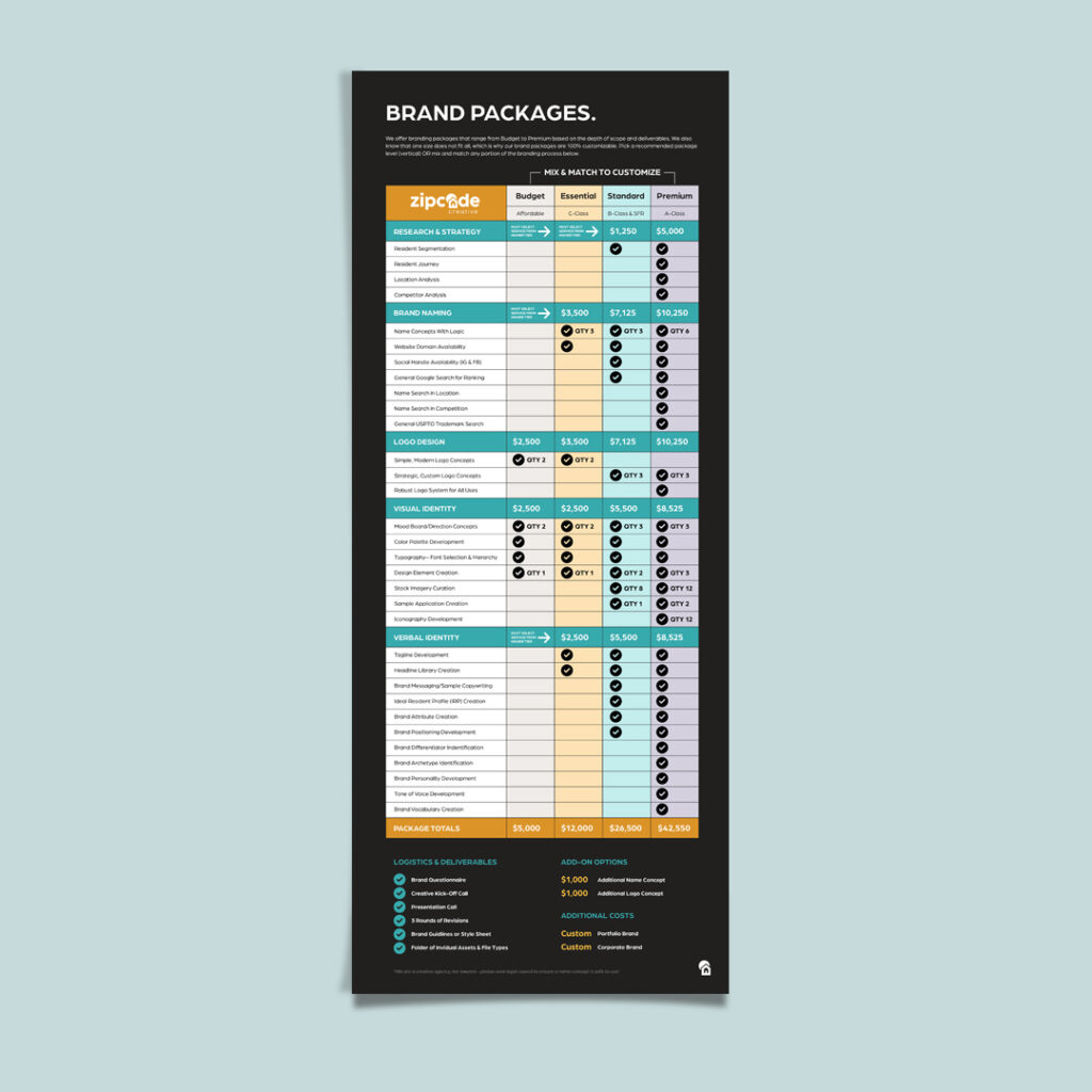
The other bonus here: A clear brand strategy maximizes the dollar spend from your marketing budget. Less time wasted, less money wasted.

ROI

When presenting budget increase requests, it’s never enough to say “I think it will…” or “We’re hoping to see…” That’s the same as saying “We don’t know what we’re doing, but give us more money and we could waste that, too.”

Instead, try using historical data.

Look back at the progress you’ve made. Identify the areas where intensive branding choices helped lead to a rent increase. Use clear ROI to justify budget increases, in the same way that you can use branding to justify some rent increases by showcasing your value to your residents.

Let’s say:
You have a property of 268 units with an average rent of $1850/month.

2% rent increase after brand enhancement would equate to $37/month per unit.
Your monthly income would then increase $9,916 while your annual income would increase to $119,000.

If your brand development investment is, say $42k (but you could spend in a wide range of $5k-80k) this additional income definitely makes up for the amount you’ve spent.

Worth it? Yes.
Now, the next time you ask for a marketing boost, you might be more likely to get it.

Long-Term Benefits of Strong Branding

RESIDENT RETENTION

For every resident that leaves, finding a new one is twice as expensive as trying to keep your current residents. Retention requires less effort, and the days, weeks, or months that a unit sits empty could mostly be a thing of the past.

Create a well-developed, strong brand, and you create an equally well-developed, strong sense of belonging and satisfaction. Think about it: If you, as a resident, feel you belong, and you’re relatively satisfied, why would you ever want to leave? They’ll be more likely to renew their leases, making your rental income more reliable, and reducing vacancy rates.

BRAND LOYALTY BUILDING

When residents move out, you could be seeing rental income walk completely away. Or: if your brand is strong enough for your portfolio of properties, you may be able to recapture that rental income.

Keep your brand experience consistent, foster loyalty, and those wandering residents could choose another property in your portfolio for their next home. 

Take In-N-Out Burger. It always tastes the same. Hungry burger lovers come to any of In-N-Out’s palm tree-decorated fast food chains, and they know their double-double animal style will be exactly what they expect: hot and delicious. That’s consistency and positivity. 

Repeat business comes from brand loyalty. And that resulting long-term revenue is a lot better for your bottom line than trying to reach new leads.

So, as you finalize next year’s budget, consider brand development a worthy investment. That spend is money well-spent—it’s forward-looking in an increasingly crowded market.

As a marketing professional, look for opportunities to develop your brand, and start small if you must. ROI can be proven, and long-term benefits have been shown. Boost your brand development and watch your properties stand out in a sea of competition, connect with the residents you want, and build up your portfolio as they prosper.

Apartment Branding for Faster Lease-Ups

Apartment Branding for Faster Lease-Ups

We’ve probably all heard at some point “Build it and they will come.” But that little phrase carries a lot of questions with it: What should I build? Who will come? And how quickly will they come? It’s just a phrase—but we’d like to offer as an alternative:

“Brand it, and they will come faster!”In the multifamily industry, apartment branding hasn’t always been the priority. Apartment communities are built on the idea that a place to live, shelter, is a necessary item. While it’s true it’s necessary, it’s also true that there is a lot of competition.

To maximize your lease-up speed and revenue, apartment branding is more than a “nice-to-have”—it’s a core factor.

Apartment Branding for Marketing Success

Branding vs. Basic Supply: The Difference

There is a housing shortage for both homebuyers and for those that wish to rent. So, if you follow rules of supply and demand, the housing will eventually lease up because it’s in demand—but maybe not as fast as you’d hoped.

Competition has become fierce in the market. There are many apartment communities near yours, offering similar amenities and units. Why shouldn’t they pick your competitors? Why should they choose you instead?

Branding. Branding can expedite the process, tightening up your lease-up process. By creating an emotional connection with prospects and residents, and helping seal the deal with full end-to-end branding that emphasizes clarity and consistency and forms trust.

Or, if you’re more into the money side of things, think about it this way: If you have units vacant for longer, that’s missed revenue. That’s an increase in marketing costs to reach a wider group to see if someone in that group will convert and sign a lease. Also, if a resident moves into an apartment, and the unit next to them is empty, they may begin to question why they signed a lease at this place instead of the one across the street.

Identify End Goals Before Branding

What’s your end goal? In multifamily, there are two primary goals for properties: Build-to-sell or long-term hold.
Before you brand you’ll want to know which direction you’re headed in. Then, you’re better prepared for strategic branding decisions. 

BRANDING APPROACHES 

Branding approaches will be different for each path. For:

  • Build-to-sell: Will you maintain the brand for the new owner or allow for rebranding? If your plan is to sell before leasing up, more intensive branding development may not be the right move for you. Alternatively—if you plan to lease up before selling, branding will be vital for you to attract residents before you sell.
  • Long-term hold: Investing in more extensive brand development makes a lot more sense if you’re retaining the property for the long-term.

Knowing what’s next in terms of ownership can help marketing teams understand the role of brand strategy. It’s possible that a light touch with branding may be enough to get the property sold. If you plan to hang on to the property as part of your portfolio, branding should be a larger budget line item and a bigger consideration—as it can, as mentioned above, help with leasing rates and speed.

How Branding Accelerates Leasing

THE POWER OF APARTMENT BRANDING

Excellent apartment branding is the key to reaching the brand’s ideal resident profile (IRP) and possibly raising rental rates (be sure to offer actual value along with that perceived value, though.) Branding sharpens targeting, and it helps keep focus where it’s needed: on the resident. 

A well-crafted brand points to your community like a beacon—“pick me!” Your community can stand out if you choose to make it different in the ways that you can: with branding. When you create perceived value (“this is worth it!”), you can speed up leasing.

Your content goes here. Edit or remove this text inline or in the module Content settings. You can also style every aspect of this content in the module Design settings and even apply custom CSS to this text in the module Advanced settings.

Refresh Your Property—Including Your Brand

Flooring isn’t the only thing that needs a good refresh every so often. Your apartment brand could use a little zhuzh. 

Your property upgrades shouldn’t be limited to the physical. Think about your verbal and visual brand identity too. Is it still serving your current IRP? Does it still look good? Does it still sound good? Your countertops and flooring will get worn out with time, and your brand may also become a little lackluster over the course of several years, especially when compared to the new kid on the block.

Instead of a full-on brand revamp, consider a brand refresh. Tighten up your design elements, tailor your colors to be more appealing, and work out a brand voice that sounds more like the brand you’ve become (if that’s what the brand should be).

Wondering when you need a brand refresh? Here are the tell-tale signs and times:

  • Shifts in the target demographic (keep up with who you want!)
  • Competitor landscape changes (keep up with the Joneses!)
  • New market trends or community repositioning (be accurate to your offerings and stay in the limelight!)

Maximizing an Apartment Brand Investment

ROI is always a consideration for marketing decisions. How can one prove the importance and the efficacy of an apartment brand?

Track it all.

And start off on the right foot.

In order to effectively maximize your apartment branding investment, please do the following:

  • Invest in high-quality design and messaging from the start—not when something “just isn’t working.”
    • Rationale: Upper management won’t be keen on spending more money if your first branding efforts were haphazard or sub-par. Goodbye marketing budget increase request.
  • Create a brand that addresses long-term goals—whether you’re selling or holding.
    • Rationale: If selling, your brand should paint a picture for the new investor or buyer. It won’t be doing all of the heavy lifting though. If you’re holding the asset, you’ll want to work harder on creating a brand that will last and does what you want. Focus on your future goals and align your brand strategy with it.
  • Use data to track your branding effort impact
    • Rationale: Is the community leasing up faster? Are occupancy rates higher than before branding was developed? Track it all. This is evidence of ROI—and should be brought to any budget or progress meeting for the marketing team.

Apartment branding can help with faster lease-ups and higher returns (if you do it right). It’s a long-term investment with a sometimes-large up-front cost. However, when you’re dealing with a competitive market and strong demand—standing out is a necessity. And branding can help you get there.