


Apartment Logo Design – Branding Ground-Up Developments
Stacey Feeney
Let’s talk apartment logo design. Logos are more than a symbol—they state something, particularly in multifamily brands.
In this blog, we’ll let you into our creative process for logo design for new developments.
First, we provide multiple design options (with a little insight into the process and inspiration behind them) and the client gives us feedback.
In a typical process, we’ll hear from the owners, the developers, and the marketers. They all have a different valuable vantage point regarding how the designs may land with their ideal resident profile.
And we have a pretty good vantage point, too, that we always work to share with the client. One example: The photo-realistic rendering. We get to show them what the property looks like to give context to the rest of the artistic choices we made. Once they understand the property build and interior design, the rest of the brand strategy can start to fall into place, and make sense from the inside-out (or the outside in)
As the designers and brand creators we then corral all the opinions into one, cohesive brand that would resonate with their target resident.
Developers and Branding
When working through branding for a new development, we have a lot of voices, opinions, and ideas, as we mentioned. There are pitfalls to branding, and you’ll have to take care to not fall into the these traps as the stakeholder:
Too Many Cooks in the Kitchen
Okay, we know it’s usually “cooks” but if we get too many voices and opinions, it’s going to be even harder to land on a consensus where everyone feels heard and happy. Find the most important opinions, and allow those to have more weight.
Missing the Forest for the Trees
Details are important. But when we’re creating a brand vibe, it’s the overall, overarching, general idea and feeling behind the images, the colors, and the textures. Please: Don’t throw out the entire idea because you’re not a fan of one stock image we chose.
Bottom line here? We know that developers have their finger on the pulse of the building—the product. And while we certainly take inspiration from the building itself, and the physical space and architecture, the marketers and designers should be given space to position the brand well.
Initial Concepts
With every brand development, we create preliminary brand style vibes for logo design. Whichever concept is chosen is then further developed into a fully fledged brand. Every concept leans on a different aspect of the information we’ve collected through research and discovery with the client:
- Demographic (age, gender, marital status)
- Location (Where’s the community, and what is the base-level of amenities provided?)
- Jobs / Hobbies (Do they work nearby? Blue collar? White collar? What do they do in their free time?)
- Purchasing Habits (Luxury vs. bargain; Research vs. Spend-Happy)
Each of these demographics are viable options to inform the brand vibe we create with the logo, palette, textures and photos. Here, we explore the inspo, the vibe, and the client feedback that guided the ultimate decision. (And yes, we’ll reveal the “winner” at the end!)
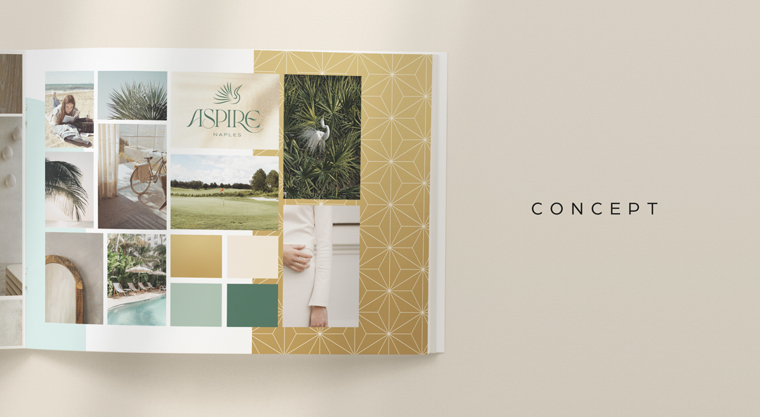
Seabird
The new community development is an actual luxury, Class-A property with all the bells and whistles. We created a palm-bird logo mark and a relaxed, but trim vibe. The typography in the logo has all the makings of a private beach kind of style, but wasn’t ultimately deemed seaworthy by our stakeholders.
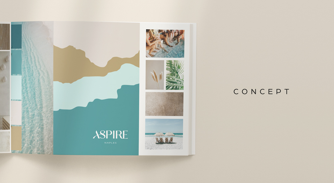
La Boheme—at the Beach
Ripples and light dancing in the water. The tickle of pampas grass and palms. Sand. Miles of it. And crystal clear water. With natural beachy colors as well as a strong, but elegant sweep through the logo’s font, this concept was meant to feel like a Florida coastal vacation, but forever.
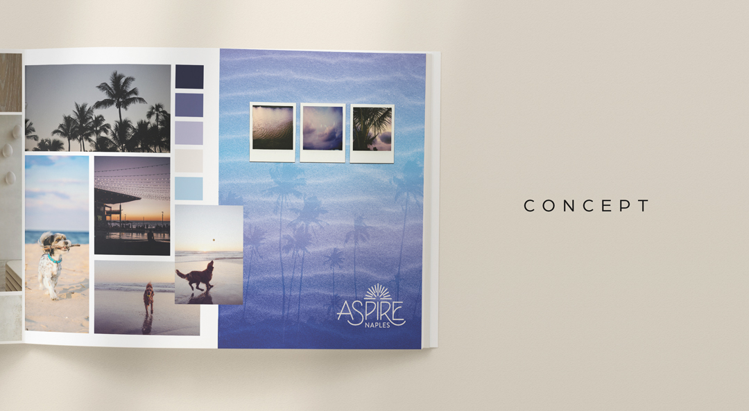
Eclectic Edge
Deep purples, A little haze. Plenty of dogs. A little early 90s combos of purple and blue. High contrast. And very much not bright blue, and no palm tree in the logo. We went counter to what was expected and did something different—a more abstract and lighthearted approach.
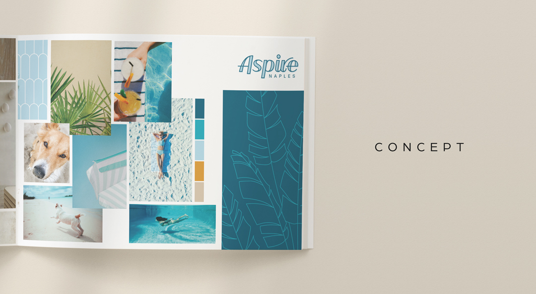
Lines in the Sand
The warmth of sand, the cool of tile, the weightlessness in pools, the evaporation of water droplets from your skin. This one is a whole feeling. Stripes make it preppy, playful dogs bring it levity. The light, yet bold typography in the logo is meant to appeal to both the young and the young-at-heart.
Grey’s Sun
Grey blue. A little chill in the air. Clean. So clean. This concept welcomed the viewer to fill in the blanks. Showing texture in design rather than photos. Showing part of an arch instead of the full picture.
![]()
The Selected Direction: La Playa
Winner, winner, beachside dinner! This one was by far the most playful. Social gatherings, happy sunkissed dogs, with plenty of simplicity to show off the “easy life”. A few angles and a few interesting shadows show the interplay between night and day, while the organic textures and shapes recall a more improvised approach to life.
Feedback:
Further development and expansion on this one resulted in a beautiful brand that stood out, had an eye-catching logo, and worked to for the IRP the stakeholders wanted to reach.
Final Brand Style (and How…and Why)
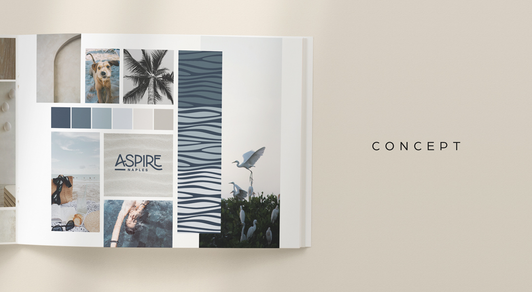
Aspire Naples, which offers a breezy, idyllic lifestyle is dedicated to be the best to appeal to a community full of culture and curiosity. The youthfulness of the logo along with the combined brightness, yet earthiness or the color palette is one that will appeal to a wide range of residents.
Breaking up the word on the logo mark creates a modern feel, while the curve of the typography keeps it from being too stark. The (mis)alignment is playful and the black color keeps it clean.
Using modern and softened approaches for the logo meant the brand’s visual direction and vibe could, too. Pulling some old and some new ideas kept it balanced, particularly for reaching their wide demographic.
By incorporating seemingly opposed elements (curved font and sans serif, black and white, organic materials and sharp shadow) the Aspire Naples brand captures the essence of a life filled with spontaneity and joy—one for residents to also aspire to.
Lease a
