Apartment Branding for Corporate-Level Operators and Marketers

Apartment branding for corporate-level operators and marketers can have a huge impact. Much of the branding that’s used in the community comes from the top down, and it’s your responsibility to create and keep a positive brand reputation. And that’s not all, really. Picture this: You’ve invested in professional branding development with a creative agency (like Zipcode Creative) or your talented in-house design has crafted a killer apartment brand. But what’s next?

Well, you’re also responsible for ensuring the branding tools are being used correctly and consistently by the on-site managers and agents. Put that beautiful new apartment brand to work!

Why Should Corporate Care about Apartment Branding?

REPUTATION

We’ve already mentioned reputation. In order to see growth in your community, you’ll need to create a brand that your residents can identify with. Branding is necessary to create something recognizable. In working with owners and stakeholders, branding can create something that’s achievable—something that can be grasped, even if only in parts at a time (logo, colors, etc.)

INVESTOR-READY

Your branding, if used effectively, can help sell your community as a package to investors. Seeing professionalism through a full branding package gives the impression that you’re ready to roll, and will help the investors trust you, and put a little more faith in you.

LEASING

Alternately, whatever you’re doing for this apartment building is about getting leases and keeping leases. And before that? Marketing and generating leads. Creating benefits for the property management company is the impetus for all that you do. Branding can help you get closer to getting the place leased up.

Bottom line: Branding creates a vision you can share with anyone—whether they’ll live there, or want to make a profit with a successful business.


Helping Teams Get Set

NEW PROPERTY MARKETING SET UP

Your team needs a lot of help, particularly with setting up property marketing. This is true of both new constructions or of takeovers. Branding items, from business cards to stationery to brochures to digital versions of the logo are necessary so everyone can do their job and do it well.

ON-SITE WORK

It’s a bustling community—and branding guidelines for your on-site leasing agents and managers will keep up appearances like no other tool in your belt.

Take a pulse and go through our mini-checklist here:

  • Stationery
  • Brochures
  • Welcome packets
  • Event Invites
  • Announcements
  • Email blasts
  • Mailers
  • Signage

Struggling to keep brand consistency with your onsite teams? Check out our blog on implementing on-site branding guidelines here.

Police-Branding

Chain of Command in Brand Consistency

TOP TO BOTTOM

If regionals are the deputies of brand “policing” (well, consistency) then you’re the chief of police! You have to, from the corporate marketing level, control as much as you can. All the outputs that require design should be ready to go, with the tools you provide. The bottom—or, the on-site management team, should be getting their marching orders from you. Make it easy for you and for them by using the brand assets and guidelines to allow them to DIY the things they’re responsible for, like social media, or last-minute flyers.

You’re at the top. And from the top down, there has to be clear, consistent branding for your community.

AT THE CORPORATE MARKETING LEVEL

Everything that goes out design-wise should have your go-ahead. Onsite, use brand assets, DIY as necessary, and make it easy for everyone on your team. The tools come from the top, and the brand look and feel should be aligned all the way down.

When you make it easier on everyone with solid, beautiful branding, you’ll be surprised at how well everyone falls in line. Easy color palette, easy fonts, consistency and clarity add up to brand development and recognition—something that will set you apart among other apartment communities.

Regional Property Managers and Multifamily Branding

Regional managers have a lot on their plate, from budgets to facility maintenance to resident satisfaction. But is branding really part of your job description as well? Absolutely, because marketing is. Read on about how multifamily branding should be one of your concerns as regional manager, to help create a robustly branded community.

Curb Appeal 

For multifamily and far beyond, signage is the perfect way to capture traffic going by—whether on foot or in a car (or on a bike) and branding your curb appeal. Through using your marketing message on your signage you can get attention. At the root of your signs—is your brand. Make it a real showstopper.

Signage Design 1

MARKETING SIGNAGE

What kind of exterior signs work best for curb appeal? Well-designed and thoughtfully positioned ones. As a regional property manager, you may be responsible for determining what type of signage would help drive leads to your properties during site visits.


Flags – Single or double-sided, this style of sign works well as a quick call-out to get attention. A row of 2-3 flag signs can help display even more information, used more as a series.

Banners – Elegance! Capture the attention of passersby with banners on your building, fence or garages—whichever surfaces face the major roads.

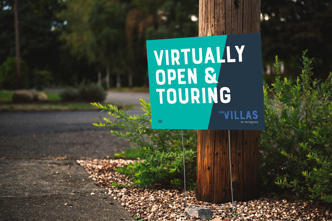
Bootlegs – Yard signs are short and sweet and best for walkers-by since they’re on the smaller side. Be sure to get to the point.


Boulevard Banners – Light pole signs are a great way to show off who you are with permanent exterior signage that tells your brand story as they drive in.

Signage-Design-2

SIGNAGE DESIGN

Make sure everything you put out is on brand! Signage should be these three things to fully capture the attention of passersby:

Well-Placed – Strategic placement is key. Likely exterior marketing signs will be viewed at a distance as people pass by in a vehicle. Make sure they can see and read it well.

Clear Messaging – Don’t share too much on one sign; it has to get the point across quickly and concisely.

Brand Consistency – Use the same typography, textures, and color palettes from your brand guide – even signage is an opportunity for establishing brand recognition (so they remember you!)

Marketing Needs and Implementation

The regional property manager has much to do with identifying needs for the community. This includes determining marketing needs or problems and the best ways to solve them.

FOR THE LEASING AGENT

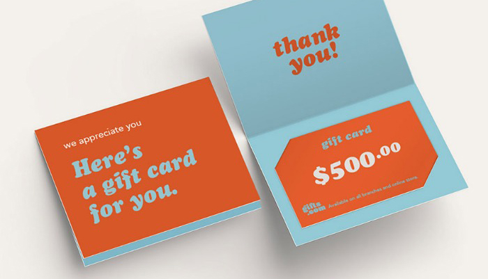
Helping out with the sales process means you’re going to provide a lot of guidance for the onsite leasing agent. Marketing collateral: print outs, brochures, floor plans, help with ordering business cards and “Thank you” notecards will probably need a little extra oversight from you. Get the brand guidelines in order and provide them to your supervisees. Look at what your onsite agents most need and help them get those designed and printed to be on-brand.

DIGITAL MARKETING

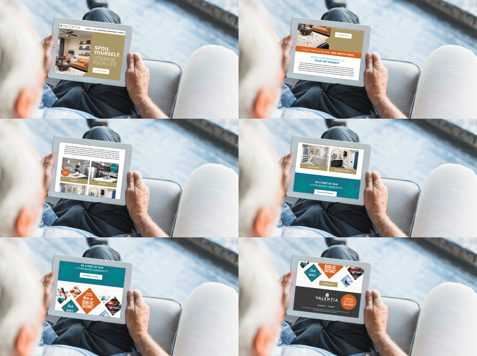
Driving leads through digital marketing is an important aspect of your “marketing mix.” Use digital marketing with your brand guidelines handy so you don’t stray far from what’s recognizable as Your Community. Social media graphics should reflect it well. Google Ads should clearly communicate your brand. Digital ads should look like your brand, and no other. Using fonts and colors and stock photography that are drawn from your brand guidelines is a foolproof way to keep the brand intact, even when you have multiple marketing channels running at once. Email marketing will require a close review, too.

BRAND ACCURACY

As the regional manager, you’re the enforcer of the community brand as the liaison between corporate and the on-site teams. We’re not calling for micromanagement, but ensure you’re providing the brand guidelines (and easy ways to use them) for your on-site leasing managers. 

You’re the gatekeeper of the brand—keep an eye out for cohesion and appropriate logo use. And don’t be afraid to give compliments to an on-site manager for following the guidelines to a “T”!

Leasing Agents Onsite and Multifamily Branding

What does multifamily branding have to do with leasing agents onsite? Loyalty built on trust built on recognition. Your branding has to be dialed in for that to happen. Where does branding show up for onsite leasing agents? Marketing collateral, signage and any printed hand out given to prospects and new residents.

Leasing agents onsite have a fair amount of DIY to their job. There are tons of pieces and plenty of marketing collateral that rely on strong branding. If these pieces aren’t consistent, the multifamily brand can lose out on brand recognition, trust, and loyalty.

Let’s break it down by the process of lead to lease. Every step in the leasing “funnel” has something to do with your ability to maintain brand consistency.

Start-with-Signage

Start with Signage

This is your first chance at a good impression. Leave a good one. Signage should reflect your brand with its colors, font choices, and messaging.

WALK BY OR DRIVE-BY

Curb appeal is a thing with multifamily communities as well. When someone walks by or drives by, they should know exactly what you’re offering, and what your style is.

DIRECTIONAL (LEASING OFFICE THIS WAY)

Make sure visitors can get to where they need to go. And ensure that the directional signage aligns with your other branded items, too. We don’t need any brand whiplash to happen as they’re walking to the leasing office!

INFORMATIONAL (ON THE INSIDE)

Clubhouse? This way. Leasing Office? Over here. Rules for the clubhouse? Here they are. Make sure posted rules, informational signage and other interior pieces look official, like they’re from the front desk. Easy way to do this? Use your colors, your fonts, and your brand voice to communicate all those rules.

SELF-GUIDED TOUR OF MODEL UNIT

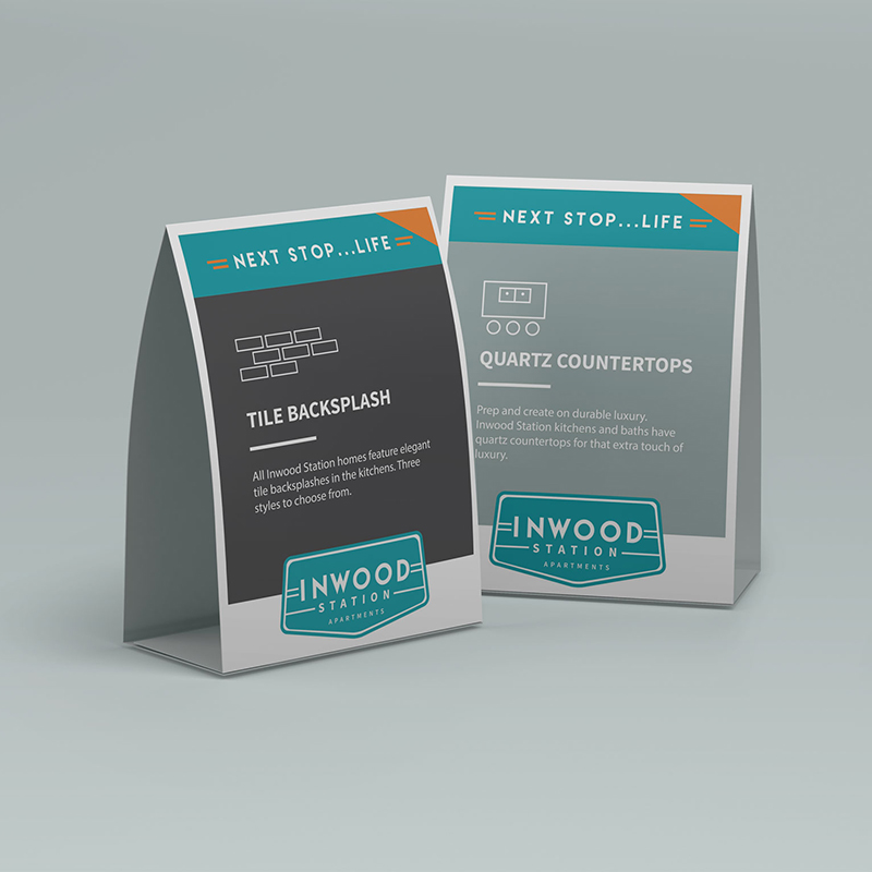
Letting your prospects go on a self-guided tour? Ensure you have all your ducks in a row. Place table tents near special features. Put up framed designs that show off your smart home features, for example. Call out boutique countertops. Identify where the in-unit washer and dryer are located.

Next Up, Marketing Collateral

TOURING PROSPECTS

Your prospect has now told you they’re interested! Great. Now is the time to hand them an info packet. This will have your business card, brochure, a rack card, an amenity sheet, and floor plan sheets—either all in a branded folder, or clipped together. The beauty of this packet is seeing how everything looks all together. These collateral handouts are essential for the touring prospect sales process. It shows you have everything they need while you answer any other questions they may have.

P.S. If you’ve gone fully digital—that still requires great design! We can help make sure your designs for your floor plans and e-brochures are good to go, wherever and however they’ll be viewed.

WELCOME NEW RESIDENTS

“Welcome to our community, here’s our gorgeous welcome packet with maintenance contact, policies and procedures, and a little “welcome” note (on our very own branded stationery).” When you brand everything well, it just works. Again, this is one more signal to the resident confirming their correct choice in signing the lease. If done well, it helps answer any lingering questions, too.

Staying On Brand—Now That They’re Here

All this work to stay consistent isn’t just for prospects and future residents. It’s for current residents, too. Enabling loyalty through consistency and predictability can help your residents feel more comfortable renewing their lease and staying at your community.

If it’s not provided from corporate, use the tools that you have at your disposal to create items that work within your brand guidelines. Using Canva, you can upload your specific color palette, your fonts, and your logos to use in pre-made designs. If you’re rusty on your design rules, check out our post on the basics of multifamily graphic design here.

That—or you can hire a pro to help you with different pieces. Whatever you need, we can help. There are so many things that you’ll need design and branding on—and not just once, but every time you have a resident event!

RESIDENT EVENTS

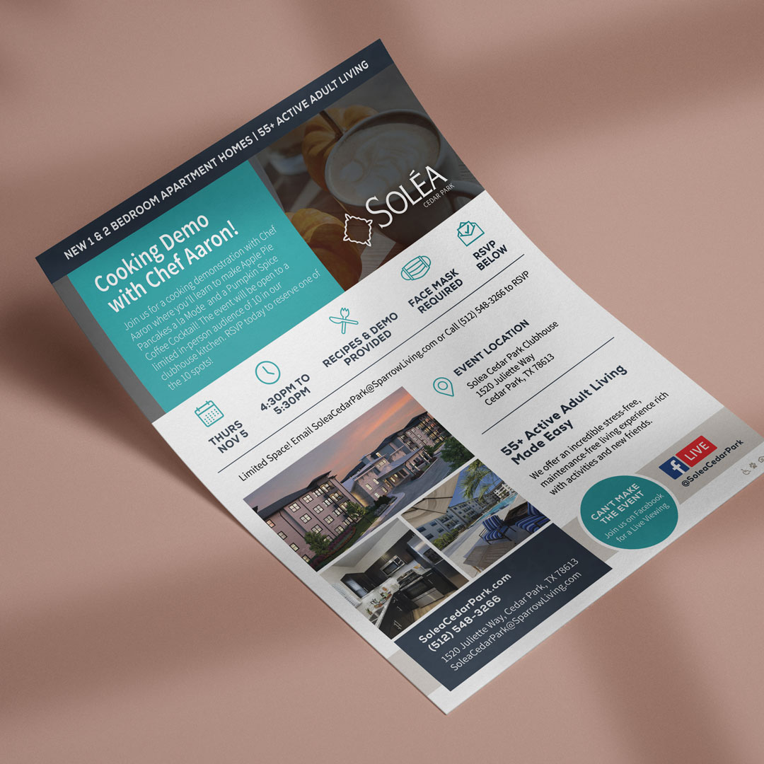
You’re going to want to stick with your branding—even in the smallest ways—for any resident events you’re planning—and then advertising with flyers and email marketing. Place your logo in the corner, use some of your brand colors. A potluck, a pool party, an ice cream social—all of these should look like something you’re putting on.

ANNOUNCEMENT AND NOTICES

Speaking of being official—when you change the regulations around swimming hours, or if there is a planned water shut off for maintenance, ensure the letterhead yells “This is serious and official business” without yelling. Logo and proper colors will tell your residents just that however you are delivering the announcement.

SOCIAL MEDIA

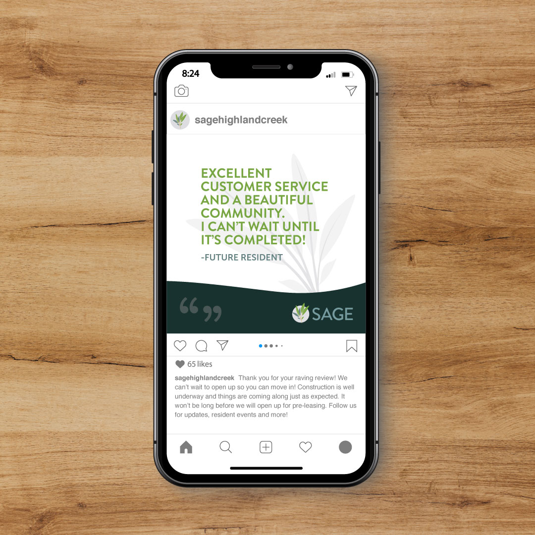
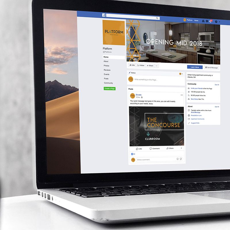
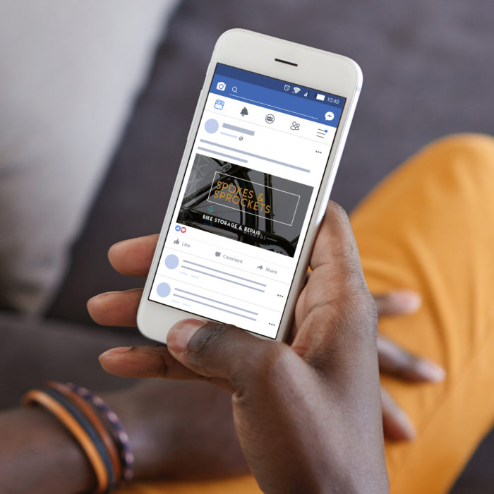
Posting about resident events, planned water shut offs, and doing a few giveaways here and there? Again: keep it all on brand. Check in to see if corporate has created social templates that you can tailor—maybe an agency (like use at Zipcode Creative) has designed them. If these aren’t available (which are preferable) you may be able to use a program like Canva to create quick social posts and maintain your brand on Instagram and Facebook.

Brand-Guidelines

Last Thing About Brand Guidelines

You’re not a designer, but you’re expected to do a lot on-site. Sometimes it’s last minute. What are brand guidelines and what’s the best way to use them as an onsite leasing agent?

  • Get comfortable with the use of your logo—the one-color, the logomark, or just the name. Of course, branding is more than a logo—it’s visual and verbal; try to understand both.
  • The visual elements of brand guidelines will be used more than any other parts when you need to create something:

We know as an onsite leasing agent, your job isn’t easy. But you’re the boots-on-the-ground guard of the community’s brand. Stay within the guidelines and you’ll reap the benefits.


Implementing Brand Guidelines for Multifamily On-Site

What are Brand Guidelines?

Apartment brand guidelines are like a road map to your apartment community’s brand. You’ll be able to get where you want to go with this map in hand!


Breakdown of Apartment Brand Guidelines

Everything you ever wanted to know about apartment brand guidelines is here. But you might also be wondering how to apply it at the on-site level. So much to do, so little time. (If you want a broader take, check out our branding basics for apartments.) We’ll get right to it

The-Watermark-Brand-Guide

BRAND POSITIONING

Brand positioning, defined:
A short, sweet brand statement about your community that communicates what you are and what you’re known for in the industry, market, and to your ideal resident.

How to implement brand positioning:

Use the brand positioning statement as an internal guiding light for everything you’re doing. Everything should measure up to it, especially if you’re concerned about brand loyalty and brand authenticity, and creating a brand that’s based on a lifestyle.

Brand-Attributes

BRAND ATTRIBUTES

Brand attributes, defined:
These are the descriptors that embody your brand, as if it were a person. We like to do the “which celebrity would your brand be and why?” to get closer to the heart behind your community.

How to implement brand attributes:
On-site managers can use brand attributes to verbalize the difference of the community (useful for any social media captions) and help embody the spirit of the culture while they give tours.

Ideal-Resident-Profile

IDEAL RESIDENT PROFILE

Ideal Resident Profile (IRP), defined:
Your community’s key audience. Age, Gender, Race, Income, there are plenty of things that you can identify as the “ideal” when it comes to the resident you’d like in your community.

How to implement the IRP:
Use your knowledge and data from your IRP to communicate better. It’s like a platonic version of “The Five Love Languages.” You can alter how you speak to the type of prospect you’re selling when you know more about them—resident demographics must influence your branding.
Brand-Voice-Tone

BRAND VOICE & TONE

Brand voice, defined:
Your brand, in words—showcasing your community’s personality and style. This is how others perceive you and hear you in written word. This will show up in your brand identity statement, your tagline, your headlines, and your general brand vocabulary. 


Brand tone, defined:

Using your brand voice in different settings, as it’s called for. Informative tone, descriptive tone, it all depends on the occasion and audience.

How to implement brand voice and tone:
The tone you use in flyers for upcoming resident events should be a little different than your brochures for touring prospects. Use your brand voice across all your collateral, but tilt your tone to angle to the right part of the customer “funnel.” Resident announcements will also require a slightly different tone, too—a little more casual, warm, and excited…rather than 100% informative.

Logo-Mark

LOGO MARK


Logo mark, defined:

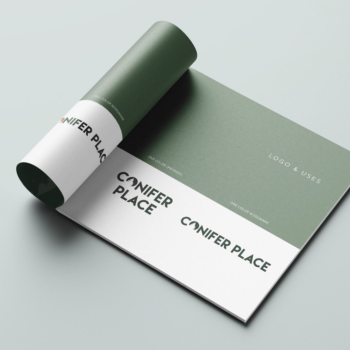
Your community’s logo with the name, or a symbol, or both. There’s typically a primary and secondary logo mark.

How to implement logo marks:

This should go on everything! The logo is the face of your brand and often what a prospect will notice first and remember last. If you’re DIY-ing any sort of design, make sure the logo is on it and used appropriately. More on that next…

LOGO MARK USAGE


Logo usage, defined:
Rules for how you can use the logo—spacing, angles, and combo rules so you don’t have crowding, stretching or skewing of something that should always be recognizable.

How to implement a logo:
Rules are rules. Follow them when you make anything with the logo included! Consistency is the name of the game. The brand guidelines are your rule book.

Color-Palette

COLOR PALETTE


Color palette, defined:
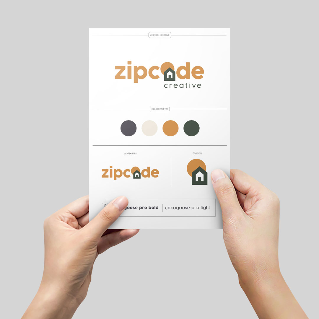
The color palette is the exact colors that are to be used in your branding materials and not meant to be strayed from. It’s between 3-6 colors, typically, and all four color codes will be identified so you can color match no matter the program or medium (RGB, CMYK, PMS, AND HEX).

How to implement color palettes:
Royal blue isn’t the same everywhere. Use the codes to look up the exact match. Close enough isn’t good enough. Find the right one in the assortment in your email newsletter builder. Type in the code in Canva. Save it. (After all, you’ll definitely use it again.) Ordering swag? Use the codes.

Fonts

TYPOGRAPHY


Typography, defined:

The fonts or typefaces chosen (usually 2-4 kinds) for your brand. This will show up in your logo, your headlines, your subheaders, and your body text.

How to implement typography:
Reference your brand guidelines for the hierarchy of the fonts being used, you can determine which one should be used where on your next flyer.

Design-Element-1Design-Element-2Design-Element-3

DESIGN ELEMENTS

Design elements, defined:
Brand patterns, shapes, stamps, and collage styles are all design elements for your brand. They’re visual cues to your audience and/or resident.

How to implement design elements:
Think of design elements like the piping work on your cake. Beautiful. Eye-catching. Adds a little extra touch to visually show the brand’s personality.

Lifestyle-Photography

LIFESTYLE PHOTOGRAPHY

Lifestyle photography, defined:
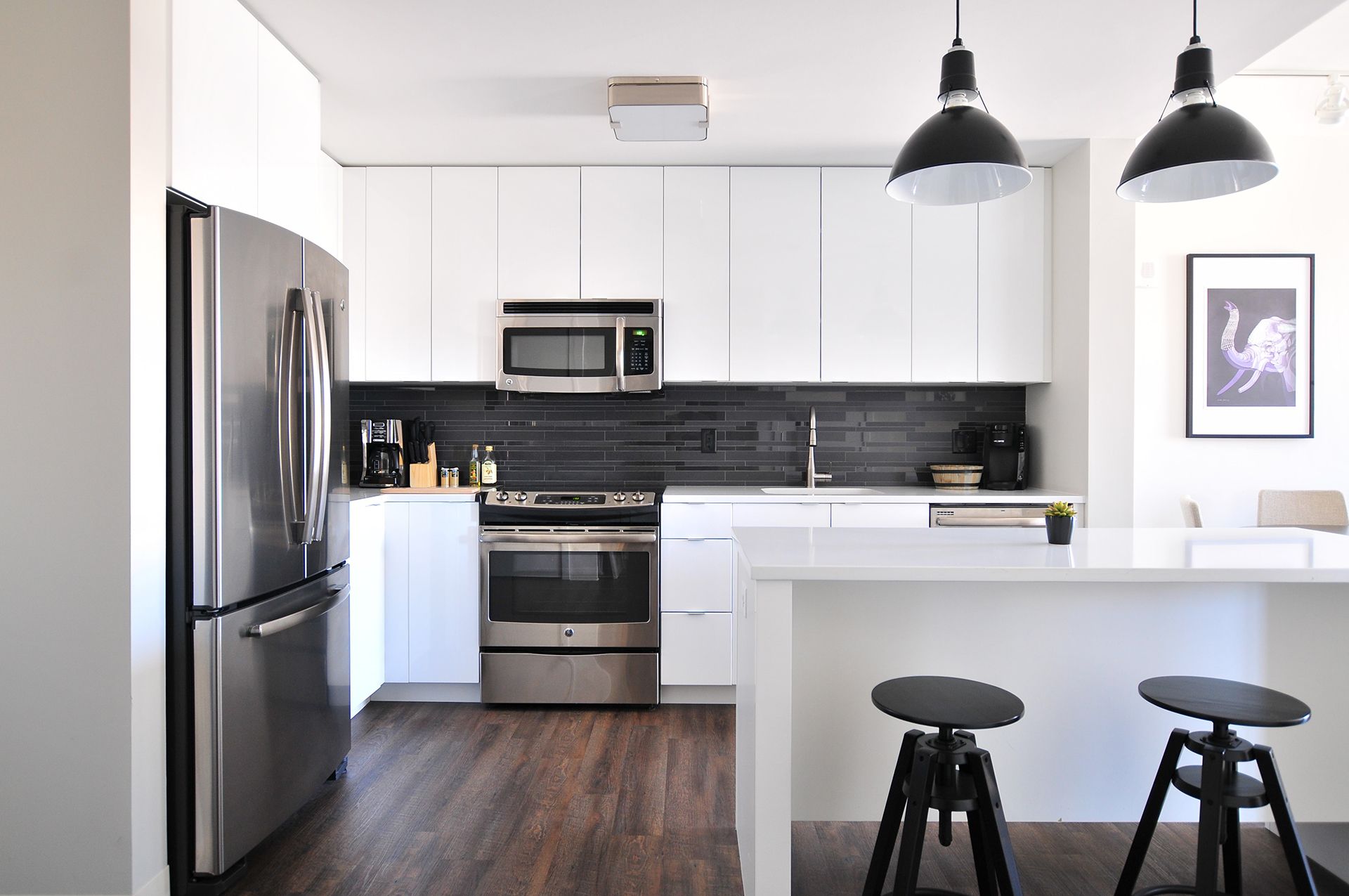
These are the photos that reflect the lifestyle vibe that your residents could live out in your community. They are intended to evoke a feeling in the viewer to help them imagine themselves living there.

How to implement lifestyle photography:
If you need to find additional images to supplement the ones provided with your branding, or if there aren’t any—use the color palette as your guide. Take the tones from that to select photos that will “play nice” in any marketing collateral you’re creating.

Iconography

ICONOGRAPHY

Iconography, defined:
Icons that help your audience get the gist without reading. They can be used to represent amenities, especially.

How to implement iconography:
Don’t want to crowd your design with so many words? Use icons to get to the point.

ILLUSTRATIONS

Illustrations, defined:
Brand illustrations are an additional visual cue for your residents and can be powerful aids in showing your brand’s personality. They’re less of exact representations or stand-ins like icons, but they help get an idea across more artistically.

How to implement illustrations:

Pick a wall that could do with a mural. See if you can get something on the wall to spruce up the space that works within your brand.

Brand-Examples-1Brand-Examples-2

BRAND EXAMPLES


Brand examples, defined:

The part of the brand guidelines where it all comes together. You’ll typically see examples of stationery, a social media feed, or how signage could look outside your building, for example.

How to implement brand examples:
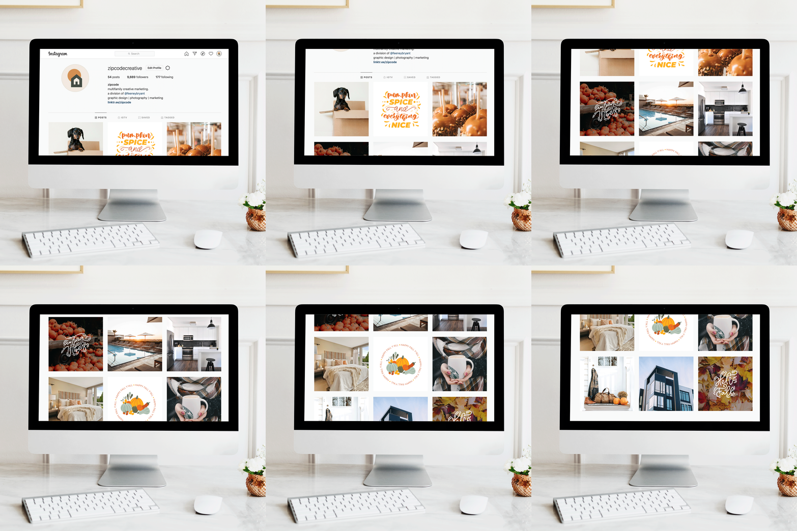
Particularly the social media feed could be helpful to see how the fonts, colors, imagery and voice come through to create one super special brand. Use these examples as inspiration!

Keeping Brand Guidelines In Line

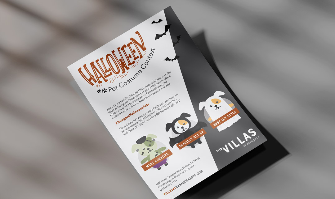
It’s incredibly tempting to go full red and green for Christmas. Or orange and black for halloween. But do these colors work with your brand’s color palette?

HOLIDAY

Instead, choose colors that work with your color palette by using color theory. Which shade of red works? Which shade of green? Color pairing can be difficult. But: Keep things dialed in with your brand and don’t use holidays as an excuse to create something unrecognizable as your brand, even if it is fun. Wondering how colors impact our thoughts? Check out our post on using color psychology to sell units.

EVENTS

Have a resident potluck coming up? Find the one-color version of your logo and start cooking up a design using Canva. You can create something that’s worth looking at. There are plenty of templates to start with. Change out the colors using your color codes, and change out your fonts with the ones that are in your brand guidelines. Pretty soon it will look and sound like your community, with very little effort.


Branding is important at every level of the community. Maybe that’s news to you, but it holds true.
On site, the responsibility to keep to the brand guidelines still holds—you’re the closest to the resident, after all.

What is Graphic Design?

Graphic Design, Defined

You asked, we’re here to answer. Graphic design is the art of putting together text and/or images to communicate an idea. Designs are typically found on websites, in advertising, on marketing collateral, or through typography. Similarly to copywriting, graphic design is often used to promote or accompany some other content in order to persuade the viewer to take action—like buy, explore, or learn more.

WHAT MAKES IT GRAPHIC DESIGN?

It’s the arrangement of visual and text elements in a layout purposely created to direct the viewer’s eye to the content and information being presented, and includes colors, shapes and images. It’s used in media—both print and digital. There is a whole lot more that makes graphic design effective. Also similar to copywriting, there are a few things that the designer must keep in mind when creating. At its most basic, you might think of the 3 C’s:

Composition – this is how the items (images and text) are laid out in relation to one another

Components – this is the images (color, shape) and text that are used in the design

Concept –  this is the idea that the designer wishes to convey to the viewer through the design

TYPES OF GRAPHIC DESIGN

There are different types of graphic design, from packaging design to game design. But the ones that we at Zipcode Creative use are more common. Zipcode Creative’s graphic design for multifamily includes: web design, advertising and marketing design, and typography design.

Most often, you’ll find us using advertising and marketing design for your apartment brand.

WHAT GRAPHIC DESIGN IS NOT

Some things aren’t graphic design:

  • Photography
  • Painting
  • Physical drawing
  • Fashion design
  • MARKETING 

So about that last one. Graphic design isn’t marketing because it doesn’t analyze numbers and sift through data—it’s creative at its core. Now, design is there for a purpose, to communicate an idea, so it’s a marketing and branding tool. But it’s not all there is. And it’s not exactly the same as marketing.

Graphic Design for Multifamilies

All that explanation of what graphic design is, and you may still be wondering how graphic design is used in multifamily, specifically.

Graphic design is a big part of the brand, the visuals, and the overall vibe of your community. Like so:

BRANDING GUIDELINES

In our brand guidelines, we outline all kinds of goodies for your apartment community.
Among those that are graphic design items? Plenty. Here they are:

Logos – Primary logo, your secondary logo and any submarks (logo best practices here)

Colors – Your color palette, along with their identifying codes: Hex, RGB, CMYK and/or Pantone

Typography – Font styles, sizes, and spacing, as well as their specific hierarchy as titles, headings, subheadings, and body copy

Design Elements – Brand patterns, brand shapes, brand collage styles, and brand stamps

Imagery – Iconography (icons representing your amenities) and illustrations (large graphics meant for a website backdrop or large wall art) are helpful for residents to skim over your designs

Signage

SIGNAGE

Nothing like an attention-grabbing, big, beautiful sign. Apartments can benefit from an array of signage for branded curb appeal and attracting drive-by or walk-by traffic:

    • Yard/Bandit/Bootleg Signs
    • Banners
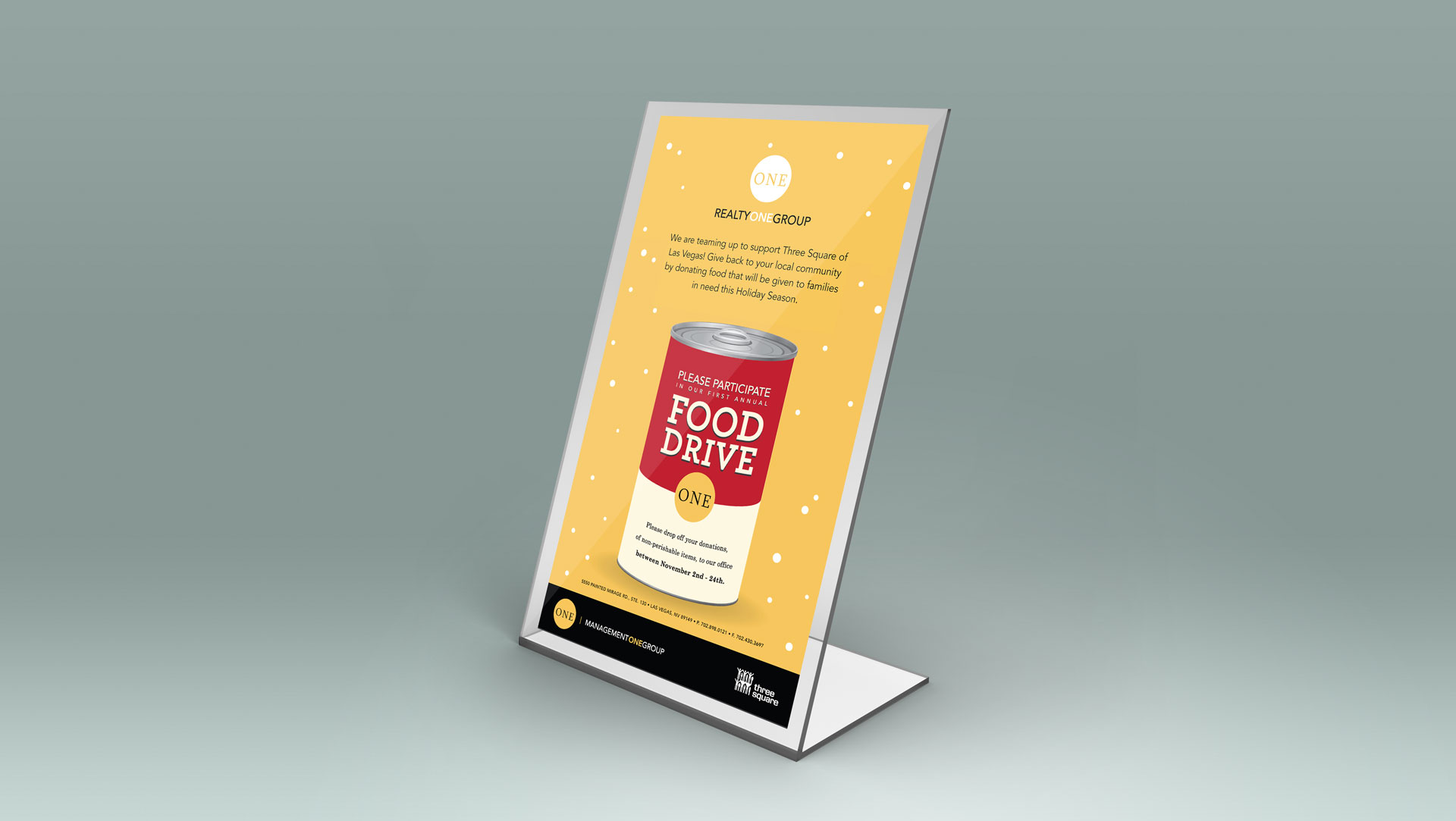
  • Table Tents
  • Posters
  • MDO Signs
  • Wall Murals
  • Window Clings

Honestly, that’s a lot, and amazingly, there are even more. Billboards, custom wraps, parking signs, A-Frames, your logo and name will be everywhere. Sounds like a lot of graphic design would come in handy, eh?

Marketing Collateral

MARKETING COLLATERAL

So, is your community the epitome of modern-luxury-meets-classy-timelessness? Or are you going for more of a trendy-urban-upscale vibe? 

Your graphic design pieces from your logo to your color palette to your typography should all underscore the idea that you’re going for. There are so many pieces that require graphic design—and if you only need one, that’s all you should pay for. That said, all the marketing collateral we provide includes:

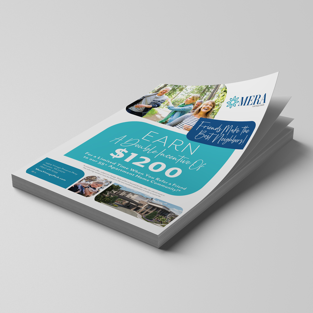
  • Stationery (business cards, letterhead, envelopes!)
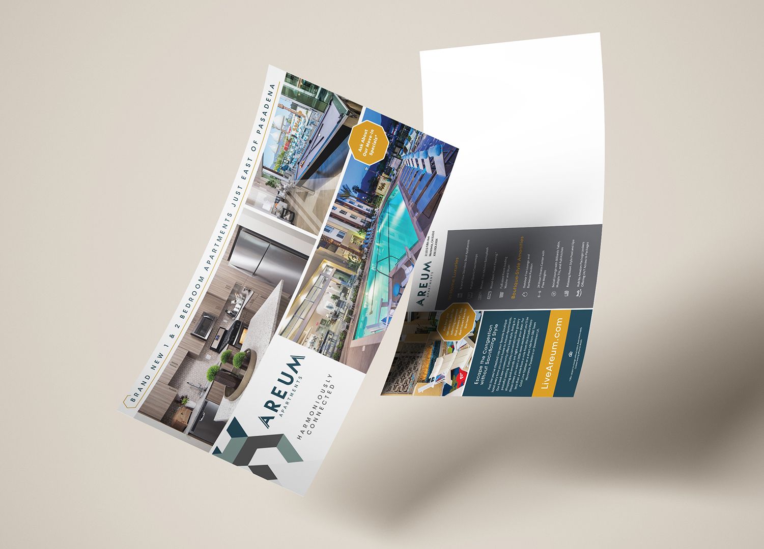
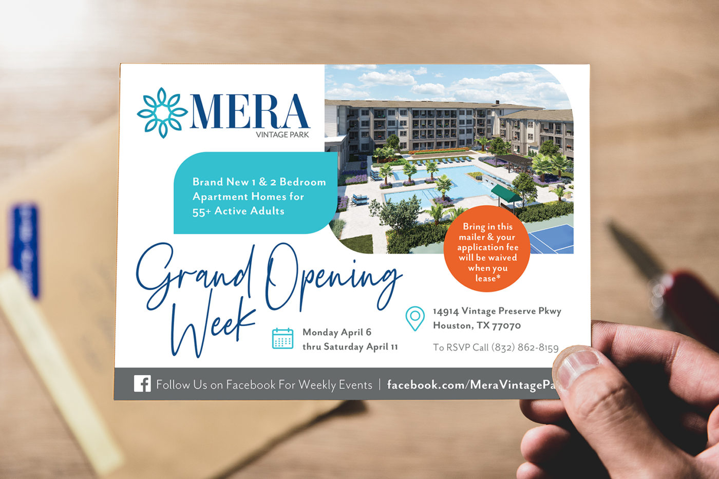
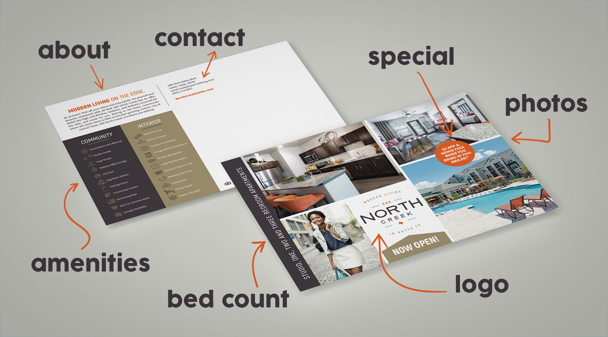
  • Rack Cards or Direct Mailers
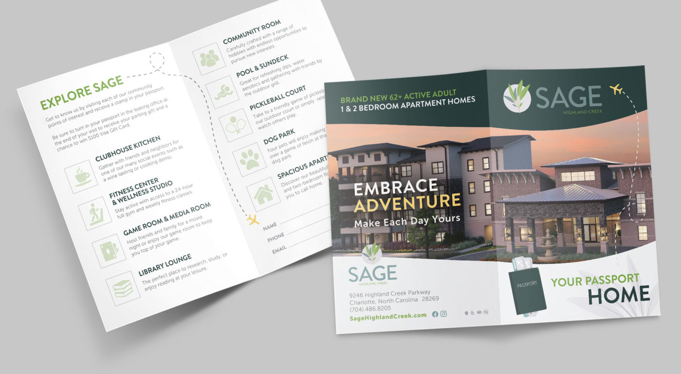
  • Brochures
  • Price Sheets
  • Flyers

There’s plenty more where that came from, too. And don’t forget your event booth stuff, too (tablecloths, branded promo products, booth walls.) First impressions mean a lot—more on that later.

DIGITAL DESIGN

Graphic design covers everything online as well. Emails, websites, digital ads, graphics for social. You’ll want to make sure your website specifically (which is the biggest marketing tool you have) is aligned with your brand. The best way to do that is to hire a graphic designer to professionally design it—and then a copywriter to write it.

MAPS

This one gets forgotten sometimes. But honestly, where would we be without maps? (I’ll see myself out.) Graphic design is necessary for all your floorplans and maps. It ventures into architectural design territory, but we’ve got it covered. For the following, you’ll need graphic design:

  • Property Sitemaps
  • Location/Area Maps

Why is Graphic Design Important for Apartment Communities?

You might be hesitant to hire a pro graphic designer for all the needs at your community. 

Isn’t a logo enough? Never. Logos can’t carry an entire brand on its shoulders—there’s plenty an apartment logos can’t do. We also want to make sure your community is branded according to your property class and we want to make sure you’ve got all your bases covered. A la carte menu options for design? Sure thing. 

We know that not all creative agencies work the way we do, so we’re ready to have you take the lead. We’ll guide as needed. Here’s why we think graphic design is important for apartment communities:

FIRST INTERACTION

It won’t be in-person, that first interaction. It’s more likely they’ll see a digital ad or a flyer. Whatever they see, it will be designed. And it will have one of three effects: 

  1. They’ll want to know more.
  2. They’ll be meh.
  3. They’ll never think of it again.

So make that design a good one. And make sure it lines up with the rest of your brand. (Handy thing is, if you hire a graphic designer to do it all, it will have a much better chance of being similar and aligning.) Tell one visual story.

BUILD CULTURE

Design elements can come together to tell a story and give a better sense of community. Similar to messaging that offers up the ways you’re different from your competitors, your visual identity helps build up your brand’s culture. Use it to attract your residents.

HIGHLIGHT REEL

We’re good at what we do, including graphic design for multifamily. We’re expert problem solvers, too—we are, after all, creative.

The idea that you should always be communicating with your graphic design:


HERE IS HOME.

Visually, you can do this through the message you convey and by offering up solutions to their problems and pain points. So, pick your best side and graphic design it up!

What is Copywriting and Why Does Multifamily Need It?

Copywriting, Defined

What is copywriting? Copywriting is promotion, through words. These words can be persuasive or interesting, and they prompt the reader to use a business, a service, or an organization. Copywriters have to create text that can be adapted for any number of channels: print, radio, website. Copywriters also need to be able to adapt the copy (also sometimes called content) to different audiences.


BRAND VOICE VS. BRAND TONE


Brand voice is your brand’s personality, through words. It can be mature or youthful, jovial or serious, succinct or verbose, mysterious or open-book. Every way you would describe a person, can usually be used to describe a brand as well. Your brand attributes help create your brand’s unique voice.

Your brand tone is how you approach different scenarios. Similar to what we said above, the copy should be able to be adapted to meet the requirements of that particular time and place. A press release versus a brochure will have a different tone. But your brand voice will still be tucked in there.

Brand voice is WHAT you say.

Brand tone is HOW you say it.


COPYWRITING VS. COPYRIGHTING?

We do get this question. No, we’re not in the business of copyright law—and we never will be! You’ll have to find a law firm for that.

Copywriting means using words to promote a business.

Copyrighting means to register and mark an original piece of work as your own, with the © symbol.

We don’t do that last bit at Zipcode Creative. But we do plenty of copywriting for multifamily.

Copywriting-vs-Copyrighting

Using Copywriting For Multifamily

How can multifamily benefit from copywriting? First let’s look at how it’s used.

COMMUNITY/APARTMENT/ASSET NAMING

Naming multifamily assets is fun, and has long-term impacts on your brand. Hire a place that can do the research and guide the decision. It sets the tone for the rest of your brand, since it’s how people will refer to you—and can steer the direction of your logo and style.

BRAND GUIDELINES IN MESSAGING

Brand guidelines will get you places you’ve never been before. It’s a little like a superhero power card as if your brand were a person (or a Pokemon?)—but everyone at the company can see it. Once your brand voice (alongside your brand statements) is established using research and discovery and determining your ideal resident profile (IRP), you can go on to create some pretty sweet things like:

Brand Tagline – Like a slogan for your community—garner interest with your words summed up in one short phrase. 

Brand Headlines – More catchy things to say about the community that keep your prospects reading or scrolling.

Brand VocabularyNaming your amenities creatively or strategically can help create a sense of interest, intrigue, and brand loyalty among your residents. 

Each of these are part of the brand guidelines that we’ll create to keep your brand on track. Our copywriters take care of the verbal parts. Our designers take care of the visual parts. We put it all together to create a singular, beautiful guide to everything Your Brand. 

Also: Your taglines and headlines simply HAVE to grab attention. Sometimes that’s all anyone will ever read, of alllll the things you’ve written. Sad, but true. Make sure you’ve got a few of these up your sleeve: Tricks for Better Taglines and Headlines.


MULTIFAMILY COPYWRITING FOR EXTRA CREDIT

Hoping for a few bonus pieces of copy? There’s plenty more.

Website & Brochure Copy: Headlines, subheads, paragraphs, calls-to-action, it’s all copywriting. Make sure it’s good.

Campaign Copy: Whether it’s a moving campaign or pet-friendly campaign, ensure the words you’re using really sell the deal.

Email Copy: First your readers have to open the email—get them with a good subject line from your favorite copywriter.

Social Media Copy: Writing captions that fit in your brand voice is harder than it sounds.


CORPORATE COPY 

Mission / Vision / Values: Writing these clearly and having them out in the open—it’s more for internal purposes, but will help guide your client-facing brand. (It’s not easy, but that’s why we’re the professionals.)

Team Bios: Your experience and personal approach to property management should shine in your bio—and help you connect with the reader.

Client/Owner/Investor Messaging: We’ll make certain your message is geared to your client. Seal the deal whether seeking investors or presenting your management acumen to owners.

Taglines Headlines

Why is Copywriting Important for Communities?

Copywriting for community brands can = SUCCESS

Spell it with me: S-U-C-C-E-S-S. It has a nice little rhythm to it.

What do you most want from your efforts in your community? 

Success…which comes from signed leases. 

Which comes from prospects that turned into leads that turned into residents.
How do you get from prospects to residents? By connecting, showcasing, and converting.

Copywriting in multifamily communities is key to those three things.

CONNECT

Make an emotional connection by establishing your brand voice and telling a STORY.

SHOWCASE

Show what you have and how it’s the answer to their problems through clear and enticing communication.

CONVERT

Give them a reason to click the “Apply Now” button. You’ve gotten them this far, now convert leads with your brilliant copy (including amazing CTAs.)

When you have a resident—you want them to stay. A strong brand, which is BOLSTERED by excellent copywriting, will be able to maintain loyalty and retain residents—possibly even turning them into your own influencer-style, walking-word-of-mouth-ad brand advocates!

A Professional Copywriter vs. Your “Good Enough” Colleague

If we haven’t convinced you yet, now’s the moment. You’re considering having your colleague who’s “pretty good at writing” pen some copy. For your brochure, for your website, for your social. There are a few places where this could be…fine. Not great, but fine. Social media doesn’t require a huge amount of writing chops—but it could still impact your brand negatively if it’s not up to snuff.

If your colleague really is a good writer, great—use them. But also be aware that because “copywriter” isn’t likely their job position OR in their job description, they won’t be prioritizing the writing you’ve asked them to do (and all the research that has to go into it). Additionally, it’s not the best use of their (or of your) time and will take them longer than a pro.

A professional copywriter for multifamily, like the ones we have at Zipcode Creative offer three things that your “good enough” colleague may not:

EXPERIENCE

A professional copywriter is just that. They have processes that they’ve developed over years. They’re in the know with copywriting trends, as well as what is most likely needed for each job. 

Your “good enough” colleague will probably know your audience’s challenges and pain points, but those can easily be communicated to the copywriter as part of their research prior to writing.

EFFICACY

A pro copywriter for multifamily can create an emotional connection. They know what builds bridges, what entertains, and what kind of copywriting grabs attention. Keeping it short, tight, and compelling are all in a day’s work.

Your colleague of “decent writing chops” may end up writing too formally or casually, or worse: ignore your brand voice completely. All that work on the brand guidelines, for nothing!?

EFFICIENCY

A copywriter working professionally for apartment communities can easily follow your requirements. You’re the client, they’re the hired help. Pros also tend to know what needs to be done without being asked—even in a niche field like multifamily copywriting.

Your colleague—bless their heart—might not know the basic rules of copywriting, and therefore, waste time and money and energy on something that falls flat.

The best kind of copywriting for apartments tells a story, creates emotional connections, and helps build up the brand’s value. That sounds like a happily-ever-after to us.