


How The Faywell Got Its Name: An Apartment Branding Case Study
Most multifamily naming gets a lot less time than it deserves. The community needs a name by the time signage goes up. The brief lands on the creative team’s desk. A few rounds of brainstorming happen. A name gets selected from the list.
That sequence produces names that…work. It does not produce names that work hard or work well.
The naming work for The Faywell, a new Banner Property Management community in Wheaton, IL, took a different path. The name didn’t come from a whiteboard. Instead, it came from the discovery part of our process. There was a story no one had zeroed in on, and collaborating with the architecture team meant we all got on the same page before we wrote a single word.
This is the story all about how the process turned out.
Why the Discovery Process Matters More Than the Brainstorm
Brainstorms work for getting ideas out. But it doesn’t always mean the strategy is part of the process. The names that actually work tend to come out of discovery instead of off of a whiteboard.
Discovery involves plenty of listening for a multifamily naming project. We sit down with stakeholders, and ask questions that reveal the real anchor. You know: Why this community, in this location, for this resident right now. How is the ownership connected to the project and what comes across with the architecture? What’s the neighborhood’s vibe?
The deliverable from discovery is information. Strategic insight. That allows us to pull name options that practically pick themselves (instead of them being simply pretty.)
The Faywell boiled down to insight gathered during a single phone call. But without our process in place, that could have been just a phone call.
The Moment That Reframed the Brief
When we kicked off the creative process with Banner Property Management, the brief included a meaningful constraint. The new community should somehow honor the legacy of their late founder, Alexander Pinsky. So of course, we acquiesced to this respectful, personal request from a team that genuinely cared about getting it right.
The first instinct on any project like this is to start sketching names that nod to the person. The Pinsky. The Alexander. Maybe something a little softer that still gestures at the name.
We didn’t start there. Instead, we asked to talk to someone who actually knew Alexander.
His grandson joined our creative kickoff call to share stories about his grandfather. We expected the usual. Career milestones, family memories, the company he built. What we got was a richer origin story.
Alexander Pinsky immigrated to the United States from Russia. Like many immigrants of his era, his surname was adapted (from Fawell to Pinsky) when he arrived. That renaming marked the beginning of his American chapter. He carried his new name through a life of myth-worthy stories, and built a legacy his family still gathers around.
In that moment, the brief shifted.
The legacy wasn’t a name to preserve. It was a story about transformation. About arriving somewhere new. About starting a fresh chapter with a name that carries you forward.
Without discovery, that story would have stayed hidden. The naming exercise stays stuck on “what should we call this place to honor Alexander?” With discovery, we asked instead, What is the real story we’re trying to tell? The answer to the second question changed everything that comes next.
The Naming Logic Behind The Faywell
Once “transformation, warmth, and a hint of magic” became the brand’s emotional foundation, the name started to take shape.
And from “Fawell”, we landed on The Faywell.
Fay carries the meaning of fairy or goddess of fate. It nods to the myths and stories Alexander left behind, and it opens up an emotional register most multifamily brands never touch (a little magic, a little enchantment, a hint of the storybook).
Well is abundance, goodness, and wellbeing. The everyday warmth of home.
Read together, Faywell sounds almost exactly like “fare thee well,” a blessing for someone setting off on a new chapter. Which is exactly what every prospective resident is doing the day they sign a new lease.
The name does several jobs at once. It honors Alexander Pinsky by capturing the meaning of his story (transformation, renaming, journey) rather than the literal facts of it. It speaks directly to the moment of life a prospective resident is in. And it gives the brand a register that no other property in Wheaton can borrow.
That’s the work a strategic name has to do. Hold two ideas in the same word, and reward the resident who notices.
Discovery Extends to the Audience
Strategy can’t happen in a bubble. We took the audience into account, as well. Part of our discovery work for any naming project is building a clear picture of the Ideal Resident Profile (IRP), the specific person the brand has to speak to.
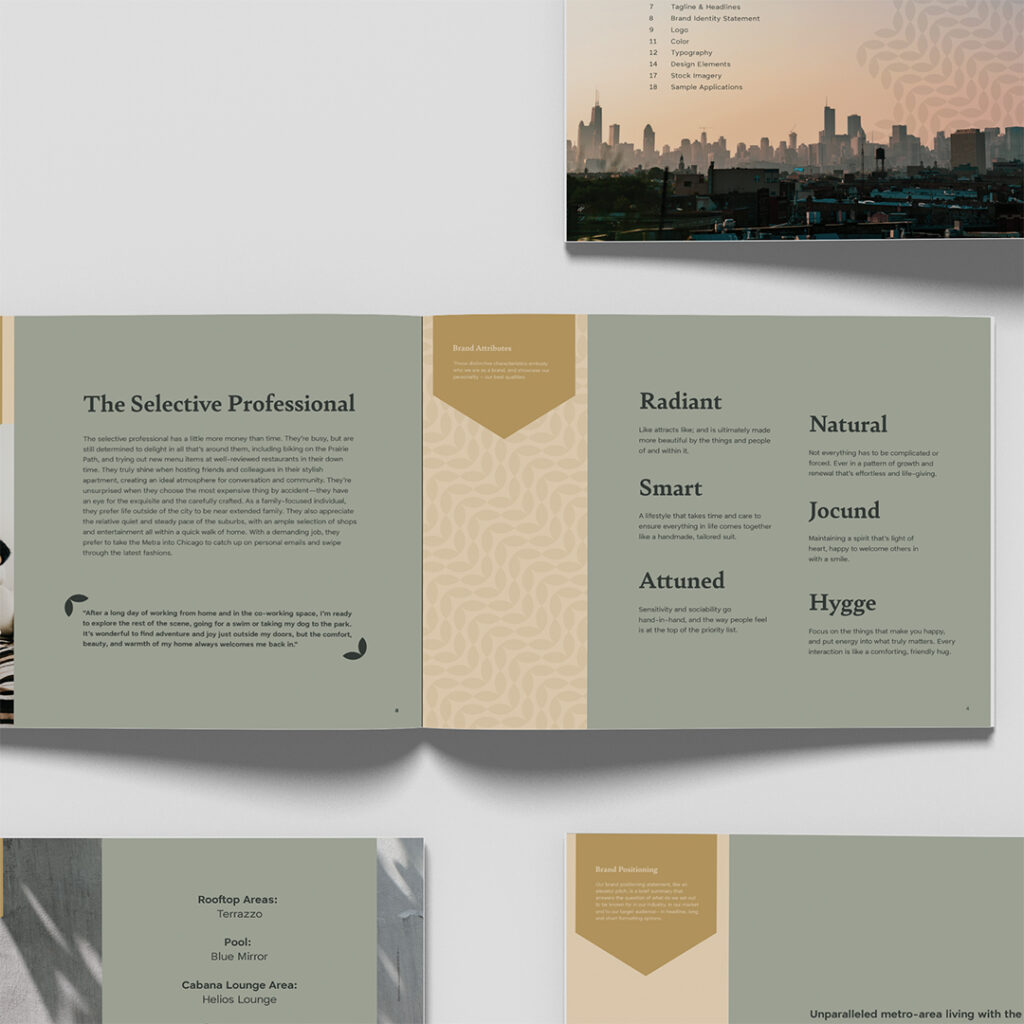
For The Faywell, that’s the Selective Professional.
The Selective Professional has more money than time. They’re family-focused, drawn to the Chicago suburbs to be near extended family, but unwilling to give up city polish. They bike the Prairie Path, host friends in their stylish apartment, and have an eye for the exquisite and the carefully crafted. They commute into Chicago on the Metra. They care deeply about how their environment feels.
Wheaton, IL gives this resident exactly what they want. A walkable downtown with the Wheaton Public Library, local theater at Wheaton Drama Inc., well-reviewed restaurants, and a Metra line straight into Chicago. The Faywell sits in the middle of all of it, with a ground-floor Egg Harbor Café tenant adding to the lifestyle promise.
This is a resident who would notice a name with meaning. Who would appreciate the subtle “fare thee well” wordplay. Who reads brand cues like other people read menus.
If the IRP had been different (say, a young family on a tighter budget), the right name would have been different. Same insight, different application. Discovery surfaces the right answer for the right person.
Brand Attributes From the Insight
The naming insight gave us the foundation for the brand’s personality system. We landed on six attributes.
Radiant. Confident, like attracts like.
Smart. The carefully-crafted life this resident is building.
Attuned. Service ethos and hospitality.
Natural. Authentic, never manicured (the Prairie Path is right there).
Jocund. Light of heart, literary, with wit.
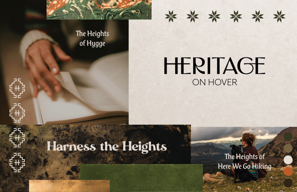
Hygge. The comforting hug, warmth as a design principle.
Two of those attributes (Jocund and Hygge) are deliberately unusual. They’re a calculated risk. A property brand that uses words most residents have to look up is signaling something about its standards and its audience. For the Selective Professional, that signal lands.
These attributes are the bridge from naming insight to every downstream decision. Visual identity, voice, amenity names, even the way the leasing office talks to prospects. All of it flows from this list.
Collaboration With the Architecture Team
A multifamily brand earns its keep when the verbal identity and the physical environment feel like one continuous experience. That doesn’t happen on its own. The brand team and the design team must talk to each other early, often, and openly.
For The Faywell, the architecture and interior design were led by BKV Group. The integration came together with unusual ease.
We came to that meeting with our brand attributes in hand. BKV came with their stated design philosophy: “Organic, Hygge, Communal.”
That word, hygge, showed up independently on both teams’ strategy docs. Neither team had told the other to use it.
When that happens, the project is on the right track. The brand insight and the design intent are pulling from the same source material (the place and the resident)—not from each other. From there, the collaboration is easy. The brand team isn’t trying to convince the architecture team of anything. The architecture team isn’t trying to retrofit the brand to a building already underway. Both teams are translating the same set of insights into their own discipline, and the project benefits from both perspectives sharpening each other.
We named the building’s amenity spaces to reinforce both the brand and the architecture.
Terrazzo (the rooftop area) was named for the actual custom Palladiana terrazzo flooring BKV specified for the clubroom. Material as identity.
Blue Mirror (the pool) is poetic, slightly mythical, and ties back to the Fay thread.
Helios Lounge (the cabana area) references sun mythology, reinforcing the goddess-of-fate naming logic.
BeWell (fitness) is plain-spoken wellness positioning and echoes “The Faywell” subtly.
Madison + Michigan (coworking) is a Chicago intersection that speaks directly to the Metra-commuting resident living between two worlds.
Teakwood Indoor Spa is material as identity, as well.
The exterior architecture (warm red brick massing with traditional and modern elements) visually echoes the brand’s heritage-meets-modern positioning. The Faywell wordmark appears at architectural scale on the brick towers, anchoring the streetscape.
None of this required heroic coordination. It was just two teams that had done their discovery, trusted each other’s process, and stayed in conversation through the whole project.
Translating the Name Into a Visual System
The visual identity had to do two things at once. Feel rooted enough to honor the heritage thread. Feel current enough to compete with new construction across the Chicago suburbs.
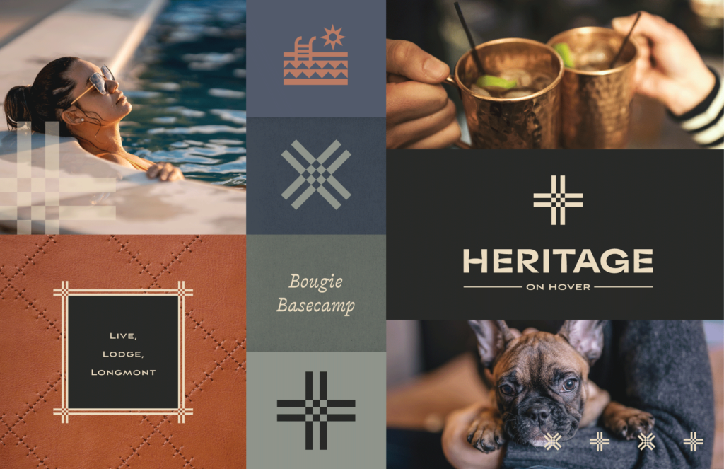
Logo. A custom script wordmark anchored by an ornate “F” iconmark. The script carries the heritage thread (handcraft, story, personal touch). The iconmark stands alone for signage, social, and architectural-scale applications.
Color palette. Deep forest charcoals and sage greens for grounded, hygge-driven sophistication. A gradient of warm golds for the radiant, fairy-tale-alchemy thread (and a subtle nod to treasured legacy). A deep wine accent for hospitality and warmth, the after-work cocktail feel.
Typography. Bely (a serif with character, literary, slightly whimsical) paired with Enkel (a clean modern sans). The pairing holds heritage and modernity in tension, the same balance the name itself strikes.
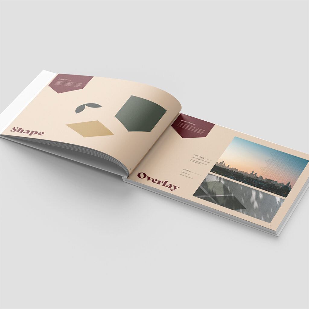
Design element. A repeating leaf pattern used at 10-20% opacity as a textural background. It whispers “natural” without resorting to literal Prairie Path imagery, and the organic shape softens an otherwise architectural visual system.
Every visual choice traces back to the naming insight. Warm but refined. Rooted but forward-moving. A little enchanted, but never twee.
What This Project Teaches About Multifamily Naming
For developers, property managers, and marketing teams working through their own naming projects, a few takeaways:
Start with INSIGHT, not the name. No matter how strong the creative team, you cannot name your way out of an unclear strategic foundation. Invest in discovery, and the name gets easier.
Talk to people most projects skip. The grandson’s call gave us the brand. He wasn’t on the original list of stakeholders. He became the most important conversation we had. Ask “who else should or could we be talking to?” and then actually go talk to them.
Constraints are inputs, not obstacles. Every brief comes with constraints. Instead of pushing back on them, find the metaphor inside them. A request to honor a person, place, or history can become the strongest creative anchor in the project, if you let it.
The right collaborators reach for the same words. When BKV and our team both wrote “hygge” into strategy docs independently, that was a signal the project was anchored in real shared insight, not in personal taste. Look for that kind of overlap on your own projects. It tells you the work is sound.
Brand attributes are positioning signals. Using words like Hygge and Jocund in a multifamily brand makes a choice about the audience the brand wants to attract. For the right resident, that’s the differentiator.
Verbal and physical brand should jibe. When the architect’s design language and the brand’s emotional language share a vocabulary, every touchpoint reinforces every other touchpoint. That alignment doesn’t happen by accident. It happens when both teams stay in conversation through the entire process.
The Faywell is the ideal product of a naming project in which discovery is taken seriously and collaboration runs deep. Every choice that shaped the brand exists because the right people asked the right questions, listened to the answers, and let the insight do (at least some of) the work.
Working through a naming challenge of your own? We help multifamily teams find the strategic insight hiding inside the brief, and turn it into a brand that does the heavy lifting at every scale. Let’s talk about what your next community could become.