Author: Stacey Feeney

Brand Development: Apartment Marketing

You have big plans for your community. It’s a new construction and you want to make sure you’re getting off on the right foot during the lease-up phase. Or maybe you’ve come to a community with a goal to rebrand and want to leave all the unengaging old branding (or lack thereof) in the dust. Either way, you need to make sure you have your brand development strategy laid out and ready to roll.

What’s Brand Development?


Brand development is the work you put into how your client base associates with and feels about your brand. You build it up and craft it so that you’re selling an experience and a lifestyle, not necessarily just one or two products. The work you put in at the beginning when developing your brand will help your residents say “If I live there, I’ll be X, or I’ll feel Y.” It’s how you ultimately set yourself apart, even if you’re offering the same thing as another company—at the same price. Your brand is your calling card and how you make your residents feel.

What are the parts of Brand Development?


BRAND STRATEGY

Create your strategy and make sure it’s aligned with your major business goals. Create your mission statement, vision statement, and values. Your mission statement tells what you set out to do. Your vision statement is what it looks like when you pull off that mission successfully. Your values are what your company stands for. Get clear on these—they’re the frame (or skeleton if you want to get spooky) to the body of your brand and will hold things up and give it lasting structure.


BRAND STORY

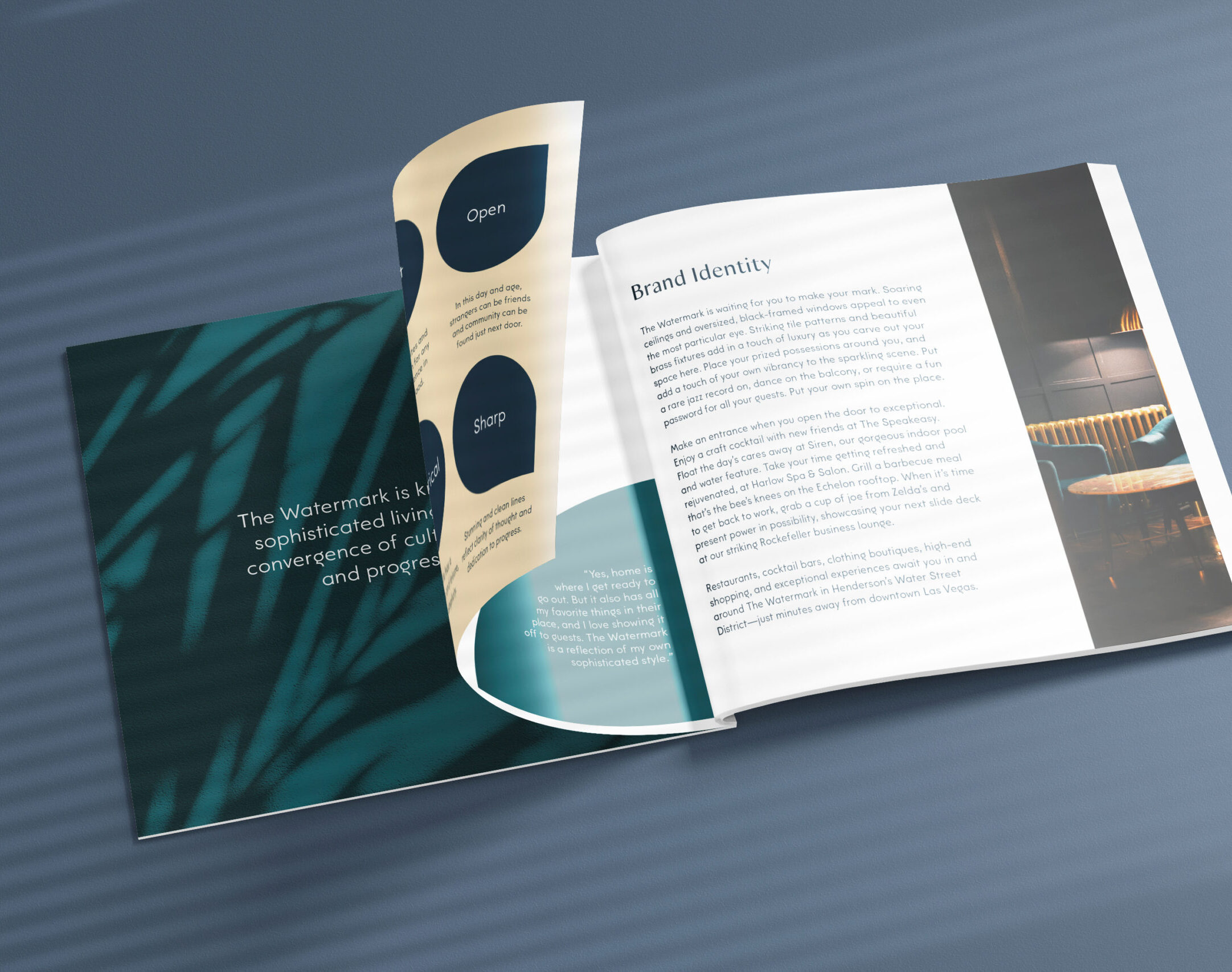
What does your brand look like and sound like? Bring the personality forward and create a logo, a tagline, your brand colors, your fonts, and your website with all of that in mind. Make it stand out but have it all be approachable or understandable. Your visual identity and your verbal identity have to tell the story of exactly who you are and why you are—but in a lot fewer words than your mission, vision, value (and sometimes with zero words—like with your colors.) This is the outward-facing part of your brand that draws people in. Make it look and sound good.


BRAND STRENGTHENING

Once you have your framework and your “appearance” together, build your muscle and get strong. Make sure it all works, and test it regularly. How? Track everything. Make adjustments. This is how you can improve your brand every day.
brand development

Why is Brand Development Important?

No one wants to work hard on something totally pointless. Trust us—this brand development business? Not a waste of time. It can build trust with your customers, instill employee pride in your company and its culture, and boost social proof. All of which impacts your bottom line. Just make sure you do it first thing—before you throw a bunch of money into paid ads, marketing collateral, and other costly things.

BUILD TRUST

When your community’s actions, messaging, and everything they do align with your community’s values, you become trustworthy through predictability, and that you’re going to do what you say you’re going to do. No (bad) surprises.


BOLSTER PRIDE

Your employees can be proud of your community brand, because it feels more akin to being part of a family. They understand who the community is, and the big company goals, and can better support them in their everyday work functions. Proud, happy employees make for a more welcoming community. Bonus.


CREATE PROOF

If your brand feels obvious and easy to you as someone on the inside of the community, then you hope that it translates to outside the community. A sign of a successful brand strategy: your current residents and your prospective residents can put into words what the community means to them. When everyone on the inside is aligned, the messaging and the efficacy of your brand will come through without a hitch, making social proof (think testimonials and quotes) an easy-to-reach-for marketing tool.


CONFIDENT MARKETING

The foundational questions that show who your brand is and what your brand is doing? Already answered. So: your content creation is shockingly easy. Tell the right story in the right way in the right places, and your audience will see why they need it or want it. Creating consistency and confidence in your marketing is a beautiful result of well-done brand strategy.

How Do You Develop Your Brand?


This is the homework portion of the assignment. Sharpen your pencils.

COMPARE

Compare yourself with your competitors. Do a full SWOT analysis. What do you do better than your competition? That’s what sets you apart. Things like “lower prices” or “faster shipping” do not work here. Think through your values and how you can help that come through in your messaging—your values and your tagline.

RESEARCH

Before you create content of any kind, do your research. Understand who your audience is, and where they’re most likely to see your information and convert. Employ A/B testing to see what kind of campaigns are more successful.

STAND OUT

This is the visual part of the game, and how your residents know they’re at your community and not the one down the street. Yes, customer service can be part of this, but make sure that your visual branding is on point and unique.

SUMMARIZE

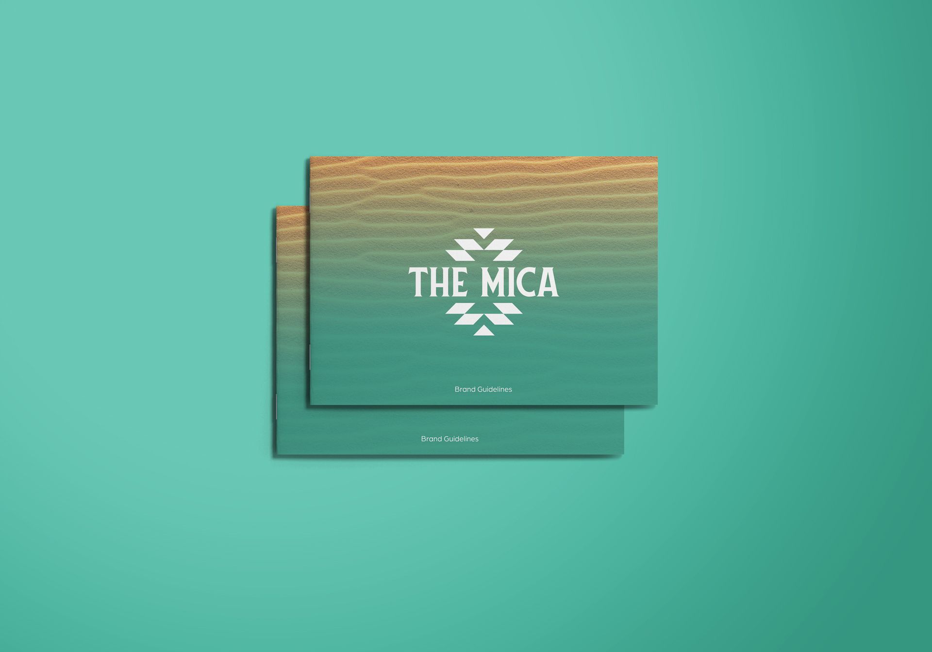
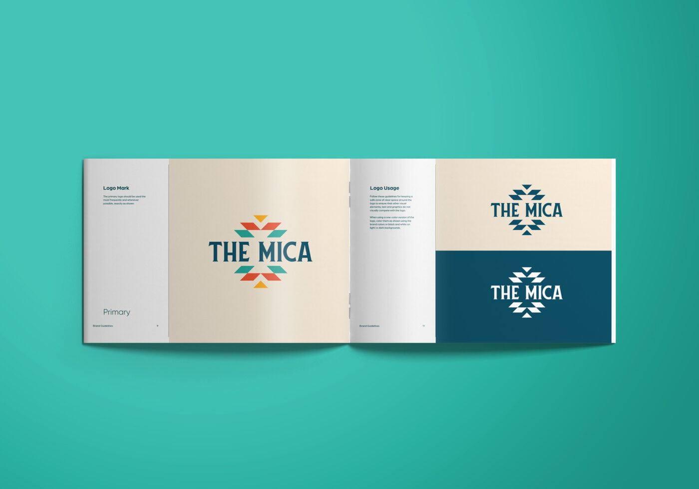
Be able to communicate your community brand with just a few words—your brand positioning statement, your tagline, your mission, these all serve as shorthand to fully encapsulate your brand. Get them all set and edit them until it completely conveys what you want. Build it into your brand guidelines, and include: all visual branding, messaging, tone, symbolism, and the thoughts behind artistic choices.

In addition to your brand guidelines, you also need to consider everything you offer: in-home amenities, community amenities, and why your location is ideal—(proximity to attractions, nature, highways, metro areas, etc.)

SHIFT AS NEEDED

Sounds scary. Isn’t. You want to stick with your brand guidelines that you’ve created, but you also must be assessing it regularly and be willing to shift if, for example, your ideal audience isn’t responding to your quirky brand personality. Your audience perception may be slightly wrong, and it’s better to evolve and capture that audience, rather than to be unwavering and fade into the rearview mirror of your target residents.
brand development

Avoid This with Brand Development

DELAY

Here’s hoping you’re reading this before you reveal or relaunch your community. Doing brand development first is foundational. You’ll end up wasting time and money if it’s an afterthought—that’s like trying to find a place to buy a map when you’re already several miles into a confusing and difficult hike. Frustrating, to say the least.

INCONSISTENCY

Brand guidelines will help keep you on the right path. Keep consistent in your online and print messaging, signage, blog, employee training, all of it. Keep the target the same. Keep the tools the same. That will help keep things on point all the time.

UNWILLINGNESS TO SHIFT

It’d be good if you did your audience and competition research and analysis before you launched any major campaigns or rebrands or management of a new community. However, maybe you didn’t. It would be fair to say that you can expect to shift some of your brand strategy that you’ve put together. Because, like we said before, it’s more important to reach your residents rather than to be doggedly consistent. Just make sure that your brand guidelines get the memo—review, shift and edit them as you need to so you can remain relevant. 
Brand Statements That Define an Apartment Community

When you work with a creative agency to develop your brand style guidelines, you may be expecting them to create your visual branding components like your logo and brand colors. But what is often overlooked in brand guidelines are elements like tone of voice and messaging. Brand statements, however, are crucial to developing a well-rounded brand and allowing you to create compelling and consistent materials that will help attract your target audience.

Multiple different brand statements work together to create your brand’s “vocal” identity and brand messaging. Each serves an important purpose that helps define who you are as a brand and an apartment community. Learn more about each brand statement and why you need them in your community’s toolkit.

Purpose Statement

To create your brand purpose statement, you have to find your “why” and identify why it is you do what you do. Your purpose should be greater than the obvious motivators like providing housing or making money. Instead, you should look to your greater purpose that is rooted in your beliefs and morals.

A great way to identify your purpose statement is to think about your community’s founding story. Was your community created to offer a unique living experience for residents? Was it created to fill a hole in your area’s housing market? Narrowing in on the answers to these questions can help you synthesize the “why” behind your community’s purpose.

Vision Statement

In a nutshell, your vision statement is the goal you are working towards. While your purpose statement explains your “why,” or your motivation, your vision statement summarizes your ultimate goal. Your vision statement should sum up your desired community impact. 

These high-level statements are often lofty and bold, and they speak to how the future you envision not only for your community but also for the world. It also should speak to the future you want to achieve over the lifespan of owning and managing your assets.

Mission Statement

Unlike purpose and vision statements, mission statements are focused on your actions. They focus on the more immediate future, and the daily actions you can take to help you work towards your loftier goals. 

Mission statements usually follow a loose format, which includes explaining your business and tying it directly to your company values. It should also focus on how you serve your prospective residents. When crafting your mission statement, be sure to hit on these three key components: purpose, values, and goals.

Brand Positioning Statement

Brand positioning statements help you craft customer communications. Once you have your vision, mission, and value propositions, you can blend them together to create your positioning statement. 

This statement should identify what your company does, the target audience, and your key differentiators. They often follow a similar structure:

(Company Name) is a (industry definition) for (target audience) that (unique value proposition).

Following this general format will help you create the first draft of your positioning statement that you can tweak and refine until it feels true to your community.

Brand Attributes

Once you’ve nailed down your vision, mission, and positioning statement, it’s time to give your brand a defined personality. Defining your brand attributes will help you start to define your brand’s tone and style, which allows your audience to get a better feel for your community. 

Brand attributes are words that describe your brand’s personality. They’re also typically paired with a short phrase or sentence to give added context and clarity. A few common brand attributes include:

  • Friendly
  • Authoritative
  • Witty
  • Bold
  • Energetic
  • Laid-back
  • Sophisticated
  • Trustworthy
  • Aspirational

Consider choosing between three and five attributes that you feel best represent your brand and stick with them to create a consistent style.

Value Propositions

Your community’s value propositions are what make them different from your competitors—they clearly define why a prospective resident would want to choose your community over another. Crafting value propositions is pivotal to creating strong marketing materials; they allow you to clearly articulate what makes your community one-of-a-kind, and in turn, help convert prospects into residents. 

Brand Identity Statement

Your brand identity statement is often a short, two or three paragraphs that describes your brand voice, tone, and style. This helps you expand upon your brand attributes and personify your brand even further. For example, your brand may sound like a friend spending their free time hanging with the resident. It could also be a sophisticated, elevated tone that alludes to a luxury lifestyle. Deciding on your overarching identity is pivotal to bringing your brand to life in a more practical way. 

Each of these brand statements works together to tell the whole story of your apartment community or property management company. Individually, they don’t tell the entire story—but when you use them all together, it helps you define who you are and create a consistent message across all of your marketing materials. Brand development plays a crucial role in setting you apart from your competitors and fostering easy brand recognition, which in turn results in a strong, stable community! 


If you need help crafting your brand statements, enlisting the help of a seasoned agency like zipcode creative can help you build the strong foundation you need. Reach out to our team today to get started!

Typography Casing for Good Apartment Marketing Design

When you’re designing your marketing materials, it’s easy to get caught up in the photos and design elements. These components can make a big impact and immediately attract the viewer’s attention—but there’s another part of design that’s equally important and often overlooked: typography casing.

Your approach to typography can make or break your apartment marketing design. While font style, size, and color work together, it’s also integral that you consider your text casing. Whether you opt for all uppercase or title case for a headline, it’s a strategic decision that can define the hierarchy of information on the page, but also helps with ease of reading. Learn more about the different casing options, and when to use them, to level up your community’s marketing materials. 

Types of Typography Casing

There are four main kinds of typography casing—and there’s a time and place for each. Be sure to keep the casing in mind to find the most readable and visually appealing design approach. 

upper caselower case

Uppercase

Uppercase typography is when every letter is capitalized—also known as “all caps”. This type of typography should be used sparingly, typically in headlines at the very top of a design. This style of type is perfect for drawing attention to a short—but very important—phrase. Things like “Leasing Special,” “Your Tagline,” or “Now Open” are ideal candidates for an all-uppercase treatment. It’s also a smart option for calls to action to make them stand out.

Lowercase

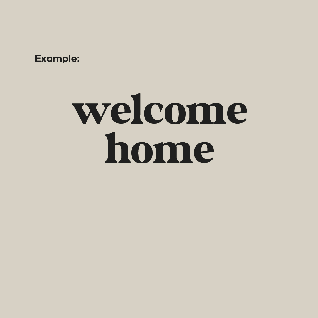
Lowercase typography is when you use all small letters for an entire word or phrase. Using all lowercase letters isn’t necessarily grammatically correct, but can be used when you’re making an intentional and stylistic design choice. This style is best reserved for a short, attention-grabbing headline (similar to those used for all uppercase). Using lowercase typography will give your designs a slightly softer look.

sentence casetitle case

Sentence Case

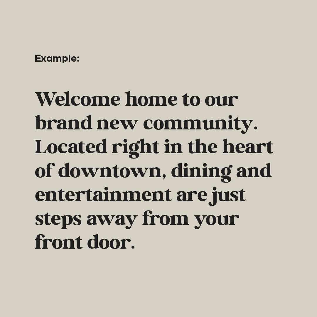
Sentence case is the style used when writing sentences—the first letter is capitalized and there is punctuation at the end of your phrase. This is most commonly used for body copy, long-form writing like blog posts, or social media captions. It’s helpful to increase readability and make your assets easy to understand. You can also choose to use sentence case for headlines or sub-headers, though they are more commonly written in title case. 

Title Case

Title case is when you capitalize the first letter of all major words in a phrase or headline. Title case is most commonly used in headlines and subheaders, but is best reserved for only one or the other. When you have a headline and subhead living together in any design, consider leveraging title case for the headline and uppercase for the subhead to create a stronger visual hierarchy. Title case is also sometimes used for calls-to-action to better differentiate them from body copy.

typography Hierarchy

Typography Casing Combos & Hierarchy

The best part about typography? You don’t have to choose just a single style. Mixing and matching different options can help you create a more dynamic, visually interesting design piece. Some common combinations include:

  • UPPERCASE HEADLINE & Sentence case body copy
  • Title Case Headline & Sentence case body copy
  • UPPERCASE HEADLINE & Title Case Subhead
  • Sentence case body copy & UPPERCASE CTA
  • Title Case Headline & UPPERCASE CTA

Especially for designs that are text-heavy, it’s important to add variety to your typography. This will create added visual interest and create a clear separation between different types of copy. But whatever combinations you choose, be sure to strive for consistency. Every headline on the page should use the same style—same with body copy, calls-to-action, subheads, and eyebrows. This approach creates a predictable visual hierarchy, so viewers understand which copy is most important at just a glance.

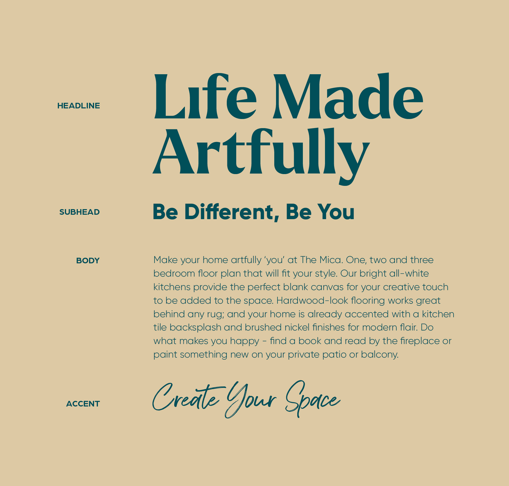
Font sizing can also help you create a clear type hierarchy. Typically, your headline should be the largest font on the page, followed by the subheadline. The body copy is often the smallest. Thinking strategically about your font size will help you move the reader’s eye down the page and help get them to engage further. It also helps you to ensure that they get the most important information first. 


If you need help defining your community’s visual style, it might be best to enlist the help of the experts. At zipcode creative, we have helped countless communities develop their branding, establish their visual guidelines, and craft their marketing materials. Get in touch with our team today to get started!  

Curb Appeal Signage: Apartment Design

First Impressions = Curb Appeal Signage

Creative apartment marketing is reliant on brand awareness—and a sign for your community is the first touch. Think of it like an introduction. And also be aware: first impressions absolutely count. When it comes to curb appeal, signage should be like a greeting—friendly, welcoming and memorable.

ONE AND DONE

Something that’s great about signage? It’s cost-effective. Your curb appeal gets a boost, and your budget also stretches a little farther. Once you put a sign up, it’s there and you don’t have to pay for it over and over, like digital ads. It’s on 24/7/365!

BE HELPFUL

Signs are a guide that’s always there, rain or shine, telling your visitors what to do and where to go. It’s also a nice way to showcase any offers or open houses you have going on. Being helpful is a big part of customer service—the foundation that customer loyalty is built on.

Stand Out With Signs Out

GRAB ATTENTION

Paid ads are targeted. Which is fine, unless you’re trying to expand beyond your typical audience. With curb appeal signage around your community, you can grab the attention of anyone who is walking, jogging, or driving by. More leads can equate to more leases!

DISPLAY OFFERS

Your prospective residents don’t know what they don’t know—in other words, if you don’t tell them about leasing specials, they won’t take advantage of them. Use bootleg signs to show off your most tantalizing amenities and start increasing the interest in the community.

REINFORCE YOUR BRAND

Signage—especially big ones (read more on that below) can help underscore your community’s brand. Improve your customer loyalty, appear more professional, and increase your brand awareness, all with a few well-placed (and well-designed) signs.

curb appeal signage blvd bannerscurb appeal signage bootlegs

The Best Signs for Community Curb Appeal

FLAGS

Also called feather signs, flags are an attractive approach to boosting your community’s curb appeal. These polyester signs can come single- or double-sided, and they’re often used to display a quick call-out. They can be placed singly or they can be staked in the ground in a group to show information, all in a row. “Now Leasing” on one flag, next to another that shows your phone number or website could be a winning combo. Make sure you match your brand colors and use a clear font—use one that’s in your apartment’s brand style guide.


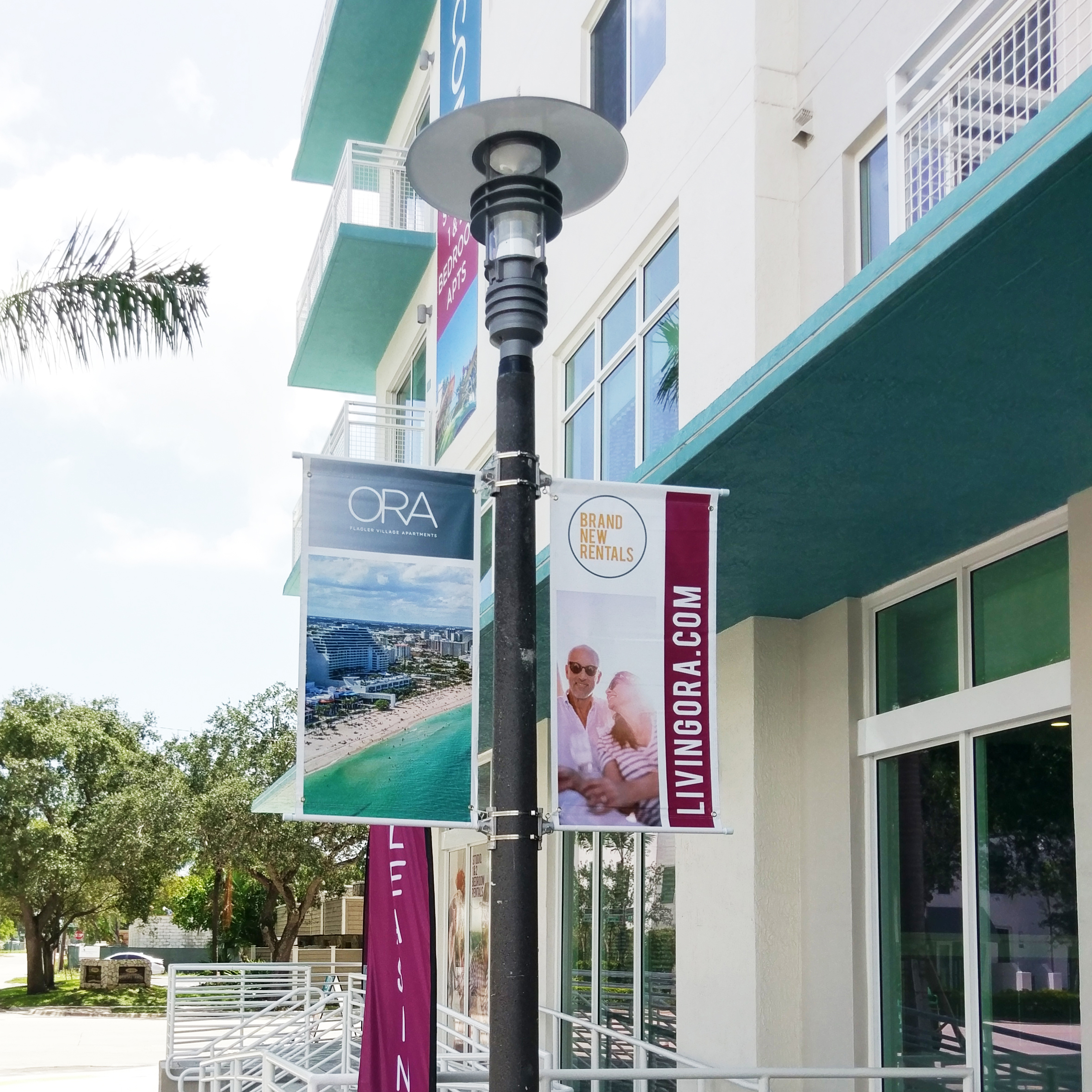
BOULEVARD BANNERS

There’s an air of hometown happiness with classic boulevard banners. Capitalize on the attention of passersby with multiple double-sided callouts in a row on the posts outside your property: “Welcome Home! Leasing Now! Great Specials!” Again, be sure to use your logo, your font, and your colors to align with everything else you put your name on. Boulevard banners are an elegant way to show off your property (even more curb appeal!) and capture more prospects.

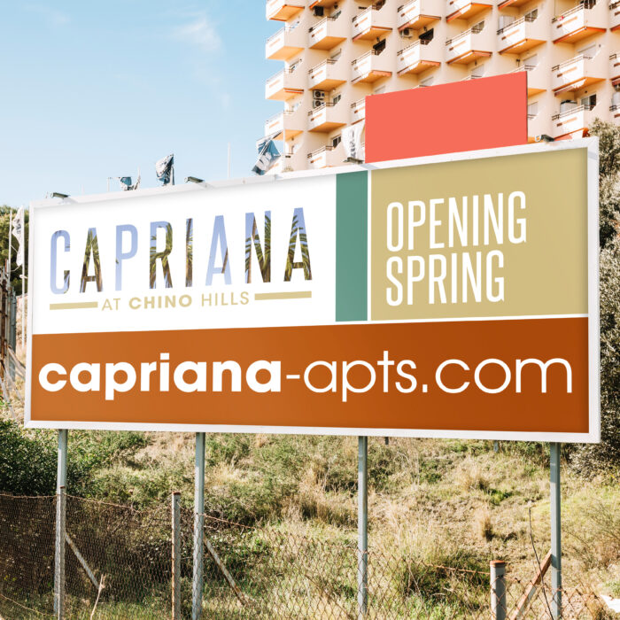
BUILDING BANNERS

(OR FENCE OR GARAGE BANNERS)

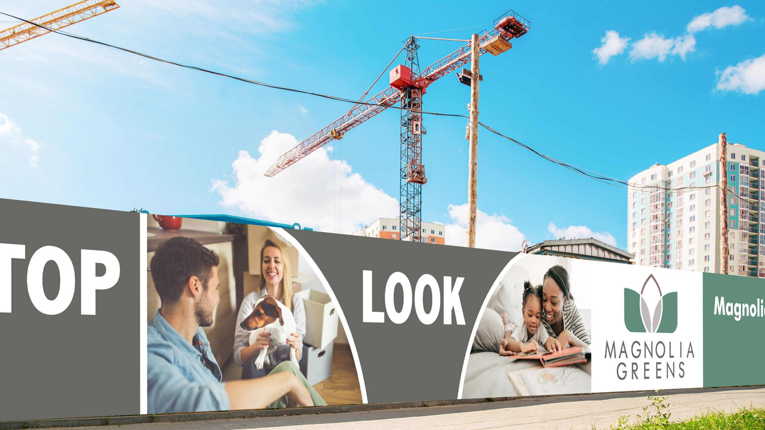
There’s no such thing as wasted space when you use banner signs on your building, fence, or garage. They’re big, they’re beautiful (if you do them right!) and they’re a game-changer. Use them to give a “Coming Soon” update if you’re in an early phase of construction. Use a big banner to give a few extra details about your apartment community, like bedroom options and your website. Show off a beautiful picture of your apartment interiors alongside your tagline. Whatever you choose, keep it clean and simple with a clear call-to-action. Done well, these make your property more attractive with extra color and interest.

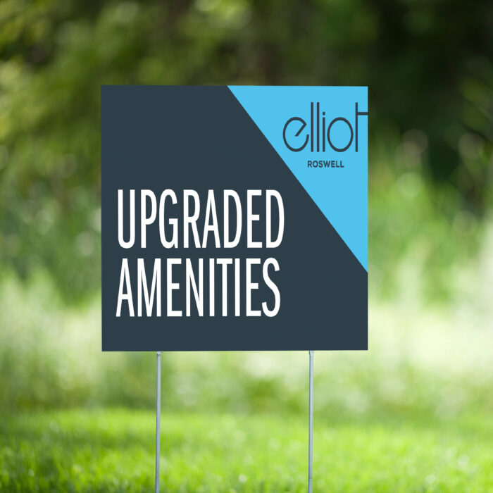
BOOTLEGS

(OR BANDIT SIGNS)

We love a good bootleg sign at zipcode creative. Also called yard signs, these are cost effective, and you can easily install them yourself. With bootleg signs, keep in mind what you would want to know about an apartment while walking by—are they accepting lease applications? Do they offer 2 bedrooms? Do they have any good leasing specials right now? Make sure, as with everything else, that the fonts, colors, and style on your cute, tidy bandit signs are indicative of your community’s brand.

curb appeal signage directional aframecurb appeal signage MDO

Apartment Community Signage Best Practices

Now that you have some ideas around what signage is best for curb appeal, it’s good to make sure you have some best practices in mind, too:

CONSISTENCY

Colors. Fonts. Style. Taglines. You should know the drill by now, but we’re here to remind you: Get and stay consistent so that your brand recognition is off the charts.

PROFESSIONAL DESIGN

Don’t leave it to the sign company. It’s a sign company. They make signs. Find a trusted branding and graphic designer who knows multifamily (like zipcode, hi!) to make beautiful, clear signs that will attract your next best resident.

CLEAR CONTENT

A pro designer knows how much info should be shared on a single sign. Enough to read it easily and quickly and have enough content to convey a basic message.

PLACEMENT

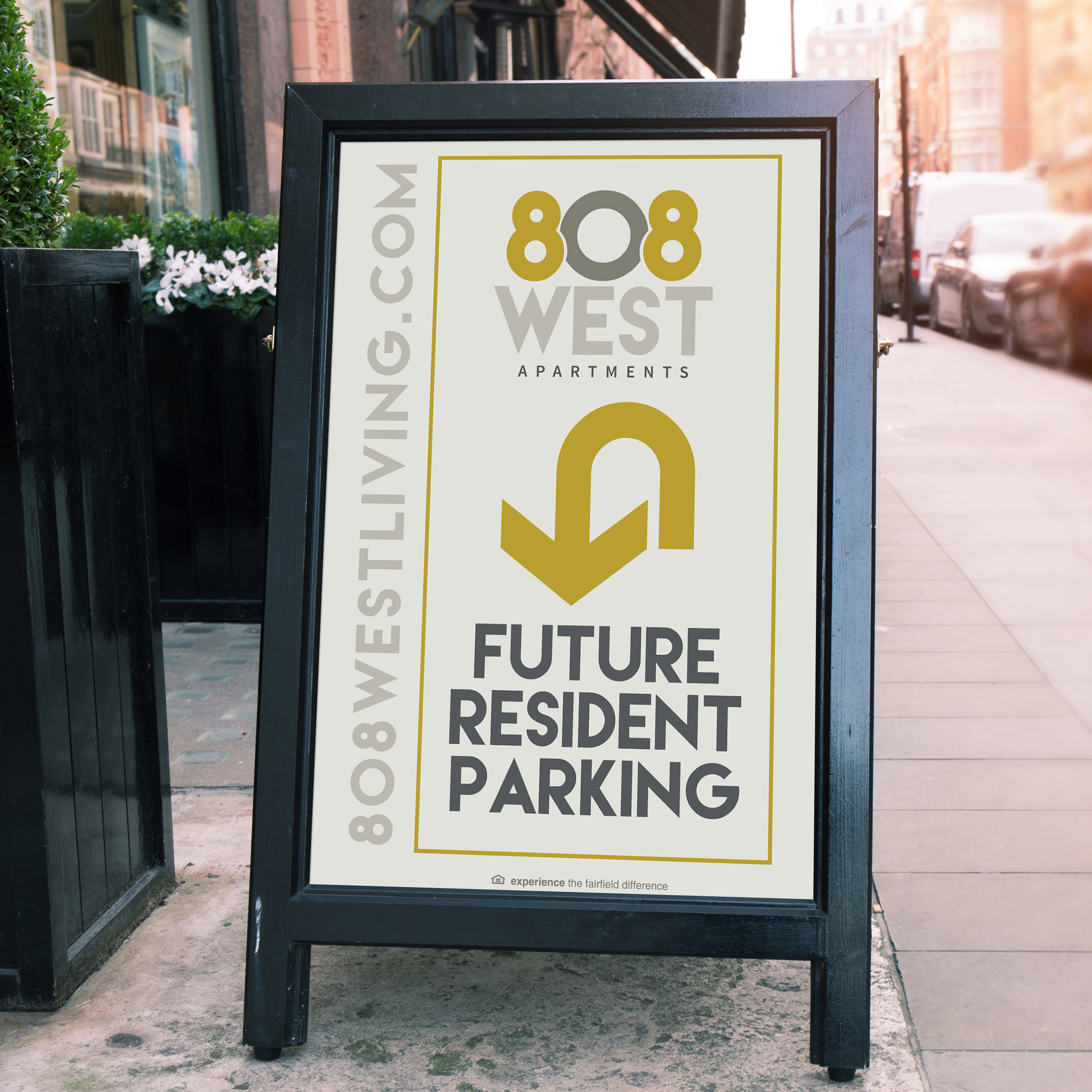
High traffic areas are the best spot for your beautiful new signage. Think, too, about what audience you’re reaching—drivers? Keep the message simple and large so they can read it quickly. Foot traffic? Add in some directional signage with arrows to beckon them into the leasing office. Neighbors? Place signage visible from the building across the way, indicating your availability and leasing specials so they can move for a better deal!


If the first words out of your new prospect’s mouth are “I saw the sign”, consider yourself a success. (And current residents will appreciate the attractive signs you’ve placed around, making their home a more beautiful one.)

808 West, Capriana and ORA are ©Fairfield Residential  |  Work executed by Stacey Feeney, owner of zipcode creative, while under creative direction and employment at Fairfield Residential.

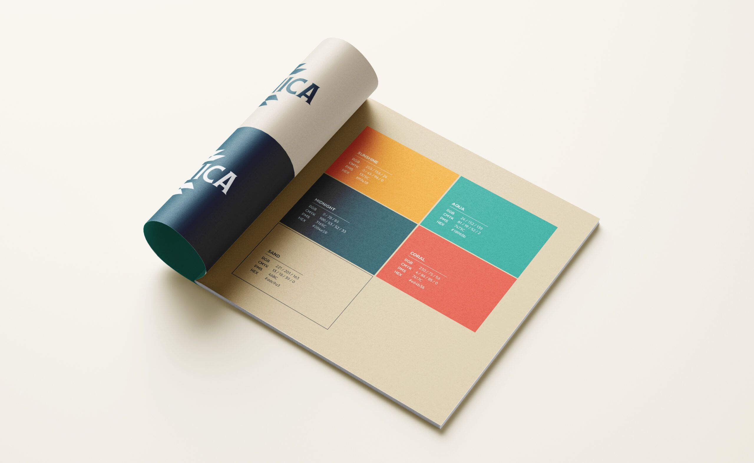
Color Palette: Branding Apartments

Besides the name and logo, there’s another part of your branding that ensures your community is instantly recognizable: your color palette. Certain combinations of colors instantly recall certain brands—while bold primary shades of yellow, red, and blue represent Google, bright red and white are equally synonymous with Coca-Cola. Choosing a distinct combination of colors is a must to help your community amp up your brand recognition and stand out from your competitors.

But all color palettes aren’t created equal. When choosing your colors, be sure to carefully consider a few different factors to land on the perfect hues.

Dos:

  • Consider color psychology
  • Explore your favorite brands’ palettes
  • Evaluate your brand’s personality 
  • Look for inspiration in unexpected places

Don’ts:

  • Copy other brands directly
  • Forget about your target audience
  • Just choose a single color
  • Skip testing your palette

Do:

Consider Color Psychology

People naturally associate certain colors with certain feelings or emotions. Red, for example, is often associated with anger or passion. Pink is typically considered a feminine color, while purple is a majestic and royal shade. When choosing your colors, be sure to consider the intrinsic meaning of each hue, and ensure it aligns with your greater brand messaging and objectives.

Don’t:

Copy Other Brands Directly

Having a unique color palette is integral to standing out. While you can seek inspiration from other brands, be sure to put your own unique twist on the shades. Change the saturation, swap out a few of the secondary colors, or use them in different ways to create a distinct visual identity for your brand. The more you can standout from your competitors, the better – so do your own thing with color too!

Do:

Explore Your Favorite Brands’ Palettes

If you’re looking for inspiration, look to your favorite brands and see what they have in common. Are you gravitating towards bright, bold color palettes? Or do you prefer more muted, neutral combos? Evaluating your top picks can help to reveal patterns and preferences you may not be conscious of, giving you a good starting point for creating your own.

Don’t:

Forget About Your Audience

Consider who you’re targeting when choosing your brand colors. If your audience is mostly Boomers, for example, you would maybe want to explore muted, neutral shades and cool tones. If your audience is Gen Z, on the other hand, you’d want to explore more playful, bold, and youthful shades. These small nuances can help your branding resonate better with your audience and make your community feel like a naturally better fit.

Do:

Evaluate Your Brand’s Personality

If your brand is sophisticated and elegant, you want to ensure you choose colors that match. Similarly, if your brand is more fun and playful, you’ll want to pick shades that represent those elements. No matter your brand personality, be sure to mimic your style and vibe with your primary and secondary colors. This will help give your audience context clues about your brand, so they better understand your style from the very beginning.

Don’t:

Just Choose a Single Color

Branding needs more than one color to shine. Choose at least two primary shades, in addition to a selection of neutrals, that you can mix and match to create different marketing collateral. This will help ensure you have dynamic and interesting assets, as opposed to ones that fall a little flat.

Do:

Find Inspiration in Unexpected Places

Colors are all around us, which can make it easier to find your favorite combos. You don’t just have to use photographs and other brand logos as a starting point. Think outside the box and look to natural landscapes, food, flowers, and even fashion trends as a starting point for the individual shades and color combinations you’re drawn to.

Don’t:

Skip Testing Your Palette

While your colors may look good in isolation, it’s important to test them in different places to make sure they make sense tother. Make a few different combinations and a few different cross-channel assets to make sure you like the way everything is working. You should also test the color contrast for accessibility to ensure any text is easy to read.

color palette

Putting it All Together

After gathering your inspiration and doing your due diligence, it’s time to put everything together. 

  1. Start by asking senior leadership which colors they love (and which they hate). This will help give you a good jumping-off point for your color palette.
  2. From there, choose your first must-have shade. This will serve as the primary color in your palette.
  3. Then, add a complementary color. If you’re not sure which color best complements your pick, look to the color wheel—the shade on the exact opposite side of the wheel is its natural complement. 
  4. Then, play around with the saturation. Choose both a light and dark version of your primary brand color. 
  5. Next, add one or two neutral colors like white, black, gray, or beige. This will help you achieve the dynamic palette you need to execute any type of asset. 
  6. Finally, add an accent color to add an eye-catching pop.


If you’re struggling to find a color palette that feels true to your brand, reach out to the experts. At zipcode creative, we handle every element of branding from logo and name development to brand guidelines and color palettes. We’ll partner with you and your team to create a brand identity that perfectly represents your community. Reach out today to get started!