Affordable Housing Can’t Afford to Skip Branding
There’s an assumption baked into affordable housing development: “The units are income-restricted, so they’ll fill themselves.”
And sure—demand for affordable housing in the U.S. is staggering. The National Low-Income Housing Coalition’s 2025 Gap report documented a shortage of roughly 7.1 million affordable homes for the nation’s 10.9 million extremely low-income renter households. Waitlists are long and the need is right in front of us.
But filling units and building a community that residents are proud to call home are two very different outcomes. And the difference between them, from our vantage point, is branding.
The Branding Gap in Affordable Housing
Walk through most affordable housing marketing materials and you’ll notice a pattern. Minimal design effort. Generic stock photography (if any photography). A name that is basically the address. Collateral that feels like it got forgotten until the last minute.
Compare that to the market-rate community down the street with its custom logo, curated color palette, branded signage, and messaging that makes prospects feel something before they even walk through the door.
The gap is bigger than aesthetic. It’s a strategic difference. It sends an unspoken message to both residents and prospects that this place isn’t worth investing in.
That’s a branding failure—not a budget constraint.
Why Affordable Properties Skip Branding (and Why They Shouldn’t)
The reasons are predictable. Budget limitations top the list. When developers and owners are navigating LIHTC compliance, construction timelines, and operating cost pressures, branding lands somewhere near the bottom of the priority stack. With funding requirements, regulatory frameworks, and occupancy targets to hit, who has time for a logo?
Then there’s the “they’ll come anyway” argument. With demand far outpacing supply—nearly half of all U.S. renters are now considered cost-burdened, according to the Harvard Joint Center for Housing Studies—it’s tempting to view marketing as unnecessary overhead.
But this logic misses something fundamental. Branding has to go farther than acquisition. It should also create resident satisfaction, community reputation, and long-term operational health. A strong brand reduces turnover. It builds word-of-mouth referrals. It gives your leasing team something real to sell beyond square footage and rent price. It gives residents a sense of belonging that makes them want to stay—and tell others they should apply.
According to industry data, NOI for fully affordable properties grew 7.4% in 2024, per Yardi Matrix analysis. The properties performing best within that segment aren’t just well-managed. They’re well-branded.
What Happens When Affordable Communities Invest in Brand
When an income-restricted property invests in its brand identity—a name that resonates, a visual identity that feels intentional, messaging that speaks to the humans who live there—several things shift.
Residents feel pride. Research from University of California, Berkeley found that LIHTC residents in well-designed, thoughtfully branded communities described their housing differently than those in generic-feeling developments. One resident put it simply: “This is not the projects. We just live here, just like any person lives in any building.” That sense of normalcy is branding doing its job. When the community looks and feels intentional, residents experience dignity in place of stigma.
The surrounding community responds differently. Affordable housing developments face NIMBY (“not in my back yard”) pushback constantly. Strategic branding and marketing can reframe how a neighborhood perceives a new development—shifting the narrative from “low-income housing” to “a community designed with care.” Developers who brand their affordable properties with the same level of professionalism as market-rate projects report smoother community acceptance and faster approvals.
Operational performance improves. Communities where residents feel a sense of belonging and pride see stronger renewal rates, fewer maintenance complaints rooted in resident disengagement, and better reviews. All of these metrics feed the operational health that owners and investors care about. Your brand isn’t just a pretty facade—it’s part of your retention strategy. And in a market where even affordable properties are seeing expense growth pressure margins, anything that reduces turnover is a financial win—not a nice-to-have.
Leasing teams have something real to work with. When your affordable community has a brand identity—real messaging, a name with personality, materials that feel professional—your leasing team can sell the lifestyle, not just the price point. That changes the entire leasing conversation from transactional to relational. And relational conversations lead to better-fit residents who stay longer.
The Stigma Problem Is a Branding Problem
Let’s name the elephant in the room. Affordable housing carries a stigma. “Section 8.” “The projects.” “Government housing.” These labels carry weight—and they stick, even when the actual living experience doesn’t match the stereotype.
Here’s where branding becomes essential: you can’t fix stigma with silence. If your affordable community doesn’t have a strong, intentional brand presence, you’re leaving the narrative up to everyone else. Neighbors, local news. The outdated assumptions average people carry around.
A strong brand gives you control over that narrative. It says: this is a community with an identity, a name that means something, visuals that reflect care, and messaging that centers residents instead of income levels.
This doesn’t mean pretending a property isn’t income-restricted. It means refusing to let the income restriction be the only thing people know about it. There’s a huge difference between “income-restricted housing at 555 Main Street” and a community called “Osprey Sound Apartments” with a visual identity that reflects the character of the neighborhood, the pride of its residents, and the intention behind its development.
One of those sounds like a spreadsheet entry. The other sounds like a place someone may choose to live.
The language matters, too. “Affordable housing complex” carries different weight than “apartment community.” The imagery matters—stock photos of generic buildings versus real photography of the actual property and its neighborhood. Every touchpoint either reinforces the stigma or helps dismantle it. And branding helps coordinate all of those touchpoints into a single, intentional message.
What Affordable Housing Branding Actually Looks Like
Branding for income-restricted properties doesn’t need to cost what a Class A lease-up spends. But it does need to be intentional. Here’s what that involves:
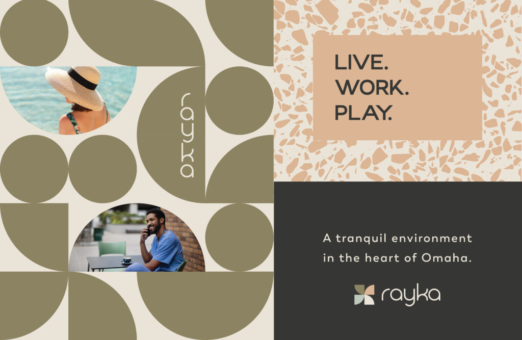
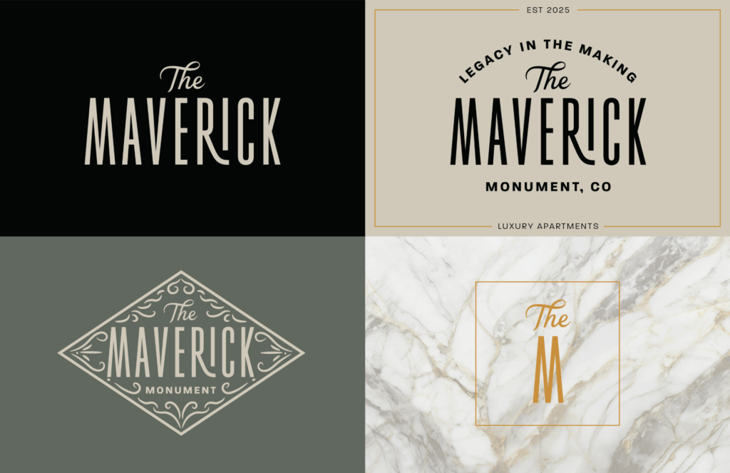
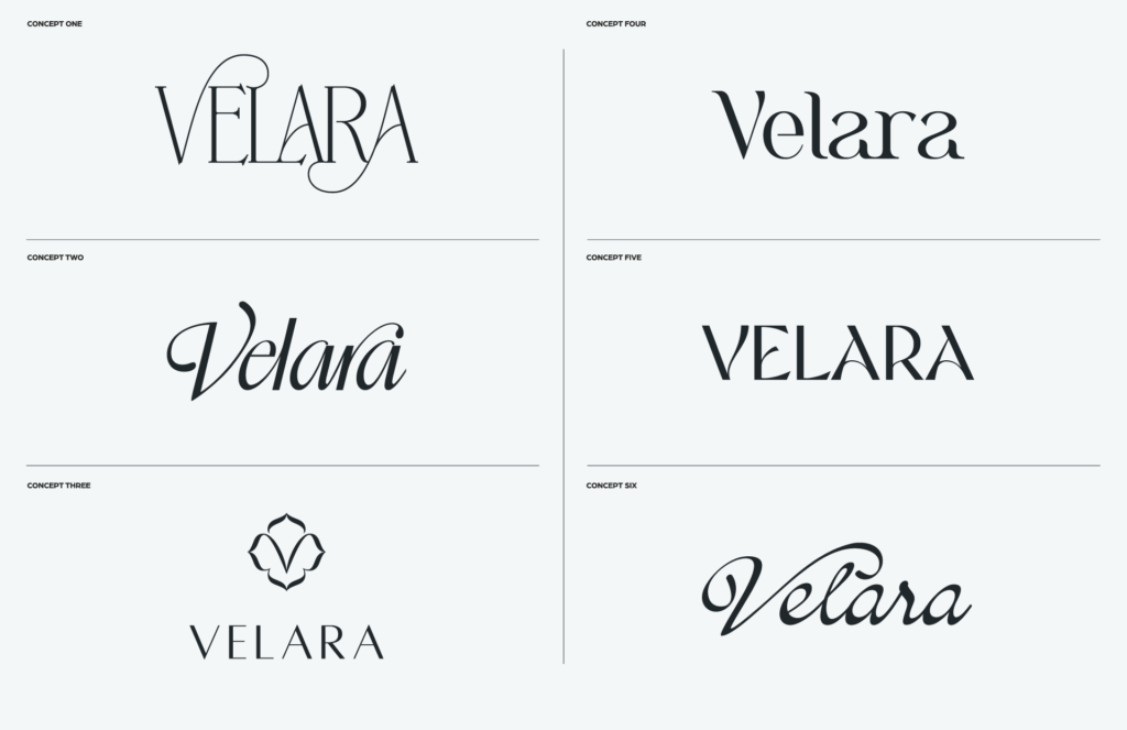
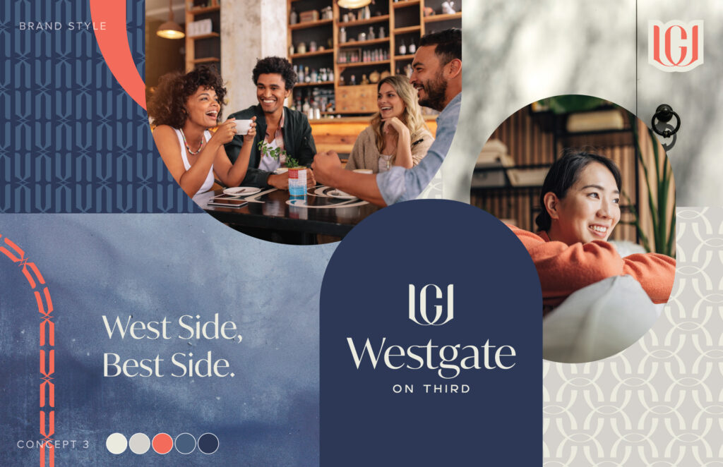
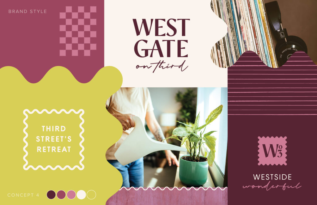
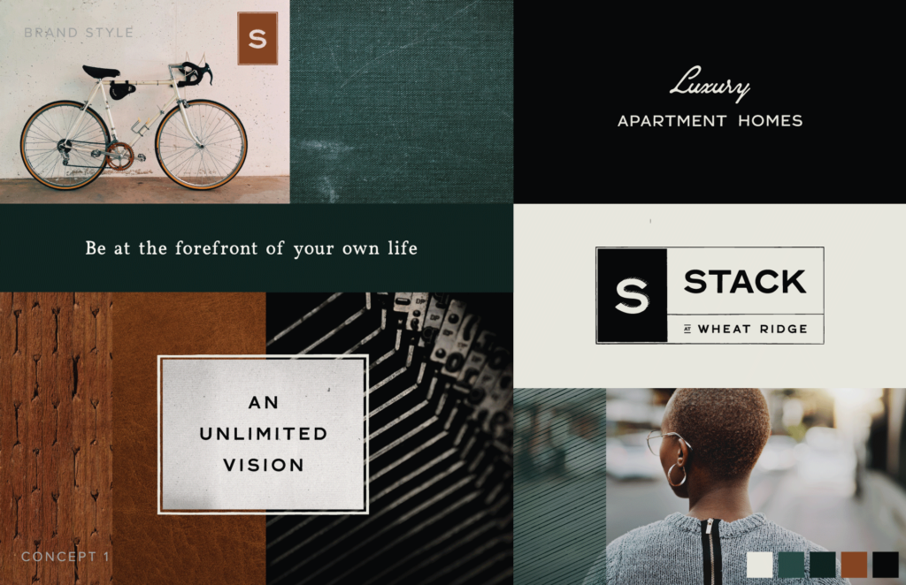
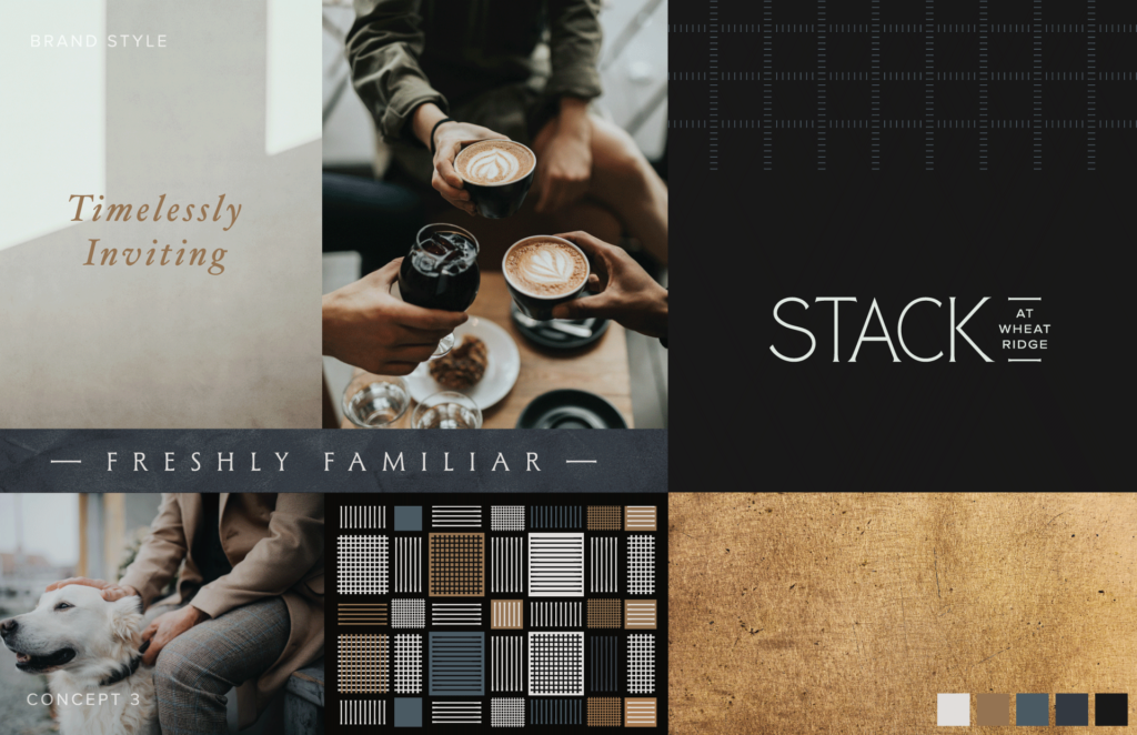
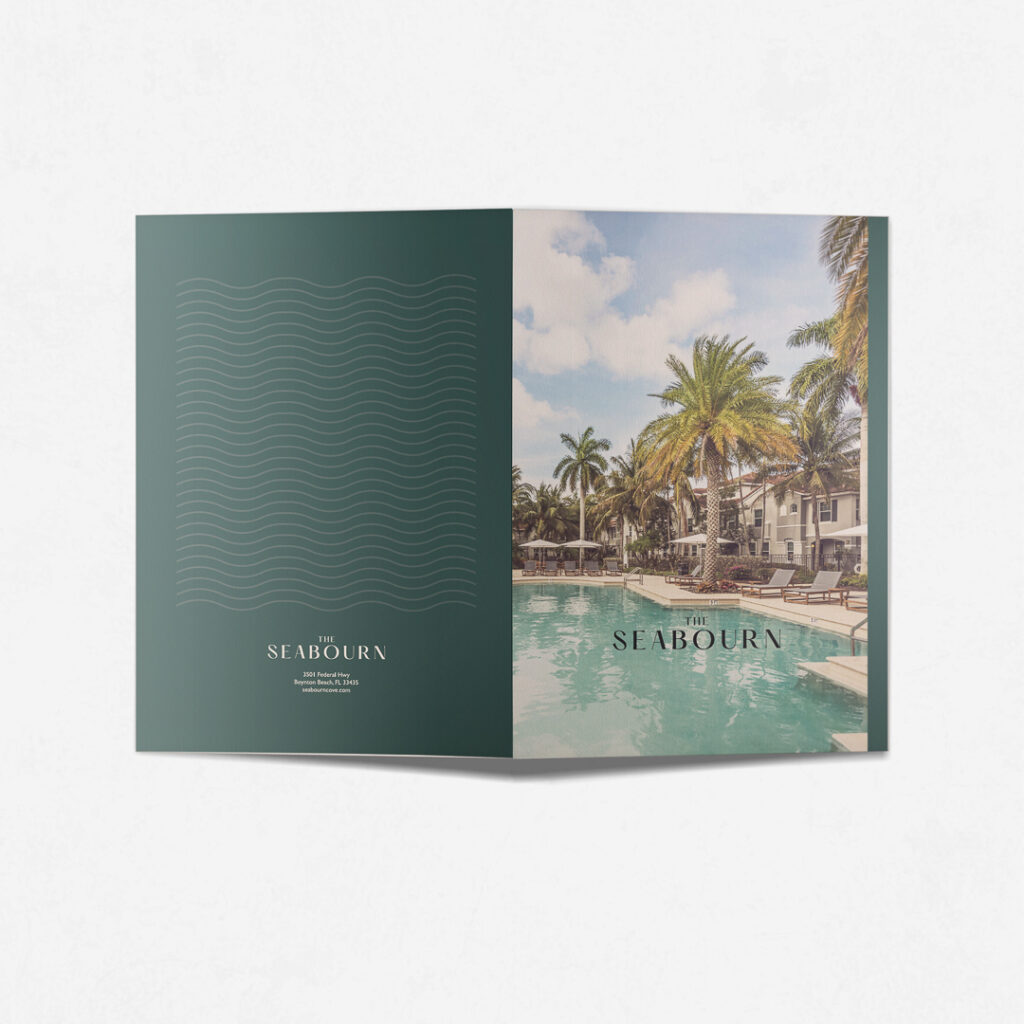
A name with thought behind it. Too many affordable developments end up with names that are either purely functional (the street address) or painfully generic (“Pleasant View Apartments”). A name that connects to the neighborhood, reflects a sense of place, or creates an emotional anchor makes a meaningful difference in how residents—and the surrounding community—perceive the property. Think about the difference between “Building 7 at Riverside” and “Osprey Sound Apartments.” One feels like a line item. The other sounds like somewhere you’d actually want to come home to. For more on what makes a community name work, Zipcode Creative’s guide to naming apartment communities is a helpful starting point.
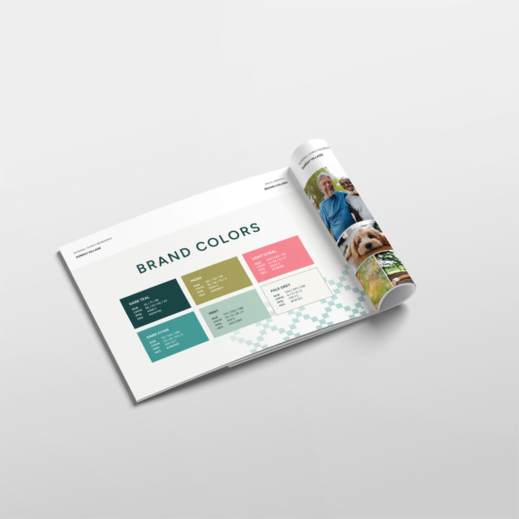
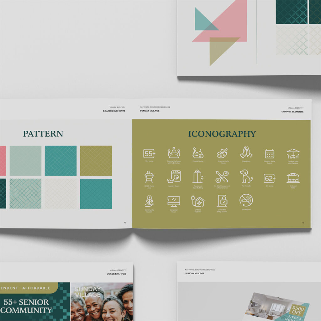
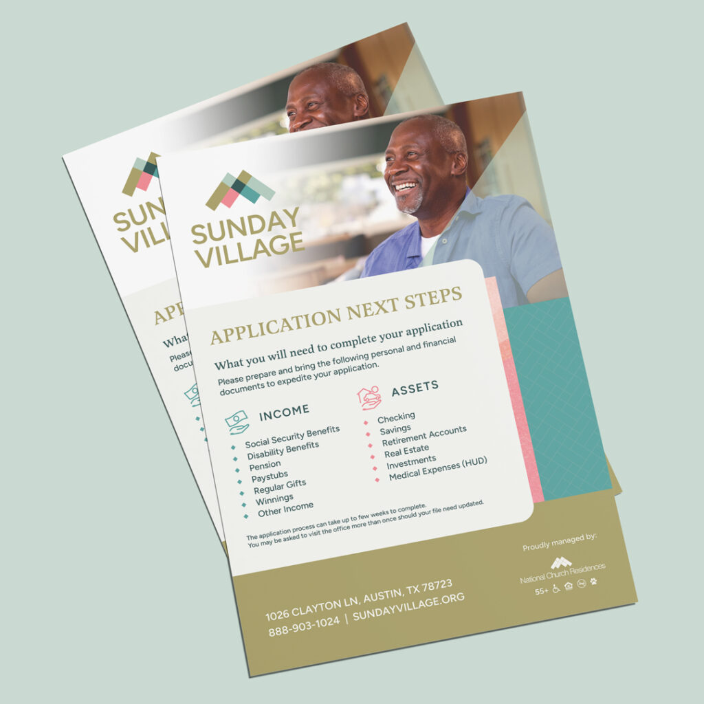
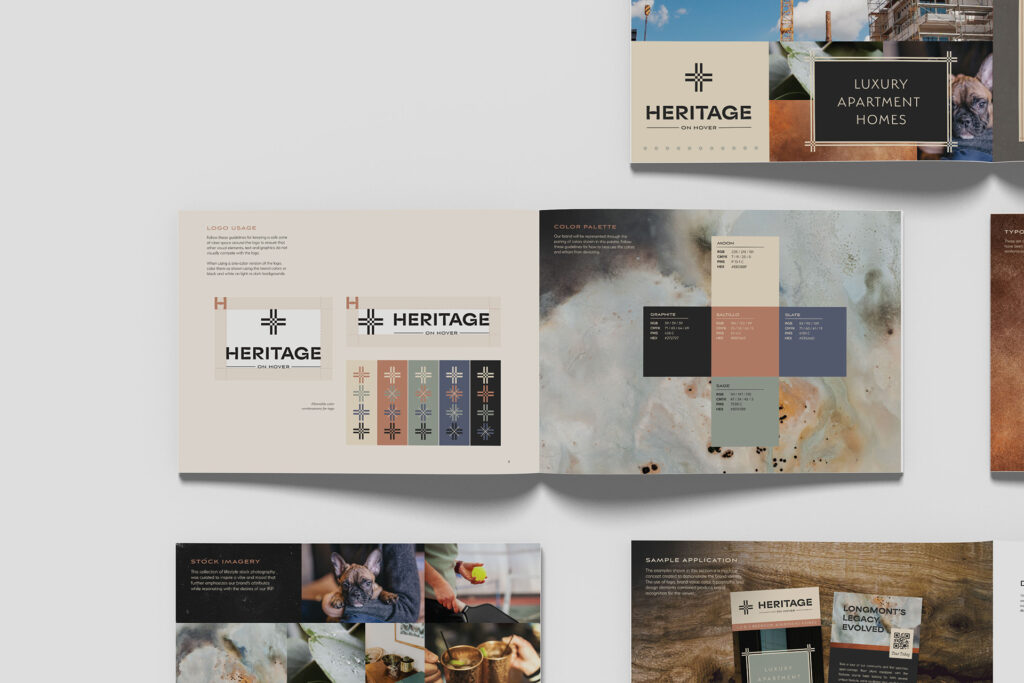
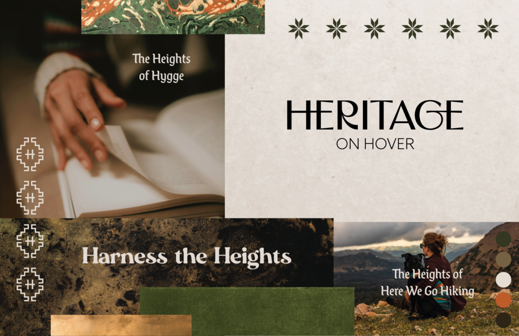
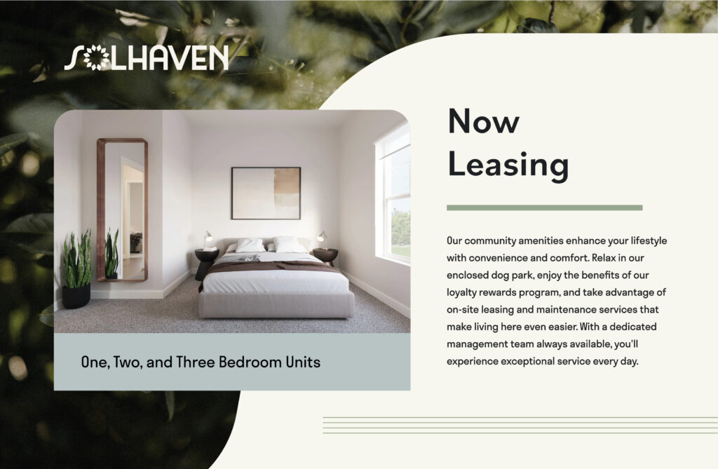
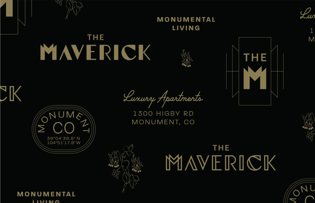
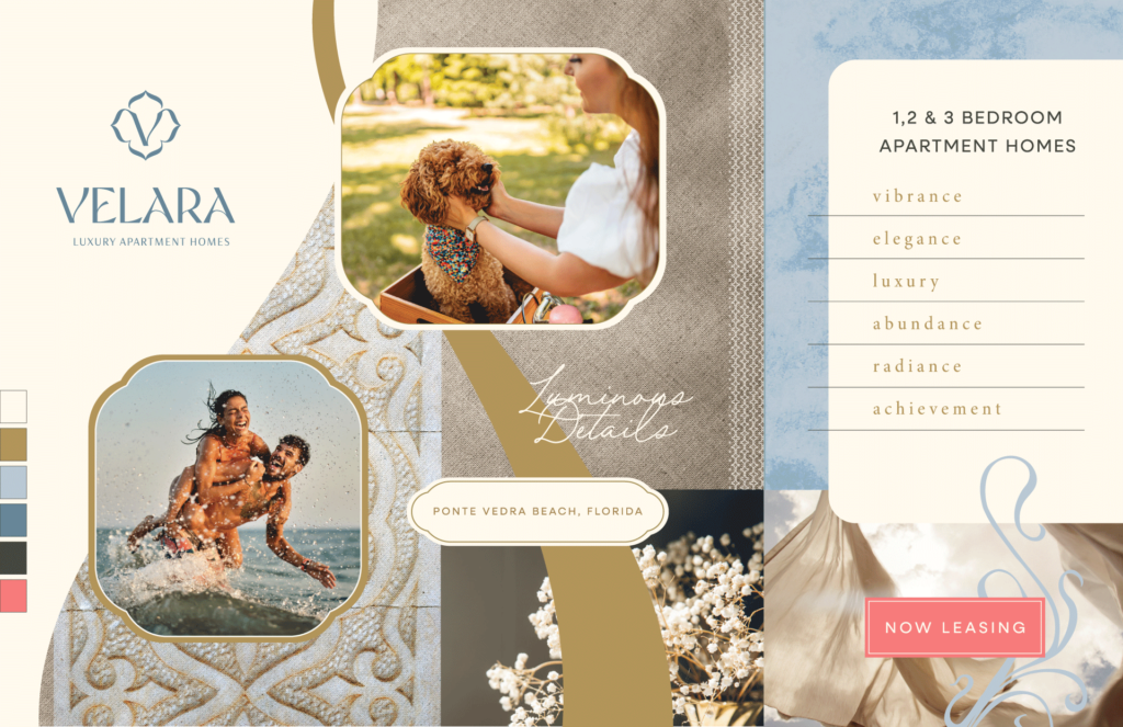
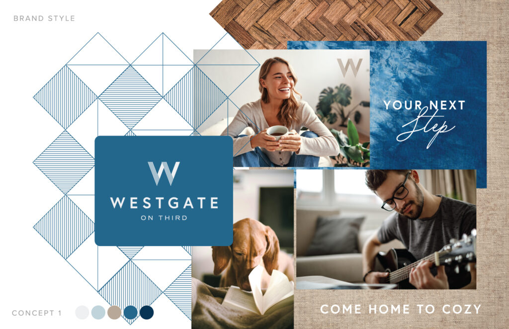
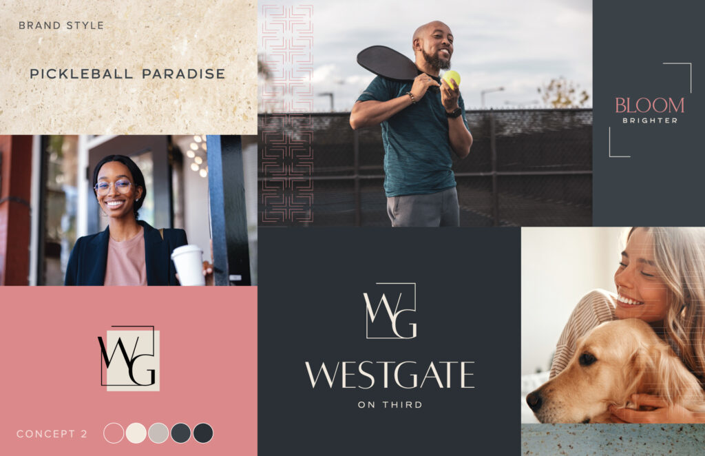
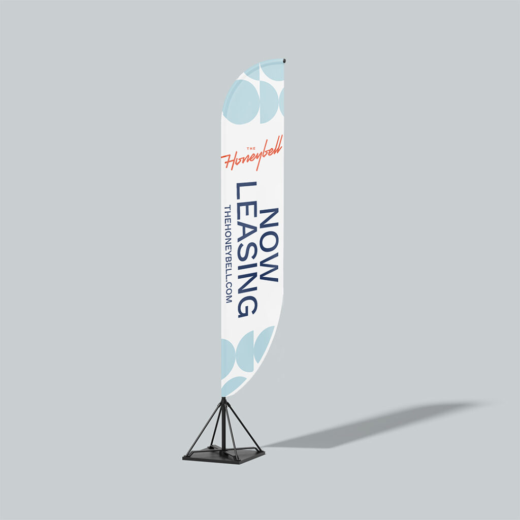
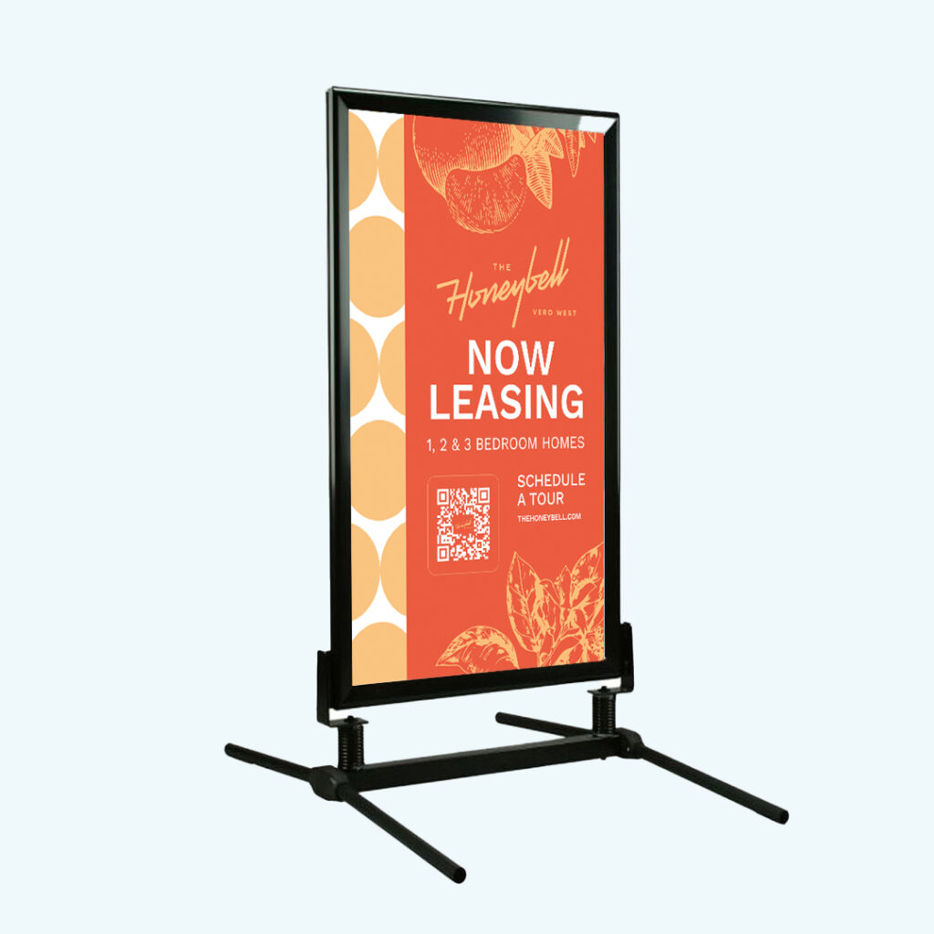
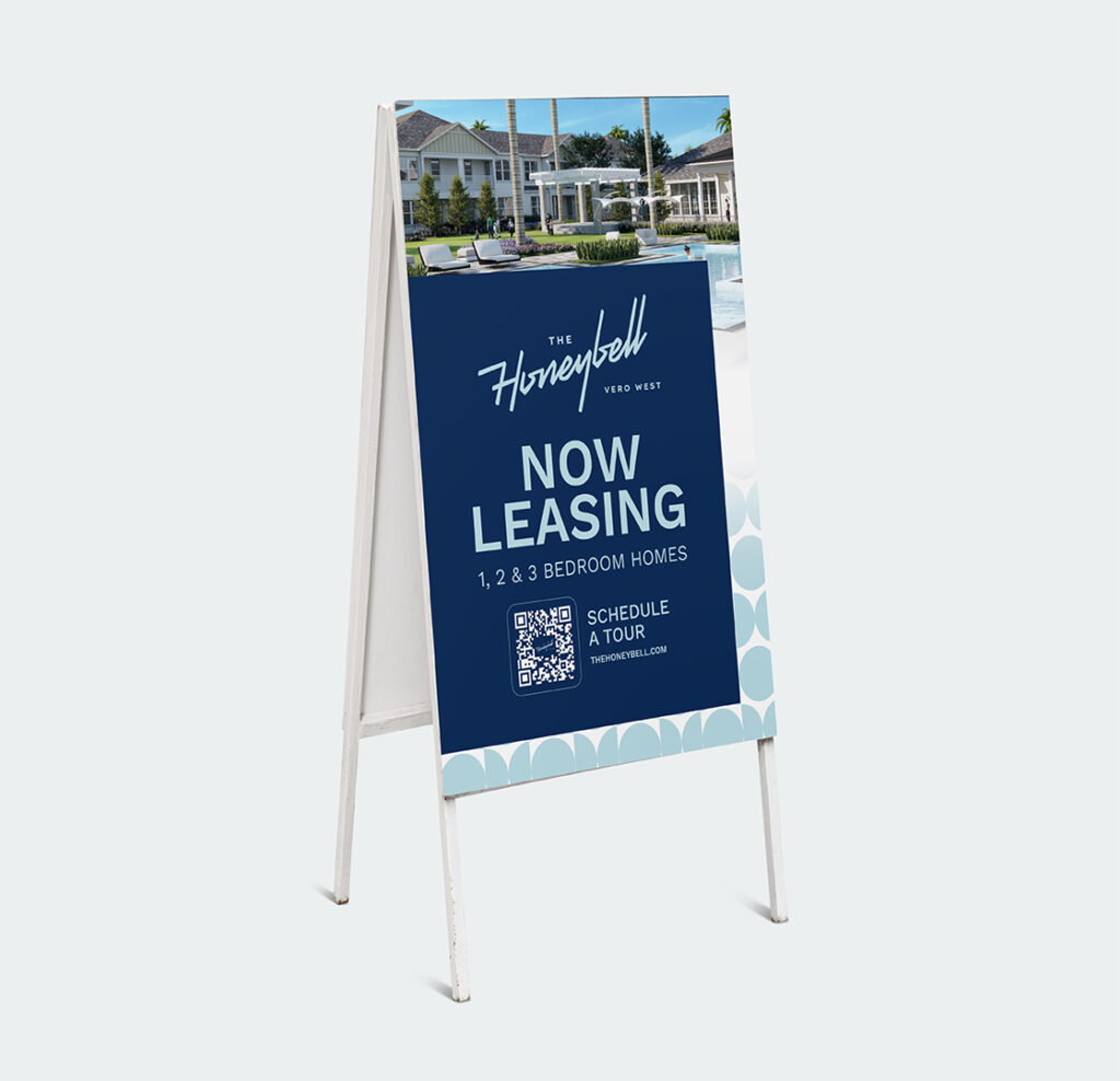
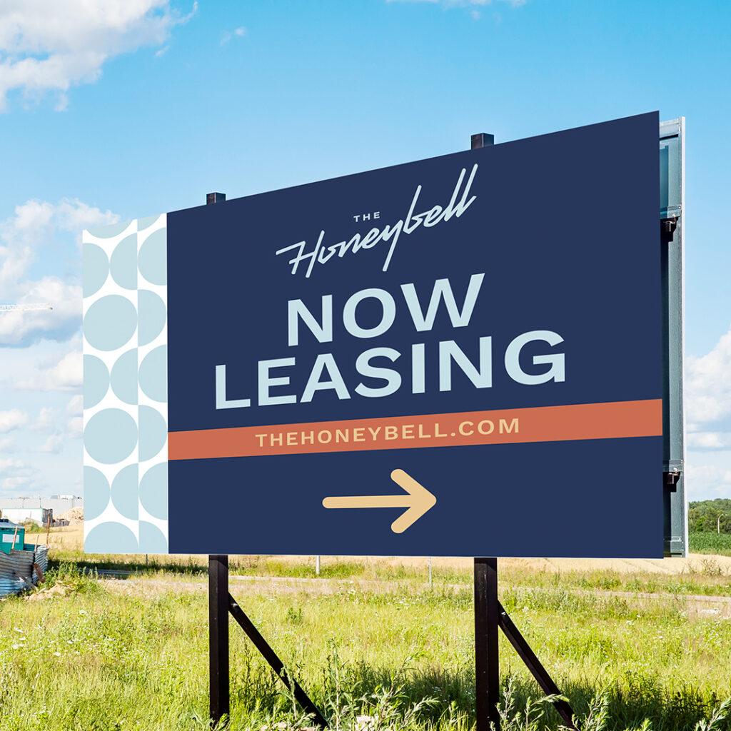
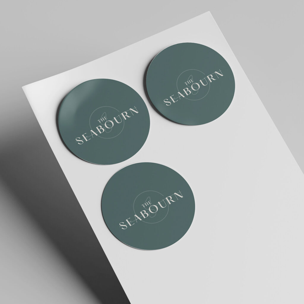
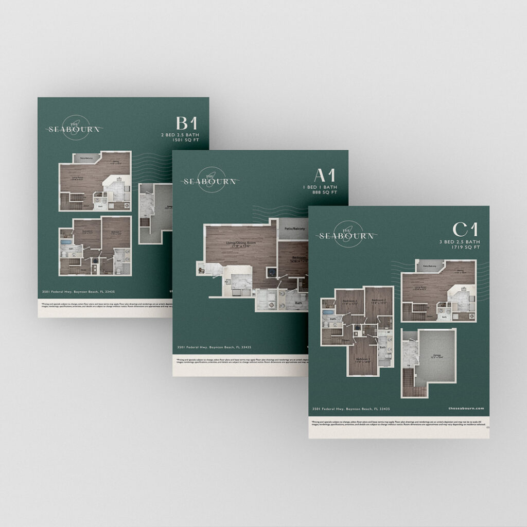
A visual identity that feels professional, not afterthought. This means a logo that works at every scale—from the monument sign to the business card. A color palette that’s consistent. Typography that feels modern and human. These elements don’t need to be elaborate, but they need to exist and they need to be cohesive. When your brand collateral looks like it was designed with care, it communicates that the community itself was built with care.
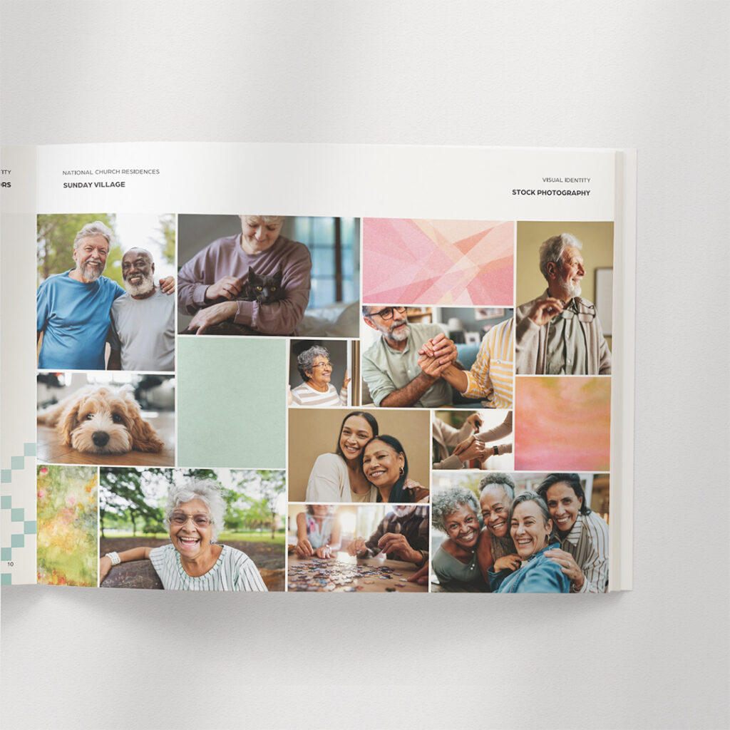
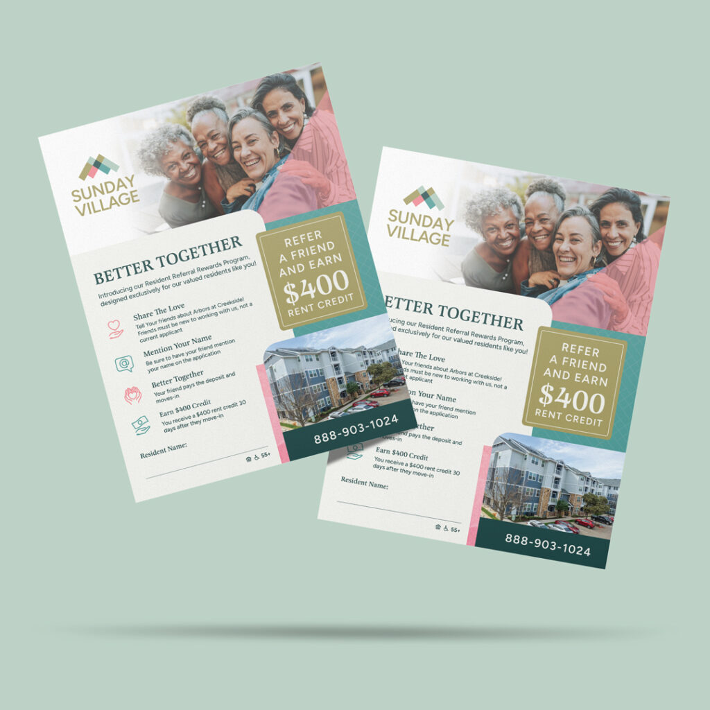
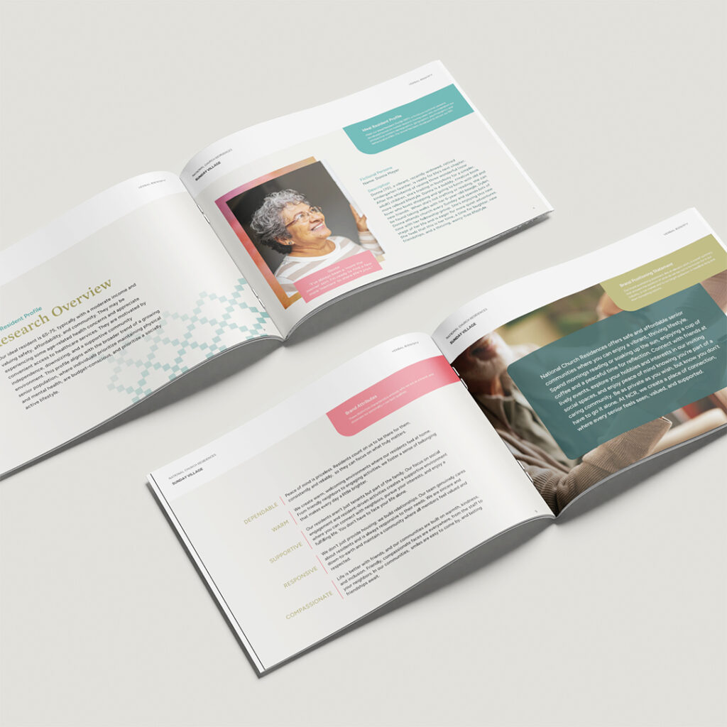
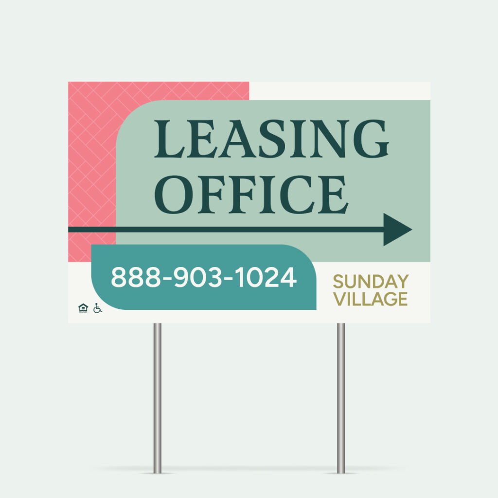
Zipcode Creative’s rebrand of Sunday Village—a senior affordable housing community—is a good example of what this looks like in practice. The property needed a brand identity that honored its residents and reflected the care behind the community, not one that defaulted to generic or institutional. The result was a cohesive visual system that gave the property a professional, welcoming presence without requiring a Class A budget.
Messaging that centers residents, not restrictions. Your marketing copy shouldn’t lead with “income-qualified” or “affordable housing.” Lead with what makes this community a great place to live. The amenities, the neighborhood, the lifestyle. The eligibility details absolutely belong in the conversation, but they shouldn’t be the headline. Residents are people first, not income brackets.
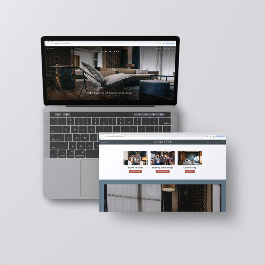
Consistency across touchpoints. The website, the signage, the leasing office materials, the social media presence—when these all tell the same brand story, the community feels cohesive and professional. When they don’t, it signals disorganization, which reinforces every negative assumption prospects and neighbors already carry.
Fair Housing Compliance and Brand Development
One more thing that makes affordable housing branding distinct: Fair Housing requirements. LIHTC properties and other income-restricted developments are subject to Affirmative Fair Housing Marketing Plans, which require proactive outreach to underrepresented populations and compliance with anti-discrimination standards.
This isn’t at odds with strong branding—it actually makes it more important. Your brand materials, from photography to messaging to advertising channels, need to reflect the diversity of your housing market area. A thoughtful brand identity built with Fair Housing compliance baked in from the beginning is far more effective (and far less risky) than trying to retrofit compliance onto generic materials after the fact.
Branding and compliance aren’t competing priorities. They’re complementary ones. A well-branded affordable community with inclusive imagery, accessible design, and thoughtful outreach demonstrates the kind of care that builds trust with every audience it touches.
Bottom Line: Every Resident Deserves a Brand They’re Proud Of
There’s a version of the affordable housing conversation that treats branding as a luxury—something you invest in when there’s money left over. But that framing gets it backward.
Branding is how you communicate value AND it’s how you combat stigma. It’s how you create environments where residents feel pride and communities feel cohesion. And it’s how you build the long-term operational performance that makes affordable housing developments sustainable—not just fundable.
The demand for affordable housing isn’t going away. According to CBRE, owning a home now costs more than twice as much per month as renting, and only about 12.7 percent of renters can afford to purchase a median-priced home in their market. That means the affordable rental market is expanding. More people will call income-restricted communities home. Those communities also deserve a brand that reflects the dignity and intention of the people living in them.
Affordable doesn’t mean generic. Income-restricted doesn’t mean identity-restricted.
Every community—regardless of price point—deserves a brand that makes residents proud to say where they live.
Ready to bring branding to your affordable or workforce housing portfolio? Zipcode Creative specializes in multifamily brand development that fits every property type and every budget. Let’s talk about your next project.