
Tag: apartment marketing

Creating Neighborhood Content That Sounds Like Your Brand

Pull up the neighborhood page on your community website. Read it top to bottom.

If it’s like most of them, you found a Walk Score, a map with pins, four chain restaurants, one park, and a sentence about how the area offers “something for everyone”. Probably a Whole Foods callout. Definitely a commute time.

Now cover the logo and show someone who doesn’t work with you. Could they name your community? Could they name your city?

That page is doing one job when it should be doing three. Right now it only proves you have an address. It should also prove you know the place, help a prospect picture their average Tuesday, and give Google and AI answer engines something specific enough to quote. A real local content strategy handles all three at once. And it doesn’t require a staff writer, a photo crew, or an extra budget line item.

The Part That Comes After “Know Your Neighborhood”

So, we’ve written about location a few times around here. Why the area should shape your brand in the first place. How local partnerships build genuine ties with the businesses around you. Why local beats bland every single time. All strategy, all important still.

This is the layer after. You did the research. You know the vibe, the history, the hot spots, the people. You built a brand that fits the block instead of ignoring it. Now you have to publish something. But knowing your neighborhood and deftly communicating it (on brand) are two different things. Let’s see what we can figure out.

What Neighborhood Content Is Supposed to Do

Your area content has two audiences, and lucky for you, they typically want the same thing.

Audience #1: A person deciding where to sign a 12-month lease. They’re not reading your neighborhood page to learn that a grocery store exists. They’re trying to run a simulation of their own life in your zip code. Where does coffee happen on a Saturday? Is the walk home at 10pm the kind of walk you want to take? What does this place feel like on a random Wednesday when nothing special is going on?

Audience #2: A machine. Google, and increasingly ChatGPT, Perplexity, and Google’s AI Overviews, which all get asked some version of “what’s it like to live in [neighborhood]” every day. These machines want specific, verifiable, first-hand claims they can pull into an answer.

Vagueness isn’t helpful. “Something for everyone” tells a prospect nothing and gives an answer engine nothing to lift. Specificity serves both at once, which is good news! You don’t have to choose between writing for humans and writing for search.

Filter the Neighborhood Through One Person

Every neighborhood has a few 100 true facts about it. Your job isn’t to list them. It’s to pick the 40 that matter to the person you’re trying to lease to.

That’s what your Ideal Resident Profile is for. Not just brand colors and messaging, but content selection.

Say your IRP is a mid-career nurse working nights at the hospital six minutes away. Suddenly your neighborhood content is about what’s open at 8am when a shift ends. Which grocery store is empty at 10am. Where you can get real food at 11pm without a drive-thru. Maybe even blackout curtain recommendations….

Nobody in your comp set is writing that guide. They’re all writing the one about the farmer’s market.

Or your IRP is a family relocating from out of state, and your content is about school boundaries, pediatricians taking new patients, which park has shade, and which streets get loud on game days. Also nobody’s writing that.

The generic neighborhood page exists because nobody made a choice about who it was for. Make the choice and the content writes itself.

The Four Formats Worth Your Time


Not all local content is worth writing. But these four categories are.

The area guide page. Your evergreen anchor, living on your own domain, structured and thorough. This is the one that ranks and gets cited. It deserves the most effort and the most voice.

The recurring roundup. A short post every month or quarter covering what’s new, what opened, what closed, what’s happening. Low effort, high freshness signal, and it gives you something to say on social that isn’t a rent special.

The named social series. Give it a title and a repeatable format so the on-site team knows exactly what to do next. “Six Minutes From Home.” “The Block Report.” Whatever fits the brand. A format beats a one-off every time.

The tour handoff piece. Printed or digital, handed to a prospect at the end of a tour. A curated map with your actual opinions on it (maybe every staff’s fave spot nearby with specific recs). It’s the cheapest brand asset in the building and it walks out the door with them.

Making It Sound Like You

Here’s where most neighborhood content fails: It’s not written in anyone’s particular voice.

Have an opinion. “Three coffee shops within a mile” is a directory listing. “The one on Fifth is where you go to actually get work done, the one on Elm is where you go to be seen” is a brand talking. Opinions are the whole product. A prospect can get the list from Google Maps. They can only get your take from you.

Use your brand’s vocabulary. If your verbal identity leans warm and a little wry, the neighborhood page should be warm and a little wry. If it’s quiet and grown-up, don’t suddenly write “the vibes are immaculate” because it’s a social post. Same brand, same words, every touchpoint.

Name real things. Streets. Businesses. The school district. The bus line. The specific mural. Vague nouns like “nearby dining” and “convenient access” mean nothing to a person and don’t solve anything for a machine.

Know what you’d never say. A brand voice is defined as much by its exclusions as its inclusions. If your guidelines don’t already have a “we never say this” list, that’s a gap worth closing.

Let a person sign it. Content attributed to a leasing manager who’s lived there four years beats an anonymous page. Google advises leaning hard on first-hand experience, and readers can feel the difference too.

Writing So Search and AI Can Both Use It

The technical part is less complicated than it sounds.

Answer the question in the first sentence of the section, then explain. Answer engines will pull the direct answer and skip the wind-up, so put the goods up top.

Use the question people type as your section header. “Is [neighborhood] walkable?” outperforms “Neighborhood Amenities” for both search and extraction.

Name your entities generously. Neighborhood name, adjacent neighborhood names, street names, business names, school district, transit lines, landmarks. Search engines and language models resolve entities and build relationships between them. You want your community sitting inside that web.

Then resist the urge to stuff “apartments in [city]” into every third sentence. It reads badly and it doesn’t work anymore.

And remember what you’re up against. The ILS neighborhood pages on Zillow and Apartments.com are generic because they have to be, since they’re describing thousands of places by formula. But you? You’re describing one place, and you’re standing in it. That’s the entire advantage. So use it.

What to Leave Out

Know when to stop, folks!

Leave out the whole city. Your community is in a neighborhood, not a metro area. A guide that covers everything within thirty minutes is a tourism brochure, and tourism brochures don’t help anybody choose an apartment. Draw a radius you can honestly claim, probably a mile, maybe two, and back it up.

Leave out the oversell. If the block is quiet and a little sleepy, say so. Some people are shopping for quiet and sleepy. Overselling an average neighborhood gets you a tour where the prospect’s face falls in the parking lot, and you can’t recover from that.

Leave out anything you can’t verify. No inherited claims from the original lease-up brochure. No “minutes from” numbers nobody has driven. No school ratings from four years ago. If you didn’t check it, don’t publish it.

Leave out the things every listing already covers. Walk Score is on the ILS. Commute times are in Google Maps. Repeating them buys you nothing and takes up space where your point of view should be.

Leave out the fair housing landmines. Describing who lives in a neighborhood, rather than what’s in it, is a fast way to a problem. Write about places, businesses, and experiences. Not demographics. When in doubt, run the copy past whoever handles compliance for your portfolio, because a beautifully written area guide that opens you up to liability is a big issue.

Please please make sure you check that last one. Local content is one of the few places where marketing copy drifts toward describing people, and it needs a second set of eyes before it goes live.

Keeping It Current Without a Full-Time Writer

Local content has a SHELF life.

One closed restaurant on your area guide costs you more trust than five good recommendations. A prospect who drives to your top pick and finds brown paper on the windows starts doubting everything else on the page.

So build in a check. Quarterly, have someone specific verify every business you’ve called out is still open. Put it in a calendar and give it an owner, because “everyone’s responsibility” means nobody’s.

Batch the work. One afternoon of walking the neighborhood with a phone gets you notes, photos, and enough material for a quarter of content. Way more efficient than trying to write it from a desk in a regional office three states away.

And use your on-site team. They know which coffee shop residents complain about, where everyone orders lunch from, which park fills up on Sundays. That’s a content calendar sitting in the leasing office. Go ask for it.

How to Tell Whether It’s Working

Pageviews are the wrong metric here. Neighborhood content helps with trust, so it shows up in indirect ways.

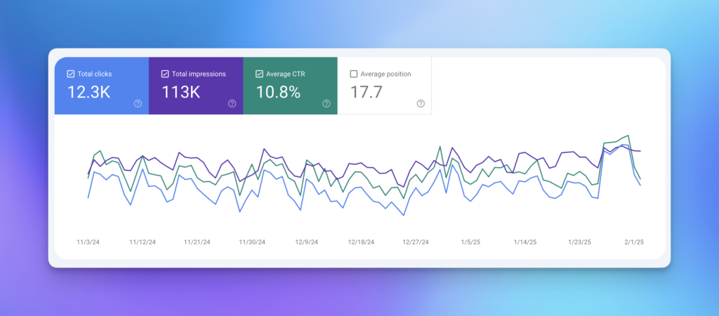
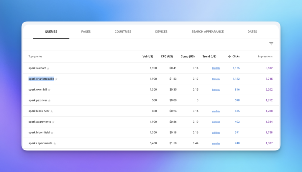
Watch time on page and scroll depth. If people are reading to the bottom, the content is doing its job. Watch Search Console for neighborhood queries you never targeted showing up, which usually means the specificity is landing. Ask your leasing team whether prospects mention it on tours, because that will tell you the most. And start checking whether AI answers about your area cite your content, since that’s fast becoming the front door.

Give it two quarters before you judge it. Local content compounds slowly and then all at once.

One Last Thing

The neighborhood is the one asset your comp set down the street can’t copy. Different corner, different walk, different noise at 9pm, different everything. 

Most communities are handing that advantage away with a Walk Score widget and a paragraph about how there’s “something for everyone”. Sigh.

If your area content reads like a directory and you’d rather it read like your actual brand, that’s copywriting work, and it happens to be the kind we love. Let’s talk about what your neighborhood sounds like.

What Makes Luxury Apartment Branding Actually Feel Luxurious

Skim five competitors’ websites in your submarket. How many used the words “luxury” in the first 10 seconds of scrolling? Yikes.

Our industry isn’t always the best with words—and “luxury apartments” branding is the perfect case in point. A 2004 garden-style community with, say, new quartz countertops claims luxury. A brand new Class A high-rise with a rooftop pool and a dog spa calls itself luxury. A B-minus asset calls itself luxury after swapping carpet out for LVP. Same word in every listing means it’s white noise. Everything is luxury? Yeah, right.

That word’s worn out and it’s costing you trust and unqualified leads who got there ‘cause you claimed something you weren’t. But there’s another problem here.

But if the word is dead, how can you revive the idea?

Instead of going for your thesaurus full of synonyms (swapping in “indulgent”—no!) and instead look to design. That’s where you can visually set your brand apart. Instead of whether or not to say luxury, you can ask how you can help your brand feel luxurious instead of sound luxurious, especially to someone who’s heard the word a thousand times and stopped listening.

The Word Luxury Broke, and We All Helped Break It

Can we pin this issue on any one person or brand? Not really. It used to be a serious signal in multifamily; shorthand for better builds, nicer finishes, leveled-up amenities. Then it got adopted all over by brands of a variety of asset classes and years that really couldn’t keep that “luxe” promise.

Instead of being confused, residents are numb. They move past it, like it’s another “artisanal” item on a menu. They’re saving their focus for the photography, floor plan names, and website loading speed. They’re looking closely at the type to see whether it’s an old template or not.

This is exactly what anyone does when they step into a hotel lobby: Read it all (not the sign, the customer service, the cleanliness, the greeting) and make an assessment. 

Luxury Is a Feeling, and Feelings Come From Signals

Marketing academics have written entire books on this. Nerd out with me here. Jean-Noel Kapferer and Vincent Bastien, in “The Luxury Strategy,” argue that luxury doesn’t work like other categories, because it isn’t built on comparison. Premium says “better than that one.” Luxury says “in a category of its own.” If you’re justifying yourself against a comp, you’ve left the luxe room.

Avoiding comps feels like uncomfortable territory for multifamily. That’s our whole dang industry! But that tells us plenty about why “luxury” apartment branding has fallen flat. If your brand is using up energy claiming “better than that guy” rather than being standalone, that’s a competitor. Not the desirable destination.

How can you get that feeling? Restraint. Confidence. Knowing when to say when after the choice is made. Luxury brands don’t fill every inch of the page, they don’t shout, they don’t overexplain. The most expensive stores leave blank space in the window.

The Signals That Actually Read as Luxury

None of what follows involves adding gold. This is what we look at when we’re building a premium apartment brand.

Restraint in the visual system. Space is expensive. That’s true in real estate and it’s true on a page. Generous white space in a brochure, an unhurried website, a monument sign that isn’t crowded with taglines and disclaimers. That says: “We can afford to not use this space.” That’s flex, and everybody’s brain knows it.

Typography that behaves like it went to finishing school. Type does more heavy lifting in premium branding than almost anything else. Tight, intentional letterspacing. A typeface with real range, not a free download. Consistent hierarchy that never gets sloppy, not even on the third page of the collateral. Renters can’t necessarily pinpoint bad typography, but they feel it.

Materials and production quality. This is where a lot of budgets betray a brand. You can design a beautiful leasing brochure and then print it on thin stock with a glossy coating that makes it feel like a takeout menu. Paper weight, finish, ink, and binding are brand decisions, not procurement decisions. The same goes for signage substrates, the leasing packet folder, and the resident welcome kit. A brand is a physical experience before it is a strategic one.

Photography that respects the intelligence of the viewer. Premium imagery has quiet in it. Fewer people. Real light. Details instead of wide shots of everything at once. Pro tip: Not every photo should be of a smiling couple toasting on a rooftop at golden hour. That’s just a cutie niche stock library, and definitely not a brand.

Color that isn’t trying so hard. Rich, restrained, and often quite dark. Deep neutrals, warm blacks, a single confident accent. The metallics trend right now runs matte and brushed rather than shiny, which tracks. High shine reads as costume. Matte reads as considered.

Copy that doesn’t oversell. Short sentences. Fewer adjectives. The confidence to say what something is instead of piling on descriptors that beg you to be impressed.

What Your Copy Says vs. What Your Copy Proves

Try this. Take the “About” or “Community” page of your highest-rent asset and delete every adjective. Elevated. Curated. Sophisticated. Refined. Unparalleled. Now read what’s left.

If there’s nothing left, that’s the finding.

Adjectives are claims. Claims are cheap, and renters know it. And the fix isn’t a better adjective, because a better adjective is still a claim. Instead, get specific. This lets the reader draw the conclusion themselves. “Elevated finishes” tells me nothing. Telling me the kitchen has a 36-inch range and honed stone does the whole job, and it does it without ever using the word luxury.

This is the single most fixable thing in most luxury apartment branding. The visual identity is usually decent. The copy is doing all the bragging.

The Comp Set Problem, or Why Everyone Looks the Same

Walk your comp set’s marketing side by side and you’ll usually find the same warm neutral palette, the same thin serif or geometric sans, the same lifestyle photography, the same amenity list in the same order, and the same three adjectives. This is the sea of sameness, and it’s the strongest argument for brand as a differentiator in this biz.

Think about it from the leasing side. Your finishes can be matched. Your amenities can be matched, and probably will be by whatever delivers next year. Your rents are a number on a screen next to four other numbers. What can’t be copied is a brand with an actual point of view: 

  • a name that means something
  • a voice that sounds like a person
  • a visual system that isn’t identical to three other lobbies in the same city.

Brand may be the only thing in your stack that a competitor can’t just build.

When Luxury Positioning Is the Right Call (And When It’s Not)

Luxury positioning is the right call when the product can back it up. New or substantially reimagined construction, a finish level that holds up under scrutiny, an amenity set that’s differentiated, a service model with staffing to match, and rents at the top of the submarket. If that’s you, position accordingly and stop hedging.

If it isn’t, we’ve written at length elsewhere about what overclaiming does to prospect trust and to the leads you attract, so I won’t rehash it all right here. The design version of it is simpler: Claiming an asset class you’re not…is like putting on a costume, it doesn’t look right up close. 

So what do you build instead for a well-located, well-run, honestly mid-tier asset? A real identity, not a borrowed one. Character. Warmth. Design credibility. A sense of humor. A neighborhood point of view. The most charming building on the block will out-tour the fake-luxury building on the block because the charm is real and the renter can feel that in the first six photos.

Positioning down isn’t losing. Positioning falsely is.

The Mistakes We See Most in Luxury Apartment Branding

Gold everything. Gold is not a strategy. Gold plus a thin serif plus a marble texture will for sure have you dressed like a bunch of other properties.

“The Residences at” as a naming crutch. It signals nothing except that the naming conversation ended early.

Loading the name with the word. If you have to put luxury (or its cousins: The Reserve, The Estates, The Grand) in the name to communicate the tier, the rest of the brand isn’t doing its job.

Amenity lists as personality. Every Class A property has a fitness center. The list tells a renter what you have. It doesn’t tell them who you are or why they’d want to be the kind of person who lives there.

A gorgeous brand and a broken execution. Beautiful brand guidelines, and then a leasing team posting flyers in Comic Sans because nobody gave them usable templates. The brand is only as premium as its weakest touchpoint, and residents see the weak ones daily.

The Brand Has to Survive Contact With the Property

The last one deserves its own moment, because it’s where premium positioning goes to die.

Luxury is a promise, and promises get tested. Every email from the property, every maintenance notice taped to a door, every package room sign, every social post, every voice on the phone. If the visual identity is refined and the resident emails read like a citation notice, the brand cracks. If the website is quiet and confident and the Instagram is chaotic, the brand cracks.

Consistency is the most underrated luxury signal there is. Not because it’s exciting, but because inconsistency is how a renter learns that the polish was superficial. The properties that succeed with luxury apartment branding don’t necessarily have the biggest creative budget. They’re the ones where somebody made sure the brand made it all the way to the front door and beyond.

What to Do With All of This

Go audit your own community with fresh eyes. Look at your website, your brochure, your signage, and your last five resident emails, and ask what a stranger would guess about your rent from those alone, without reading a single price. Then ask whether the answer matches what you’re actually charging.

If there’s a gap, the fix isn’t more adjectives. (Step away from the superlatives, sir.) It’s usually less of everything, done better.

Trying to position a high-end community in a market where everyone claims the same thing? That’s the fun part of our job, and we’d love to hear what you’re working on. Let’s talk about your community.

How to Set Brand KPIs When Everyone Insists Branding Can’t Be Measured

Branding is the first line item people reach for when the budget gets tight. It tends to attract negative attention, because it doesn’t have positive numbers—because it wasn’t set up to be measured! When leadership wants to know actual results, a shrug and beautiful logo won’t win you the money argument.

That shrug will cost you. It’s the reason a community will fund another paid search campaign without blinking and then question every dollar of a rebrand. Performance marketing comes with a dashboard. Brand shows up to the same meeting with only “vibes.” Guess which one survives the cut?

So let’s fix the setup. Brand KPIs measurement is absolutely possible, and you don’t need a research budget the size of a coastal high-rise to do it. You need to track the right things, tie them to outcomes your CFO already cares about, and stop pretending a few of the popular numbers mean anything.

Now, this can get muddled. Proving that brand has value at all is one argument, and we’ve made that case before, right down to the specific data sources that signal brand strength. This is the next step past that. Instead of debating whether branding’s worth it (it is) it’s time to figure out which vital numbers you’ll commit to, baseline, and run quarterly reports on. That is a different discipline, and it will keep the budget. Here’s how to build a set of brand KPIs you can defend.

Why Brand Keeps Losing the Budget Fight

Brand has an impact. It just takes time to show it—the impact is a lagging indicator. Don’t lose heart. Look closer.

When a community leases up faster than its comp set, leadership credits the leasing team, the concessions, the location, maybe the market. When renewals tick up, operations takes the bow. Brand sits in the background doing a lot of the work and getting none of the credit. The connection is real, but time lag and varying contributing factors make it easy to wave away.

Executives are not being unreasonable when they push back. They have watched plenty of “branding investments” produce a mood board and not much else. So, aim to walk into the conversation speaking their language: baselines, movement over time, and a clear line from a brand metric to a business result. That is the entire job. Not proving branding is magic. Proving it is accountable.

The Two Kinds of Brand KPIs (and Why You Need Both)

Every useful brand KPI falls into one of two buckets. (Don’t make the mistake of living in only one of them.)

The first bucket is brand health. These are the metrics that tell you whether your brand is doing its job in the market: are people aware of you, do they recall you, do they think well of you, do they choose you on purpose? The second bucket is business outcomes. These are the results branding influences but doesn’t fully own: lead quality, conversion, lease velocity, rent premium, retention.

You need both because each one covers for the other’s weakness. Brand health metrics move early, which makes them great leading indicators, but they feel soft on their own (“awareness is up nine points” means nothing to a skeptic). Business outcome metrics are hard and credible, but they’re crowded with other influences, so branding can’t claim sole credit. But pair those buckets up, and you can tell the full story: brand health improved here, and the outcome it should affect improved there. That pairing is the whole game.

Brand Health Metrics Worth Tracking

These are your leading indicators, the brand-side numbers that tend to move first. Shift towards treating them as KPIs you watch as they trend over quarters, not as a one-time report card on whether your brand is “good.” You can read every one of these without commissioning a national study, and most you can pull or run yourself:

Aided and unaided awareness. Can your ideal resident name your community when prompted with a list, or better yet, without one? In a defined submarket, a short survey of recent tours and online leads gets you a workable read. Track the trend, not the absolute number.

Branded search volume. When people type your community name directly into Google instead of “two bedroom apartments near me,” that’s brand working. It’s free to monitor, it’s hard to fake, and it climbs when your name recognition climbs. Direct website traffic tells a similar story.

Online reputation. Reputation is branding expressed through the people who already live with you, and in this industry it has a standardized score. J Turner Research’s ORA score rates a property’s online reputation on a 0 to 100 scale across review sites, and J Turner has positioned it as the multifamily standard for measuring how communities are perceived online. Whatever benchmark you use, sentiment and rating trends belong on your brand scorecard, because prospects are tuned into reviews and reputation before your team ever says hello!

Brand consistency. This one may be the most predictive on the list, and the easiest to control. Widely cited brand research has linked consistent brand presentation across channels to meaningful revenue lift. You can audit consistency without a survey at all: pull your community’s logo, voice, and imagery across the website, ILS listings, signage, and social, and score how unified it reads. Drift is a leak. Closing it is a KPI you can move on purpose.

Share of voice. In your comp set, how often does your community show up in the conversation, the local press, the social feeds, the “best places to live” roundups, compared to the others? It doesn’t have to be precise to be directional.

The Business Outcomes Your Brand Actually Moves

Here’s where you connect brand to the numbers leadership already lives in. You won’t claim branding owns these outright. You’ll show that when brand health moves, these tend to follow.

Lead quality is the clearest one. A strong, specific brand attracts people who already self-identify as a fit, which means more of your tours convert and fewer leads waste the leasing team’s afternoon. Tour-to-lease conversion rate tells you whether the promise your brand made out in the market matches what people feel when they walk in.

Lease velocity, or time to lease, is the metric every owner feels in their gut, and brand pulls on it from both ends: more qualified traffic at the top, less hesitation at the bottom. Rent premium relative to your comp set is the one that makes CFOs lean in, because a brand people trust and prefer supports a price the spreadsheet can’t otherwise justify. And renewal and retention close the loop: residents who feel a real connection to where they live, not just a lease, stay longer and argue less about the increase.

Cost per lease deserves its own mention, because it’s the metric that translates brand into a number finance loves most: efficiency. When a brand does its job, more of your leases come from people who found you on their own, recalled your name, typed it straight into the search bar, and walked in already half-sold. That lowers how much you have to spend in paid channels to fill the same number of units. A strong brand subsidizes your entire acquisition budget, and cost per lease is where that shows up—in black and white.

None of these are branding’s alone. But all of them are within branding’s reach. That distinction is exactly what keeps your KPIs honest. If you start claiming branding alone drove a leasing surge, your CFO will start discounting everything else you say.

How to Set Brand KPIs That Hold Up in a Room Full of Skeptics

Pick a business goal first, then work backward to the brand metrics that feed it. If the goal is leasing up a new community faster, your brand KPIs are awareness and branded search and tour conversion, not your follower count. If the goal is supporting rent growth at a stabilized asset, you’re watching reputation, sentiment, and renewal. The goal sets the metrics. Always that direction, never the reverse.

Then baseline before you do anything. You can’t prove movement unless you measure the starting point; “we think it got better” is how brand loses the (board)room. Capture where each metric sits today, even roughly, before the new identity or campaign goes live.

Choose a small set. Like 3-5 KPIs you’ll report (not 15 you’ll forget about shortly thereafter). Make sure you have the capacity to maintain it, otherwise your branding team won’t get taken seriously. (Utter lack of follow-through.)

Give it a realistic horizon. Performance marketing answers in weeks. Brand answers in quarters. Awareness and reputation and preference move on a slower clock, and promising executives a brand turnaround by next month sets you up for (apparent) failure when you were actually right on schedule. Name the timeline up front, so expectations are set appropriately.

Report movement, not trophies. “Branded search up 22% and tour-to-lease up 4 points over 2 quarters” is a sentence that earns next year’s budget. “We refreshed the brand and it looks amazing” will only get you the side-eye. Same work. Wildly different framing.

And put it on a rhythm. A brand scorecard that surfaces once a year, conveniently right before you ask for money, reads as defensive. The same numbers shared every quarter read as a team that has its act together and happens to be winning. Pick a cadence, keep it boring and consistent, and let leadership watch the trend build in real time instead of meeting it as a surprise. Ideally, the budget conversation will feel like a formality because everyone already saw the story unfold.

The Metrics That Look Important and Aren’t

Some numbers are popular precisely because they’re easy to grow and impossible to connect to anything that pays the bills. Treat these as decoration, not as KPIs.

Raw social media followers and likes top the list. They feel like progress and they reliably go up if you post enough, but a community with 8,000 Instagram followers and a half-empty building has a vanity metric, not a brand win. Impressions and reach belong in the same drawer: a big number that confirms a post was served, not that anyone cared. Email open rates have gotten so distorted by privacy changes that they tell you very little. And website pageviews without any sense of who those visitors were or what they did next is just traffic, not signal.

The test is simple. Ask whether a metric, if it doubled tomorrow, would plausibly move leasing or rent or retention. If you can’t draw that line in one sentence, it’s not a brand KPI. It’s decoration.

Giving Your Brand Credit Without Overclaiming

The fastest way to lose credibility is to claim brand caused every good thing that happened. The moment leadership catches one inflated claim, they discount all of them.

So be the person in the room who names the other factors. Yes, lease velocity improved, and the market also softened on concessions, and here’s the piece brand can reasonably claim. That honesty is not weakness. It’s the thing that makes your next claim believable. Attribution in multifamily is messy, with long decision cycles and a dozen touch points. Pretending otherwise doesn’t fool any multifamily pros.

Correlation reported humbly beats arrogantly asserted causation. Your argument has to made from brand health metrics and business outcomes that move together, consistently in a pattern. Don’t oversell. Just show the receipts.

Brand KPIs That Make It Into Next Year’s Budget

Pretty decks are only that. Protect your brand by translating it into something finance can read. Create a baseline. Make a short list of metrics for real goals. Establish a realistic timeline. Show movement every quarter.

Do that, and the brand stops being the target of first-line budget cuts. It becomes the line item with receipts, which is the only kind that survives a tight year. You don’t have to make branding louder to defend it. You have to make it legible, understandable. Set the KPIs, track them honestly, and let the pattern do the persuading.

If your community is rebranding or repositioning and you want a brand made to be measured from day one (not retrofitted with metrics after the fact) that’s the kind of work we love. Let’s talk about what we’d track and why.

SEO Copywriting: How to Write Copy That Ranks and Converts

Most apartment websites get optimized so much that people who find them won’t want to read them.

“SEO copywriting” has now become a checklist. Get the city name into every other sentence. Repeat “luxury apartments in Austin” until it starts sounding like gibberish. Just add in a 1200-word neighborhood guide that no human’s actually read start-to-finish, and there ya go. The copy might rank. But the prospect bounces and everyone points fingers at The [rental] Market.

That approach is failing on both ends now. It doesn’t convert humans who land on the page, and it doesn’t win the machines either. Google has penalized keyword stuffing for years, AI answer engines skip copy that reads like it was written for a crawler, and even when a stuffed page does rank, most searches now end before anyone clicks it. The fortunate part: Fixing one problem fixes the other. SEO copywriting for apartments has circled back to something refreshingly simple: Write genuinely useful, interesting content, structured so machines can understand it too.

Old SEO Rules? Goodbye Leases.

For about a decade, the formula was stable. Pick a keyword, hit a density target, build some backlinks, watch the rankings climb. (Like magic!) Property marketing teams (and the agencies they hired) wrote for the algorithm first and the resident second, because the algorithm was the gatekeeper. If Google liked you, people found you. If people found you, some of them leased.

Search doesn’t really work like that anymore. The Pew Research Center tracked the actual browsing of 900 U.S. adults and found that when one of Google’s AI summaries sits at the top of the results, people click through to a real website only about 8 percent of the time, compared to 15 percent when there’s no summary. They click a link inside the summary itself just 1 percent of the time. Nearly six in ten people in the study ran into at least one of these AI summaries in a single month, and that share has only climbed since. Which means your page can rank beautifully and the searcher still gets the answer and moves on, never landing on it.

For an apartment community, that means the page you keyword-stuffed for “pet friendly apartments near downtown” might be doing its job (informing the searcher) without ever earning the visit. And when someone does click through, they are landing on copy that was written to satisfy a crawler, not to make them picture themselves living there. Higher intent visitor, weaker page. Winning at SEO but losing at leasing. Major bummer. 

What SEO Copywriting for Apartments Actually Means Now

SEO copywriting is the craft of writing copy that search engines can understand and that people actually want to read. Both halves matter. Drop the first half and you have a beautiful page nobody finds. Drop the second half and you have a found page nobody acts on.

For apartments specifically, the search landscape is unusually competitive and unusually local. Prospective residents are not searching in the abstract. They are typing things like “2 bedroom apartments with a yard in Charlotte” or asking their phone “what apartments near me allow large dogs.” Your on-page SEO has to speak that language without sounding like a robot reciting it back. You have to be able to weave normal search terms into copy so it still sounds like a place worth living, not a listing.

This is where multifamily marketers have a real advantage if they use it. You are not selling a widget. You are selling where someone will sleep, host friends, walk the dog at 6 a.m., and maybe even hide from their roommates. That is emotional, specific territory. Copy that leans into the specifics tends to both rank and convert. Copy that only says “modern amenities meet timeless elegance” does neither.

Meet GEO (The Reason AI Reads Your Copy Before Your Prospect Does)

There’s a newer layer most property teams haven’t adjusted for yet. SEO got a sibling, and its name is GEO.

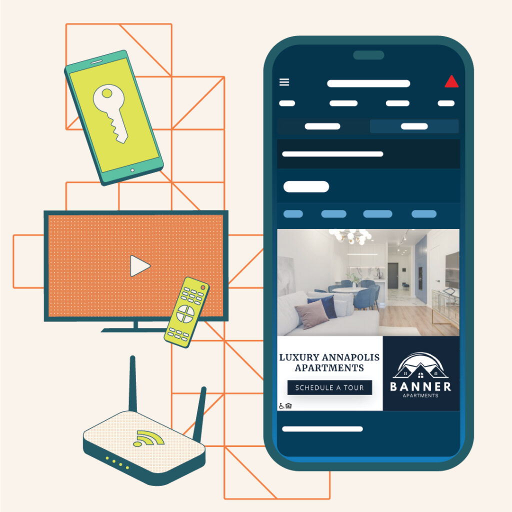
GEO stands for Generative Engine Optimization. SEO is about ranking in traditional search results, the familiar list of blue links. GEO is about being the source an AI engine pulls from when it generates an answer. When someone asks ChatGPT, Google’s AI Mode, Perplexity, or Claude “what are the best family friendly apartment communities in Nocatee,” those tools read across the web, synthesize an answer, and sometimes cite their sources. GEO is writing in a way to ensure your community is the thing they cite, not the thing they skip.

Bain & Company has reported that a large majority of consumers now rely on these zero-click, AI-summarized answers at least part of the time, and that overall organic traffic is sliding as a result. So the question for apartment copy has to go beyond “will this rank?” You also must determine: “If AI summarizes this category for a renter, does my community make the cut, and is it described the way I want?”

This isn’t a fringe worry, and the multifamily-specific teams who live in search all day have been raising the flag. Resi, an apartment website and SEO platform, has been walking property marketers through this exact shift to GEO, and puts it plainly: being left out of an AI summary isn’t like ranking a little lower, it’s closer to vanishing from the results altogether. Jonah Digital also brings up that renters are already researching apartments through tools like ChatGPT and Gemini, and that those models read and relay whatever a property site tells them, so a thin or generic site never gets surfaced. When the firms focused on building apartment websites are all sounding the same alarm, clearly the ground has shifted.

The encouraging part: the things that make copy GEO-friendly are not exotic. AI engines favor content that answers questions directly, uses clear and consistent language, defines what it’s talking about, and reads as credible (not salesy!) In other words, AI rewards the same clarity a good leasing agent uses on a tour. Meaning, you’re probably already capable of GEO writing. Just stop burying the answer.

Why Keyword Stuffing Backfires Now

Old habits die hard. Keyword stuffing (repeating a target phrase as many times as possible regardless of how it reads) backfires now for three reasons.

Search engines got smart enough to recognize natural language and actually penalize obvious stuffing, so the tactic doesn’t even win the ranking it was chasing. AI engines tend to pass over copy that reads like it was written for a machine, because their whole job is to surface the clearest, most trustworthy answer. And the page visitor can feel the difference instantly. Nobody has ever read “our luxury apartments offer luxury living in a luxury community” and thought, “Yes, this is the one.” (For one thing, get a thesaurus!)

Don’t abandon keywords altogether. Instead, use them the way a person would say them. If your primary phrase is “apartments for rent in Tempe,” you might use it once in your page headline, once early in the body, and then let semantically related language carry the rest: the neighborhood name, nearby landmarks, the kind of resident who thrives there, the floor plan details people actually search. That related vocabulary (sometimes called LSI, for latent semantic indexing) signals depth to a search engine and gives a real reader something to hold onto. The apartment website specialists at 30 Lines describe the goal as topical authority: every signal on the page, the copy, the headings, the metadata, even the image alt text, should reinforce the same subject, without anyone resorting to stuffing. Do that and the page reads as genuinely about its topic, to a person and a crawler alike.
Writing for Humans and Machines at the Same Time

You don’t have to pick one! The overlap between “what a person finds compelling” and “what a search engine and an AI find credible” has gotten so large that you can mostly write for one and serve both.

A person remembers a specific, vivid detail. A search engine and an AI reward specific, factual content. So when you write “the kitchen has a waterfall island big enough to actually seat your in-laws at Thanksgiving” instead of “spacious gourmet kitchens,” you have given the human a picture and the machine a fact, in the same sentence. A person trusts copy that sounds confident and honest. AI engines take trustworthiness into account (as much as a robot can). So writing plainly and accurately, without overpromising, helps you in both arenas. A person scans before they read. Search engines and AI parse structure to understand a page. So: clear headings and direct answers help everyone.

Stop treating SEO as garnish. It’s a seasoning that, handled well, makes the copy better. Constraints do that. Ask any songwriter who has had to fit a great idea into a chorus.

The One Thing That Cuts Through the Sea of Sameness

Multifamily has been swimming in a sea of sameness for a long time. Walk through ten communities in the same submarket and you’ll see the same quartz countertops, the same matte black fixtures, the same resort-style pool, the same “luxury” clubhouse with the same shuffleboard table nobody uses. The physical product has been converging for years. Same amenities, same features, same finishes.

Now look at the words. For most of that time, apartment copy has been written for exactly one audience: the search engine. And lately, more and more of it is being generated by AI, often from the same handful of prompts feeding the same models. So the buildings already looked alike, and now the descriptions of them are starting to sound alike too. Same floor plan language, same amenity lists, same neighborhood blurbs, increasingly produced by the same tools.

Which raises the question every property marketer should be sitting with. If the building is the same, the finishes are the same, and now the words are the same, how does a community actually stand out, get noticed, and resonate with the resident it’s trying to reach?

The answer is brand. It’s the one thing a competitor across the street can’t quartz-countertop their way into copying. And brand isn’t a logo you slap on at lease-up. When it’s built right from the start, through real research and strategy, and developed thoroughly enough to include a verbal identity (your brand voice, your positioning, the specific way your community talks and what it stands for), you end up with the thing that makes all of this easy: the know-how to write copy that’s compelling, worth reading, and unmistakably yours. The voice work done upfront helps every sentence written after it be on brand. Period.

How to Keep Your Brand Voice and Still Get Found

This is the part marketers worry about most If you optimize too hard, every community starts sounding identical, which is the exact opposite of what branding is supposed to do. So how do you stay discoverable without flattening your voice into the same beige paste as every competitor in your submarket?

A few principles that hold up. Keep your keywords in the load-bearing places (page title, first hundred words or so, a subheading, the meta description) and let your personality run free everywhere else. Search engines care a lot about those anchor spots and care much less about whether your third paragraph cracks a joke. That paragraph is yours.

Decide what your community actually sounds like before you write a word of web copy, because voice is a brand decision, not a copywriting one. A community for young professionals downtown should not read like a 55-and-better community in the suburbs, even if both are technically “luxury.” When your voice is specific, your copy is automatically more distinctive. That’s precisely what helps you stand out in an AI-summarized result that is trying to tell communities apart.

And resist the urge to optimize the soul out of a sentence. If a phrase is doing real emotional work, do not break it just to wedge in a keyword. There is almost always another spot in the copy for the keyword. There is rarely another spot for the line that makes someone feel something.

The Structure That Helps You Get Found and Get Remembered

Structure is where SEO, GEO, and good writing all shake hands. A few moves do a disproportionate amount of work.

Lead with the answer. If your page is about pet policy, the first thing on it should clearly state the pet policy, in plain language, before you wax poetic about the on-site dog park. Both AI engines and impatient humans reward pages that answer the question up front.

Use real subheadings that match how people ask questions. “Do you allow large breeds?” is a better subheading than “Pet Amenities,” because it mirrors a search and gives the AI a clean question to answer with your content. Write in scannable paragraphs, not walls of text. Three to five sentences keeps a reader moving and keeps your page easy for a crawler to parse.

Be genuinely complete. Cover the related questions a prospect would naturally ask next, all in one place. A community page that answers parking, pets, lease terms, and the vibe of the neighborhood in clear sections will outperform four thin pages that each answer one thing badly. Completeness signals authority to a search engine, helpfulness to AI, and respect to a human who doesn’t want to dig.

There’s a newer reason completeness pays off. Google has started treating renting the way it treats banking and healthcare, as a “Your Money or Your Life” topic, since where someone lives affects their finances and their safety. According to the Resi team, that holds property websites to a higher bar for trust, transparency, and accuracy; building to that bar becomes its own advantage. They’ve found that properties leaning into real expertise and trust gain visibility, while competitors still relying on thin content see double-digit drops in search performance. Thorough, honest, specific pages pull ahead. Vague ones fade into the background.

A Quick Before and After

Before: “Welcome to luxury living redefined. Our modern apartments offer the perfect blend of comfort and convenience in a vibrant community setting designed for the way you live.”

That sentence could be any property in America. It uses a cliché the whole industry has worn out, says nothing specific, and gives neither a person nor a machine a single concrete thing to grab.

After: “These are one and two bedroom apartments a seven-minute walk from the Blue Line, with in-unit laundry, a rooftop dog run, and a parking garage you will actually appreciate in February. Built for people who want downtown access without the downtown parking nightmare.”

Same length. The second version names the floor plans (search-relevant), the transit access (high-intent local detail), the specific amenities (concrete and citable), and the kind of person it is for (voice and positioning). It is more findable and more persuasive, because specificity serves both at once.

Where to Start This Week

You do not need to rewrite your entire web presence by Friday. Pick your highest-traffic page, probably your floor plans page or your main community page, and run it through three quick questions. 

  • Does it answer the obvious question in the first few lines, or make people scroll for it?
  • Does it use the words real prospects type and say aloud, or industry filler? 
  • And does it still sound like your community, or like a template that forgot to fill in the name?

That is the whole balance. Findable, credible, and unmistakably on-brand. The teams that get there are going to keep showing up, in Google and in whatever AI hands a renter next, while everyone still stuffing keywords disappears into the scroll.

If you want a second set of eyes on copy that is trying to do all three jobs at once, that is squarely what we do at Zipcode Creative. We would love to help you sound like the only community worth touring.

Why Brand Positioning Drives Higher Rents and Faster Leasing

Two apartment communities sit three miles apart. Same submarket. Same unit mix. Similar finishes—shaker cabinets, LVT flooring, quartz countertops, the usual. One commands $200 more per unit per month and maintains 96% occupancy. The other’s been running concessions for six months straight.

With identical amenities, what’s the difference? Lean in: The positioning.

Brand positioning is the single most underleveraged tool in multifamily marketing—and it directly impacts your ability to charge premium rents, fill units faster, and keep residents longer. Not vaguely. Not theoretically. Measurably.

Let’s get into why, exactly.

The Rent Gap Nobody Talks About

Here’s something that doesn’t get enough airtime: the gap between what a property could charge and what it does charge has very little to do with the physical asset. It has everything to do with market perception.

Research from McKinsey shows that price increases have a more immediate impact on profitability than any other business lever—a 1% increase in pricing can translate to an 11% increase in operating profit. In multifamily terms, that’s not small money. On a 300-unit community averaging $1,500/month, even a modest positioning-driven rent premium of $50/unit generates an additional $180,000 in annual revenue.

And that number compounds year over year across a portfolio.

The challenge is that most apartment communities haven’t actually positioned themselves in the market at all. They’ve decorated. They’ve described amenities. They’ve picked a color palette. But positioning—actually claiming a specific space in your prospects’ minds—that’s totally different.

What Brand Positioning Actually Means in Multifamily

Brand positioning isn’t your tagline. It’s not your logo. It’s not the adjective you slap in front of “living” on your website.

Brand positioning is the answer to one question: Why should someone pay to live here instead of anywhere else in the submarket?

That answer needs to be specific, defensible. And it needs to be communicated consistently across every single touchpoint—from your website headline to the way your leasing team describes the community on a tour.

In traditional marketing, this is called Segmenting, Targeting, and Positioning—identify your audience, choose who you’re specifically going after, and position your brand to be the obvious choice for that group. It’s been the foundation of brand strategy for decades because it works.

Most multifamily marketing skips straight to tactics without doing any of that foundational work, resulting in communities that look, sound, and feel interchangeable. And when everything looks the same, prospects default to the only differentiator they have: Price.

Suddenly that minor branding problem has become a revenue problem.

Why Positioning Beats “Pretty” Every Time

Let’s be clear about something: Good design matters. A well-executed visual identity can absolutely move the needle on perception and leasing velocity. But design without positioning is decoration. It looks nice, but doesn’t do anything strategically.

Think about how major brands operate. Apple doesn’t just have clean design—it’s positioned around simplicity and innovation for creative professionals. Nike isn’t just a swoosh—it’s positioned around athletic ambition and personal achievement. Target doesn’t just have a red bullseye—it’s positioned as accessible design for budget-conscious families.

Each of those brands uses visual identity to reinforce a position that was defined first. The position drives the design. Not the other way around.

In multifamily, this means your Ideal Resident Profile (IRP) should drive every creative decision. What does your target resident value? What lifestyle are they pursuing? What emotional need does your community fulfill that the property down the street doesn’t?

If you can’t answer those questions with specificity, your brand isn’t positioned. It’s just… present.

The Five Positioning Levers That Actually Move Rent

Positioning isn’t abstract. There are specific, strategic levers you can pull—and each one has direct implications for rent premiums and lease velocity.

Lifestyle alignment. This is the big one. When your brand clearly signals a specific lifestyle, be it urban professional, active outdoor enthusiast, creative community, family-first, prospects who identify with that lifestyle perceive higher value. They’re not just renting an apartment. They’re joining a community that gets them. Studies on brand loyalty back this up—emotional connections can drive customers to pay premiums of 5% or more, even when cheaper alternatives exist. The same psychology applies to apartment selection.

Aspirational identity. People rent based on who they are and who they want to be. A community positioned around wellness and personal growth attracts residents who’ll pay more to live in a place that reflects their aspirations. This goes beyond having a gym as an amenity—it’s about how you talk about it, photograph it, and weave it into the brand story. Strong brands create aspiration. Strong multifamily brands create lease signatures.

Perceived exclusivity. This doesn’t mean “luxury” (please, not another “luxury living” tagline). It means specificity. When your positioning is clear and targeted, the residents who aren’t your audience self-select out—and the ones who are your audience perceive the community as curated for them. That perception of curation is worth real dollars per square foot.

Trust and consistency. Brand strength and willingness to pay premium prices are directly linked—that’s not opinion, it’s documented. In multifamily, trust gets built through consistency. Meaning, your website matches your tour experience, your tour experience matches your move-in experience, and your move-in experience matches your renewal touchpoints. Every disconnect erodes the positioning (and the rent premium it supports).

Local relevance. Communities that tap into the specific character of their neighborhood—its culture, its food scene, its history, its energy—create a sense of place that generic branding can’t touch. That sense of place is a differentiator prospects can feel, and it’s nearly impossible for competitors to replicate. A national developer can build the same unit mix in any submarket. They can’t replicate the craft-brewery-district energy that makes your community feel like it belongs exactly where it is. (We’ve written extensively about the power of local branding as a positioning strategy—it’s one of the most underused advantages in multifamily.)

Each of these levers works individually, but the real power comes when they work together as a cohesive positioning strategy. A community that aligns with a specific lifestyle, creates aspirational identity, feels curated and exclusive, delivers consistent brand experiences, and is rooted in its local context is differentiated in a way that carves out its own space. No competitor can replicate all five at once.

What Bad Positioning Looks Like (And Why It’s Costing You)

You know bad positioning when you see it. Or more accurately—you don’t see it, because it’s invisible. Here’s what it usually looks like in practice:

The “Everything for Everyone” community. No clear audience. Marketing that tries to appeal to young professionals, families, empty nesters, and remote workers simultaneously. The messaging is so broad it connects with nobody. This is the most common positioning failure in multifamily—and it leads directly to competing on price because that seems to be the only difference!

The “Amenity List” community. Positioning that starts and ends with “resort-style pool, state-of-the-art fitness center, and pet-friendly environment.” But….every community in your comp set has the same amenity list!? When your brand message is a bulleted feature sheet, you’re not positioned. You’re a spreadsheet.

The “Borrowed Identity” community. This happens when a community adopts a visual style or voice that belongs to a different market segment. Luxury branding on a Class B workforce housing property. Ultra-casual, Instagram-heavy marketing for a senior-adjacent community. The mismatch creates confusion—and confused prospects don’t sign leases.

The “Copy-Paste” portfolio. Same template, different city name. Same stock photography with different overlays. Same “experience the difference” headline across twelve markets. Portfolio consistency is important, but identical positioning across different submarkets ignores the reality that each community exists in a unique competitive landscape.

Each of these positioning failures translates to lost revenue. Not lost in a vague, theoretical way—lost in the form of actual longer vacancy periods, actual deeper concessions, and actual lower effective rents.

How Positioning Accelerates Leasing Velocity

Higher rents get all the attention, but positioning’s impact on leasing speed is arguably just as valuable. Plus, it’s more immediate.

When your brand is clearly positioned, three things happen that directly accelerate leasing:

  1. Qualified prospects self-select. A positioned brand attracts the right people and filters out the wrong ones before they ever schedule a tour. That means your leasing team spends less time with lookers who’ll never convert and more time with prospects who already feel like your community was built for them. The tour confirms what they already believe.
  2. Decision timelines compress. Prospects in a saturated market suffer from decision fatigue. Every community blurs together. But a clearly differentiated property cuts through the noise. Memorably. And memorable communities get applications faster because they eliminate the time wasted comparing 12 different places. From the prospect’s perspective: Of the six communities they toured, five had the same “modern living” messaging and stock-photo-lifestyle aesthetic. Only one had a distinct personality. Which one do they apply to first?
  3. Referral rates increase. Residents who feel a strong connection to their community’s brand identity talk about it. They recommend it. They post about it. Every word-of-mouth referral driven by strong brand positioning is a lease you didn’t have to pay for in advertising spend—and referral leads convert at significantly higher rates than cold traffic.

Lucidpress found that consistent brand presentation across platforms can increase revenue by up to 23%. In multifamily, consistency of positioning across your digital presence, your physical community, and your resident experience creates a compounding effect on both lease velocity and rent premiums.

Finding Your Position: Where to Start

If you’re reading this and realizing your community might be under-positioned (or not positioned at all), here’s the honest truth: positioning isn’t something you can reverse-engineer from a Canva template.

It starts with research. Who are your actual residents—today, and who could they be with intentional targeting? Who’s the competition, and where are the positioning gaps nobody’s claiming? What’s happening in your submarket that creates opportunities for differentiation?

Then it moves to strategy. Based on what you learn, what position can you credibly claim, consistently deliver, and defensibly own? Your positioning needs to be true (don’t promise what you can’t deliver), specific (not “luxury living” or “modern comfort”), and sustainable (not a trend that expires in two years).

Only then should you move to execution—the brand identity, the messaging, the marketing materials, the resident experience standards that bring the position to life. When that creative work is rooted in strategic positioning, every dollar you spend on marketing works harder because it’s pointing in one direction instead of twelve.

This is also why positioning can’t be an afterthought in the development or acquisition process. The most effective positioning happens before the first marketing material is designed—ideally before the community even opens. For properties already operating? Repositioning is absolutely possible (and often necessary), but it requires the same rigor: research first, strategy second, creative execution third.

And one more thing worth mentioning: positioning isn’t a one-time event. Markets shift. Competitor properties open. Resident demographics evolve. The strongest multifamily brands treat positioning as a living strategy that gets revisited regularly—not a deck that gets created during lease-up and forgotten by stabilization.

The Bottom Line

Brand positioning is absolutely a revenue strategy.

Properties with clear, differentiated positioning command higher rents because they’ve created perceived value that goes beyond the unit itself. They lease faster because they attract the right prospects and cut through the noise. And they retain residents longer because people who feel connected to a brand—not just a building—are far more likely to renew.

The communities leaving money on the table right now aren’t the ones with bad amenities or poor locations. They’re the ones with no position. They look like everything and nothing at the same time. In a competitive market, that cloak of “sameness” is costly.

If your community’s brand is blending into the background—or if you suspect it might be—that’s where we come in. Zipcode Creative specializes in strategic brand positioning for multifamily communities, from the research and strategy that defines your position to the creative execution that brings it to life. Let’s talk about your next project.

The Anatomy of an Apartment Email That Gets 40%+ Open Rates

Your apartment community’s email just landed in 500 inboxes. Three hours later, 47 people opened it. That’s a 9.4% open rate—and it’s quietly killing your leasing pipeline.

Here’s what makes this frustrating: email still works. According to HubSpot’s research, the average open rate across industries hovers around 42-43%. Campaign Monitor found that segmented email campaigns see open rates 14.3% higher than non-segmented ones. The data makes it crystal-clear: email marketing remains one of the highest-ROI channels in property marketing.

So why are so many apartment emails collecting digital dust?

The answer usually isn’t the platform or the timing or even the offer. It’s the brand—or rather, the absence of it. When your emails look and sound like they could come from any apartment community in America, they get treated like every other apartment email: ignored.

Let’s break down how brand consistency, voice, and visual identity actually drive email performance.

The Problem with Most Apartment Emails

Most apartment emails fail before anyone reads a single word of body copy. They fail in the preview pane. In that split-second decision between “this might be worth my time” and “delete.”

But the deeper issue isn’t just weak subject lines or bad timing. It’s that most property marketing teams treat email as a separate channel with its own rules (or no rules)—disconnected from the brand they’ve built everywhere else.

Think about it: your website has a distinct personality. Your signage was carefully designed. Your leasing team was trained on how to talk about the community. But your emails? Assembled from generic templates, written by whoever had five minutes, and sent without a second thought about whether they sound like you.

The result: Brand fragmentation. A prospect who fell in love with your community’s personality on Instagram or during a tour gets an email that feels like it was written by a different company entirely. That disconnect erodes trust—and trust is what drives email opens. 

When your emails feel consistent with every other touchpoint, recipients learn to recognize (and anticipate) your messages. Recognition drives opens. Opens drive engagement. Engagement drives leases.

Why Brand Consistency Matters More Than You Think

Brand recognition isn’t just a nice-to-have in email marketing—it’s the foundation of performance.

Here’s what happens when someone sees your email in their inbox: In about two seconds, they decide whether to open it, ignore it, or delete it. That decision isn’t based on a careful evaluation of your subject line’s merits. It’s based on pattern recognition. Do I know this sender? Do I trust them? Has their content been worth my time before?

Consistent branding builds that pattern. When your sender name, visual style, and voice feel familiar, you’re not starting from zero with every send. You’re building on previous positive experiences.

Research from Lucidpress found that consistent brand presentation across all platforms can increase revenue by up to 23%. While that study looked at overall brand consistency, the principle applies directly to email: when recipients instantly recognize your community’s emails as yours, they’re more likely to engage.

This is why the most successful apartment communities approach email as a brand expression channel, not just a communication tool. Every email is an opportunity. Take that opportunity to reinforce who you are and why that matters to both your residents and prospects.

The Subject Line: Your Brand’s First Impression

Your subject line is the first (and sometimes only) chance your brand gets to make an impression. It should sound like you—not like every other apartment email in someone’s inbox.

Generic subject lines get generic results. “New Listings Available!” and “Don’t Miss Our Spring Special!” could come from literally any apartment community. They’re forgettable because they’re brandless.

Branded subject lines perform better because they’re distinctive. If your community’s personality is warm and welcoming, that should come through. If you’re urban and edgy, let that show. The goal isn’t to trick people into opening—it’s to signal that this email is worth their time because it comes from a community they already connect with.

Some principles that work across brand personalities:

Specificity beats vague. “Your tour at The Emery—next steps” outperforms “Thanks for visiting!” because it tells the recipient exactly what they’ll find inside. Specific subject lines also feel more personal and intentional.

Personality should show, not hide. If your brand voice uses humor, a subject line with a wink can outperform a straightforward one—for your audience. The key is alignment. A playful subject line from a playful brand feels authentic. The same line from a sophisticated, upscale brand feels off.

Consistency builds anticipation. When recipients learn that your emails deliver value in a recognizable voice, they start looking for them. That’s when open rates go from acceptable to exceptional.

Voice, Tone, and the Art of Sounding Like Yourself

This is where most apartment emails fall apart—and where brand-conscious communities pull ahead.

Your brand voice is how your community sounds when it speaks. It should be consistent whether someone’s reading your website, talking to your leasing team, or scanning your email. When that voice wobbles—professional on the website, robotic in emails, overly casual on social—prospects notice the inconsistency even if they can’t articulate it.

The best apartment emails read like they were written by a person your audience would want to hear from. Not a corporate announcement. Not a sales pitch. A voice that’s fully you.

But not every email has to be a creative writing exercise. Instead:

Your greeting should feel natural for your brand. “Hi Sarah” works for most communities. “Hey Sarah!” works for some. “Dear Ms. Johnson” works for others. There’s no universal right answer—greet the way YOUR BRAND would greet (casually or formally, etc.)

Your body copy should reflect your personality. A brand that’s warm and approachable shouldn’t suddenly sound formal and distant in email. A brand that’s sophisticated and refined shouldn’t try to be casual just because “that’s how email works.”

Your calls to action should match your overall tone. “Schedule a tour” is straightforward. “Come see for yourself” is warmer. “Let’s find your perfect floor plan” is collaborative. Each signals something different about who you are.

The goal is that someone who’s interacted with your brand anywhere else would read your email and think, Hm! I’ve heard that voice before!

Visual Brand Elements That Drive Recognition

Before anyone reads a word, they see your email. And what they see either reinforces your brand or confuses it.

Sender name and “from” address are the most overlooked brand elements in email. “The Emery Apartments” feels different from “Sarah at The Emery.” Both can work depending on your brand personality—but the choice should be intentional, not accidental. For prospect nurture sequences, a human name often outperforms a property name because it signals personal attention. For community-wide announcements, the property name may carry more authority.

Visual design should extend your brand identity. Your email template is an extension of your brand guidelines—same fonts, same colors, same design sensibility. When someone who’s seen your website opens your email, the visual language should feel immediately familiar.

Photography matters more than most teams realize. If your website features professional photography of your community, your emails should too. Stock photos—especially obvious ones—undermine the authenticity you’ve built elsewhere.

Preview text is often wasted. It’s the snippet that appears after your subject line in most email clients—40-90 characters of valuable brand real estate. Don’t let it default to “View this email in your browser.” Use it to extend your subject line’s personality and give readers another reason to open.

Keep your visuals consistent, down to the smallest details. If your brand uses a specific shade of blue, that blue should appear in your email headers. If your typography is clean and modern, your email fonts should follow suit. These details accumulate into recognition.

Timing, Frequency, and Staying Top of Mind (Without Being Annoying)

Brand consistency extends to how often you show up—and when.

Predictable timing reinforces brand trust. If you send a resident newsletter every first Thursday of the month, your residents learn to expect it. That expectation is a form of brand relationship. Random, sporadic sends feel less intentional and carry less weight.

For prospect communications, the rhythm matters too. A well-paced nurture sequence that delivers value at predictable intervals builds familiarity. A desperate flurry of emails during lease-up panic feels like exactly what it is—and damages the brand perception you’ve worked to build.

Over-communication is a brand problem, not just a tactical one. When you email too frequently, you’re not just annoying people—you’re training them to devalue your brand’s communications. Each email that gets ignored makes the next one easier to ignore.

The principle: only send emails worth opening. If you don’t have something valuable to say that’s aligned with your brand’s purpose, don’t hit send just to stay visible. Silence is better than noise when noise erodes trust.

Segment to stay relevant. One way brand consistency breaks down is when you send the same message to everyone regardless of their situation. A prospect who toured yesterday and someone who went quiet six months ago shouldn’t receive identical emails. Neither should someone looking for a studio and someone looking for a 3BR.

Segmented campaigns see dramatically higher engagement—Campaign Monitor puts it at 100% higher click-through rates—because they feel relevant. And relevance is really just brand consistency at the individual level: communicating in a way that shows you understand who someone is and what they care about.

Putting It All Together

Hitting open rates of 40% or more isn’t about finding one magic trick. It’s about treating email as what it really is: an extension of your brand, not a separate channel with different rules.

Brand recognition built through consistent visual identity means recipients see your name and immediately know what to expect.

Brand voice carried through subject lines and body copy means your emails sound like you—not like a boring, generic property management template.

Brand trust developed through valuable, well-timed content means recipients have learned that your emails are worth their attention.

Each element contributes a few percentage points. Combined, they’re the difference between emails that get ignored and emails that drive tours, applications, and leases.

The apartment communities seeing exceptional email performance aren’t doing anything wild or off-the-wall. They’re just applying the same thoughts (and rules!) around branding to email that they apply everywhere else—with consistency and intention.

And in a channel where most competitors are still sending brandless, template-driven content to unsegmented lists, that consistency becomes a genuine competitive advantage. 

Start sharpening your subject lines, people.


Building a brand that shows up consistently everywhere—including the inbox? That’s what Zipcode Creative does. Let’s talk about how your community’s brand can work harder in every channel.

How Multifamily Marketers Are Using AI Without Replacing Creativity

The panic was predictable. When ChatGPT launched, half the multifamily marketing world thought they’d be replaced by robots within 18 months. The other half secretly wondered if they could finally stop writing the same amenity description for the 47th time.

Three years later, the reality is more nuanced—and a little more interesting. AI hasn’t replaced apartment marketers. But it has fundamentally changed what the job looks like, how teams spend their time, and what “good” apartment marketing even means anymore.

If you’re still figuring out where AI fits into your marketing strategy (or if your leadership keeps asking why you haven’t “implemented AI” yet), this is the practical breakdown you need.

The AI Question Every Multifamily Marketer Is Asking

Here’s the question that keeps coming up at industry conferences, in Slack channels, and in every budget conversation: How do we use AI without making everything sound like it was written by a robot?

It’s the right question. Because here’s the thing—AI tools have gotten remarkably good at producing content. But content and brand aren’t the same thing. Your community’s voice, its personality, the reason a renter chooses you over the identical-looking property down the street? That’s not something you can outsource to a language model.

The multifamily teams getting this right aren’t asking “How can AI do our jobs for us?” They’re asking “Where can AI handle the repetitive stuff so we can focus on the work that actually moves the needle?”

That distinction matters more than you’d think.

Where AI Actually Helps Apartment Marketing Teams

Let’s get into the deets. After watching how operators are actually using these tools (not how vendors say they should), we’re seen a few patterns emerge:

Content ideation and first drafts. This is where generative AI shines. Need 20 subject line variations for your email campaign? A starting point for your neighborhood guide? Social media caption ideas that don’t make you want to cry? AI can generate options in seconds that would have taken your team hours to brainstorm. The key word is starting point. Teams that dump AI output directly onto their website without editing are the ones creating the sea of generic, forgettable content that’s flooding the internet right now.

Data analysis and pattern recognition. AI tools can now analyze customer data—search queries, engagement patterns, feedback themes—and surface insights that would take humans weeks to uncover manually. Property managers report using AI to identify which amenity features drive the most interest, what questions prospects ask repeatedly (hint: parking and pets!), and where their marketing funnel is leaking.

Repetitive communication tasks. Answering the same pricing and availability questions at 11 PM on a Tuesday? AI can handle that. Sending follow-up reminders to prospects who haven’t scheduled a tour? AI can handle that too. This isn’t replacing human connection—it’s making sure no lead falls through the cracks while your team is doing actual human work.

Personalization at scale. AI makes it possible to tailor content and campaigns to specific audience segments without creating 43 different versions of everything manually. The technology can adjust messaging based on where a prospect is in their search journey, what floor plans they’ve viewed, and what their stated priorities are.

Laptop displaying Respage website homepage featuring AI multifamily marketing platform with headline and integration partner logos

The Rise of AI Leasing Assistants

If there’s one AI application that’s actually, genuinely transformed multifamily operations, it’s the AI leasing assistant. The clunky chatbots five years ago could never! They could only answer, what, three questions before hitting a dead end? Today’s AI leasing assistants—tools like RealPage’s AI Leasing Agent, EliseAI, Zuma, ResMate, and LeaseHawk’s ACE—can handle increasingly sophisticated conversations.

We’re talking AI that can quote real-time pricing and availability by pulling from your PMS; schedule tours across voice, chat, email, and text; answer detailed questions about pet policies and lease terms; qualify leads before they ever reach your leasing team, and hand off seamlessly to human agents when conversations get complex.

The numbers are hard to ignore. Properties using AI leasing assistants report response times dropping from hours to minutes—in some cases, under two minutes—and lead-to-tour conversion rates improving by 20-30%.

But here’s the nuance that matters: the best implementations aren’t removing humans from the equation. They’re letting leasing teams focus on what humans actually do better—building relationships, reading emotional cues, solving complex problems, and creating experiences that make prospects feel genuinely welcome.

AI and Search: Why GEO Is the New SEO

This is the shift that’s catching a lot of apartment marketers off guard. The way renters search for apartments is changing—and your SEO strategy from 2022 might not cut it anymore.

As of late 2025, over 20% of Google searches trigger AI Overviews—those conversational summaries that appear at the top of search results. When an AI Overview shows up, organic click-through rates drop by more than 34%. That’s a massive shift in visibility.

And it’s not just Google. Renters are increasingly turning to ChatGPT, Claude, Perplexity, and Microsoft Copilot to help with their apartment search. They ask: “What’s a good apartment near downtown Austin with a dog park and under $2,000?” and getting AI-generated recommendations that pull from property websites, Google Business Profiles, ILS listings, and review platforms.

This is where GEO—Generative Engine Optimization—comes in. It’s the practice of structuring your content so AI tools can understand, parse, and cite it accurately. That means clear, well-organized information; conversational FAQs that match how renters actually ask questions; accurate and consistent data across every platform where your property appears; and structured content that AI can easily reference.

The properties winning in AI search aren’t just optimizing for keywords anymore. They’re optimizing for clarity, accuracy, and machine readability. If your website content is vague, outdated, or inconsistent with your ILS listings and Google Business Profile, AI tools will either ignore you or surface incorrect information about your property. Neither outcome is good.

Where AI Falls Short (And Why That Matters)

For all the hype, AI has real limitations that apartment marketers need to understand—especially before handing over the keys to their brand.

AI doesn’t understand context the way humans do. Language models can produce grammatically correct, even persuasive copy. But they don’t actually understand your community’s story, your residents’ real experiences, or the subtle positioning decisions that differentiate your brand. They can’t tell when a “creative” idea crosses the line into tone-deaf territory or when a phrase that sounds clever on paper will fall flat with your actual audience.

AI-generated content often sounds…generic. This is the trap so many marketers are falling into. When everyone’s using the same tools with similar prompts, the output starts to sound weirdly similar. Scroll through apartment websites right now. See the same phrases, the same structures, the same unfortunate, forgettable descriptions. AI makes it easy to produce content at scale. It doesn’t make it easy to produce content that stands out.

AI doesn’t fact-check itself. Large language models can generate information that sounds authoritative but is completely inaccurate. They can invent statistics, misremember details about your market, and confidently state things that aren’t true. Every piece of AI-generated content needs human review before it goes live—full stop.

AI can’t replace relationship-building. At the end of the day, renting an apartment is a significant life decision. Prospects want to feel understood, valued, and confident in their choice. AI can streamline the process, but it can’t create the genuine human moments that turn prospects into residents and residents into community advocates.

The Fair Housing Consideration You Can’t Ignore

Here’s the uncomfortable truth that doesn’t get enough attention: AI tools can perpetuate bias.

Because language models learn from existing data—including data that reflects historical biases—there’s a real risk that AI-generated content or AI-driven recommendations could produce outputs that violate Fair Housing laws. The bias isn’t always obvious. It can show up in subtle word choices, in which amenities get emphasized for different audience segments, or in how AI systems prioritize and respond to different types of prospects.

This isn’t hypothetical. Fair Housing regulations prohibit discriminatory practices based on race, color, religion, national origin, sex, familial status, and disability. If your AI tool is generating marketing content or responding to prospects in ways that could be interpreted as discriminatory—even unintentionally—you’re exposed.

The solution isn’t to avoid AI entirely. It’s to implement guardrails, review AI outputs for potential bias, and never use AI as a replacement for professional legal review on anything that touches Fair Housing compliance. Your leasing team should review AI-generated communications, your marketing team should review AI-generated content, and no AI tool should have free rein to make decisions that could create liability.

How to Use AI Without Losing Your Brand Voice

So how do you keep AI’s efficiency without making marketing content that sounds…oddly familiar? Use this guidance:

Use AI for speed, not for voice. Let AI handle the repetitive tasks—first drafts, data analysis, scheduling, follow-ups—but keep human hands on anything that directly represents your brand personality. Your community’s voice is an asset. Don’t dilute it by letting algorithms make your creative decisions.

Invest time in prompting. The quality of AI output depends heavily on the quality of your input. Generic prompts produce generic content. Specific, detailed prompts that reference your brand voice, target audience, and specific context produce significantly better results. This is a skill worth developing.

Edit everything. AI-generated content is a starting point, not a final product. The best multifamily marketers are using AI to generate drafts, then refining until it sounds like their brand.

Stay consistent across touchpoints. If you’re using AI for some communications and human writers for others, your brand voice can drift. Create clear guidelines for how AI should be used, what review processes apply, and what standards the final output needs to meet.

Keep testing. AI tools are evolving a little more, every single day. What worked six months ago might not be the best approach today. Stay curious, keep experimenting, and be willing to adjust your strategy as the technology—and best practices—continue to develop.

The Bottom Line on AI in Apartment Marketing

AI isn’t going to replace apartment marketers. But apartment marketers who learn to use AI effectively will have a significant advantage over those who don’t.

The teams getting this right are using AI to eliminate busywork and free up time for strategic, creative, relationship-building work. They’re leveraging AI leasing assistants to ensure no prospect waits hours (or days) for a response. They’re optimizing content for AI-powered search engines while protecting the human voice that sets their brand apart. (And they’re staying up-to-date on its limitations and risks—especially around Fair Housing compliance.)

The question isn’t whether to use AI in your apartment marketing. The question is how to use it in ways that make your team more effective without sacrificing what makes your brand unique.

Make sure you get the answer to that question right.

How to Name Multifamily Communities That Attract Premium Residents: A Coastal Florida Brand Identity Case Study

Master the art of multifamily community naming with proven strategies that transform properties into sought-after destinations

In the competitive world of multifamily development, effective community naming can make the difference between a property that struggles to lease and one that commands premium rents with a waiting list. When Thompson Thrift approached us for their luxury community in Ponte Vedra Beach, Florida, they weren’t just looking for any name—they needed a multifamily brand identity that would position them above their competition and attract their ideal residents.

This comprehensive case study reveals the strategic naming process that resulted in Velara, a name that not only captured the essence of coastal luxury but also provided a foundation for successful apartment community branding. Whether you’re a property manager developing your first community or overseeing a portfolio of properties, these proven strategies will help you create names that resonate with your target market.

The Strategic Importance of Multifamily Community Naming

Apartment community naming isn’t just about finding something that sounds nice—it’s about creating a strategic asset that drives marketing success. According to industry research, properties with memorable, well-positioned names achieve faster lease-up times and can command rent premiums of 5-15% compared to generically named competitors.

The National Apartment Association emphasizes that “strategic branding is more important than ever” in today’s dense multifamily market, noting that “branding matters before a brick is ever laid.”

The challenge facing Thompson Thrift was common among luxury multifamily developers: How do you differentiate your property in a market saturated with high-end options? Located in Nocatee, a master-planned community known as one of the top places to live, this development needed a name that would signal exclusivity while remaining approachable to their target demographic.

Understanding the Multifamily Naming Landscape

Modern property management branding goes far beyond traditional geographic naming conventions. Today’s residents—particularly those choosing luxury rentals—are looking for communities that align with their lifestyle and values. This shift has fundamentally changed how successful developers approach multifamily brand development.

The most effective apartment community names share several characteristics:

  • Emotional resonance that connects with the target demographic
  • Distinctiveness that sets the property apart from competitors
  • Memorability that aids in word-of-mouth marketing
  • Digital compatibility for online search and social media presence

Research-Driven Multifamily Naming Strategy

Our apartment community branding process begins with comprehensive research that goes far deeper than market analysis. For the Ponte Vedra Beach project, we examined multiple layers of information that would inform our naming strategy.

Target Resident Analysis for Apartment Community Branding

Understanding your ideal residents is crucial for effective multifamily naming. Thompson Thrift’s target market consisted of upper-class suburbanites who value both luxury and the relaxed coastal lifestyle. These weren’t first-time renters or temporary residents—they were professionals and families choosing rental living for its convenience and amenities.

This demographic insight shaped our entire approach. Rather than pursuing obvious coastal references that might feel cliché, we looked for names that would convey sophistication while maintaining the effortless elegance these residents sought.

Competitive Analysis in Multifamily Brand Development

Successful apartment community naming requires understanding your competitive landscape. We analyzed naming patterns among luxury properties throughout Northeast Florida, identifying oversaturated themes and unclaimed positioning opportunities.

Many competitors relied heavily on predictable coastal imagery—names incorporating “Bay,” “Shore,” or “Ocean.” While these names clearly communicated location, they failed to differentiate properties or create memorable brand identities.

Interior Design Integration: A Unique Approach to Multifamily Naming

One of our most effective multifamily branding strategies involves drawing inspiration from planned interior design elements. For this project, Thompson Thrift had already established design direction featuring zellige tile, slate blue paint, rattan pendant lighting, and living walls—all creating a sophisticated coastal aesthetic.

This design vocabulary provided crucial naming inspiration. The interiors spoke of understated luxury, natural materials, and that effortless “Sunday morning” feeling that characterizes the best coastal living. These visual and emotional cues guided us toward names that would feel cohesive with the planned resident experience.

This approach of drawing branding inspiration from interior design creates authentic connections between the physical space and brand identity—something we’ve found essential for successful multifamily developments.

The Art and Science of Multifamily Community Name Development

Professional apartment community naming combines creative ideation with practical considerations that many property managers overlook. Our systematic approach ensures names that work across all marketing channels while building long-term brand equity.

Creative Development Process for Apartment Community Branding

We developed name options across multiple thematic directions, each designed to appeal to different aspects of the target market:

  • Saltwater Sophistication: Names that evoked coastal elegance without being overly literal
  • Golf-Adjacent Options: Subtle references to the area’s renowned golf culture
  • Lifestyle-Focused Names: Names that emphasized the living experience rather than location

Each option underwent rigorous evaluation for trademark availability, domain accessibility, and social media handle securing—critical steps that prevent costly rebranding efforts later in the development process.

For a detailed breakdown of what makes apartment names truly effective, our guide on creating strong apartment brand names provides additional insights into the strategic considerations that drive successful naming decisions.

Why Velara Succeeded: Anatomy of Effective Multifamily Naming

Velara emerged as the winning choice for several strategic reasons that illustrate best practices in apartment community naming:

Linguistic Excellence: The name’s Spanish origin (“candle”) provided rich metaphorical possibilities while maintaining international sophistication that appeals to diverse resident demographics.

Phonetic Appeal: With its flowing syllables and luxury brand association (similar cadence to high-end names like Versace), Velara was immediately memorable and easy to pronounce—crucial for property managers dealing with prospect inquiries.

Acronym Potential: We developed VELARA as an aspirational acronym—Vibrance, Elegance, Luxury, Abundance, Radiance, and Achievement—providing marketing teams with built-in messaging frameworks.

Brand Extensibility: The name provided a strong foundation for comprehensive multifamily brand development, from logo design through marketing collateral and digital presence.

Velara apartment community logo design and brand identity materials showcasing sophisticated coastal-inspired multifamily branding
Velara luxury apartment community marketing rack card demonstrating effective multifamily branding and naming implementation

Implementing Your Multifamily Community Name: From Concept to Community

Successful apartment community branding extends far beyond name selection. The implementation phase determines whether your naming investment delivers measurable returns through enhanced leasing performance and brand recognition.

Visual Identity Development for Multifamily Properties

Once Velara was selected, our multifamily brand development process moved into visual identity creation. We developed three distinct logo concepts, each capturing different aspects of the name’s meaning and target market appeal.

The chosen direction incorporated sophisticated typography with coastal-inspired color palettes ranging from warm “Linen” tones to elegant “Storm” blue accents. Every design decision reinforced the luxury positioning while maintaining the approachable elegance that attracts quality residents.

Marketing Asset Creation for Property Management Teams

Effective apartment community branding requires comprehensive marketing support that enables property managers to consistently communicate the brand across all touchpoints. For Velara, we created:

  • Digital Marketing Guidelines ensuring consistent brand presentation across websites and social media
  • Print Collateral Templates for leasing offices, including rack cards and informational brochures
  • Signage Specifications for both temporary construction messaging and permanent community identification
  • Photography Direction helping property managers select images that reinforce the brand identity

SEO and Digital Optimization for Apartment Communities

Modern multifamily community naming must account for digital discoverability. We ensured Velara’s online presence would support lead generation through:

  • Search Engine Optimization: Strategic keyword integration around the community name and luxury coastal living themes
  • Social Media Strategy: Consistent handle securing across platforms with content frameworks that reinforce brand messaging
  • Website Architecture: URL structure and content organization that supports both resident experience and search ranking

Measuring Success: The Impact of Strategic Multifamily Naming

Professional apartment community branding delivers measurable results that extend far beyond aesthetic appeal. Properties with strategically developed names and cohesive brand identities consistently outperform competitors in key performance metrics.

Leasing Performance Benefits of Effective Naming

Properties with memorable, well-positioned names typically experience:

  • Faster initial lease-up due to enhanced memorability and word-of-mouth referrals
  • Premium pricing power as strong brands can command higher rents than generic competitors
  • Improved resident retention when branding creates emotional connection to the community
  • Enhanced referral rates as residents proudly recommend distinctively branded communities

Long-Term Brand Equity in Multifamily Development

Strategic apartment community naming builds asset value that compounds over time. As Velara establishes market presence, the name becomes increasingly valuable intellectual property that:

  • Reduces marketing costs through improved organic brand recognition
  • Supports expansion opportunities if Thompson Thrift develops additional properties
  • Creates competitive barriers as other developers cannot replicate the specific brand positioning

Essential Best Practices for Multifamily Community Naming Success

Drawing from our extensive experience in apartment community branding across diverse markets, these proven strategies will guide your naming decisions toward maximum impact.

Research and Due Diligence for Property Managers

Successful multifamily naming requires thorough preliminary research:

  • Market Analysis: Study competing properties within a 5-mile radius, identifying naming patterns and positioning gaps
  • Target Demographics: Develop detailed resident personas including lifestyle preferences, cultural backgrounds, and communication styles
  • Legal Clearance: Conduct comprehensive trademark searches and secure relevant domain names before final commitment
  • Future-Proofing: Consider how the name will work for potential expansion properties or brand extensions

Strategic Naming Principles for Apartment Communities

Effective multifamily community naming follows these core principles:

  • Emotional Connection Over Geographic Description: Names like “Velara” create emotional engagement, while “Ponte Vedra Apartments” merely states location
  • Distinctiveness in Competitive Markets: Avoid oversaturated themes unless you can bring unique perspective or superior execution
  • Pronunciation and Spelling Simplicity: Property managers and residents should easily communicate the name verbally and in writing
  • Cultural Sensitivity: Ensure name meanings are appropriate across diverse resident populations and avoid unintended negative associations

Industry research from the National Apartment Association reveals that leading property managers like Camden and AvalonBay have found significant SEO benefits from incorporating geographic elements strategically, noting that location-based naming “helps from a search perspective as the location is ideally selected as a place people would look for apartments when searching Google.”

Implementation Strategy for Property Management Teams

Comprehensive apartment community branding requires systematic implementation:

  • Staff Training: Ensure leasing teams understand the name’s meaning and can articulate brand positioning to prospects
  • Marketing Integration: Develop messaging frameworks that consistently reinforce the name’s intended associations
  • Community Programming: Create resident events and communications that reinforce the brand identity
  • Performance Monitoring: Track brand awareness and leasing metrics to measure naming effectiveness

For property managers taking over existing assets, our comprehensive guide to multifamily acquisition rebranding provides actionable strategies for successful transitions.

Advanced Strategies for Multifamily Brand Development

Sophisticated apartment community branding goes beyond basic naming to create comprehensive brand ecosystems that support long-term success.

Creating Brand Storytelling for Apartment Communities

Modern multifamily marketing relies heavily on narrative appeal. Velara’s story—centered on the metaphor of candlelight and the ritual of luxury—provides rich content for ongoing marketing efforts:

  • Lifestyle Content: Social media posts and blog articles exploring the “luminous details” that inspire resident delight
  • Community Messaging: Resident communications that reinforce the aspirational acronym values
  • Leasing Presentations: Tours that highlight how the community embodies vibrance, elegance, luxury, abundance, radiance, and achievement

Understanding how branding and interior design work together can help property managers create these cohesive storytelling opportunities throughout the resident experience.

Technology Integration in Modern Apartment Branding

Contemporary multifamily naming must account for digital-first resident experiences:

  • Voice Search Optimization: Ensure the community name works well with voice assistants and smart home technology
  • Social Media Strategy: Develop hashtag strategies and content themes that reinforce brand identity
  • Virtual Tour Integration: Create online experiences that reinforce the name’s emotional associations

Common Multifamily Naming Mistakes Property Managers Should Avoid

Ineffective apartment community naming typically results from these preventable errors that can significantly impact leasing performance and long-term brand value.

Our detailed analysis of the most common branding mistakes in multifamily provides additional context for avoiding these pitfalls during the naming process.

Geographic Over-Reliance in Apartment Naming

Many property managers default to location-based names assuming they provide SEO benefits. However, names like “Downtown Metro Apartments” or “Riverside Village” often create more problems than benefits:

  • Search Engine Competition: Geographic terms face intense competition from multiple properties and businesses
  • Brand Dilution: Generic location references fail to create distinctive market positioning
  • Expansion Limitations: Geographic names restrict future brand extension opportunities

Trend-Chasing in Multifamily Community Naming

Sustainable apartment community branding avoids short-term trends that quickly become dated:

  • Industrial/Urban Themes: Names incorporating “Loft,” “Mill,” or “Station” may feel outdated as design trends evolve
  • Tech-Inspired Names: References to connectivity or innovation can quickly feel obsolete
  • Generational Targeting: Names that specifically target millennials or Gen Z may alienate future resident demographics

Legal and Digital Oversights in Property Naming

Professional multifamily naming requires comprehensive clearance processes:

  • Trademark Conflicts: Failure to conduct thorough searches can result in costly legal challenges
  • Domain Availability: Securing appropriate web presence is crucial for digital marketing success
  • Social Media Handles: Consistent branding across platforms supports integrated marketing strategies

The Future of Multifamily Community Naming and Branding

Progressive apartment community branding anticipates evolving resident expectations and market dynamics that will shape successful naming strategies.

The National Multifamily Housing Council represents the leadership of the trillion-dollar apartment industry, bringing together prominent owners, managers and developers who provide homes for 35 million Americans. Their research consistently shows that successful properties create emotional connections with residents through every touchpoint, starting with the community name.

Demographic Evolution in Multifamily Markets

Forward-thinking property management branding accounts for changing resident preferences:

  • Diverse Cultural Backgrounds: Names must resonate across increasingly diverse resident populations
  • Multigenerational Appeal: Successful communities attract residents across age ranges with broadly appealing brand identities
  • Values-Based Selection: Modern residents choose communities that align with personal values around sustainability, community, and lifestyle

For insights into upcoming trends that will influence naming decisions, explore our analysis of 2025 trends in multifamily branding and design.

Technology’s Impact on Apartment Community Naming

Digital-first multifamily marketing influences naming considerations:

  • Voice Search Compatibility: Names must work effectively with voice assistants and smart home technology
  • Social Media Integration: Community names should support organic content creation and sharing
  • Virtual Reality Experiences: Brand names must translate effectively to immersive digital marketing presentations
Velara apartment community fence banner showing pre-leasing signage and multifamily brand implementation during construction

Conclusion: Building Lasting Value Through Strategic Multifamily Naming

The Velara case study demonstrates how thoughtful apartment community naming creates value far beyond initial leasing success. By combining strategic research, creative development, and comprehensive implementation, property managers can develop names that serve as powerful marketing assets throughout the property lifecycle.

Effective multifamily community naming requires balancing creative inspiration with practical considerations including legal clearance, digital optimization, and long-term brand extensibility. The investment in professional naming and branding development pays dividends through enhanced leasing performance, premium pricing power, and sustainable competitive advantage.

Whether you’re developing your first community or expanding an existing portfolio, remember that your property name will influence every marketing interaction and resident touchpoint. Take the time to develop a name that not only attracts your ideal residents but also builds lasting brand equity that increases property value over time.

Ready to create a name that transforms your multifamily property into a sought-after destination? The strategic approach outlined in this Velara case study provides the framework for naming success that drives measurable results in today’s competitive market.

For additional insights on multifamily branding strategies, explore our comprehensive guides on apartment brand development and creating memorable first impressions that support successful leasing outcomes.


Looking for expert guidance on your multifamily community naming and branding project? Our team specializes in creating distinctive brand identities that attract premium residents and build lasting value for property owners and developers.

How to Build a Multifamily Portfolio Brand Worthy of Five Stars

The multifamily industry has witnessed remarkable growth in portfolio branding strategies, yet many property management companies still miss opportunities to leverage this powerful approach. Portfolio branding can dramatically impact your leasing success rates and resident retention through enhanced brand recognition that rivals the hospitality industry’s most successful chains.

Imagine if your apartment communities could build resident loyalty the same way Marriott or Hilton creates guest loyalty. That’s the transformative power of multifamily portfolio branding—and it’s more achievable than you might think.

What is Multifamily Portfolio Branding?

Portfolio branding represents a strategic approach where multiple apartment communities operate under one unified brand identity. Rather than marketing each property independently, this method creates a family of communities that share consistent naming conventions, visual elements, and resident experiences.

Consider a portfolio brand called “Tranquility” (created for illustration) that operates communities named “Tranquility Meridian,” “Tranquility Boise,” and “Tranquility Denver.” This naming strategy immediately communicates brand connection while allowing for location-specific identity.

Why Portfolio Branding Matters for Property Management Companies

The hospitality industry perfected this approach decades ago. When guests have positive experiences at one Marriott property, they’re more likely to book with Marriott again, even in different cities. Multifamily brand strategy operates on identical principles.

For property management companies and multifamily development groups, portfolio branding creates:

  • Enhanced resident loyalty when residents relocate between markets
  • Increased brand recognition in competitive markets
  • Streamlined marketing efforts across multiple properties
  • Higher perceived value and premium pricing opportunities

Research shows that properties with strong brand identities can achieve 23% higher rental income and 20% faster lease-up rates compared to unbranded competitors.

Essential Components of Successful Portfolio Brand Development

Building an effective multifamily portfolio brand requires strategic planning across multiple touchpoints:

Market Research and Strategy

As industry research from Multifamily Executive demonstrates, successful portfolio branding requires executive team commitment from the beginning. “The entire company must be a part of the process of building the brand so it becomes innate to them—all associates have to live and breathe the brand,” notes Kellie Hughes, vice president of operations for Mill Creek Residential. Before developing any brand elements, comprehensive market research forms the foundation of success. Property managers must understand their ideal resident profiles across different markets while identifying common psychographic and demographic trends that connect their target audience.

This research phase should examine geographics, demographics, and lifestyle preferences to ensure the portfolio brand resonates across diverse markets while maintaining relevance for each community’s specific location.

Strategic Naming Development

Portfolio brand naming requires more complexity than individual community branding. The brand name must work across multiple markets, remain available for domain registration and social media handles, and avoid trademark conflicts.

Property management companies should invest time in this crucial step, as the name becomes the cornerstone of all future marketing efforts and resident recognition.

Visual Identity Systems

Your portfolio brand’s visual identity—including logo design, color palette, typography, and imagery style—must maintain consistency while allowing flexibility for individual community adaptations. This visual system becomes the thread connecting all communities under your portfolio brand umbrella.

Brand Voice and Messaging

Developing clear brand voice guidelines ensures consistent communication across all properties. Your messaging strategy should reflect the portfolio brand’s personality while addressing the specific needs and preferences of your target resident demographic.

Digital Presence Architecture

According to the National Multifamily Housing Council, the apartment industry represents a trillion-dollar market serving 35 million Americans, making brand differentiation increasingly crucial for property management companies seeking competitive advantages. Modern apartment seekers conduct their housing searches online, making your digital presence crucial for portfolio brand success. Your website structure should clearly demonstrate the connection between individual communities and the overarching brand, similar to how Gap showcases its family of brands including Old Navy and Banana Republic.

Aligning Your Portfolio Brand for Maximum Impact

Maintain Asset Class Consistency

Successful portfolio branding requires consistent asset class positioning. Mixing Class A luxury properties with Class C value communities under one portfolio brand creates confusion and diminishes brand equity.

Residents expect consistent experiences across portfolio brand properties. If someone has a luxury experience at one property, they should find similar quality standards at every location within your brand family.

Strategic Portfolio Categories

Property management companies can organize portfolio brands using several approaches:

Geographic Focus: Regional brands that serve specific markets or metropolitan areas Demographic Targeting: Brands focused on specific resident types (luxury professionals, families, students) Lifestyle Positioning: Brands built around specific lifestyle themes (urban living, suburban communities, eco-friendly living)

Avoiding Brand Misalignment

Brand inconsistency destroys resident trust faster than any other factor. Imagine residents visiting a second property in your portfolio and discovering significantly different amenities, service levels, or community atmosphere. This disconnect immediately undermines the brand loyalty you’ve worked to build.

Investment Benefits and Long-Term Value

Portfolio branding represents a strategic investment that pays dividends through operational efficiency and marketing effectiveness.

Operational Efficiency Gains

Once your portfolio brand guidelines are established, adding new communities becomes significantly more efficient:

Website Development: Single template and messaging strategy reduce development time and costs Marketing Materials: Pre-designed assets require only minor customization for new properties Social Media Management: Consolidated accounts increase content volume while strengthening brand visibility

Cost Savings Through Shared Resources

Portfolio branding eliminates duplicate effort across properties. Instead of developing unique brands for each community, property management teams can focus resources on perfecting one strong brand that scales across their entire portfolio.

Enhanced Market Positioning

Strong portfolio brands command premium positioning in competitive markets. Residents increasingly value brand consistency and the peace of mind that comes with choosing a recognized property management company.

Best Practices for Portfolio Brand Implementation

Consider Multiple Portfolio Brands

Property management companies operating diverse asset classes should consider developing separate portfolio brands for different market segments. Forcing luxury and affordable housing properties under one brand often creates confusion rather than clarity.

If your company manages both student housing and senior living communities, separate portfolio brands allow for targeted messaging and appropriate brand positioning for each demographic.

Leverage Technology Integration

Modern property management software can support portfolio branding efforts through consistent resident communication, unified online platforms, and streamlined leasing processes that reinforce brand identity across all touchpoints.

Monitor Brand Performance

Track portfolio brand performance through resident satisfaction scores, lease renewal rates, and market position analysis. Strong brands should demonstrate measurable improvements in resident retention and leasing velocity compared to unbranded properties.

Getting Started with Your Portfolio Brand

Developing a multifamily portfolio brand requires specialized expertise in both branding strategy and industry-specific challenges. Property management companies benefit from partnering with creative agencies that understand the unique requirements of multifamily branding.

The investment in professional portfolio brand development typically delivers returns through faster lease-ups, higher resident satisfaction, improved renewal rates, and enhanced market positioning that justifies premium pricing.

For property management companies ready to transform their marketing approach and build lasting resident loyalty, portfolio branding offers a proven path to sustainable competitive advantage in today’s challenging multifamily market.

Conventional in a Student Area: Westgate on Third Case Study

Westgate on Third. That name might sound like a student address (especially given its proximity to IU Bloomington), but peel back the layers of this multifamily branding case study and a compelling strategy is revealed. In a location saturated with collegiate life, Wo3 stood as a conventional apartment community ripe with unique opportunity.

Our mission was to cut through the predictable and connect with the discerning independent student or the ambitious post-grad young professional – individuals craving more than cramped quarters and late-night revelry, seeking a more sophisticated vibe and a more established lifestyle.

This conventional vs student housing marketing challenge required careful navigation. According to the National Apartment Association, conventional apartments typically achieve higher NOI at 60.1% of GPR versus 55.8% for student housing, making strategic positioning crucial for maximizing property performance.

Now, enter the additional dynamic of stakeholder vision. Our developer, a creator of enduring, successful properties, held fast to a deep-rooted aesthetic. The tightrope we walked was in forging a brand that not only called to the modern sensibilities of our independent student residents but also served the developer’s established taste.

Key Educational Insight: When positioning conventional apartment communities in college areas, property managers must balance three critical factors: target resident needs, market differentiation from student housing, and stakeholder aesthetic preferences. Success comes from finding the intersection of these sometimes competing demands.

Setting the Stage: Research

First: a deep dive into the project’s essence. This research helped us pinpoint key strategic considerations that any property manager can apply when facing similar conventional vs student housing positioning challenges:

Location Analysis: “Westgate on Third” offered immediate recognition, thanks to its connection to the well-known, student-beloved 3rd Street. Our strategy was to leverage this familiarity while clearly positioning its quieter, more residential west-side location.

For property managers in similar situations, this demonstrates the importance of reframing location advantages rather than fighting them. If you’re near campus, emphasize convenient access to opportunities. If you’re in a party area, position your specific location as offering the energy when desired but tranquility when needed.

Pinpointing the Ideal Resident: Our ideal resident profile moved beyond the undergrad. We envisioned a cohort of young professionals alongside discerning graduate students ready to embrace a more refined, less party-centric lifestyle. The unit mix, leaning towards studios and one-bedrooms, underscored a commitment to those who valued their independence and personal space.

This resident profiling reveals a crucial strategy for college town apartment branding: narrow targeting often yields better results than broad appeal. Graduate students and young professionals typically offer higher income stability and different lifestyle priorities that align better with conventional apartment community models.

Addressing a Market Opportunity: We identified a clear demand for high-quality, upscale apartments independent of the student scene. Research from Harvard Graduate School of Design shows that residents are willing to pay an 8.47% premium for stronger community connections. Westgate on Third was the answer, offering elevated amenities and a refined atmosphere in a convenient location, appealing directly to those transitioning to a more established lifestyle.

The educational takeaway here is significant: often the most profitable opportunities in multifamily marketing exist in underserved segments. Instead of competing directly with established student housing in their specialty, look for gaps between what existing properties offer and what potential residents actually value.

Demographics and Psychographics

Next: A deep understanding of the market’s nuances. Key insights illuminated our strategy and offer valuable lessons for property managers working on similar positioning challenges:

Demographics: The local area presented a significant segment of younger, well-educated individuals, perfectly aligning with our target resident profiles.

Resident Mindset: We explored the lifestyles, values, and attitudes of our potential residents, shaping a brand personality defined by intelligence, sociability, and approachability. This psychographic research is crucial for any conventional apartment community seeking to differentiate from student housing.

Understanding resident motivations helps property managers develop amenity strategies that truly resonate. Where student housing might invest in party-enabling amenities, conventional properties targeting young professionals should focus on career-supporting features like co-working spaces, professional networking opportunities, and quiet study environments.

Generational Currents: Recognizing the influential presence of younger generations was critical. Their emphasis on individuality and digital engagement directly informed aspects of our brand communication strategy.

This insight translates to important marketing considerations: young professionals and graduate students use different social media platforms and respond to different messaging than typical undergraduates. LinkedIn becomes more important than campus flyering; professional development content resonates more than party promotion.

Crafting the Brand Identity

Creating the Westgate on Third brand was a strategic process of marrying our vision with the developer’s established preferences. This challenge is common in multifamily branding and offers valuable lessons for property managers working with ownership groups that have strong aesthetic opinions.

The Logo: A delicate alchemy: the developer’s preferred timeless elegance subtly infused with modern energy, hinting at the vibrant community within.

The design process demonstrated that successful multifamily brand development often requires collaborative approaches that honor stakeholder preferences while ensuring market appeal. Rather than fighting the developer’s classical preferences, we found ways to make traditional elements feel contemporary and relevant to our target residents.

The Experience: A compelling narrative of sophisticated living that pulses with approachable, youthful energy.

This brand experience strategy reflects research from Multi-Housing News showing that storytelling creates emotional connections with potential residents, making properties more than just places to live. For conventional apartment communities in college areas, the story must emphasize sophistication without alienating younger residents.

The result? A magnetic, modern draw for independent students and young professionals nested within the developer’s established brand, building trust and familiarity.

Strategic Application for Property Managers: When working with developers or ownership groups with established aesthetic preferences, don’t fight their vision—elevate it. Show how their preferred style can appeal to your target market through subtle modern touches or fresh applications of classic elements.

Amenities That Support Brand Positioning

The amenity strategy for Westgate on Third demonstrates how physical spaces can reinforce brand positioning in conventional vs student housing marketing. Every amenity decision became a communication about who we served and what we valued.

Professional-focused amenities included co-working spaces with high-speed internet, quiet study areas with sound insulation, and spaces for professional networking events. These choices clearly differentiated the community from typical student housing amenities like game rooms and party-focused pool areas.

Wellness amenities reflected the target demographic’s priorities: a professional-grade fitness center, yoga and meditation spaces, and outdoor areas designed for small gatherings rather than large parties. Technology integration was crucial but subtle—smart home features and fiber internet were standard inclusions because our residents’ success depended on reliable connectivity.

For property managers considering similar positioning, the key insight is that amenities aren’t just features—they’re brand statements. Focus on amenities that appeal to working and studying residents rather than party-focused features. Consider how your amenity mix reinforces or contradicts your target market positioning.

Marketing Strategy Alignment

Our marketing channel strategy for Westgate on Third differed significantly from typical student housing approaches, reflecting the target audience’s professional aspirations and media consumption habits.

Instead of campus flyering and undergraduate social media channels, we invested in LinkedIn advertising and content marketing. Graduate students and young professionals actively use LinkedIn for career development, making it ideal for reaching serious, goal-oriented residents.

Content marketing became powerful for demonstrating understanding of our target audience. Blog topics like “Creating a Productive Home Office” and “Professional Networking in College Towns” attracted exactly the residents we wanted while positioning the community as understanding their priorities.

Partnership marketing proved especially effective for college town apartment branding. We developed relationships with graduate school departments and local young professional organizations, providing event space that built our reputation in exactly the right circles.

The educational insight for property managers is that marketing channel strategy must align with brand positioning. If you’re targeting young professionals and graduate students, your marketing approach should reflect their professional aspirations rather than undergraduate social priorities.

Overcoming Implementation Challenges

The biggest challenge in this conventional apartment community positioning was overcoming existing perceptions about the Third Street location, which was strongly associated with undergraduate party culture.

Our solution involved “location education” campaigns that acknowledged the street’s energy while highlighting our specific advantages. Marketing materials explicitly contrasted “the energy of Third Street” with “the tranquility of the west side.” This approach built trust by being honest about the location while positioning our distance from the action as a benefit.

Another significant challenge was maintaining brand standards during the leasing process. Pressure to fill units quickly can lead to compromising on resident screening or brand positioning. We addressed this by developing clear resident screening criteria that prioritized cultural fit alongside financial qualifications.

For property managers facing similar challenges, the key lesson is that successful conventional vs student housing positioning requires consistency throughout the resident lifecycle. Staff training should emphasize identifying prospects who align with your community values, not just financial requirements.

Creating Resonance

Westgate on Third’s brand strength lies in its alignment. By deeply understanding the target resident, respecting stakeholder perspectives, and grounding our creative choices in market understanding, we crafted a brand that resonates with the intended audience while honoring the client’s classic-leaning preference.

Studies show that properties with strong branding achieve 7% higher occupancy rates, and this strategic balance is the very heart of effective branding—a strategy that transcends mere surface appearances to forge a genuine connection.

The success of this conventional apartment community proves that with the right approach to college town apartment branding, property managers can attract ideal residents regardless of location’s competitive landscape. The key is understanding that branding isn’t just about logos and marketing materials—it’s about creating comprehensive resident experiences that align with your target market’s values and lifestyle aspirations.

Measuring Success in Conventional vs Student Housing Marketing

The true test of any multifamily branding strategy lies in measurable results. Westgate on Third’s success validates the effectiveness of strategic conventional apartment community positioning in college markets.

Occupancy performance exceeded market averages, with strong leasing velocity that outpaced both student housing and conventional apartments in the area. More importantly, resident retention rates were significantly higher than typical student housing properties, indicating that residents found what they were looking for and wanted to stay.

Lead quality metrics were particularly telling. A much higher percentage of leads met financial qualification criteria compared to student housing properties, indicating that our targeting effectively reached residents with the income stability needed for success in conventional apartment communities.

Resident satisfaction surveys consistently highlighted the “adult atmosphere” and “professional management” as key differentiators. Online reviews maintained high ratings with residents specifically praising elements that reinforced our brand positioning.

Perhaps most importantly, referral rates exceeded industry averages. When residents actively promote your community to their network, you know the brand promise is being delivered consistently throughout the resident experience.

Applications for Property Managers

Whether you’re managing a property portfolio that includes both conventional and student housing or looking to reposition an existing community, the principles behind successful multifamily branding remain consistent: understand your market, know your audience, and create authentic connections through strategic design.

For property managers considering similar positioning, start with competitive analysis that goes beyond surface-level comparisons. Look for gaps between what existing properties offer and what potential residents actually value. Often, the most profitable opportunities exist in the spaces between established categories.

Develop clear resident personas based on research rather than assumptions. Understand not just who your ideal residents are, but how they live, work, and make housing decisions. Use these insights to guide everything from amenity selection to marketing channel strategy.

Consider how apartment brand refresh or complete rebrand strategies can help reposition existing properties. Sometimes small changes in positioning and presentation can unlock significant value by attracting different resident segments.

Looking for more insights on multifamily brand development? Our team specializes in helping property managers and developers create distinctive brands that attract premium residents and build lasting community value.

The success of strategic conventional vs student housing positioning demonstrates that in today’s competitive multifamily market, the biggest opportunities often exist in serving underrepresented segments. For properties dealing with multifamily acquisition rebranding or seeking to build portfolio brands worthy of five stars, understanding the nuances of market positioning becomes crucial for long-term success.

Our specialized approach to multifamily branding ensures that whether you’re working with conventional apartments, student housing, or mixed-use developments, your brand strategy aligns with your business goals while creating authentic connections with residents who become long-term community advocates.

Lease More Than a Home, Lease a Feeling.


Ready to transform your apartment community’s brand positioning? Whether you’re navigating the complexities of college town marketing or looking to differentiate your property in a competitive multifamily landscape, our team understands the nuances of strategic brand development. Let’s discuss how strategic branding can unlock your property’s potential and attract the residents who will become your strongest advocates. Contact Zipcode Creative today to start your multifamily branding journey.


How to Use Brand Guidelines with Canva for Consistent Multifamily Marketing

Property managers know that maintaining brand consistency across all marketing materials can feel like herding cats—especially when multiple team members are creating content for your apartment community. Enter Canva templates paired with solid brand guidelines: your secret weapon for professional, on-brand marketing that doesn’t require a graphic design degree.

Just like every multifamily community has its unique personality, your brand guidelines serve as the foundation that keeps all marketing materials singing the same tune, whether it’s announcing new amenities or promoting your next resident event.

Understanding Multifamily Brand Guidelines

Your brand guidelines are essentially your community’s DNA—they define everything from your visual identity to how you communicate with current and prospective residents. For property managers working with design tools like Canva, these guidelines become even more critical for maintaining professional standards.

Essential elements of multifamily brand guidelines include:

Brand Positioning: What sets your apartment community apart from competitors and what residents should remember about your property. This strategic positioning influences every design decision your team makes.

Brand Attributes: The personality traits that describe your community. Are you welcoming and family-friendly? Modern and sophisticated? These descriptors guide visual and messaging choices in all marketing materials.

Ideal Resident Profile (IRP): Understanding your target demographic helps property managers create Canva designs that resonate with prospective residents and speak their language effectively.

Brand Voice & Tone: How your community “sounds” in written communications. Whether friendly and conversational or informative and professional, consistency in voice builds trust with your audience.

Logo Usage Guidelines: Specific rules for logo placement, sizing, and variations ensure your community’s visual identity remains recognizable across all marketing touchpoints.

Color Palette: Your brand’s unique color combination that creates instant recognition. Property managers need exact color codes (RGB, CMYK, PMS, and HEX) for accurate reproduction in Canva.

Typography Standards: Font choices that reflect your community’s personality and maintain readability across different marketing materials and digital platforms.

Design Elements: Patterns, graphics, or visual elements that add your community’s unique character to marketing materials without overwhelming the message.

Lifestyle Photography Guidelines: Image standards that showcase the living experience at your community, helping prospects envision themselves as residents.

Setting Up Canva’s Brand Kit for Multifamily Marketing

Canva’s Brand Kit feature transforms your brand guidelines into an easily accessible toolkit for consistent design creation. For property management teams, this setup streamlines the design process while maintaining professional standards.

Here’s how to optimize your Canva Brand Kit:

Upload All Logo Variations: Include horizontal, vertical, and icon versions of your community logo. Having multiple options readily available ensures appropriate logo usage across different design layouts and marketing materials.

Input Exact Brand Colors: Enter your specific color codes from your brand guidelines. This prevents team members from guessing at colors and ensures every marketing piece maintains your visual identity.

Add Brand Fonts (Canva Pro): If your community uses custom typography, upload these fonts to maintain consistency across all text-based marketing materials.

According to recent multifamily branding research, consistent visual identity increases brand recognition by up to 80%, making this setup crucial for community marketing success.

Once your Brand Kit is configured, team members have instant access to approved brand elements, reducing design time while maintaining professional standards that reflect well on your property management company.

Creating On-Brand Canva Templates for Property Managers

The real efficiency gains come from developing pre-designed templates that incorporate your brand guidelines from the start. These templates serve as starting points for common marketing needs while ensuring brand consistency.

Strategic template development includes:

Choose Appropriate Base Templates: Select Canva templates that match your community’s style and typical marketing needs—event announcements, social media posts, resident communications, or leasing promotions.

Integrate Brand Elements: Replace generic template elements with your logos, brand colors, and typography from your established Brand Kit.

Establish Standard Layouts: Create consistent design patterns for recurring marketing needs, ensuring residents and prospects develop familiarity with your visual communication style.

Include Brand-Specific Design Elements: Incorporate any patterns, icons, or graphic elements that are unique to your community’s brand identity.

Provide Usage Guidelines: When sharing templates with your team, include simple instructions about which elements should remain consistent and which can be customized for specific campaigns.

For apartment communities, having branded templates for marketing collateral essentials—like flyers, social media posts, and resident newsletters—ensures every marketing touchpoint reinforces your professional image and community brand.

Property manager using laptop with Canva interface showing multifamily brand guidelines and apartment community marketing templates

Best Practices for Multifamily Brand Consistency in Canva

Maintaining brand consistency while using design tools requires clear processes and team education. Property managers can implement several strategies to ensure all marketing materials meet professional standards.

Key consistency strategies include:

Team Training: Ensure all staff members understand your brand guidelines and know how to access and properly use your Canva Brand Kit and approved templates.

Regular Brand Reviews: Periodically audit marketing materials to ensure they align with your established brand guidelines and maintain professional quality standards.

Template Updates: Keep your Canva templates current with any brand guideline changes or seasonal adjustments while maintaining core brand elements.

Quality Control Process: Establish approval workflows for marketing materials, especially those that will be seen by prospective residents or shared publicly.

According to industry research on multifamily marketing strategies, communities with consistent branding across all touchpoints achieve higher resident satisfaction and stronger lease conversion rates.

Common Branding Mistakes to Avoid with Canva

Even with the best intentions, property management teams can make costly branding mistakes when using design tools. Understanding these pitfalls helps maintain professional standards.

Avoid these common errors:

Inconsistent Logo Usage: Stretching, skewing, or placing logos inappropriately can damage brand recognition and appear unprofessional to prospects.

Color Variations: Using similar but not exact brand colors creates visual inconsistency that weakens brand recognition over time.

Font Mixing: Combining too many typography styles or using fonts that don’t align with brand guidelines can make marketing materials appear chaotic.

Template Overuse: Using the same template repeatedly without variation can make your marketing feel repetitive and reduce engagement.

As highlighted in our guide on multifamily branding mistakes, maintaining authenticity while using design tools requires balancing efficiency with creative variation.

Measuring Success of Your Brand Consistency Efforts

Property managers should track the impact of improved brand consistency on key performance indicators that matter for multifamily communities.

Important metrics to monitor:

Brand Recognition: Survey residents and prospects about brand awareness and visual identity recognition to measure consistency impact.

Marketing Efficiency: Track time spent on design creation and approval processes to quantify productivity improvements.

Leasing Performance: Monitor inquiry rates and lease conversion rates to assess whether consistent branding improves marketing effectiveness.

Team Satisfaction: Gather feedback from staff about design processes and brand guideline usability to identify improvement opportunities.

Research from leading property management companies shows that consistent branding contributes to higher resident retention rates and improved property performance metrics.

Conclusion

Successfully implementing brand guidelines with Canva empowers property management teams to create professional, consistent marketing materials without sacrificing efficiency or requiring extensive design expertise. When your brand feels cohesive across all touchpoints—from social media to leasing materials—prospects develop confidence in your community before they ever schedule a tour.

The key lies in thorough setup, comprehensive team training, and ongoing commitment to brand standards. Property managers who invest time in establishing these systems find that consistent branding becomes second nature, ultimately contributing to stronger community identity and improved leasing outcomes.

Remember, your brand guidelines aren’t restrictions—they’re the foundation that allows creativity to flourish within professional boundaries, ensuring every marketing piece reflects the quality and character that makes your apartment community home.


Ready to develop comprehensive brand guidelines that work seamlessly with your marketing tools? Our multifamily branding experts help property management companies nationwide create cohesive brand identities that drive results. Contact us today to discuss your community’s branding needs.

Multifamily Acquisition Rebranding: Your 30-Day Strategy for Success

You’re about to close on a multifamily property acquisition. Congratulations—you’ve cleared the first major hurdle! Now comes the real strategic challenge: executing a multifamily acquisition rebranding that captures attention and drives occupancy. In today’s competitive apartment industry, there’s no time to waste, especially when the standard timeline for acquisition rebranding is just 30 days. Speed and precision are your new best friends.

This is your comprehensive briefing on navigating this crucial phase effectively, from property manager perspective to execution.

Understanding Your “Why” Behind Acquisition Rebranding

Multifamily rebranding isn’t simply applying fresh paint to aging exteriors (though that’s often part of the equation). It’s about crafting a compelling new narrative that resonates with your target residents. The strategic reasons for apartment community rebranding during acquisitions include:

The Fresh Start Strategy: Creating Powerful First Impressions

Sometimes the existing property name lacks appeal, doesn’t align with your brand vision, or simply needs modernization. Perhaps legal requirements mandate a name change. This presents an excellent opportunity to establish a memorable brand identity that speaks directly to your ideal residents, communicating “This is where YOU belong.”

Successful property management branding starts with thorough market research to ensure your new identity resonates with prospective residents and clearly differentiates your community from competitors. According to the National Multifamily Housing Council, strong branding can significantly impact leasing velocity and resident retention rates.

Showcasing Capital Improvements Through Strategic Branding

When you’ve invested time, energy, and capital into property improvements, your rebranding efforts must effectively communicate these enhancements. New fitness centers, updated kitchens, enhanced amenity spaces—these upgrades deserve strategic promotion. Your multifamily marketing materials should serve as visual testimony to your renovations and commitment to resident satisfaction.

New Management, New Standards: Signaling Change

For properties with challenging histories or new management teams, rebranding provides a powerful reset opportunity. It communicates “Operations have changed, management is serious about excellence, and this community is committed to providing exceptional living experiences.” This positioning helps establish trust and credibility with prospective residents.

Mastering Acquisition Rebranding Timelines

The 30-day multifamily acquisition rebranding timeline demands sprint-level execution rather than marathon pacing. Success requires strategic planning and the right creative partnerships. According to Commercial Property Executive, rapid rebranding execution is becoming increasingly critical as acquisition competition intensifies nationwide.

Engage Your Creative Agency Early for Maximum Impact

Involve your multifamily branding agency before closing documents are finalized. While 30 days isn’t ideal for comprehensive brand development, acquisition timelines rarely allow for extended planning periods. The right creative partner can begin preliminary work immediately upon receiving your green light, transforming time constraints into competitive advantages.

Share your vision clearly and provide creative teams with early access to property information, target resident profiles, and competitive analysis.

Strategic Task Delegation for Operational Efficiency

Acquisition processes involve countless operational tasks, making creative delegation essential for success. Leverage your agency beyond basic logo design—entrust them with website development, marketing collateral creation, signage design, and comprehensive brand implementation. This approach frees your internal team to focus on critical acquisition tasks while ensuring consistent brand execution.

Learn more about creating cohesive branding experiences in our guide to marketing collateral must-haves for multifamily branding.

Essential Acquisition Branding Collateral Checklist

To ensure successful market entry, prioritize these critical apartment marketing materials for immediate development and deployment:

Brand Foundation Elements

Logo and Brand Guidelines: Your visual identity serves as the foundation for all resident interactions. Comprehensive brand guidelines ensure consistent, professional presentation across all touchpoints, from digital platforms to physical signage.

Digital Presence Optimization

Website and Online Authority: Your website functions as your digital leasing office, requiring user-friendly navigation, compelling visuals, and search engine optimization for local discovery. Update all online listings, social media profiles, and review platforms to reflect your new brand identity immediately. Research from Google My Business shows that properties with complete, updated business listings are 70% more likely to be viewed as reputable by prospective residents.

For more insights on digital strategies, explore our comprehensive guide to 2025 trends in multifamily branding and design.

Leasing and Sales Enhancement Tools

Marketing Materials for Leasing Teams: Equip your property management team with professional brochures, floor plan sheets, and informational materials that clearly communicate your community’s unique value propositions. Understanding your target audience and speaking their language directly impacts leasing success rates.

Visual Wayfinding and Property Identity

Comprehensive Signage Strategy: Ensure all signage reflects your new brand identity, from prominent monument signs to internal directional signage. Clear, professionally designed wayfinding enhances resident satisfaction and creates positive first impressions for prospective residents.

Digital Marketing and Resident Engagement

Multi-Channel Marketing Approach: Implement comprehensive digital marketing strategies including social media engagement, email campaigns, and targeted advertising to reach ideal residents across their preferred platforms.

Current Resident Communication: Maintain positive relationships with existing residents through thoughtful communication about rebranding initiatives. This approach builds goodwill and encourages residents to embrace positive changes, potentially improving retention rates.

Strategic Implementation for Acquisition Success

Successfully rebranding a multifamily acquisition within 30 days requires comprehensive strategy, clear communication, and excellent creative partnerships. Organize your priorities systematically, communicate your property’s enhanced story compellingly, and watch occupancy rates improve.

The key to apartment community marketing success lies in authenticity—ensure your rebranding efforts accurately represent the quality of living experience you’re committed to providing. When your brand promises align with operational reality, you create the foundation for sustained leasing success and resident satisfaction.

For properties requiring class-appropriate branding strategies, reference our detailed guide on branding apartments based on multifamily property class. Industry research from Multifamily Executive consistently shows that properties with strong brand identities achieve 23% higher rental income and 20% faster lease-up rates compared to unbranded competitors.

Understanding what branding means for multifamily properties can also help inform your strategic decisions throughout the acquisition rebranding process.


Ready to transform your multifamily acquisition into a branding success story? At Zipcode Creative, we specialize in rapid-turnaround acquisition rebranding that drives results. Our expertise in multifamily branding, coupled with our understanding of tight acquisition timelines, makes us the perfect partner for your next property transformation. Contact us today to discuss your acquisition rebranding needs and discover how we can help you lease more than a home—lease a feeling.

Multifamily Brand Development: Building Communities, Not Just Buildings

Multifamily brand development often feels like trying to capture lightning in a bottle—intangible, elusive, and frustratingly hard to quantify. But here’s what property managers and multifamily marketing professionals need to understand: that “feeling” you’re chasing is actually the most measurable and profitable asset you can develop.

The difference between a community with constant turnover and one with waiting lists isn’t just about amenities or location. It’s about strategic brand development that creates emotional connections with residents and builds lasting value for property management companies.

Why Strategic Brand Development Transforms Multifamily Properties

Forget the quick fixes and trending tactics. Effective multifamily brand development is about building strategic relationships—with residents, property management teams, and industry partners. A well-crafted brand doesn’t just attract residents; it keeps them loyal, justifies premium pricing, and positions your property as more than just housing.

According to MRI Software’s research, properties with strong branding have a 15% higher resident retention rate, which translates directly to reduced turnover costs and increased NOI. When you’re selling a lifestyle and community feeling rather than just apartment units, you create connections that extend far beyond lease agreements.

The Four Foundations of Successful Multifamily Branding

To develop a compelling multifamily brand that resonates with your ideal resident profile, focus on these core components:

Brand Recognition – Is your apartment community generating buzz in your market? Does your property management company have visibility across digital platforms? When prospects search for apartments, does your community name appear in their considerations?

Resident Loyalty – Are your lease renewal rates above market average? Do current residents become brand ambassadors who refer friends? High retention rates and resident referrals indicate strong brand equity in the multifamily space.

Perceived Value – Do residents feel your amenities and services justify the rental rates? Does your community deliver an experience that supports your pricing strategy? Value perception directly impacts resident satisfaction and renewal decisions.

Brand Associations – What immediate thoughts come to mind when people hear your property name? Are these associations positive, memorable, and reflective of your community’s unique character in the local multifamily market?

These elements work together to create the foundation for apartment communities that residents want to call home, not just places they rent.

Strategic Brand Development: Five Essential Components

A successful multifamily brand requires more than surface-level marketing. It demands strategic development across five critical areas:

Research & Market Strategy

Understanding your target resident demographics, local market conditions, and unique value proposition forms the foundation of effective brand development. Property managers who skip this step often struggle with inconsistent messaging that fails to resonate with their ideal residents, as highlighted in recent multifamily marketing research.

Community Naming Strategy

Your apartment community name creates the first impression and sets expectations for the entire brand experience. It should reflect both your property’s character and appeal to your target demographic.

Logo Design & Visual Identity

Your logo distills your brand essence into a single, memorable mark that residents and prospects will associate with your community. Combined with cohesive visual elements—color palettes, typography, and imagery—your visual identity should differentiate your property from competitors while reflecting your community’s personality.

Verbal Identity & Messaging

The tone, voice, and messaging strategy that creates high-value perception for both residents and prospects. This includes everything from leasing presentations to social media content and resident communications.

Brand Guidelines & Implementation

Consistent application across all touchpoints—from signage and marketing materials to digital platforms and resident communications—ensures your brand builds recognition and trust over time.

Each component must work cohesively to create a brand that not only attracts quality residents but fosters genuine community connections.

Customized Brand Development Solutions for Every Property Type

At Zipcode Creative, we understand that multifamily properties have unique challenges, target demographics, and budget considerations. That’s why we’ve developed tailored brand development packages designed for different property categories:

Essential Package – Foundational naming and brand elements perfect for Class C and affordable housing properties. This package establishes the groundwork for future brand growth while staying within budget constraints typical for value-oriented communities.

Standard Package – Comprehensive brand development for Class B and Build-to-Rent properties, including ideal resident profiling and market positioning. We craft compelling narratives that attract the right residents and support your property management goals.

Premium Package – Full-service brand development that positions Class A and new construction properties as elevated lifestyle experiences. High-end properties require sophisticated branding that justifies premium rental rates and attracts discerning residents.

Corporate Package – Brand development for property management companies and multifamily suppliers, focusing on establishing industry credibility and trust. We help you create corporate brands that support business development and industry partnerships.

Portfolio Package – Consistent brand strategy across multiple properties, ensuring brand recognition and resident loyalty throughout your portfolio while maintaining individual property personalities.

These packages serve as starting points, but every solution is customized based on your specific property needs, target demographics, and business objectives.

Zipcode Creative brand development packages for multifamily properties from Essential to Portfolio levels

Measuring Brand Development ROI in Multifamily

While brand development might seem intangible, its impact on multifamily operations is measurable through key performance indicators:

  • Lease-up velocity for new properties
  • Resident retention rates and renewal percentages
  • Referral rates from current residents
  • Premium pricing ability compared to comparable properties
  • Online reputation scores and review quality
  • Qualified lead generation from marketing efforts

Properties that employ emotional branding strategies can command rental premiums of up to 8%, according to a Forbes report on multifamily branding, demonstrating the direct financial impact of strategic brand development.

The Bottom Line: Brand Development Drives Business Results

Effective multifamily brand development isn’t a luxury expense—it’s a strategic business investment. In today’s competitive rental market, properties with strong, authentic brands consistently outperform those relying solely on location or amenities. Research from the National Multifamily Housing Council shows that brand differentiation has become increasingly critical as apartment supply reaches historic levels.

The most successful property managers and multifamily companies understand that they’re not just providing housing; they’re creating communities where people choose to build their lives. That distinction—between offering apartments and creating home experiences—is what separates thriving properties from struggling ones.

When you invest in strategic brand development, you’re building an asset that appreciates over time, creates resident loyalty, and supports sustainable business growth. The communities that master this understanding don’t just fill units—they create waiting lists.


Ready to transform your multifamily property with strategic brand development? Contact Zipcode Creative to discover how our proven branding strategies can elevate your community, boost resident retention, and drive measurable business results. Let’s create a brand that residents don’t just live in—they love.

Location-based Branding: A Case Study of Aspire on 10th

The Challenge

In the competitive Sarasota real estate market, Aspire on 10th needed a serious edge to stand out. We recognized the opportunity to paint a new picture for our target audience:  young professionals who weren’t just looking for a place to crash but craving a vibrant, cultured, and undeniably cool lifestyle.

The Opportunity

Sarasota has long been a vibrant hub for the arts. With its world-class museums and thriving galleries, it has a palpable creative energy. So our work for Aspire on 10th wasn’t about simply promoting an apartment building; it was about tapping into that artistic spirit. We wanted our prospects to imagine waking up just blocks from Bayfront Park, with the Performance Center practically on their doorstep and the arts district a stone’s throw away. We needed them to feel they’d have a front-row seat to the cultural scene. And we could not let them forget the property’s unique history – built on the former worksite of a renowned sculptor (we’ll call him the 8M dollar man, as his last sold piece commanded that price), nestled among majestic grand oaks. This rich history provided a compelling narrative that we wove into the very fabric of the brand.

Research & Strategy

When figuring out who we were targeting, we weren’t just throwing darts at a board. We dug deep to understand our ideal residents. Who were they? What did they care about? We accessed comprehensive demographic and psychographic data to understand our prospective residents: young professionals, 26-35, with the income to play. We learned that they crave a vibrant urban lifestyle: walkability was a must, amenities were a given, and access to the city’s cultural heartbeat was non-negotiable.

Next, we needed to assess the competition and strategize. There was plenty of competition. The Sarasota market is flooded with luxury apartments. How would we stand out? We had to get down to the nitty-gritty of our key differentiators.

We had a few aces up our sleeve. 

First, location, location, location! Bayfront Park, the Performance Center, the arts district—we were right in the middle of it all. We had unparalleled access to the city’s pulse, precisely the culture-forward lifestyle our residents were seeking.

Then there’s the history. Aspire on 10th is built on the former studio site of a world-famous sculptor. Creativity and artistry are ​​foundational to the property—that’s a story that writes itself

Finally, the amenities: a dog park for furry friends, a fitness center with Pelotons aplenty, a pickleball court for some pulse-pounding competition, a golf simulator named “Deep Green,” and even a dedicated craft room. Who wouldn’t want to live here? If you’re being honest, you’re thinking about it right now.

Implementation

The strategy for Aspire on 10th focused on highlighting the property’s unique character and leveraging its connection to the local arts scene. Marketing materials featured the property’s historically artistic significance, using vibrant and creative (and bespoke) design elements. Collateral consistently reinforced the “Creative,” “Appreciative of Culture,” “Likes to Walk,” “Urban Environment,” and “Modern” aspects of the Aspire on 10th brand. The exclusive amenities were featured across the board, enticing the target audience to opt in and choose the lifestyle that they didn’t know they were craving.

The Big Picture

The Aspire on 10th case study demonstrates the power of leveraging a community’s unique cultural identity to create a successful multifamily brand. By embracing Sarasota’s vibrant arts scene and focusing on the needs and desires of its target audience, the Aspire on 10th brand is establishing itself as a leading multifamily brand— artfully.

Building Brand Value for Multifamily Through Data & Insights

In today’s competitive market, data-driven decisions are crucial for successful brand and marketing strategies. We recently asked Anne Baum, VP of Marketing at Towne Properties, and  Stacey Hampton of Asset NOI Consulting, to share their thoughts with us. We asked: Where exactly do you find the evidence that your brand delivers results? Let’s dive into the key data sources we need to be tracking.

Find the Data that Proves the Value

A well-executed brand minimizes reliance on costly tactics like escalating marketing spend, concessions, and rent reductions. By comparing traditional marketing metrics, such as click-through rates, contacts, and tours, to operational performance, you’ll see a clear correlation between lower expenses and higher revenue.

Metrics that indicate that a property has a strong brand and customer experience include a rating of 4.5 or higher on Google, a tour tour-to-application rate that is higher than the benchmark, the percentage of leases coming from referrals, and Rental Income Per Unit Compared to Budget at 100% or higher.

Online reviews and reputation management platforms offer valuable insights into resident sentiment and brand perception. High online ratings and the number of referral leases reflect strong resident satisfaction and brand strength.

Resident surveys and feedback provide crucial insights. Renewal rates and move-in/move-out NPS scores measure resident satisfaction and identify areas for improvement.

Website analytics provide valuable insights into website traffic patterns and user behavior. Analyzing website traffic helps understand which marketing channels are driving engagement and identify areas for optimization. A high bounce rate suggests that your website is not effectively engaging visitors.

How Corporate and Individual Property Brands Work Together 

The corporate brand sets the overall tone and values for the entire organization, while individual property brands reflect each location’s unique character and personality. Balance is achieved when clear brand guidelines and frameworks are established, such as standard photos, videos, tours, collateral, and sign packages. The individuality in the design and messaging should reflect the community, the people who reside there, and what’s important to them. 

With a strong operational foundation and mission at the corporate level, properties can then  reflect their purpose in their communities. 

A strong corporate brand provides a foundation of trust, quality, and consistency that resonates with potential residents. Individual property brands then build upon this foundation, offering a tailored experience that appeals to the specific needs and preferences of the target market for that particular location.

Verbal Identity Shapes Brand Personality 

Your verbal identity (brand voice and messaging) shapes your brand personality. Crafting a verbal identity involves defining your target audience and understanding their needs and values. It tells a compelling brand story,  communicating the unique value proposition of your brand and what makes it stand out. Finally, it consists of developing a consistent tone of voice that ensures your messaging is authentic, engaging, and reflects the desired brand personality.

It is essential to train your staff to embody and deliver the defined brand promise. Part of the brand promise is the experience prospects and residents receive from staff. Additionally, make sure brand assets are readily available to site staff. Consider managing websites and marketing sources centrally to ensure brand consistency.

Bring Your Leasing Team into the Brand Development Conversation

Your leasing team is on the front lines, interacting with potential residents and gathering valuable insights into their needs and preferences. The team understands their communities, know what prospects value most, and are deeply familiar with the area they work in daily. Look to them to differentiate your branding, centered around what prospects connect with, such as nearby schools, employers, and popular local eateries.

Physical + Visual Audits 

Beyond the data, conducting regular physical audits is crucial to ensure brand consistency across all touchpoints.This includes assessing the physical condition of the property, ensuring that the property is well-maintained and reflects the desired brand image. It also includes evaluating the property’s visual appeal, ensuring that its exterior and interior design are aesthetically pleasing and aligned with the brand identity. Finally, it includes inspecting signage and branding elements, ensuring that all signage and branding elements are consistent, up-to-date, and effectively communicating the brand message. Remember, physical visits help ensure consistent branding while identifying opportunities to expand it across the community. Existing communities often see improved occupancy with the slightest refresh in branding. 

Additionally, pairing physical with digital audits is also very important to ensure no discrepancy between how the property is represented online and IRL.  It is easy to misrepresent the property through website design, photography, and staging–but discrepancies will impact the tour-to-application ratio when there is a disconnect between the online and physical brand.

Which Type of Brand Do You Want to Be?

You can focus on being the “cheapest or closest to where I go every day,” appealing to renters primarily concerned with affordability and location. Alternatively, you can focus on creating a desirable lifestyle and emotional connection, appealing to renters who seek more than just a place to live. The answer will depend on your target market, competitive landscape, and overall business objectives.

By leveraging data, conducting thorough audits, and actively involving your team in the development process, you can create a powerful brand that drives resident satisfaction, enhances the resident experience, and maximizes your bottom line. 

Remember, your brand is more than just a logo or a slogan. It’s your promise to your residents, reflected in every aspect of your business, from your marketing materials to your resident interactions. 

Selecting Lifestyle Stock Images for Apartments: A Behind-the-Scenes Look

Choosing the right stock photos for your multifamily brand can be as challenging as it is critical. Your photos are the visual story of your community: silent salespeople, showcasing your brand and enticing potential residents to call your property home. It’s so much more than just finding pretty pictures – it’s strategic image selection that tells a compelling story and resonates deeply with prospective residents. To help establish a framework, consider the following when making your selections:

Color Play: The Power of Your Palette

Color isn’t just about aesthetics; it evokes emotions. By consistently weaving your brand colors throughout your marketing materials, including your stock photos, you create a strong visual identity that resonates with your target audience on an emotional level. 

Look for images that pop with your brand colors – think of people sporting your brand colors, furniture in similar hues, or even backgrounds (like those vibrant green parks if green is your thing!). If your brand colors are blue and green, look for images of serene lakes, lush gardens, and clear blue skies to subtly reinforce your brand identity. 

Building a library of stock images that align with your brand colors allows for more strategic and consistent use across all marketing—and makes a lasting impression.

Lifestyle Vibes: Capture the Essence of Your Community

Lifestyle imagery should evoke a feeling of what it would be like to live in your community. Focus on imagery that inspires. Instead of showing literal depictions of activities (e.g., a person on a treadmill), choose images that evoke a feeling of wellness, relaxation, or community; allowing potential residents to imagine themselves living that lifestyle within your community. 

Select images that tell a story. For example, an image of a bustling coffee shop suggests a vibrant neighborhood, while an image of a serene park evokes a sense of tranquility. Instead of a generic gym photo, showcase an image of a yoga class in a serene space. This evokes a sense of wellness and community. Highlight trends like remote work by including images of stylish home offices or co-working spaces. This shows that your community is designed to support modern lifestyles.

Amenities Spotlight: Showcasing What Makes Your Community Shine

Your stock images should reflect the amenities and features of your apartment community. While you don’t need to use images of your exact building, showcase images that are similar to your community’s features, such as modern kitchens, spacious balconies, and state-of-the-art fitness centers. Include images that showcase nearby attractions, such as restaurants, shops, and parks, to give potential residents a sense of the surrounding area.

People Power: Depicting the Ideal Resident & Diversity

While it’s important to include people in your imagery, carefully consider who you are depicting. Based on your brand development, identify the characteristics of your ideal resident. This will guide your image selection and help you choose images that resonate with your target audience. 

Remember: it’s crucial to include people of various ages, genders, ethnicities, and abilities in your images. Depicting a diverse range of residents ensures compliance with fair housing regulations and also strengthens your brand identity as an inclusive and welcoming community.

Brand-aligned lifestyle stock images communicate your community’s unique offerings, and result in compelling marketing materials— resonating with potential residents and driving your brand’s success.

Ready to elevate your marketing with impactful imagery? Contact us today to learn how we can help.

Crack the Code: Brand Strategy and Geofencing for Multifamily Marketing Success

When it comes to multifamily marketing, attracting the right residents is about more than just throwing ideas at the wall to see what sticks. It demands a deep understanding of your target audience and a strategic approach to reaching them. The true dynamic duo of brand strategy? A strong Ideal Resident Profile (IRP) and geofencing.  Let’s look at how these high-octane tools can ultimately crack the code and attract the perfect residents to your community.

Know Your Audience: Demystifying Your Ideal Resident

Before reeling in those renters, you must understand who you’re casting your net for. That’s where brand strategy comes in, specifically the (cue the choir) Ideal Resident Profile (IRP). Consider it a detailed identity sketch of your ideal resident— we’re not talking broad strokes. We want to get granular. We’ll dissect this research like your best friend vets your new boyfriend’s social media posts—every detail matters.

  • Demographics: Age, income, marital status, and education level paint a picture of who can afford and (wait for it) is likely to be interested in your apartments.
  • Geographic Data: Population density, income levels, and household size within different neighborhoods provide valuable insights into where to focus efforts.
  • Psychographics: This is where things get riveting. We learn about our residents’ lifestyles, values, interests, and attitudes. Are they health-conscious? Do they prioritize experiences over material possessions? Understanding these nuances allows us to tailor our messaging for optimal results.
  • Behavioral Data: How do they spend their time? What are their online habits? What are their purchasing behaviors? This helps us understand how to reach them best.
  • Generational Persona: Understanding the values, motivations, and communication styles of different generations enables us to craft messages that resonate authentically.

Brand Central: Building Your Brand Around Your Ideal Resident

Once you know your ideal resident inside and out, it’s time to craft a brand that speaks directly to them. Here’s how the IRP informs your brand development:

  • Messaging: Lose the generic marketing-speak—use language that sings to your IRP. For example, lean into your community’s green features if your research reveals a strong interest in sustainability.
  • Visual Identity: Curate the photos, videos, and graphics on your website and social media. Does your ideal resident prioritize modern aesthetics? Showcase sleek interiors and contemporary design.
  • Value Proposition: What makes your community stand out? Don’t just say you have a pool; help prospective residents imagine cooling off after an epic pickleball match (if your research indicates a fitness-focused resident).

The Power of Geofencing: Right Place, Right Time

Now that your brand strategy is locked in, let’s get tactical with geofencing. 

Remember, thanks to our research, we know precisely where your ideal residents spend their time.  

Imagine drawing an invisible fence around the places they frequent – coffee shops, gyms, and restaurants– oh, my!  When they enter that geofenced area with their mobiles, your perfectly targeted CTA will greet them.

Here’s how geofencing, combined with your ideal resident profile, creates a targeting dream team:

  • Location, Location, Location: Geofencing isn’t just about throwing a digital net over a neighborhood and hoping for the best. It’s about laser-focusing on where your ideal residents actually spend their time. Apt Geo’s geofencing technology takes the guesswork out of the equation by leveraging real-world behavioral data.

By using insights from the Ideal Resident Profile (IRP), such as where prospects live, work, and play, Apt Geo can create precise virtual fences around high-intent areas. That means ads show up when and where they’ll have the most impact.

For example:

  • Want to reach renters actively looking for a new apartment? Geofence competitor properties, places of interest (POIs), or common employers.
  • Attracting upscale (or luxury) renters? Geofence luxury retail centers, high-end gyms, and premium grocery stores like Whole Foods or Trader Joe’s.

By zeroing in on the right locations, you can ensure your message isn’t just seen—it’s seen by the right people, at the right time.

  • Contextual Targeting: Geofencing allows you to tailor your ad content to a specific location. Someone at a gym might be more receptive to an ad about your fitness center, while someone at a coffee shop might be more interested in learning about your co-working space. Your Ideal Resident Profile (IRP) shapes where we geofence, ensuring your ads appear in the places your audience already frequents.

The Winning Formula: Brand Strategy + Geofencing = Resident Acquisition Magic

By combining the power of brand strategy and geofencing, you can reach and attract residents who are the perfect fit for your community. 

To recap:

  1. Craft an Irresistible Profile: Deeply understand your ideal resident – their demographics, psychographics, behaviors, and motivations.
  2. Build a Brand That SINGS: Develop a brand identity that speaks directly to your ideal resident through compelling messaging, visuals, and a uniquely relevant value proposition.
  3. Leverage the Power of Geofencing: Target your ideal residents with hyper-local ads when and where they are most receptive. The perfect brand strategy defines who you want to reach, and geofencing ensures you reach them when and where it matters most. 

This winning formula will attract better leads and build a community of compatible, happy residents who feel they are where they need (and want) to be.

What’s Next in Brand Strategy and Geofencing?

Ready to unlock the true power of geofencing and elevate your resident acquisition strategy? Zipcode Creative and APTGEO are your dream team of data-driven brand strategies and cutting-edge geofencing technology. 

If you are ready to:

  • Identify and target your ideal residents with laser precision.
  • Craft compelling ad campaigns that resonate with residents’ unique interests and lifestyles.
  • Leverage geofencing to deliver hyper-targeted messages when your ideal residents are most receptive.
  • Track and measure campaign performance to optimize your results.

Reach out today. Let’s discuss how Zipcode Creative and APTGEO can help you crack the code—and attract and convert your ideal residents.

Priorities for Memorable Logo Design

A logo is more than just a pretty picture. It’s the visual cornerstone of your brand identity, the first impression that resonates with your audience. Remember that your logo can communicate important qualities about who you are and what you do. So, how do you ensure your logo is visually appealing and truly effective? Let’s dive in.

Meaning & Message: More Than Just a Pretty Face

Your logo shouldn’t just look nice; it should whisper the essence of your brand. Think subtle symbolism, hidden meanings, whimsy (or NO WHIMSY EVER), and a touch of intrigue. Avoid the temptation to be overly literal – something the film and theater world calls “on the nose.” It can quickly veer into “try-hard” territory and signal a lack of sophistication. We don’t want to look like amateur night!

Personality & Vibe: Let Your Logo Sing!

Your brand has a distinct personality – is it sophisticated, playful, edgy, classic, or a unique blend of all these (or others)? Your logo needs to reflect this character. It bears mentioning that this is why brand strategy should precede logo design, and never be skipped.

  • Typography as Voice: Just as our voices are ours alone,  your font should be custom, creating a subtle and clever symbolism that communicates important elements of your brand. A brand name typed out in a generic font signals a generic brand. (More font wisdom.) 
  • Color as Emotion: Colors evoke powerful emotions. Think of how serene blues feel or how energetic oranges are. Your color palette should align with your brand’s desired emotional impact. (Read more about color psychology.)
  • Beyond Aesthetics: Consider the “feel” of your logo. Is it minimalist and sleek? Bold and dynamic? Handwritten and warm? These subtleties matter when communicating your brand’s personality.

Practical Considerations: Don’t Forget the Real World

While aesthetics are crucial for a captivating logo, don’t forget about the practicalities of real-world application.

  • Readability is King: Can people read your logo clearly and quickly? It seems obvious, but it’s surprisingly easy to overlook. Remember:
    • Intricate designs or overly stylized lettering can make your logo difficult to decipher at small sizes.
    • Mispronunciations and spelling errors stemming from an illegible logo can damage your brand’s credibility and make it harder for people to find you online.
    • Always prioritize clarity and readability across different sizes and formats.
  • Versatility is Key: Your logo must be a chameleon, adapting seamlessly to various applications. Consider:
    • It should look stunning on social media, where it might appear as a small icon or a larger profile image.
    • It must easily adapt to business cards, letterheads, and other stationery.
    • It must maintain its integrity when printed on merchandise like t-shirts, mugs, and promotional materials.
    • How will your logo look in different colors, on different backgrounds, and in various sizes?

Common Pitfalls: Logo Design Sins to Avoid

Even the most talented designers can fall victim to common pitfalls. Here are a few to watch out for:

  • Clutter is the Enemy: Resist the urge to cram your logo with unnecessary elements like taglines (just— no), extravagant icons, or excessive details. Simplicity is key. A clean, uncluttered logo is easier to remember and more versatile in application.
  • Color Chaos. While color can be a powerful tool, too many colors can be overwhelming and detrimental to your logo’s effectiveness. Don’t forget:
    • A restricted color palette creates a sense of unity and professionalism, and enhances brand recognition (hey, Coca-Cola red).
    • Too many colors can make your logo look amateurish and difficult to use consistently across different applications and backgrounds.
    • A primary brand color with one or two accent colors is a more polished and impactful look.
  • Trend Chasing: Avoid chasing the latest design trends. Why?
    • Trendy designs can quickly become dated, leaving your logo outdated and irrelevant.
    • Focus on creating a timeless logo reflecting your brand’s core values and standing the test of time.

The upshot is this: crafting a truly memorable logo is an art form. It requires careful consideration and a laser focus on the elements that truly matter. By prioritizing meaning, personality, and practicality, you can craft a visual identity that resonates deeply with your audience, elevates your brand above the competition, and leaves a lasting impression.

Conference Branding that Makes an IMPACT for Property Management Company

Setting the Stage: A Dual Celebration

When JVM recently asked us for help with a project, they were preparing for a dual celebration: their 50th anniversary and their 2025 Managers Conference. As a close-knit, dynamic real estate investment and property management company passionate about its work, customers, and people, it was essential to everyone that this event truly reflected company values.

The Challenge: Capturing “Impact”

They already had a conference theme in mind: “Impact,” which perfectly encapsulated their focus. They had begun the branding process, but the initial results weren’t quite resonating. They explained that the theme was about understanding the ripple effect of every decision, the interconnectedness of actions and outcomes, and the importance of clear, effective communication. It was about recognizing that every interaction, from internal teamwork to resident engagement, has an impact. And since the conference coincided with their 50th anniversary, they wanted branding that conveyed the “Impact” theme and honored their rich history.

Our Approach: Crafting a Visual Narrative

We understood the challenge—this wasn’t just about slapping a logo on some materials. This project was about crafting a visual identity that embodied JVM’s values and vision. We dove deep into the theme, exploring ideas like the butterfly effect and the interconnectedness of actions. We knew priority one was visually representing how each individual at JVM contributes to the larger whole, creating a powerful collective impact.

The Solution: A Logo That Delivers

The logo we designed delivered the goods, effectively capturing their vision. Sophisticated and dynamic, it interweaves the letters of “Impact,” demonstrating how one action flows into the next, building momentum and creating a powerful chain reaction. A single, continuous line running through the lettering symbolizes the unifying force of JVM, the common ground that connects everyone within the organization.

Beyond the Logo: Extending the Impact

The logo was just the beginning. We extended the visual identity across all conference materials, from signage to collateral, using an abstract grid system to represent the individual contributions of each team member. The “Impact” letters, deconstructed and rearranged, further emphasized the idea of individual pieces coming together to form a powerful whole. While paying homage to JVM’s familiar blue and gold, the vibrant color palette introduced new energy. The narrative of cause and effect continued with overlapping elements, visually demonstrating how every action influences the next.

The Result: A Brand Experience That Resonates

The result was a cohesive and compelling brand experience that resonated deeply with JVM’s team. It wasn’t just about pretty visuals but about capturing the essence of “Impact” and celebrating JVM’s 50-year legacy. We didn’t just design a logo; we crafted a visual narrative that told the story of JVM’s commitment to making a difference. And that is the true measure of impact.

Modernizing a Brand: The Apartment Geofencing Case Study

Sometimes brands are born overnight, cobbled together with the best intentions and a Fiverr gig. That was the humble story of Apartment Geofencing’s day-one branding. A quick fix, a placeholder, it served its purpose initially. But like a house built on sand, it wasn’t sustainable. The more it evolved, the less cohesive it became, and just-for-now designs popped up like weeds—creating a disjointed, dated look. It simply didn’t reflect the sophisticated services AptGeo offered, nor the evolution of the company itself. 

When Apartment Geofencing first came on the scene, literal interpretations worked well. Their name even included the “.com” from their website URL and their logo displayed a dropped pin amidst a city backdrop. But times change, and successful companies adapt, pivot, and rebrand

With considerable changes (and new offerings) on the horizon for their larger company, they needed a brand that matched their ambition and said, “We’ve arrived.” Their tactical goals were clear: align their visual identity with the high quality of their services and, as they put it, “make ourselves look better.” And that’s where Zipcode Creative came in.

The Approach

Apartment Geofencing came to Zipcode Creative’s team with a request for a brand refresh—a modernization with visuals that would abstractly represent the multifamily industry as well as their geofencing service.

RESEARCH, DISCOVERY, AND REQUESTS 

After some digging and research Zipcode Creative discovered that Apartment Geofencing was actually referred to as “AptGeo” internally, which was eventually adopted by their client base and other industry friends to make the full name quick and easy. (An indicator of things to come, certainly.) The new nickname stuck and now better conveys the brand’s friendly, easy personality.

By filling out the brand questionnaire, AptGeo also indicated that they wanted to add the following traits to their brand’s personality: can-do attitude, dedication, trustworthiness, confidence, and high capability.

As for colors, they elected to maintain a closely related yet refined and simplified color palette. They hoped to maintain but refine their current palette and see a few alternatives during the rebranding process.

DIFFERENTIATORS 

Apart from being the leaders in their geofencing space, AptGeo had plenty of differentiation to set them apart from any competition. With decades of industry knowledge, they are tailored for multifamily, offer dedicated account management and support, and always keep fair housing in mind.

Something that was clear, even to our team during various calls and brainstorming sessions: They’re one of the best places to work in multifamily (and have been awarded for it, too.) This positive, fun culture also had a place in the art direction for the rebrand.

The Results

The visual identity was based on a bird’s eye view of a city. With this “experts from above” perspective, geometric elements in the new brand mimic the tops of buildings and street grids—in an abstract way, of course!

The colors were strategically chosen to connect back to the original brand to maintain some brand recognition, but we cranked it up to better fit their upbeat personality.

Initially, their team created a black-and-white grid-style logo, which worked well as a brand stamp, but still needed a touch more versatility. So our design team stepped in and helped it evolve into the cooler, newer version of themselves.

The rebrand’s impact is already evident. Leads are flowing through previously quiet channels, like the website chat, and treasured clients enjoy seeing the in-house nickname’s starring role. Internally, there’s a renewed sense of pride, with employees sporting new swag and swagger. AptGeo’s reaction? Pure joy. This “labor of love” feels special. Moving forward, they’ll lean into the modern, tech-forward AptGeo name, using the refreshed brand to attract new clients, make a stellar first impression, and solidify their reputation. They know a strong brand isn’t just about aesthetics; it’s about mirroring their exceptional customer experience and being seen as a trusted partner, handling client creative with expertise and care. Can we get an “Amen!”

See more images of the rebrand here.

Customer Service & Brand Involvement for Multifamily Marketers

Reputation is built on the stories we share, and customer service can be the make-or-break for your community’s success. If you exceed expectations you have the power to transform an ordinary renter experience into the extraordinary. The difference between an “I trusted the leasing office” and “they don’t really know what they’re doing here, therefore…this is an overpriced, underserved apartment building” comes down to ensuring the customer feels seen and heard. 

With competition rapidly growing in the multifamily sector, older communities are having to go head-to-head with new construction

Did you know that according to J Turner Research, if you boost your resident satisfaction by 5% your retention increases by 10-15%. So where do we begin? Now your property needs to strategize or refresh how to stand out from the rest, but not sure where to begin. It all starts with your brand. A brand identity goes far beyond the colors, fonts, and logo. That is just the beginning; how do your customers feel when they interact with your property?

 Think big about the definition of your customer; this applies to your prospects, your current renters up for renewal, your vendor partners, your coworkers, and beyond. Expand the brand involvement from the inside out, top to bottom—including customer service and you can bolster your reputation, financial success, etc. 

Bring Your People Into the Branding

Let’s dive into property branding! When it comes to this phase of strategy development, you will want to keep in mind the parent corporate branding. Defining a brand at both the corporate and property level will establish a clear identity that sets it apart within the industry. Create a strategy, while ensuring to get all key players involved throughout the process. By getting clear on your strategy it helps residents, partners, and employees understand its purpose, values, and impact. How are your customers going to feel when they interact with your brand? How are employees going to talk about their experience working on site? What are the touchpoints of the customer journey in the life cycle of renting, employment, and business collaboration? With a clear strategy,  every element of the brand contributes to a cohesive and recognizable presence.

For site level branding, we’re not necessarily talking about involving top management, though they’ll need to have buy-in later on. However, it is critical to clearly articulate the financial and occupancy goals of the property to marketing and site teams to ensure they understand the deeper results the brand is built to achieve. 

Think culture: a brand rooted in culture transforms function into purpose.  That purpose then informs the everyday customer experience. When we have a deeper connection to our work, it provides deeper meaning and motivation—resulting in elevated service.

In your strategy as you develop your brand, allow the on-site teams and regional folks into the conversation, early and often. Because of their proximity not only to the property, but also to competition, they’ll have some unique insight that will get your community better set apart

This serves (at least) two vital purposes:

  1. Buy in from the inside out—starting with listening to the “boots on the ground” part of your staff
  2. Unique differentiation to better set your community apart.

By building up a strong community identity, your apartments will look and feel different. This unique identity for each property is enhanced by a consistent brand voice and visual language – ‘connective tissue’ that ensures a cohesive experience across all your properties. Once you get your branding completely consistent by starting from the inside out, the resident experience is fully elevated.

Note: This will be easier with rebrands of existing communities rather than new construction, based on where hired personnel are located. But it’s always worth tapping into local insider knowledge and considering who on your team may have the best connection to the market. This is your negotiation discussion to have marketers involved early and often in the acquisitions discussion. The earlier your marketing team is involved, the earlier they can begin their market research to successfully determine the SWOT of the current branding. 

If you’re working on a lease-up and the brand is in development, but the building isn’t yet open for residents, send in someone to immerse in the market to fully understand competitors and local insight months, if not years in advance of opening. It is also essential for marketing to be involved early and often in development, as this can often make or break the success of a lease-up. 

Implementing the Brand

You’ve just spent a bunch of time strategizing and creating your brand guidelines. You’ve ensured you have a clearly defined brand positioning, verbal expression, visual expression, and have outlined sample applications in various mediums so various levels of the organization have a deep understanding to be empowered by the brand. Now the rubber meets the road—ensuring the brand persona is working across all channels by activating your apartment brand via staff training and brand guideline.

TRAINING STAFF

On-site, you’ll need to go deep into the resident persona. Knowing who you are vs who you are not within the branding guidelines is the perfect place to start, as it will get to the deeper level of the “why” and “who” behind the brand choices. It is helpful for your staff to embody the brand in their actions and communications with staff and full cycle renters alike. Training should include mock exercises of what good experiences look like vs poor experiences. This may seem obvious, but by taking the time to go over these scenarios allows you to hold your teams to high standards that will allow them to achieve superior customer satisfaction, which results in operational financial results. Not able to do this in person? No problem! This is a great time to utilize the tools you have for virtual leasing to build a library of video content to best train your staff of all positions onsite, so you can streamline your onboarding strategy. This is also a great way to prove 360 ROI on the video technology you have invested in for your marketing technology stack. With video you can empower teams to be inspired by how branding can come through in such everyday mock interactions. 
A bonus to training your staff on everything for your brand: team retention. Your people will feel like they have some semblance of ownership when the culture is crafted and the brand is maintained starting from the inside. Plus, ownership leads to consistency and loyalty. In addition, recognition is a powerful tool: consider recognizing team members who embody the organization’s culture. The team member won’t forget the approval, and the recognition validates the importance of the culture.

BRAND PERSONA GUT CHECK

Not sure if the branding is being used properly across the board? Ensure you’re not hitting the “one and done” on training your employees. Ensure they all have access to the brand guidelines and can easily access mock interaction video content so teams know how to use it, and are reinforcing it for themselves and for those around them.
Use Canva’s brand kit to maintain fonts and colors in quick graphic design items and ChatGPT to create social posts that work within your brand voice. And be sure to have everyone policing themselves and others with the brand guidelines in hand.

Selling the Brand Experience

In today’s market everyone loves a good deal. People value personalized moments where they feel seen and heard; this applies to your team members, prospects, and renters alike. It’s better in the long run to have a brand that works to connect on an emotional level with residents. If it’s done well and done consistently, it can have the greatest impact on your residents—more than the colors, more than the logos—the brand experience looks like:

  • Staff taking on the brand personality in their interactions
  • Responses to maintenance requests
  • How resident disputes are handled
  • Events and happenings in your community
  • How changes to policies and technology on site are communicated

BEYOND CONCESSIONS AND ADS

When your brand experience is different and good, it can be more effective in signed leases and renewals—rather than just discounts. Getting the first month’s rent free is great—and advertising your latest deals is all part of marketing. But once those deals dry up and they’ve seen all your ads, what’s left? Your brand. If it’s good.

A strong brand cultivates a powerful reputation. Reputation is built on the stories we share, and our reputation is what consumers are sharing about us when we are not in the room. These stories, whether whispered amongst friends or shared publicly online, can lead to a long list of benefits. Resident referrals become a valuable source of new leads, positive online reviews enhance credibility, and a strong reputation attracts top talent to your team. A well-crafted brand acts as a silent salesperson, working tirelessly to build trust and attract loyal residents even when you’re not actively marketing.

ENGAGE RESIDENTS WITH BETTER BRANDING

If we are selling a dream-home lifestyle in our ads and digital marketing, we need to ensure we are delivering that same experience consistently and everywhere– from online to in person. If we build strong brands they will instill trust in the prospect before they ever step foot on site, which gives our site teams a big responsibility to maintain that trust through the experience they deliver.

Make sure your brand is ready to take on the weight of your residents’ expectations—this means outstanding customer service that aligns with your brand promise. Just like we want marketers involved early and often in development and acquisition timelines, ongoing communication throughout the renter cycle applies equally. Using the right words shapes perception and expectation, and your customer service is left to follow through. 
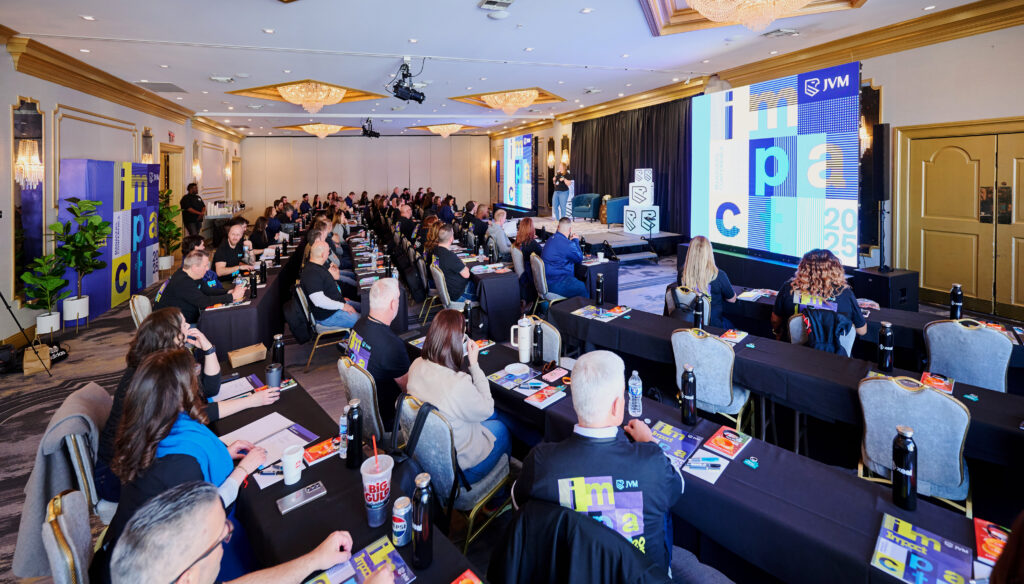
Build a Brand-Bought-In Team

Work to create a culture where staff feel fully integrated with the brand. The more trained around the “why” behind branding choices, the more likely they are to be bought-in to the brand. Which then leads to a shift in the culture of your team. 

By creating community appeal through branding, your team will be more cohesive, and your customer service will come more naturally.

Branding and Search Strategies to Boost Better Brand Visibility

Better branding and better SEO results don’t have to be mutually exclusive. In the same way that it makes sense to establish your brand identity before you build your website, crafting your brand’s verbal identity before you attempt SEO is also in your best interest.

Basically: Create the blueprints, build the thing, then invite people to come see it.

In our blog on balancing brand voice and SEO we talk a bit about how having a great brand is ideal, but you also have to be found through search in order for that brand to be seen and experienced online.

To that end, first we’ll talk about developing your brand’s verbal identity, and then we’ll walk through developing a strategy, and then we’ll discuss (with the help of our friends at 30Lines) SEO within the context of brand messaging.

Brand Verbal Identity Development

Your brand voice is how your brand comes to life through words. This includes your content (what you choose to talk about) and your messaging (how you choose to say it.)

A large part of your overall brand includes your visual and verbal identity. Developing a brand’s verbal identity is a little less cut-and-dried than the visual identity (which includes colors, fonts, icons, and imagery.) Verbal identities include:

Brand Statements – Who are you and what do you offer (and why are you special?)

Brand Voice – How others perceive you; your personality, if it could be read aloud

Brand Tone – How you say something—depends on audience and occasion

Brand Story – Why you say things the way you do

Brand Vocabulary – Proprietary words/amenities, how you use grammar and punctuation, and what you do and do not say.

The Importance of Strategic Development

Developing your brand’s verbal identity shouldn’t be a shot in the dark. It should include careful research of your ideal resident and putting your competitors under a microscope to see what they’re doing (and if it’s working.) 

IDEAL RESIDENT PROFILE

Resident demographics should influence your brand development. During research and discovery for brand development, the demographics and psychographics of your ideal residents plays a big part in how your brand should be positioned. Does it exude a cool, laidback vibe for all your telecommuting millennial residents? Or does it have a comfortable yet classic sense of exclusivity for your upper-crust active seniors?

Ideally, you’ll develop a profile that’s specific enough for you to be a step ahead (or two) at all times, to become The Community they’ve been searching for.

COMPETITOR RESEARCH

Audience research is great. Creating an ideal resident profile….also great. However, it’s worth taking a look at your competition, too. Are their methods working? If yes, see what you can do similarly, and over and above what they’re doing. If their methods are not working, look for the holes in their strategy and step into the space they’re not occupying. 

Differentiation does have some part of this, too. You don’t want to be identical to your competition. Give your prospects a reason to choose you—whether it’s improved amenities or more fun resident events, or an amazingly branded website with crystal clear brand messaging.

Balancing Brand Messaging with SEO

Intrigue. Convince. Convert. That’s what you want your brand messaging to do. But if your ideal resident can’t find it, it’s not going to matter how convincing your writing is. 

So, now that you’ve developed your brand voice that will intrigue and delight, it’s time to create copywriting that’s easy to read and grabs attention AND is optimized for search.

A strong brand and productive SEO program actually stem from the same root – deep understanding of your customer

Brand is an extension of status: it helps the customer say, “This is a product, an experience, a crowd, a place I want to be associated with.” 

SEO is how you demonstrate that you’ve thoughtfully checked all the boxes and answered all the questions that same customer is searching for along their apartment shopping journey. 

While maintaining your brand voice, look for opportunities to incorporate local SEO elements:

  • Use location-specific keywords naturally in your content
  • Create neighborhood guides and local event calendars
  • Optimize meta tags, descriptions, images, and videos with local keywords
  • Collaborate with your website developer to add structured data to help search engines and AI bots to more easily understand your site – property details, your floor plans, your pricing, your reviews, and more. 

Best practice: Develop location-specific landing pages for each property, incorporating local landmarks, attractions, and community features.

Do you have the best dog park in the neighborhood? Build a landing page that talks about your pet-friendly apartments. Are you right around the corner from a major employer or a busy highway or the metro station? Build a page focused on your convenient location. Your top amenities and selling points deserve more than a casual mention in a bullet point in your Amenities page. 

Every new in-depth answer you provide like this is a new opportunity for you to be discovered. It’s more real estate that puts you in a prime digital location: at the top of the list of options presented to your prospect.  

The Case for Balance

On one hand, multifamily traditionally hasn’t been a brand-centric industry — even today, most shoppers tend to search by location and price first. And that behavior likely won’t change for a long time.

That’s why you want a strong apartment SEO program: to boost your visibility and get you in front of more potential customers who don’t know you by name yet. When customers search for best pet-friendly apartments in [XYZ neighborhood], the right SEO can help you show that you’re the best answer to the prospect asking that question. 

But on the other hand, multifamily hasn’t been a brand-centric industry. 🙂 

That means that most of your competitors are foregoing the opportunities to build awareness and trust as a result of a strong brand. Brand becomes the way you’re more easily recognized by prospects and referred more often by friends. It’s your path to skip the line, jump ahead of your competitors, and become less reliant on search algorithms that are constantly changing.

Brand and SEO aren’t mutually exclusive, either. You can have a strong, unique brand voice and still answer all the questions that prospects are searching for. 

Organic Search

Content written for search is only as good as it is helpful. Your content should be answering a question, solving a problem, and providing your website visitors with something useful (or entertaining)—but mostly useful, given that you’re a multifamily brand.

They’re looking for answers, and you have the website that showed up in the results. When you pair strategic and creative messaging with SEO, you strike gold.

If you write only for SEO, you may end up with some very dry content that directs your audience to your website, but can’t keep them there—either because it’s not interesting enough or doesn’t actually give them what they’re looking for. 

Google knows this and actually rewards more compelling websites. If your website is engaging enough to keep visitors around longer and convert more readers into prospects, search engines see that and infer that it must be a better website … and therefore, should be ranked higher for the next shopper. 

SEO gets you noticed; your brand keeps them interested. Dialing in your branding and search is a pairing meant to convert those initial glances into a long-term relationship. For both elements, your best bet is always to write for people, not for some unseen algorithm.

KPIs: HOW DO YOU KNOW IT’S WORKING? 

Search engines and AI chatbots know to tailor their results for each individual based on thousands of different variables. So if everyone’s results are personalized and different, how do we know if our SEO is working? And how can we tell if this brand we’ve invested in is helping our marketing?

Like most projects, it helps to start with the right tools.

To track your SEO and brand impact, you’ll need the following:

  • Google Analytics (GA) to track your website traffic (And if GA feels overwhelming, there are some great free or inexpensive alternatives out there like Microsoft Clarity and Matomo.)
  • Google Search Console to help you understand how Google sees your website and how it’s performing in search results
  • Data from your local listings like your Google Business Profile (GBP). This could be directly from GBP or through a distribution tool like Yext or Moz Local. 

Attribution reporting from your CRM to help you close the loop as much as possible (there are some limitations here)

Are prospects finding me through search?

Let’s start in Search Console.

This is a free tool from Google (Bing’s version is called Webmaster Tools) that tells you how Google’s search engine sees your site. It will tell you how many pages can be found in search, if there are any errors on your site, and other data points that factor into how your site shows up in search results. 

Some key metrics to watch:

  • Total impressions – Am I showing up in search results more often? (This is one of the very first indicators to tell you if your SEO is working, even before you start seeing more traffic to your site.) What’s good? Forget about exact numbers here; you just want to see consistent growth in this number.
  • Click-Through Rate (CTR) – It doesn’t matter if you rank in search if no one clicks on the results and takes the next step to your website. If impressions are up but it’s not translating to website traffic, it’s time to take a look at your meta titles and descriptions. Make these compelling enough that people want to click through and learn more. 
  • Unique Queries – How many different keyword phrases are people using to find us? In general, it’s better to show up for a wider variety of queries – this tells you that your SEO is helping you get in front of a broader audience. It’s also the reason why you shouldn’t care much about average position for any one keyword (besides maybe your brand name). Practice saying this to your boss: “Sure, we can waste a bunch of money and effort trying to outrank Zillow for ‘Dallas apartments’ … but there are 782 other searches that also drove traffic to our website last month.” 

(Also look at branded vs. unbranded queries here. Are you showing up for city/neighborhood searches that don’t include your brand name? That’s the goal of SEO! A huge increase in searches for you by name? That’s the goal of branding!) 

Search Console tells you how your site is performing in the Google search results, but you’ll want to dig into your Google Analytics to see how that organic search traffic is performing. 

In GA, you’ll want to look at where your traffic is coming from. Traffic from search engines is called Organic – keep an eye on how much traffic you’re getting, how much those visitors are engaging with your site, and how often those visitors are converting to leads (called “Key Events” in GA). 

When your SEO is working, you’ll see:

  • More traffic from Organic search sources like Google and Bing
  • More engaged visitors who are interested in your site and your content
  • More leads converting from Organic sources (and often, a higher percentage of leads are coming from search)

Note: Google and AI tools like Perplexity are getting way better at surfacing answers for shoppers without sending that traffic through to your website. These are called zero-click searches – they’re not necessarily bad for multifamily marketers (as long as the shopper is finding the info they want about you) … but this does muddy the water quite a bit when you’re trying to quantify how your SEO is performing. 

Remember, people search in lots of different ways. For prospects searching by location, you’ll also want to check your GBP, Yelp page, and other local listings to see how people are finding your other outposts in local searches. Many of those local directories offer their own reporting tools to show you how you’re being discovered in Google Maps and other local search channels. 

Are people searching for my brand?

In Google Search Console, you can also see Queries, the phrases that people use to find you in search results. 

When you check those queries, you’ll likely see that a number of shoppers searched for you by name. The more you do to build a recognized, trusted brand, the more shoppers will start to seek you out directly (instead of searching for unbranded local keywords first). 

Over time, as you build your brand, look to these Queries as well as your GA data. You’ll know it’s working when you start to see a steady increase in the number of shoppers seeking you out by name. 

Should I build a strong brand or focus on SEO? Yes.

Brand helps you go beyond search. When you build a recognized brand, you build an ambient trust that helps increase clicks and conversions across every channel, and especially search. And even better, every property helps to build on the next one – it just reinforces itself as you grow your portfolio. 

Think about it. If you’re going to book a rental car or hotel for your next trip, you’re more likely to go with a brand you recognize. And in many cases, you’ll probably even spend a little more specifically to go with the brand you trust. 

Apply that same thought process to multifamily. 

A prospect who isn’t sure what they want yet will start their search with something broad and usually location-specific — something like best apartments in Colorado Springs

Your SEO does the work to get you on their initial list of options. You’re helping the search engine (or AI chatbot) serve you as a potential answer to their search. 

But what happens next? Without brand, you’re forcing yourself to compete on other factors like price and ratings. 

Investing in both brand and SEO is a move that delivers undeniable benefits. A strong brand establishes trust, recognition, and consistency, while SEO ensures visibility and accessibility to your target audience. 

Combining the two creates a powerful marketing machine that sets you apart from competitors, drives more qualified traffic to your website, and ultimately boosts conversions at every step of the process – from initial discovery all the way through to retention and renewal.

Fonts to Fit Your Brand

There was a lot of huff and puff over Jaguar’s latest rebrand. The typeface in the new logo and overall vibe felt too modern for an old, classically luxury car brand. But it was different. Just knowing that the brand was able to portray something new with a fresh font and a different brand direction goes to show: Fonts affect a brand’s personality and vibe.

Font Types

There are multiple categories of typefaces, and each one has countless specific fonts within the category. Every one has the ability to convey emotion and either underscore your brand’s personality, or fight against it—so it’s best to learn how they work, and what styles will work best for your brand and the vibe you’re going for.

EMOTION, PERSONALITY, VIBE

Sometimes things that are not alive can be assigned some measure of human character and emotion. We can anthropomorphize fonts, or give them human qualities. Some typefaces make us nostalgic. Some typefaces make us sit up a little straighter. Some typefaces bring us a sense of joy and fun. Fonts can create emotion. Can Arial do that? Not likely. But choose something like Courier New, and you’ll feel like you’ve been whisked back to an old-timey newsroom.

The easiest way to get a sense of this is to take one short phrase, say, “I love you” and toggle through different fonts to tap into the feeling. Are some sweet? Some over-the-top? Some creepy? Keep in mind that the words didn’t change, but suddenly the feeling it evokes did. All because you swapped the font.

Categories of Typefaces

There are multiple typeface categories: serif/slab serif, sans serif, script, and display. They all have the capability to evoke different feelings, and with that comes a great deal of power. Choose the right one for your brand, based on the vibe you want to go for (and the kind of resident you want to connect with).

Serif / Slab Serif

A serif on a font is an additional detail on each letter—a small stroke at the end of each larger stroke.

Serif fonts are classic. They convey reliability, trust, and good old-fashioned formality and stability. 

Example: Times New Roman is probably the most well known font out there, thanks to its wide and early use in newspapers. It was also the typical font setting for Microsoft Word programs, and generally accepted as readable and clear.

If you want your brand to feel like it will stand the test of time, go with a serif font. It gives the sense that it has been there forever, and always will be.


A slab serif is similar, but the serifs are more blocked off, giving the letters a boxier appearance. One of the most popular slab serif fonts is Sentinel.

Sans Serif

As you might expect, sans serif is a typeface that does not use serifs. Each letter only uses the stroke itself to identify the letter, and no extra ornamentation. These are generally considered minimal, modern, and much more straightforward than their detailed counterparts.

Example: Arial is one of the most popular sans serif fonts. It’s often the default in plenty of programs, including Google docs.

If you want your brand to feel clean, modern, no-nonsense—sans serif is likely the way to go. Sometimes you can also angle into more geometric versions of sans serif, or lean into a robot-age style with some interesting futuristic sans serif fonts.

Script / Handwritten

Like handwriting, but more consistent and tidy. This can mean a script that flows from one letter to the next, or it can have a more handwritten vibe, whether somewhere between cursive and manuscript.

Example: Pacifico is a popular handwritten style font. It’s light and breezy but has a sturdy readability to it, as long as it’s used in larger sizes, sparingly and not in body text.

There is a large variety of script and handwritten fonts out there. It’s worth finding one that may work with your brand as an accent font, but not as body text. Determine whether you want something fancier (a more calligraphic look) or if something scribbly works best. Either way, it will definitely stand out.

Decorative / Display / Retro

Similar to some handwritten and script fonts, decorative fonts are meant to be just that: fancy for the sake of being fancy, to create a vibe, or to keep with a theme. It certainly manages to catch one’s eye! But be sure to have something additional in your brand guidelines for body text to get the full message across.

Display fonts are typically used for headings and other large sized text to grab attention.

Retro fonts are fonts that harken back to another time, whether bubbly 70s letters that make you think “Groovy, baby, yeah!” or a creatively thick-to-thin sans serif that brings an old New York City delicatessen to mind.

Example: This could be anything from Thriller to Playbill to a collegiate looking block style font.

Choose carefully and check the vibes before you move forward finalizing that one for your brand guidelines.

Where to Find Fonts

Go behind the scenes with Stacey Feeney, our founder and chief creative director as she gives you the best resources for finding fonts and how to use them!

Fonts for Brands—Best Practices

First off, let’s address a quick misconception: “Your font should match your logo.” Nope! We’d actually argue the opposite. The logo should stand out. It should identify your brand, be recognizable and eye-catching and work with your vibes. However, the fonts you choose should compliment your logo instead of match it. Fun fact: most logos (if made well) don’t even use a font. Instead, they’re custom-designed lettering and imagery and won’t have a font that matches anyway.

Now, onto best practices of fonts for brands.

RULES OF THUMB

Couple rules we like to live by at Zipcode Creative:

  1. In most cases, body copy should be simple and sans serif. It’s clean and easy. Save your fancy styles for headlines and other shorter info blocks (think taglines and call outs.) Note: Books typically use serif fonts, but for apartment brands, we’re not getting too much more content than 1 paragraph at a time.
  2. Don’t go higher than 4 font types—if you’re using an accent font. If you’re not using an accent font, 3 is the maximum number of fonts you should be juggling. When you have too many fonts, the reader will feel confused and the design will appear cluttered and chaotic. Plus, they won’t know where to look, and your branding and identity will get lost in the (visual) noise.

BUT WHAT ABOUT TEMPLATE DEFAULTS?

We talked a bit about the defaults that happen in Google docs, in Microsoft word—and often defaults will appear in your website and email builder as well, whether Mailchimp or WordPress or Squarespace. It’s not uncommon for your very specific font choice to be unavailable in these templates.

Besides feeling special about your very custom brand font, you might feel panicked that it won’t match. Get as close as possible. Many fonts are very similar, with minute differences only obvious to the hyper-trained (graphic designer) eye. 

Now that you understand typefaces, you’ll be able to identify the category (serif, sans serif) and choose something that will be similar to what you’ve already outlined in your brand guidelines as The Font.

(Don’t you dare choose Comic Sans or Papyrus.)

Accent Colors How to Add To Your Apartment Brands Palette

Accent Colors—How to Add To Your Apartment Brand’s Palette

Color theory isn’t theoretical in terms of importance for your apartment brand. It’s part of your overall identity and will definitely impact how your prospects (and anyone else who comes in contact with your brand) view your apartments or corporation. Accent colors are a helpful way to expand your branding guideline’s use.

If you already have a color palette established, choosing additional colors can seem risky or difficult. Let’s walk through choosing excellent complementary colors that will work with the branding you already have.

This will help you select accent colors to make your brand pop.


Ready?

Let’s pop.

Background: Color Theory Basics

Let’s get back to Art 101 here, including parts of the color wheel (which has 12 parts). Plus a couple definitions that may be helpful:

Color Types

Primary – Red, yellow, and blue. You can make any color from these.
Secondary – Green, orange, and purple. Basically the other part of the rainbow, made from primary colors.
Tertiary – Mix a primary and secondary, get one of six tertiary colors. Like Red-orange.

Color Characteristics

Hue – The color—or the name we give it. Every color has a basic hue—which would have to be one of the primary, secondary, or tertiary colors. (A lavender color has a purple hue.)

Saturation – The vibrancy or intensity of a color—the lower the saturation, the less vibrant it is.

Brightness – The shade or tint of a color.
Contrast – How one color stands out from another.

Each of these color elements impacts perception of your brand. And every color has an associating idea and mood. If you’re familiar with those ideas, it will help you narrow down your choices. For example, green is typically seen as soothing and natural. Purple is associated with royalty and luxury. Blue is trustworthy.

(Read more of the color psychology breakdown in our blog here.)

Complementary Colors

Those that are opposite each other on the color wheel—and they tend to look good together. Think: orange and blue, yellow and purple, red and green.

But if you’ve already got a color palette, and you’re just adding to it, it’s helpful to know what will work best.

Adding to Existing Color Palettes

You already have brand colors? Start there. Look at what it has going on. Does it have a little bit of everything? Figure out what, if anything, is missing.

First– try the analogous, complementary, and split-complementary colors. Second– try using varying tones of the same hue to gain color through lighter or darker versions of an existing color.

BEST PRACTICES

Accent colors should be just that: an accent. Certain colors will “pop” against the rest of the palette and can draw attention to the things you want to highlight for your residents and prospects. They should be used sparingly, as they’re not the main idea.

Also: keep it simple. Don’t go overboard with too many colors; it just muddies your brand recognition. When you have 3-4 main colors and 1-2 accent colors, that’s the sweet spot. If you have more, your brand recognition will have diminishing returns. Think about Coca-Cola. They have, what, four colors? Red, white, black, and gold—and nothing else. And you can picture the colors in your head. If you want brand recognition, keeping it simpler will be helpful. Find the best possible color pairings and go from there.

POLICE IT

We’ve said before: If it’s “close enough” it’s not good enough. Every color has a specific pantone, RGB, CMYK, and HEX code. Use them and show the team how to use them.
Without proper training, you’ll end up with things that look kind of right, but maybe a little off. 

Plus, when it comes down to holiday and/or seasonal creations, it may not be obvious what’s allowed or not—so get ahead of this and indicate what is permitted for, say, Christmas or Thanksgiving posts in regards to color palettes and accent colors.

Once you have your color palette and brand guidelines, you need to stick with them and make sure everyone else does, too.

BEHIND THE SCENES

Go behind the scenes with Stacey Feeney, our Founder & Chief Creative Director, where together you will learn how to add colors to an existing, limited brand color palette.

Brand Implementation is the Key to Success

A well-developed brand is only theory until it’s seen and experienced in the wild. Brand implementation for multifamily is the key to success—to set your community apart and stand out against the comps.

If your brand is fully developed—visual, verbal, experiential—and everything is laid out and planned, it doesn’t matter at all unless and until it’s carried out. Pay attention to how you implement your brand across every channel and touchpoint. For example, consider how your onsite team is carrying out your branding. They’re not marketers, but they’re certainly part of your brand perception for both residents and prospects.

Brand Consistency Comes Through Training

If they’re an employee with your community, they’ll play a part in the brand perception. Everyone who touches the brand should fully “get” the brand—through how they’re treated by upper management, and through how they’re familiar with the visual and verbal identity aspects of the community brand to, in turn, be able to speak to residents within the brand voice.

TRAINING

If your teams don’t “get” the brand, they weren’t trained properly. Ensure nothing falls between the cracks and use tools and training to get your whole team on board.

Corporate training – Bring in the marketing team to train everyone. Make room for questions to ensure full understanding of brand elements and guidelines (so, questions like “Why?” are definitely welcome here). Give some background into choices and ensure the mission and vision are crystal clear. Give examples of what it looks like in action, too.

Use the tools – Using the Canva Brand Kit will help streamline your visuals. Using ChatGPT can help corporate take control over the brand execution—particularly if you create fill-in-the-blank brand voice prompts, like: “Please write a ______ in our brand voice that is youthful and quirky.” This is particularly helpful to create a starting point if you don’t have a branding team with a copywriter helping at every turn. 

Make Marketing Materials Cohesive

Your prospects should be able to see and feel and experience your brand in a cohesive way no matter where they are in the (sales) funnel, and no matter where they are in their resident journey, whether researching apartments or living there, from online search to in-person tours. That’s done through brand consistency.

TOUCHPOINTS FOR BRAND CONSISTENCY

When does consistency matter? All the time. That’s how you reach peak brand awareness. But it’s particularly helpful to make sure you have these bases covered:


Digital presence – Messaging and visuals must maintain the brand identity. This is usually the first point of interaction for prospects. So ensure your website, socials, and digital ads all add up to the same brand!


Physical marketing collateral – Everything that has your name on it should be immediately recognizable. Every handout, every brochure, every sign should be completely cohesive with the brand’s look and feel.

Surroundings (Details and Decor) – Don’t stop at your stationery and website. Bring your brand all the way into your interiors. The décor and lobby styling should reinforce your brand (not clash). Bring the color palette into the paint choices, or artwork, or throw pillows (or all three).

Basically: Attention to detail will get you on the right track, and keep you there. Implementing brand guidelines consistently, and you’ll be able to build trust with your prospects.

Keep the Brand Promise to Residents

Now that your prospects have turned into residents, your branding work is far from done. The trust you’ve built with your prospects should NOW turn into the loyalty you build with your residents. Maintaining your brand is done in part by the actual experience of living at your community.

WHY KEEP THE BRAND PROMISE?

Loyalty stems from a positive experience. When something is good, we want more of it. Hence, another lease renewal, or a handful of referrals. Seeing a pattern of this? Your brand is on the right track, keeping the brand promise—what you say you’ll do and actually doing it.

GO BEYOND LEASING

Executing the brand isn’t just about arriving at the signature on the lease. Like we said before, it’s for far more touch points than that. It also includes:


Staff Interactions – They’re the true embodiment of the brand. Their greetings, their body language, their email messaging should all be part of an experience that is fully in line with the brand’s values.

Community Standards – If you have the correct color signage, but it’s poorly lit, that’s not a good look. Ensure maintenance and updates happen regularly so that hard work in branding your community isn’t totally detracted from. Focus on quality, cleanliness, and style—all in keeping the vibe of your brand.

Amenities and Events – Choose events that work within your brand and don’t feel “off”. Amenities should have been chosen to differentiate you—now make sure they’re a fully positive experience that helps residents make lasting memories.

You can see just how well your brand is “working” in your community based on the renewal rates and referrals that come in. If your resident is satisfied, they’re not looking for the greener grass. They’re telling their friends that your community is where the grass is truly green. Retain them!


Get beyond the logo and aim for the heart of your brand. Train your personnel to ensure it’s coming through in human interaction. Create tools to make it easier. Keep your brand promises. Implement your branding and enforce it (gently) regularly. When the branding is done authentically, with buy-in, it’s a lot easier to sell the whole community as the place to live.

Brand for Differentiation: A Case Study of Paragon Ranch

Being able to brand for differentiation can be used to your complete and full advantage—if you know how to wield it. For Zipcode Creative client, Paragon Ranch, it was vital to find a way to serve up differentiation to attract the right residents. It came in the somewhat-unlikely form of pickleball (the fastest growing sport in the U.S.)

Paragon Ranch is a newly launched multifamily development just outside of Cincinnati, Ohio. It’s attracting prospective residents who want to lead a more elite lifestyle, in a way that is attainable. So finding outside-of-the-box recreational amenities to offer, like pickleball and golf, was a good way to create interest and demand.

Follow along as we walk through the ways high-value experiences can create brand differentiation (and how), especially at Paragon Ranch.

Background and Context

ABOUT PARAGON RANCH

Paragon Ranch is the first new build of its kind in the area in a decade. It brings exceptional service and is targeted to both young professionals and empty nesters. Being located close to the city and to nature allows residents to find a good balance between work and play. 

The goal of Paragon Ranch was to create a spacious, sanctuary-like living experience to get away from never-ending home maintenance to-do lists and pressing work deadlines—to focus solely on leisure.

TRENDS IN MULTIFAMILY AMENITIES

Unique amenities are popping up everywhere. Pickleball, which used to be the domain of senior living offerings, is now becoming much more popular in conventional communities. The active tennis-badminton sport is suddenly resonating with a younger, more diverse audience—including the young professional audience that Paragon Ranch was working toward capturing. Golf is also popular with the younger set, and Paragon Ranch’s amenities feature a golf simulator, as well.

LOCATION ANALYSIS

Given Paragon Ranch’s location, between plenty of outdoor recreational adventures, it’s able to draw a demographic that’s focused on sports, and values both outdoor activities and social experiences. Pickleball can’t be played alone—so creating the opportunity for teamwork and physical activity was an ideal amenity offering.

Research and Strategy

Of course, what good is an amenity if you’re not sure how it will land with the ideal residents?

INSIGHT GATHERING

By gathering research focused on the local demographic and their interests, we were able to help Paragon Ranch inform the branding. We specifically discovered a heavy local interest in (and passion for):

  • Sports
  • Recreation
  • Golf
  • Outdoor activities in fair weather

Taking each of these and lining it up with the community brand’s goals and messaging was a surefire way to give the people—that the community wanted—what they want. We used research to our advantage, and it helped form the ideal resident profile we could more closely target. With more data and knowledge, comes better strategy and improved differentiation.

IMPORTANCE OF IRP (IDEAL RESIDENT PROFILE)

The IRP shaped every bit of our branding efforts—knowing what kind of voice would resonate with them, identifying what priorities needed to be, and what kinds of values would make sense to reach the IRP. Making sure the branding worked with the prospective residents’ preferences and lifestyle aspirations (relaxation, outdoor activity, social time) helped us guide the amenity offerings and focus the messaging around what would be most vital to the community’s success.

LINKING STRATEGY AND DIFFERENTIATION

As we’ve noted before in other blogs and posts, competition is fierce out there in the multifamily world. Crafting a way to differentiate your brand is the best set-yourself-apart strategy we can think of. 

By using pickleball as an amenity focus (aligning with the IRP’s priorities and desires) we’re helping place Paragon Ranch top-of-mind for prospects. It’s not common for communities to place a pickleball court front and center in their lineup of offerings. But that’s how Paragon Ranch is going to stake its unique claim.

Brand Development and Concept

VISUAL AND VERBAL CONCEPTS

Based on a country club experience with amenities on par with something exclusive and sporty—the core of the brand gets combined with accessible distinction. By creating refined and aspirational messaging focused on outdoor options and sport-related amenities, Paragon Ranch was crafted to attract sports and outdoor enthusiasts.

Visually, the fonts recall an old school sport uniform script. The logomark echoes the lines of sport courts. The stock photos use pickleball as a focal point. Everything about it says: active and luxe-lite.

The brand voice itself used some aspects to steer clear of too-casual or silly of a brand voice. By using brand attributes like “timeless” “connected” and “optimistic” the brand voice could stay grounded and have wide appeal, but still offer a professional and engaging tone. This gave a sense of the quality of lifestyle that residents could look forward to at Paragon Ranch.

FUTURE EXECUTION

As for implementing these brand identity elements, Paragon Ranch hasn’t yet opened for pre-leasing, but is expected in 2025. When pre-leasing begins, telling the full brand story and using every (branded) visual at their disposal will help them enhance their differentiation. 

For example, for every marketing channel, there’s a way to weave in that “elite” sporting theme. From pickleball tournament resident events to golf gear giveaways for new leases signed, the strategy options are endless. 

Paragon Ranch is paving the way with multifamily branding with recreational amenities as part of its core identity. By using a brand strategy to attract residents that want what they offer, they’ve set up their community to stand out in the market.

Multifamily Brand Activation

A brand gets built, and fully developed to set a property apart. But what happens if it’s never put to work, and activation happens too late?

Brand activation is crucial to drive engagement and create a successful leasing machine in multifamily. If you don’t allow space and opportunity for a brand to connect with its desired audience, the value prospects place on your brand won’t be strong or stable.

Instead: create a marketing strategy that builds up your brand’s image and encourages your prospects and residents to take action. Brands today often have fewer physical touchpoints. Activating the brand early brings it to life, creating brand awareness for your prospective residents.

There are six key disciplines within brand activation worth exploring. Keep reading if your brand is “ready to connect”.

When to Activate Your Brand

Marketing teams shouldn’t wait until the last minute to activate their brand. Brand activation should be part of the equation from the start. Historically, maybe you did “fine” in the past without pre-leasing so early—but what worked before might not keep working in your favor. 

EARLY ACTIVATION FOR NEW CONSTRUCTION

When building a new ground-up development, that community’s brand activation should be integral from the beginning, with brand development occurring 18-24 months before the first units are delivered.

For example, once the brand is established, create an interest list landing page (“Interested in living at Palms Place? Drop your email here, and you’ll be the first to know when our units are ready to lease!”). Then begin driving traffic to it through all forms of brand activation—see the next section.

WHY ONGOING ACTIVATION IS KEY

Lease-up period calls for activation. But after the lease-up hits your goals…deactivate? No! Don’t ever “deactivate” your brand. While your occupancy may be high, failing to continue to activate your brand through various channels can lessen your “top of mind” status for your residents and prospects. When a brand is at the top of a list, that’s the worst time to rest on your laurels. Continue marketing and maintaining brand awareness for prospects—it’s the best way to keep occupancy up.

The Six Disciplines of Multifamily Brand Activation

#1 COMMERCE MARKETING

How a company goes about generating commerce is commerce marketing—making the connection between the product (apartment units) and sales (leases signed). 

How can you achieve this with multifamily communities?

Online, activate the brand using the community website. Align it fully with your brand’s visual and verbal identity, and make sure that it’s consistent across channels so your prospects recognize and trust you.

In person, activate the brand in the physical spaces of your community with branded signage, interior design/art, and printed collateral. Your move-in guides, welcome packets, and clubhouse lobby should all feel cohesive. (This is where your prospects are deciding whether to sign the lease.) And if you’re under construction, fence banners, leasing trailer banners, and “Coming Soon” signs near intersections are all part of it!

#2 CONTENT MARKETING

The best way to be top of mind for your prospects is through proving your usefulness. Engage your prospective residents with content that they want to have. This could look like tips on moving, furnishing small spaces, how to keep up with a young professional lifestyle, and plenty of neighborhood “hit lists”.

Brands that feel more relevant to their target audience have likely created useful content. This can be accomplished through timely blog posts, creative social media, and email newsletters. If you want your brand to be sought-after, make yourself useful.

(Likewise, if you want your brand to be recognizable, be consistent across your channels with brand voice and tone.)

#3 EXPERIENTIAL MARKETING

“And how did that make you feel?” is no longer just a line reserved for therapists addressing their clients. It could now appear in a post-marketing experience survey

Create events that prompt residents and prospects to take action. When residents can interact with the brand through an in-person community event, your brand has the opportunity to make a lasting impression.

By hosting neighborhood pop-up events (like a volunteer sign-up fair for local nonprofits!) you can show off the community’s friendly, neighborly spirit. Other ideas, like fitness classes or food truck gatherings can bring your community together and create a stronger feeling of connectedness. If community is part of your brand, plan to prioritize these types of events. 

P.S. Bonus points if it’s “instagram-worthy” with decor or giveaways—that could get you more traction with the next brand activation tactic.

#4 INFLUENCER MARKETING

While this idea of “influencers” is a bit polarizing, it’s still a way to connect on an emotional level with your prospects and residents—because it’s deeply human.

Real residents can be your brand advocates. By using their testimonials to make content, you can step to the side and let their experience speak volumes. Choose your most loyal, satisfied residents to help you with this.

Pro-tip: Try partnering with Rentgrata. They enable residents to share their experiences directly with prospects. Creating transparency and access is a huge step toward trust and loyalty (and future brand ambassadors).

#5 PROMOTION MARKETING

Everyone loves a deal. Costco gives out samples. Grocery stores mail coupons. B2C companies create sweepstakes: “Win a $15,000 home makeover!”

But how can multifamily brands better activate using promotions? Time it right. Create incentives and special offers that promote your community before you think you need to. Use promotions to activate earlier and with more frequency. For example, for pre-leasing, drive urgency: “If you’re the first to reserve a new unit, you get a $150 gift card!”

Again: everyone loves to get more for less—so if you create a promotion, try it through multiple channels and see what sticks. This could be time-based (lease by the end of October and get one month free rent!) or referral based: “Tell a friend, and get a $200 gift card when they sign a 12-month lease.” 

Run the promotions through direct mail, social media ads, email campaigns (or newsletters) and through digital display ads.

Generally, once your promotion has run its course, your prospect should feel happy enough with the value they received that they will want to stay. The promotion is the way to get them (or their friend) in the door.

#6 RELATIONSHIP MARKETING

The human element of marketing cannot be underestimated. Your leasing agents are the bread and butter of your brand—the original brand ambassadors.

Each interaction, each phone call, each tour—they all add up into a total brand experience. Every positive interaction with a prospect is an opportunity to build up your brand on a human connection (sometimes in person) and solidify in actuality the culture you’ve built in theory.

This looks like: training leasing staff to understand your mission, vision and values—particularly as it relates to customer service, and personal touches during tours, follow-ups, and resident events.

How to, Really: Multifamily Brand Activation

What does multifamily brand activation look like in the real world? It’s likely less complicated than you think.

An excellent brand + marketing strategy = brand activation

For example, an urban luxury community could create a pre-leasing landing page and set up a targeted influencer campaign at the same time. Create a brand, then create buzz.

Or, a community in the suburbs might focus on experiential marketing through hosting monthly resident events. By showing off their resident events on their website and social channels, it helps residents feel connected through the events and develops excitement for prospects.

Brand activation should be continuous. Just as you wouldn’t (or shouldn’t) take too long a pause from updating your social media feeds, you shouldn’t assume that your brand will remain top of mind without consistent marketing. Continue to engage prospects and residents so your brand maintains its status and keeps your leasing pipeline running smoothly.

If you’re not sure which brand activation method to choose—or you have something in mind but don’t have the time or energy to get it done—reach out to Zipcode Creative. We’re happy to help you create a tailored brand and leverage your marketing strategy to activate your multifamily brand.

Brand Awareness for Multifamily Communities

Brand awareness for multifamily is tough. How can you measure it, exactly? Sure, residents may mention your community or brand by name in reviews or social posts, but even then it becomes difficult to get accurate data. Insights from experts, like our friends at Widewail, can provide insight on the number of times a brand name is mentioned; however, it may skew toward the negative, when a person is more likely to leave a specific review. That doesn’t paint the right picture, necessarily.

Running a brand awareness ad campaign is possibly another option—but beyond showing clicks to the website or a number of scheduled tours, it doesn’t tell us about:

  • Previous brand awareness
  • If the ad campaign helped make a long-lasting impression and create brand awareness
  • Brand perception—if a person became aware of the brand (will they take action? Become loyal?)

Let’s dig in and see what we can control and track for better results for brand awareness in multifamily.

Brand Awareness Types

There are multiple types of brand awareness. Brand recall, brand recognition, and top-of-mind brand awareness. Breaking it down even further:

BRAND RECALL

Brand recall is essentially the percentage in a given number of people that can actually recollect your brand. This is step number one in putting your brand on the map. It’s typically determined by a survey that goes out that asks, “Have you seen or heard of this brand before?”

Brand recall is helpful particularly in comparison with competitors. If prospective residents have heard of a property management company brand before (“Oh, I’ve seen their management signs outside my friend’s apartment!”), they may be more likely to explore living in that community. You may not be a known quantity to them in the truest sense, but they’ve heard of you or seen you.

Brand recall example: A resident seeking a dog-friendly apartment in Sarasota recalls your brand after seeing an ad that talked about your pet-friendly amenities.

BRAND RECOGNITION

Where brand recall is about remembering, brand recognition is…recognizing a brand through its color, logo, shape, or other attributes. When placed next to another similar brand, those who recognize your brand know the immediate difference.

Again, the better the brand awareness—in this case, brand recognition—the better chances you have at being “chosen”.

Brand recognition example: A prospect sees your signature green logo and immediately thinks of premium amenities. (Bingo!)

TOP-OF-MIND BRAND AWARENESS

When I say facial tissues, you say “Kleenex.” To most, there’s almost no competition for that kind of product. Kleenex is now the term that has replaced the idea of facial tissue. Similar to Band-Aid, Chapstick, Jell-O—the terms are synonymous with the entire market they’re in.

Similarly, when a brand has incredible top-of-mind brand awareness, it’s a snap to think of the name when prompted. It’s similar to being the mental #1 in the list of possibilities for a specific industry or service. That’s a good place to be.

Top-of-mind example: At the very start of their apartment search, a prospect types in your apartment community name.

Boost Brand Awareness with Brand Development

Getting strategic with brand development can improve brand awareness and turn brand perception of your multifamily brand positively. The strategies below should be used to help bring your brand awareness levels up and away:

KNOW YOUR RESIDENT (IRP)

Your ideal resident profile (IRP) is the key to unlocking the strategy. Know their needs, their lifestyle, their preferences, then create a brand identity that will “jive with their vibe.” If you’re trying to reach young professionals, for example, you might focus on what your nearby nightlife offers and whether you have remote work spaces available in your building.

ALL ABOUT LOCATION

You can’t pick up and move an apartment community—it’s tied to where it is geographically. So, make sure the branding fits in with what’s going on around it. If you’re near a large hospital or tech hub, for example, consider focusing on easy commutes. If you’re close to many recreational spaces, show how your campus connects with walking trails and nearby parks and keep an active resident in mind for your brand. Or, better yet, if you’re close to the ocean, talk about the views and the beach access.

Your content goes here. Edit or remove this text inline or in the module Content settings. You can also style every aspect of this content in the module Design settings and even apply custom CSS to this text in the module Advanced settings.

DIFFERENTIATION

Ooh, one of our favorite words. And an excellent part of a brand strategy. What makes you special and different will set you apart. Highlight it (as long as it’s good). If your differentiation includes how you solve some common prospects’ problems (hey, a pickleball court—or an on-site remote work area) you’ll come out head and shoulders ahead of the competition. If you’re in the middle of Portland, OR, you know the foodies and the eco-conscious abound. Work towards creating a brand that prioritizes earth-friendly finishes, activities, and partnerships—and show it off.

Strong Branding Makes Better Brand Awareness

You’ve got some strategic moves up your sleeve, so get ready for advanced brand awareness. How?

Thoughtful Design

Resonate with your resident by using logos, color palettes and other visual identity elements that will help jog their memory. Over time, your brand can be recognized through its typography, colors, and general style—just from a sign or an ad.

Purposeful, Pointed Messaging

What you say matters as much as what you show. If you’re clear and align your brand with the audience you want to reach, you’ll be able to connect on an emotional level (like speaking straight to their heart).

Multi-Channel Cohesion and Consistency

Lather, rinse, repeat. If you do the same thing, show the same colors, speak the same way across your channels, you’ll show up consistently and predictably. This creates trust. Trust creates confidence. Keeping your brand promises creates loyalty. With consistency and a well-crafted marketing and branding strategy, you can become top-of-mind for the prospects you want.  (Kind of like a song that’s so catchy and plays on the radio all the time, you can’t help but sing it even when it’s not playing.)

P.S. When we say “multi-channel” we mean digital, social, print, and ads. And on-site signage, too, of course.

There’s far more to brand awareness than just the scattershot approach—if you have a big ad budget, awesome. But even if you have loads of money to spend on marketing and advertising, if your brand is flat, you may never take off and reach that coveted “top-of-mind” placement for your IRP.

Go beyond the ads. Start with branding well. Then stay the course to connect deeply with the prospects you want to attract. Call us up, email us, message us—we can help you find the brand development package that will work for your community.

Empty Nesters: Branding for Resident Personas

The most common resident persona in multifamily is the career-focused, non-homeowning young professionals. But don’t forget about those who just launched those young professionals into the world: empty nesters. This group of renters are the second most targeted group for apartment living.

Knowing the purchase habits, preferences and ideals of a specific demographic can help you understand and cater to empty nesters for your apartment community as you tailor branding and marketing.

Your content goes here. Edit or remove this text inline or in the module Content settings. You can also style every aspect of this content in the module Design settings and even apply custom CSS to this text in the module Advanced settings.

Who Are Empty Nesters?

Empty nesters are individuals who have children that have left home to go on to school or careers and live their own lives. Empty nesters are typically 50-65 years of age, with early 60s about the average.

This group is extremely diverse, from younger empty nesters whose children have left for college, to the older ones that are closer to retiring. Depending on the generational trends, whether they’re Baby Boomers or late Gen X, they have differing values, lifestyle preferences, and financial means and priorities.

EXAMPLE STATS

There were two groups of empty nesters that we explored for these statistics, and while they have some items in common, their age, hobbies, and values varied a little.

For Group 1:
Age: 60-64
Household income: $75-100k
Household size: 2 people
Common leisure activities: Pets, mall shopping, music, sports, retail.

Home Values and Priorities: Like to stretch their money, and obtain information and news from TV channels and TV shows. Enjoy fast food and fast-casual restaurants.
College education: ~35%

For Group 2:

Age: 65-74
Household income: $75-100k
Household size: 2 people
Common leisure activities: Yoga, golf, running, grandparenting, dogs, food, music, traveling.
Home Values and Priorities – Staying active and healthy; are retired, or nearly retired. Appreciate amenities that help them maintain their health and activity.
College education: ~41%

Empty Nesters in Market-Rate Apartments vs. Senior Living

NOT SEEKING OUT SENIOR LIVING

But which of these empty nesters prefer age-segregated living? Many don’t see themselves as seniors and aren’t ready to dive in the early-bird specials and senior discounts at Denny’s. They’d rather seek out market-rate apartments that offer amenities that align with their modern, active lifestyles.

While empty nesters may be downsizing, they aren’t likely ready to stay at home and have it all “in one place.” Their sense of adventure, hope for regular activity, and penchant for travel might be dampened by a spot that’s specifically for seniors. Empty nesters would rather have flexibility—they’d like an apartment community that supports their lifestyle that’s in an in-between phase that brings access to vibrant, walkable neighborhood amenities.

WHY MARKET-RATE FOR EMPTY NESTERS?

Empty nesters are still an ideal target for regular (market-rate) apartment marketing. Empty nesters still have a significant population that is younger than 55—they aren’t even eligible for age-specified communities. After owning a home, they may be ready to move on from consistent home management and maintenance to simply renting and enjoying closeness to the bustle of the city (now that they don’t necessarily have to hustle). Plus, they pride themselves on their still-active lifestyle. Instead of days filled with puzzles and herbal tea, they are more into pilates and boba. Staying up and moving is part of their day-to-day, and they’re not about to release that aspect of their youthfulness.

The Importance of Branding for Empty Nesters

TAILORING THE BRAND

It’s one thing to brand an apartment community to reach young professionals. It’s quite another to also attract another demographic of empty nesters. Tailor your brand and marketing to empty nesters by staying aware of their preferences, positioning your amenities to attract them, and showing off the highlights of your neighborhood. And, as the multifamily space becomes more and more competitive, it helps your community stand out when you can appeal to another demographic—especially one that’s growing, as more Baby Boomers and Gen Xers become empty nesters. So: tailoring your brand to appeal to their values of quality, comfort, and simplicity can help guide the way you brand and market your spaces.

UNDERSTAND THE PERSONA

Developing your brand should stem from the ultimate goal: reaching the target audience. And if you know you’re attracting empty nesters, it’s best to understand that group of people. Bring in data points and statistics to inform decisions about the overall brand development.

For example, incorporate their preferences for:

  • Modern amenities
  • Smaller, but upscale spaces
  • Walkable communities
  • Convenient locations near urban centers

Highlight each of these amenities and offerings in your marketing, and ensure it’s part of the perception of your overall brand. Talk about it, show it off, and highlight it on any tours, whether virtual or in-person.

Apartment Branding Strategies to Reach Empty Nesters

GO BROAD

A broad branding approach can help you appeal to empty nesters. In design, go conservative, but modern. A simple and timeless set of aesthetics can show a side of sophistication while also highlighting the practicality of your community.

Because your target audience is hyper-focused on staying young, it makes sense to appeal to their desire to cling to youth and activity. In your messaging, focus on the themes of active living, convenience, and a lifestyle that’s far more maintenance-free than before.

In addition to a life that’s maintenance-free, it’s also extremely flexible and has a sense of freedom. Because so many empty nesters enjoy traveling, you can focus on how easy it is to live in a space that doesn’t require yard care, trash pick up and plenty more.

In terms of amenities, think carefully about what you offer—empty nesters will be more satisfied with amenities that feature quality over quantity. High-tech amenities like smart features and keyless entry are less likely to appeal than a really nice dog park, for example. Go quiet and upscale rather than trying to offer several amenities that aren’t top notch.

CONSIDER BRAND VOICE

Your brand voice is another aspect that can either attract (or distract) from your community. Find a way to balance your brand voice, with an optimistic but not too trendy use of words and style. By talking about your property as the “next chapter” it feels like that natural next step (without mentioning retirement, per se.) Most of all, you want to offer and provide ease of living—rather than inactivity, a life of chosen activity and hobbies and access to everything residents desire.

Empty nesters are a key resident persona—and it will help set your community up for success if you take note of their preferences and desires. By knowing their needs, you can fulfill them. By understanding their lifestyle (budget, spending habits, and hobbies) you can create a brand that will blend seamlessly into the life they’re envisioning after their kids have “flown the coop”. 

In crafting your brands—reflect the demographics you want to reach, or adjust your branding to attract and retain the empty nesters that are becoming a growing percentage of the renting population.

Branding by Zipcode Creative – Ask the Founder

For Stacey’s birthday, we flipped the script—and decided to let you in on a round of Ask the Founder!

Making a living at being creative isn’t just about knowing color palettes—but running Zipcode Creative is truly a labor of love, finding what works and what doesn’t both with visual and verbal branding as well as within the realm of multifamily.

We do things a little differently. Because our brand founder and creative director Stacey Feeney, takes a different approach. So we picked her brain as our gift to you!

What are your all-time favorite brands? Why?

Stacey: Two come to mind.

Subaru. I love the culture they’ve created around their vehicles. They are THE outdoor adventure car. It’s a movement, really. Mostly, they’ve done a great job of identifying their ideal customer and tailoring their brand and marketing to speak directly to that person. The thing is, they are not the most rugged off-roading vehicle brand and their features really put them in a higher class, but they’ve made a reputation for themselves as being the must-have brand for the outdoor enthusiast. I recently moved to Colorado and sure enough: I go on a hike and 80% of cars in the parking lot are Subarus. I also have one, so I guess it worked on me, too.

Secondly: Kimpton Hotels. I’ve consistently been drawn to Kimpton hotels whenever I travel. They do such a great job of branding the experience through thoughtfully curated interior design that extends into branding. Their features, amenities, and design make you want to stay and spend time in the hotel—more than just using your room as a place to lay your head after a day out on the town you’re visiting. Multifamily can learn a lot from looking at this adjacent industry gem.

What creative work do you do in your own time?

Stacey: I often develop brands for either pro bono/charity work, friends and family, or occasionally we will take on a client outside of the multifamily industry just to bring variety into our day-to-day and keep our creativity flowing. Variety spices things up—we get this through taking on a plethora of project types. For example, I recently created a brand for my cousin—she’s starting a food truck business in Indiana: loaded baked potatoes! My favorite bit: All the clever plays on her name: “Taylor”. Tay’s Tayters is the business, but there are a bunch of fun brand voice additions—see if you can spot them all!

/im

Other pro bono projects we’re currently working on:

  • Creative for the Multifamily Mentor Matchmaking group’s new website in partnership with Resi
  • Branding for Project 29:11’s “Community Building Through Community Giving” program. 

How do you stay up to date on trends and stuff?

Stacey: Looking both outside of the industry and within is important for this. Hospitality is a great place for me to start because it’s extremely similar to multifamily, and is an adjacent industry, really.  I love keeping an eye on hotel brands because the experience and offering are very much the same, but length of stay is the main difference (short-term vs. long-term).

But: even outside of industries similar to multifamily, like hospitality, it’s good to see which brands our ideal residents engage or identify with. For example, the adventurous or outdoorsy type of persona might resonate with Patagonia, North Face, Subaru, while the health-conscious may be drawn to Whole Foods or Lululemon.

In my day-to-day, Pinterest is a big part of staying up to date for me. It’s a classic, tried-and-true place to see trends and then document them in boards to help my team see the vision.

In your opinion, what’s the biggest challenge in brand development?

Stacey: First challenge is the educational piece.
We always want to make sure clients understand what branding really is (so much more than a logo!) The verbal identity is particularly difficult to grasp at times, because it’s not something that feels tactile or visible in the same way that typography, textures, and palettes do.

My team and I work really hard to produce content all year long that helps educate and shed light on branding: what it is, why multifamily needs it, and the benefits of a well-crafted brand.

The second challenge is strategy balance.
Doing the work in research and deep discovery then strategizing on brand positioning for the right audience…it’s all super important! Yet the thing that makes this the most challenging is when stakeholders have strong opinions that end up trumping our expert advice backed by the research we’ve done and the strategy we’ve developed. It’s always finding the right balance of pleasing owners and stakeholders while also ensuring we are positioning the brand to target the right customers.

The definition of success for us is working with you so you’re happy and your brand works.

Where do you find creative inspiration? What’s the strangest thing/place you’ve drawn inspiration from?

It’s funny how many random things can spark inspiration for me. It could be anything really. Sometimes I get inspired by fashion brands, sometimes it’s car commercials, but usually it’s the most random little detail I come across in my daily life. Lately I’ve been taking photos of the various moss/growths on rocks when I’m on hikes because I love the natural color palettes I find there (and in nature in general). 

What’s the most valuable lesson you’ve learned over the years as a founder and creative director?

As a brand founder I’ve learned how to multitask really well. Ha! But also that I need to delegate because I can’t do it all. So: hiring good people that you can trust. 

I’ve also learned that just because it’s an industry norm or a business standard process doesn’t mean it’s the right fit for me and my company. I am always asking questions and soaking up advice like a sponge from a variety of sources, but at the end of the day I get to make the calls and I often find myself doing something outside of the box because it feels right for me and how our clients experience us. 

As a creative director I’ve learned not to take it personally when a client selects artwork that isn’t my own favorite concept or option. Ultimately, creative choice is subjective. This also goes back to one of the challenges I mentioned previously: Finding the right balance between what we believe will resonate best with the target audience and what the client wants…and what I personally like!