Author: Stacey Feeney

Apartment Brand Research and Discovery: Don’t Skip It

The Apartment brand research and discovery phase is vital to a successful launch. It sets the stage. Just like you wouldn’t buy a house without doing an inspection, you wouldn’t launch a brand without going through the steps of research and discovery. It carefully lays the foundation for what you need to do next with your name, your logo, and your messaging.

It’s smart.

Apartment Brand Research & Discovery Includes

TARGET RESIDENT MARKET

For both the community and the market, it’s vital to identify your target resident market. When you know who you’re trying to reach, that greatly impacts both your verbal and visual identity pieces as a brand. In market segmentation, break it down into four pieces, and break it down further to get super-specific about your IRP.

Geographics – This includes where they are. Demographics – These are data points around who they are. Psychographics – This information relates to your ideal residents’ ethos and hobbies—how they spend their time and energy. Behavioral – This indicates where they are in the “funnel” and what they like to spend their money on.

GEOGRAPHICS

DEMOGRAPHICS

PSYCHOGRAPHICS

BEHAVIORAL

Country Age/Generation Lifestyle Benefits Sought
State Gender Activities Purchasing Habits
City Ethnicity Interests Brand Loyalty
Neighborhood Income Opinions Usage Frequency
Density Education Concerns Occasion or Timing
Population Social Class Personality Buyer Readiness
Climate Marital Status Values Engagement Level
Language Family Size Attitudes
Life Stage Political Affliation
Occupation
Religion

LOCATION

It really is all about location, right? Our internal team will take a look at where your building is (or will be, for new construction)—what’s around it, what’s nearby, what are the local hotspots, conveniences, attractions, and history, and how the area is perceived.

COMPETITIVE MARKET

Investigating who you’re “up against” can be key for determining what makes you special and different: do you have a gym on site? More community events? Bike storage? Looking at what the competitors are lacking (and making sure you’re not missing what they have) will be helpful for figuring out how to tailor your messaging to fully identify your offerings.

COMMUNITY DETAILS

The really fun stuff that makes up your actual physical community can be wonderfully inspirational while we go through apartment brand research and discovery. It helps us understand the community itself in order to create a brand that flows out from what’s already determined.

  • Architectural design – Art deco? Adobe style? Allowing the details of the building to come through in the font, the colors, even the brand tone can make a brand absolutely POP. 
  • Interior style – The details of stylistic choices can impact your brand in a big way. We’ll often be inspired by mood boards, whether they’re from you or from us. Color palettes, pattern and texture, design elements—everything comes together to make a big, beautiful brand.
  • Amenities – Your amenities go hand in hand with your brand. You could be simple, standard, elevated, or luxurious. Work with what you have, and be realistic about what you’re offering. (i.e. Don’t claim luxury if you’re offering simpler student housing.) And then: tweak your brand messaging to align with it!

COMPANY VISION

Sometimes the ownership of the up-and-coming brand comes into our discussions with something particular in mind. We love that! If you have something vital that must come through your brand (and/or your community name) we are all ears. We’ll add it into our research and discovery phase, making sure that you have a few branding options that work within your ideal parameters. For example, if you are hoping to name an apartment building after one of your founders, we’ll try every possible angle to include that vision—sometimes when you have more choices, the winner becomes more clear.


Remember: Every unique service or offering you have is a differentiator, to put you higher up on the list of possibilities for your future residents.

How does Research & Discovery Impact Brands?

Your name, your logo, and your messaging have to come from somewhere. If you’re a new construction, dream big. If you’re taking over as new management and going through a rebrand, look closely at what you’re working with. Either way, you need to come up with some solid pieces of your community that will inform your brand in both the visual and the verbal sense. When you’ve put the work in (the ol’ apartment brand research and discovery phase) your residents should be able to say, “If I live there, I’ll be X or feel Y.” That’s the power of excellent branding. And when a resident trusts you, they’re more likely to stay—because you’ve done what you said you would. The power of positive research, in branding, is better for leases than any amount of positive thinking.

How to Prep for Branding Projects

When it’s time for apartment brand research and discovery—make sure you’re fully prepped. Typically, we ask for quite a few pieces from our clients because we want the full picture (not just half of a jigsaw puzzle with a couple of key pieces missing). When we have it all, we can start formulating a brand strategy that will dazzle and delight—instead of fizzle and fail.

NEW CONSTRUCTION BRANDING

When we do a new construction branding project, we want it all (cue Queen) including:

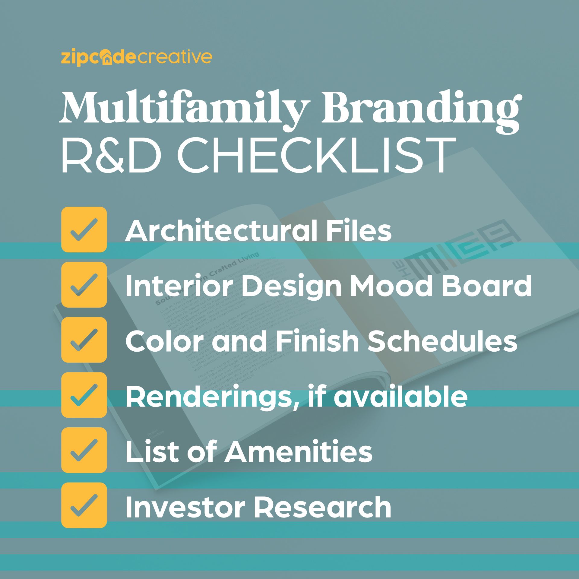
  • Architectural Files
  • Interior Design Mood Board
  • Color and Finish Schedules
  • Renderings, if they’re available
  • List of Amenities: (both unit amenities and common area amenities)
  • Pitch Deck/Equity Book/GEO Study: This investor research paves our way.

It’s like the start of a brochure. Or…a dating profile of sorts. Speaking of which:

BRAND PERSONALITY PROMPTS

Play a quick game of Get To Know Your Brand, with a few prompts to give you a stack of personality traits to weed through (Maybe 20-30). Mark up your favorites (5-6) and now you have a handful of your top personality traits—perfect for providing direction to your marketing team and branding providers and graphic designers (us)!

  • On a first date—how does your brand act?
  • At a cocktail party, what’s your brand wearing (outfit and attitude)?
  • If your brand had a dream home, where would it be? Country? Top-floor Penthouse? Yacht?
  • When your brand feels totally comfortable, how does it interact with others? Shy? Introverted? Outgoing? Extroverted?
  • What’s on your brand’s “bucket list”?

Every one of these Dating Game-style questions help us to get to know your brand a little better. See the style, the passion, the goals, the priorities, and the values. Plus, it might be the most fun you’ll have in the midst of your apartment brand research and discovery phase.


OUR BRAND QUESTIONNAIRE

Our favorite questions to ask of apartment brands are similar, but a little bit more pointed, to get you thinking hard about what’s most important to your brand’s success. Every one of these questions helps us cut to the chase—to see the inner workings of your brand now, or your eventual, aspirational brand. See more of our brand questionnaire here.

Zipcode Creative Provides Apartment Brand Names

We’re the Jacques Cousteau of apartment brand names—we take a deep dive so you can enjoy the wonderful treasures of a clearly and cohesively named apartment community: more signed leases, and higher resident retention rates.

We work to cover all the bases, so you can be sure that you’ve got a solid choice for a name. We’ll give you name concepts along with the logic behind them. We’ll search for meaningful inspiration for the name from the project, the locale, the company, or the owner. We’ll also research the name for viability of use in these areas:

  • US trademark search
  • Online reputation search
  • Website domain availability
  • Social handles availability (IG, FB)
  • Digital impact (SEO)


Imagine if you’d picked out the perfect name, but there were 0 social handles available, and all the good website versions of the name were used up! You’ll also want to make sure that every bit of energy you’re putting into the name doesn’t land you in a tough SEO spot—competing with a lot of other “Aston apartments” search results, for example.

Along with these services, we give recommendations for best choices among the name concepts we provide you and answer any questions you might have. There’s so much to a name—and plenty of research is par for the course. For good names, anyway.

Through hiring a pro team of researchers, designers, copywriters, and marketers, (hey, like us!) you’ll be able to confidently proceed with your brand strategy (and name)!
Color Psychology: Selling a Feeling to Lease Units

Whether you realize it or not, you have an unconscious reaction to every color you see. Color is a powerful way to subtly affect someone’s perception, making it a useful tool for companies looking to refresh and reevaluate their branding. Instead of choosing colors at random, leverage color psychology to make more strategic decisions and develop branding that makes the right impression. You’re not selling units, you’re selling a feeling with your apartment branding – or at least, you should be! 

What is Color Psychology? 

Color psychology is a brand of psychology that analyzes how colors impact human moods and emotions. This discipline has determined that each of the main colors on the color spectrum has a distinct set of associated feelings and perceptions.

Color Psychology_Black

BLACK

Black is perceived as a bold and powerful color. It also evokes sophistication, mystery, and sadness.

Color Psychology_White

WHITE

White is considered a very pure shade. It also is associated with peacefulness, cleanliness, and simplicity.

Color Psychology_Red

RED

Red is commonly associated with strong emotions, including love, passion, and excitement. It is also sometimes viewed as the color of anger or dominance.

Color Psychology_Blue

BLUE

Blue has a wide range of emotional reactions. Some view it as a calming or wise shade, while others feel inspired, stable, or peaceful.

Color Psychology_Green

GREEN

Green is often associated with nature and growth. It also evokes optimism and good luck. 

Color Psychology_Yellow

YELLOW

This bright and bold hue conveys feelings of energy, cheer, and warmth.

Color Psychology_Purple

PURPLE

Purple has long been considered the color of royalty. It’s also associated with imagination, wisdom, and rarity.

Color Psychology_Orange

ORANGE

Similar to yellow, orange brings out feelings of enthusiasm and happiness.

Using Color Psychology to Build Color Palettes

Choosing the right color to represent your apartment community is a pivotal decision. Spend time deciding which traits and characteristics you want to be associated with your brand, and pick the hue that best lines up. If you’re unsure of what shade to use, consider pulling colors from your community’s interior design mood boards. This will help create an even more cohesive look across physical and digital spaces. 

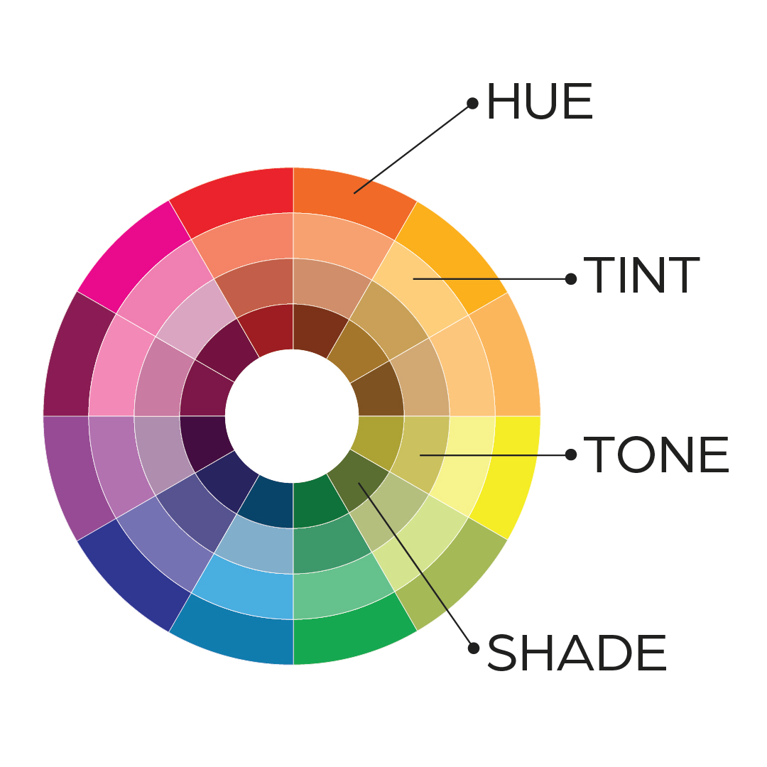
After choosing your primary shade, you’ll also need to build a color palette. Leveraging differences in hue, tint, tone, and shade can help create a well-rounded, multidimensional palette that is versatile enough to work with all of your marketing needs.

Color Psychology_hue-tone-tint-shade

Hue

Hue is the purest form of a color. 

Tint

Tint is the pure hue mixed with white to produce a lighter version of the color. For example, mixing purple with white results in a lavender shade.

Tone

Tone is the pure hue mixed with gray to produce a muted version of the color. For example, mixing green with gray creates a silvery, sage green hue. 

Shade

Shade is the pure hue mixed with black to produce a darker version of the color. For example, mixing blue with black creates navy.

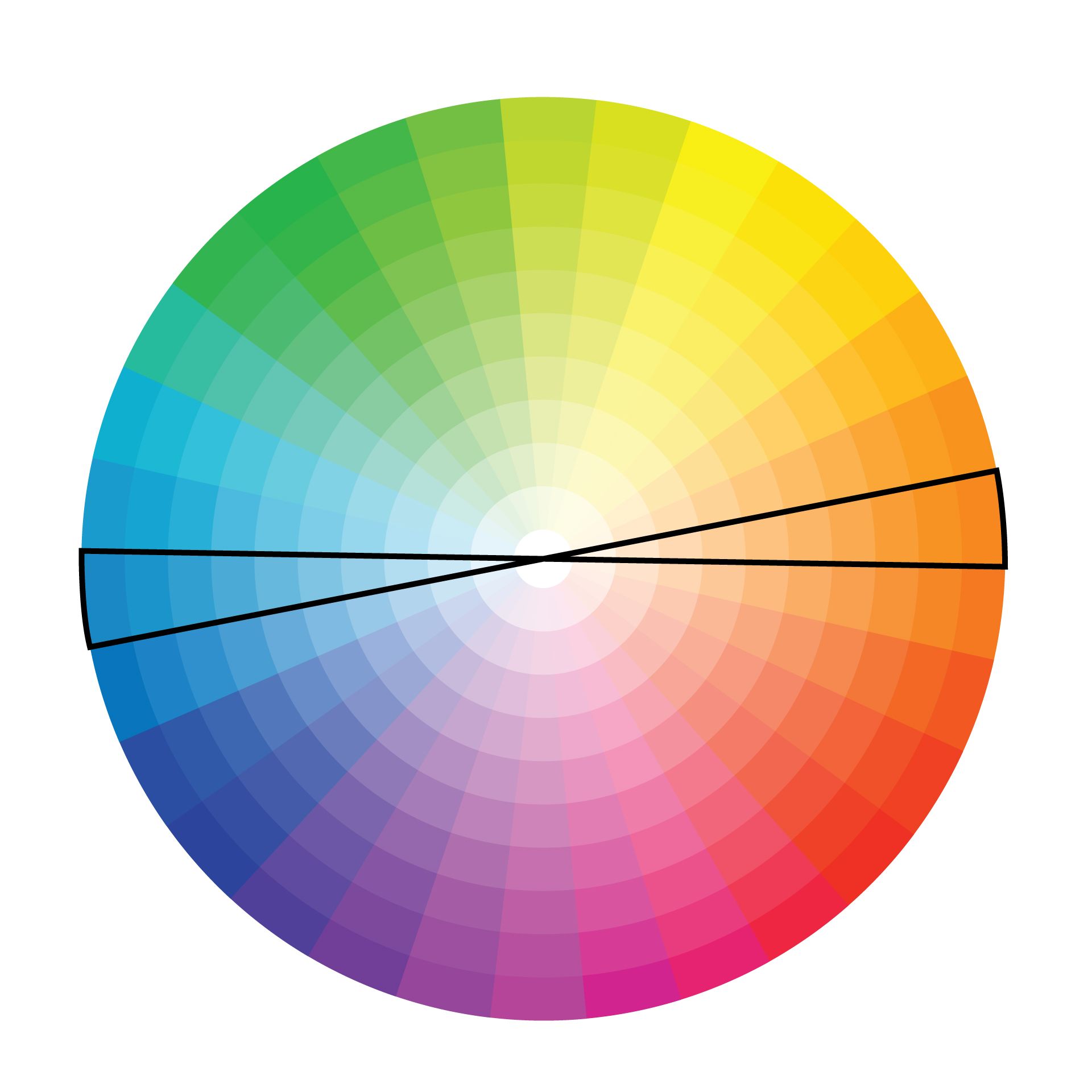
Creating variety in hue, tint, tone, and shade will create a monochromatic palette that gives you the perfect shade for every use case. You can also incorporate a contrasting, “pop” color that will highlight important elements of your design. Consider picking a color opposite of your primary shade on the color wheel to make it stand out. 


If you’re having trouble deciding on your primary color or creating your color palette, branding experts like zipcode creative can help. As experts in apartment marketing, we can create a cohesive color scheme that represents your brand and sends the right message to prospective residents. We can even help you translate your chosen color palette across all of your marketing materials for a unified look. Get in touch today to learn more!  


Brand Voice for Apartments: What It Is and How to Use It

What is Brand Voice for Apartments?


DEFINITION

Show your brand through words. Connect to your audience. Bring in your:

  • Personality: through tone; your
  • Style: through descriptions; and
  • Clarity: through explanations. 


Brand voice for apartments is the hidden string that ties your content together, to create a seamless, connected experience across channels and all content (and all verbal identity pieces). Brand voice brings your multifamily brand to life through words, and is one part of the full verbal identity. There’s that phrase again: verbal identity—keep reading if you’re wondering what that is.

PARTS OF THE VERBAL IDENTITY

You’ve heard of visual identity. Maybe. That’s what a brand looks like. The verbal identity is what it sounds like: words, content, messaging.

Brand Statements – What you do and why (and why you’re so special).
Brand Voice – We just told you, but no worries: it’s how others hear you and perceive you in written word.
Brand Tone – This is how you say it, depending on the occasion or the audience
Brand Story – This is the behind-the-scenes, get to know us for real, part of your verbal identity
Brand Vocabulary – Semi-style guide; this adds different word usage rules—especially proprietary or made-up words, plus how you use grammar and punctuation, and what’s off limits or definitely discussed in your content.

More Important Than The Logo

The logo seems important. It absolutely is. You’ve heard us say this before, but it bears repeating: Your logo can’t do everything for your brand. In fact, brand voice is more important to your apartment community because it is directly communicating your brand to your current and prospective residents. 


BRAND NAMES ARE KEY

The part of your brand voice that tops the list of importance here: apartment community brand names to accompany that logo. While both are essential, the name holds more importance. Here’s why…

  • The verbal identity (the apartment name) informs the visual identity (the logo design)
  • Words can create imagery that speaks volumes
  • A good name with a bad logo is painful
  • A bad name with a good logo is absolutely tragic

Bring them both together, and you can thoroughly explain who you are, define first impressions, form brand recognition and leave a lingering flavor. The question you most need to answer when you’re creating that brand voice is: What do you want your communities to “taste” like?

This can be done through brand personality choices that are portrayed through your voice and in your tone.

Brand Voice vs. Brand Tone vs. Brand Style

What’s the difference? It’s subtle. But it’s there. 


BRAND VOICE

This is what your brand talks about. It’s your brand, through words. Brand voice is what you always use to relay the core, most foundational aspects of your brand—the soul (through your mission, vision, and values.) It’s consistent and reliable. It tells your audience who you are, what you do, what you believe, what we stand for, and what you have to offer.

BRAND TONE

Brand tone is how you say things. It can vary based on the audience, the channel, and the subject. Brand tone allows you to ramp up emotion or connect on a deeper level with your ideal resident. Tone can keep your brand flexible in its verbal identity. According to Forbes, “When communicating, there is a necessary balance for brand voice to bring consistency and tone to create a relatable space.” Residents who relate are residents who remain in the community.


BRAND STYLE

Brand style is what the eyes (instead of the ears) take in. Up for a quick game of word association? Let’s go with “style.” We’d say “fashion, looks, couture, tailored.” Right? So, brand style is how the brand looks: logo, colors, fonts, designs, images. We use our eyes first—and that’s when the first impression comes in. And we love a good first impression. But that’s not the only bit apartment brands need.

VOICE IS OF EQUAL IMPORTANCE

Go deeper: Your brand voice counts just as much. After you grab the attention of your ideal residents with a sweet logo, then the viewer slows down to read just a quick headline, for instance. And these words can penetrate their minds more deeply and provide greater understanding of who your brand is and what you do. That’s if you’ve taken the time to create an engaging brand voice full of personality that will draw them in with useful, relatable content.

Where and How to Use Brand Voice

BRAND STATEMENTS

Use your brand voice in your brand statements. This includes your mission and vision statements. Your values. Your purpose statement, your brand positioning statement, and your brand attributes. Bring out the voice there and make sure it aligns with the personality traits you’ve identified as part of your brand.

BRAND VOICE FOR APARTMENTS

But how do you incorporate that? You’re going to have to write how people speak. Why do I have to write that way? Because that’s exactly who’s reading it. People. (And sometimes Google bots.) A quick test for this is to literally read your copy and content outloud. Does it sound natural? Does it sound like a conversation you could have with a friend? Most of all: does it sound the way you want your brand to sound—does it use the personality you’ve set aside for your exact brand? Here are a few personality spectrums to get you started:

  • Trendy vs. Classic
  • Casual vs. Elegant
  • Matter-of-Fact vs. Enthusiastic

BUDGET FOR STRATEGY AND COPYWRITING

Finally, are you putting enough weight behind your apartment’s brand positioning? We mean strategy and professional copywriting when you’re branding or rebranding an apartment community. (Wondering what makes a good apartment brand? Read this blog next.) If strategy and copywriting are not in the budget, get it in there now—it will be worth the amount you spend on it.

Pro-tip: When you get a professional copywriter (like the ones here at zipcode creative) make sure your strategy is clear. If you don’t have a strategy, get one. That will save you a lot of time when it comes to aligning all the copy around your super magical, one-in-a-million brand voice for your apartments.

Apartment Logo Design Best Practices

Designing a logo for an apartment community is vital to getting the visual part of your branding dialed in. The key is to make it good. But what does a good logo look like? What goes into the process of creating an effective multifamily logo? First, we’ll clear up some misconceptions around logos, then we’ll identify logo types and show you how to put your logo to the test to make sure you’re hitting the target with your next apartment logo design. (Or redesign!)

Logo Myths

MYTH 1: DIY IS EZ

With the advent of Canva and now Adobe Express, it feels like anyone can be a designer. That’s a little bit different from saying everyone can design something. When we hear apartment community managers say, “We can design it in-house” but they don’t actually have a designer, we get a little concerned. Putting text over a photo or selecting different colors or “move to back/front” layering actions are more accessible than ever. But will that apartment logo design look good? Will it stand the test of time? Even the logos that seem super simple are complicated in terms of design rules and what looks best. Heard of the golden ratio? Do you know what kerning is? Use a professional to get professional, longer-lasting results for logo design.


MYTH 2: MY FAVORITE COLOR IS THE BEST OPTION

You’re not your brand. So your favorite color could never…well, not never, but shouldn’t always be representative of what your brand is. Color theory is helpful in creating something that will stand out, and will align what you’re saying with what your residents are seeing. Think about what colors would make your residents feel. Class? Warmth? Elegance? Vivacity? (More on color usage in a bit.)


MYTH 3: FONTS ARE WHATEVER

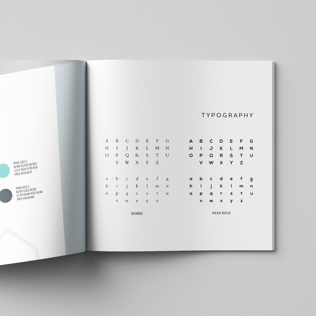
Font Psychology. Subliminal messaging. Emotional connection. Fonts are so not whatever. They are crucial to connecting the dots for your residents. Legibility and keeping with your brand’s personality are crucial to keeping your brand cohesive in its visual aspects to go with its verbal aspects (messaging and content). Beyond this, you’ll also have to figure out what kind of typography casing to use for your brand name when you’re in the midst of apartment logo design.

MYTH 4: I HAVE TO PORTRAY MY BIZ EXPLICITLY IN MY LOGO

There’s no rule that says you must show what your company does in your logo. You can if you want, but: Your name might hint at it. Your colors may give it away a bit. Maybe your font suggests some ideas about who you are and what you do. It’s okay to use your name and build your community brand so that your prospective and current residents know who you are without those added hints. Think: Saks Fifth Avenue. There’s not a shopping bag in sight in that logo. Not a clothes hanger. No hat boxes. Zero shoes. But people know what they do. You’re allowed to keep your logo simple. There’s no rule that says if you’re a flower company you have to dot your “i” with a daisy. Cute, but not required. Or maybe you have an image stand in fully for your logo. That happens, too.

Logo Types

Logo-Types_Apple

IMAGE MARKS

Take an image of something and super simplify it—now you have an image mark. Apple is a good example of this. They don’t even need their name on their products anymore.


Logo-Types_Pepsi

ABSTRACT MARKS

Take a big idea and boil it way down. Make it into something representative of that idea—but don’t use an actual recognizable object. Voila! An abstract logo mark. Pepsi has one of these—started one way and started getting boiled down over the years.

Logo-Types_Saks-Fifth

WORD MARKS

Remember Saks Fifth Avenue? There’s nothing to it besides a scrolly, swirly script that overlaps with itself. No pictures. Simple as that. If you consider a script font, simple, I guess. Another big one? Facebook. No symbol. Just the word in a very particular typographic style. Instantly recognizable. A bonus point for facebook: They could put just an “f” on a blue square and folks know what it is.


Logo-Types_Burger-King

BADGE MARKS

The word and the image are one—image and brand name work together to create one thing: a badge. Burger King craftily combined their name with a bun—their name is the meat. These are tricky to do, but simplifies things when you get to creating branded gear—really only one option and it covers all your bases.

Logo-Types_McDonalds

SYMBOLIC LETTERFORMS

That “F” from Facebook is a type of symbolic letterform. That’s when a letter is stylized and designed to convey a certain message—McDonald’s “M” is another example. Those golden arches can be spotted miles away. Think what that could do when you bring that energy next time you’re designing a logo for an apartment community.

SMART LOGO EXAMPLES

Some brands had logos designed that contain hidden messages or meanings that aren’t apparent at first glance. 

  • FedEx has an arrow.
  • Beats by Dre—is a “B” but also depicts a profile of headphones on a head. What?!
  • Amazon has an arrow that runs from A→Z. Which feels fitting.

Not every brand needs to come up with something this clever, but we’d be remiss if we skipped over these awesome examples of simplicity combined with smarts in logo design.

Test a Logo Design

Designing a logo for apartment community isn’t one and done—it takes time and tests:


LOGO TEST #1: SIZE

Make it small. How does it look? Make it big. How does it look? Is everything still sharp? Readable? Identifiable? You’ll need to be able to resize your logo without losing the overall clarity or making things unreadable.

LOGO TEST #2: BLACK AND WHITE

This is a structure and shape test. How does it look when it’s black and white? Can you still recognize it? Does it still look pretty good in black and white? Some designers even start with the design phase in black and white for better overall visual alignment before they introduce color. Color cannot save a bad design. An additional bonus: Your brand guidelines will likely call for a one-color logo, so you might as well have it handy anyway! (Bonus: if you’re ordering swag, it’s cheaper in one-color.)

LOGO TEST #3: VERSATILITY

Can this logo go on everything—absolutely everything—and still look good? A hoodie? A brochure? A hat? A sign? A photo overlay? Think of every possible brand asset and make sure it will work—easily. Having a variety of logo marks also helps: type only, logo mark only, and a combo.

LOGO TEST #4: FEEDBACK LOOP

Ever stare at a word so long, it starts to look misspelled and weird? Designing logos for apartment communities can have that happen, too. Bring in the feedback loop: test it with a small audience to get opinions and fresh eyes on it. They’ll see things you don’t—we promise.

Bottom Line with Apartment Logo Design

THE WORTH OF A LOGO

Logo design is not the place to cut your budget. Find a good designer. Look at brands that inspire you. Create a logo that will last and will complete your brand: not as the foundation, but more like glue, bringing it all together in one tidy package to show who you are visually. A professional designer—like zipcode creative—can do exactly that. If your goal is to market your communities well and lease up your building, apartment logo design should not get the short end of the stick. Give it time, give it energy, give it attention.


Beyond that: You’ll have to look at it every day. Make it pretty. Make it good.

Using Storytelling in Multifamily Branding

We’re all for using storytelling in multifamily branding. So many brands (beyond apartment communities) are already focused on telling a compelling story to connect with their audience emotionally. Maybe this is through the brand’s history, values, or mission, through a marketing campaign, or by highlighting the people behind the brand. But the multifamily branding market has so many good stories to tell; it’s time to put them front and center. 

 Let’s start designing brands with better storytelling as a focus (to help prospective residents visualize living at your community). But how? A couple of different ways:

Identify Your Audience

THE AUDIENCE MATTERS

Think of it in terms of telling a joke. You have to know who you’re talking to, and what they’ll understand—generationally, culturally. As for content and brand voice, think through their problems. Their fears. Their goals. Their desires. Bonus points if you can think forward to desires they don’t even know about yet.

REACH YOUR IDEAL RESIDENT PROFILE

Build up your appeal visually and in your content: Apartment branding should speak to the community’s Ideal Resident Profile (IRP) both with voice and visuals. But who is that?

The IRP is determined based on data driven target audiences, user personas, and current resident demographics to identify the ‘who’ your branding is appealing to. Remember: The IRP doesn’t have to be one type of person, it can identify multiple people or have variations of a persona. The IRP shouldn’t exclude or discriminate against any protected classes, but rather it paints a picture of who is most likely to become residents at a given community.

You’re Not Selling Units, You’re Selling a Feeling

Think through what tops the list of your residents deepest desires. When you determine that, you can write a story that solves the problem, offers a solution, or satisfies those deep desires—all emotional benefits alongside your very real, tangible offerings of homes and apartments and community. Bottom line: Serve, don’t sell. Or, if you must “sell”—sell a feeling.

Here’s what we mean:

EXAMPLE
Allison leases a two-bedroom apartment. But actually, she’s leasing her first home away from home. But then, she’s leasing a space to offer guests when they visit her. She’s also leasing the feeling of joy in hospitality. And maybe she’s leasing some sense of independence when she buys things to make her apartment feel homey. Or the independence that only comes from leaving home, knowing that she’ll find community in the welcoming neighbors surrounding her.

The example above included zero amenities. And certainly not in a list format. Sure, amenities could be part of another story, but this one is one of independence. Branding should be so much more than looks and descriptions of amenities—it’s knowing your audience and serving their wants, needs and desires. Now, how to do it.

Storytelling Techniques

IDENTIFY KEY ELEMENTS

Of the brand story, that is. Think of the “we’ve always done it this way” crew—challenge it. Figure out what issues surround things staying the same. Figure out a way to work around it and re-work it completely, to the benefit of your residents. Now you’ve just identifies the key elements of a brand story:
1) Status Quo
2) Conflict
3) Resolution

CREATE A NARRATIVE ARC

If you want to get a little more literal, we can go by the book:
Exposition. Rising action. Climax. Falling Action. Resolution. Happily Ever After.

You get the picture. Think of using storytelling in multifamily branding more in terms of books or movies. Set it up (but not for too long), create a sense of urgency, hit them with some intensity or problems, bring it to the heights, and then resolve (obviously with your community as the solution).

STORY TYPES

Not every story is for every audience. But there are four main story types you can use to reach your audience. Each one serves a slightly different purpose:

Value – This tells the story of what your community offers to a future resident; how it will change their life.
Founder – This tells the story of the company’s beginning—who started it, who’s running it (makes it personal)

Purpose – This is the “big meaning” you portray, and helps bring your staff/company together around values.

Customer – This is what it means to a specific resident that found your community and is now living their best life—thanks to your multifamily community.

Use these four types for bringing storytelling into multifamily branding—and portray your brand through and through. In fact, one of the questions we suggest you ask yourself before a rebrand is: “Are we telling the right story—the story we want to tell?”


BRING THE STORY TO LIFE

Details are your BFFs for this. You need to bring in these four pieces of detail that will get ‘em every time:

  • Specific, relatable characters
  • Real emotions
  • Specific time or moment
  • Imagery and descriptions

Without these details, your story doesn’t feel quite real. Add in details to paint the picture you most want to convey and your audience will “get it”. Especially if they’re an audience you’ve already identified…

Why Storytelling Works

SHIFT THE FOCUS

Storytelling in apartment branding is a different approach. It’s a mindset shift.
You’re not leasing vacant units, you’re ______________

  • Providing a fresh start for a young professional
  • Opening doors of stability for a young family
  • Creating a sense of independence for a student
  • Surrounding the oft-lonely with community

USING STORYTELLING IN MULTIFAMILY BRANDING

Where should you use these stories—and how is it woven through your brand? Brand storytelling can be key to your marketing efforts, but you have to be consistent:

  1. Build Trust – through honesty and behind-the-scenes stories
  2. Don’t Sell – solve problems instead
  3. Identify Value – show them how you make their life easier
  4. Paint a Picture – give them an idea of what it would be like to live there!

Conclusion

If you’ve gotten this far and you’re still asking: What is the point of using storytelling in multifamily branding? 

It’s to connect. To make things real. To be memorable. To rise above the competition and offer something of substance—not just things, but feelings.

Font Psychology and Identification for Apartment Brands

While selecting fonts many seem like a straightforward, easy choice, the opposite is true. Typefaces an integral part of any design, making them a decision that needs to be made with thought and care. But with hundreds of thousands of fonts to choose from, it can sometimes be a daunting choice. How do you choose the best font to convey not only your message but also more about your brand? Learn more about font types, font psychology, and how to pick the right font for your apartment marketing design.

What is Font Psychology?

Each font and typeface conveys a message—whether you intend it to or not. Subconsciously, your reader will draw conclusions about you and your brand just from your font choice. Choosing fonts strategically based on their innate characteristics can help you hit home your message even more clearly. 

Certain font families are associated with certain traits, which can help you narrow in on your choice.

Serif

Serif fonts are defined by the small stroke attached to the end of the larger stroke in each letter. Commonly used serif fonts include Times New Roman, Georgia, and Garamond. These fonts are considered quite traditional and tend to convey a more formal tone. They are also associated with sophistication, trustworthiness, and respectability. 

Serif fonts are often used in long-form text like books, magazines, and other printed materials because they help improve legibility—especially in smaller font sizes. They may also be used in more creative assets, like brand logos, that align with the fonts’ traits. 

Sans Serif

Sans serif fonts are those that do not have serifs, the small stroke attached to the ends of each letter. Common sans serif typefaces include Arial, Helvetica, and Calibri. These fonts have a more modern aesthetic and are considered more straightforward, efficient, and simple. 

Sans serif fonts are more common in web-based and digital assets, like websites, blogs, social media, and PDFs. It’s also best for spaces where there is short copy, like a headline, subheadline, or caption. Like serif fonts, they are also often used in branding elements like logos. 

Script

Script fonts are designed to mimic cursive handwriting. They are usually more fluid, with letters connecting in elegant strokes. This sophisticated style is often associated with creativity, whimsy, and happiness. 

Because they are harder to read at a glance, script fonts should be used sparingly and only in places where there are short lines of copy, like a headline or tagline. They have also become popular for brand logos because they stand out easily.

Decorative

Decorative fonts are very unique and were originally designed for advertisements like posters. These typefaces were designed only for decorative purposes, so like script fonts, should be used sparingly.  Decorative fonts, like Cooper Black or Gazpacho, are original, quirky, and fun compared to the other font types, making them perfect for headlines, titles, and logos

How to Choose the Right Typeface

Understanding the different font types and what they communicate is important to ensure you can choose the font that fits your brand. It also allows you to more effectively partner with your graphic designer or creative agency partner when making font choices. 

Serif, sans serif, script, and decorative fonts all have a time and a place based on the message you want to portray and the audience you’re speaking to. When choosing a font, ask yourself the following questions:

  • Does this font match my brand’s spirit and personality? 
  • Is the font legible and easy to read?
  • How many other fonts will this be mixed with?
  • Do this font’s traits align with my audience’s? 

Answering these questions can help you narrow down the right font for every situation. But if you’re feeling unsure, a seasoned creative agency like zipcode creative can help you identify the fonts that are the right fit for your brand and ensure that you’re mixing and matching them in the best ways to bring out your personality and resonate with your audience. Font selection is always part of our brand style development process!