Leasing Agents Onsite and Multifamily Branding
Stacey Feeney
What does multifamily branding have to do with leasing agents onsite? Loyalty built on trust built on recognition. Your branding has to be dialed in for that to happen. Where does branding show up for onsite leasing agents? Marketing collateral, signage and any printed hand out given to prospects and new residents.
Leasing agents onsite have a fair amount of DIY to their job. There are tons of pieces and plenty of marketing collateral that rely on strong branding. If these pieces aren’t consistent, the multifamily brand can lose out on brand recognition, trust, and loyalty.
Let’s break it down by the process of lead to lease. Every step in the leasing “funnel” has something to do with your ability to maintain brand consistency.
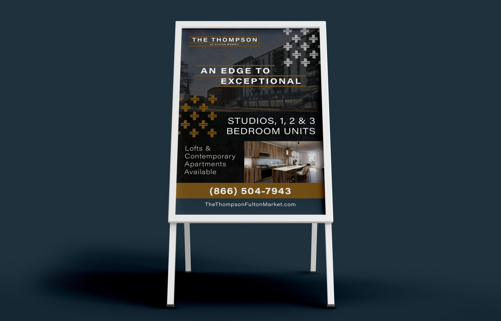
Start with Signage
This is your first chance at a good impression. Leave a good one. Signage should reflect your brand with its colors, font choices, and messaging.
WALK BY OR DRIVE-BY
Curb appeal is a thing with multifamily communities as well. When someone walks by or drives by, they should know exactly what you’re offering, and what your style is.
DIRECTIONAL (LEASING OFFICE THIS WAY)
Make sure visitors can get to where they need to go. And ensure that the directional signage aligns with your other branded items, too. We don’t need any brand whiplash to happen as they’re walking to the leasing office!
INFORMATIONAL (ON THE INSIDE)
Clubhouse? This way. Leasing Office? Over here. Rules for the clubhouse? Here they are. Make sure posted rules, informational signage and other interior pieces look official, like they’re from the front desk. Easy way to do this? Use your colors, your fonts, and your brand voice to communicate all those rules.
SELF-GUIDED TOUR OF MODEL UNIT
Letting your prospects go on a self-guided tour? Ensure you have all your ducks in a row. Place table tents near special features. Put up framed designs that show off your smart home features, for example. Call out boutique countertops. Identify where the in-unit washer and dryer are located.
Next Up, Marketing Collateral
TOURING PROSPECTS
Your prospect has now told you they’re interested! Great. Now is the time to hand them an info packet. This will have your business card, brochure, a rack card, an amenity sheet, and floor plan sheets—either all in a branded folder, or clipped together. The beauty of this packet is seeing how everything looks all together. These collateral handouts are essential for the touring prospect sales process. It shows you have everything they need while you answer any other questions they may have.
P.S. If you’ve gone fully digital—that still requires great design! We can help make sure your designs for your floor plans and e-brochures are good to go, wherever and however they’ll be viewed.
WELCOME NEW RESIDENTS
“Welcome to our community, here’s our gorgeous welcome packet with maintenance contact, policies and procedures, and a little “welcome” note (on our very own branded stationery).” When you brand everything well, it just works. Again, this is one more signal to the resident confirming their correct choice in signing the lease. If done well, it helps answer any lingering questions, too.
Staying On Brand—Now That They’re Here
All this work to stay consistent isn’t just for prospects and future residents. It’s for current residents, too. Enabling loyalty through consistency and predictability can help your residents feel more comfortable renewing their lease and staying at your community.
If it’s not provided from corporate, use the tools that you have at your disposal to create items that work within your brand guidelines. Using Canva, you can upload your specific color palette, your fonts, and your logos to use in pre-made designs. If you’re rusty on your design rules, check out our post on the basics of multifamily graphic design here.
That—or you can hire a pro to help you with different pieces. Whatever you need, we can help. There are so many things that you’ll need design and branding on—and not just once, but every time you have a resident event!
RESIDENT EVENTS
You’re going to want to stick with your branding—even in the smallest ways—for any resident events you’re planning—and then advertising with flyers and email marketing. Place your logo in the corner, use some of your brand colors. A potluck, a pool party, an ice cream social—all of these should look like something you’re putting on.
ANNOUNCEMENT AND NOTICES
Speaking of being official—when you change the regulations around swimming hours, or if there is a planned water shut off for maintenance, ensure the letterhead yells “This is serious and official business” without yelling. Logo and proper colors will tell your residents just that however you are delivering the announcement.
SOCIAL MEDIA
Posting about resident events, planned water shut offs, and doing a few giveaways here and there? Again: keep it all on brand. Check in to see if corporate has created social templates that you can tailor—maybe an agency (like use at Zipcode Creative) has designed them. If these aren’t available (which are preferable) you may be able to use a program like Canva to create quick social posts and maintain your brand on Instagram and Facebook.
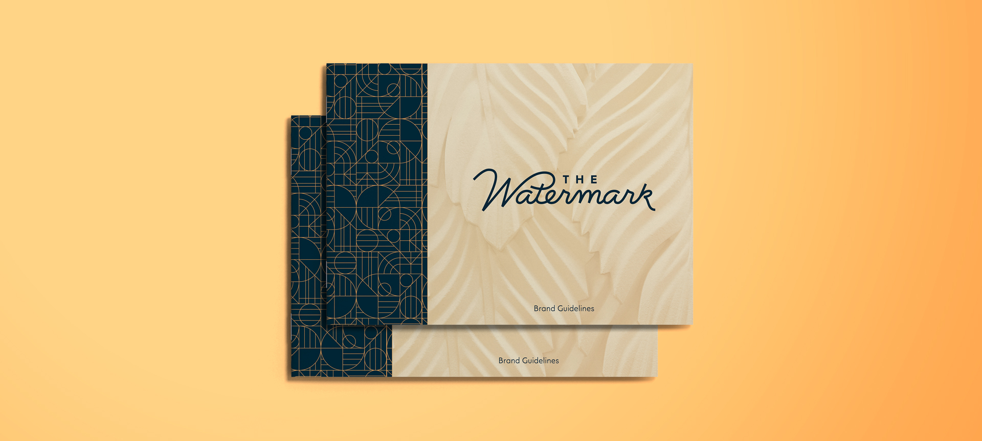
Last Thing About Brand Guidelines
You’re not a designer, but you’re expected to do a lot on-site. Sometimes it’s last minute. What are brand guidelines and what’s the best way to use them as an onsite leasing agent?
- Get comfortable with the use of your logo—the one-color, the logomark, or just the name. Of course, branding is more than a logo—it’s visual and verbal; try to understand both.
- The visual elements of brand guidelines will be used more than any other parts when you need to create something:
- Logo
- Colors
- Typography
- Imagery
We know as an onsite leasing agent, your job isn’t easy. But you’re the boots-on-the-ground guard of the community’s brand. Stay within the guidelines and you’ll reap the benefits.
