Apartment Logo Design Best Practices
Designing a logo for an apartment community is vital to getting the visual part of your branding dialed in. The key is to make it good. But what does a good logo look like? What goes into the process of creating an effective multifamily logo? First, we’ll clear up some misconceptions around logos, then we’ll identify logo types and show you how to put your logo to the test to make sure you’re hitting the target with your next apartment logo design. (Or redesign!)
Logo Myths
MYTH 1: DIY IS EZ
With the advent of Canva and now Adobe Express, it feels like anyone can be a designer. That’s a little bit different from saying everyone can design something. When we hear apartment community managers say, “We can design it in-house” but they don’t actually have a designer, we get a little concerned. Putting text over a photo or selecting different colors or “move to back/front” layering actions are more accessible than ever. But will that apartment logo design look good? Will it stand the test of time? Even the logos that seem super simple are complicated in terms of design rules and what looks best. Heard of the golden ratio? Do you know what kerning is? Use a professional to get professional, longer-lasting results for logo design.
MYTH 2: MY FAVORITE COLOR IS THE BEST OPTION
You’re not your brand. So your favorite color could never…well, not never, but shouldn’t always be representative of what your brand is. Color theory is helpful in creating something that will stand out, and will align what you’re saying with what your residents are seeing. Think about what colors would make your residents feel. Class? Warmth? Elegance? Vivacity? (More on color usage in a bit.)
MYTH 3: FONTS ARE WHATEVER
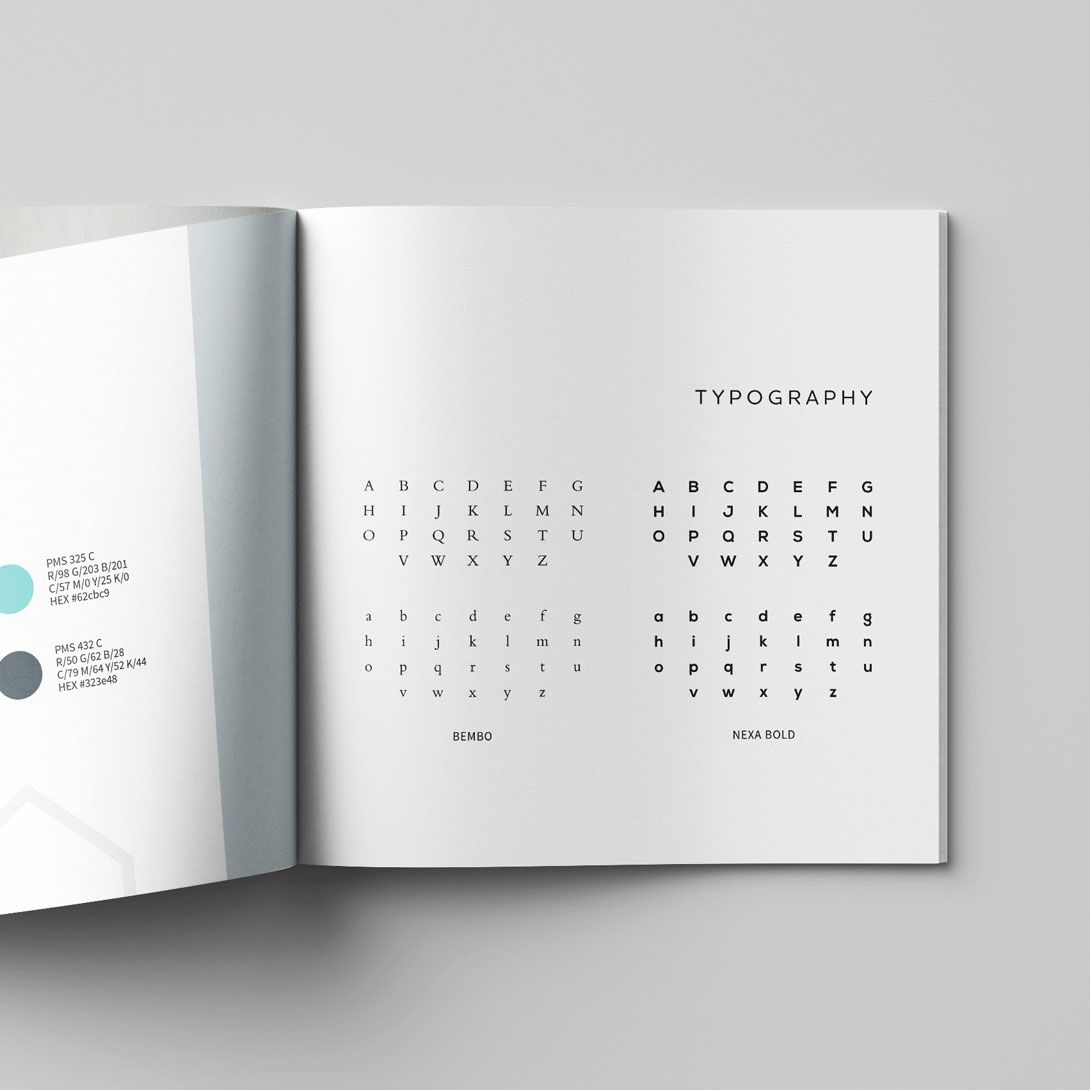
Font Psychology. Subliminal messaging. Emotional connection. Fonts are so not whatever. They are crucial to connecting the dots for your residents. Legibility and keeping with your brand’s personality are crucial to keeping your brand cohesive in its visual aspects to go with its verbal aspects (messaging and content). Beyond this, you’ll also have to figure out what kind of typography casing to use for your brand name when you’re in the midst of apartment logo design.
MYTH 4: I HAVE TO PORTRAY MY BIZ EXPLICITLY IN MY LOGO
There’s no rule that says you must show what your company does in your logo. You can if you want, but: Your name might hint at it. Your colors may give it away a bit. Maybe your font suggests some ideas about who you are and what you do. It’s okay to use your name and build your community brand so that your prospective and current residents know who you are without those added hints. Think: Saks Fifth Avenue. There’s not a shopping bag in sight in that logo. Not a clothes hanger. No hat boxes. Zero shoes. But people know what they do. You’re allowed to keep your logo simple. There’s no rule that says if you’re a flower company you have to dot your “i” with a daisy. Cute, but not required. Or maybe you have an image stand in fully for your logo. That happens, too.
Logo Types

IMAGE MARKS
Take an image of something and super simplify it—now you have an image mark. Apple is a good example of this. They don’t even need their name on their products anymore.
ABSTRACT MARKS
Take a big idea and boil it way down. Make it into something representative of that idea—but don’t use an actual recognizable object. Voila! An abstract logo mark. Pepsi has one of these—started one way and started getting boiled down over the years.
WORD MARKS
Remember Saks Fifth Avenue? There’s nothing to it besides a scrolly, swirly script that overlaps with itself. No pictures. Simple as that. If you consider a script font, simple, I guess. Another big one? Facebook. No symbol. Just the word in a very particular typographic style. Instantly recognizable. A bonus point for facebook: They could put just an “f” on a blue square and folks know what it is.
BADGE MARKS
The word and the image are one—image and brand name work together to create one thing: a badge. Burger King craftily combined their name with a bun—their name is the meat. These are tricky to do, but simplifies things when you get to creating branded gear—really only one option and it covers all your bases.
SYMBOLIC LETTERFORMS
That “F” from Facebook is a type of symbolic letterform. That’s when a letter is stylized and designed to convey a certain message—McDonald’s “M” is another example. Those golden arches can be spotted miles away. Think what that could do when you bring that energy next time you’re designing a logo for an apartment community.
SMART LOGO EXAMPLES
Some brands had logos designed that contain hidden messages or meanings that aren’t apparent at first glance.
- FedEx has an arrow.
- Beats by Dre—is a “B” but also depicts a profile of headphones on a head. What?!
- Amazon has an arrow that runs from A→Z. Which feels fitting.
Not every brand needs to come up with something this clever, but we’d be remiss if we skipped over these awesome examples of simplicity combined with smarts in logo design.
Test a Logo Design
Designing a logo for apartment community isn’t one and done—it takes time and tests:
LOGO TEST #1: SIZE
Make it small. How does it look? Make it big. How does it look? Is everything still sharp? Readable? Identifiable? You’ll need to be able to resize your logo without losing the overall clarity or making things unreadable.
LOGO TEST #2: BLACK AND WHITE
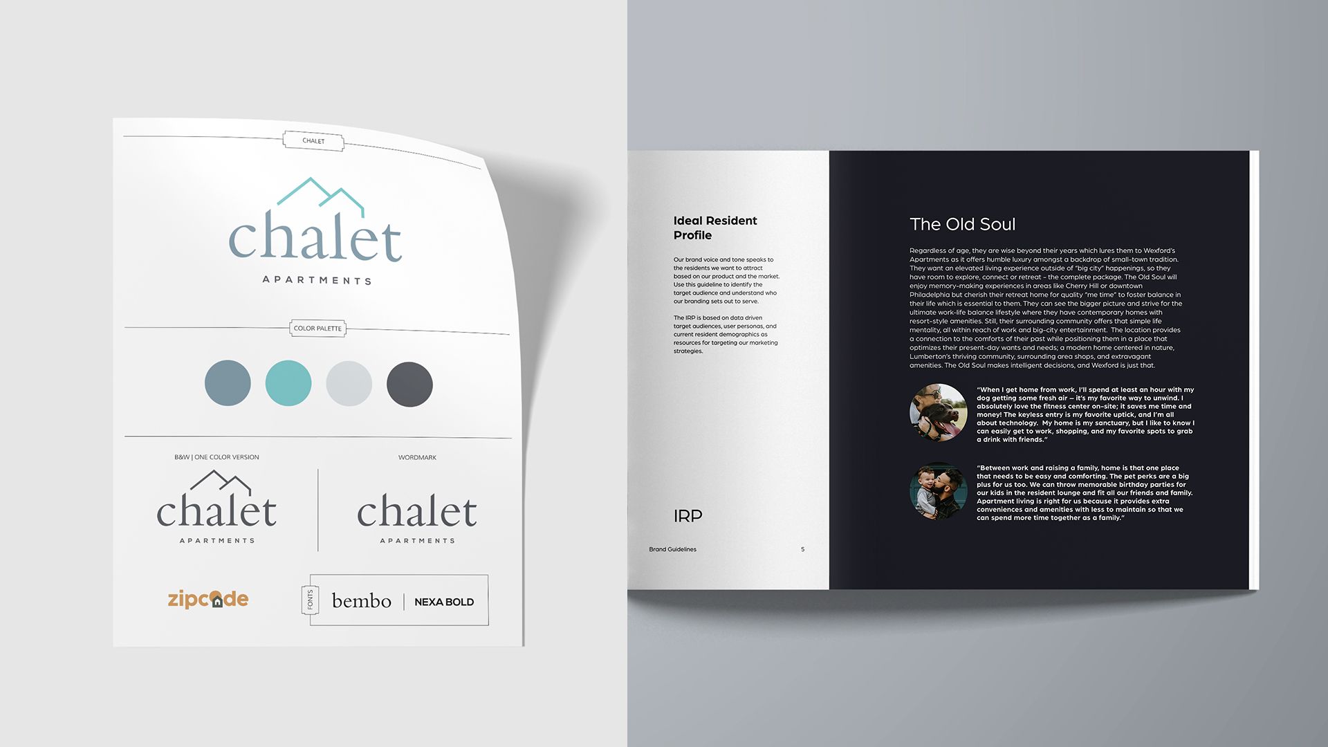
This is a structure and shape test. How does it look when it’s black and white? Can you still recognize it? Does it still look pretty good in black and white? Some designers even start with the design phase in black and white for better overall visual alignment before they introduce color. Color cannot save a bad design. An additional bonus: Your brand guidelines will likely call for a one-color logo, so you might as well have it handy anyway! (Bonus: if you’re ordering swag, it’s cheaper in one-color.)
LOGO TEST #3: VERSATILITY
Can this logo go on everything—absolutely everything—and still look good? A hoodie? A brochure? A hat? A sign? A photo overlay? Think of every possible brand asset and make sure it will work—easily. Having a variety of logo marks also helps: type only, logo mark only, and a combo.
LOGO TEST #4: FEEDBACK LOOP
Ever stare at a word so long, it starts to look misspelled and weird? Designing logos for apartment communities can have that happen, too. Bring in the feedback loop: test it with a small audience to get opinions and fresh eyes on it. They’ll see things you don’t—we promise.
Bottom Line with Apartment Logo Design
THE WORTH OF A LOGO
Logo design is not the place to cut your budget. Find a good designer. Look at brands that inspire you. Create a logo that will last and will complete your brand: not as the foundation, but more like glue, bringing it all together in one tidy package to show who you are visually. A professional designer—like zipcode creative—can do exactly that. If your goal is to market your communities well and lease up your building, apartment logo design should not get the short end of the stick. Give it time, give it energy, give it attention.
Beyond that: You’ll have to look at it every day. Make it pretty. Make it good.
