Brand Promise – The “Vows” of Your Apartment Community

What is a Brand Promise?

Everytime your brand shows up visually or verbally, there is a specific association with what your apartment brand offers as an experience to its clientele or residents. That’s the brand promise. Each time your brand messaging and visual representation show up, like an ad or a mailer, you’ve set up your brand to deliver an experience you have vowed (or promised!) to give residents…which they now know to expect.  It’s not always spoken or written—but it is a form of mission and values and the feeling that your residents get when they think of you. It will certainly come out in different ways through your verbal identity.

In short, it’s a public benchmark. It helps recall why you’re doing what you’re doing in the first place, sprinkled with what you value most.

I TAKE THEE, COMMUNITY

Brand promises can get tricky, though. Like a marriage vow, you might not want to go fully traditional—because that’s not unique or interesting, per se. However, if you write your own vows, things can go a little off the rails. 

Here’s some guidance for your brand promise that will have prospective residents flocking to your apartment community.

In Your Brand Promise, DON’T:


OVERPROMISE

When you overpromise and then subsequently underdeliver, that becomes an epic disappointment. It’s also a total misalignment of expectation versus reality. If you’re overpromising something, like “We’ll always make it right, no matter what” and then your service director or management staff aren’t trained with how to fix the problems at hand, you can count on a broken brand promise. Only promise what you can actually achieve—it’s not the time to be aspirational or overly inspiring. Be real. Be good. But don’t overpromise.


BE SELFISH

Wedding vows aren’t about the person speaking. Likewise, brand promises are not strictly about the brand itself. It’s what you offer. It’s what you’re promising as a service. Instead of being selfish, tell your residents what you can do for them. (A certain JFK quote comes to mind here.) Look outward instead of in, and you’ll have painted a better brand promise.


GO OVERBOARD WITH THE WORDS

Hey, here’s an idea! Make your brand promise easy to understand, read, and have it grab attention. Kind of like your other multifamily copywriting (if you followed our advice in this blog.) Don’t be flowery. Don’t be fluffy about it. Say what you mean and be clear. 


DO WHAT’S BEEN DONE

More word advice here. When you use phrases that have been seen before, they don’t offer the same weight or meaning. Your residents and prospects will skim right over it. So when you say “unique solutions” or “outstanding customer service” they hear “blah blah blah.” That’s a bad promise.


Instead, it’s best to keep the focus where it should be: On the resident

Watermark

In Your Brand Promise, DO:

HIGHLIGHT THE RESIDENT’S NEEDS

When you put the resident’s needs first, they feel drawn in. By subtly calling out your experience and differentiators, they don’t feel sold to, they feel their problem being one step closer to a solution. 

WRITE “THE STORY” TO FEATURE THEM

The resident is the main character. They’re the hero of your story. And your apartment community is just the tool to help them get what they want. Once you pull your brand out of the top billed credits, you’ll have a better shot at creating a brand promise that’s focused on the most important piece of the puzzle: The Resident.


BRING THE BEST WORDS

Break out the thesaurus and find a new way that truly underscores what you’re promising—the feeling that residents can expect whenever they interact with your brand. Using the right words helps shape perception and gives you a direction to go.

How does one do this?
Try this on:

Example: Our caring staff and beautiful grounds will help you feel at ease in your new home, so you can fully relax—your biggest worry will be what to wear to the community mixer each month.


Just like a mission explains what you do, which is mostly for internal use, a brand promise is outward-facing, to tell your residents what you’ll do for them every day of your existence. Don’t break the promise!

Your content goes here. Edit or remove this text inline or in the module Content settings. You can also style every aspect of this content in the module Design settings and even apply custom CSS to this text in the module Advanced settings.

Creating an Apartment Brand: The Secret Sauce

Look under the hood, pull back the curtain, call it what you want…we all want to know what’s behind the scenes of creating an apartment brand. Creating something that’s beautiful, memorable, and effective.

Let’s go step by step.

Brand Questionnaire

We’re asking the questions here. And the answers you provide in the zipcode creative brand questionnaire will help us catch the vision for your community’s brand or rebrand. Boxes for you to fill in with logo inspiration, color likes/dislikes, location of your community, and resident demographics give us the insight needed to work with you in achieving something spectacular.

Next up:

Client Creative Call

During a call with zipcode, you can expect to discuss your vision along with your “dos and don’ts” in regard to your ownership’s preferences—this last one is particularly important when rebranding your community. Sometimes a few things are rolled over for a brand identity, and it’s always better for us to know those specific requests up front.

In our conversation, we’ll get to know you a little more, and we’ll open it up to any questions you have about the process or about our thoughts. We’ll verbally summarize what we’ve heard, and what we’re going to do next. (We’ll be hitting the books.)

Research and Discovery

In the research and discovery phase, we get into the thick of it, and make sure you know who you want to reach, and which options would work best for your brand.

WHAT WE RESEARCH

Identify your ideal resident profile, and plan to market the heck out of it. Using geographic, demographic, psychographic, and behavioral patterns helps paint the picture of who we’re talking to. In addition to “audience” we also look closely at the community offerings in your area—we’re talking hotspots, attractions, and history. This all plays into the larger brand idea, too.

And let’s not forget competitors—knowing what you’re up against gives you the ability to meet what they offer, and then go a little further and set yourself apart in one way or another.

DIGGING DEEPER

When we dive into discovery, and start seeing the options, it helps narrow things down. Sometimes you have to chip away at something until the final idea is revealed. And then, the fine-tuning can begin.

Architecture – We love any architectural theme and style that can give us a hint of what’s to come. Branding that’s inspired by the physical building brings it all together, as though it was always meant to be.

Moodboards – If we can use the renderings and moodboards from the interior designer, fantastic. Beyond that, we’ll also create our own mood board to curate the look, feel, and, well, mood to fully capture your brand visually.

Parallel and Adjacent Industries – Looking at what others are doing is helpful. Do they have the same kind of ideal resident? How did they capture that resident with how their brand looks and feels? We also love to explore adjacent industries, like the hospitality industry—hotels make beautiful brands. The multifamily industry could learn a lot from exploring the depths hotels go to in creating an immersive brand experience.

Concept Time

Strike while the iron is hot, make hay while the sun shines, and design while creativity is flowing.

We always go to the drawing board when we’re in the flow, so we can work out concepts. Throw it all on the canvas and see what sticks. Sometimes you have to get through some less-than-good ideas to circle around and land on something great.

Brand Concept Presentation

WE MAKE THINGS PRETTY

We love this part. We take all of the pretty stuff we’ve made (in a beautiful slide deck) and present it. We include logo concepts, color palette concepts, and preliminary design elements, along with a hint of lifestyle stock curation.

VIBES FOR DIRECTION

After we show the pieces, we sit back and allow the vibes and visuals to speak for themselves. Nothing new-agey here, we just think it’s great for our clients to be able to marinate in the concepts and then converse with their own team after our meeting. That way, when they come back with feedback, they have a clear picture on the direction that feels right for their brand. It’s always fun to hear what clients have landed on!

Final Brand Style Development

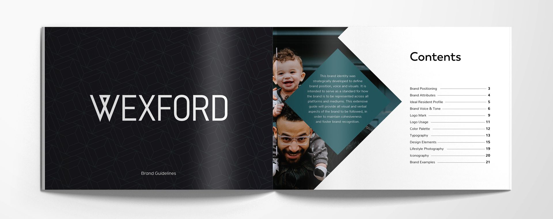
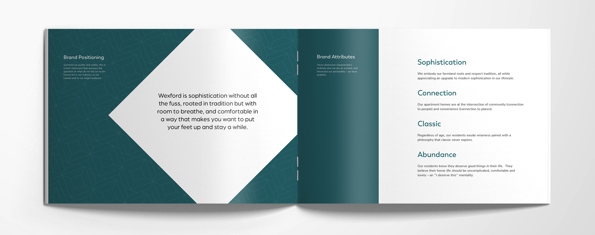
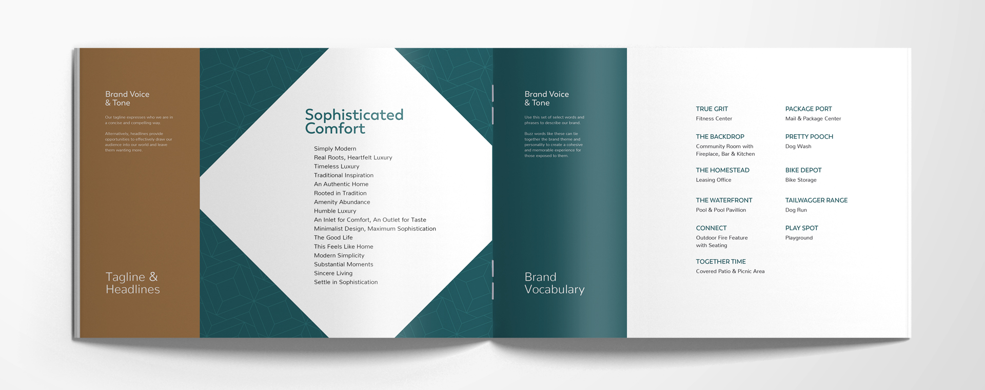
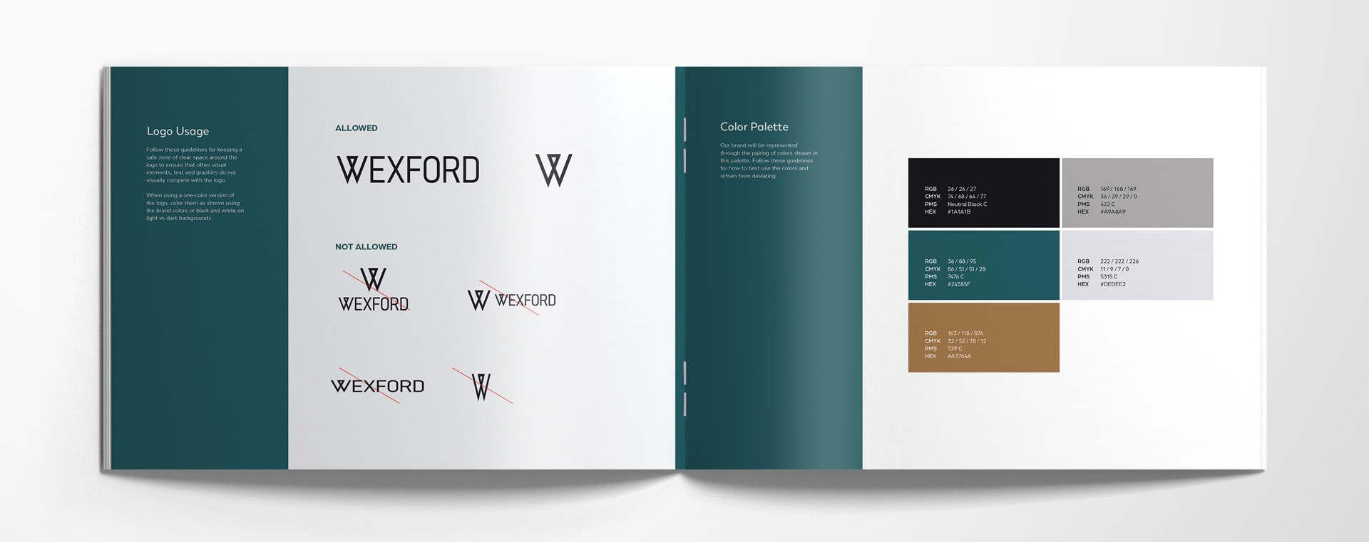
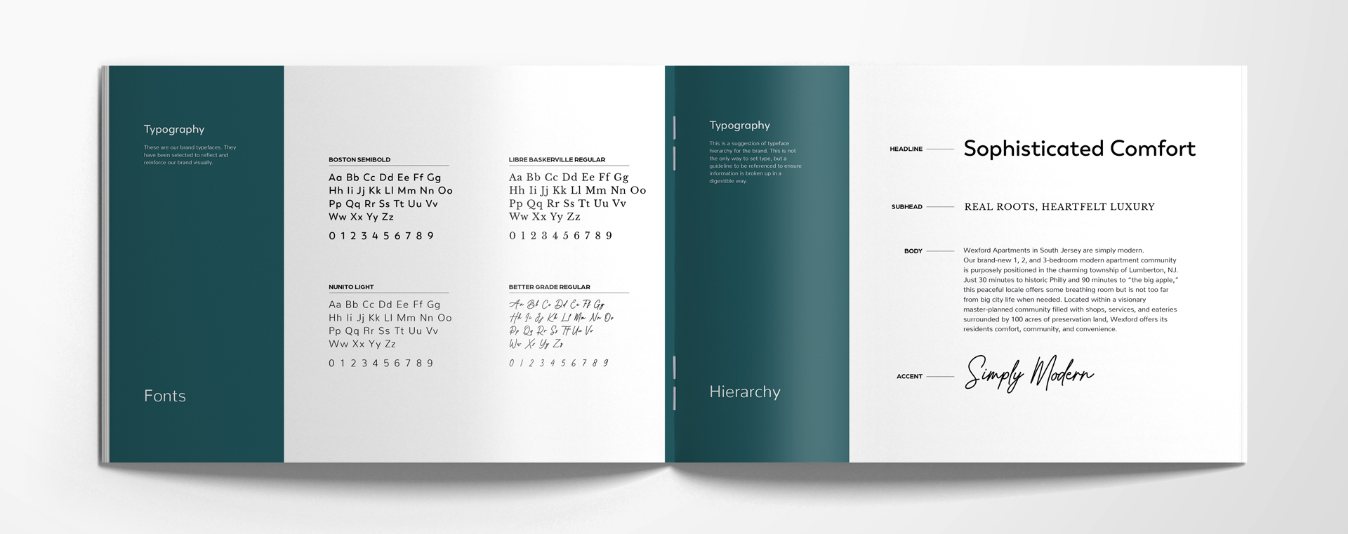
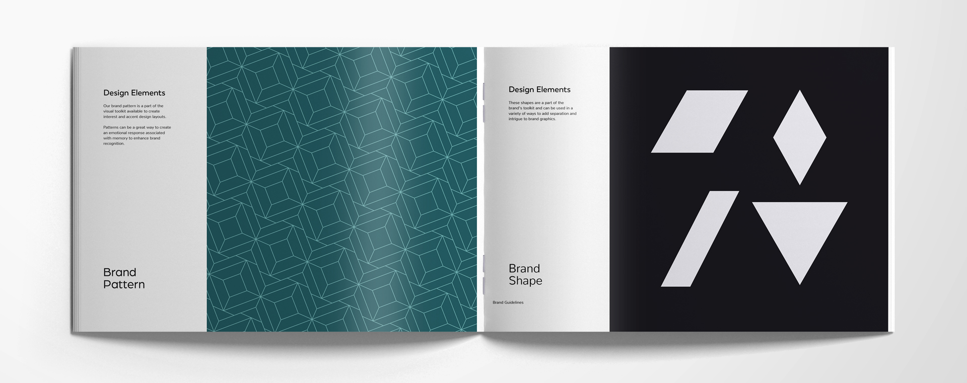
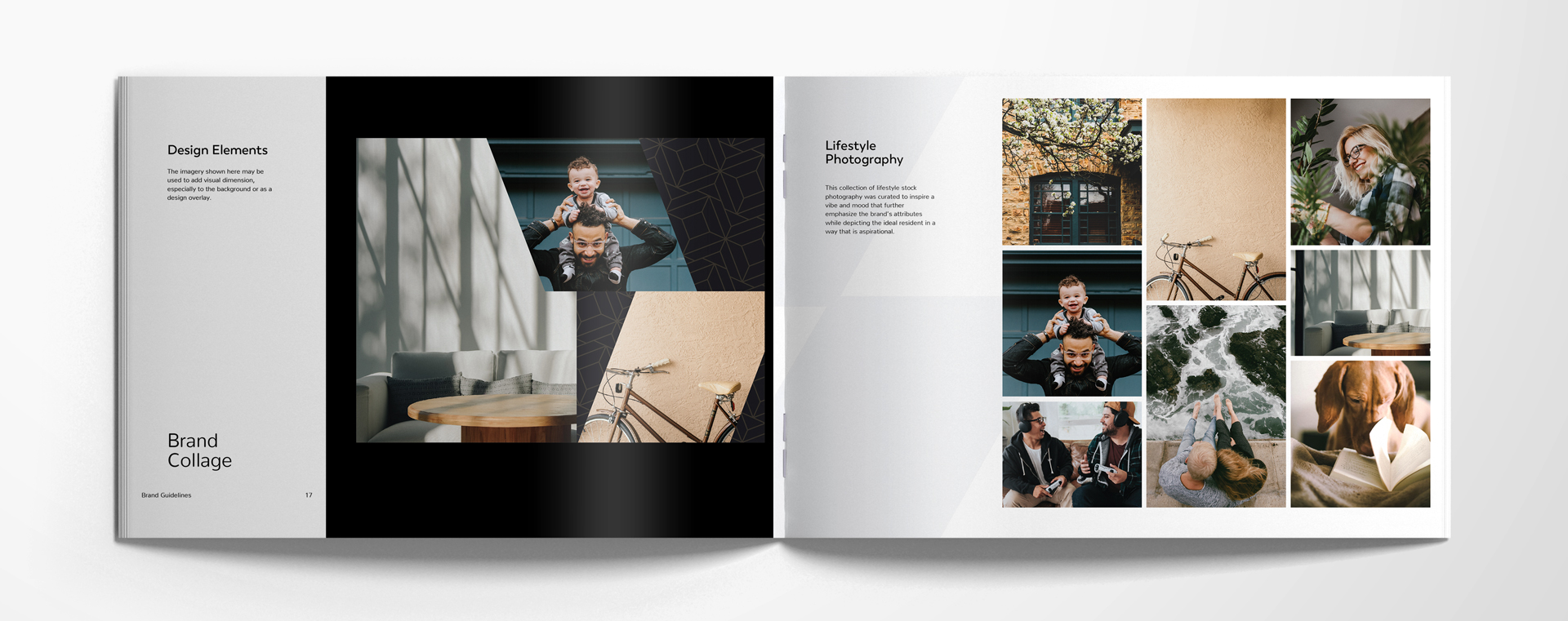
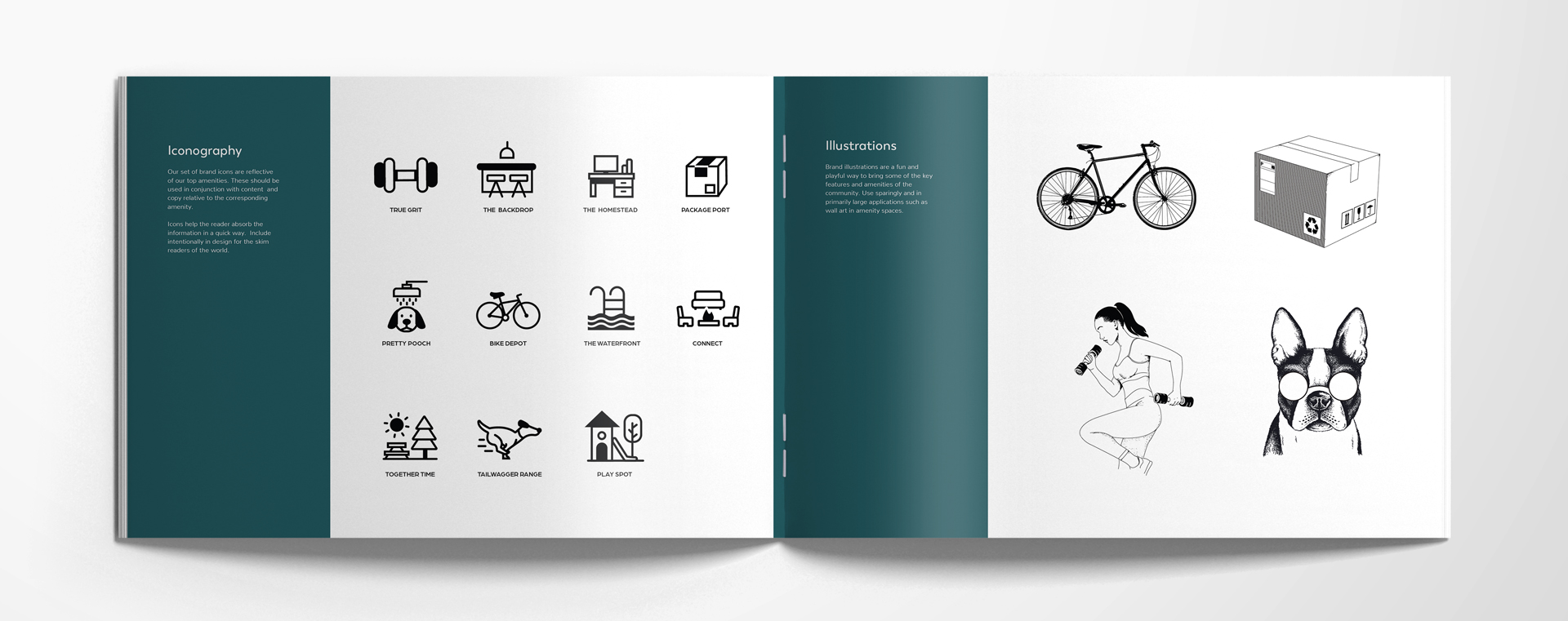
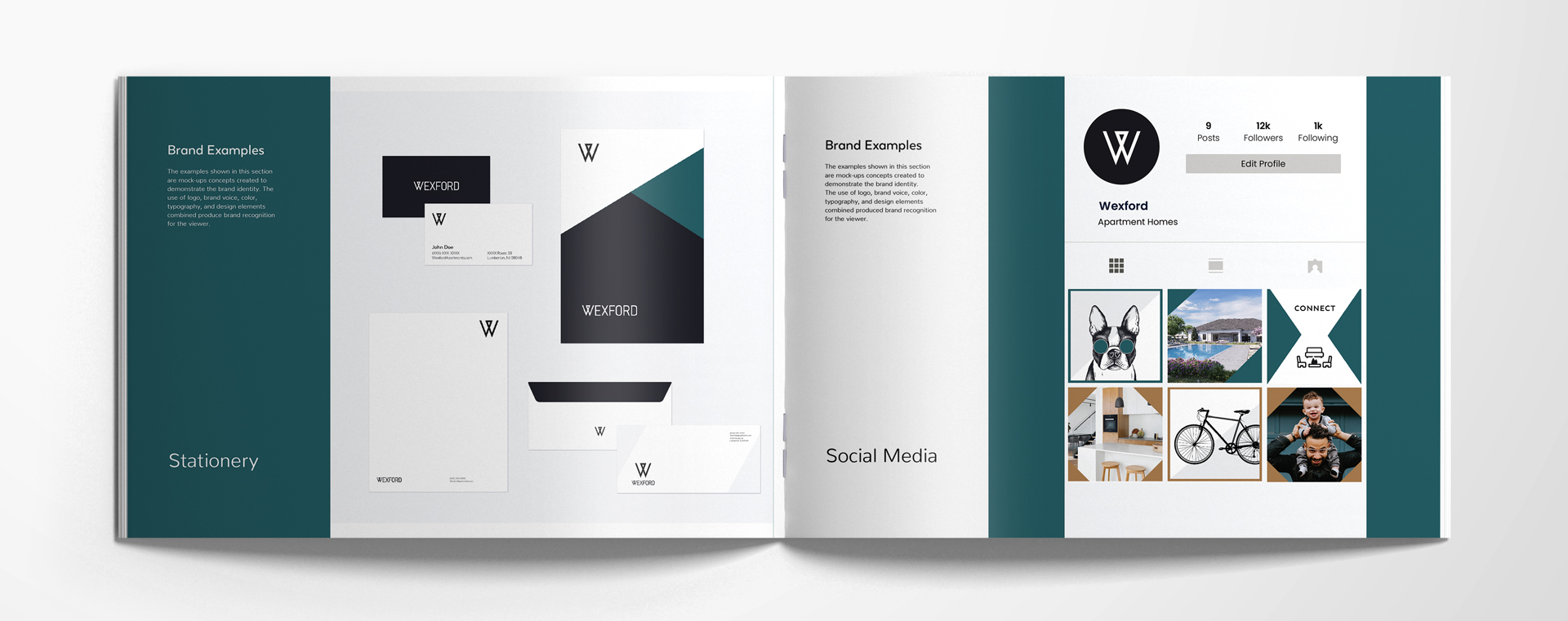
Last step: When clients come back and tell us the way they want to go, we put the car in drive. We take the agreed-upon direction, and we expand on it to source the full library of corresponding lifestyle stock imagery, bringing the patterns, shapes, textures, stamps, graphics, and logo variations to life. We take it all, package it up, and create a full brand style guideline. Check these brand style guidelines we’ve recently created.

New Construction Lease-Up Branding and Marketing—By Development Phase

Four phases of development directly inform how we handle our new construction lease-up branding and marketing. 

The logic behind this? It’s optimal to align your apartment community’s branding and marketing with construction—because that’s what drives timelines. For example, you can’t create stationery before you have the final address or phone numbers for your community. Think about it: you’ve created a brochure, but you don’t have images or even a leasing office to distribute them from! Go in the right order.

Let’s break it down into each phase, so that you can see how we’re able to keep our clients on track, and drive them to the finish line. 

If we can stay ahead of construction on the branding and marketing side, we can begin pre-leasing and be that much closer to occupancy goals right at first units delivered.

Phase 1 – Early Construction

12-18 months before the first phase of completion, or at groundbreaking.


NAMING YOUR APARTMENT COMMUNITY

The perfect name for your community should embody your values, style, and audience. Make sure you’ve got a good one picked out before you begin with Phase 1. You’ll want to get legal documents in order with the city and county as you set up your web domain and social handles, too. (Beyond that, how can we create a brand identity without a name to pull from?)

FOUNDATIONAL BRANDING DESIGN

The voice, the visuals, we need to get it all dialed in. What do you look like and sound like? Once that’s nailed down (along with your brand’s taglines, headline library, logo design, color palette, typography and lifestyle stock imagery) we can get moving on your floor plans, your renderings, and a landing page that feels consistent with your brand. A consistent brand that extends to your landing page gives you a legitimacy that’s vital in the first phase of your lease-up. Also! Pair your identity with your interior: Architectural plans and mood boards motivate and inspire us. Aligning with where you’re headed helps us work together even better, narrowing our focus so we can go with exactly what you’re envisioning.

Phase 2 – Coming Soon

6-12 months before first phase of completion

YOU’RE HERE—OR YOU COULD BE

This is the moment to make marketing start-up items. Think signage design, rack cards, and maps. We love to help create a property sitemap (we make it pretty—we’re well-known for our beautiful sitemaps!) or a point of interest map that shows nearby freeways, shopping, eateries and the like. 


SIGN UPS

Launching an interest list website is also helpful in order to start developing SEO for your location. During this time, we typically encourage our clients to put “Coming Soon” on their marketing pieces and direct prospects to a landing page with a contact form as the primary CTA.

Phase 3 – Pre-Leasing

3-6 months before first phase of completion

PEOPLE, GET READY

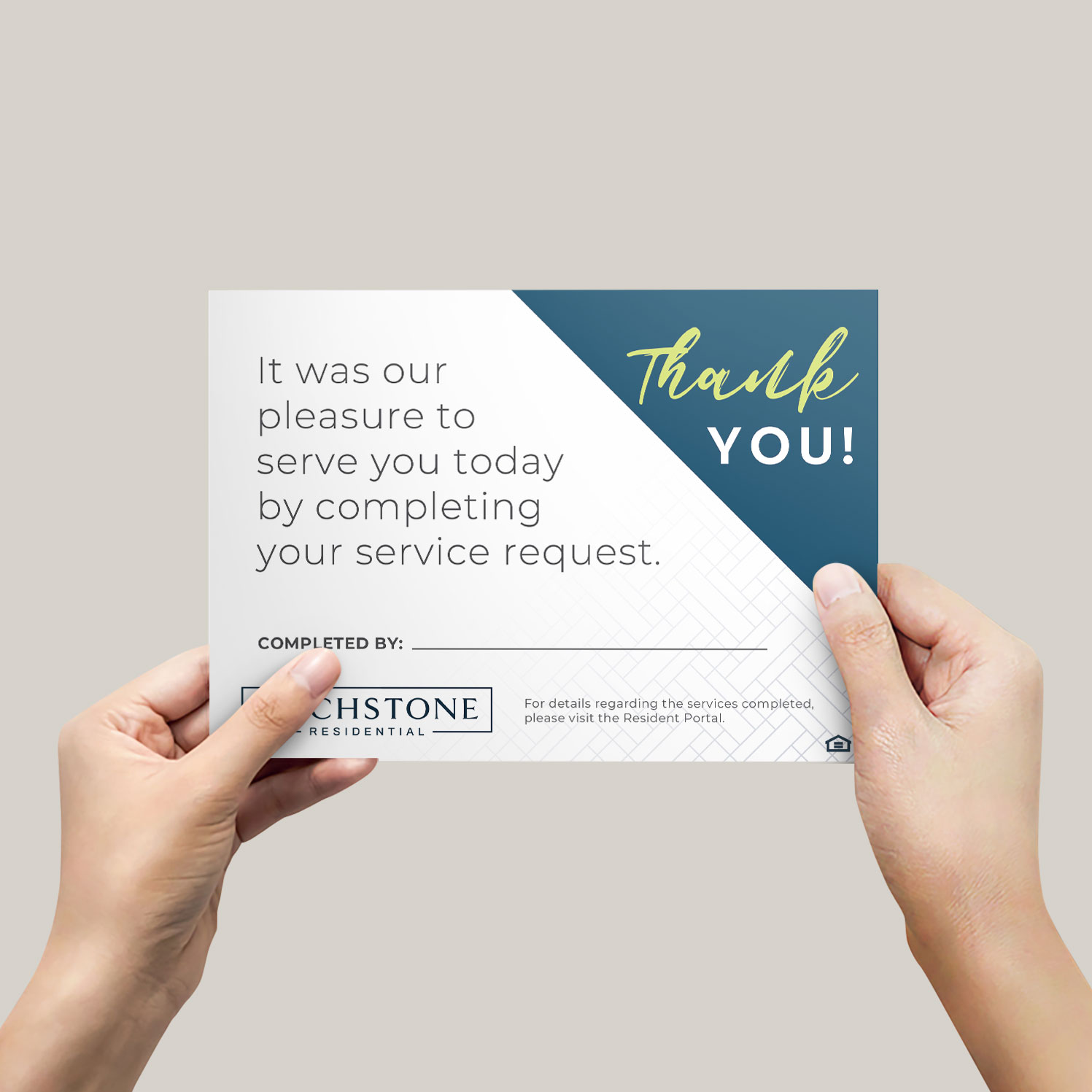
This is when the magic happens—units get reserved, leases get signed. We can help you transition your branded marketing message from “coming soon” to “pre-leasing” as you start up your unit reservations. When you have big goals, you need better branding. During this phase, we like to create business cards for your property manager, leasing agents, and your maintenance supervisor. You’ll also want to have handy a thank you card (with a pre-written message) and a move-in gift note card. When you’re this close to opening, you don’t want to be waiting on printed pieces at the moment your residents step foot in their new home. Plenty of other pieces help bring the “welcome” for any pre-lease signers.

Most of all—get your full website ready. Websites are a huge representation of your brand; get it launched in time for the next (and final)…

Phase 4 – Now Open

At time of first phase of completion

IT IS TIME

Finally, your first move-ins are permitted! And you get to unfurl the “Now Open” banners and signage—we got you covered on that front. We’ll make sure you’ve got building banners, yard signs, boulevard banners, and enough directional signage to make even the most directionally-challenged resident find their way with no problem.

When you hold your soft opening, have marketing collateral handy. When you have your grand opening, have swag and giveaways handy. When (or if you can) do unit delivery by phase after your clubhouse and community amenities are complete, you’ll still want to have everything ready. You won’t miss a thing, if you’re using our checklist.

A checklist?

A Lease-Up Marketing Checklist for Every Phase

Oh, yes. We provide our full branding package clients with a comprehensive project brief—a live google doc that shows the scope and timelines for a new construction, lease-up community. This added benefit includes a lease-up marketing checklist that covers everything you could want to do to set your community up for success. After being in the multifamily industry (on the property management side) for many years, we know what’s most vital and what’s optional when it comes to creating a successful lease-up strategy for your community’s brand.

Behavioral Marketing for Apartment Brands

Behavioral marketing for apartment brands deserves its very own blog post. Buyer behavior (or in our case, resident behavior) is the best indicator of purchasing power and timing. It’s the thing that you can target and use to segment your audience and reach them more easily and efficiently based on where they are in the funnel.

Get ready for step one.

Identify your Ideal Resident Profile

TAKE A LOOK

Who are the perfect resident types to live in your community based on the amenities, floor plans and location you offer?  Take into account the companies they work for, their hobbies, their favorite brands, their interests, and their intentions. This goes above and beyond their gender, their marital status, age, and other typical demographic factors. Instead, it dives into their passions and desires!


HOW TO RESEARCH PROFILE DETAILS

It’s not the who—it’s the how. That sums up everything about resident behavior. You can predict what they may do based on other factors, such as shopping and spending habits. Hubspot picks out a few ways you can create an analysis of your customers to see what they might do next:

1. Segment your audience

2. Identify key benefits

3. Source resident trends

4. Compare data

The items that fall under behavioral marketing for segmentation include:

  • Benefits sought
  • Purchasing habits
  • Brand loyalty
  • Occasion or timing
  • Buyer readiness
  • Engagement level

The goods that count as psychographic segmentation are:

  • Belief systems
  • Values
  • Goals
  • Attitudes

See more on that with our blog on research and discovery for apartment brands.

Ready for step 2?

Target Your Ideal Resident

Take those behavior demographic categories and create a campaign that works around it. If they’re looking for an apartment for the future, start small. If they’re searching for an apartment community that offers fitness classes, ensure that segment is getting the message that you offer exactly what they’re looking for.

Again, you can base your apartment branding and marketing on those demographics, especially if you have identified your IRP (ideal resident profile). That sets up the structure to guide the rest of your marketing choices. 

Did that gym class example get your attention? Next up:

USE WHAT YOU KNOW

Some people love yoga. (And other people haven’t tried yoga and they don’t love it—yet.) Those yoga lovers are probably members of a local yoga studio. Perhaps they’ve purchased clothes from LuluLemon. Consider offering a yoga membership with a one-year signed lease. Advertise your onsite, all-inclusive yoga studio. Attract the demographic you want by tailoring your marketing (messaging and campaigns) to that particular resident behavioral segment.

Behavioral Marketing for Apartment Brands Helps Tell Better Stories

You are marketing to a lifestyle, and you’re selling a feeling. When you can look at the audience (your ideal resident) then you can tell a better story. If you don’t know who you’re talking to, or look at your results, it’s a little like telling a joke on zoom to black screens on mute—you’re not sure if they weren’t listening, didn’t get it, or just didn’t think it was funny. When you can see and identify who you’re trying to target, you have a much clearer picture of their problems, and therefore how you can solve it with something they need or want! Don’t make it complicated—just do the research and solve the problems.

In addition to this, when your visuals align with their favorite brands, it can fit right in with the flow of their regular life. It feels like it aligns with the brand of their life. Using behavioral demographics helps us be both better storytellers and branders for apartments. Because the #1 thing we focus on with our stories is lifestyle—what they want, and what they need, and how we can offer it to them!

Multifamily Copywriting That’s Easy to Read and Grabs Attention

Reaching your ideal resident through the written word isn’t a huge secret; it’s just knowing how to write easy to read multifamily copywriting. There are five tips that will help you get there, fast.

Speaking of fast…

1. Write for Short Attention Spans

This means short sentences. Imagine you don’t have a lot of time. Maybe 5 minutes. But you have something you want to look up, and the solution is right there, ready for you. And it’s nice and short. Great! That’s all the resident wants. 

Another good thing to remember? If you want to grab their attention, get it quickly. And then tell them the rest, quickly. (Take food blogs—they’ve become a joke for the amount of content and backstory given before they get to the actual recipe.)

Imagine you’re trying to tell a 10-year-old about your community. You don’t have to talk at them or over them. Just write easy to read marketing copy: explain it in an understandable, interesting way.

Since humans now have an average attention span shorter than a goldfish (8.25 seconds vs. 9 seconds) it’s best to get to the point—now.

2. Write Scannable Text

Not long-form prose or the next New Yorker article. Write so that it can be read quickly.

  • Bold, italicize, or underline different sections.
  • Use bullets or number your items.
  • Use the enter/return button often
  • Write brief, bold statements. (A balance of long and short sentences is okay, but lean toward shorter ones.)
  • Be absolutely clear: Don’t leave anything to the imagination. 

People spend, on average, over 3 hours on their phones every day. It’s a small screen. That’s where you’ll be reaching them, more than likely. And you only have their attention for a moment, so you need to make it worth it—whether you’re writing copy for a brochure or sending an email campaign for your newest leasing special.

Another tool? Use graphics to break your text up into digestible chunks.

3. Use Simple, Familiar Words

This is not the moment to show off your word skills. Write so your reader can understand. If you’re using a word they have to look up, that’s ineffective. And it takes their time and attention away from the main event (your message). Always write easy-to-read marketing copy, not essays or novels.

It’s okay to stretch your reader in other ways, but when it comes to work, simpler is better. Or, if you have to use a more complicated word, be sure to add plenty of context to clue them in. Reading about your community shouldn’t be a chore. It should feel like they’re getting to know you, word by word—instead of  struggling to get through the content

4. Cut the Fluff

Too much content? Sharpen your sentences to say exactly what you mean. There’s a big difference between trying to say something and just saying it. Once you write your content, get your red pen out—there will be plenty to cut, while still portraying the gist.

Not sure what to cut? Read it outloud and you’ll hear where it’s too long or too wordy. There are typically four kinds of words that go into a sentence. There are three that don’t help. Take them out.

Instead of using adjectives and adverbs, use better verbs. 

Carefully designed apartments→Crafted apartments

Instead of using words that have been around the block tell the story better.

Don’t say “unique”— give your audience the evidence of your community’s uniqueness.

Instead of using connectors, get to the point.

Therefore, those words should disappear.

5. Simplify Long Sentences

What does that mean? Understand who you’re talking to, and who’s reading your content. Another bonus of simplifying long sentences is that your content gets tighter and has more punch. 

Example
Attempt: “We would really love for you to come take a tour of our community.”
Better: “Come tour our community!”

The second sentence works better because it’s shorter and gets to the point faster without losing any meaning. Everyone can use an editor. A great editor will get your words down to the absolute essence.

Another fun trick:

You can cut the word “that” a lot of the time that you use it. Er—most of the times you use it. See?


When you have a piece that needs plenty of copy, you should write easy to read marketing content for your community. Otherwise, your verbal identity is wasted and your visual identity and entire brand can get ignored. If you’re on the lookout for punchy headlines and tight messaging for your multifamily copywriting, reach out. We can help.

Creative Problem Solving in Multifamily Marketing

When it comes to creative problem solving in multifamily, creativity is key. Sometimes, it’s a struggle as a creative to come up with solutions to things that get in the way of a beautiful and effective design. But there are a few scenarios that appear regularly, and we’ve figured out the best workarounds for each.

A Logo Design With “The”

Using “The ________” in your apartment brand name seems like a good idea—making a statement about how you are THE place. It’s a traditional power stance verbally. Yet visually, it’s tough. Even though it’s really short and quite small, it’s a challenge to design it interestingly without overpowering the main event (which would be “Watson” in The Watson, for example).

Example: The Watson

A special workaround we sometimes recommend—if you’re in the planning stages, you can drop the “the” (say that five times fast) for something fresh and modern. That eliminates the ugly stepchild syndrome that can happen to little articles (a, an, the) in a big design.

watson-stationary-2

Creative Problem Solving A Long Brand Name

A rose by any other name would smell as sweet—we promise. Sometimes we’re so caught up with a name that we don’t consider where it has to go and how it has to work. When a name is longer, it tends to be locked into being used only as a horizontal logo, because that’s the only way it will work. Think of all the digital platforms that are square—which is most of them, honestly. Placing your logo horizontally in a square or circular space (or heaven forbid in a vertical use) as your profile pic makes everything smaller. 

So, should you keep the long name? Think through the pros and cons. Is it perfect? Is it easy to say? Consider how it would land with your ideal residents. Would shortening it keep it snappy and memorable, like these famous brand names?

  • Nike
  • Pepsi
  • Lyft
  • Google

A Lengthy Tagline in the Logo

Creative problem solving in multifamily extends beyond the logo, too—to the tagline. We like to keep them separate for a reason. Please, please don’t make us put the tagline in the logo. Taglines are vital, so absolutely keep them front and center in your designs. In your flyers, on your website, plastered on your window graphics—but not in the logo.  The only exception we can think of? If we need to say “Apartments” under the name.

Beyond this, designing the tagline to go with the logo everywhere is a challenge. The balance and readability is a problem (because the tagline is longer than the logo and can become tiny and hard to read). If you can’t let the logo and tagline go their separate ways—consider having two versions: a logo with the tagline and a logo without the tagline.

Brands to Stand Out (Without Making Waves)

If edgy, cutting-edge, sharp, and rugged are how you identify your brand’s personality, but your target audience or ownership group are more traditionally minded, you may find yourself in a pickle. It’s important to create a stand-out brand identity, but you also have to design with your audience in mind. What will appeal to them? Sometimes, it’s best to focus on infusing your differentiators and voice with that personality rather than the visual elements. Being creative means you can avoid being boring, and still get in front of the resident you want to attract the most (while keeping your investors and management happy). 

Keeping the Brand Style On Track

Many brands we work with already have a brand style and a guide. But, they may make a design request that comes straight out of left field and doesn’t align with the brand guidelines. As professional designers, we have a duty (an unspoken oath if you want to get weird about it) that we will stay true to known brand guidelines so the brand has consistency and cohesiveness across all platforms—this should sound familiar. It’s what we’re always preaching. Why? Because without it a brand doesn’t have brand recognition. When we get a wild request, we gently push back and remind the client of the brand guidelines. Just because you’ve got a brand guide doesn’t mean your designs have to be boring—we can work within constraints and still bring all the creativity we’ve got. We typically end up compromising, or creating an addendum to the brand standards so the new approach can be captured. Just be sure that the new addition is going to be used more often, so you can keep the train rolling towards brand recognition.

When There Are Too Many Words and You’ve Asked Us To Create Something That It Just Won’t Fit Into It No Matter How Small We Make The Font

Weird heading, right? Here’s a hint: It’s too much copy. If you’re not a designer, using too much copy or content in a marketing piece doesn’t seem like a big deal. That is, until it gets to us and we’re trying to lay it out in a limited space, like the constraints of a mailer or brochure. If we put all the words in, it will look cluttered, the text will be too small (visual proportions that are suddenly unsettling) and it will risk the audience either skimming it or skipping right past it. 

Less is absolutely more—take our professional design and copywriting opinion. We’ll definitely ask before we cut content down, and if you think it all needs to stay, we’ll do our best to work with it. Our humble request: audit and edit your content for clarity and conciseness (un-fluff it) before you send it over.

Ugly Photos on Beautiful Marketing Pieces

It’s a match made in…the bad place. If your branding is the absolute best, with the most creative graphic designer in the world working on it, and then you have crappy photos, you can throw that flyer straight in the trash. No one will take it seriously. You’ve lost street cred and the perception of the whole piece goes down thanks to those fuzzy, poorly lit, oddly composed photographs. Forget the lipstick on a pig attempts, and invest in an actual professional photographer or get quality renderings of the space. (Please.)

We all have opinions on what requires the most creative problem solving in multifamily. Our promise to you is that we’ll always find unique ways to solve (at best) or workaround (at worst) the biggest design problems plaguing your apartment brand.