Author: Stacey Feeney

Tailoring Your Branding and Messaging Around Renter Preferences

Tailoring Your Branding and Messaging Around Renter Preferences

Residents and prospects are becoming choosier these days—both because they can pick and choose among all the options, and because so many may be “forever renters” rather than homeowners. They’re re-ordering their priorities for what they’d like in their community. Your branding and messaging should be tailored to meet renter preferences—and to clarify what you have to offer to attract them.

Location

Let’s start with where you are—are you urban, suburban, rural? Get a handle on what is nearby, what is special about your location, and become a resource for your residents.

NEIGHBORHOOD OFFERINGS

Is there a city bus around the corner? Is the grocery store just a couple blocks away? Identify them, so you can give your prospects and residents the inside scoop on why you’re ideally placed and accurately priced.

RELOCATING RESIDENTS

Using information from crowd-sourced reviews and information to listicles from local moving companies online like niche.com, you can use data to better attract residents who are relocating, whether individuals or families.

What this looks like in your branding and messaging:

With gathered data, you can tailor your messaging to offer up the most valuable information for precisely what they seek. When you have the info they’re in need of, you can ensure that your messaging hits all the high points for them. In addition to the Neighborhood page on your website, make sure you’re showing the highlights of living in the area on your social pages. If you have a variety of prospects, vary your front desk script for phone calls and tours with a customized focus on what each renter preference may be.

When you become a resource to both your residents and your prospects, you can build a relationship on trust and sweeten the leasing process.
smart technology

Smart Home Technology

With smartphones in pretty much every hand in the U.S., the expectations for automated amenities have climbed the charts. If offered, these popular amenities may help your community beat out the competition. The NMHC 2022 Renter Preferences Survey revealed that 60% of renters surveyed want smart locks, while 70% desire smart thermostats to be placed in their units.


SMART THERMOSTATS

Smart thermostats, like the Nest, can be programmed from the resident’s phone.

DOORBELL CAMERA

Helpful to know who is there, and whether it’s likely safe to greet them, a doorbell camera is one more item that’s desired by this security-minded generation.


KEYLESS ENTRY / SMART LOCKS

These can be placed either on the main entrance to the building, or to the unit, or for both. No more changing locks, turning in keys, or losing them.

What this looks like in your branding and messaging:

Pick the top features you know your ideal residents are looking for (like these smart features) and create campaigns around them. In your messaging, you can also highlight the safety and security aspects of each of these offerings. This added control will help your resident feel more at home in your community.

Storage Space

Being a wholesale club member doesn’t always make sense when you’re renting. Where do the 24 rolls of toilet paper and year-supply of macaroni and cheese go? According to a 2023 Renter Consumer Survey from RCLCO, closets and kitchens have the most impact on a multifamily renter’s willingness to pay more for a rental.

WALK-IN CLOSETS

Extra space to store clothes and out-of-season items can make the rest of your home feel calm and collected and less cluttered.

LARGE KITCHEN PANTRY

Without a pantry, it’s a pain trying to figure out where to place cans and boxes. Having a large kitchen pantry keeps foodstuffs close at hand without making your home look messy.

PATIO STORAGE CLOSET

When you’ve got a patio storage closet, all your outdoor goods can stay clean-ish and out of sight.

ADDED STORAGE FOR RENT ON-SITE

It’s helpful to have a landing spot for your own seasonal equipment, bicycles, and other less-regularly-used items.

What this looks like in your branding and messaging:

Focus on space and storage in your messaging. Residents can bring their stuff with them when they come to the community—and can truly be themselves when they can take their hobbies, their fashion, whatever makes them them. Your brand should go along with this flow of things, and offer up plenty of photos of what you’re offering. Don’t forget to show it off on any tour—whether self-guided or not.

Working From Home

Post-pandemic, the working culture has changed dramatically. Corporate real estate has diminished and many are now working from home. According to the NMHC survey, 27% of the renters surveyed work from home every day, and another 23% work from home one or more days per week. With those numbers in mind, it’s no wonder that renter preferences are shifting for what “home” offers with a dual function as a workspace.

SOUNDPROOF WALLS

Barking dogs and noisy music make for poor concentration when you’re up against a deadline. Even for non-WFH residents, soundproof walls are a bonus. Some apartment communities are even designating areas, spaces, or entire buildings with more “quiet” in mind.

ADDED SPACE

Flex space for guests, for working out, or—most likely—for an office, is a big draw. Bonus points for a built-in desk, too.

CO-WORKING SPACES

If you can’t make office space in your apartment, individuals will likely be more interested than families in having easy co-working spaces where they can hold meetings and feel productive.

HIGH SPEED INTERNET CONNECTION

Choppy internet won’t work well for WFH residents’ regular online call check-ins and meetings.

COMMUNITY SPACE WiFi

Along with co-working spaces, WiFi in the community areas is helpful to have for when you decide to take a WFH break pool-side but need internet (just in case).


What this looks like in your branding and messaging:

Work is a big part of life—the biggest demographic for apartments is literally “young professionals.” Show your prospects and residents that you get it by offering them the best WFH options as a part of the package, and prioritizing the technology and space they need to get the job done.

Conveniences

Even if your residents may never own a house, it’s nice to feel like things are still streamlined and easy in their home

IN-UNIT WASHER/DRYER

A washer and dryer all their own is a luxury unto itself. They can change the load in a minute without ever having to leave their unit.

ON-SITE PACKAGE LOCKERS

Online shopping isn’t going away anytime soon. Protect your residents’ packages with lockers.
Also of note: Per NMHC, 80% of renters prefer storage lockers versus storage rooms for packages.

SELF-GUIDED TOURS

After COVID, plenty more prospects want to keep with the minimally invasive self-guided tour method. They can say their thoughts aloud, and exit the tour whenever they want.

ONLINE RENT PAYMENT

Almost all bills can be paid online these days. Make it easy and create a portal.

What this looks like in your branding and messaging:

Convenient and comfortable. If your community can offer these things, you may find less attrition in your lease rates. Your tagline can communicate as much, too.
Branding

Accentuate Renter Preferences in Branding

In your branding lies the unspoken methods that will direct your prospects to what they most desire, and could put your community at the top of their wishlist. To fold renter preferences into branding, there are four places to focus on.

ICONOGRAPHY

Draw attention to what you need them to see most. You can do this through visuals that pull out and separate their preferred amenities. For example, if you have a coworking space, you can use an icon that indicates as much—and use the same one across all platforms and collateral.

GRAPHIC ILLUSTRATIONS

Extend your brand across an entire wall—like a branded mural on your fitness center. Use your colors, use your vibe, and get playful through your showcase of some of your best features. This makes the amenity space feel exciting, unique, and like they can’t get this experience anywhere else.

IMAGERY

Sometimes seeing is believing. And before the prospective resident can schedule a tour, they are looking at your imagery. The lifestyle stock photography should paint the picture of someone experiencing the very amenity they’re most interested in. Note: Choose the photos carefully so they can connect with it and “see” themselves in the space.

MESSAGING

Identify who you’re speaking to. Know what their preferences are. Tailor your brand message to speak directly to them and their desires (and how your community solves their problems or gives them what they’re looking for.

Knowing how important renter preferences are, along with showing how you are solving the modern problems they have will help your community stand out from the rest.

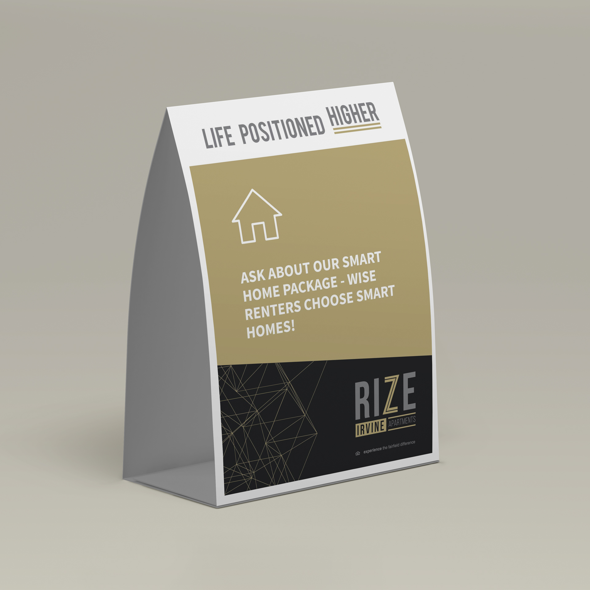
RIZE and Inwood Station signage examples are ©Fairfield Residential  |  Work executed by Stacey Feeney, owner of zipcode creative, while under creative direction and employment at Fairfield Residential.
Stock Photography in Branding and Its Impact Potential on Residents

martha-bader

Co-Authored by Martha Bader, Director of Marketing and Programming, Arden

Stock photography in branding and marketing has a significant impact on outcomes, connection, and inclusion. It’s natural to pick only the most beautiful, the most youthful, and the smiliest people for our brand’s imagery. But there’s a lot more to stock imagery than picking the shiniest, happiest people. It’s supposed to reflect your brand.

But what happens when the stock images you choose—that do reflect your brand, just don’t jive with the resident profile that’s supposed to be targeted?

Aspiration may—remarkably—turn into disconnection and frustration, and should be considered when selecting brand images.

A Deeper Dive into Stock Photography in Branding

We recently partnered with Martha Bader, Director of Marketing at Arden 55+ Living, who has worked with zipcode creative on multiple projects, particularly around brand voice and public relations. Perception is a huge part of stock imagery and we both wanted to know what really resonated with active adults and those that are 55+. The results have been eye opening! 

We hosted an in-person gathering to show participants stock photography and obtain their feedback to better understand how our use of stock imagery could portray what we intended, and foster an ideal perception from the viewer. They were then encouraged to describe their initial reactions to and feelings around these images, which resulted in a lively discussion around some of the questions below.

The answers might be surprising to you, but Martha knew exactly what to expect, having spoken with thousands of people 55+ across the country over the last six years to better understand this growing demographic.

1) How old do you consider yourself (versus your actual age)?

Note: Participants were all 55+.

quote

“At least 15 years younger, if not more!” 

“I am not old, I think about what my parents looked and acted like at my age, and I feel so much younger than them.”

“It depends on the day, sometimes 15 and sometimes my age.”

2) What do these images make you feel?

Elderly Friends Posing After YogaiStock-1352619757quote

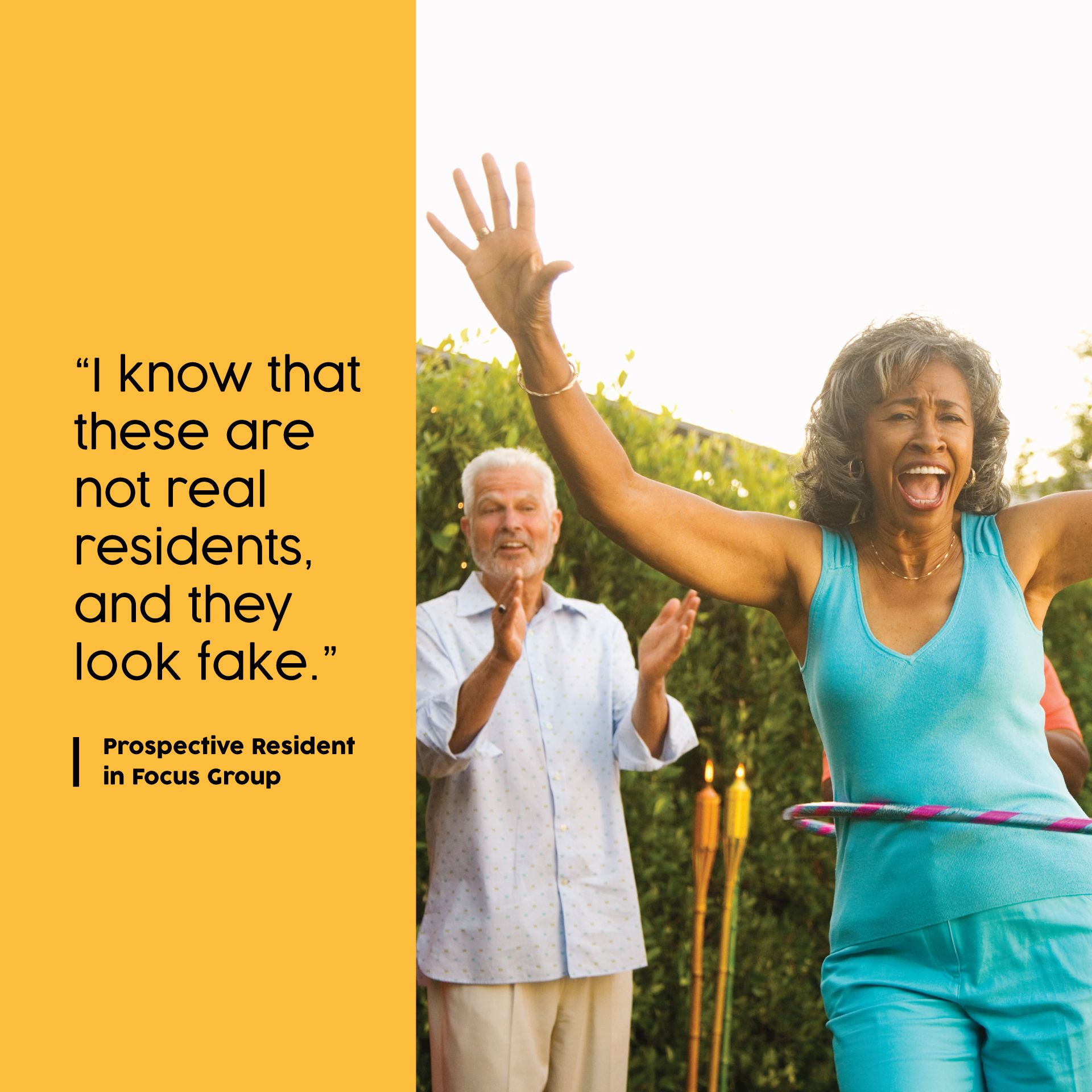
“I know that these are not real residents and they look fake.”

“These people mean nothing to me.” 

“I feel worse about myself because I don’t look like that.”

“I know that this is for senior living because of these posed pictures.”

“Please don’t use people in ads—it reminds me of my age.”

3) What is your initial perception of 55+ communities?

quote

“They feel very exclusive.”

“I wonder what will happen to me if I am the oldest person there.”

“Great idea.”

4) What does being “active” mean to you?

quote

“Taking care of my health.”

“I love doing things and going places.”

“Being social.”

When choosing images, Martha believes that they should be like a permission slip to dream of what life can look like and shouldn’t be overly prescriptive or overpromise things like ‘If you move here, you will then your life will look like this, and these will be your new friends.’ Martha says, “In the age of photoshopping, we want to continue to celebrate all walks of life, and make sure that we are not excluding people or they are not self-selecting out of exploring what a 55+ community has to offer because they don’t see themselves in the images portrayed.” While studies have previously shown that using faces in imagery builds connection, it may not be the type of attention that you want. 

Another thing to keep in mind: Watch your third-party brands—they may use stock imagery that has a negative impact, such as an on-demand fitness app used in the fitness center, making health goals feel even harder or less likely to reach. Ask if their apps or AI can be modified to represent your residents and not exclusively young and extremely fit models  that could be problematic or triggering to  your 55+ residents. Take an extra minute to reflect on what the resident experience might be to ensure engagement and inclusivity for your residents!

Martha adds, “It is a fine line to walk of realism and possibility and we continue to engage with prospects on what grabs their attention and compels them to make decisions.”

Choosing Stock Photography in Branding and Marketing

There are five ideas that should be considered when selecting stock imagery for branding and marketing materials for your apartment community’s brochures, websites, signage, mailers (and plenty more).

Representation – Follow fair housing laws. Get diverse with your representation through your photos. This includes a variety of ethnicities, genders, ages, body types, abilities and cultural backgrounds. This will help show that your brand values everyone from everywhere—because you may not be sure who you’re excluding, even unintentionally, with your selection of stock imagery.

StereotypesEnsure the photos that you choose for your brand do not perpetuate stereotypes or biases. Choose visuals that allow for the full spectrum and breadth of abilities and e experiences. Keep in mind that stereotyping/bias could be conscious or not!

AccessibilityThis is particularly true for stock imagery that you place on your website. Screen readers will need to be able to indicate to anyone with visual impairments or disabilities what is happening in the photo. For this reason, provide alternative text descriptions for your images. Beyond this, every image you choose should be clear and high-quality.

AuthenticityMake your photos relatable. Choose stock imagery in branding that will represent people accurately rather than being props for diversity. A stock photo that attempts to show an interesting story and perspective will have deeper meaning than a photo chosen simply because it fills in the gaps of your diversity spectrum.

Emotional ConnectionYour audience—or ideal resident—will relate to your brand partially based on the stock images that you choose. Choose wisely, and you may be able to evoke emotions and create a connection to your brand. If you can offer up photos that remind your audience of themselves (ones that feature folks that look like they do) this can be the bridge to long-term loyalty.

Risks When Using Stock Imagery With People


It can be difficult to choose stock imagery with people in it. Keep these risks in mind when you choose to use stock imagery:


ACTIVE ADULTS

Depicted Too Old, They Feel Younger – “What? This isn’t for me. I’m still spry.” This might be what your 55+ community demographic is feeling when the pictures show elderly folks in wheelchairs. They’re not looking for a retirement home—they’re still active adults. Look out for the “too old” photo pitfall!

Depicted Too Young, They Can’t Relate – “Oh my, I can’t keep up with these youngins. I’m not going to like this place.” This might be what your 70+ residents may be thinking when they see an (attractive!) salt-and-pepper man backpacking up a mountain. Look out for the “young and having fun” pitfall, too.

STUDENTS

Ah, college students. This is possibly the most judgy age (besides tweens) that any person is at any point. Make sure you depict people that are a little beige. Not too preppy, edgy, lazy, or goodie-goodie. Find students that look pretty—to put it in terms you’ll understand: Normcore. Totally normal. Nothing particularly stand-out. (It does help if they’re attractive, though.)

YOUNG PROFESSIONALS

Where paths diverge: younger professionals. There’s a reason there is white collar and blue collar nomenclature. If you depict someone working remotely on their laptop in a coffee shop, the service worker may feel unconsidered. If you show only young couples enjoying a night out, a single mom may feel forgotten, because she never gets the opportunity to have a happy hour with friends. Share the love, consider the imagery that may get overlooked. Try to level the playing field with your images.

Arden-Diff-Lifestyle-Image-02Arden-Diff-Lifestyle-Image-03Arden-Diff-Lifestyle-Image-04 (1)

Inclusionary Practices


Images that are inclusive can help broaden your customer base because you’re reflecting a diverse target audience. Inclusion is good, all on its own. But it’s also helpful as a business move because you can connect with even more people who may be interested in becoming a resident in your community.

BOOST YOUR INCLUSION WITH THESE PRACTICES

1) Abstract Depictions

Get a little less specific and capture the feeling you want them to have while living the lifestyle that’s quintessential to your community. What do we mean? Instead of trying to figure out who exactly to include in your images, instead opt for photos of:

  • A close-up of a shimmering pool on a bright day
  • A linen curtain blowing in the breeze
  • A group of different cocktails on a tray
  • Dogs!

2) Groups of People


When it does make sense to include faces in your imagery—select carefully. Candid and natural shots will always win out over dated, posed shots. Get a group that has multiple ages and races in one photo to keep the diversity going.

    3) The Property

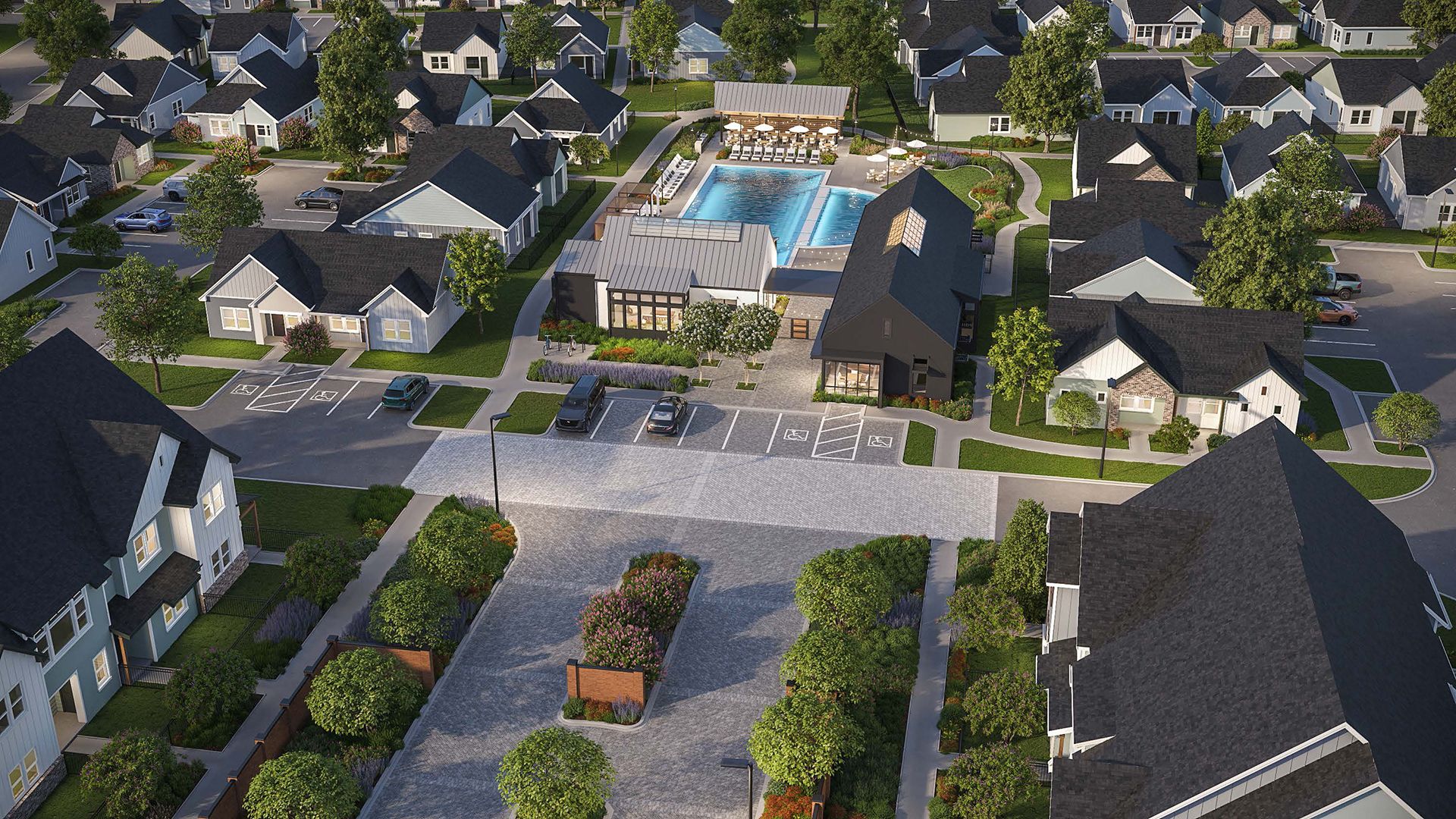
    If done well, you can’t go wrong with photos of the property, or beautiful, photo-realistic renderings for apartment marketing. This is the actual product that your ideal residents are looking into “purchasing” (okay, leasing), and by showing off the architectural lines, details, colors, and spaces, you let the community speak for itself!

    All in all, it is absolutely impossible to find imagery that relates to everyone—and someone will inevitably feel excluded based on their perceptions of the stock imagery in branding that you’ve chosen. However, being aware of the risks (including with any third-party businesses you use) and conscientiously choosing imagery to be inclusive and best reflect your biggest target population or majority target renter demographic can help make a positive impact for your brand and for your number of signed leases.

    Build-To-Rent (BTR) Communities—Coming to a Town Near You

    With less stock in the home market, and the rental market becoming pricier, housing is continuing to be difficult for both homebuyers and renters to come by. As a sort-of-solution, home builders and investors have now introduced “build-to-rent” (BTR) communities, also referred to as single family rentals. In fact, according to the U.S. News, the BTR sector is on the rise, and has grown a significant 42% from one year to the next, with 6% of all housing built between September 2021-September 2022 falling within the build-to-rent category. What counts as a build-to-rent community? Why are they important, and how can your company brand your next BTR community well enough to capitalize on the new BTR boom?

    What’s a Build-To-Rent?


    By definition, a build-to-rent is made of detached units that have been built specifically to lease out to long-term residents. Funnily enough, build-to-rent is also called BTR or B2R or built-to-rent, or built-for-rent, or even B2B. Just kidding about that last one.

    The newer multi-family sub-industry offers communities of single-family homes that are constructed to be immediately leased out—but they’re handled just like an apartment community, with the exception of different looking phases of units delivered.

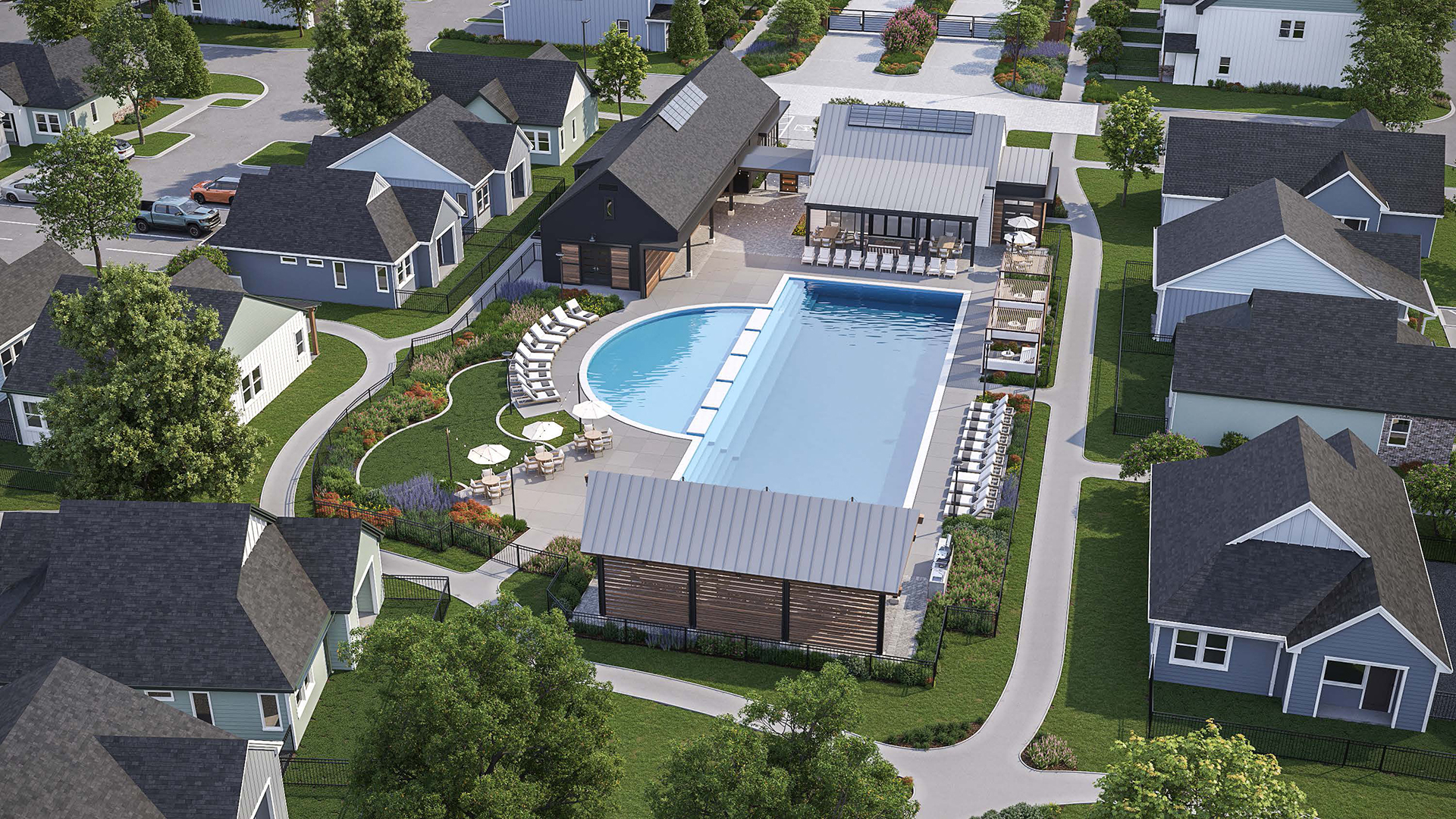
    The community is close together, even though each home is typically a standalone place. There are amenities in the area, but the units aren’t necessarily vertically stacked—instead, they’re spread out and typically have some outside space—maybe their own building, and possibly their own lawn. They’re detached, but there’s a leasing office on-site, and you’ll likely find amenities typical of apartment communities, too, like a pool or a fitness center, or both, though they’ll be more spread out. This allows residents to live as if they are homeowners or have their standalone property, but behind-the scenes, the property functions more like a traditional multifamily community, where amenities abound and maintenance worries are assuaged.


    TYPES OF BUILD-TO-RENT

    What really counts as a build-to-rent community? A couple types of buildings could fall under this category:

    • Row houses – Build side-by-side, row homes can share a wall
    • Duplexes – Similar to row-houses, but really only two units that are attached
    • Horizontal apartments – Instead of building up, they’re built out and around
    • Small lot homes – Single-family homes that are built close together, with a lot as small as 600 square feet (for reference, a typical home lot could be closer to 5,000 square feet)
    • Factory built homes – Manufactured home communities

    Build to Rent Howard Hughes Corp 3Build to Rent Howard Hughes Corp 2

    Is it a Good Investment?

    BTRs offer plenty of benefits for both landlords and for residents. For one, the renewal rate is astonishingly high—close to 74%, according to licensed real estate salesperson Jack Richardson. The standalone units make renovation and correction of problems much easier to roll out, since you can do it one unit at a time, without disturbing other units. It also gives owners and managers easy access to systems, and the spaces are better equipped for turnover—even though turnover is a lot less frequent than average apartment communities. You could even turn one vacant home into a local cafe instead of renting it out again.

    Because BTRs can be built more quickly than typical single-family homes, it can help address the lack of affordable housing for residents looking to lease a home. They’ll be built faster than a subdivision, and they’ll be much more welcomed by the existing neighborhood than a towering apartment complex that impedes views and impacts parking.

    Build-to-Rent

    Branding Build-to-Rent Communities

    There is the question of how exactly to brand your build-to-rent units so that you can attract the right residents. The key is knowing the difference between BTRs and typical apartments. There aren’t a ton of differences in branding, but there are enough to make it worth paying attention here.

    INDEPENDENCE

    Your own structure. Your own lawn. Your own address. It’s a sign of independence. Make sure this ends up in your messaging. (“Your own home—but better” kind of thing.)

    ALL THE AMENITIES

    Your basic HOA could never. WIth a BTR, you’ll have residents clamoring for all the amenities you’re offering. It’ll be far more than your typical suburb. A pool. Lawn maintenance. Home exterior upkeep.

    EFFICIENT

    Everything is designed to work all together, so residents are able to rely on the on-site management to handle exterior maintenance while they enjoy a little piece of land to call home.

    COMMUNITY-ORIENTED

    Good fences make good neighbors—and it also helps if your ceiling isn’t their floor. Depending on how things are laid out, the community may be a lot more neighborly than a very-closed-door apartment complex.

    AFFORDABLE

    This is an affordable way for residents to have comfort and community. If residents can’t save for a down payment or they’re not sure that they want to purchase a home, this is a great way to have the best of both worlds; amenities, community, and a little more privacy. Hit this hard in your messaging!

    All in all, it will be best if you stay ahead of the burgeoning built-to-rent market. Don’t miss the bus, and make sure your branding lays out the direct benefits to your resident—in messaging and photos. If you need extra help, zipcode creative is just a click away, and we’ll get your BTR set up for success.

    Images courtesy of Howard Hughes Corporation.

    Is Apartment Branding Worth The Cost?

    Apartment branding certainly costs money—but is branding worth it? Quick answer: Yes. Good branding is definitely worth the investment for apartment communities. Branding can help any business be more successful, especially in the multifamily business.

    What’s Involved in Apartment Branding?

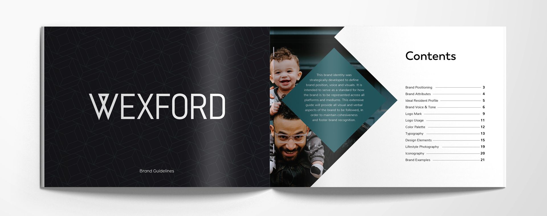
    Apartment brand guidelines are a good place to start. Having an idea of what’s involved will help you get a head start—and it will help you better understand a cost that makes sense. (Plus, you’ll see what goes into it, so you know if an agency is putting together a full package that will work for your apartment community’s brand.)

    How much does Apartment Branding Cost?

    The cost of custom branding projects depends on exactly what you need and who you’re working with. Both of those factors can make the cost estimate vary wildly. 

    Let’s say you get a quote for $99. That’s cheap. And you’re going to get what you pay for.

    Or, maybe you’ve found a high-end agency, and they’ve given you a quote for $100k. That’s going to get you something pretty spectacular, but realistically you don’t need that many bells and whistles – just enough to stand out above the competition.

    Look for something in between. Perception counts for something—if the branding looks high-quality and intentional (consistent, a color palette that makes sense) then your prospective resident might still spring for a higher monthly lease cost over your competitor, because you look more put-together and attractive.

    Since branding is how you look and how you make people feel, it’s completely worth the time and money spent, if done properly.

    Why is Apartment Branding Worth It?


    1. Branding sets you apart.

    The demand for apartment living is at an all time high with ever-increasing rates in the housing market. And that means the competition is getting tougher. Set your community apart with a well-defined brand. Your unique identity should show the real you (or at least the most ideal version of you). This means that when you have competitors who are in the same market as you (with similar features, location, and target audience) you can begin to stand out through creating a lifestyle that speaks to how you’ll improve the lives of your residents. Creating a strong brand, you increase the chance of attracting and retaining your residents with culture and sense of community.

    What it’s worth: Think about how much income you’ll receive from just one new lease being signed? In terms of ROI, it adds up.

    2. Branding helps you gain trust and credibility.

    A brand that’s well-built helps stack up trust and credibility with its residents—whether current or future. If your property has a positive reputation, you’re known for quality and reliability. People want to live there when they feel like they’re a part of something—it’s that culture thing again. That positive word-of-mouth marketing stemming from online reviews and friendly recommendations come from satisfied residents. That’s all part of who you are (remember: how you make them feel!)

    What it’s worth: You don’t have to pay for word-of-mouth. Free benefits add up.

    3. Branding helps establish loyalty and keep current residents.

    When more people want to live there, it becomes an attractive option to everyone, including the people who already live there. (Ooh, people want in? Well, I have it, so I should hang on to this valuable thing!) The only thing better than a signed lease is a renewed lease. It’s a lot easier to keep the residents you already have (as long as they’re current on their payments) than one that you have to go out and pound the pavement for.


    What it’s worth: Lease renewals cost significantly less than acquiring a new resident.

    4.Branding can help justify premium pricing.

    Luxury lofts, eh? That won’t be believable if your branding work is all over the place: inconsistent, unprofessional, and downright outdated. Keep things classy and make sure your branding is telling your ideal resident that “You’re Worth It.” Because if they’re not convinced of your status, they’re not going to be willing to pay a premium for it. Turn their desires into reality with exceptional branding that targets your ideal resident.

    What it’s worth: Perception is everything, branding can justify higher rents when quality is matched with the property’s features and amenities.

    5. Branding helps keep a good thing going.

    We also like to call this success inertia. Branding is the initial burst of energy that helps you onto the scene. After that positive word-of-mouth goes around, you’ll spend a lot less time attracting leads because of your loyal current residents’ referrals to friends. Brand recognition will also help reduce marketing costs and efforts over time when brand presence establishes in the market. 

    Now, you’ll be able to spend more time growing the portfolio. Show your lease-up rates to investors interested in reputable property management, and you’ll find a pattern of growth and expansion to develop or acquire additional properties.

    What it’s worth: Brand recognition leads to better reputation, which leads to faster lease-ups and company expansion.

    Multifamily developers and owners like you can establish a strong market presence, generate higher returns, and position their properties for long-term success in the competitive rental market, all because you decided apartment branding was worth the cost.

    Using Renderings for Apartment Marketing

    Using Renderings for Apartment Marketing

    Renderings for apartment marketing could be the difference between scrolling past the website and a signed lease. Learn more about why using renderings for apartment marketing is important—and how best to put them to use.

    What are renderings?

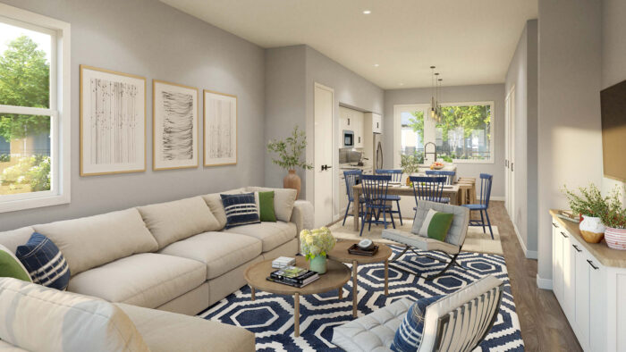
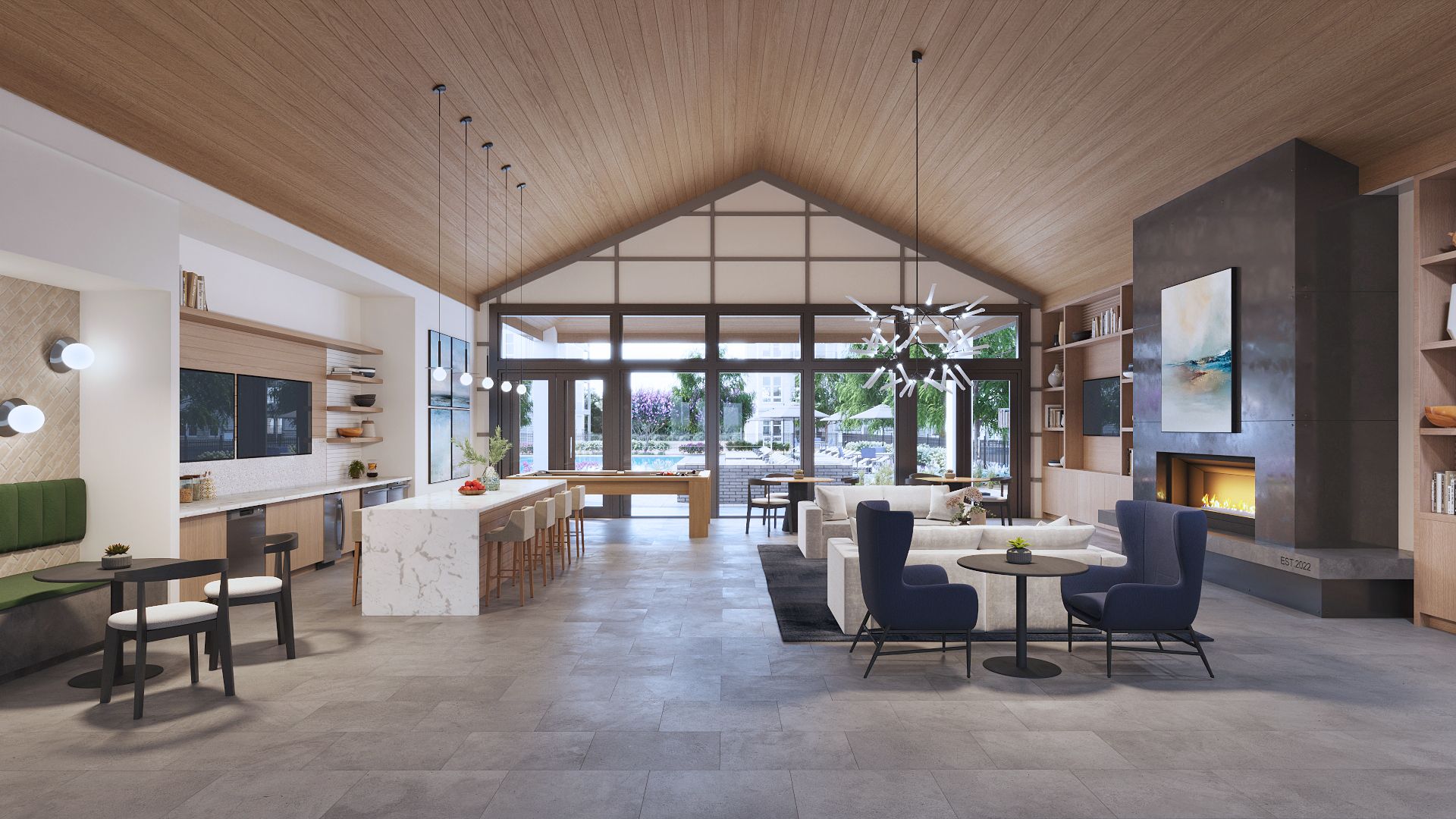
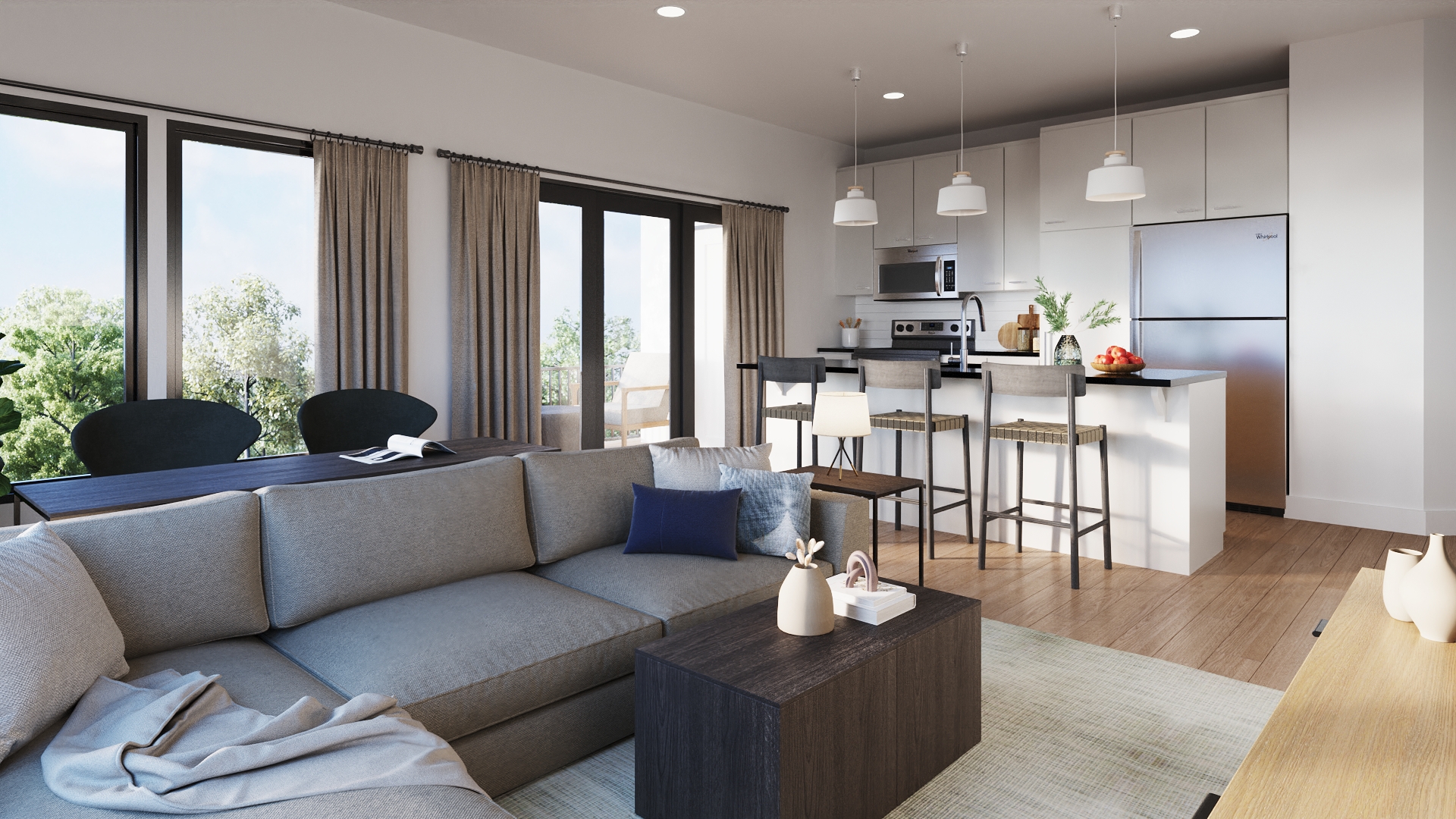
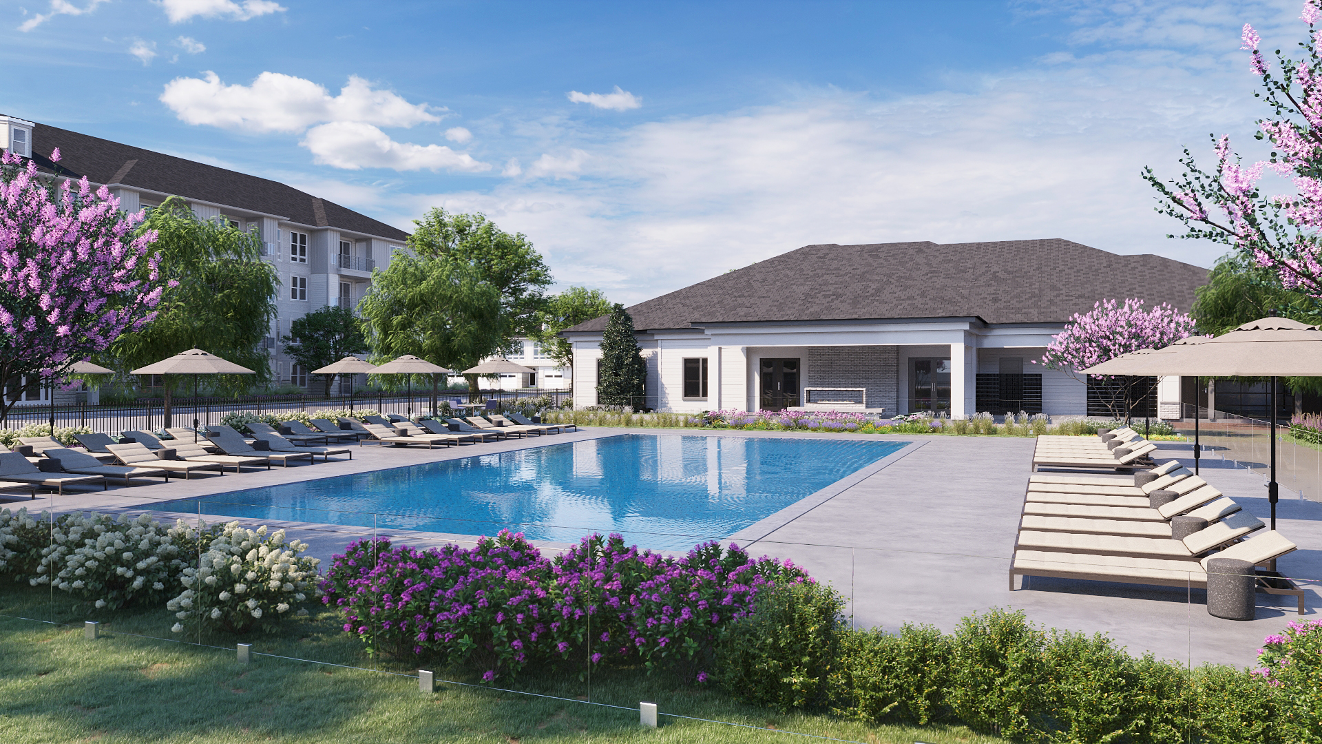
    Renderings are realistic images of a building or space, generally prior to its construction or completion. It also offers up a visualization of what a unit may be filled with (i.e. a master bedroom with a king size bed, dresser, and nightstands.)

    Renderings are extremely helpful for new construction lease-up properties since there won’t be a building to show off—or they can be useful in a property that has been remodeled or rebranded.

    Types of Rendering Services

    There are a few different types of renderings for apartment marketing. Each one serves a slightly different purpose. These services can include:

    EXTERIOR AND INTERIOR STILLS

    These types of renderings show the outside of your buildings as well as what the interior could look like. Generally, you’ll want renderings of the community spaces as well as the residential buildings, if different. It’s extremely important to have interior stills of the clubhouse and exterior stills of any pools, game courts, and dog parks, if applicable.

    360 VIRTUAL TOURS

    360 virtual tours are meant to allow prospects to feel like they’re in the middle of the spaces you’re offering. They may choose to use these 360 virtual tours if they’re moving into town from far away and can’t take an in-person tour, or this may be something you offer before construction is complete so you can attract more interest.

    VIDEO FLY-OVERS

    Stills are great to visualize. 360 virtual tours drop you into the place. But video fly-over renderings will give your prospects the full picture and the full layout of the design, and fully wow them. Seeing how it all fits together and what the landscaping around the area may look like is one more way to get them interested.

    Renderings for Apartment Marketing 2

    Why Do Renderings for Apartment Marketing?

    SHOWCASE BEFORE COMPLETION

    If you’ve tried to sell something without using visual aides, you know: it’s important for the final decision. Any new construction should be able to showcase the community before it’s completed. You can use the renderings on your website, your brochures, in your ads, on your signage. Any place you might have typically put a photo, you could place a rendering. This helps push the idea of the lifestyle you’re selling—because we both know that words can’t do everything.

    HELP WITH PRE-LEASING

    Rendering for apartment marketing should be on your checklist. It helps with pre-leasing if it’s done well: beautiful, photo realistic, high quality. And in that sense, it’s completely worth the investment.

    SUPPLEMENT TO PHOTOGRAPHY

    Once you’ve completed construction and you book photography for your units, your common spaces and some pretty architectural shots, the renderings you have can still work as your “hero image”. Why? Because it will always be perfect weather in the virtual world, and all of your plants are alive. And sometimes a photographer might not get the exact shot you want—but the renderings can give you precisely the angle you’d hoped for. Use renderings for apartment marketing before that photo sesh and after.

    VISUALIZE YOURSELF HERE

    Seeing is believing—without a building to show off, it’s harder to get leases signed. The renderings also tell the prospective resident that you’re highly invested in attracting them, and they’ll be more attracted if the rendering is done well. Helping them easily envision themselves there gets them to sign a lease to live there for real.

    Renderings for Apartment Marketing 3

    Renderings with zipcode creative

    Imagine it and be it! Our founder, Stacey, has a background in architectural photography. She knows that visuals are vital to securing a signed lease and building your apartment’s brand. She is passionate about renderings that are high-quality and photorealistic. If you have a rendering, it’s best if the viewer is asking, “Wait, is this real?” That’s when you know you’ve hit the nail on the head. 

    When you look for a marketing partner to get renderings for your apartment community, make sure you see what they’ve done in the past. Decide whether you want only floor plans, or if you need the whole deal with renderings from top-to-bottom. If you’re in the process of rebranding or remodeling, a decent rendering could change the game (in your favor).

    What’s Included in Apartment Brand Guidelines?

    Ever wish there was a roadmap for apartment branding? Meet apartment brand guidelines.

    This…map won’t look like anyone else’s. Except for the main elements that are required for any map: scale, latitude, longitude, compass.

    And When you have every piece of your brand guidelines all laid out in front of you, it’s going to be a lot easier to get where you want to go (the land of sweet success, the true treasure.)

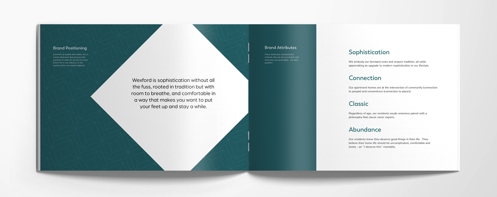
    Brand Positioning

    WHAT’S BRAND POSITIONING?

    Brand positioning is a quick statement about your apartment brand that tells the reader: This is what we are known for—or wish to be known for—in our industry, market, and to our target audience.

    WHAT’S BRAND POSITIONING FOR?

    Brand positioning is your company’s compass. Or, if you’re even more old-fashioned, your North Star. It reminds you of the direction you’re headed, and gives you something to measure up to, which could be business decisions, ad copy, partnerships, you name it. If it doesn’t align, it shouldn’t be considered the right choice, and it won’t feel authentic to your brand, either..

    Brand Attributes

    WHAT ARE BRAND ATTRIBUTES?

    Brand attributes are characteristics that distinguish your brand. By using words that display the best parts of your brand’s personality, you can embody who you are, and put your best side in the spotlight. A fun way to think about this is choosing a celebrity that most embodies your brand—and why. (e.g. Julia Roberts—she has a sense of humor, is gorgeous, and is, in our minds, a spicier twist on classic.)

    WHAT DO BRAND ATTRIBUTES DO?

    Brand attributes are meant to set your brand apart. (You’re not like everyone else, right?) This puts the hard-to-define soul of your brand into literal words and ideas. By choosing 4-6 words, with a brief rationale for each, we can get a little closer to the heart of your apartment community’s brand.

    brand-guidelines-1

    Ideal Resident Profile

    WHAT IS AN IDEAL RESIDENT PROFILE (IRP)?

    An ideal resident profile is your key audience. It will help your brand speak directly to the very residents it wants to attract. By taking in the data from your product offering (luxury apartments? 55+ condos?) and from the market you’ve placed yourself in (bustling city life vs. quiet suburbs) you can better identify exactly who your brand sets out to serve. The IRP is based on data 

    WHY DO I NEED AN IRP?

    An IRP gives you a resource when you’re determining your best targeting or marketing strategies. In the same way that your apartment’s brand positioning statement is your compass, your IRP is where X marks the spot. Your goal. Your target. Who you’re reaching for.

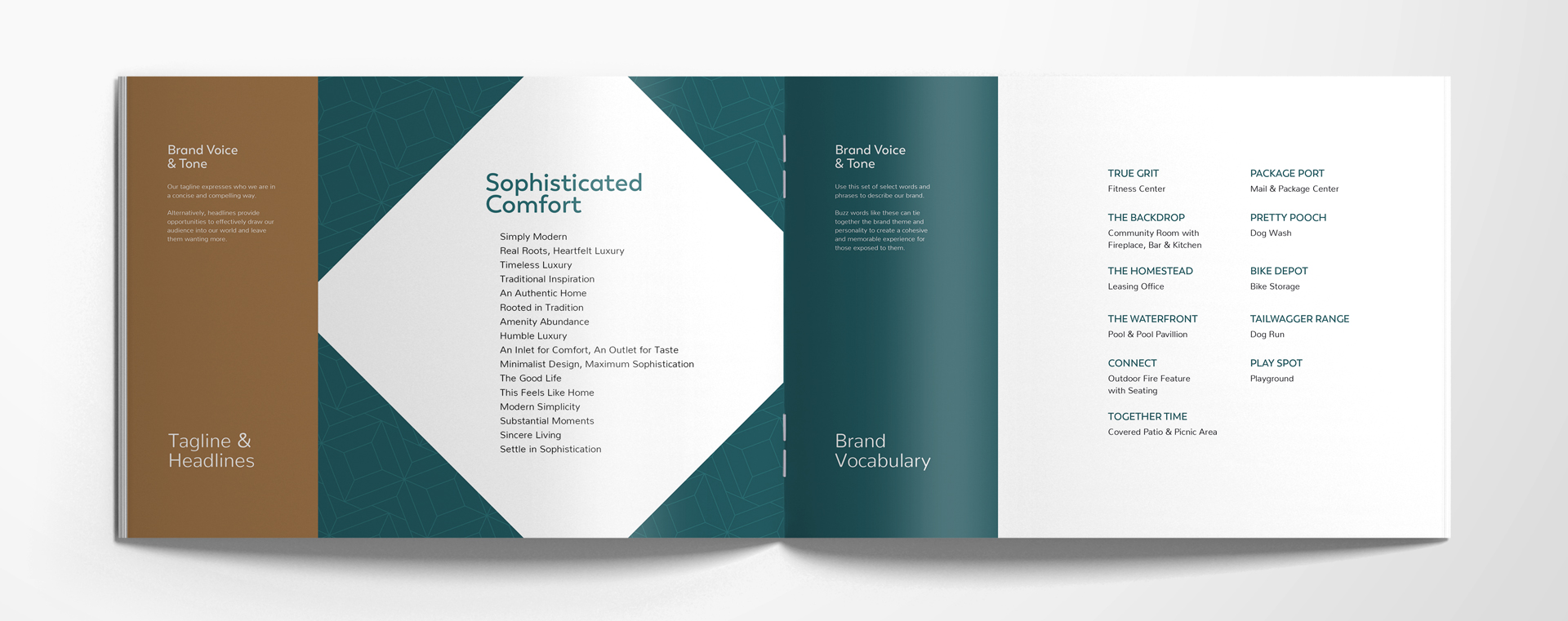
    Brand Voice & Tone

    WHAT IS BRAND VOICE AND TONE?

    Now that you know who you’re taking to (IRP) you’ll have an easier time getting your brand voice and tone tightened up. Channel your brand attributes when speaking to your ideal resident profile while you recall your brand positioning (you remember, right?: what you want to be known for). Bring it all together in your content and you’ve got a brand voice and tone.

    HOW DO I IDENTIFY MY COMMUNITY’S BRAND VOICE AND TONE?

    A few ways.
    Brand identity statement:
    Summarize your brand’s full identity with statements that tell who you are and what you offer, in a few paragraphs. Write your brand identity statements in a way that will appeal to your IRP, keeping in mind their biggest desires, fears, and hopes—that you fulfill.

    Tagline:

    Grab attention with something short and snappy that sums up who your brand is—kind of like a slogan.

    Headlines:

    Keep that attention with shorter phrases that can be sprinkled throughout your content to intrigue your current and future residents with more hints of who your brand really is.

    Brand Vocabulary:

    Distinct to you, it’s your own language—a set of phrases and words that are in your brand’s go-to dictionary. With interesting names for your amenities, you create a culture all your own for every piece of your community.

    brand-guidelines-3

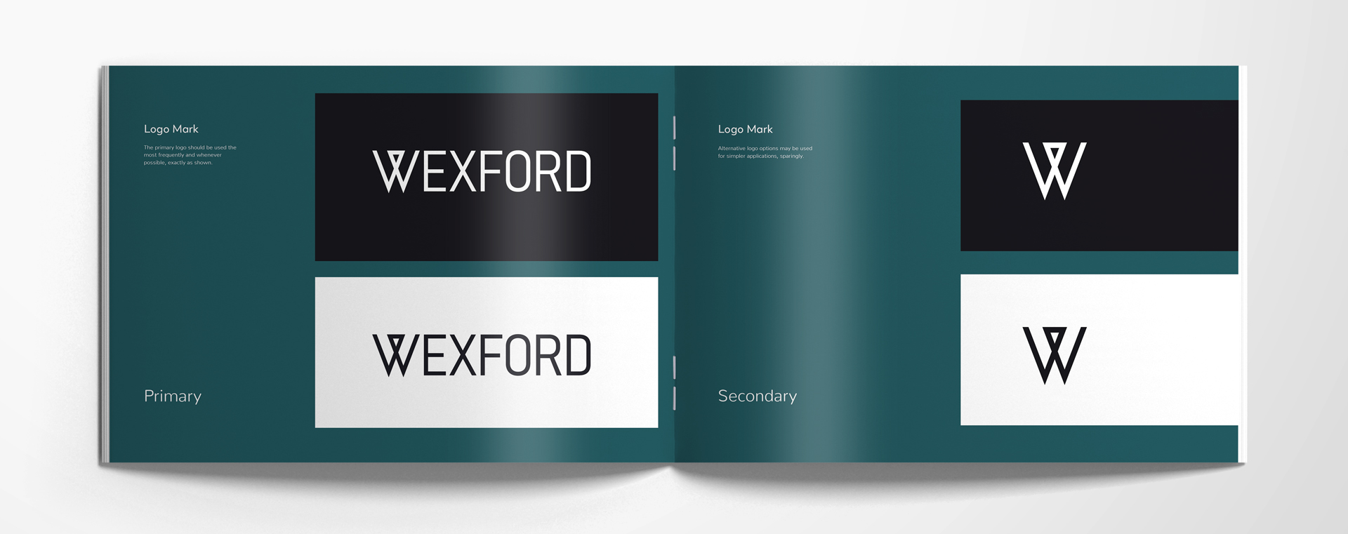
    Logo Mark

    What’s a logo mark?

    A logo. With a few variations—mostly there will be a dark background and light background version of a primary and a secondary. Primary logo marks should be used most often. When needed, the secondary can fit in smaller spaces or simpler applications.


    WHY IS A LOGO MARK IMPORTANT?

    This allows you to have your logo be consistent and recognizable. When you do something good, you’ll get recognition—because your logo was on it.

    brand-guidelines-4

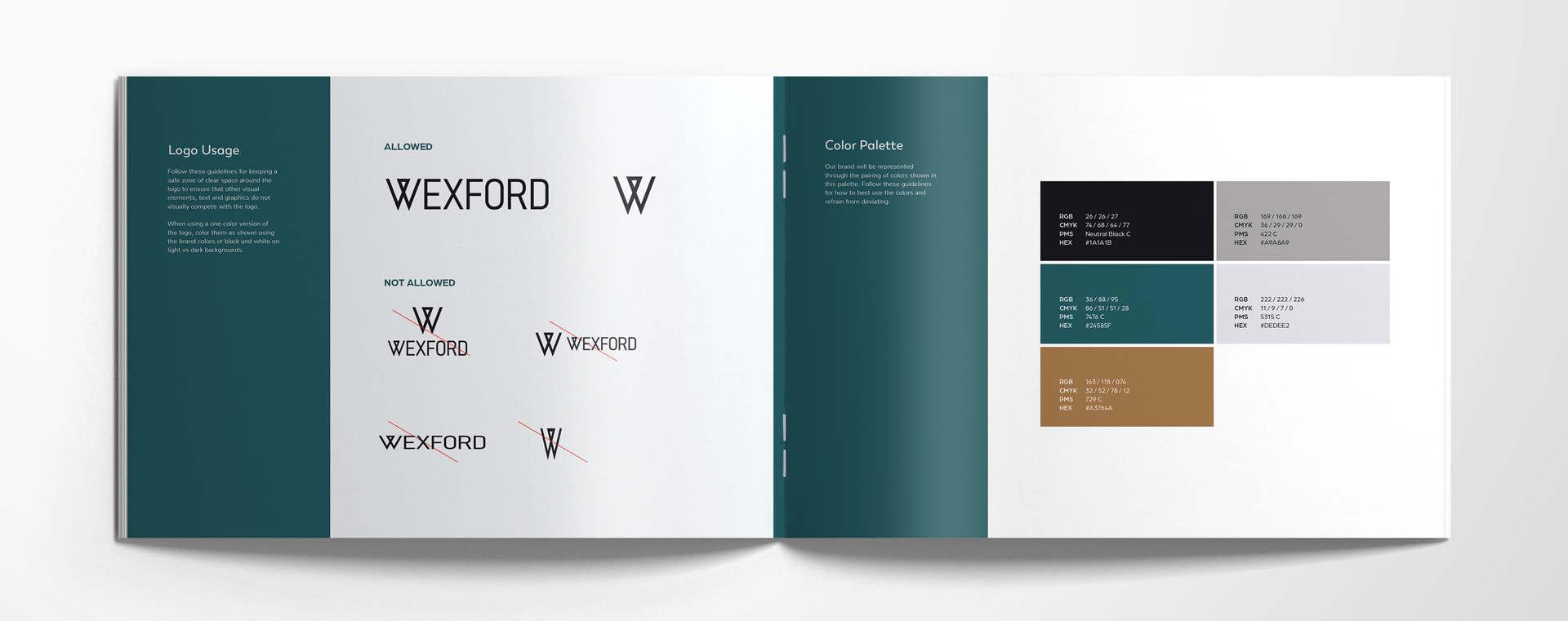
    Logo Usage

    WHAT’S LOGO USAGE?

    This is the rule book for how your apartment community logo may be used. It usually includes rules against tight spacing, strange angles, stretched or skewed logo marks, and incorrect combinations of the primary and secondary being used at the same time.


    WHY IS LOGO USAGE IMPORTANT?

    The rules are there for a reason. Keep things consistent, and appealing—the graphic designer knows best and has worked with the marketing portion of your team to dial in your brand visually, for the best chance at brand recognition and loyalty. Don’t touch the dials.

    Color Palette

    WHAT’S A BRAND COLOR PALETTE?

    A brand color palette in your apartment brand guidelines indicates precisely which colors are to be used in your marketing—your website, your mailers, your banners. It will typically include 3-6 colors, all with the four color codes included for exact matching (RGB, CMYK, PMS, AND HEX).


    WHY DO I NEED A BRAND COLOR PALETTE?

    Consistency through color is a major precursor to brand recognition and loyalty. Your colors are another visual reflection of your brand—color psychology is definitely a thing. Keeping them consistent means that you are predictable and reliable—to your residents.

    brand-guidelines-5

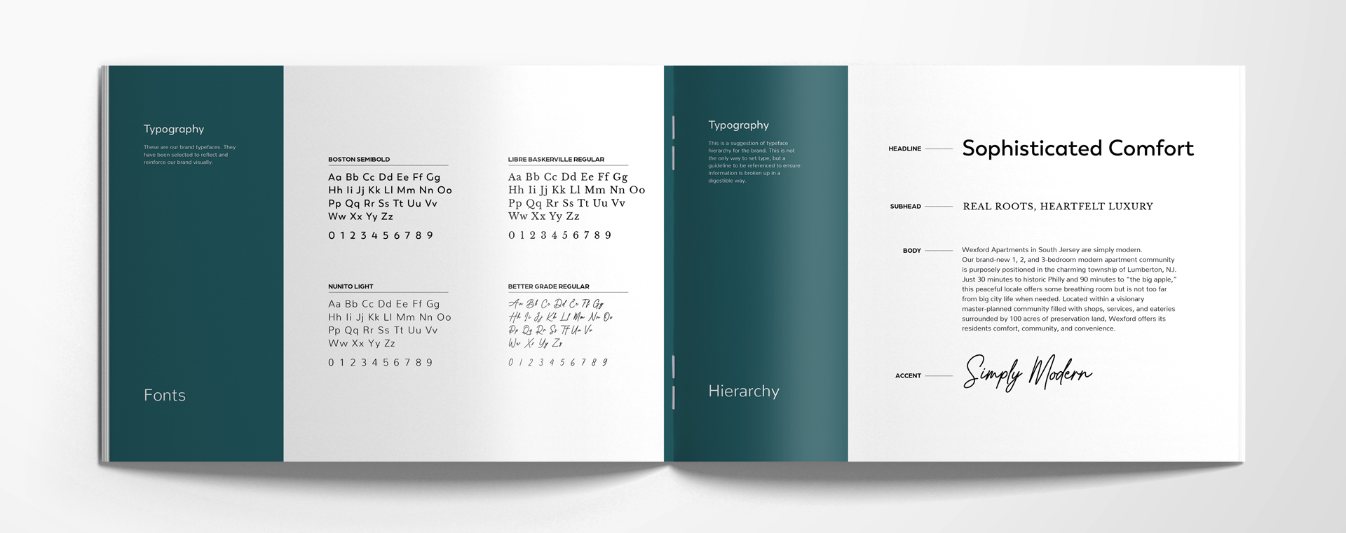
    Typography

    WHAT’S TYPOGRAPHY?

    Fonts. Typefaces. You can choose 2-4 fonts for different purposes. For example: headings, large text, small long text, and callout fonts can all be different. This is also called “typeface hierarchy”: a general guideline that helps your designers and marketing team ensure the content they’re publishing and/or printing is clear and easily understood, thanks to the fonts used for each section (i.e. heading, subhead, body, an accent uses).

    WHY IS BRAND TYPOGRAPHY IMPORTANT?

    Every typeface that your brand uses (again, ideally no more than 4) is another way to reflect your brand visually. When you use fonts consistently, it will help reinforce your brand to your IRP, especially if you’re in tune with how fonts make us feel.

    brand-guidelines-6

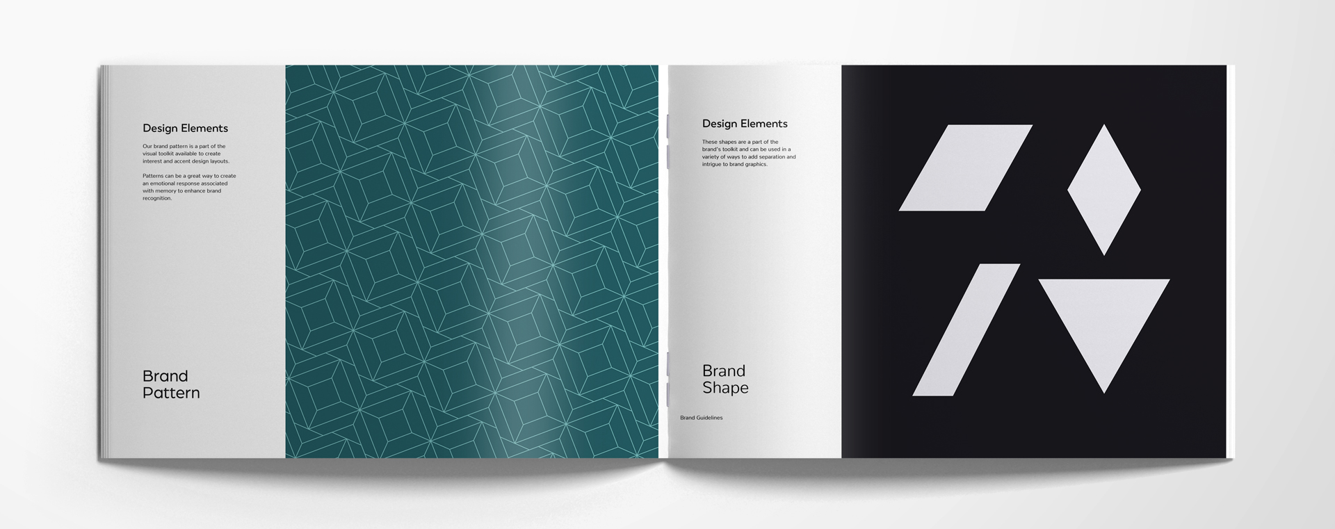
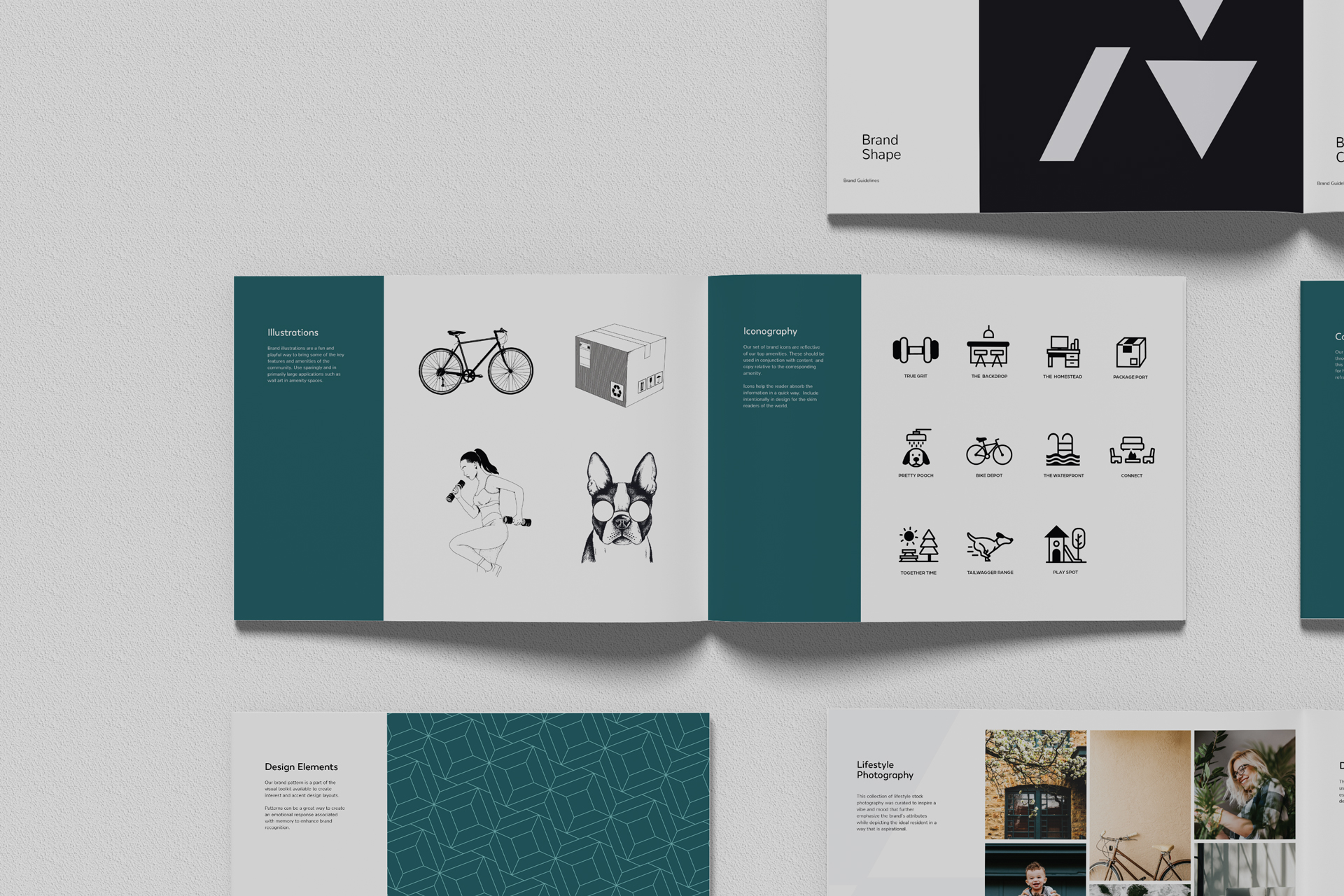
    Design Elements

    WHAT ARE APARTMENT DESIGN ELEMENTS?

    Apartment design elements are additional visual cues to clue your resident into the fact that you’re here, and you’re you. These design elements can include brand patterns, brand shapes, brand collage styles, and brand stamps.


    WHY DO I NEED APARTMENT DESIGN ELEMENTS?

    Community brand design elements are icing on the cake. It’s additional guidance for designers who want to do a little something extra for your website or printed materials. It makes it clear what is permissible in terms of design styles. 

    Brand patterns can help evoke emotion and recognition with patterns that repeat through the website background and on the borders or printed materials.

    Brand shapes help create intrigue in brand graphics—a way to break up too much text or photos for better readability or scannability.

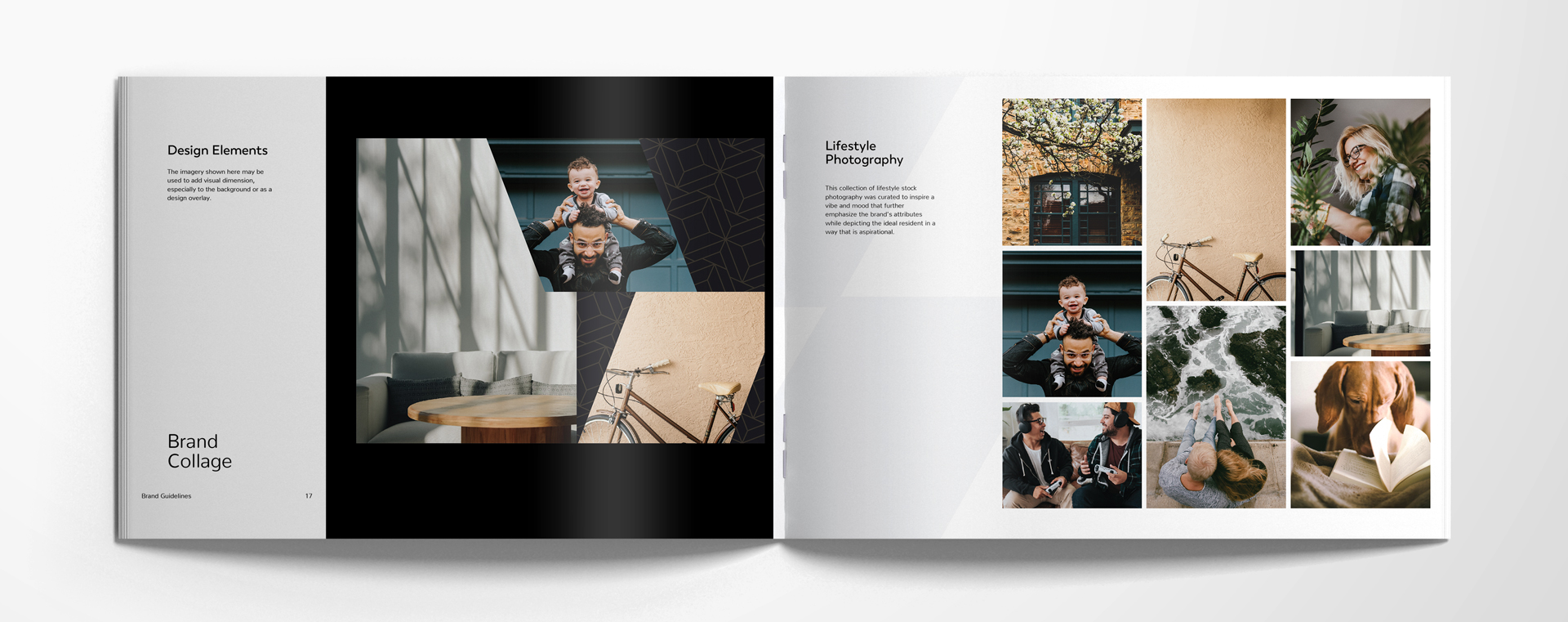
    Brand collage styles are a suggestion of how to lay out photos and brand elements together in a way that works in tandem with the rest of the brand guideline choices. It can be used as a background or a design overlay.

    Brand stamps are similar to logo marks. They should be used sparingly, and are generally useful for a hit of attention to strut your stuff where you most need it.

    brand-guidelines-7

    Lifestyle Photography

    WHAT’S BRAND LIFESTYLE PHOTOGRAPHY?

    “It’s a whole vibe.” Choosing the right style of stock photography for your brand is vital for an audience that is highly visual. They’ll want to see photos that inspire them, and photos that reflect the most aspirational parts of their psyche. 


    HOW SHOULD I CHOOSE PHOTOS FOR MY BRAND?

    Choosing photos that fall within a specific color palette will help keep everything cohesive. Each photo you pick out should emphasize the attributes you identified early on in your brand guidelines.

    brand-guidelines-8

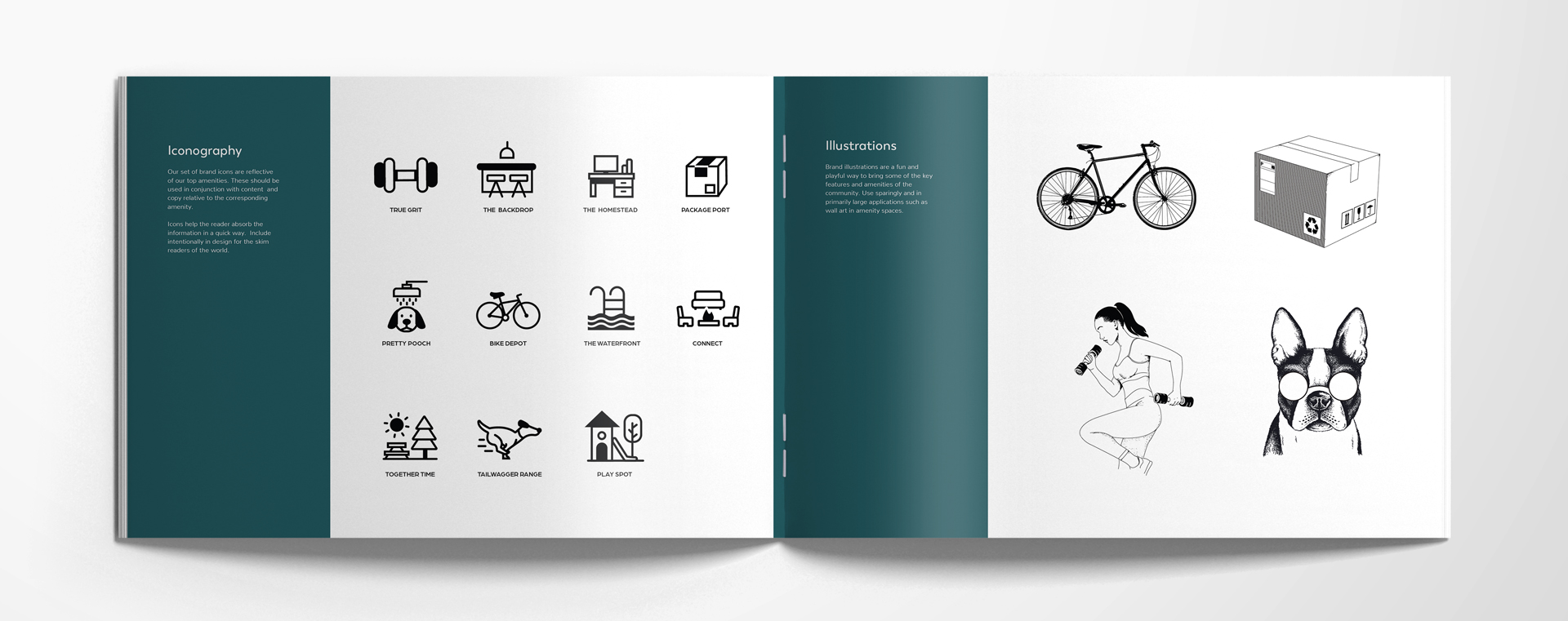
    Iconography

    WHAT’S ICONOGRAPHY?

    Who reads anymore? Hopefully you. But your ideal resident may not read that closely or carefully. Having icons is helpful—like a shortcut to an idea.

    HOW SHOULD I PICK ICONS?

    Make sure your brand iconography vibes with your content and copy, and clearly indicate what they are. Place them in your designs to help your residents (current and future) skim through your content to find what they’re looking for.

    Illustrations


    WHAT ARE ILLUSTRATIONS?

    We’re talking brand illustrations. But they’re not wildly different from book illustrations in their purpose—they can be fun and playful to use for your community’s features and amenities.

    WHERE SHOULD I USE BRAND ILLUSTRATIONS?

    Large applications are best for these very specific brand illustrations, like wall art or on the background of a webpage.

    brand-guidelines-9

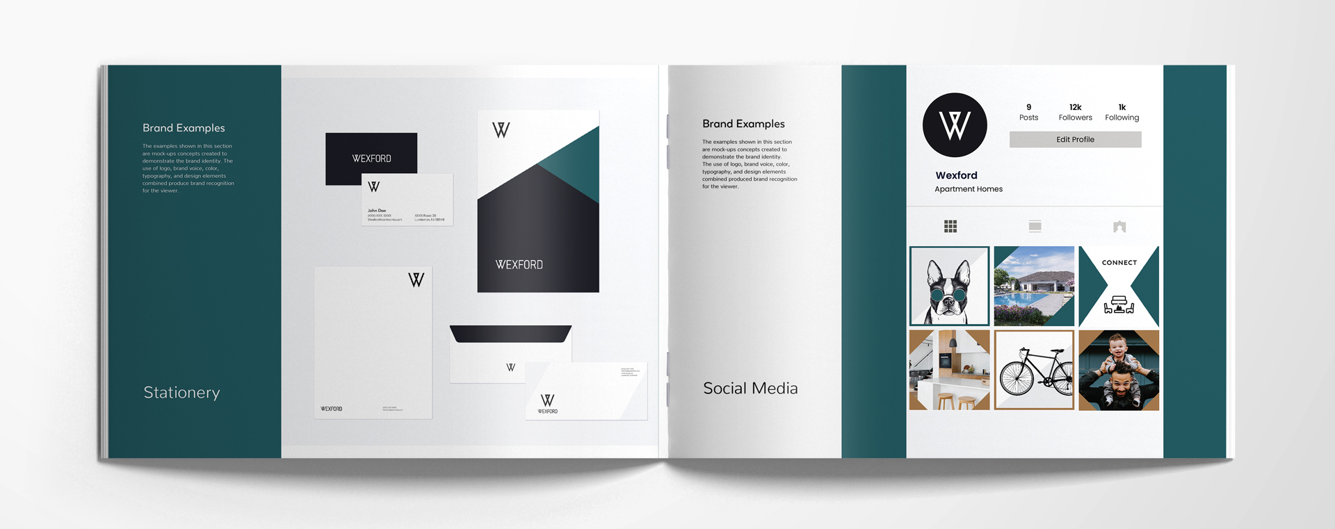
    Brand Examples

    The preview is here. In your brand guidelines, having a visual that shows how your stationery will look, what your signage displays, and how your instagram feed can be laid out, helps you fully visualize the ideal version of your brand. Guidance is key—and we think you’ll rise to the occasion.

    brand-guidelines-10

    Need a boost to figure out your brand? Reach out to zipcode creative today to set up a call.