Directional Signs and Maps are Vital to Apartment Marketing
Stacey Feeney
It’s finally time to open up your multifamily community, or re-launch your next leasing cycle. The leasing office is welcoming. The grounds are tidy. The surrounding neighborhood is excited. From your marketing analysis to the move-in of your residents, every step is vital to ensure an easy transition to life in your community! In order to make sure your residents’ journey to their new door is as easy as possible, give them a crystal clear map of what to expect and where to find all the amenities and offerings they’re looking for with directional signs and maps.
Today’s residents rely heavily on word of mouth (do their friends like it?), impressive/cohesive branding and marketing, and online reviews. On top of that, residents want to make sure that they’re located close to the amenities they want, both within the community they’re considering, as well as the surrounding neighborhood. Beyond an outline of community and local amenities, practicality is key for prospective or new residents–no one wants to be lost, despite all those “Not all Who Wander Are Lost” bumper stickers floating around. That’s where directional signs and maps will be vital.
Directional Signs
Much like street numbers that are easily visible on a house, providing directional signage in the community is important to ensure a sense of welcome, ease, and expectation.
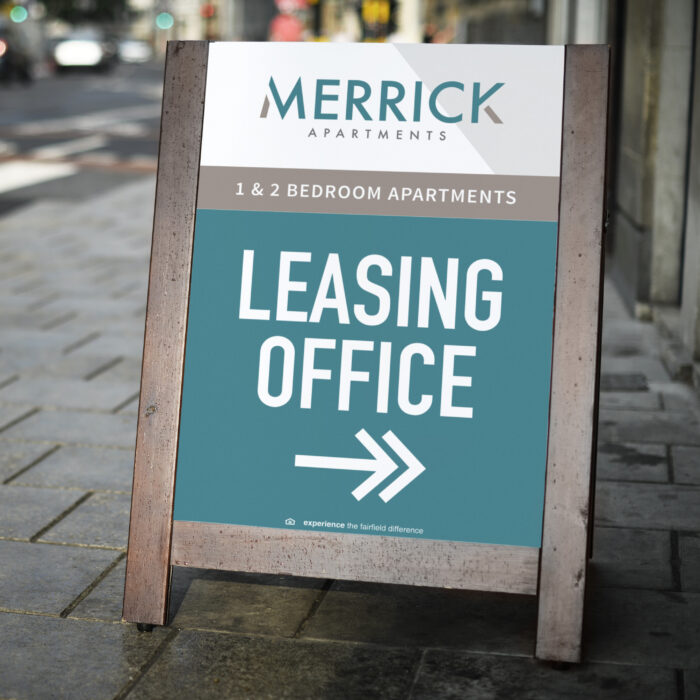
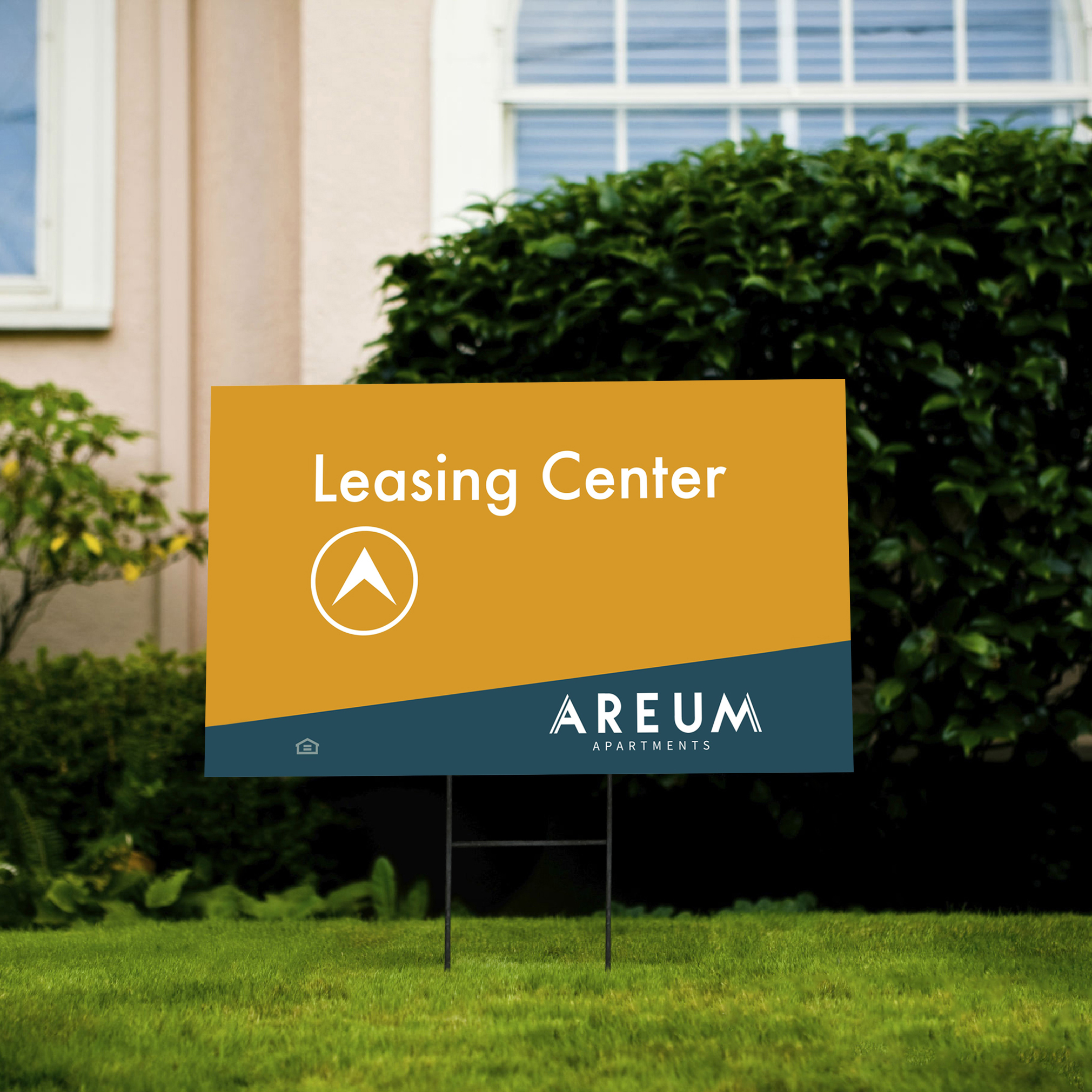
Bootlegs/bandits, which are also called yard signs, are helpful for giving directions to the leasing office for prospective residents, with a combination of text and arrows. (If a resident can’t find the leasing office, it will be difficult for them to sign the lease.) Make it as clear as can be with your directional signs.
When a prospective resident comes to your community, to find out whether they’d like to live there, signage should be clear, regular, and consistent. If the signs don’t match your typical branding styles, it may be confusing. If there are no signs, it can be a source of frustration. Just like a focus on customer experience with a website is vital, you should also focus on the customer journey through your physical community! Avoid wasting their time, causing them embarrassment, or becoming a source of frustration or confusion with well-branded directional signage.
If your community is multilingual, consider having your signs show two languages, so that everyone feels welcome, and can navigate without necessarily having to translate.
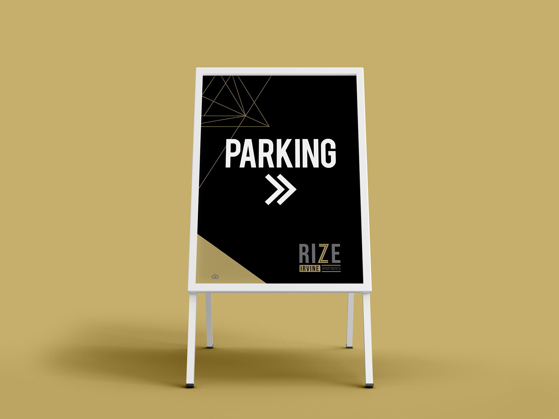
In addition to leasing office directions, having signs for parking can be a godsend. Not every visitor is confident in their ability to find parking, with some even previewing Google Earth to pre-plan their parking. Anticipate their needs, and have them saying “I saw the sign!”
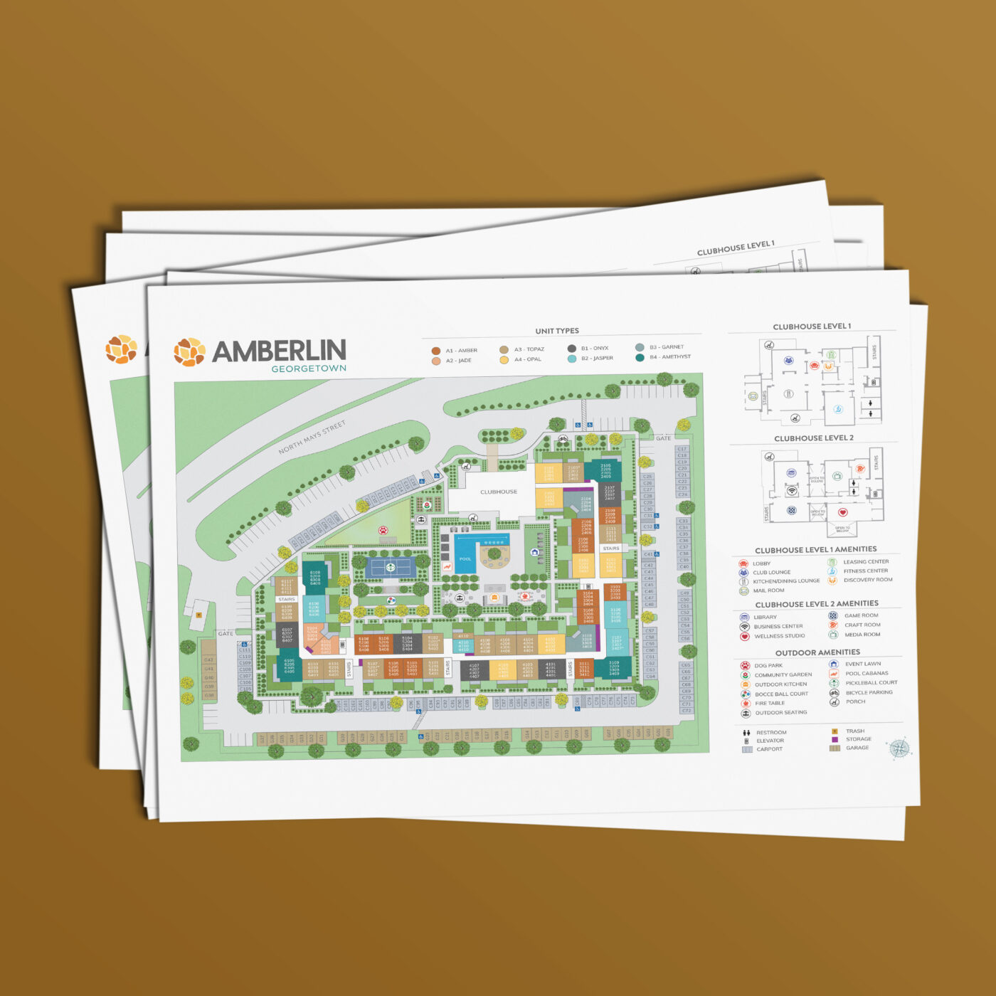
Sitemaps
The custom property sitemap, one of zipcode creative’s specialties, is like the corner piece of the puzzle for many apartment communities. Though most everyone has a smart phone with a web browser, GPS, messaging functions and many other apps, they don’t have a way to navigate your community beyond the front door. The residents and prospective residents are relying on you to create a map that helps show them where the apartments are in relation to everything else in the community.
Perhaps they’re a young couple, and they’d like to be close to the pool area. Perhaps they’re a family with older kids, and the barbeque area is more important. Or maybe they’re a single person that wants to meet others, and being near the clubhouse is high on their list. Depending on what their needs are, they should be able to easily see where your community amenities are in relation to the unit they’re considering.
zipcode creative’s sitemaps can be formatted for your use in both digital and printed versions, so you can share the map on your website through an email marketing campaign, or through a printed apartment welcome packet. With our help, we’ll make sure to identify the most important aspects of your asset: the lease office, parking, unit buildings and numbers, landscaping, and your special amenities that may include clubhouses, pools, and barbecue areas that your residents desire.
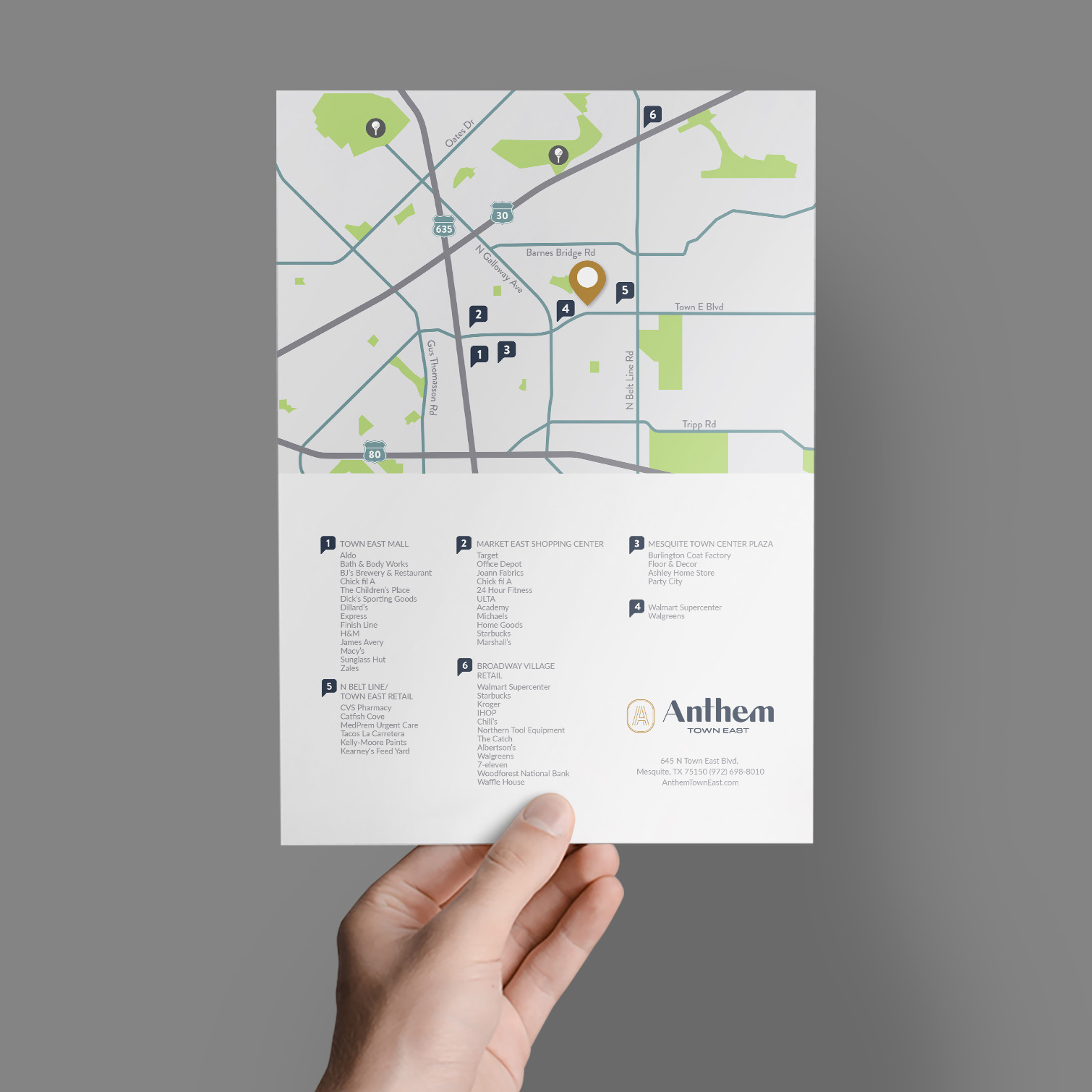
Location Maps
Beyond the borders of your apartment community, your residents will want to know: “Where’s the best place to ________?” in the surrounding neighborhood. You can answer that question, no matter how it ends, with a custom-designed location map from zipcode creative. With our detailed and stylized neighborhood map, you can identify all the good stuff that’s just a couple of blocks away, including restaurants, cafes, conveniences, and other points of interest (stadiums, golf courses, oh my!) Your residents will be excited to move in because you’re close to their favorite grocery store, or within walking distance of a cozy coffee shop.
PRO-TIP: Partner with a local business, and give your newly-signed-on residents a gift card to a restaurant or coffee shop!
The location map can be tailored to your ideal resident. For example, if you’re a senior living community, you can highlight nearby golf courses, healthcare facilities, and shopping centers. In contrast, student housing communities may choose to highlight the nearby university, coffee shops (“this one has free WiFi!”), gyms, and have more of a focus on nightlife.
No matter who your resident is, it’s always helpful to center them with a simple “You Are Here” message. Directional signs will welcome them, while sitemaps and location maps help them feel right at home in your community.
Contact zipcode creative to roll out the welcome wagon today.
Merrick, Areum, and Rize artwork is ©Fairfield Residential | Work executed by Stacey Feeney, owner of zipcode creative, while under creative direction and employment at Fairfield Residential.
