Ways You’re Breaking the Graphic Designer’s Heart
Stacey Feeney
Every time you open a word doc to create a design, a graphic designer knows and sighs. Unbreak every graphic designer’s heart by knowing the rules, best practices, and really, the greatest guidance for your multifamily designs.
With graphic design, it’s easy to make “mistakes”—but the worst part of making those mistakes is that a whole lot of other people are going to see those mistakes as well, when you put them on your flyers, your mailers, your postcards, and your banners. (Let’s hope they don’t end up on a billboard.)
Here are the mistakes we most commonly see. Don’t get down if you’re doing these, but…definitely commit to either fixing them or finding a graphic designer who already knows how to avoid these mistakes.
#1: Poor Image Choice
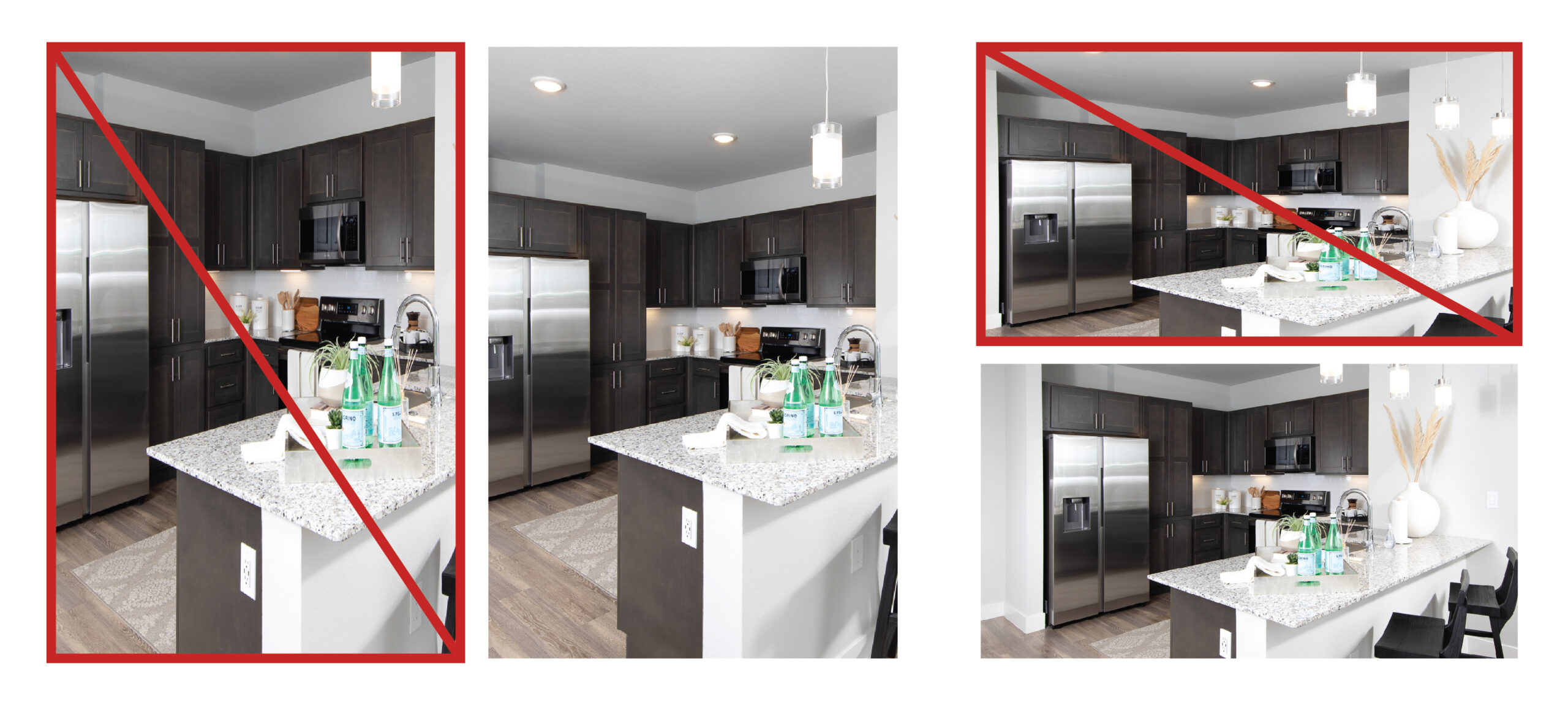
Whether stretched, squished, or cropped improperly, forcing a photo to fit in a space it can’t is bound to look strange. It looks unprofessional and will turn off the viewer pretty quickly.
DISTORTION/STRETCHED IMAGES
Stretching the image because you don’t know how to crop? Start learning! Often an email builder requires a specific image dimension. Stretching an image to fit is never a good look.
Do this instead: Crop or use clipping masks to help it fit into a space or shape. No distortion, no problem. Be sure to follow the rule of thirds as you crop, too.
BAD STOCK PHOTOS
This one isn’t hard to fix. But it’s sometimes hard to avoid if you’re not experienced with the wide set of options for stock. There are so many better stock photo options now. Avoid becoming a meme-worthy brand—avoid the stock photos that look like stills of the “Before” videos in infomercials..the woman opening a cabinet full of tupperware lids, the man cutting his hand on a can lid, the elderly lady getting tangled in a blanket.
Do this instead: Find better stock photos by paying for them and finding ones that look like natural people—i.e. not a white backdrop in front of an overly emotive person. Out with the ‘cheese’, in with the authenticity.
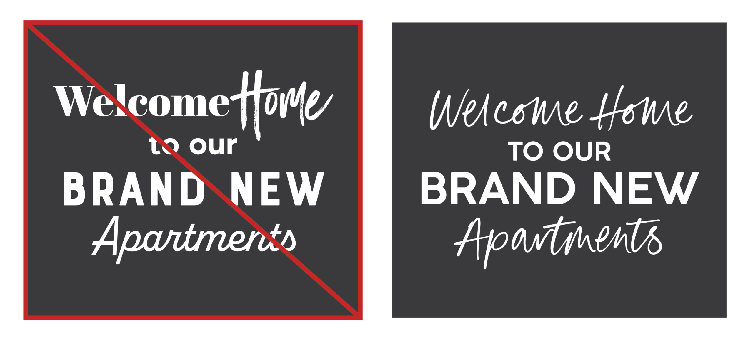
#2: Too Many Typefaces
Repeat after us: The typefaces you use should be no more than three in number, and should visually complement each other when used in the same design. Again, no more than three types of font.
Your content goes here. Edit or remove this text inline or in the module Content settings. You can also style every aspect of this content in the module Design settings and even apply custom CSS to this text in the module Advanced settings.
FONT PSYCHOLOGY
This one is so complicated, we did a whole blog post on font psychology. There’s plenty to consider when choosing a font. Serif, sans serif, script, decorative. And choosing one that will align with your brand (and what you want to communicate) is vital. When you have more than three fonts, it may make the viewer feel a little ill at ease.
Do this instead: Choose three fonts max. One of our favorite tips is to use one font and choose a few different weights (thin, semi-bold, extra bold, and the like). And pay attention to how you’re using the fonts—with a proper hierarchy of headline, sub-heads, and body text.

#3: Bad Colors
Certain color combinations remind us of specific types of things. Red and yellow? Fast food and hotdogs. Green and yellow? Cheeseheads.
Colors impact what we feel, pretty easily. Did you know, for example, that red is associated with strong, passionate feelings—cupid’s hearts (or depictions of the devil) anyone? Color psychology is very real and should definitely be a factor when you’re creating any of your graphic designs. And make sure they fall within or work well with your community brand’s color palette.
BAD CONTRAST
Beyond color choice, the contrast must also be considered. The text on the background must be readable—it can’t be dark if the background is dark, and it can’t be too similar to the color in the background.
TOO BRIGHT/JARRING
Think neon’s fun? Make sure you’re using something to offset it. If you use too many different colors (kind of like using too many fonts) it will cause visual chaos.
Do this instead: Take some time to understand the color wheel and make smart color pairing choices, ensuring that you keep the variety to a minimum and include varying shades of light to dark to accomplish your goals.
#4: Busy Busy Busy
Speaking of visual chaos, you also have to determine which elements you’re going to use and which ones should be the most important. You must create a visual hierarchy in order to broadcast the message you need to.
NEGATIVE SPACE
Leave a little room for imagination. This can help you give the viewer a sense of relief—there’s room to breathe. Negative space also makes the important things stand out more. Similar to the idea of contrast, the empty space highlights the things that are there.
WORDS VS. IMAGES
Use both words and images, allowing images to speak plenty, and keeping the text to the minimum of what’s required to tell your message.
Do this instead: If you’re creating a piece with both typography and imagery, the images should take precedence. As they say, they’re worth a thousand words. Much more space-efficient, right?
#5: Wrong Again
Designing in a bubble? Pop the bubble and make sure someone else sees it before it goes to print to prevent any easily edited mistakes to be fixed
THAT’S JUST WRONG
You forgot to proofread? Oh, no. Now your whole design is for nothing. When folks find a typo, that’s all they can think about. Make sure you have a second and third set of eyes on it. Sometimes it’s not even that a word is misspelled or misused, but rather that a letter has a design effect on it that has made it appear like something else. Get a second opinion, always.
TRENDS OR TIE IT ALL TOGETHER?
Trendy is fun. Not necessarily timeless. However: all designs must work with the brand identity. (If you don’t have a brand identity, be sure to get one!) If you have a trend that could work with your brand identity and it’s not super distracting, by all means—catch the ideal resident’s eye!
Brightly colored minimalism is fun, and asymmetrical layouts are intriguing. There’s certainly a right way and wrong way to use these—use your designs to tie everything together.
Do this instead: Working through your visual identity and ensuring it all aligns will be best for your visual identity’s longevity. Find your style, and do your best to stick with it.
Bottom line here is, if you’re DIY-ing your designs, any mistakes you’ve made…you did it to yourself.
Let us save you from poor design choices by guiding you in the right direction; we’ve been doing it long enough to spot mistakes a mile away!
Contact Zipcode Creative for graphic design without breaking anyone’s heart.
