
Tag: branding colors

How to Choose the Best Color Pairings for Apartment Branding

Color is so essential to branding and design, that brands are often recognized by just their chosen hues—even before our brains can process the logo shape or words. The cherry red of the Coca-Cola logo or the red and yellow that signify McDonalds are as distinct—if not more recognizable—than some of their other branding elements. Be sure to prioritize color pairings for your apartments to help make your mark. Before you design your logo or create your community website, start with finding the best combinations for your community using these tips and tricks. 

Understanding Color Theory

Color harmony is one of the main tenets of color theory that assesses which colors work well together—and which don’t. There are three main approaches to color harmony: complementary colors, analogous colors, and triadic colors.

Complementary Colors

Complementary colors are those that are opposite on the color wheel. For example, red and green, purple and yellow, and blue and orange are all complementary color pairings. The reason these colors work so well together is that complementary colors pair together a warm and cool color to create contrast. The opposing hues help the colors appear brighter for a more eye-catching combination. 

Complementary color pairings are often found in nature, which also makes them naturally pleasing to the human eye. For example, purple flowers with a yellow center, an orange sunset over the blue ocean, or green leaves with bright red berries are all beautiful combinations that you can find on almost any nature walk. 
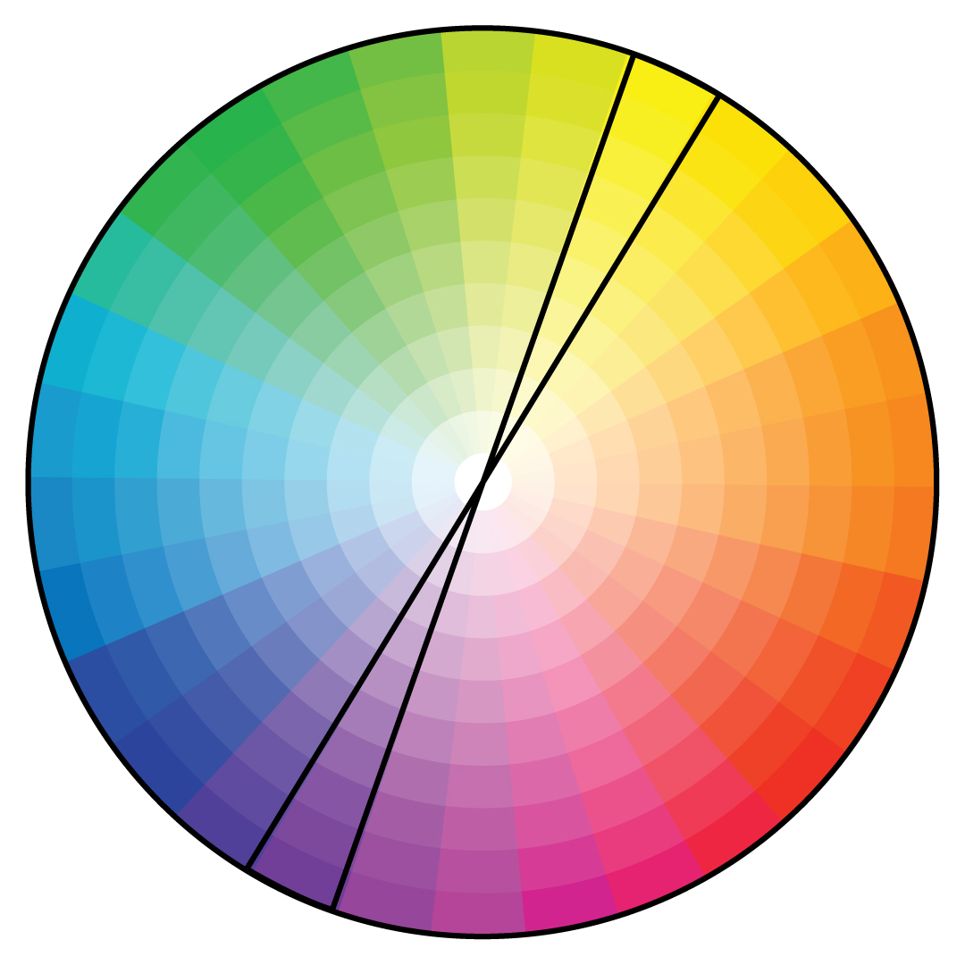
Analogous Colors

Unlike complementary colors, analogous colors are those that are next to one another on the color wheel. Red, orange, and yellow, or blue, green, and yellow are examples of analogous color combinations. When creating an analogous color scheme, one color should be the dominant shade, while the others serve as accent colors. Though these color palettes aren’t as attention-grabbing as complementary color schemes, they are still very pleasing to the eye and are a good, more subtle option when choosing your brand colors. 

Triadic Colors

Triadic color schemes are combinations of three separate shades that are equal distances apart on the color wheel. Red, blue, and yellow, for example, is one of the most common triadic color palettes. Green, orange, and purple is another triadic combination. While this approach is less common than complementary or analogous color schemes, it’s a vivid option that can help your brand’s logo and marketing materials stand out.

color pairingscolor pairings

Choosing Your Color Scheme

Because there are nearly infinite color combinations to choose from, it can be a challenge to pick your brand colors. To make it simpler, start with the favorite or must-have color. Take that shade and create a few different color palettes to see what works best with your brand.

Combine your chosen shade in a complementary, analogous, and triadic color pairing. This will help you see your favorite hue in several different combinations, making it easier to visualize what your brand colors and logo might look like.

Be sure to also take a look at color psychology to ensure your chosen shade speaks to your brand values. Each shade has intrinsic effects on people, whether they realize it or not. Blue, for example, tends to have a calming effect while red creates a sense of urgency. Green is associated with wealth, while purple is often associated with respect and wisdom. Before finalizing your palette, evaluate your chosen primary color and make sure that the meaning aligns with what you want your brand to be known for.

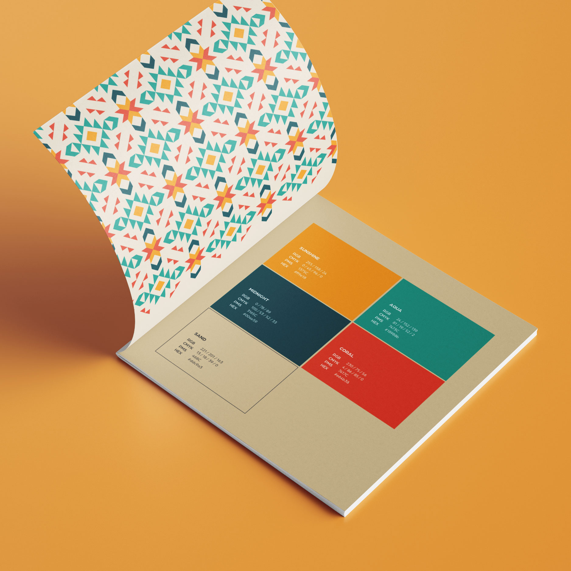
Once you’ve nailed down your palette, don’t forget to expand your hues by adding both light and dark shades—to create a well-rounded palette that allows you to develop any marketing asset your community may need.


If you’re struggling to find the perfect pair of colors to represent your apartment community, we can help. As design experts in the multifamily space, we know exactly how to curate brand colors to make your community stand out. Get in touch today to get started!

Color Palette: Branding Apartments

Besides the name and logo, there’s another part of your branding that ensures your community is instantly recognizable: your color palette. Certain combinations of colors instantly recall certain brands—while bold primary shades of yellow, red, and blue represent Google, bright red and white are equally synonymous with Coca-Cola. Choosing a distinct combination of colors is a must to help your community amp up your brand recognition and stand out from your competitors.

But all color palettes aren’t created equal. When choosing your colors, be sure to carefully consider a few different factors to land on the perfect hues.

Dos:

  • Consider color psychology
  • Explore your favorite brands’ palettes
  • Evaluate your brand’s personality 
  • Look for inspiration in unexpected places

Don’ts:

  • Copy other brands directly
  • Forget about your target audience
  • Just choose a single color
  • Skip testing your palette

Do:

Consider Color Psychology

People naturally associate certain colors with certain feelings or emotions. Red, for example, is often associated with anger or passion. Pink is typically considered a feminine color, while purple is a majestic and royal shade. When choosing your colors, be sure to consider the intrinsic meaning of each hue, and ensure it aligns with your greater brand messaging and objectives.

Don’t:

Copy Other Brands Directly

Having a unique color palette is integral to standing out. While you can seek inspiration from other brands, be sure to put your own unique twist on the shades. Change the saturation, swap out a few of the secondary colors, or use them in different ways to create a distinct visual identity for your brand. The more you can standout from your competitors, the better – so do your own thing with color too!

Do:

Explore Your Favorite Brands’ Palettes

If you’re looking for inspiration, look to your favorite brands and see what they have in common. Are you gravitating towards bright, bold color palettes? Or do you prefer more muted, neutral combos? Evaluating your top picks can help to reveal patterns and preferences you may not be conscious of, giving you a good starting point for creating your own.

Don’t:

Forget About Your Audience

Consider who you’re targeting when choosing your brand colors. If your audience is mostly Boomers, for example, you would maybe want to explore muted, neutral shades and cool tones. If your audience is Gen Z, on the other hand, you’d want to explore more playful, bold, and youthful shades. These small nuances can help your branding resonate better with your audience and make your community feel like a naturally better fit.

Do:

Evaluate Your Brand’s Personality

If your brand is sophisticated and elegant, you want to ensure you choose colors that match. Similarly, if your brand is more fun and playful, you’ll want to pick shades that represent those elements. No matter your brand personality, be sure to mimic your style and vibe with your primary and secondary colors. This will help give your audience context clues about your brand, so they better understand your style from the very beginning.

Don’t:

Just Choose a Single Color

Branding needs more than one color to shine. Choose at least two primary shades, in addition to a selection of neutrals, that you can mix and match to create different marketing collateral. This will help ensure you have dynamic and interesting assets, as opposed to ones that fall a little flat.

Do:

Find Inspiration in Unexpected Places

Colors are all around us, which can make it easier to find your favorite combos. You don’t just have to use photographs and other brand logos as a starting point. Think outside the box and look to natural landscapes, food, flowers, and even fashion trends as a starting point for the individual shades and color combinations you’re drawn to.

Don’t:

Skip Testing Your Palette

While your colors may look good in isolation, it’s important to test them in different places to make sure they make sense tother. Make a few different combinations and a few different cross-channel assets to make sure you like the way everything is working. You should also test the color contrast for accessibility to ensure any text is easy to read.

color palette

Putting it All Together

After gathering your inspiration and doing your due diligence, it’s time to put everything together. 

  1. Start by asking senior leadership which colors they love (and which they hate). This will help give you a good jumping-off point for your color palette.
  2. From there, choose your first must-have shade. This will serve as the primary color in your palette.
  3. Then, add a complementary color. If you’re not sure which color best complements your pick, look to the color wheel—the shade on the exact opposite side of the wheel is its natural complement. 
  4. Then, play around with the saturation. Choose both a light and dark version of your primary brand color. 
  5. Next, add one or two neutral colors like white, black, gray, or beige. This will help you achieve the dynamic palette you need to execute any type of asset. 
  6. Finally, add an accent color to add an eye-catching pop.


If you’re struggling to find a color palette that feels true to your brand, reach out to the experts. At zipcode creative, we handle every element of branding from logo and name development to brand guidelines and color palettes. We’ll partner with you and your team to create a brand identity that perfectly represents your community. Reach out today to get started!