Apartment Logo Design from A to Z
Stacey Feeney
Apartment Logo Design 101
THE PURPOSE OF AN APARTMENT LOGO
You need an apartment logo design. But why? What is the actual point of a logo? A logo does two things: it tells people who you are (with your brand name) and it shows people who you are—with the design; the visual illustration stands in to fully represent your company. So, no, it shouldn’t be the last thing on your laundry list of marketing to-dos. It’s vitally important to your community marketing strategy, so bump it up to the top of your list. Right now.
WHERE TO USE YOUR APARTMENT LOGO
Your apartment marketing strategy would be lost without a logo. It should be everywhere, on everything: brochures, mailers, advertisements, and signage. Giveaways, welcome packets, and your website. If it can be seen (whether it’s printed or digital) and is part of your marketing collateral, it should have at least one version of your logo placed on it.
IMPORTANCE OF LOGOS IN COMMUNITY BRANDING
If we haven’t convinced you yet, here are the top three reasons why branding your community with excellent logo design is in your best interest:
- Foundational – You’re busy building your brand. The logo is the first thing people will look at. If they’re skimming your marketing collateral, your apartment logo design has the opportunity to stand out and be memorable. Make it a good one.
- First impressions – An excellent apartment logo design projects professionalism. Want to be taken seriously? Use a great logo, and use it consistently.
- Brand recognition – Yes, you want to be recognized, but you also want to be associated with good things. But that simply can’t happen if the brand recognition isn’t there. Use your logo on everything you can (once per piece is likely enough) and make sure it’s an approved version of the logo.
Designing an Apartment Logo
Whether you’re starting from scratch (hooray, a new construction!) or rethinking your entire brand, it’s important to have an idea of where you want to go. Create a roadmap. Allow yourself time to go through a full branding process that gives space for logo brainstorming, values alignment, and full logo iteration.
STAKEHOLDER BRAINSTORM
Get a committee together and brainstorm. Talk through your ideas and feelings about the brand. Answer a brand questionnaire together. If you’re rebranding, make sure you have your mission, vision, and values set up. These will inform your big ideas about the community, of which your logo can then become a visual representation.
BUT WHAT’S IT ALL MEAN?
Logos need to align with your brand—you’ve heard us say this before. But you need to ensure that it reflects your community at present, and at its best: it should be both descriptive and aspirational (even if abstractly so), encapsulating who you are now and what you hope to be for your ideal residents.
LOGO COMPONENTS
In order to reflect your best self, er, your best apartment community brand, you need to take into account each of the basic logo components when you’re creating your design: color, font, and graphics.
Color has a lot to do with feelings—what do you want your future resident to think about your brand? For example, black is associated with luxury. Orange is associated with youth and excitement. Blue is associated with trust. Green makes for a natural feeling. Show your true colors!
Fonts can be tricky. You don’t want it to be so basic it’s boring, but you also want to stay away from excessively complicated and distracting serif or cartoony fonts. Fonts can help you tell the personality of your brand: Elegance? Charm? Youth? Stability? Friendliness? The right one can make your logo design a home run.
Illustration is a huge part of your logo (and is sometimes a stand-alone piece). Don’t make it complex. Simplify the look and make it easy to understand. If the illustration portion of your logo design causes furrowed brows, that’s a sign. A bad one. Make it easy, make it clear, make it memorable.
Apartment Logo Design Best Practices
DON’T DIY A LOGO: FIND A PARTNER
If the above instructions are any indication: logo design can be complicated. It’s best to find a partner that can help you through the process. They’ll give you their best tips, and help you get a logo design that you’re happy with (and one that should last for a good, long time.)
ENVISION EVERY OPPORTUNITY
An excellent apartment logo design will look good everywhere it’s used. Make sure it stands out enough, but also captures ideas around your community’s location, your specialized amenities, and especially: the feeling you want your residents to connect with. For example, choosing a logo that looks youthful and fun if you are attracting student residents. Or: envision something that is more relaxed and inviting if you’re a 55+ active adult community (to show off the maintenance-free living aspect).
GET VARIATIONS
Logos aren’t necessarily one and done. Yes, once you have the basic illustration, the font choice, and the colors to go with, you’re nearly there. However, you should also make sure you have the rest of the logos you may need: a one-color logo, the basic logomark, and of course, the logo with the apartment community name—in various placements. Wherever you plan to put your logo, make sure you have a version that works.
SET UP DESIGN PARAMETERS
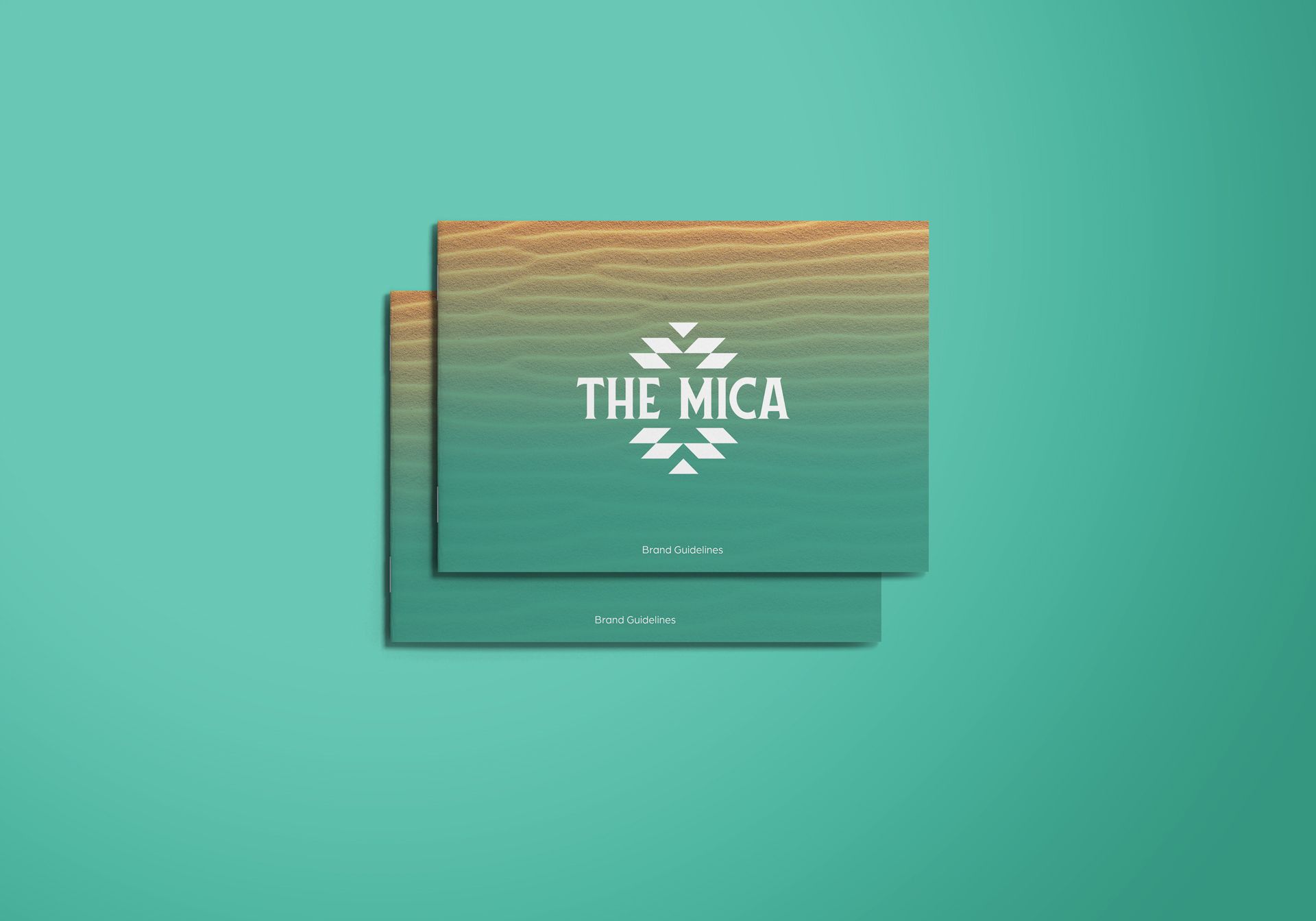
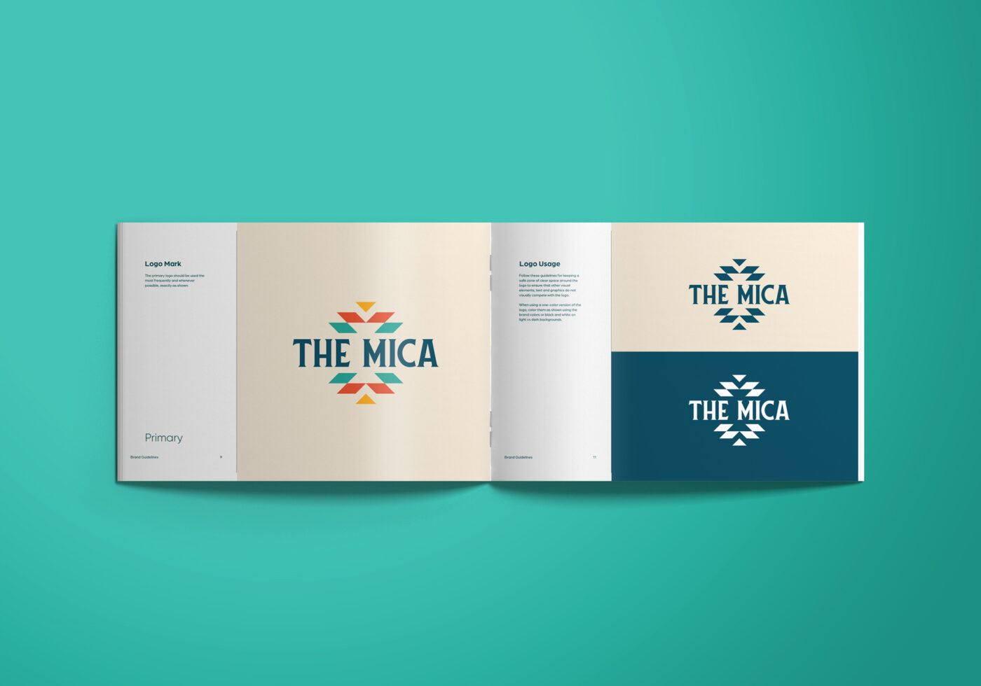
Limits and boundaries are always a good idea. Give clear instructions on logo usage, laid out in your brand style guide. For example—don’t show the logo in unapproved colors, and make sure it has space around it to stand out. Show exactly how to use the logo and you’ll be set for apartment branding consistency.
AVOID AT ALL COSTS
Ah, yet another vote for simplicity in logo design for your apartment community. When you make it overly complicated with faded edges, or ombre coloring (or more than 3 colors) you end up with a design that is confusing and sometimes difficult to replicate—especially on apparel. Bring the answers, not the questions, with your logo design.
Apartment Logo Design Services
zipcode creative offers a number of professional logo design services for apartment communities. We’ll partner with you to make sure you get exactly what you need, while guiding you with best practices, and multiple years of experience in the multifamily business.
LOGO DESIGN
This option will get you a new custom logo design for a new construction or a rebranding. With this choice, you’ll have 4-6 design concepts to choose from, and we’ll refine from there. Ah, we’re already excited to help you. (Logo design is our jam, in case you haven’t noticed.)
LOGO REDRAW OR REFRESH
We can help you get your apartment logo back in business. Sometimes you need a recreation of your current logo for high res and vector file types with a color change if needed (that’s a redraw). Or, sometimes you just need to update and refresh to keep a good thing going—we can modernize your current logo and keep it close to the original, with 4-6 logo concept options to choose from.
Logos are one of the most defining aspects of your apartment community’s brand. Let us help, and we’ll guide you with best practices (and super fun color theory) to help you stand out and stay up to date.
