What’s Included in Apartment Brand Guidelines?
Stacey Feeney
Ever wish there was a roadmap for apartment branding? Meet apartment brand guidelines.
This…map won’t look like anyone else’s. Except for the main elements that are required for any map: scale, latitude, longitude, compass.
And When you have every piece of your brand guidelines all laid out in front of you, it’s going to be a lot easier to get where you want to go (the land of sweet success, the true treasure.)
Brand Positioning
WHAT’S BRAND POSITIONING?
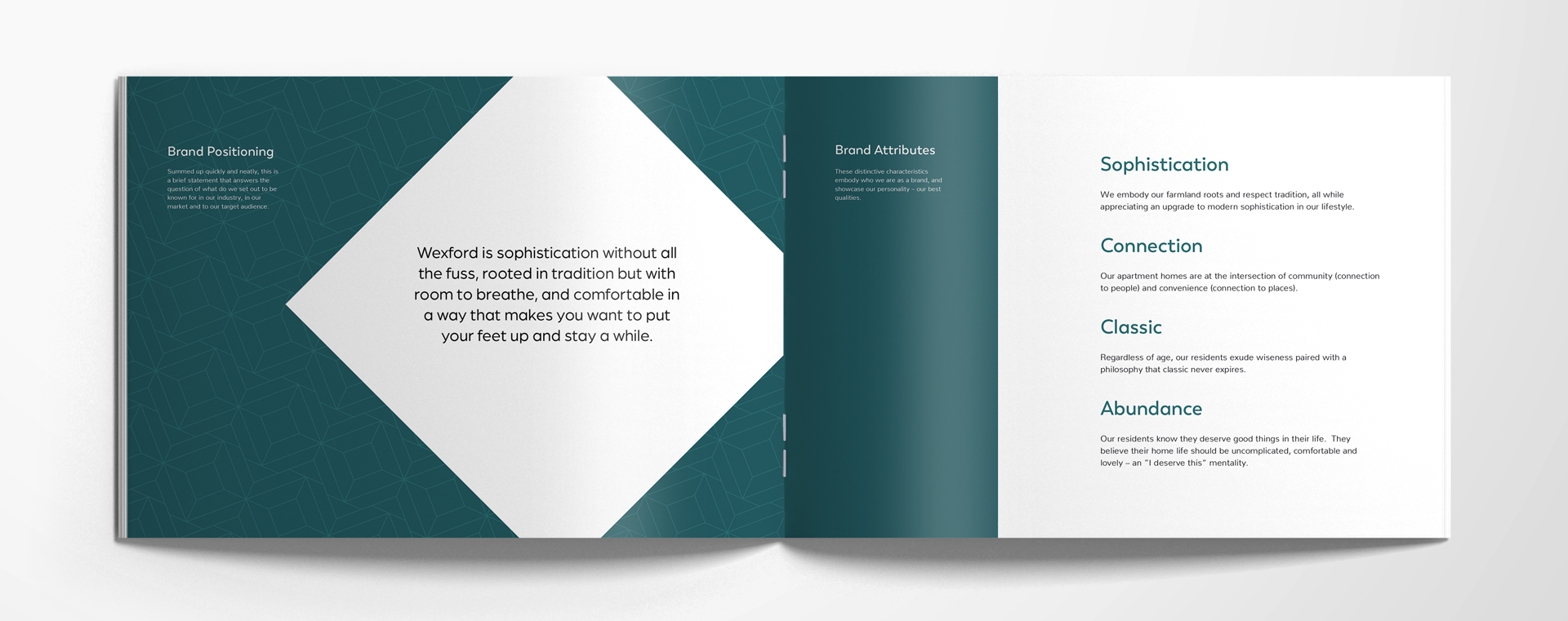
Brand positioning is a quick statement about your apartment brand that tells the reader: This is what we are known for—or wish to be known for—in our industry, market, and to our target audience.
WHAT’S BRAND POSITIONING FOR?
Brand positioning is your company’s compass. Or, if you’re even more old-fashioned, your North Star. It reminds you of the direction you’re headed, and gives you something to measure up to, which could be business decisions, ad copy, partnerships, you name it. If it doesn’t align, it shouldn’t be considered the right choice, and it won’t feel authentic to your brand, either..
Brand Attributes
WHAT ARE BRAND ATTRIBUTES?
Brand attributes are characteristics that distinguish your brand. By using words that display the best parts of your brand’s personality, you can embody who you are, and put your best side in the spotlight. A fun way to think about this is choosing a celebrity that most embodies your brand—and why. (e.g. Julia Roberts—she has a sense of humor, is gorgeous, and is, in our minds, a spicier twist on classic.)
WHAT DO BRAND ATTRIBUTES DO?
Brand attributes are meant to set your brand apart. (You’re not like everyone else, right?) This puts the hard-to-define soul of your brand into literal words and ideas. By choosing 4-6 words, with a brief rationale for each, we can get a little closer to the heart of your apartment community’s brand.
Ideal Resident Profile
WHAT IS AN IDEAL RESIDENT PROFILE (IRP)?
An ideal resident profile is your key audience. It will help your brand speak directly to the very residents it wants to attract. By taking in the data from your product offering (luxury apartments? 55+ condos?) and from the market you’ve placed yourself in (bustling city life vs. quiet suburbs) you can better identify exactly who your brand sets out to serve. The IRP is based on data
WHY DO I NEED AN IRP?
An IRP gives you a resource when you’re determining your best targeting or marketing strategies. In the same way that your apartment’s brand positioning statement is your compass, your IRP is where X marks the spot. Your goal. Your target. Who you’re reaching for.
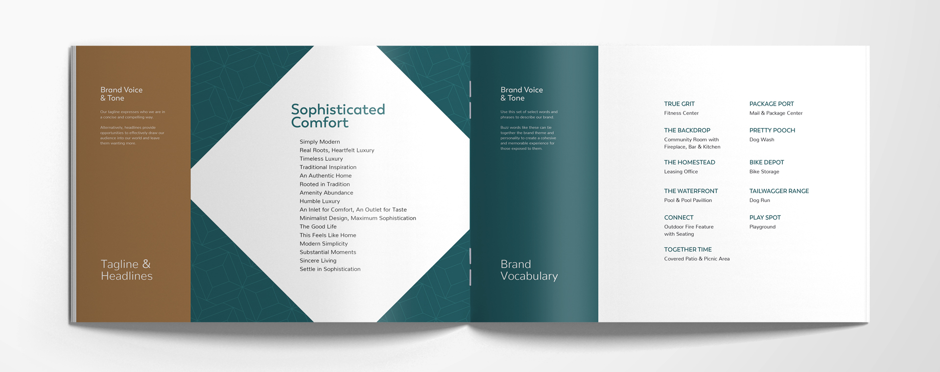
Brand Voice & Tone
WHAT IS BRAND VOICE AND TONE?
Now that you know who you’re taking to (IRP) you’ll have an easier time getting your brand voice and tone tightened up. Channel your brand attributes when speaking to your ideal resident profile while you recall your brand positioning (you remember, right?: what you want to be known for). Bring it all together in your content and you’ve got a brand voice and tone.
HOW DO I IDENTIFY MY COMMUNITY’S BRAND VOICE AND TONE?
A few ways.
Brand identity statement:
Summarize your brand’s full identity with statements that tell who you are and what you offer, in a few paragraphs. Write your brand identity statements in a way that will appeal to your IRP, keeping in mind their biggest desires, fears, and hopes—that you fulfill.
Tagline:
Grab attention with something short and snappy that sums up who your brand is—kind of like a slogan.
Headlines:
Keep that attention with shorter phrases that can be sprinkled throughout your content to intrigue your current and future residents with more hints of who your brand really is.
Brand Vocabulary:
Distinct to you, it’s your own language—a set of phrases and words that are in your brand’s go-to dictionary. With interesting names for your amenities, you create a culture all your own for every piece of your community.
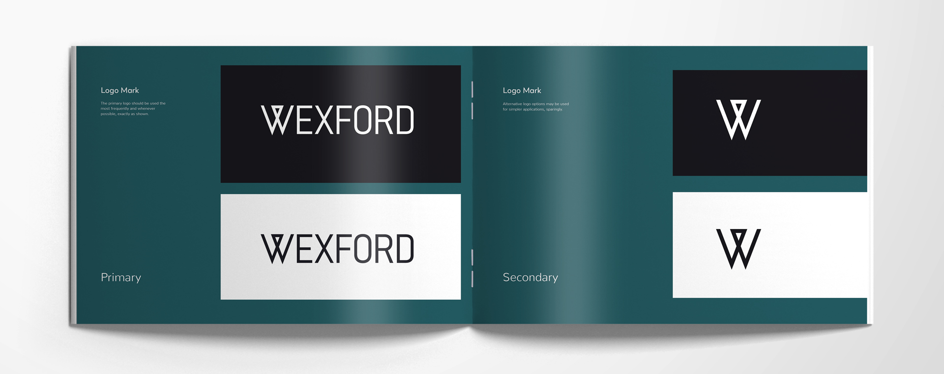
Logo Mark
What’s a logo mark?
A logo. With a few variations—mostly there will be a dark background and light background version of a primary and a secondary. Primary logo marks should be used most often. When needed, the secondary can fit in smaller spaces or simpler applications.
WHY IS A LOGO MARK IMPORTANT?
This allows you to have your logo be consistent and recognizable. When you do something good, you’ll get recognition—because your logo was on it.
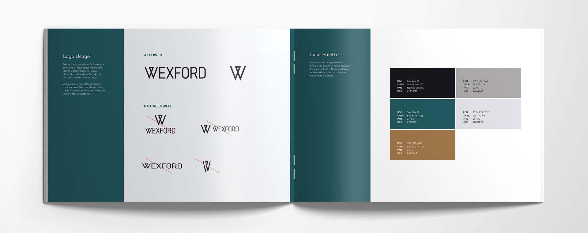
Logo Usage
WHAT’S LOGO USAGE?
This is the rule book for how your apartment community logo may be used. It usually includes rules against tight spacing, strange angles, stretched or skewed logo marks, and incorrect combinations of the primary and secondary being used at the same time.
WHY IS LOGO USAGE IMPORTANT?
The rules are there for a reason. Keep things consistent, and appealing—the graphic designer knows best and has worked with the marketing portion of your team to dial in your brand visually, for the best chance at brand recognition and loyalty. Don’t touch the dials.
Color Palette
WHAT’S A BRAND COLOR PALETTE?
A brand color palette in your apartment brand guidelines indicates precisely which colors are to be used in your marketing—your website, your mailers, your banners. It will typically include 3-6 colors, all with the four color codes included for exact matching (RGB, CMYK, PMS, AND HEX).
WHY DO I NEED A BRAND COLOR PALETTE?
Consistency through color is a major precursor to brand recognition and loyalty. Your colors are another visual reflection of your brand—color psychology is definitely a thing. Keeping them consistent means that you are predictable and reliable—to your residents.
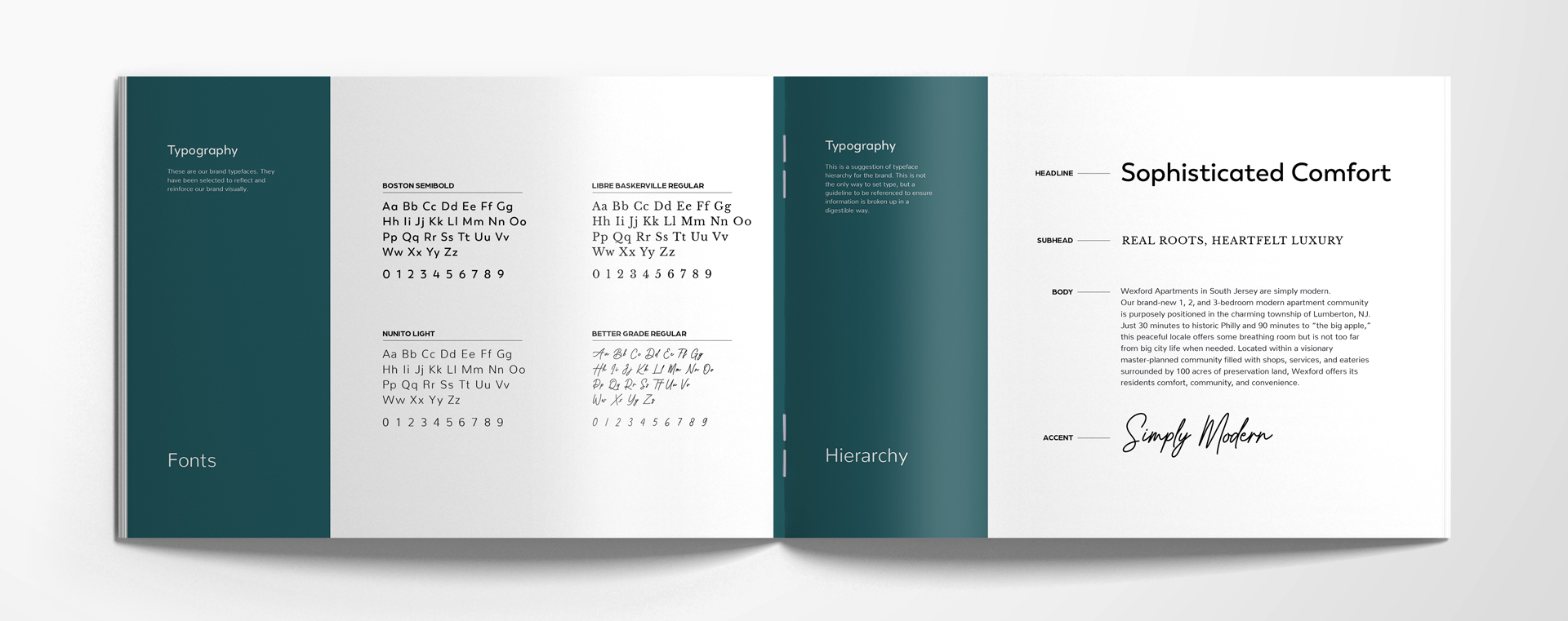
Typography
WHAT’S TYPOGRAPHY?
Fonts. Typefaces. You can choose 2-4 fonts for different purposes. For example: headings, large text, small long text, and callout fonts can all be different. This is also called “typeface hierarchy”: a general guideline that helps your designers and marketing team ensure the content they’re publishing and/or printing is clear and easily understood, thanks to the fonts used for each section (i.e. heading, subhead, body, an accent uses).
WHY IS BRAND TYPOGRAPHY IMPORTANT?
Every typeface that your brand uses (again, ideally no more than 4) is another way to reflect your brand visually. When you use fonts consistently, it will help reinforce your brand to your IRP, especially if you’re in tune with how fonts make us feel.
Design Elements
WHAT ARE APARTMENT DESIGN ELEMENTS?
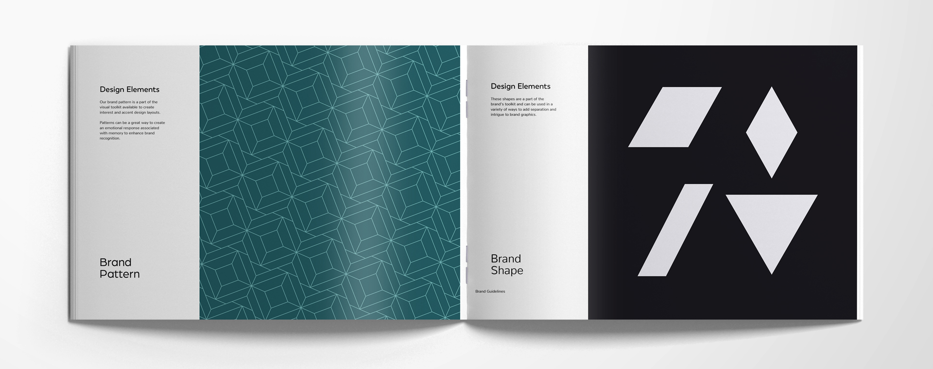
Apartment design elements are additional visual cues to clue your resident into the fact that you’re here, and you’re you. These design elements can include brand patterns, brand shapes, brand collage styles, and brand stamps.
WHY DO I NEED APARTMENT DESIGN ELEMENTS?
Community brand design elements are icing on the cake. It’s additional guidance for designers who want to do a little something extra for your website or printed materials. It makes it clear what is permissible in terms of design styles.
Brand patterns can help evoke emotion and recognition with patterns that repeat through the website background and on the borders or printed materials.
Brand shapes help create intrigue in brand graphics—a way to break up too much text or photos for better readability or scannability.
Brand collage styles are a suggestion of how to lay out photos and brand elements together in a way that works in tandem with the rest of the brand guideline choices. It can be used as a background or a design overlay.
Brand stamps are similar to logo marks. They should be used sparingly, and are generally useful for a hit of attention to strut your stuff where you most need it.
Lifestyle Photography
WHAT’S BRAND LIFESTYLE PHOTOGRAPHY?
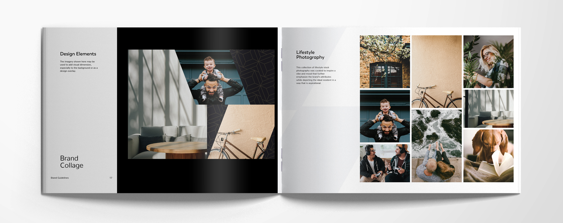
“It’s a whole vibe.” Choosing the right style of stock photography for your brand is vital for an audience that is highly visual. They’ll want to see photos that inspire them, and photos that reflect the most aspirational parts of their psyche.
HOW SHOULD I CHOOSE PHOTOS FOR MY BRAND?
Choosing photos that fall within a specific color palette will help keep everything cohesive. Each photo you pick out should emphasize the attributes you identified early on in your brand guidelines.
Iconography
WHAT’S ICONOGRAPHY?
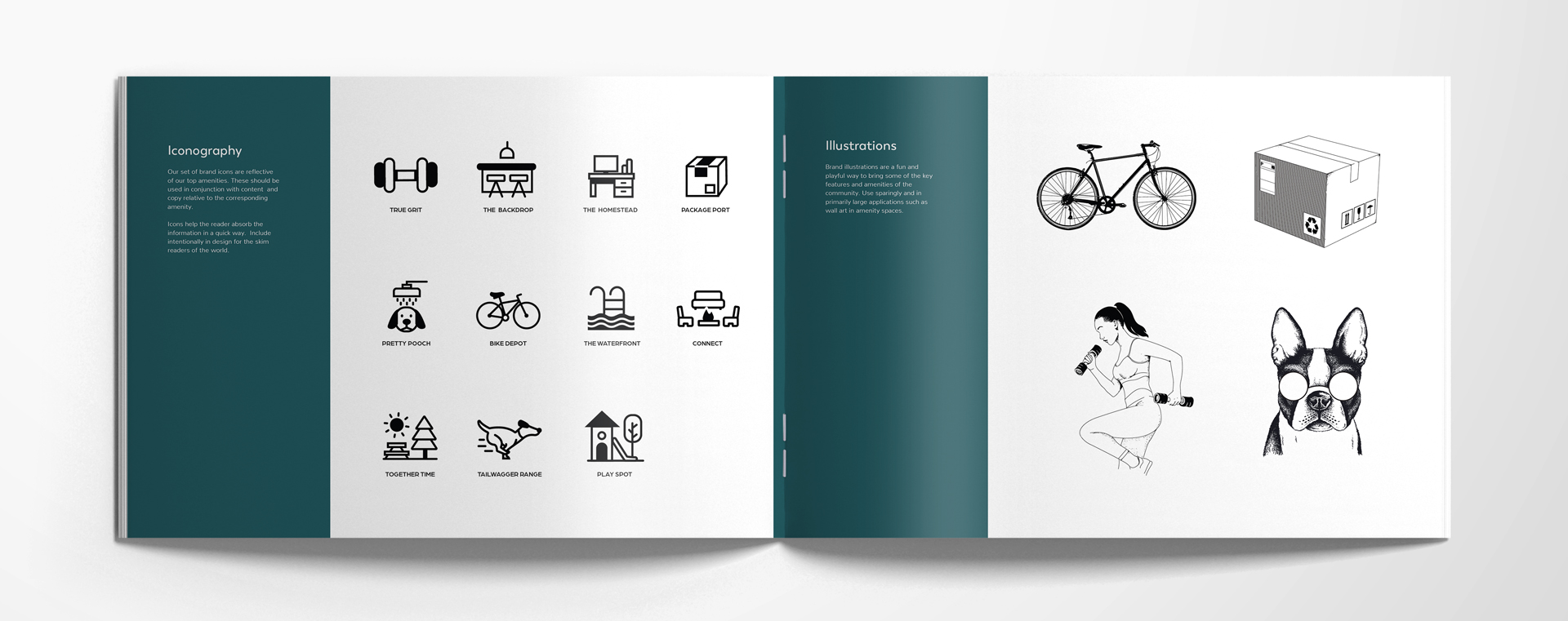
Who reads anymore? Hopefully you. But your ideal resident may not read that closely or carefully. Having icons is helpful—like a shortcut to an idea.
HOW SHOULD I PICK ICONS?
Make sure your brand iconography vibes with your content and copy, and clearly indicate what they are. Place them in your designs to help your residents (current and future) skim through your content to find what they’re looking for.
Illustrations
WHAT ARE ILLUSTRATIONS?
We’re talking brand illustrations. But they’re not wildly different from book illustrations in their purpose—they can be fun and playful to use for your community’s features and amenities.
WHERE SHOULD I USE BRAND ILLUSTRATIONS?
Large applications are best for these very specific brand illustrations, like wall art or on the background of a webpage.
Brand Examples
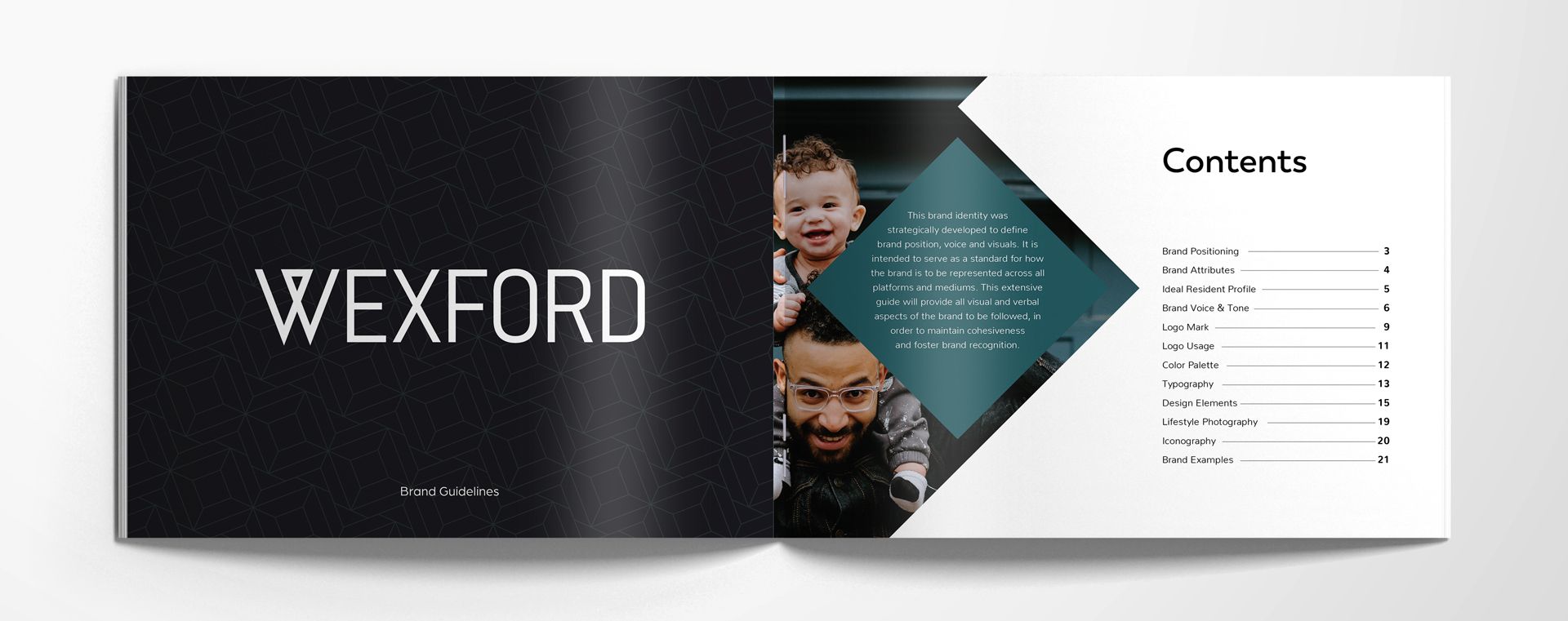
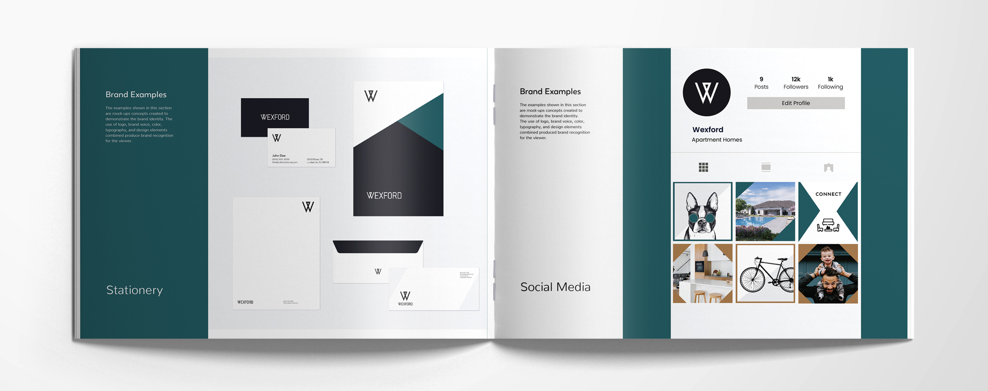
The preview is here. In your brand guidelines, having a visual that shows how your stationery will look, what your signage displays, and how your instagram feed can be laid out, helps you fully visualize the ideal version of your brand. Guidance is key—and we think you’ll rise to the occasion.
Need a boost to figure out your brand? Reach out to zipcode creative today to set up a call.
