Curb Appeal Signage: Apartment Design
Stacey Feeney
First Impressions = Curb Appeal Signage
Creative apartment marketing is reliant on brand awareness—and a sign for your community is the first touch. Think of it like an introduction. And also be aware: first impressions absolutely count. When it comes to curb appeal, signage should be like a greeting—friendly, welcoming and memorable.
ONE AND DONE
Something that’s great about signage? It’s cost-effective. Your curb appeal gets a boost, and your budget also stretches a little farther. Once you put a sign up, it’s there and you don’t have to pay for it over and over, like digital ads. It’s on 24/7/365!
BE HELPFUL
Signs are a guide that’s always there, rain or shine, telling your visitors what to do and where to go. It’s also a nice way to showcase any offers or open houses you have going on. Being helpful is a big part of customer service—the foundation that customer loyalty is built on.
Stand Out With Signs Out
GRAB ATTENTION
Paid ads are targeted. Which is fine, unless you’re trying to expand beyond your typical audience. With curb appeal signage around your community, you can grab the attention of anyone who is walking, jogging, or driving by. More leads can equate to more leases!
DISPLAY OFFERS
Your prospective residents don’t know what they don’t know—in other words, if you don’t tell them about leasing specials, they won’t take advantage of them. Use bootleg signs to show off your most tantalizing amenities and start increasing the interest in the community.
REINFORCE YOUR BRAND
Signage—especially big ones (read more on that below) can help underscore your community’s brand. Improve your customer loyalty, appear more professional, and increase your brand awareness, all with a few well-placed (and well-designed) signs.
The Best Signs for Community Curb Appeal
FLAGS
Also called feather signs, flags are an attractive approach to boosting your community’s curb appeal. These polyester signs can come single- or double-sided, and they’re often used to display a quick call-out. They can be placed singly or they can be staked in the ground in a group to show information, all in a row. “Now Leasing” on one flag, next to another that shows your phone number or website could be a winning combo. Make sure you match your brand colors and use a clear font—use one that’s in your apartment’s brand style guide.
BOULEVARD BANNERS
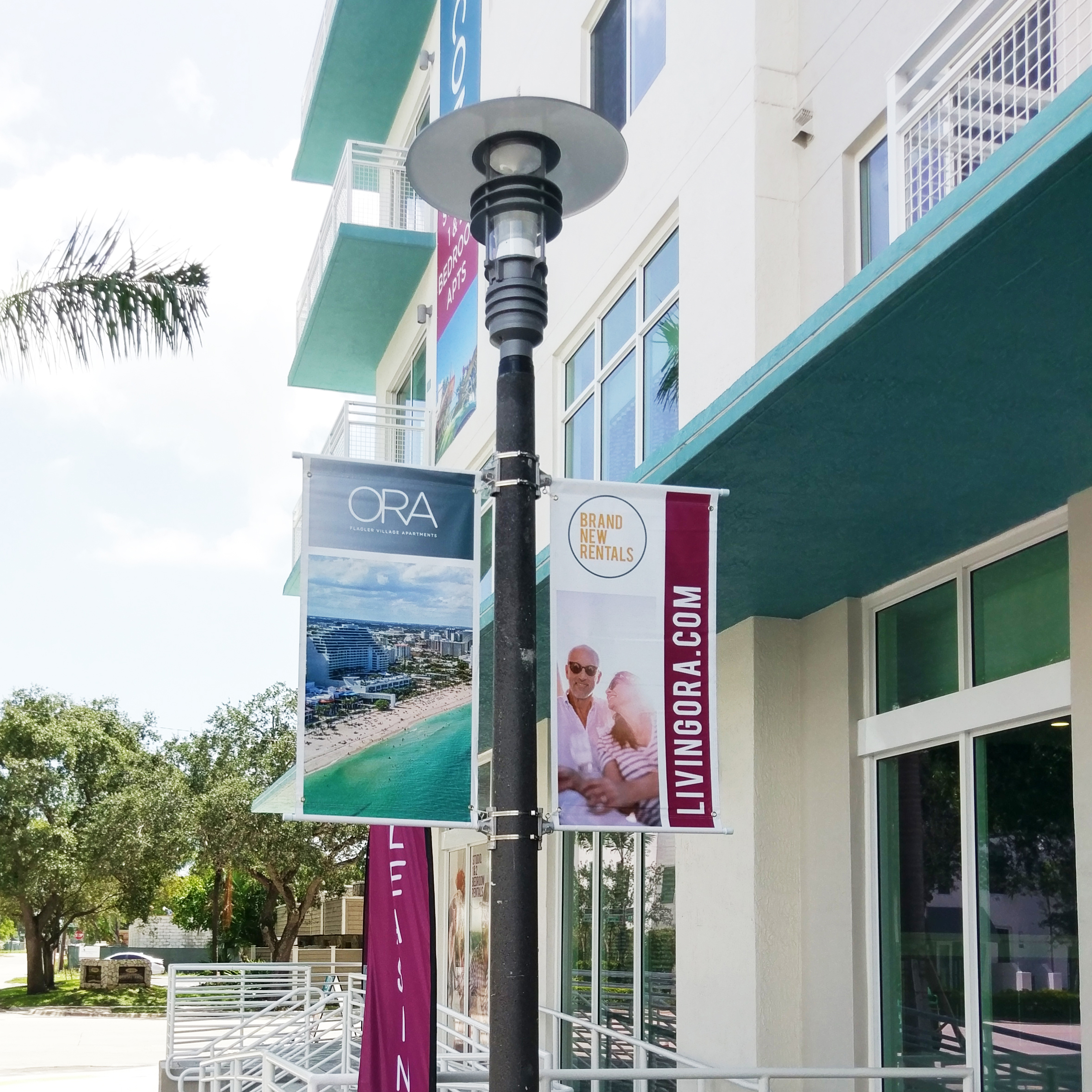
There’s an air of hometown happiness with classic boulevard banners. Capitalize on the attention of passersby with multiple double-sided callouts in a row on the posts outside your property: “Welcome Home! Leasing Now! Great Specials!” Again, be sure to use your logo, your font, and your colors to align with everything else you put your name on. Boulevard banners are an elegant way to show off your property (even more curb appeal!) and capture more prospects.
BUILDING BANNERS
(OR FENCE OR GARAGE BANNERS)
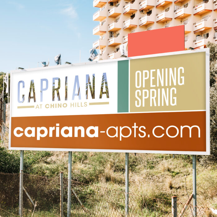
There’s no such thing as wasted space when you use banner signs on your building, fence, or garage. They’re big, they’re beautiful (if you do them right!) and they’re a game-changer. Use them to give a “Coming Soon” update if you’re in an early phase of construction. Use a big banner to give a few extra details about your apartment community, like bedroom options and your website. Show off a beautiful picture of your apartment interiors alongside your tagline. Whatever you choose, keep it clean and simple with a clear call-to-action. Done well, these make your property more attractive with extra color and interest.
BOOTLEGS
(OR BANDIT SIGNS)
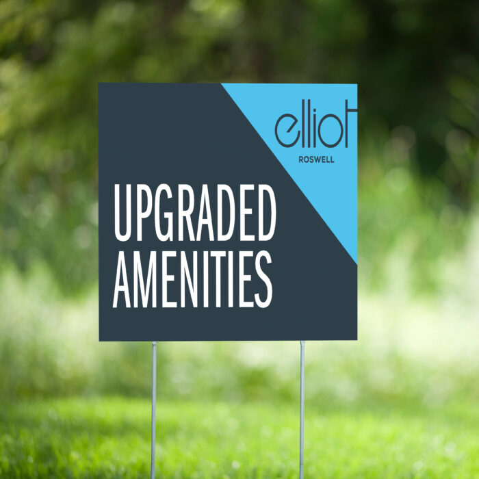
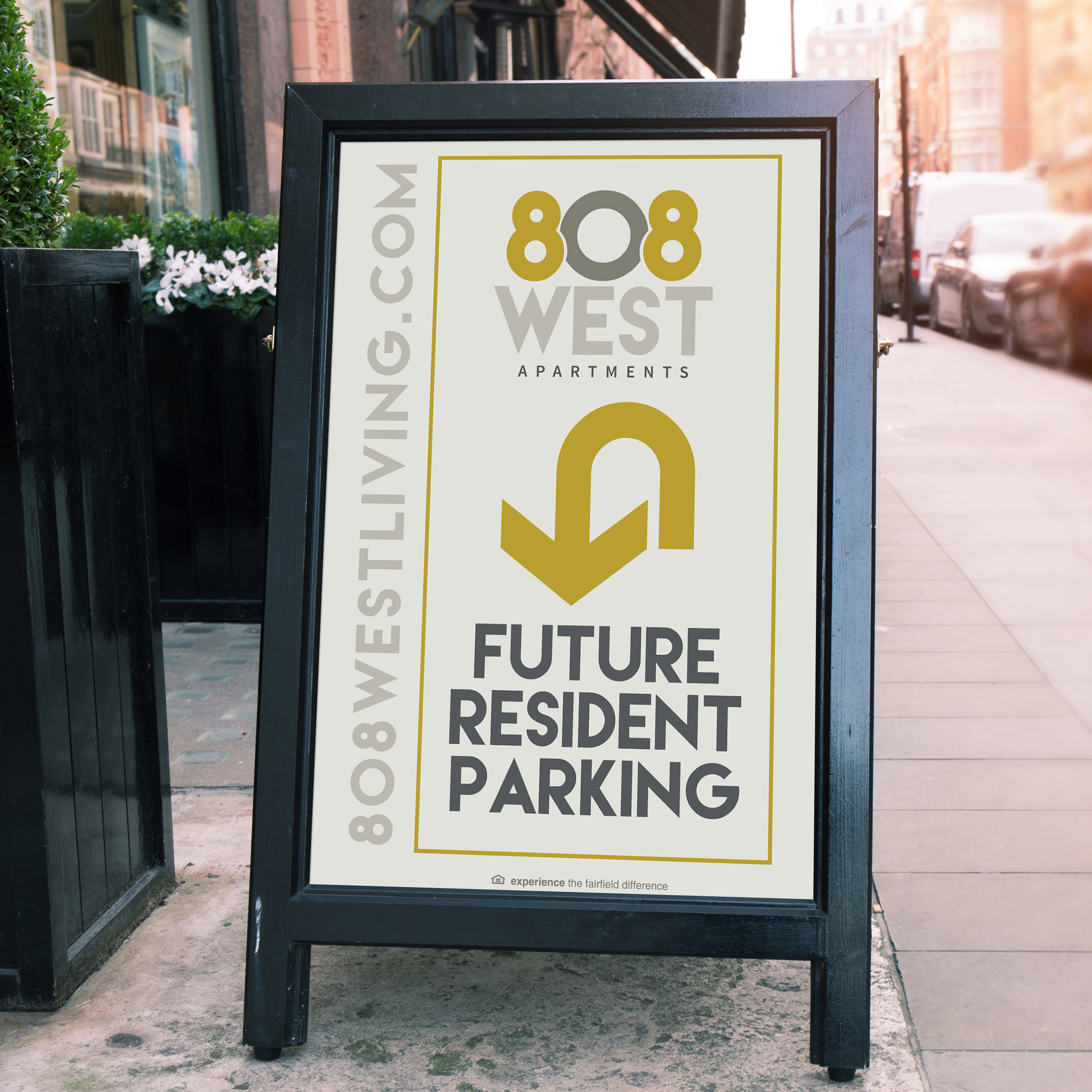
We love a good bootleg sign at zipcode creative. Also called yard signs, these are cost effective, and you can easily install them yourself. With bootleg signs, keep in mind what you would want to know about an apartment while walking by—are they accepting lease applications? Do they offer 2 bedrooms? Do they have any good leasing specials right now? Make sure, as with everything else, that the fonts, colors, and style on your cute, tidy bandit signs are indicative of your community’s brand.
Apartment Community Signage Best Practices
Now that you have some ideas around what signage is best for curb appeal, it’s good to make sure you have some best practices in mind, too:
CONSISTENCY
Colors. Fonts. Style. Taglines. You should know the drill by now, but we’re here to remind you: Get and stay consistent so that your brand recognition is off the charts.
PROFESSIONAL DESIGN
Don’t leave it to the sign company. It’s a sign company. They make signs. Find a trusted branding and graphic designer who knows multifamily (like zipcode, hi!) to make beautiful, clear signs that will attract your next best resident.
CLEAR CONTENT
A pro designer knows how much info should be shared on a single sign. Enough to read it easily and quickly and have enough content to convey a basic message.
PLACEMENT
High traffic areas are the best spot for your beautiful new signage. Think, too, about what audience you’re reaching—drivers? Keep the message simple and large so they can read it quickly. Foot traffic? Add in some directional signage with arrows to beckon them into the leasing office. Neighbors? Place signage visible from the building across the way, indicating your availability and leasing specials so they can move for a better deal!
If the first words out of your new prospect’s mouth are “I saw the sign”, consider yourself a success. (And current residents will appreciate the attractive signs you’ve placed around, making their home a more beautiful one.)
808 West, Capriana and ORA are ©Fairfield Residential | Work executed by Stacey Feeney, owner of zipcode creative, while under creative direction and employment at Fairfield Residential.
