Creating a Sense of Community with Design in Multifamily
Stacey Feeney
Gather around the fire, and we’ll tell you a tale of how creating a sense of community can be done through branding design at your apartment communities.
THE ROLE AND IMPACT OF DESIGN
A community should be just that. A place where people feel like they’re home. But where does it start? The first interaction. And it probably won’t be in-person. Perhaps they’ll see a digital ad. A window sign. A flyer. A mailer. Whatever they see, it will be designed. And it will either beckon them in to learn more, make them ambivalent, or will give them cause to never think of it again. That’s the role of design for your multifamily community.
Let’s take a mailer that your prospects receive. Maybe they like the design, it speaks to them. And if they do decide to learn more, they’ll find “more where that came from” and it will be aligned, organized, and will tell one visual story (ideally). Guess what else? Predictability typically means comfort, and where someone is comfortable, that has the ability to become home. AKA a lease that gets signed.
THE ROLE OF BRANDING
The resident experience is the ultimate in feedback. Just like design has its place, it also has a vital impact. After you’ve attracted prospects, and they’ve signed a lease, you want to keep them—because it’s way more cost-effective to keep the residents you already have (no empty units)! Resident retention is a pretty good indicator of how well you’re leveraging branding in your community. How can you leverage it? What makes the most sense? When you create a sense of community with design, first up is cohesive and consistent good apartment branding, which builds trust. Trust equates to satisfaction and open communication. And even better, you get to tell the story of your brand—so you can define the problems it solves, the solutions it provides, the way it’s different from your competitors.
Pairing Identity with Interior
LEAD INTO COMMUNITY
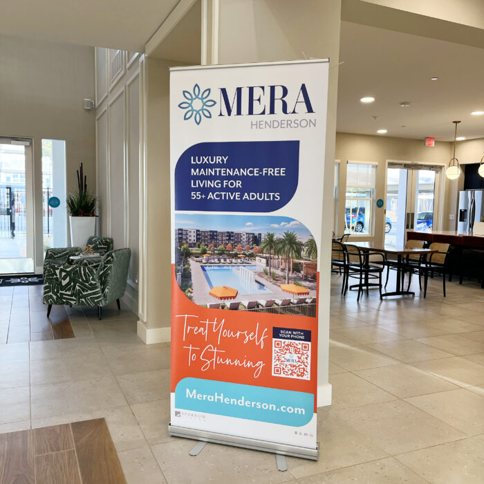
Just like excellent packaging hints at what’s inside with typography, spacing, shapes, and color, multifamily communities should lean into integrating the brand’s visual identity with the actual physical space. It’s the ultimate inspiration to take interior design and draw it through to your visual identity. Making this cohesive, from the real/physical, to the portrayed/branded ends up reinforcing the space and relaying the full intention: everything was designed for the resident. Typically, taking the common amenities and the clubhouse design is the best place to draw inspiration, because it’s the most heavily designed. (Units will be left a little more customizable, to the residents’ tastes.) Creating a sense of community through branding design that integrates with the space itself is something you can absolutely do!
CREATE A CULTURE
Tell the story of your brand using color. Optimistic brand? Use green. Passionate brand? Use red. Sophisticated brand. Go for black. If your multifamily community is near a sports team or university, match or blend with their color scheme for an even bigger-feeling community. (Roll tide!) Additionally, use design elements that you see in the common spaces and clubhouses. Find lifestyle stock photography that aids in telling that story to give a better sense of community. Just like you use messaging to tell about the way you’re different from your competitors, you can use visual identity to create a culture around your brand—one that prospects will want to be part of, and will be attracted to.
GO FURTHER WITH AMENITY NAMES AND BRANDED WALLS
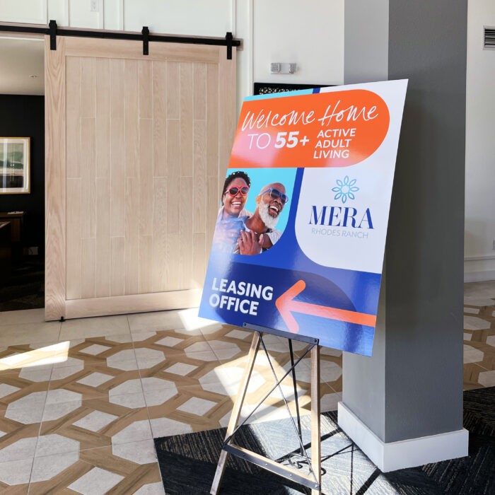
Getting creative with naming your amenities is a fun way to draw in your prospects as well. Forget “rooftop patio”—try “The Echelon” instead! Use the names to fully extend your brand to every corner of your multifamily community, so everything feels intentional, fun, and fully meshed. Additionally, creating a branded wall or window art, making your brand larger-than-life can help excite your community’s prospects, applicants, and residents.
(Un)Common Spaces
Imagine a theme park without the overpriced snacks and massive lines (with its super fun different “worlds” all over the park). Your community can have just as fun of a vibe. In the theme park, everything within each world is named and designed to fit within a specific mold, for fun and for a type of consumer immersion. You, multifamily marketer, can do the same!
EXTRA SPECIAL AMENITIES
They’re not special just because you say they are, though that’s one part of it. They’re special because of the thoughtful branding you’ve put in place. The common spaces in your community don’t have to be old hat, boring, run-of-the-mill things. You can boost them to an extra special level by branding the heck out of everything you have. Special names. Special design. Tie it in with the broader picture, and the resident gets the sense that these are no ordinary amenities—they’re extra special, because time was taken with the branding, and each piece was well-thought-out and intentional. Residents are way more likely to value what you tell them to (subconsciously through branding). When you are intentional in creating a sense of community with design, people will be attracted to that.
USE BEHAVIOR TO MARKET
When you know your ideal resident profile (IRP) and what they’re most likely to be doing during the day, night, weekend. What their desires and fears are and what their problems and goals are, you have a clear indicator of probable behavior. Use your IRP’s behavior demographics to pinpoint exactly which amenities you should draw attention to (and spend time on branding heavily). Ensure you’re reaching them with authenticity and storytelling to simply show them the amenities that will
1) Help them reach their goals
2) Aid in solving a problem
3) Fit into their routine
When you can fit into your IRP’s life a little more seamlessly, signing a lease seems like the easy and right choice. And that’s the power of creating a sense of community with design!
