Apartment Branding: Beyond the Obvious
Stacey Feeney
Apartment branding should go beyond the obvious. When we say “obvious” we’re talking: logo, visual identity, and verbal identity. We talk about those things a lot. They’re essential. Developing those primary three branding components are the foundation for everything else, informing visuals and messaging. However, going farther and deeper into beyond the basics, you’ll be doing two important things:
1) Doing your brand justice; and
2) Beating out your competition
Solidify your apartment community’s essential brand elements (the obvious)—and then start branding beyond.
Brand Essentials
What are those essential brand elements? Your logo. Your visual identity. Your verbal identity. They make up the primary three things that every brand should have. Let’s look through what they are exactly, and what their roles are for your community’s brand.
Logo – Apartment logo design is a quick way to represent your brand through an identifiable design, sometimes with imagery or symbolism, as well. It’s meant to show people who you are and what you do, through your name and the details around it in your logo.
Visual Identity – This is the essence of who you are, based on who you want to attract. Visual elements of your brand identity include your logo, your style/vibe, and your imagery. It’s meant to grab attention, create connection, and foster recognition.
Verbal Identity – Your apartment brand’s verbal identity is your brand, put into words. Starting with your mission, vision, and values, it contains your soul. Plus, knowing your brand identity and personality (through your brand voice) can help you tailor your messaging to represent your brand best, especially in terms of what will appeal to your Ideal Resident Profile (IRP). The role of your verbal identity: Brand consistency and relatability through all your content and messaging.
Secondary Brand Elements
All that messaging with your verbal identity is going somewhere. This brings us to the second layer of brand elements—using your voice and visuals in marketing channels.
Digital Marketing – Grab attention and craft your best selling points with your website, ads, social media, and email marketing. Expanding your brand to the internet is a must for visibility. And it should all look and sound like you.
Print Collateral – Make it pop and get to the point with print collateral. If it doesn’t look and sound like your brand, your mailers might get mistaken for another community and get tossed.
Signage – Bring your brand all the way through to the signage you place around your community—even before you open. Keep colors, fonts and imagery consistent to start your brand recognition early on.
MESSAGING ALIGNMENT
Every place you write words for your community, and every place your logo and imagery show up should look and sound like an extension of your existing brand guidelines—not like version 2.0.

Go Beyond with Apartment Branding
Now that we’ve clarified the basic elements of your brand, you need to look further afield. Go deeper, go wider, and brand everything you can. Does this mean putting your logo on everything? No. It’s creating continuity, from your walls to your hallways to your artwork to your furniture, everything just fits.
But where should you look?
PHYSICAL SPACES
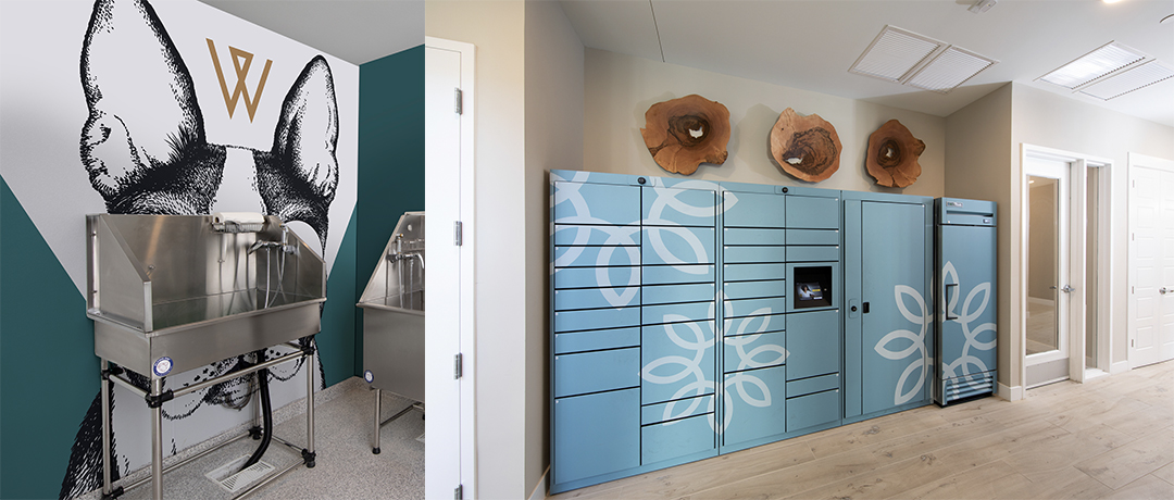
As we touched on above, the community’s physical spaces are the perfect opportunity to expand the brand experience. It’s visual, tactile, and covers many of the five senses. Common area amenities, the leasing office and model units should be aligned with the brand. Have you noticed the color consistency in over-the-counter and prescription drug commercials? Prilosec OTC = Purple. Naturemade = Yellow. Mucinex = Green. They know that when their buyer goes to the store, they’ll see that color, and associate it with the commercial touting the benefits.
Community spaces can accomplish the same subscious brand recognition associations too. Your interior design details can bring in paint colors from your brand color palette. Your furniture styles can reflect your visual aesthetic. The artwork can show off the brand’s inspiration. Plus, the textures and finishes chosen for the spaces can boost or blah your brand—don’t skip out on the details.
Your content goes here. Edit or remove this text inline or in the module Content settings. You can also style every aspect of this content in the module Design settings and even apply custom CSS to this text in the module Advanced settings.
RESIDENT AND PROSPECT EVENTS
All across the resident journey, branding can align events and experiences from tours all the way to renewal. Each moment in this journey should SCREAM your brand, from visuals and verbals to experience. Consistency leads to trust. Which leads to loyalty.
Tour – Your brand should show up as a perfectly color coordinated info packet, with a tour guide that’s totally bought into the culture of your community (more on that in the next section). The model unit you see should use inspiration from your brand colors and your brand style to drive the point home. Maybe there’s a branded key redeemable for a caffeinated beverage in the clubhouse kitchen!
Move-in – The brand has set the foundation, and residents have signed the lease. Now, at move-in, hand them a welcome packet with information on events coming up, and applicable community involvement. You can also provide reminders of amenities (that you’ve branded to match up with your IRP’s wants and needs) and give them a nice move-in gift that falls within your color palette and has a logo on it. (Branded stationery with a handwritten note also has a good place here.)
Occupancy – Keep a good thing going. While your resident lives there, be sure to continue branding everything that the resident receives. This includes regular newsletters and updates, maintenance cards (“Maintenance was here”) and keeping signage updated. Social media channels should also stay in line with your brand so residents feel everything is in order. (Also beneficial for the on-looking prospect.)
Renewal – Well, before the resident renews, send off a campaign that coincides with their lease being up for renewal. Remind them of the reasons they came in the first place. And then: All that hard work paid off. They’re sticking around. This is a great time for a thank you note and a renewal gift. Keep them branded and ensure that you reach out for a quick testimonial to find out more about the reasons for their renewal. Determining your year-over-year success will rely on surveys and feedback to measure your mastery of your brand.
STAFF AND COMPANY CULTURE
The company culture and the way the staff interacts with each other and with prospects and residents speaks volumes about your community. Ensure it’s all on-brand by using helpful training and setting the culture from the top.
Training – It’s not always easy to get everyone in line. Training helps to answer the questions of “why this and not that” so your staff can understand the rationale behind decisions. Plus, providing them with the brand guidelines and brand personality can give them insight into the ideal customer service interaction. Give examples, and train them well (and regularly). They’re the brand in human form. Negativity and poor service can plummet your brand perception.
Brand Culture Mindset – Once your staff understands and buys into the “why” behind the brand, it will be easier for them to capture the culture with their mindset and attitudes. Their behavior and treatment of prospects, and residents should fully reflect the brand culture you’ve envisioned. If the staff’s happy, they’ll make everything a little better for the resident, too. (Think: happy wife, happy life.)
Corporate Influence – Sometimes the brand culture needs to be set from the top and trickle down. If each property has its own brand identity, that will need to be set by management. Lead by example, 100% police brand implementation, and set the tone for culture you want to see embodied.
Get beyond the obvious with your brand. Go where no other community has gone before—and create a holistic experience with your apartment branding.


