Multifamily Branding Example Shines on a Custom Website
Stacey Feeney
Multifamily Branding Example Shines on a Custom Website
THE STORY
Branding development can be beautiful when you find the right mutual partnership, as we learned with our friends at Viking Residential.
Viking Residential is a real estate investment, development and management company specializing in the multi-family industry in the Philadelphia Metro Area. Though they’ve been around since 1982, with a portfolio of both residential and commercial property management, they were headed into new territory with a new construction asset and they needed a guide.
Enter: Zipcode.
We first met Viking Residential at NAA 2022 in San Diego at our booth. As first-time conference vendors, Zipcode Creative’s booth was in the New & Noteworthy section. After a few emails and zoom meetings after the conference that delved deeper into Viking Residential’s needs, we found that this new partner needed branding development for their first-ever new construction lease-up community.
We love ushering companies into new avenues to see how they can stretch more than they thought possible (and look good doing it).
THE GOALS
For the success of this new construction lease-up community, Viking Residential needed to nail its branding and showcase it everywhere, starting with a website landing page. In other words, Viking sought to build awareness around this brand-new community by clearly showcasing the property’s offerings and surrounding area benefits to the ideal residents best suited for Wexford.
So, Zipcode’s team set out to create conscious design, clear messaging, and consistent branding.
THE PROJECT
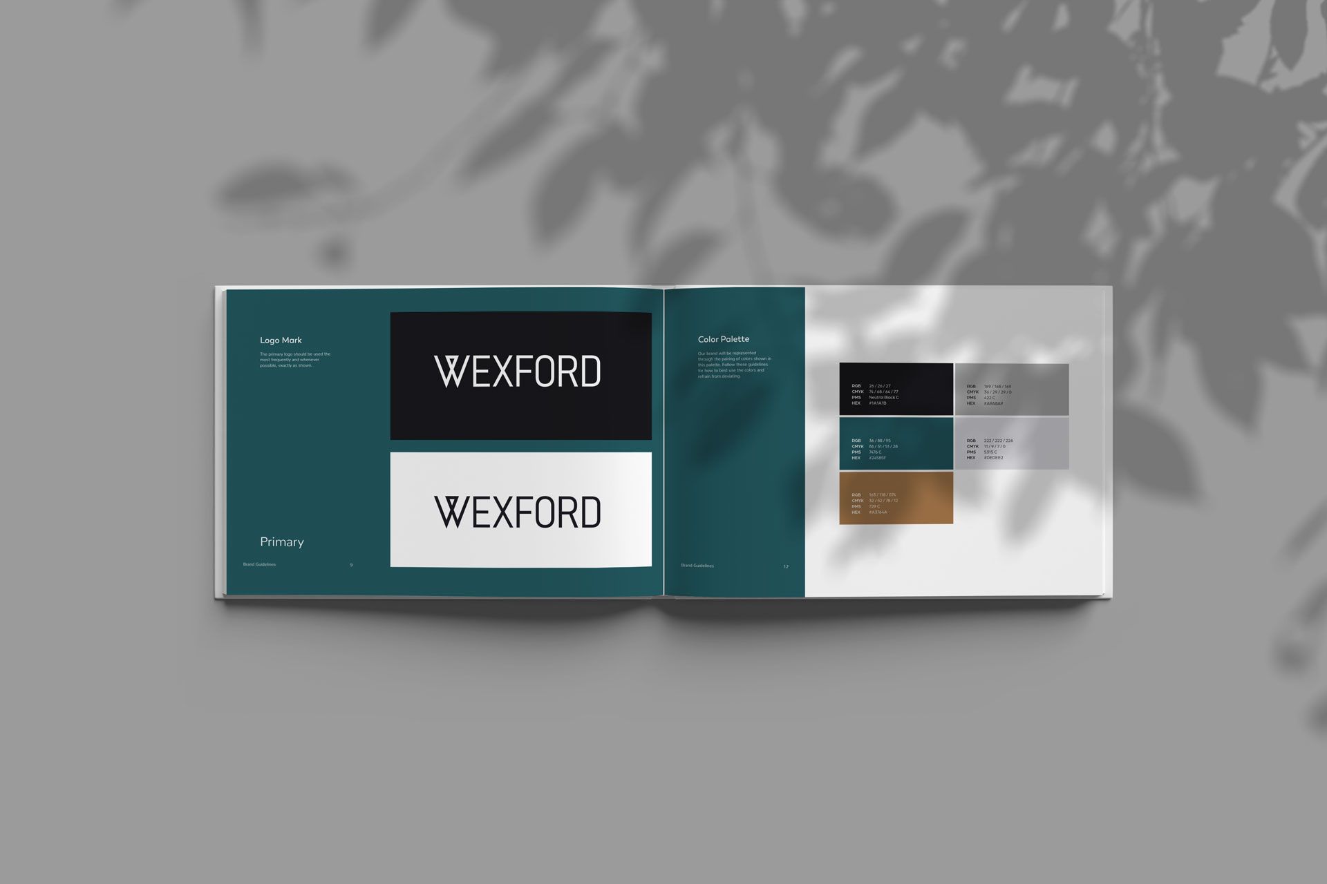
In order to properly build up the branding and create a website that spoke to the residents they most wanted to attract, Zipcode researched and developed the lifestyle vibe they set out to achieve for Viking Residential’s project: Wexford.
Wexford will be the first of its kind in rural New Jersey (Lumberton) just outside of Cherry Hill. The Class A level multifamily community solution (with proximity to Philly) has all the bells and whistles, and it’s set within a greater master planned community being built on historic farmland off of New Jersey’s Route 38.
THE PROCESS
This partnership was full of communication and collaboration and, most notably: trust. The teams worked together to determine the ideal resident and how best to speak to them through brand visuals and messaging. As the project progressed, Viking Residential leaned heavily on Zipcode’s team to advise in every area of creative design and branding, giving our team full creative reign within the process.
Research and Discovery
In order to develop the brand with informed strategy and an engaging story, Zipcode asked Viking to send over any and all collateral for Wexford, including full architectural plans, interior design concepts, applicable market research, and amenity details.
Tagline
Viking Residential’s team is highly communicative, and putting the tagline together for Wexford was no different. With their guidance on location and ideal residents along with their vision for Wexford, the process was more fun than it was work. After a little bit of collaboration, our teams landed on Sophisticated Comfort to echo the idea of higher-end touches meshing with the familiar.
Initial Design Concepts
Starting from scratch is almost always easier than pivoting a brand. That said, there’s still a science to it.
Based on market research and ideal resident profiling, our team worked toward a trendy, yet timeless vibe. The visuals/design and brand voice/messaging were all built to attract the IRP, who value small-town charm and traditions and are seeking an escape from bustling city life—while still staying close enough to go “into the city” whenever they wish. The aesthetic was aligned with the interior design plans, as well: simply modern, sophisticated comfort. We used clean lines and colors that paired with the modern simplicity of the interior design and communicated the balance between classic and trendy we were aiming for.
Success Secrets
Beyond the creative and messaging aspects of the project, we strongly recommended that Viking host the website with RESI, a platform specifically for multifamily hosted websites. RESI integrates with the client’s PMS to pull floor plan pricing and availability, and it’s easy to navigate the backend to make simple changes. When we work with RESI (our go-to partner for building custom websites like the one for Wexford) we oversee the direction of the design and look of the site to align with our created branding, while the RESI team develops, hosts, and manages the site.
Viking Residential also allowed us to take the lead in creative direction for Wexford’s permanent signage, which is being produced by a local sign company. With that connection, we’re able to ensure the branding stays on track and is implemented the way it was intended.
[et_pb_video src=”https://youtu.be/PPy6i-8HNBg” _builder_version=”4.20.2″ _module_preset=”default” hover_enabled=”0″ sticky_enabled=”0″][/et_pb_video]
Services provided:
- Brand Development
- Photo-Realistic Renderings
- Floor Plans & Sitemap
- Custom Website Design and Copywriting
- Signage Design
- Marketing Collateral and Digital Design
- [Future:] High-end professional photography
MULTIFAMILY BRANDING RESULTS
Through Zipcode’s conscious design, clear message in the brand voice, and overall branding, future residents can see the value of Wexford living. As of Summer 2023, the community is in construction, and the project is progressing.
The landing page went live in great time, allowing Viking Residential to collect inquiries and gather an interest list to prepare for pre-leasing. The President of Viking Residential, Caroline Adillon, along with the rest of the Viking team, was impressed with our landing page—so much so, that she’s been giving our name to others in the multifamily space after our work on the project.
Sure, building a brand strategy can be done with just about any client. And the road goes both ways. But we’re glad Viking Residential chose us as a partner. Excellent communication and transparent trust from Viking’s team gave us space to make it pretty, fun and most importantly: effective.


