What Makes the Perfect Apartment Website Design?
Stacey Feeney

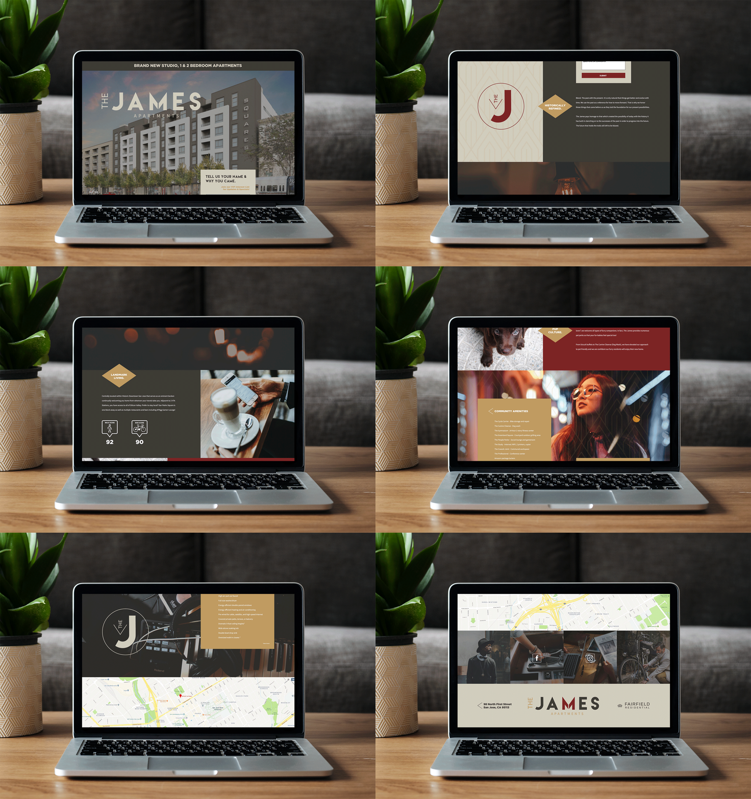
In the digital age, having a website is integral to succeeding in any business—and multifamily housing is no different. Creating a unique digital footprint online for your community is the perfect way to increase your reach and pique prospective residents’ interest. Whether you’re looking to revamp your existing website or are starting from scratch, there are a few must-have elements you should consider for your apartment website design to create the best possible user experience. From site navigation to design elements like photos and videos, be sure to take these six things into consideration before you get started.
1. Website Structure
Having a clear website structure ensures that your site is intuitive and easy to navigate. When prospects arrive on the site, they should be able to instantly find whatever information they are looking for without digging through pages and clicking on multiple links.
At the top of the apartment website design, create a clear main navigation bar with large, easy-to-read buttons that link to other pages within the site. There are a few important pages that every community’s site should include:
- Homepage
- About
- Gallery
- Amenities
- Floor plans
- Neighborhood
- Contact
In addition to these pages, many sites also have an online application and a resident portal available, making it a one-stop shop for both prospective and existing residents to find everything they may need.

2. Photography
There’s a reason they say that a picture is worth a thousand words. When prospective residents are evaluating your community, using professional photography is the best way to show off every detail. From the interior of your units to your industry-leading amenity spaces, high-quality photos allow potential residents to get a real sense of what it might be like to call your community home. Be sure to incorporate photos throughout the individual pages of the website in addition to a comprehensive gallery that has imagery of everything from the lobby to the model unit.
3. Video & Virtual Tours
While photography can help show off your space, video is what brings it to life. From sizzle reels that you can use to show off community highlights to full-blown virtual video tours, there are endless ways you can use video to showcase what your community has to offer. Consider adding a video to the top of your homepage to make it as eye-catching as possible when a new visitor lands on the site. You can also add video tours to your gallery page, making it easier for prospects to explore your community without having to come on-site.
4. Copywriting
While photography and videos show your community in the best light, expert copywriting will help seal the deal. Having a professional write all of the content on your site will ensure that it’s compelling and catchy to attract attention, even in a crowded market.
A copywriter knows exactly how to convey certain emotions, highlight specific benefits, and convince prospects to convert. From headlines to calls-to-action, make sure that you carefully consider every piece of copy on your website to put your best foot forward and create a cohesive and on-brand experience for web visitors.

5. Floor Plans
Floor plans are one of the most important things to feature on your apartment website design. Add floor plans for all available units so prospects can get a sense of the size, layout, and flow of any apartment they may be interested in. This will allow them to compare and contrast between different units and understand what they can get for their budget.
Consider having 3D floor plan renderings created of your available units to bring them to life, making it even easier for prospects to imagine themselves living in the space.
6. Neighborhood Info
When residents are evaluating your community, they aren’t just looking at the apartment. They’re also looking for a neighborhood feel and easy access to nearby attractions. To showcase your surrounding area, add an interactive Map to your website with all of the local attractions plotted. Add favorite restaurants, parks, and other outdoor activities, nearby shopping, schools, and anything else that may be important to your prospects. Then, they can see everything—all in one place—an added selling point to what makes your community so great!

Professional Website Design
Let the experts in multifamily apartment marketing help create the perfect apartment website design for your community instead of trying to DIY your way through. At zipcode creative, we’re experts in everything from branding and logo design to website copywriting to create an industry-leading online presence for our clients. We handle everything from the site structure through to the 2D and 3D floor plans, ensuring that your site has a polished and professional look. We’ll even tackle the photography and renderings, making zipcode creative a one-stop shop for all of your web needs.
Our partners, Results Repeat and Resident360, handle website development, management, SEO, and will oversee digital ads, ensuring that each community has access to all of the experts they need to drive leads and increase their presence on the web.
Get in touch today to learn more about our services.
The James website is ©Fairfield Residential | Work executed by Stacey Feeney, owner of zipcode creative, while under creative direction and employment at Fairfield Residential.


