Stock Photography in Branding and Its Impact Potential on Residents
Stacey Feeney

Co-Authored by Martha Bader, Director of Marketing and Programming, Arden
Stock photography in branding and marketing has a significant impact on outcomes, connection, and inclusion. It’s natural to pick only the most beautiful, the most youthful, and the smiliest people for our brand’s imagery. But there’s a lot more to stock imagery than picking the shiniest, happiest people. It’s supposed to reflect your brand.
But what happens when the stock images you choose—that do reflect your brand, just don’t jive with the resident profile that’s supposed to be targeted?
Aspiration may—remarkably—turn into disconnection and frustration, and should be considered when selecting brand images.
A Deeper Dive into Stock Photography in Branding
We recently partnered with Martha Bader, Director of Marketing at Arden 55+ Living, who has worked with zipcode creative on multiple projects, particularly around brand voice and public relations. Perception is a huge part of stock imagery and we both wanted to know what really resonated with active adults and those that are 55+. The results have been eye opening!
We hosted an in-person gathering to show participants stock photography and obtain their feedback to better understand how our use of stock imagery could portray what we intended, and foster an ideal perception from the viewer. They were then encouraged to describe their initial reactions to and feelings around these images, which resulted in a lively discussion around some of the questions below.
The answers might be surprising to you, but Martha knew exactly what to expect, having spoken with thousands of people 55+ across the country over the last six years to better understand this growing demographic.
1) How old do you consider yourself (versus your actual age)?
Note: Participants were all 55+.

“At least 15 years younger, if not more!”
“I am not old, I think about what my parents looked and acted like at my age, and I feel so much younger than them.”
“It depends on the day, sometimes 15 and sometimes my age.”
2) What do these images make you feel?


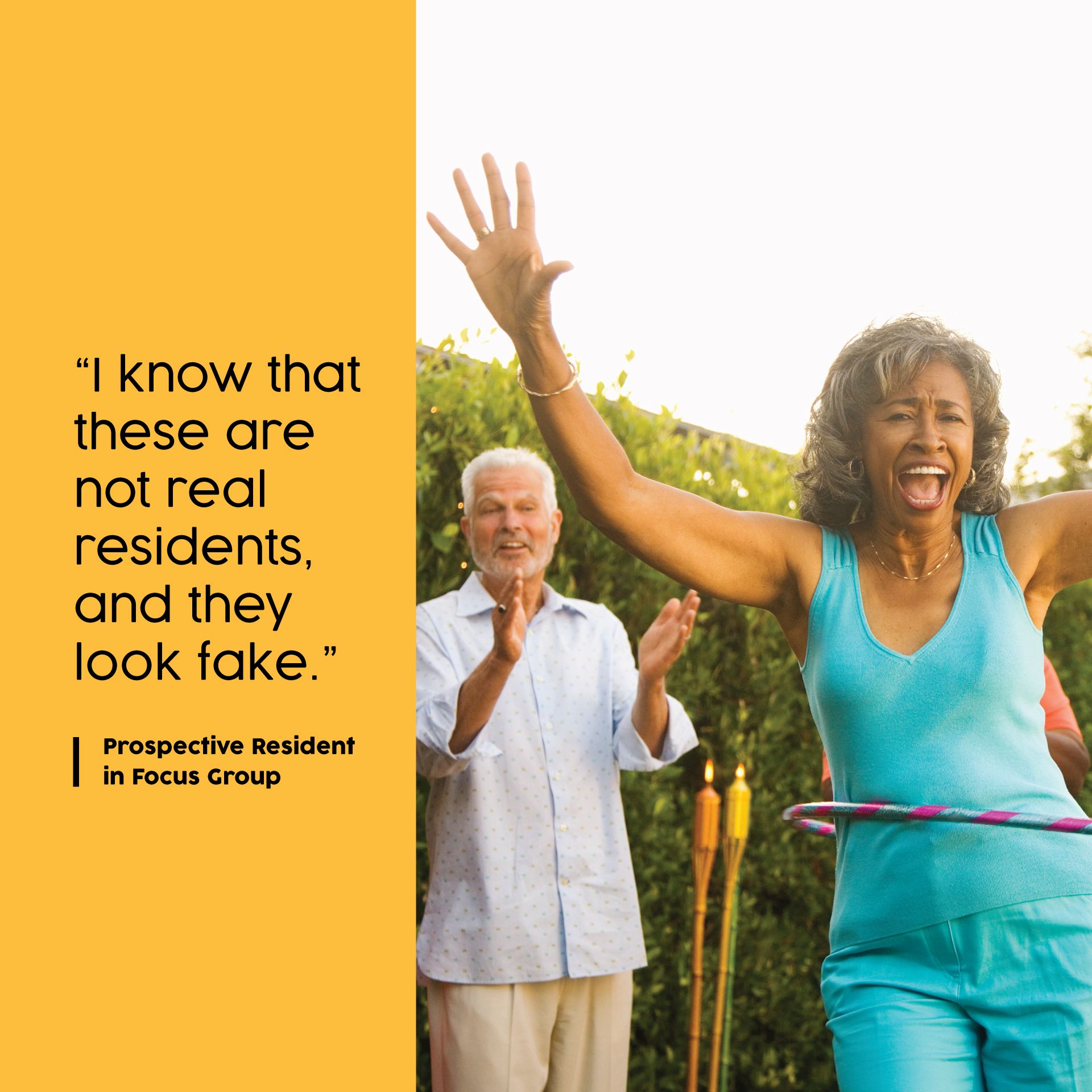
“I know that these are not real residents and they look fake.”
“These people mean nothing to me.”
“I feel worse about myself because I don’t look like that.”
“I know that this is for senior living because of these posed pictures.”
“Please don’t use people in ads—it reminds me of my age.”
3) What is your initial perception of 55+ communities?

“They feel very exclusive.”
“I wonder what will happen to me if I am the oldest person there.”
“Great idea.”
4) What does being “active” mean to you?

“Taking care of my health.”
“I love doing things and going places.”
“Being social.”
When choosing images, Martha believes that they should be like a permission slip to dream of what life can look like and shouldn’t be overly prescriptive or overpromise things like ‘If you move here, you will then your life will look like this, and these will be your new friends.’ Martha says, “In the age of photoshopping, we want to continue to celebrate all walks of life, and make sure that we are not excluding people or they are not self-selecting out of exploring what a 55+ community has to offer because they don’t see themselves in the images portrayed.” While studies have previously shown that using faces in imagery builds connection, it may not be the type of attention that you want.
Another thing to keep in mind: Watch your third-party brands—they may use stock imagery that has a negative impact, such as an on-demand fitness app used in the fitness center, making health goals feel even harder or less likely to reach. Ask if their apps or AI can be modified to represent your residents and not exclusively young and extremely fit models that could be problematic or triggering to your 55+ residents. Take an extra minute to reflect on what the resident experience might be to ensure engagement and inclusivity for your residents!
Martha adds, “It is a fine line to walk of realism and possibility and we continue to engage with prospects on what grabs their attention and compels them to make decisions.”
Choosing Stock Photography in Branding and Marketing
There are five ideas that should be considered when selecting stock imagery for branding and marketing materials for your apartment community’s brochures, websites, signage, mailers (and plenty more).
Representation – Follow fair housing laws. Get diverse with your representation through your photos. This includes a variety of ethnicities, genders, ages, body types, abilities and cultural backgrounds. This will help show that your brand values everyone from everywhere—because you may not be sure who you’re excluding, even unintentionally, with your selection of stock imagery.
Stereotypes – Ensure the photos that you choose for your brand do not perpetuate stereotypes or biases. Choose visuals that allow for the full spectrum and breadth of abilities and e experiences. Keep in mind that stereotyping/bias could be conscious or not!
Accessibility – This is particularly true for stock imagery that you place on your website. Screen readers will need to be able to indicate to anyone with visual impairments or disabilities what is happening in the photo. For this reason, provide alternative text descriptions for your images. Beyond this, every image you choose should be clear and high-quality.
Authenticity – Make your photos relatable. Choose stock imagery in branding that will represent people accurately rather than being props for diversity. A stock photo that attempts to show an interesting story and perspective will have deeper meaning than a photo chosen simply because it fills in the gaps of your diversity spectrum.
Emotional Connection – Your audience—or ideal resident—will relate to your brand partially based on the stock images that you choose. Choose wisely, and you may be able to evoke emotions and create a connection to your brand. If you can offer up photos that remind your audience of themselves (ones that feature folks that look like they do) this can be the bridge to long-term loyalty.
Risks When Using Stock Imagery With People
It can be difficult to choose stock imagery with people in it. Keep these risks in mind when you choose to use stock imagery:
ACTIVE ADULTS
Depicted Too Old, They Feel Younger – “What? This isn’t for me. I’m still spry.” This might be what your 55+ community demographic is feeling when the pictures show elderly folks in wheelchairs. They’re not looking for a retirement home—they’re still active adults. Look out for the “too old” photo pitfall!
Depicted Too Young, They Can’t Relate – “Oh my, I can’t keep up with these youngins. I’m not going to like this place.” This might be what your 70+ residents may be thinking when they see an (attractive!) salt-and-pepper man backpacking up a mountain. Look out for the “young and having fun” pitfall, too.
STUDENTS
Ah, college students. This is possibly the most judgy age (besides tweens) that any person is at any point. Make sure you depict people that are a little beige. Not too preppy, edgy, lazy, or goodie-goodie. Find students that look pretty—to put it in terms you’ll understand: Normcore. Totally normal. Nothing particularly stand-out. (It does help if they’re attractive, though.)
YOUNG PROFESSIONALS
Where paths diverge: younger professionals. There’s a reason there is white collar and blue collar nomenclature. If you depict someone working remotely on their laptop in a coffee shop, the service worker may feel unconsidered. If you show only young couples enjoying a night out, a single mom may feel forgotten, because she never gets the opportunity to have a happy hour with friends. Share the love, consider the imagery that may get overlooked. Try to level the playing field with your images.


Inclusionary Practices
Images that are inclusive can help broaden your customer base because you’re reflecting a diverse target audience. Inclusion is good, all on its own. But it’s also helpful as a business move because you can connect with even more people who may be interested in becoming a resident in your community.
BOOST YOUR INCLUSION WITH THESE PRACTICES
1) Abstract Depictions
Get a little less specific and capture the feeling you want them to have while living the lifestyle that’s quintessential to your community. What do we mean? Instead of trying to figure out who exactly to include in your images, instead opt for photos of:
- A close-up of a shimmering pool on a bright day
- A linen curtain blowing in the breeze
- A group of different cocktails on a tray
- Dogs!
2) Groups of People
When it does make sense to include faces in your imagery—select carefully. Candid and natural shots will always win out over dated, posed shots. Get a group that has multiple ages and races in one photo to keep the diversity going.
3) The Property
If done well, you can’t go wrong with photos of the property, or beautiful, photo-realistic renderings for apartment marketing. This is the actual product that your ideal residents are looking into “purchasing” (okay, leasing), and by showing off the architectural lines, details, colors, and spaces, you let the community speak for itself!
All in all, it is absolutely impossible to find imagery that relates to everyone—and someone will inevitably feel excluded based on their perceptions of the stock imagery in branding that you’ve chosen. However, being aware of the risks (including with any third-party businesses you use) and conscientiously choosing imagery to be inclusive and best reflect your biggest target population or majority target renter demographic can help make a positive impact for your brand and for your number of signed leases.


