



Brookwood Point Isn’t a Property Brand: A Senior Living Branding Case Study
Stacey Feeney
Brookwood Point isn’t a property brand.
It was launched on a specific property (Brookwood Point), independent living for adults 55 and up, on the east side of Columbus. But the identity we built isn’t only for that building. It’s for an entire housing product tier inside National Church Residences’ portfolio, and it will roll out across their Senior Living mid-market communities.
When we build multifamily portfolio brands, the approach and positioning will look much different than brand development of apartments in one singular location. A portfolio brand must be able to span across many properties in many markets and locations as well as target a range of resident personas.
Check out how we did it with a multi-tier, mission focused portfolio brand.
Five Housing Products, Five Different Residents
National Church Residences is a nonprofit senior housing provider based in Columbus with communities in roughly 25 states. And they’ve got incredible range.
Their portfolio spans five product tiers. Permanent supportive housing, where residents contribute, at most, a few hundred dollars a month but is primarily subsidized through their Foundation. HUD-subsidized senior housing. LIHTC affordable communities. Market-rate mid-market senior living. A continuing care retirement community with six-figure entrance fees.
One parent organization. Residents whose financial lives have almost nothing in common with each other.
One brand voice can’t possibly cover it all. If you pitch to the top, you’ve told everyone below. “Not for you.” Pitch to the middle and the six-figure entrance fee prospect feels like they’re suddenly overpaying.
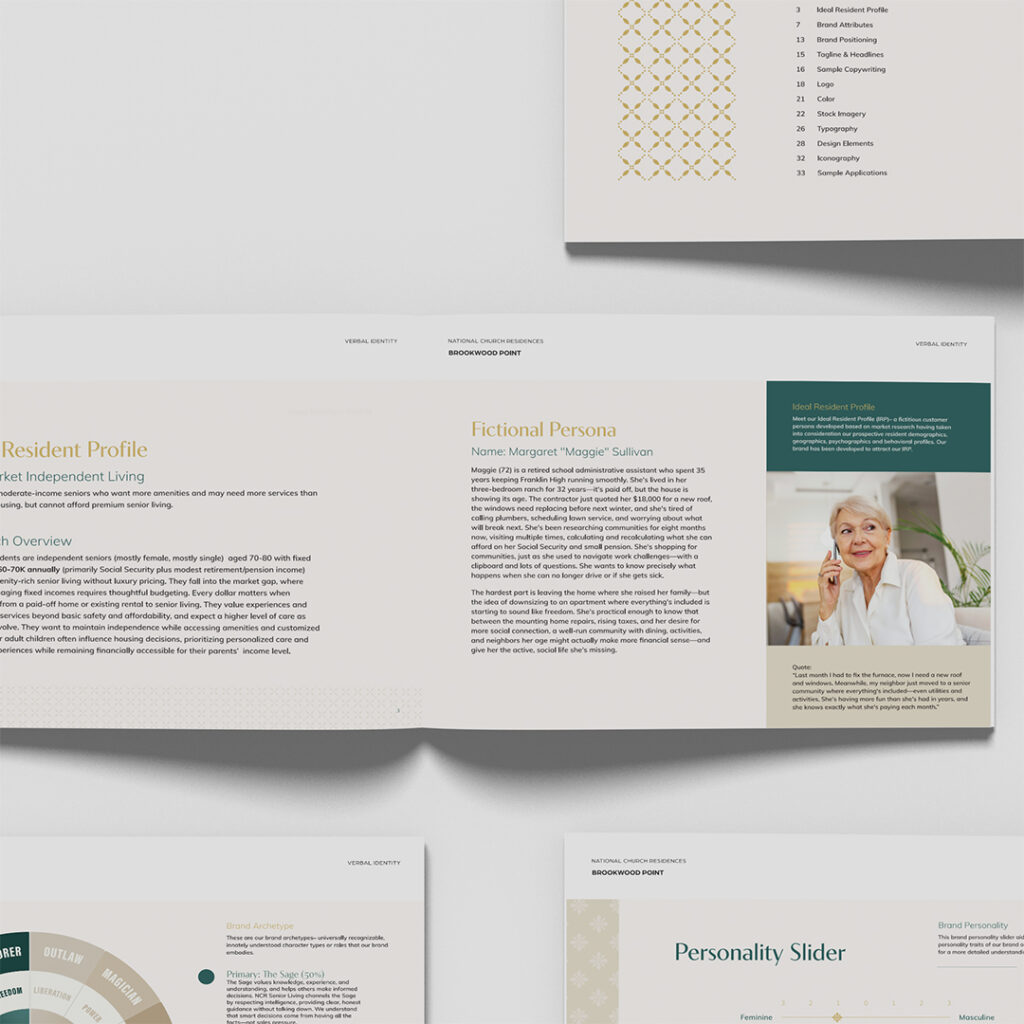
We’ve seen this problem; we’ve mapped it out. So before we did individual brand work, we developed the house of brands segmentation for National Church Residences: research and positioning across every tier, with demographic, psychographic, behavioral and generational profiles, regional variations, and a developed Ideal Resident Profile for each one. Including a separate profile for the adult daughter who does most of the research and initiates a large share of the inquiries—because in senior housing she’s a second audience with her own needs.
What Changes When the Brand Has to Travel
Brookwood Point is the third act here. First came the portfolio research. Then Sunday Village, the brand we built for the LIHTC affordable tier, which launched on a heavily renovated Austin property that needed distance from a troubled past. Now the market-rate senior living tier, which is where Brookwood Point comes in.
And this is the part that changes everything about how you design. The identity we built for Brookwood Point rolls out across National Church Residences’ Senior Living communities. And it’s just the starting point.
Designing for one property and designing for a portfolio of properties of a shared housing product tier are different jobs. When a brand only has to work on one building, you can lean on that building: its architecture, its neighborhood, its particular quirks. When the same system has to hold up across communities you haven’t seen yet, in markets with different competitors and different housing stock, every choice has to survive being applied somewhere you didn’t design it for.
So the work moves up a level of abstraction. Instead of expressing one property, you’re expressing what every community in that product tier has in common: who it’s for, what it costs, how it treats people. If it’s true of only one address, it becomes a variable rather than a foundation.
Worth flagging if you manage a portfolio, because it’s the most common way this goes wrong. A brand built beautifully for the flagship gets rolled out to 12 other communities and immediately starts straining, because it was designed around that first flagship’s specifics.
The Elevation Brief
So what does the portfolio ask this particular brand to do? The answer came back refreshingly precise: tie back to the corporate brand, but make this one feel more elevated than its siblings, because these are market-rate rents and the offering is genuinely different.
Two constraints pulling opposite directions. Be recognizable as part of the family of brands, BUT be clearly more expensive than the rest of the family. That gets tricky for design; and note that neither half of it has anything to do with the building in Columbus.
The call back to the family of brands came through structure rather than surface. The corporate mark is built from overlapping angled forms suggesting rooftops. The Brookwood Point mark uses the same underlying idea, resolved into twin peaks that read as rooftops and as a literal “point” at once, formal and symmetrical. Same “genetic material”, different register. Someone who knows the parent brand recognizes the relationship. Someone who doesn’t just sees a serious, established mark.
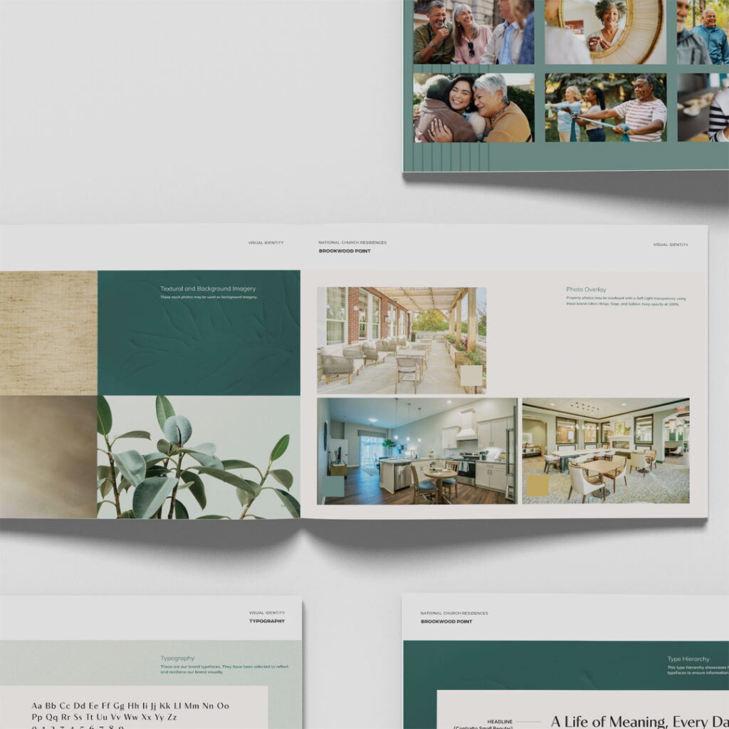
The elevation came from a set of cues that signal expense (without ever claiming it): a high-contrast display serif set in generous letterspacing, a restrained and classically established palette, ornament held quiet enough to read as texture rather than decoration.
When it comes to the palette, we do want to explain our choice. It’s conventional for senior living. We know it. But it works and it’s fast, meaning, a prospect mentally categorizes Brookwood Point under “established, serious, probably expensive” in about a second, before reading any content. If we fought that convention, we may have lost their attention, and spent time and money in the wrong place.
Because the distinctiveness here is verbal, plain and simple.
To wit: You don’t have to be different everywhere. Decide where you’re conventional on purpose, then spend everything you saved on the one place where being different changes the outcome.
It also travels well, which was the point. Convention holds up in markets we haven’t seen yet.
Position Against What the Competitor Can’t Claim
Elevation positions the brand within its own family. Positioning sets it up against everyone else.
Fight the instinct to try to beat a competitor on their own terms. Nicer budget, bigger amenities, “ultimate luxury” language. Get ready to lose your budget and lose the game.
The better move is to find what the leading competitor cannot to claim.
The recognized premium player in this category is Brookdale. National, luxury-positioned, for-profit, with no faith-based foundation and no mission-driven approach. That isn’t a flaw in their brand. It’s simply not available to them. National Church Residences has it built in.
So the gap we built toward wasn’t “more luxurious.” It was polish, plus mission credibility. Look like you belong in the comparison, then win on the thing your competitor can’t buy.
That produced the positioning: the smart choice for people who value substance, community, and peace of mind, designed for those who’ve worked hard and planned well, in a market crowded with overpriced and unimpressive generic options. The tagline followed: Enriched Living, Independent Spirit. And the differentiator carrying the most weight in the guide: amenity-rich without luxury pricing.
Run the same exercise on your own comp set. What can the strongest community in your market genuinely not claim? You’ve just uncovered your positioning.
Where the Honesty Lives
Visuals are aspirational, making space for words to be perfectly honest.
This brand looks like luxury and then refuses to talk like it. On purpose. A resident here is on a fixed income, shopping against a national operator built on pure luxury positioning. She needs the brand to at least look like it belongs in that comparison. But the words, while honest, shouldn’t make her feel like she’s settling.
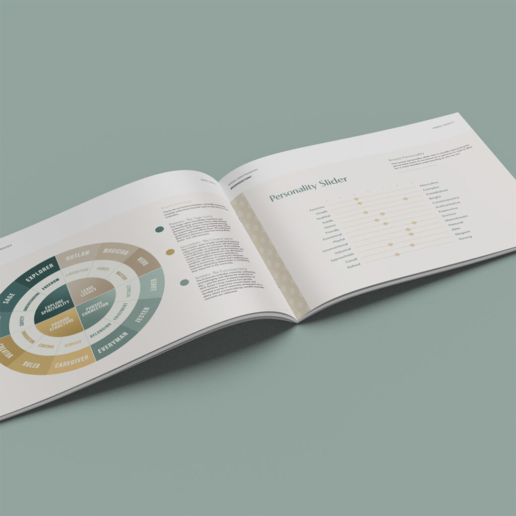
The verbal identity runs on a Sage-dominant archetype: clear, honest guidance without talking down, built on the idea that good decisions come from having the facts rather than from sales pressure. Archetypes are diagnostic, though. They describe where a brand sits. They don’t tell a copywriter what to type on a Tuesday.
Enter: The vocabulary list.
Use: residents and community members, boutique community, all-inclusive, thoughtful design, trusted partner, worry-free living, smart decision, financial sense.
Avoid: tenants, facility, luxury amenities, service provider, maintenance concerns, affordable option, budget-friendly, crisis.
Read that avoid list twice, because the reasoning behind it is the most transferable thing in this project. “Affordable option” and “budget-friendly” aren’t neutral descriptors. They reframe a good decision as a compromise. And a line like “don’t worry, we’ll take care of everything for you” sounds warm while undermining a person’s independence and intelligence in the same breath.
This brand treats condescension as a fail. Not blandness. Not being forgettable. Condescension.
Most brand guidelines exist to keep a community from being forgettable. Very few are built to keep it from being subtly insulting to the people it’s trying to attract. If you market to older adults, to first-time renters, to students, to anyone a marketing team has decided is a little out of their depth, that’s the reframe worth stealing.
Since website copywriting was in scope, the guide describes tone and it includes finished sample copy to show how it sounds in very specific circumstances. A tone chart can’t teach anyone to write. Sample copy can, though! If your guidelines describe your voice without ever demonstrating it, the people using them every day are just guessing.
We wrote sample copy about their programming. The activities aren’t meant to keep people busy, but instead to connect them to what and who matters. Bringing the Sage archetype and anti-condescension bits into it. That copy could then become the foundation for the rest of the copy on the site.
What’s Next
The finished guide runs 36 pages across verbal and visual identity. Collateral design is the next phase and it’s underway now.
What National Church Residences has at this point isn’t one property brand. It’s portfolio research that feeds every project, a brand for the affordable tier, and now a brand for the market-rate senior living tier that’s ready to roll out to the next community (and the one after that).
The takeaway here is, whether you run senior living or conventional multifamily: before you brief a brand, work out what the portfolio needs it to do—which residents it’s for, which of your other properties it has to sit beside without embarrassing, and how many communities it eventually has to cover. Answer those first and most of the creative decisions become super clear.
Brief it as though it belongs to one building, and it will only ever fit one building.
If you’ve got a portfolio where the properties are more different than the marketing admits, we can help you solve that. All you have to do to start is tell us a little more about it.
Lease a
