Knowing Your Niche: How Strategic Research Positioned The Sansom Against New Class-A Competition
Stacey Feeney
When new Class-A construction opens directly across the street from your apartment community, you have two choices: panic and try to compete on amenities you don’t have, or double down on what makes you genuinely different. For The Sansom in Philadelphia’s iconic Rittenhouse Square neighborhood, the answer was clear—and it started with knowing exactly who they served.
Competing Against New Construction Through Strategic Positioning
Pennsylvania-based property management company Scully Company approached Zipcode Creative with a challenge many multifamily properties face: repositioning an existing property in the face of flashy new competition. The Sansom, already several years into serving the Rittenhouse community, was undergoing renovations when a brand new Class-A building opened directly across the street.
The property needed to stay competitive while maintaining its existing exterior signage—a constraint that would actually become an opportunity. Rather than fighting against what The Sansom was, we worked on repositioning this strong property to attract modern residents by focusing on what it genuinely offered: history and heart.
Discovery and Research: Understanding The Opportunity
Multifamily repositioning involves strategic brand development to differentiate properties in competitive markets, and The Sansom needed to clarify its offerings to reach the residents it wanted most. Through our discovery questionnaire, we identified the brand’s core essence: accessible sophistication.
Sitting between Class A and Class B properties (A-/B+), The Sansom had a genuine opportunity to offer quality living for young professionals who wanted to live in Rittenhouse Square without paying for fancy amenities they’d never use—like the ones in the new community across the street.
Our strategic brand research process revealed aspects The Sansom could capitalize on:
- Ideal Rittenhouse location (two minutes to the park, boutiques, and dining)
- Minimized amenities model providing competitive pricing—intentionally
- High-quality residences without high-rise markup
- Trusted local Philadelphia management
- Reputation for strong customer service
Target Demographic Research for Healthcare Workers and Young Professionals
Our research revealed a crystal clear demographic: healthcare workers, students, and young professionals—mostly singles or couples—who wanted location, quality, and authenticity above over-the-top amenities. They craved a real Rittenhouse experience that would leave money in their budget to enjoy the area’s offerings.
Understanding your target demographic this precisely is essential for developing effective multifamily brand strategies that resonate with ideal residents rather than trying to appeal to everyone.
Brand Personality Development Through Strategic Questionnaires
Part of our research always includes a brand questionnaire—fun at first glance, but it gives us undeniable insight into how the brand truly functions. Each preference the client noted, from Emma Stone and Mindy Kaling to an Audi A4 to espresso martinis and brunch, told us what we needed to know about The Sansom’s personality: refined accessibility. Sophisticated, never intimidating. Grounded in reality.
Renovation-Inspired Visual Identity Design
The renovations happening were a fantastic reason to prompt a brand refresh and align the brand more closely with the physical building’s look. We allowed the renovation renderings to shape the visual direction, noting these elements in the interiors:
- Warm woods
- Brass and gold accents
- Charcoal and grey palettes
- Perforated metal screens
- Clean, modern lines
These details informed the “feel” of the brand: elevated warmth and stylish modernity. Creating visual identity systems that reflect actual interior design creates cohesion residents notice—even subconsciously.


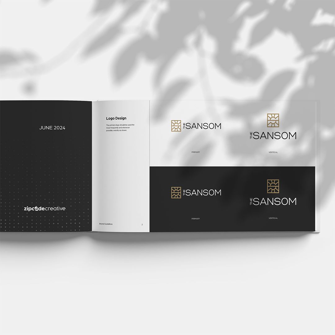
Logo Design That Honors Heritage While Embracing Modernity
The Sansom had one significant constraint: existing signage needed to stay in the same “family” and maintain relevance with the refreshed brand. Instead of fighting the signage, we leveraged it in our designs.
The old logo’s red-and-gray split “S” leaned too corporate and needed a modern refresh. The solution became a sunburst “S”—Sansom means “sun” or “sun child.” We crafted something reminiscent of sunrays: a radiating geometric icon that honored brand recognition, added warmth and movement, reflected neighborhood energy, connected to the interior’s metal screens, and created a symbol that was fully “The Sansom.”
This approach demonstrates how memorable logo design balances practical constraints with creative vision.

Strategic Color Palette Selection for Market Differentiation
We selected gold and charcoal for strategic reasons. Gold provided warmth, refinement, and paired beautifully with the interior’s brass fixtures. Charcoal settled the look into urban sophistication. Secondary colors (neutrals) mirrored the lighter woods and natural materials in the interiors, hitting on that approachable polish vibe.
In a neighborhood full of blue and black color palettes, these selections quietly stood out—critical for competitive differentiation.
Typography Choices That Balance Style and Readability
Typography was aimed at both style and readability. We selected:
- Minerva Modern – great for headings with its crisp elegance
- Lato Regular – for body copy; it’s friendly and readable
- Briquette – for accents; it gives a casual but personal edge
Pattern Design Inspired by Interior Architecture
Patterns pulled from the metal screens used a perforated dot pattern. This helped add texture, story, and continuity. When residents see the dot pattern on collateral, they’re subconsciously reminded of the beautiful design details in their building—enhancing brand recognition through design elements.
Lifestyle Photography That Captures Authentic Rittenhouse Living
Nailing the lifestyle aspect was key. The photography styles zeroed in on real living: catching up over coffee, evenings out, dogs in the park (they’re dog-friendly!), walking to work, Rittenhouse energy. The messaging “Experience the good life” told prospective residents this was an aspirational lifestyle within reach.
It didn’t lean too hard on luxe messaging—it simply stated this was something good and attainable. Selecting the right lifestyle imagery makes all the difference in communicating authentic brand personality.
Market Positioning Strategy: Owning a Different Value Proposition
The Sansom was precisely positioned with its refreshed identity—embodying the choice for professionals who cared most about location, service, and thoughtful design. Residents who wanted a home that elevated daily life while leaving room in the budget to enjoy the surrounding neighborhood could choose them.
Instead of competing on amenities, The Sansom owned a different value proposition altogether. This strategy aligns with how successful multifamily portfolio brands maintain competitive positioning across properties.
Competitive Analysis in Philadelphia’s Rittenhouse Square
With multiple multifamily communities nearby in the Rittenhouse area, The Sansom needed to find its lane and stay in it. Among four competitors, there was a mix of cold and hyper-amenitized properties, along with generic luxury or traditional brands, plus a bold brand that didn’t land in the elevated camp.
The Sansom clearly set itself apart with warmth and modern refinement. The look was ready to be remembered and invite new residents.
This positioning aligned perfectly with their business model:
- Don’t overpromise amenities they don’t have
- Emphasize what they DO have: location, service, quality, value
- Appeal to the demographic they’re already serving successfully
- Position renovations as elevation, not complete reinvention
Scalable Brand Systems for Long-Term Success
A note on scaling: The brand can scale up. All the unit signage, print collateral, digital ads, and social graphics embody the brand identity seamlessly. The sunburst can shrink (as an icon) or get blown up (for banners), the palette remains classy, and the typography feels future-proofed.
A brand that’s flexible is worth its weight in gold (specifically #B79562).
Results: Strategic Branding That Drives Competitive Advantage
The Sansom’s brand refresh created a logo and visual identity that was beautiful, yes, but also strategic—based on discovery and research rather than aesthetic preferences alone.
We helped The Sansom:
- Compete effectively with flashier new construction nearby
- Communicate accessible, high-quality sophistication in a prime location
- Look and feel refined with warmth and welcome
- Maintain connection with its roots and current resident demographic
This cohesive and strategic transformation helped The Sansom gain a new market presence without losing touch with what made it special. By capitalizing on its genuine strengths—location, service, thoughtful design, and true livability—it could compete with the neighborhood on the exact things its target residents were actively looking for.
Shiny new towers, say hello to The refreshed Sansom, with its own special shine.
Ready to position your multifamily community strategically in a competitive market? Zipcode Creative specializes in research-driven brand development for apartment communities nationwide. Let’s discover what makes your property genuinely different.


