How Strategic Repositioning Helped 1306 Exchange Attract Young Professionals in Durham’s Competitive Market
Stacey Feeney
When ML Property Group acquired and renovated a Durham apartment community, they faced a challenge familiar to many property owners: how do you attract a completely different demographic than your previous resident base?
The answer wasn’t just a fresh coat of paint or a new logo. It required strategic repositioning backed by research, intentional brand development, and marketing that spoke directly to their ideal residents.
Here’s how we helped ML Property Group transform their newly acquired property into 1306 Exchange—a community that successfully appeals to young professionals in healthcare and technology.
The Challenge: Repositioning for a New Market
ML Property Group came to us after completing a value-add renovation on their recently acquired Durham property. The community had a new name and updated interiors, but they needed more than aesthetic improvements to compete with newer apartment communities in the area.
Their goal was clear: shift from primarily serving blue-collar residents with average incomes of $40-60k to attracting young professionals in Durham’s growing healthcare and technology sectors. The challenge? Positioning themselves as an affordable alternative to downtown Durham apartments without sacrificing appeal to this more affluent demographic.
This type of multifamily repositioning requires more than surface-level changes. It demands a complete rethinking of how the property presents itself to the market.
Building Strategy Through Discovery
Every successful repositioning starts with understanding who you are and who you want to attract. We began with our brand questionnaire—a tool designed to uncover the personality, values, and aspirations that would shape the brand moving forward.
The questionnaire revealed crucial insights about 1306 Exchange’s brand personality. Words like “fun-loving” and “creative” emerged alongside appreciation for both urban nightlife and nature’s tranquility. When asked what celebrity would represent their brand, they chose Ice Cube. For a car? A Mustang. These answers weren’t random—they pointed to authenticity, adaptability, and timeless appeal.
This discovery phase also clarified the demographic shift. The community needed to appeal to residents seeking downtown proximity without downtown prices—young professionals in healthcare and tech who valued convenience but also wanted breathing room from the urban core.
Understanding your target audience’s demographics, pain points, and aspirations is fundamental to any brand repositioning strategy.
Location as a Competitive Advantage
Location doesn’t change, but how you position that location absolutely does.
1306 Exchange held several strategic advantages: proximity to Duke hospitals, major shopping areas, Ellerbee Creek trails, and easy highway access. These weren’t just amenities to list—they were the foundation of the community’s competitive positioning.
We positioned the property as offering an ideal combination of suburban comfort and urban convenience. This positioning directly addressed the needs of the target demographic: healthcare and tech professionals who work near downtown but don’t want to pay premium downtown rents or sacrifice space and nature access.
This location-driven strategy became central to all marketing messaging, helping differentiate 1306 Exchange in a market crowded with new construction competing for the same residents.
Creating Visual Identity with Purpose
With strategy established and target personas defined, we moved into creative development. Every visual element needed to align with the strategic goals we’d identified.
Brand Stamp/Symbol
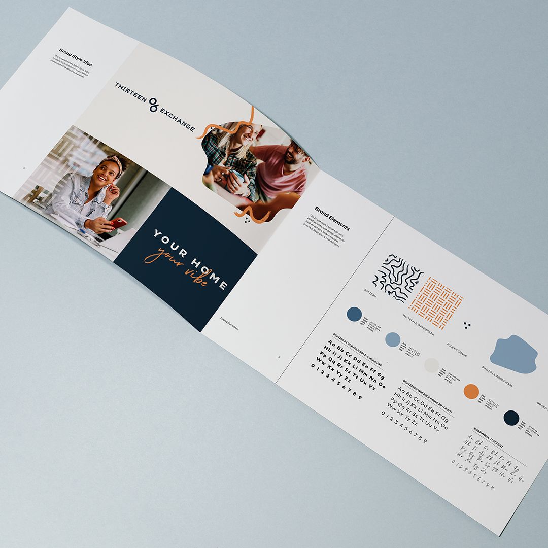
The address itself—1306—became a distinctive brand element. We created a modernized “06” symbol that felt both established and contemporary. Remember that Mustang analogy? Classic, yet adaptable. The symbol provided brand recognition while maintaining flexibility across applications.
Color Palette
We built upon the building’s existing blue-gray tones and added bright orange as an energetic accent color. The client wanted a pop of color, and we tested both yellow and orange. Orange won—it provided better contrast and brought the vibrancy the brand needed without overwhelming the sophisticated base palette.
These colors became the foundation for patterns and accent elements throughout the marketing collateral, creating visual cohesion across every touchpoint.
Typography
Font choices might seem minor, but they set tone immediately. We selected typefaces that balanced professionalism with warmth—exactly the combination that would appeal to healthcare and tech professionals seeking a community that felt approachable but credible.
Every element of visual identity development serves a strategic purpose when done intentionally.
Strategic Brand Positioning
The property’s name—Thirteen 06 Exchange—connected to ML Property Group’s existing portfolio while emphasizing connection and interaction. Though we didn’t name the property, the name gave us momentum for positioning.
The word “Exchange” particularly resonated with the community-building goals. It suggested interaction, collaboration, and the social atmosphere that young professionals seek. This became a theme we wove throughout the marketing narrative.
The positioning also directly addressed area perception challenges. Durham has experienced significant growth, but some neighborhoods still carry outdated reputations. By emphasizing community, safety features, and the collaborative spirit, the brand positioning helped overcome these perception hurdles.
The Complete Brand System
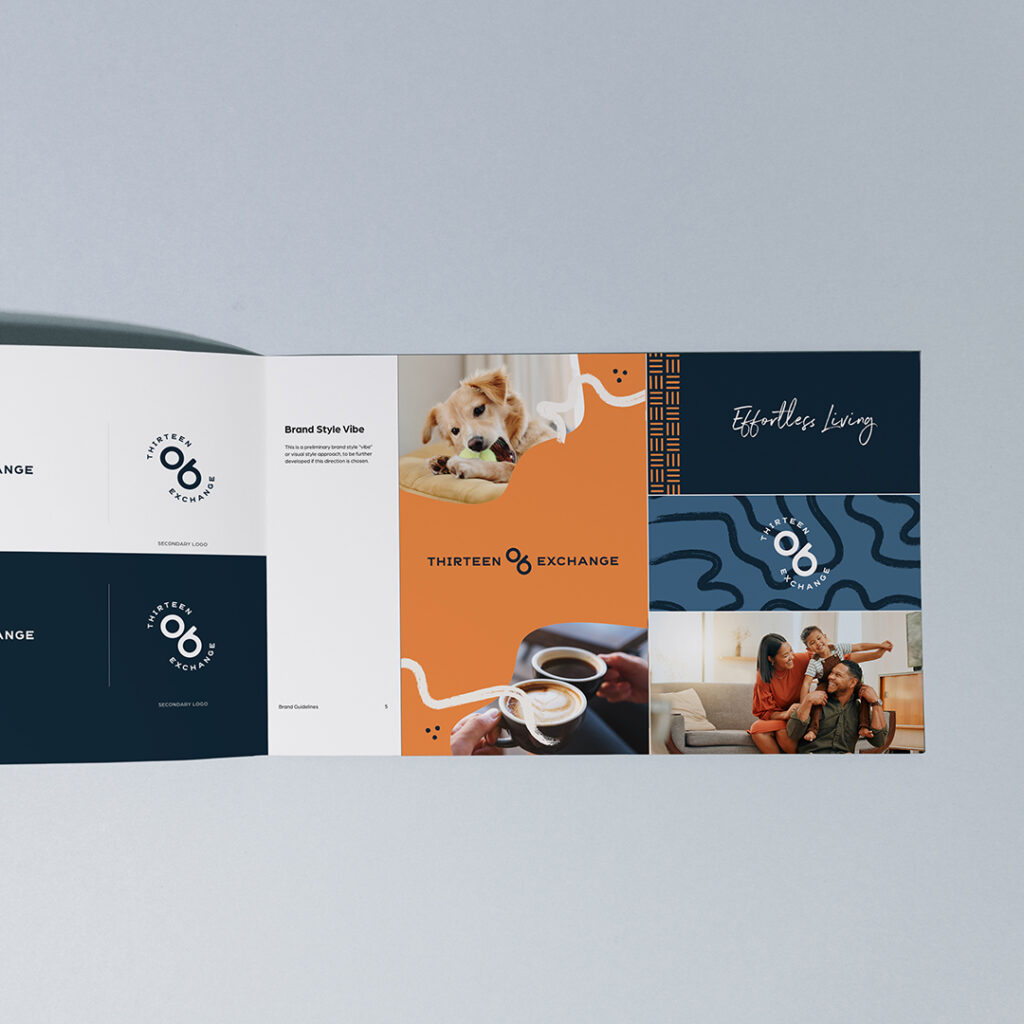
The final brand guidelines created a comprehensive, cohesive system that could flex across multiple applications:
Logo: Clean, modern, and versatile enough for everything from signage to social media.
Pattern: Organic, flowing patterns that referenced the nearby Ellerbee Creek and nature access—subtle but meaningful.
Photography Style: With the demographic shift to young professionals, photography needed to reflect this audience. The style guidelines now featured diverse, happy families and young professionals in authentic lifestyle moments.
Tagline: “Effortless Living” captured exactly what the target market valued most—convenience and ease in a world of complexity.
This complete brand system gave ML Property Group everything needed for consistent application across all marketing channels. Every touchpoint would reinforce the same message and visual identity, building recognition and trust with prospective residents.
Marketing That Connects with the Target Audience
Brand strategy means nothing if it doesn’t translate into effective marketing. We applied the positioning and visual identity across all marketing materials with strategic intent.
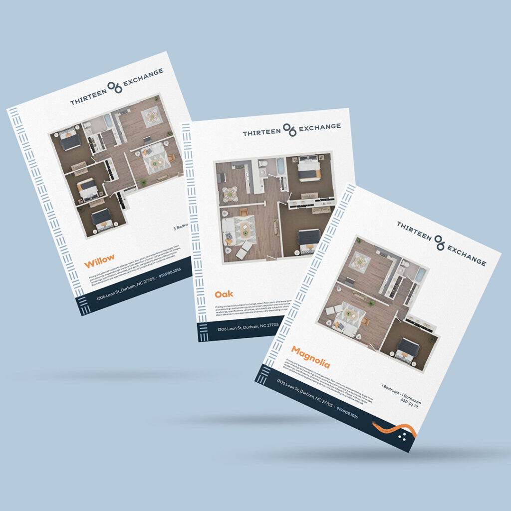
Floor Plan Naming: Rather than generic “A, B, C” designations, we named floor plans after trees—Magnolia, Oak, Maple. The names felt natural and grounded (literally), connecting to the nearby creek and nature access while maintaining sophistication. They were accessible but elevated—exactly the balance the brand needed.
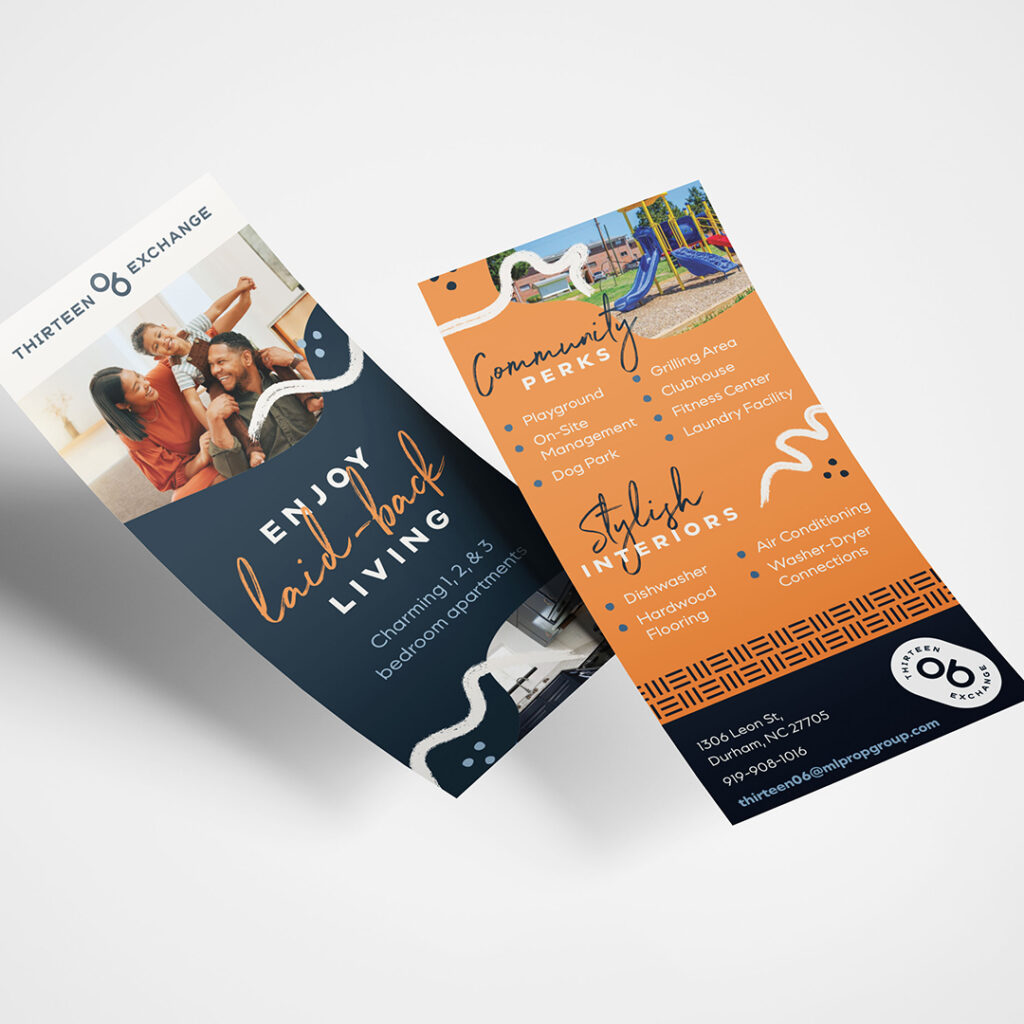
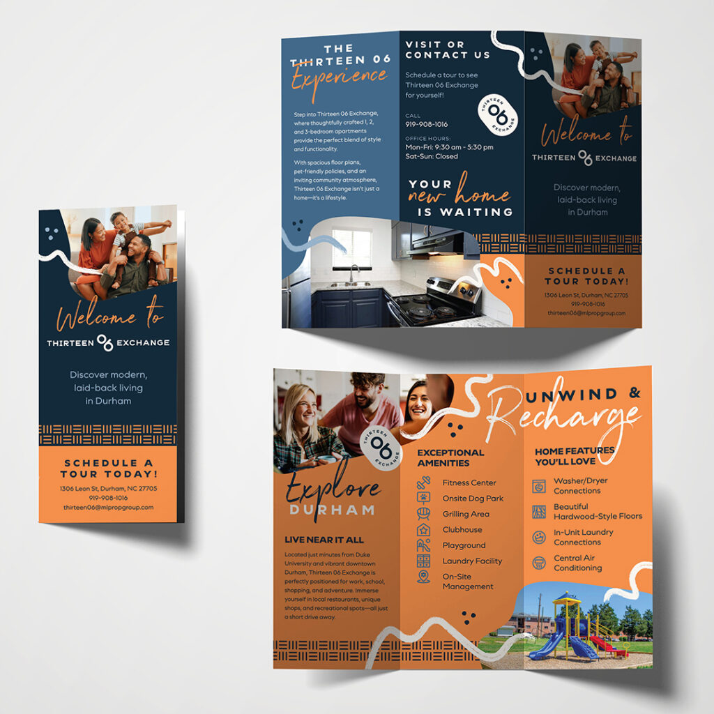
Marketing Brochures: Every amenity listed addressed the practical needs and quality-of-life desires of the target demographic. Washer-dryer connections, security cameras, dog park, fitness center—these weren’t random features. They were strategic selections that spoke to safety-conscious professionals who wanted modern convenience and active lifestyles.
The security messaging deserves special mention. By highlighting security cameras and off-duty officers, the marketing directly addressed the area’s reputation concerns without being heavy-handed. It provided reassurance while maintaining the positive, aspirational tone throughout the rest of the materials.
Creating marketing collateral that drives leasing results requires this level of strategic thinking behind every choice.
The Results: Professional Polish Meets Laid-Back Living
The final brand successfully positioned 1306 Exchange to attract the exact demographic ML Property Group wanted: healthcare and tech professionals seeking suburban tranquility with urban accessibility.
But success in repositioning isn’t just about attracting residents—it’s about attracting the right residents. The brand system we created:
- Projected professional polish without feeling stuffy
- Emphasized laid-back living without appearing unserious
- Addressed safety concerns while maintaining aspirational messaging
- Balanced nature and urban convenience
- Honored the property’s authentic character while repositioning for a new market
This is what strategic branding accomplishes. It’s not about surface aesthetics or following trends. It’s about creating an identity that accurately represents who you are, speaks directly to who you want to attract, and positions you competitively in your market.
The security features addressed reputation concerns. The lifestyle imagery projected aspiration. The nature-inspired patterns and tree names connected to location. The “Effortless Living” tagline promised exactly what busy professionals needed.
Everything worked together because strategy came first.
Ready to reposition your multifamily community to attract your ideal residents? Strategic branding research and development helps you compete effectively, even in crowded markets. Let’s talk about your property’s unique positioning opportunity.
