


When a Fresh Start Means More Than Fresh Paint: Rebranding Sunday Village
Stacey Feeney
How strategic naming and a comprehensive brand identity helped a senior affordable housing community in Austin escape its troubled past and attract the residents it was built for.
There’s a serious challenge in multifamily branding that doesn’t get talked about enough: what happens when a property’s reputation is so damaged that even a $25 million renovation can’t shake it?
That was the situation facing National Church Residences when they acquired a 175-unit senior affordable housing community in Austin, Texas. The property had spent years under previous ownership marked by neglect, crime, and mismanagement. Despite a complete gut renovation—new interiors, elevators in every building, senior-focused amenities, and secured gated entry—occupancy sat at just 60%.
The buildings were transformed. But the perception wasn’t.
The Challenge: A Legacy That Wouldn’t Let Go
This went beyond a normal repositioning project. The property—formerly known as Arbors at Creekside—had developed the kind of reputation that spreads through a community (in a bad way). Neighbors warned each other. Negative stories popped up when adult children researched housing options for aging parents.
National Church Residences had invested heavily in the physical transformation. Every unit was gutted and rebuilt. Senior-friendly features were added throughout. The management team was completely refreshed with new regional leadership and a new property manager. But the name “Arbors at Creekside” still carried all that negative history with it.
Meanwhile, the Austin market was working against them. An oversaturated senior housing landscape meant competitors were dropping rates and offering aggressive move-in incentives. A new market-rate property had opened adjacent to the community. The area was undergoing re-gentrification—full of opportunity, but also full of competition.
Time was of the essence. The property needed way more than a new coat of paint. It needed a complete brand transformation that said to prospective residents and their families: This is a different place now.
Discovery: Understanding Who We’re Really Talking To
Before any creative work began, we needed to understand exactly who this community was built for. This project was part of a larger engagement with National Church Residences to develop comprehensive persona research across their entire portfolio of housing types—from permanent supportive housing to market-rate communities.
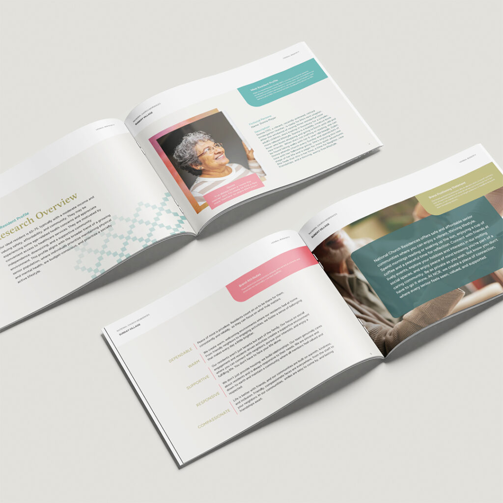
For Sunday Village specifically, we were targeting seniors in the LIHTC (Low-Income Housing Tax Credit) affordable housing space. These aren’t the seniors typically depicted in generic stock photography. They’re individuals like our ideal resident persona, Donna—a 70-year-old retired kindergarten teacher, recently widowed, vibrant and creative. She attends church every Sunday, loves her book club, takes walks with her beagle, and is ready for life’s next chapter. She’s not looking to slow down. She’s looking for community.
Understanding this persona shaped everything that followed. These residents value independence but crave connection. They’re budget-conscious but proud—they want quality housing that respects their dignity, not something that feels like a compromise. They’re active, engaged, and looking for a place where they can live life to the full, not just survive.
Research from the National Multifamily Housing Council consistently shows that brand perception directly impacts lease velocity—and for affordable communities competing in tight markets, that gap between “nice renovated property” and “place I actually want to live” can mean the difference between 60% occupancy and full stabilization.
Strategic Naming: Finding Meaning in “Sunday Village”
The naming process required threading a particularly delicate needle. National Church Residences is a faith-based organization—they offer chaplaincy services at all their properties—but the branding couldn’t feel overtly religious. The name needed to resonate with seniors of all backgrounds while subtly honoring NCR’s mission.
“Sunday Village” emerged as the solution, and the reasoning goes deeper than it might initially appear.
Simply say the word “Sunday” and tension eases. It’s a day associated with rest, relaxation, and doing what you love. For many seniors—particularly those who are (as we put it) “Day of Rest-minded”—it carries a gentle spiritual connotation without being exclusionary.
But there’s also a specifically Texan connection that grounds the name in local history. “Sunday Houses” were a tradition among German ranchers and farmers in Texas—smaller second homes built in town so country dwellers could do business on Saturday and easily attend church on Sunday morning. Many retiring farmers eventually moved into their Sunday House full-time after passing the family property to their children.
That historical thread captured everything we wanted the brand to communicate: tradition, rest, togetherness, and the natural transition into a new chapter of life. Paired with “Village”—which reinforces community and connection—the name tells a complete story.
The tagline followed naturally: Life is Better Together.
If you’ve read our post on how voice search should influence apartment community naming strategies, this is a great example of those principles at work. “Sunday Village” is distinctive, easy to say, and easy for search engines (and AI assistants) to recognize—no clarification needed.
Building the Brand System
With the name established, we developed a complete verbal and visual identity system. (The logo itself was provided by National Church Residences to maintain consistency with their parent brand—the geometric mark subtly suggests community and shelter while tying back to their organization-wide identity.)
Verbal Identity
The brand voice needed to speak directly to our ideal resident without feeling patronizing or clinical. We developed positioning that emphasizes thriving over merely living, connection over isolation, and ease over struggle.
Key messaging pillars included “Where Value Meets Vibrant” (addressing the affordability factor without making it feel like a limitation), “Find Your Happy Place” (speaking to the emotional need for belonging), and “More Living, Less Worry” (capturing the appeal of maintenance-free apartment living for seniors downsizing from homeownership).
The sample copy we developed focuses on what daily life actually looks like: enjoying quality time with a pet, joining a book club, discovering a hidden talent for painting, sharing stories over coffee. Every word of it was a genuine reflection of the lifestyle NCR communities facilitate.
Visual Identity
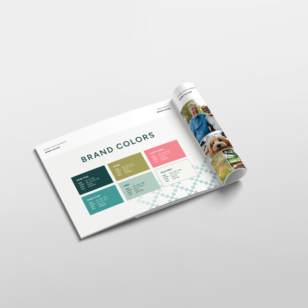
The color palette moves away from the institutional teals and burgundies that dominate much of senior housing. Instead, we brought in a fresh mix of dark teal, moss green, light coral, mint, and warm neutrals. The result feels contemporary and welcoming—more “vibrant retirement” than “assisted living.”
Typography pairs a classic serif (Latienne Pro) for headlines with a clean, readable sans-serif (Figtree) for body copy. The serif carries sophistication and tradition; the sans-serif keeps things approachable and modern. This mirrors the approach we discuss in our breakdown of brand identity elements that drive leasing success—every choice should be intentional, not decorative.
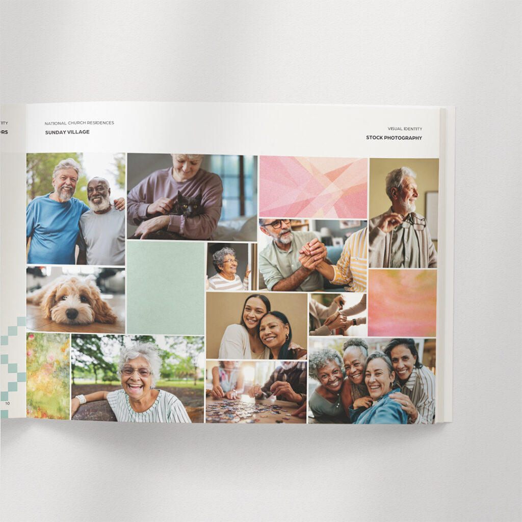
Photography direction emphasizes genuine connection—seniors laughing together, enjoying hobbies, spending time with pets. We specifically sourced diverse imagery that reflects the actual demographics of LIHTC senior housing, not the homogeneous (and often unrealistic) stock photography that pervades the industry.
Design Elements
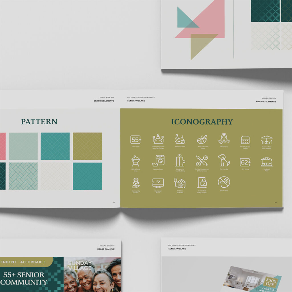
We developed a distinctive pattern system—including a quilted gradient motif and geometric overlays—that can be applied across all touchpoints. These elements give the brand visual consistency while providing flexibility for different applications. The quilted pattern in particular ties back to themes of warmth, tradition, and handcrafted care.
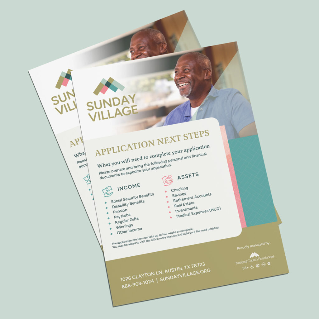
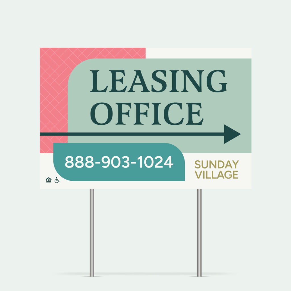
From Guidelines to Collateral: A Complete Marketing Toolkit
A brand system only works if it’s actually usable. (We talk about this a lot. Gorgeous 60-page brand guidelines collecting dust in a leasing office drawer = Unhelpful.) For Sunday Village, we developed an extensive collateral suite designed to support every stage of the resident journey.
- Awareness and attraction included yard signs, flags, A-frames for street-level visibility, and branded templates for digital advertising.
- Leasing and tours got floor plan marketing sheets, lifestyle-focused brochures, open house flyers with QR codes, and leasing incentive flyers that addressed the competitive market directly.
- Application and move-in materials demystified the LIHTC qualification process—because wow can affordable housing applications feel overwhelming!
- And retention and referral collateral included resident referral program flyers, review cards, and community event promotion templates.
Every piece maintains brand consistency while serving a specific purpose in the marketing funnel. And critically, every piece communicates the same core message: Sunday Village is a place where seniors can thrive, connect, and enjoy this chapter of their lives.
The Bigger Picture: Building Brand Systems That Scale
This project was part of a broader strategic initiative with National Church Residences. The persona research and brand positioning work we developed served far more than Sunday Village. It’s a framework that can be applied across NCR’s entire affordable senior housing portfolio.
When property management companies operate dozens or hundreds of communities, brand consistency becomes both a challenge and an opportunity. The research-driven approach we took here—starting with deep demographic and psychographic understanding, then building naming strategies and visual systems that authentically speak to those audiences—creates a model that can be repeated and scaled up.
Each property can have its own distinct identity while still benefiting from the strategic groundwork. The persona insights, the messaging frameworks, the photography direction—these become organizational assets that make every subsequent project more efficient and more effective. If you’re a property management company navigating brand consistency across your portfolio, our post on multifamily brand implementation breaks down why this matters and where most companies get it wrong.
What Strategic Rebranding Actually Looks Like
The Sunday Village project illustrates something we see consistently in our work: the most effective branding isn’t about simply creating something beautiful. It’s about solving a specific business problem.
In this case, the problem was clear—a property with everything going for it physically, but burdened by a reputation it couldn’t shake. The solution required research that revealed the real audience (not generic “seniors” but specific individuals with specific needs and motivations), naming that created genuine distance from the past (not just a superficial change, but a new identity rooted in meaning and local relevance), verbal and visual systems that communicate transformation (every touchpoint reinforcing that this is a different place now), and practical tools that support leasing (because beautiful brand guidelines don’t help if the on-site team can’t actually use them).
For property managers and developers facing similar challenges—whether it’s escaping a troubled history, repositioning for a new demographic, or simply standing out in a competitive market—the lesson is the same:
Brand isn’t decoration. It’s strategy made visible.
Zipcode Creative specializes in strategic brand development for multifamily properties, with particular expertise in senior housing, affordable communities, and portfolio-wide brand systems. Ready to talk about your next project? Let’s connect.
Lease a
