


Priorities for Memorable Logo Design
Stacey Feeney
A logo is more than just a pretty picture. It’s the visual cornerstone of your brand identity, the first impression that resonates with your audience. Remember that your logo can communicate important qualities about who you are and what you do. So, how do you ensure your logo is visually appealing and truly effective? Let’s dive in.
Meaning & Message: More Than Just a Pretty Face
Your logo shouldn’t just look nice; it should whisper the essence of your brand. Think subtle symbolism, hidden meanings, whimsy (or NO WHIMSY EVER), and a touch of intrigue. Avoid the temptation to be overly literal – something the film and theater world calls “on the nose.” It can quickly veer into “try-hard” territory and signal a lack of sophistication. We don’t want to look like amateur night!
Personality & Vibe: Let Your Logo Sing!
Your brand has a distinct personality – is it sophisticated, playful, edgy, classic, or a unique blend of all these (or others)? Your logo needs to reflect this character. It bears mentioning that this is why brand strategy should precede logo design, and never be skipped.
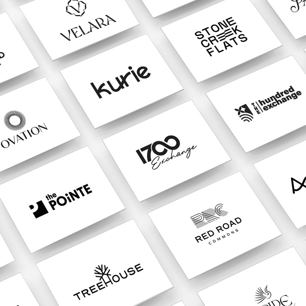
- Typography as Voice: Just as our voices are ours alone, your font should be custom, creating a subtle and clever symbolism that communicates important elements of your brand. A brand name typed out in a generic font signals a generic brand. (More font wisdom.)
- Color as Emotion: Colors evoke powerful emotions. Think of how serene blues feel or how energetic oranges are. Your color palette should align with your brand’s desired emotional impact. (Read more about color psychology.)
- Beyond Aesthetics: Consider the “feel” of your logo. Is it minimalist and sleek? Bold and dynamic? Handwritten and warm? These subtleties matter when communicating your brand’s personality.
Practical Considerations: Don’t Forget the Real World
While aesthetics are crucial for a captivating logo, don’t forget about the practicalities of real-world application.
- Readability is King: Can people read your logo clearly and quickly? It seems obvious, but it’s surprisingly easy to overlook. Remember:
- Intricate designs or overly stylized lettering can make your logo difficult to decipher at small sizes.
- Mispronunciations and spelling errors stemming from an illegible logo can damage your brand’s credibility and make it harder for people to find you online.
- Always prioritize clarity and readability across different sizes and formats.
- Versatility is Key: Your logo must be a chameleon, adapting seamlessly to various applications. Consider:
- It should look stunning on social media, where it might appear as a small icon or a larger profile image.
- It must easily adapt to business cards, letterheads, and other stationery.
- It must maintain its integrity when printed on merchandise like t-shirts, mugs, and promotional materials.
- How will your logo look in different colors, on different backgrounds, and in various sizes?
Common Pitfalls: Logo Design Sins to Avoid
Even the most talented designers can fall victim to common pitfalls. Here are a few to watch out for:
- Clutter is the Enemy: Resist the urge to cram your logo with unnecessary elements like taglines (just— no), extravagant icons, or excessive details. Simplicity is key. A clean, uncluttered logo is easier to remember and more versatile in application.
- Color Chaos. While color can be a powerful tool, too many colors can be overwhelming and detrimental to your logo’s effectiveness. Don’t forget:
- A restricted color palette creates a sense of unity and professionalism, and enhances brand recognition (hey, Coca-Cola red).
- Too many colors can make your logo look amateurish and difficult to use consistently across different applications and backgrounds.
- A primary brand color with one or two accent colors is a more polished and impactful look.
- Trend Chasing: Avoid chasing the latest design trends. Why?
- Trendy designs can quickly become dated, leaving your logo outdated and irrelevant.
- Focus on creating a timeless logo reflecting your brand’s core values and standing the test of time.
The upshot is this: crafting a truly memorable logo is an art form. It requires careful consideration and a laser focus on the elements that truly matter. By prioritizing meaning, personality, and practicality, you can craft a visual identity that resonates deeply with your audience, elevates your brand above the competition, and leaves a lasting impression.
Lease a
