


Naming Multifamily Communities Well: A Coastal Florida Brand Identity Case Study
Amanda Marino
In Ponte Vedra Beach, FL, you can find a variety of communities. A mere 15-minute drive from the beach sits a high-end community that needed a name and an identity that made it clear: They were at the top of all the top-of-the-line options out there. So we set to work on something we do best: naming multifamily communities. And we took plenty of interior inspiration.
The Opportunity
The client, Thompson Thrift, came to us primarily for our ability to name things the right thing. A name holds a lot of power. And with a whole clutch of competition in the luxe apartment market, this community needed to stand out, to show a better level of living to its prospective residents.
Our team at Zipcode Creative came in to craft a set of name options that could work for this coastal gem. But first, we had to do the research and look at any existing inspiration and pieces, including the interiors.

Research & Strategy
With a call to be “classic and enduring” we used the research Thompson Thrift provided. Since the development was situated in Nocatee, a Master Planned Community and a top-rated place to live, it was vital to portray the difference this apartment community would provide, starting with the name.
After reviewing research including their ideal residents—and internalizing the Thompson Thrift team’s requests regarding style and vibes, we set to work on names for the new property. We also looked at elegant ideas, and names that would relate to their market: upper class suburbanites. Particularly, when we looked at the interiors, we saw the classy coastal vibes come through clearly. Zellige tile, slate blue paint, rattan pendant light shades, greenery-covered walls, everything was classic but casual in the ultimate beachtown way.
After checking social media handles, URL, and trademark availability, we offered up name options ranging from saltwater sophisticated to golf-adjacent, given the revered local sport favorite. But the one that floated to the top (like cream): Velara.
We described the name this way:
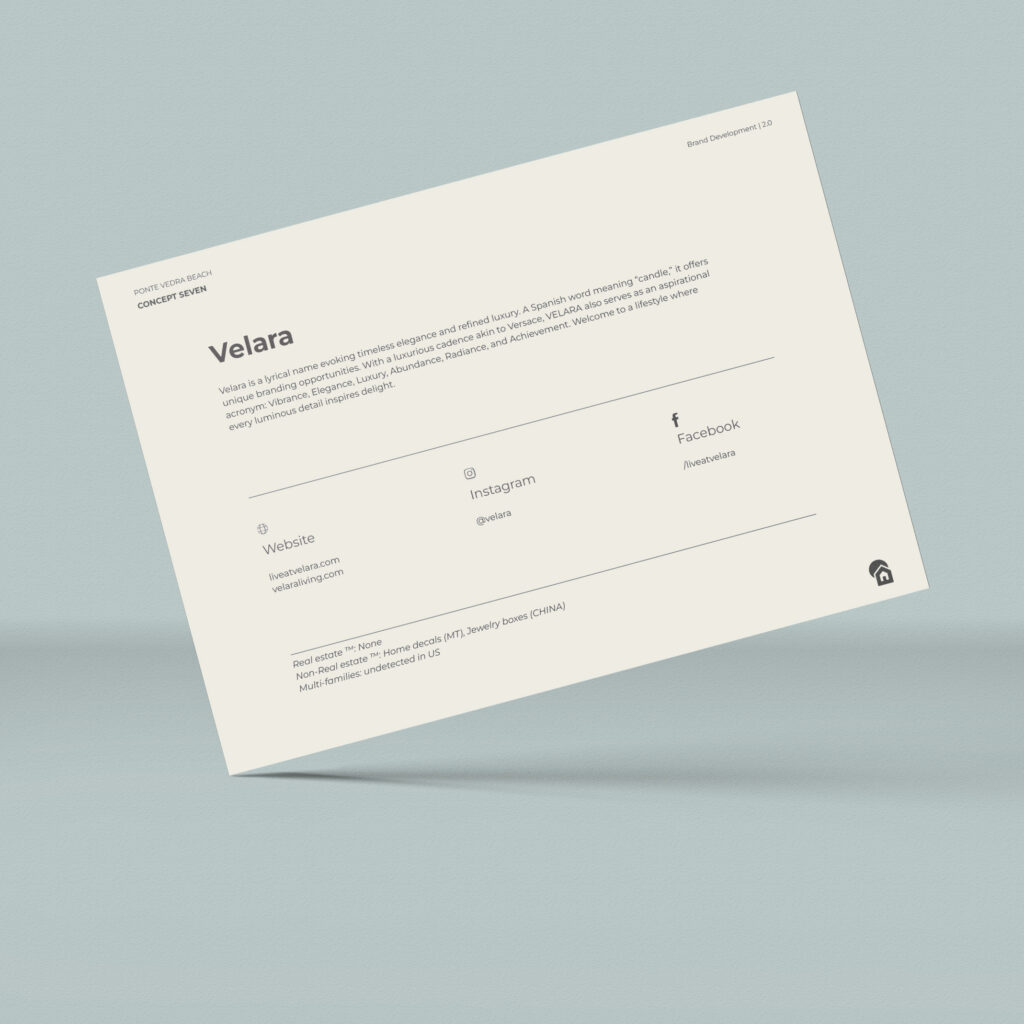
Velara is a lyrical name evoking timeless elegance and refined luxury. A Spanish word meaning “candle,” it offers unique branding opportunities. With a luxurious cadence akin to Versace, VELARA also serves as an aspirational acronym: Vibrance, Elegance, Luxury, Abundance, Radiance, and Achievement. Welcome to a lifestyle where every luminous detail inspires delight.
We referenced its similar sound to another luxury brand. We talked about the musicality of the name. We ensured it rolled off the tongue and was easy to say, per the client’s specific request. We even created an acronym to fully capture the essence.
Implementation
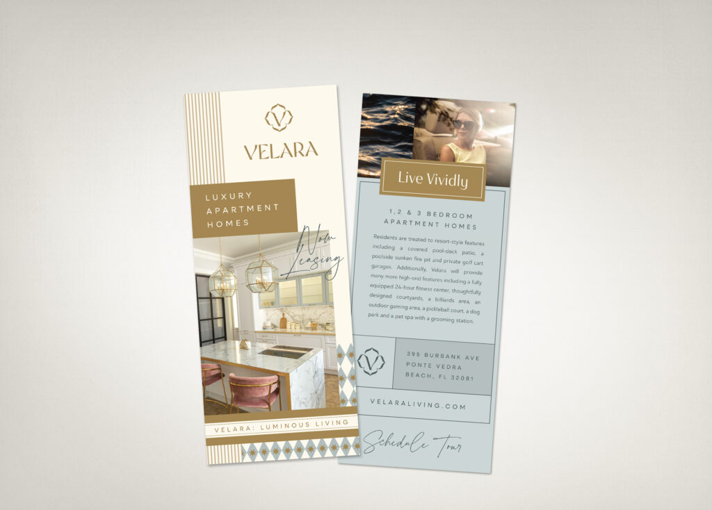
From the name, everything else fell into place. We created logos, three visual concept options, and our client chose a color palette that included a host of colors from a tan “Linen” to a classy stony “Storm” blue. Every part of the branding was a top-shelf selection from the name to the logo and the verbal identity. By including stylized stock photos examples, we also ensured that they had guidance for choosing the best photos that would go with their new name, interiors, exteriors, and verbal identity. Every part of the branding was built atop the name.
Big Picture
Because the apartment name is one of the most important branding decisions made, we developed name options that would be absolutely foundational to the future brand identity and help easily create cohesion:
- Name meaning – Velara means “candle” in Spanish and evokes the ritual of luxury. The glow and allure of light in the dark.
- Location vibes – A coastal, sought-after region pushed us to create a name that felt more exclusive. With so many competitors, we focused on making this apartment community sound as ideal as it looks.
- Interior design plans – Bright and airy interiors helped shape the flowy name. With everything looking as easy as Sunday morning, its name had to be equally smooth to say and spell.
The average ideal resident of Velara is high class, modern, and someone who chooses to rent because of the ease of life and minimal upkeep. By using the interiors as inspiration for the name and the rest of the brand, we could ensure everything felt singular—both to the brand, and as a unique, standalone spot.
For the feel of built-in luxury, a name was the start, and a full, sweeping seascape-style brand identity was the result.
Lease a
