


Multifamily Website Template Design Choices to Be On-Brand
Stacey Feeney
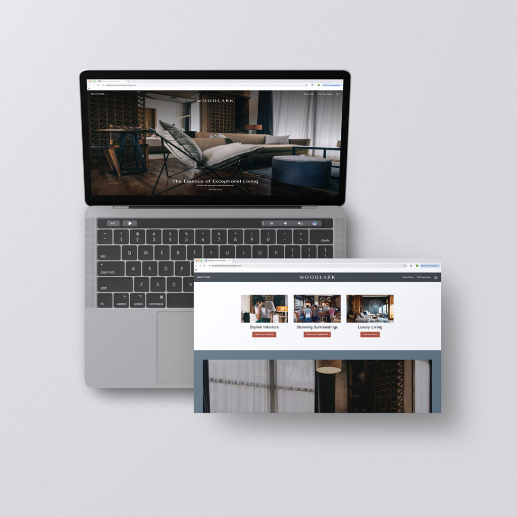
Using a website template isn’t unusual in the multifamily industry. But it doesn’t mean you’ll need to stick with the usual—the default settings on everything. You still have the capacity to make it your own.
There are certainly factors that come into choosing a template: budget, timing, marketing team size and capabilities. Even though it’s not a fully custom website from scratch, you can take the template to the next level while still staying on-brand. Ensure every one of your website template design choices are on-brand to set you apart.
There are a variety of ways to make an apartment community templated website appear more custom. When using a PMS provider like RentCafe or a third-party template provider like Jonah Digital, it still pays dividends to follow your brand guidelines as much as possible. Let’s walk through some practical hacks to make an apartment community website look less “seen-it-before” and more “can I see that again?”
Start Here: Fonts + Colors
The first thing you’ll want to touch is the fonts and the colors. This is a small effort, big payoff move. Anywhere the template allows the user to make custom selections—that’s the spot to shine. Adjust the colors to match your palette. Adjust the fonts to match your typography selections—and as much as you can, enable the font hierarchy to be the same as what’s outlined in your brand’s guidelines.
Everything you choose should be consistent with your brand guidelines. This will help when a prospect jumps from your socials to your website—if it looks the same, they won’t second-guess where they’ve ended up. They’ll know it’s the same brand. This goes for print and email, as well.
Note: Be precise. Matching approximately is not going to be professional. Use the exact HEX codes for your color palette from the brand guidelines.
Backgrounds: Use the Negative Space
Just because it’s default doesn’t mean it’s the right choice. So many templates default to plain white backgrounds, but this is the perfect place for brand personality to shine. A brand color can be just the “pop” needed when used as the background’s negative space instead. Beyond solid brand colors (that are in the brand guidelines)—which are simple, but effective—backgrounds that use the below could also work well:
Patterns or textures: These should be pulled from your brand identity, not just selected from a list of drop-down options in the website template.
Custom images or graphics: Using these in section backgrounds can help break up the page and further push forward your brand identity, even from the background.
To do all of this effectively, keep these things in mind:
Make sure the image (whether a photo, pattern, or texture) is high-quality and has the right resolution. If it’s blurry, it’s unprofessional. Work with your creative partner to upload vector files when possible.
Test it on mobile and tablets to make sure it’s showing up how you want—no awkward cropping or stretching as the site moves through its responsive screen sizes.
Don’t overdo it. Don’t do a pattern or photo everywhere you can. That ends up looking busy and can overwhelm website visitors.
Prettier Than a (Property) Picture
Property photos are helpful for prospects to know the basics—how apartments look, the layout of the pool, the cool hangout spaces in the community area. But take it a step further. Beyond the expected.
If you’re already working with a templated website for your property, get more creative with the photos you use. If you’re able, use brand-driven visuals. They’re far more memorable than standard pool, community, apartment photos.
Beyond photos of the property, images could include:
- Subtle graphic overlays on photos (using brand elements)—similar to how social media posts are designed
- Accent typography as an artistic addition if it works with your brand style
- Swap traditional photo blocks for a totally graphic-designed element (cool!)
Additionally, stock images can help you easily tell a story, helping the prospect envision themselves in the community. Choose stock photos carefully, and keep them within the same style, too.
Once again: Make certain that everything shows up properly on mobile, tablet and desktop screens.
The Little Things
If you know us at all at Zipcode Creative, we do sweat the small stuff. The little details. The micro-elements that can push your brand a little farther in the competition to win the heart of your prospects. It’s all worth it.
These oft-overlooked items include:
Buttons – The style of the button is important. The shape, the color, and whether there are any hover effects.
Iconography – Icons can be a great way to draw the viewer’s eye to key amenities and work to showcase the brand’s style and personality. If you don’t have custom icons as part of your brand guidelines, search for stock sets that work within the aesthetic.
Bullet points and list markers – This is similar to your typography options. Choose bullet points that make sense with your brand guidelines. Arrows? Big bullets? Hollow bullets? Diamonds? Totally depends on your vibe.
Every choice, big or, in this case, small, has an impact on how your brand is perceived. Polish up your appearance and keep things cohesive. When your brand implementation is consistent, prospects notice—and remember.
What NOT To Do With Your Multifamily Template Site Design
PITFALLS TO AVOID
There are always pitfalls with design. And multifamily templated site customizations are no different. Be sure you…
Do NOT overload the site with distracting patterns and imagery
Do NOT use low-res or poorly cropped backgrounds
Do NOT add text INTO images unless it’s carefully crafted as part of the brand style
Do NOT forget to view changes on mobile—that’s where prospects will likely make their first impression
A template doesn’t have to look template-y. It can look customized and totally on brand. Just be sure to consult your brand guidelines to give your prospects a fully custom feel and experience. When you’re building more than buildings, every touchpoint matters—including your templated website. Use your creative team or ask your agency for help to make the most of your template options.
Ready to elevate your apartment community’s digital presence beyond template defaults? Our branding experts help multifamily marketers transform standard websites into branded experiences that convert. Let’s talk about making your template work harder for your brand.
Lease a
