Connecting Innovation and Industry: The Multifamily Consortium Case Study
Stacey Feeney
Multifamily Consortium was founded to bridge a growing gap in the multifamily housing industry—where property management operators face innovation fatigue, and emerging vendors struggle to access the right decision-makers.
As a new platform connecting start-up vendors with potential clients, the Consortium needed a brand that could clearly communicate its purpose, unify its offerings, and position it as the trusted connector in a noisy, fast-evolving market.
Our challenge was to bring clarity to a multi-sided business model and express its value through a cohesive visual and strategic identity.
The Challenge
The brand discovery process revealed a fundamental two-sided marketplace problem. Property management companies lacked time and expertise to vet countless new technologies, while proptech vendors couldn’t access the right industry contacts—or speak the “multifamily language” necessary to build trust.
The founders—seasoned multifamily executives with decades of experience—understood this gap firsthand. Guided by the belief that “alone we can do so little; together we can do so much,” the Consortium set out to become the industry bridge they had always wished existed.
Strategy
Defining the Brand Foundation
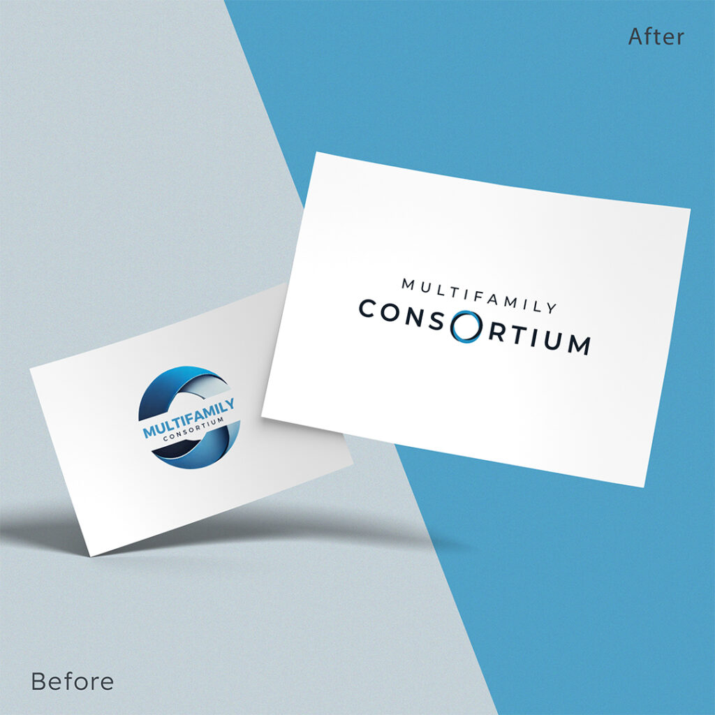
We began with a strategic metaphor from the client: the Möbius strip, symbolizing infinite connection and non-duality—two sides joining to form a continuous whole. This concept became the cornerstone of the brand narrative and visual identity, capturing the Consortium’s role as a seamless connector between innovation and implementation.
Understanding how brand strategy drives multifamily marketing decisions helped us establish this strong foundation before moving into creative execution.
Market Segmentation & Research
Our research and client input identified five core audience personas that together form the Consortium’s ecosystem: Testers (innovation pioneers at large REITs), Adopters (risk-conscious regional operators), Connectors (well-networked former executives), Partners (established proptech platforms), and Investors (industry-savvy angels and seed funds).
Unlike traditional venture capital firms, the Consortium focused on more than funding, and included ecosystem development—offering guidance, access, and industry credibility. Just as comprehensive brand research transforms multifamily communities, our research phase proved essential to positioning the Consortium correctly.
Reframing Industry Challenges
Market research uncovered a critical insight: “The multifamily industry isn’t resistant to innovation—it’s fatigued by it.”
Operators weren’t anti-technology; they were just overwhelmed by vendor noise and sales-heavy pitches. The strategic opportunity was clear: Position Multifamily Consortium as a trusted curator (rather than another marketplace)—an organization that does the homework on behalf of the industry.
This led to a positioning platform centered on “Wisdom-Guided Innovation.”
Creative Direction
Logo & Symbolism
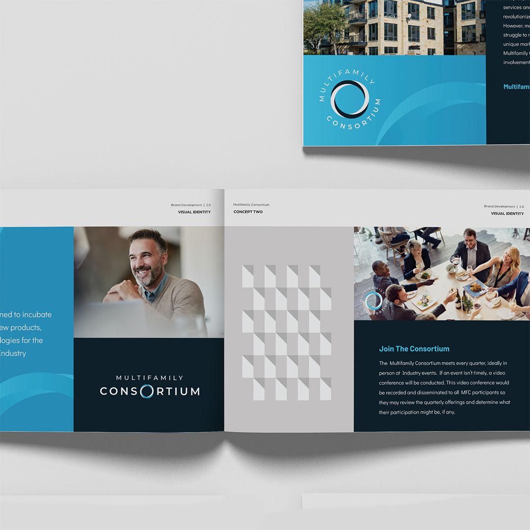
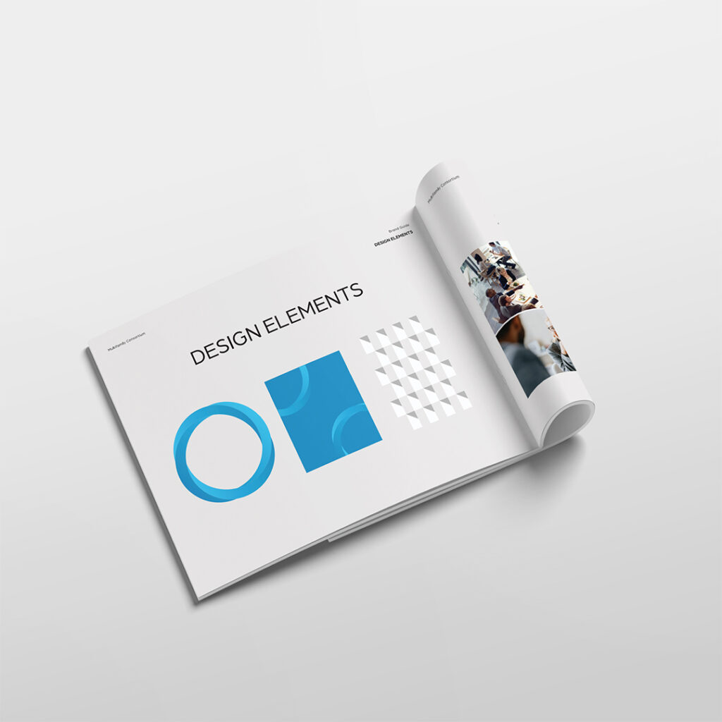
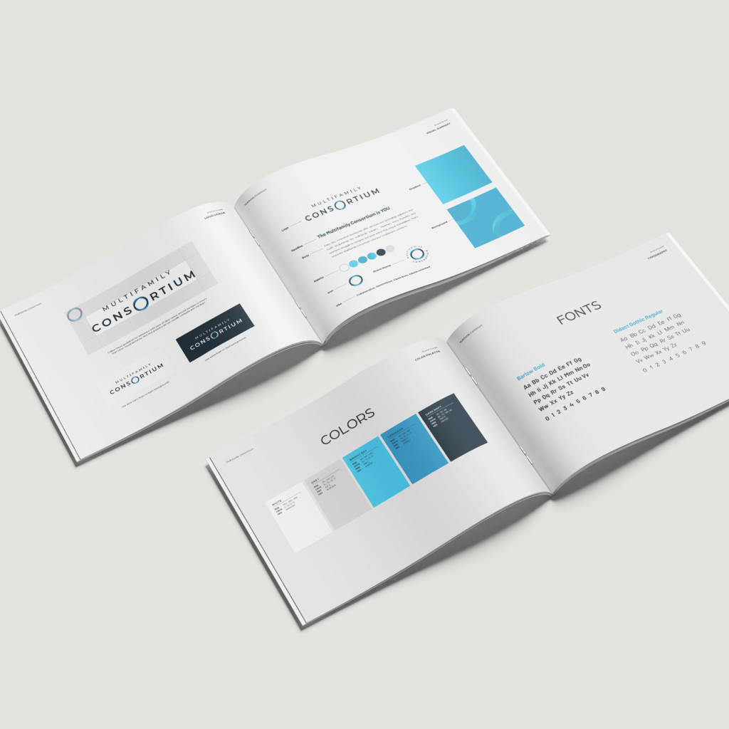
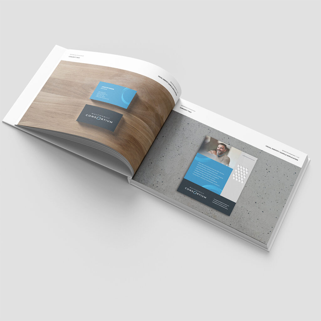
At the heart of the visual identity lies a Möbius-inspired mark, representing continuous connection, trust, and transformation. It serves as both a stand-alone emblem and a dynamic wordmark element—reinforcing consistency and versatility across applications.
The priorities for memorable logo design we established early in the process ensured the mark would be timeless, versatile, and instantly recognizable.
Color System
A blue gradient—from bright teal (#4ABCE8) to deep navy (#1A2B3D)—visualizes the journey from idea to execution, echoing the Consortium’s bridge positioning. The palette also signals professionalism, reliability, and forward motion.
Typography
Modern sans-serif typography provides balance: approachable yet authoritative, designed for executive-level communication across digital environments.
Tone & Personality
The brand tone was inspired by a fusion of two cultural icons: Elon Musk for innovation and cross-industry insight, and Gary Vaynerchuk for authenticity and community-building.
This led to the creation of the “Sage + Connector” archetype—intelligent, grounded, and collaborative. Lifestyle cues such as the Tesla Model X and Theory Performance Wear reinforced the brand’s dual nature: performance-driven, yet refined.
We helped Multifamily Consortium define their voice as professional but conversational, visionary yet credible.

Implementation
Website Content Strategy
The original website relied on vague “ecosystem” language and lacked clarity of purpose. Our messaging strategy for the Consortium established structure and confidence through evidence-backed content that validated expertise rather than “try this, buy this” promotional type language.
Industry-specific terminology reinforced authenticity—using the real vocabulary of multifamily professionals (“property managers,” “residents,” “operators”) instead of generic business-speak. Additionally, knowing that not every website visitor was ready to dive all the way in, we helped provide language for users at any level of the funnel, whether awareness or conversion.
Understanding how to develop a corporate unique value proposition informed our messaging framework across all touchpoints.
Strategic Messaging Framework
We knew that for every pain point, the Consortium needed an answer, if they wanted to be truly different from other “vendor marketplaces.”
| Audience Insight | Strategic Response |
| Operators are overwhelmed by vendor noise | “Your Time Is Valuable. We Do the Homework.” |
| Industry is 3–5 years behind, but willing | “Innovation Through Industry Wisdom.” |
| Distrust of marketing claims | “Curated Innovation. Peer Validation.” |
| Seeking trusted partners, not salespeople | “Partnership. Expertise. Results.” |
Results
Through research, strategy, and design, Multifamily Consortium evolved from a broad ecosystem idea into a distinct market leader—a brand that feels both credible and collaborative.
Outcomes
- Clear differentiation from accelerators, VCs, and vendor marketplaces
- Strong alignment between values and visual identity
- Enhanced clarity through audience-specific messaging and navigation
- Authority established via founder credibility and authentic industry tone
Brand Values in Action
| Value | Expression |
| Honest & Trustworthy | Transparent, hype-free communication |
| Visionary & Empowering | Innovation grounded in experience |
| Strategic | Structured messaging, data-backed design |
| Approachable | Confident yet down-to-earth personality |
Similar to how we approached the Red Road Commons repositioning, we ensured every brand touchpoint reinforced the core positioning and personality.
The Resulting Position
Multifamily Consortium now stands as the trusted industry insider—a connector, curator, and catalyst for collaboration across the multifamily ecosystem.
By embracing a wisdom-guided approach to innovation, the Consortium differentiates itself not through louder messaging, but through earned credibility and authentic value creation.
Bottom Line
Our brand development process helped transform Multifamily Consortium from an abstract “ecosystem” concept into a strategic industry bridge that operators trust and vendors respect.
Through research-driven insight, refined storytelling, and visual unity, the Consortium is now positioned for sustainable growth—leading the industry forward, one connection at a time.
Multifamily Consortium: Where Innovation Meets Experience.
Looking to position your multifamily brand as a trusted industry leader? At Zipcode Creative, we specialize in brand development strategies that transform vague concepts into clear, compelling identities that resonate with your target audience. Let’s create a brand that connects with the people who matter most to your business.
