


When a Brand Outgrows Its Identity: The Cadence Marketing Solutions Rebrand
Stacey Feeney
Eight years of growth can do something funny to a brand.
You add a product, launch a community, create a podcast, host an event—and somewhere in the process, the parent company that started it all fades into the background. People start knowing you by your sub-brands instead of your company name. You become “the Run Club people” instead of “Cadence.” Your flagship consulting work—the core of what you actually do—gets overshadowed by the things you built around it.
The fault doesn’t lie with marketing. It’s a brand architecture issue. It’s not the first time we’ve seen this with growing multifamily companies. We’ve seen it with property management operators adding portfolio products. We’ve seen it with vendors adding new services. We’ve seen it with consultants building up an ecosystem around their core work.
The fix can vary depending on the situation. But the diagnosis is almost always the same.
When Your Multifamily Company Brand Stops Doing Its Job
A brand is doing its job when it easily answers three questions:
- Who are you?
- What do you do?
- Why should someone pick you (over the other guys)?
When a brand’s working, your team members describe your company the same way whether they’re at a conference or a client call. Your prospective clients understand your full offering—not just the piece they heard about through word of mouth. And every product, sub-brand, or service you’ve created is unmistakably yours.
When a brand quits working, you start seeing symptoms. Your team improvises their pitch because there’s no shared language. Clients know one thing you do (but not the rest). Your sub-brands have developed their own gravity—and they’re pulling attention away from the parent company instead of reinforcing it.
That last one is where Cadence Marketing Solutions found itself when they came to us.
The Growing-Brand Trap: When Sub-Brands Steal the Spotlight
Cadence had built something seriously impressive over eight years: a respected multifamily marketing consultancy, a thriving online community (Run Club), a signature audit product (STRIDE), an industry event (Cadence Connect), and a podcast (Optimized). Each of those offerings had earned real recognition in the industry. The problem was that people recognized them individually—without connecting them back to Cadence as the company behind all of it.
As Cadence founder and CMO Janet Rosseth put it: “We really needed to find a way to take all these sub-brands and make sure it was crystal clear when you see these logos that they are affiliated with Cadence Marketing Solutions.”
For a company that positions itself as the team that brings clarity, alignment, and strategy to other organizations’ marketing—that disconnect was especially telling.
This is the sub-brand trap in its clearest form. Each product is strong enough to stand on its own. But individual brand strength isn’t the same as building up the parent company’s equity. When sub-brands operate without a unifying system, every piece of recognition they earn is going into a bucket that doesn’t clearly belong to anyone.
Discovery That Goes Deeper Than a Logo Brief
The Cadence rebrand started at the visual identity phase—the team had already done significant internal work on who they are and what they do. But our brand questionnaire process pushed further, pulling out the personality nuances and cultural DNA that ultimately shape every creative decision.
A few of the answers were particularly revealing.
When asked which celebrity best represents their brand, the team answered Jennifer Garner — “savvy businesswoman, great mom, girl next door.” That’s a very specific set of qualities: highly capable without being showy about it, warm and approachable, the kind of person you’d trust to tell you the truth without making you feel small. Not a power-suit-and-corner-office brand. The person in the room who’s done the work and shows up as a real person rather than a persona.
The other questions painted the same picture from different angles. The brand drives a two-year-old Audi or Lexus (aspirational but not flashy). It wears Athleta (purposeful, performance-minded, made for women who are actually doing things). It listens to Yacht Rock — “age doesn’t define our product; we’re not the newest thing, but we are approachable and timeless and fun.”
These might sound like exercises in whimsy, but they’re not. They’re calibration tools — ways of surfacing the implicit personality of a brand so that every subsequent creative decision has something to check against. Is this logo choice Jennifer Garner, or is it trying too hard? Does this headline sound like someone who’s genuinely helpful, or does it sound like an authority trying to impress you?
The questionnaire also made the core strategic tension explicit: the consulting side of Cadence—the deep, long-term strategic partnership work—was being overshadowed by the community and audit products. Potential clients weren’t grasping that Cadence’s biggest offering is organizational-level marketing transformation, not just a mystery shop or an online community. The rebrand needed to address that.
The ICP Question That Shapes Every Creative Decision
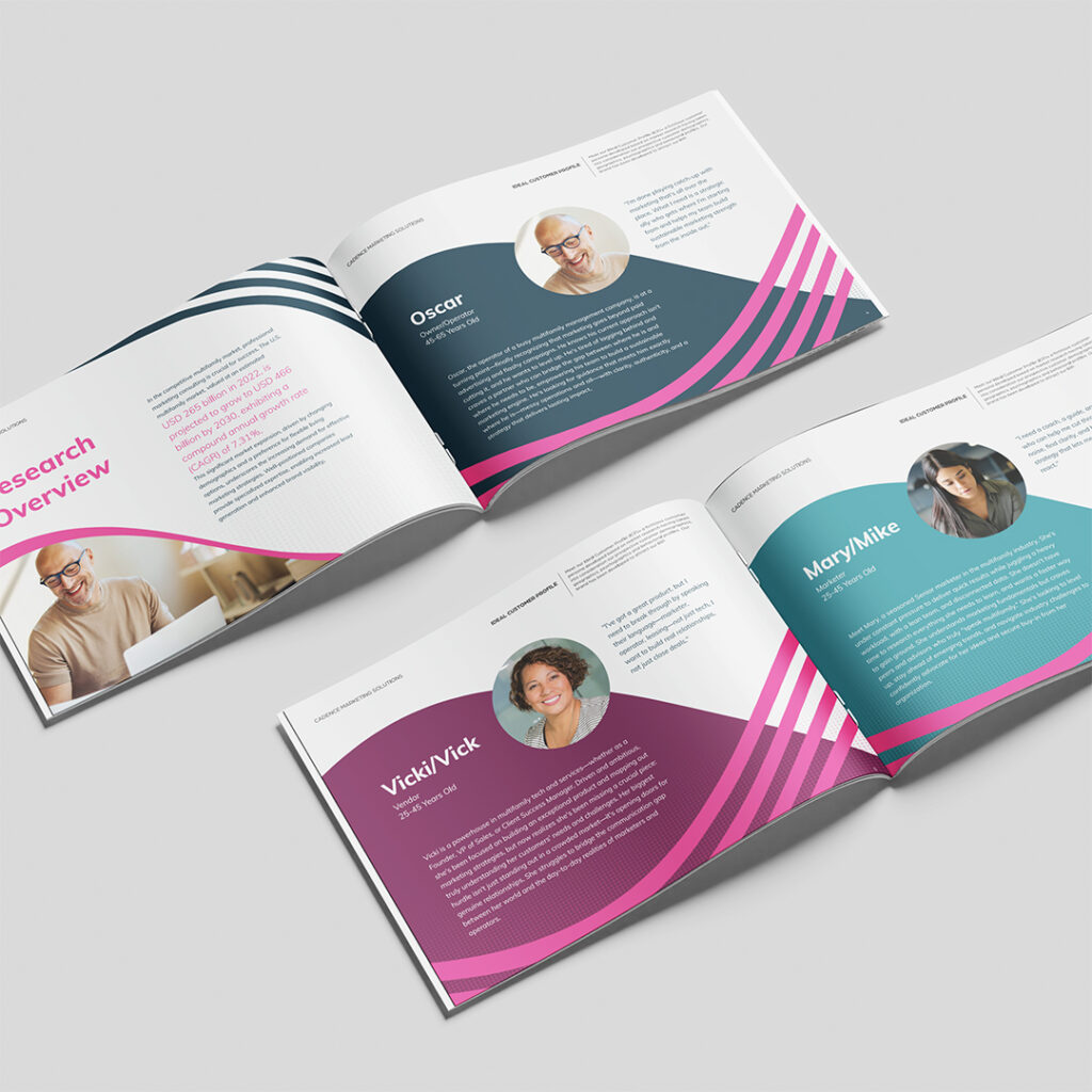
One of the most important—and most skipped—steps in brand development is building out distinct Ideal Customer Profiles before any creative work begins. Not target demographics. Actual personas with specific circumstances, motivations, and pain points.
For Cadence, three distinct ICPs emerged from the research.
Oscar, the owner/operator (45–65), is at a turning point. He knows his current marketing approach isn’t cutting it and he’s ready to stop playing catch-up. He doesn’t need someone to run his marketing for him. He needs a strategic ally who understands where he’s starting from and can help him build something sustainable from the inside out.
Vicki (or Vick), the vendor (25–45), has built a strong product but is struggling to break through to operators and marketers. She doesn’t just want to close deals—she wants real relationships built on genuine understanding of her customers’ world.
Mary (or Mike), the in-house marketer (25–45), is a seasoned professional under constant pressure: heavy workload, disconnected data, a lean team, and no time to research everything she needs to learn. She needs a coach and a peer. Someone who speaks multifamily and can help her navigate the noise and lead rather than just react.
These aren’t hypothetical placeholders. They become the filter through which every creative decision gets evaluated. Does this language resonate with Oscar? Does this tone make Mary feel seen rather than talked down to? Does this positioning earn Vicki’s trust, or does it feel like marketing to a marketer?
ICP development doesn’t just inform messaging — it informs visual choices, hierarchy, tone, and structure. A brand without this foundation is essentially guessing at who it’s talking to every time it opens its mouth.
Verbal Identity: The Deliverable That Changed How the Team Showed Up
If one deliverable made the most immediate, tangible difference for the Cadence team, it wasn’t the logo. It was the words.
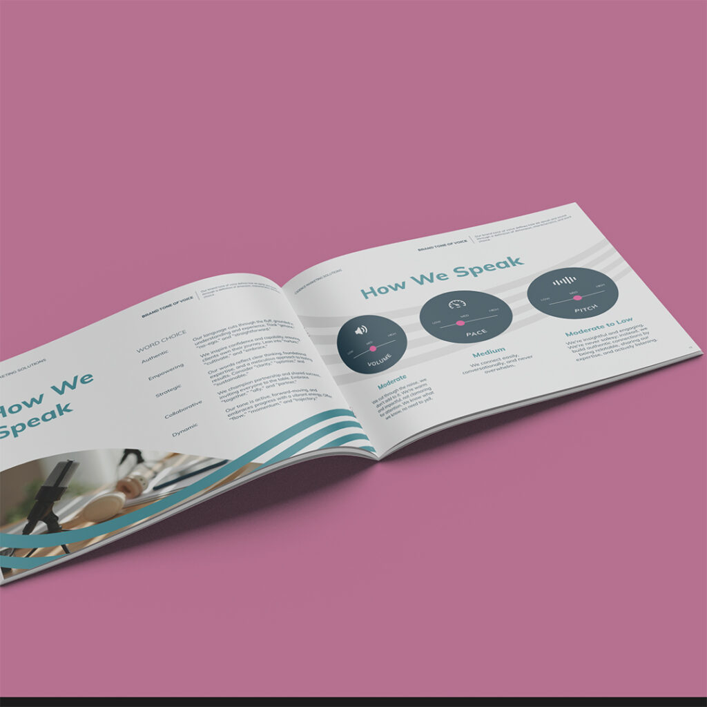
Verbal identity—the codified voice, vocabulary, positioning language, and communication principles for a brand—is consistently the most underinvested part of brand development and consistently the most impactful. A logo can’t walk into a room and represent your company. Words can.
Cadence had strong instincts about their tone and positioning. What they didn’t have was language made explicit, codified, and shareable across a remote team of five—language that any team member could pick up and run with without the founder having to translate it in real time.
After the brand guidelines were delivered, two members of the Cadence team attended a major industry conference. They split up for hours and worked the room separately. When they reconnected at the end of the day, they realized they’d been describing Cadence to every person they met in nearly identical terms—same words, same framing, same energy. The guidelines had done something a year of verbal repetition couldn’t: they’d made the voice transferable.
That’s the real ROI of verbal identity work.
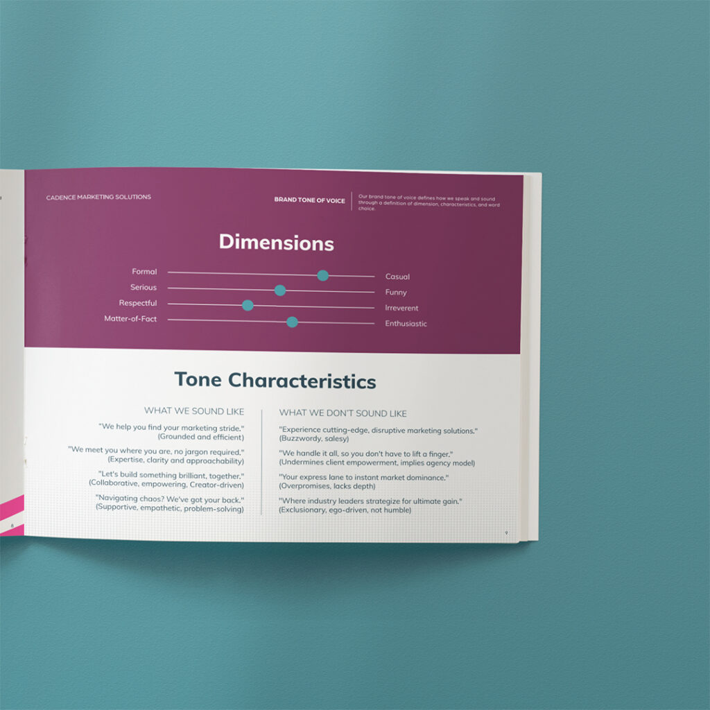
Some of the most useful outputs were surprisingly specific. The brand vocabulary guide — words Cadence uses and words they deliberately avoid — draws sharp distinctions rooted in a coherent philosophy. “Optimize,” not “fix” (fixing implies something is broken; optimizing implies building toward potential). “Insights,” not “data.” “Journey,” not “funnel.” “Ally/coach,” not “authority.” These aren’t just brand preferences — they reflect how Cadence actually relates to its clients, made explicit so every team member can apply it consistently.
Building a Visual System That Works as a Family
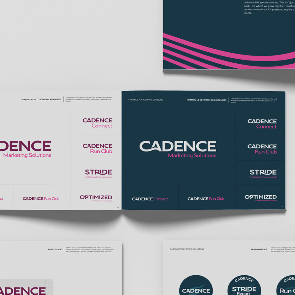
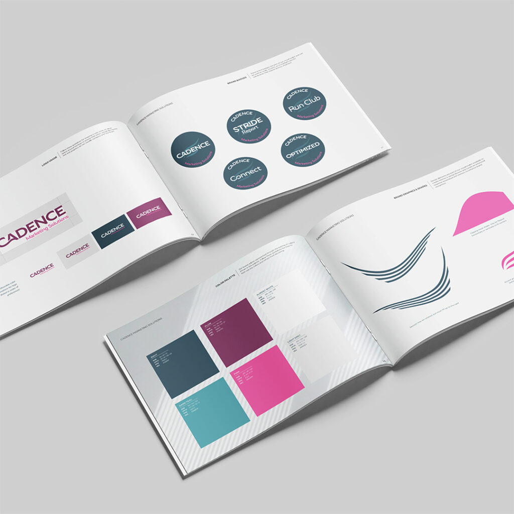
The visual challenge was specific: create a brand system that serves a parent brand and four distinct sub-brands, maintaining family resemblance without flattening everything into sameness.
The primary Cadence wordmark is bold and clean — CADENCE in a strong sans-serif, paired with “Marketing Solutions” in a lighter weight. But the defining element of the system is the swoop: a flowing curved element built into the logo that moves consistently upward and to the right. That direction isn’t decorative. It represents forward momentum and the act of lifting others — which is precisely what Cadence does for its clients.
Rather than assigning entirely separate color palettes to each sub-brand (which would break the family connection), the system uses color emphasis as the differentiator. All sub-brands draw from the same palette — deep navy, hot pink, plum, dark teal — but the weighting shifts. The parent Cadence brand leads with sophisticated navy. Run Club is anchored in plum, giving it a warmer community feel. The Optimized podcast leans into brighter combinations of pink and teal. Same family; different emphasis. Recognizably connected, without being identical.
The STRIDE audit logo takes this further: the letter “I” in STRIDE is replaced with a running figure icon, creating a mark that’s simultaneously typographic and illustrative — and unmistakably tied to the Cadence philosophy — without requiring explanation.
A strong brand architecture system does this: it creates enough shared DNA that any piece of the system reads as part of the family, while giving each sub-brand enough visual personality to exist credibly on its own.
What Happens When a Brand Does Its Job
A brand system succeeds when it makes an organization more capable of being itself — more consistently, more confidently, and with less friction.
For Cadence, the rebrand accomplished several things simultaneously. It unified a fragmented sub-brand ecosystem so that any touchpoint — a STRIDE deliverable, a Run Club post, an Optimized podcast episode, a Cadence Connect event invite — reads unmistakably as Cadence. It articulated the consulting core of the business more clearly. And it gave a distributed team shared language that empowers each person to represent the brand confidently without having to go back to the founder for every nuanced communication decision.
That last piece matters more than most companies realize until they experience it. Brand consistency at scale isn’t about enforcement — it’s about making the right choice the easy choice. When the language is explicit, the voice is codified, and the visual system has clear rules, teams stop improvising and start executing.
If your company has grown past its original brand — if the products you’ve built around your core work have started to compete with it instead of supporting it — the problem isn’t any individual logo or tagline. It’s the system underneath everything. Fix the system, and everything gets clearer.
Ready to untangle a brand that’s outgrown itself? That’s exactly the kind of challenge we love. Let’s talk.
Lease a
