Modernizing a Brand: The Apartment Geofencing Case Study
Stacey Feeney
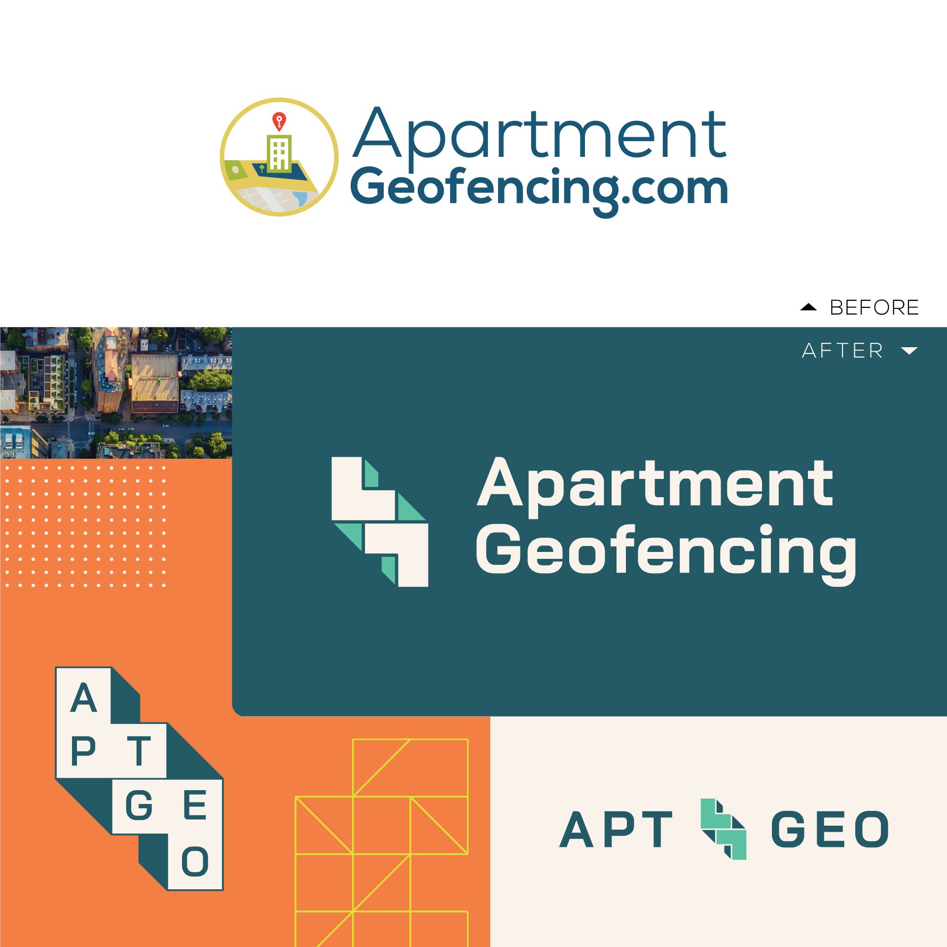
Sometimes brands are born overnight, cobbled together with the best intentions and a Fiverr gig. That was the humble story of Apartment Geofencing’s day-one branding. A quick fix, a placeholder, it served its purpose initially. But like a house built on sand, it wasn’t sustainable. The more it evolved, the less cohesive it became, and just-for-now designs popped up like weeds—creating a disjointed, dated look. It simply didn’t reflect the sophisticated services AptGeo offered, nor the evolution of the company itself.
When Apartment Geofencing first came on the scene, literal interpretations worked well. Their name even included the “.com” from their website URL and their logo displayed a dropped pin amidst a city backdrop. But times change, and successful companies adapt, pivot, and rebrand.
With considerable changes (and new offerings) on the horizon for their larger company, they needed a brand that matched their ambition and said, “We’ve arrived.” Their tactical goals were clear: align their visual identity with the high quality of their services and, as they put it, “make ourselves look better.” And that’s where Zipcode Creative came in.
The Approach
Apartment Geofencing came to Zipcode Creative’s team with a request for a brand refresh—a modernization with visuals that would abstractly represent the multifamily industry as well as their geofencing service.
RESEARCH, DISCOVERY, AND REQUESTS
After some digging and research Zipcode Creative discovered that Apartment Geofencing was actually referred to as “AptGeo” internally, which was eventually adopted by their client base and other industry friends to make the full name quick and easy. (An indicator of things to come, certainly.) The new nickname stuck and now better conveys the brand’s friendly, easy personality.
By filling out the brand questionnaire, AptGeo also indicated that they wanted to add the following traits to their brand’s personality: can-do attitude, dedication, trustworthiness, confidence, and high capability.
As for colors, they elected to maintain a closely related yet refined and simplified color palette. They hoped to maintain but refine their current palette and see a few alternatives during the rebranding process.
DIFFERENTIATORS
Apart from being the leaders in their geofencing space, AptGeo had plenty of differentiation to set them apart from any competition. With decades of industry knowledge, they are tailored for multifamily, offer dedicated account management and support, and always keep fair housing in mind.
Something that was clear, even to our team during various calls and brainstorming sessions: They’re one of the best places to work in multifamily (and have been awarded for it, too.) This positive, fun culture also had a place in the art direction for the rebrand.

The Results
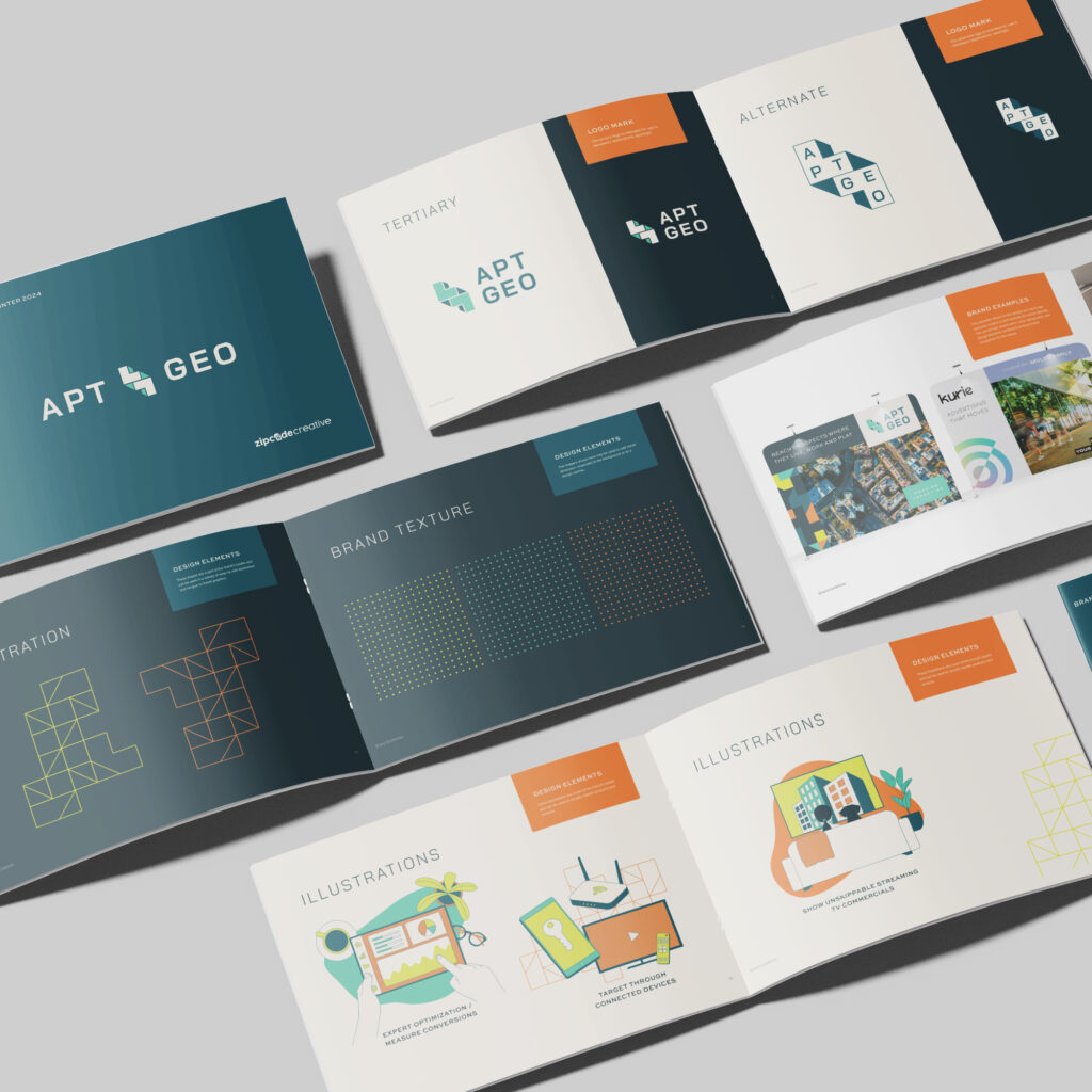
The visual identity was based on a bird’s eye view of a city. With this “experts from above” perspective, geometric elements in the new brand mimic the tops of buildings and street grids—in an abstract way, of course!
The colors were strategically chosen to connect back to the original brand to maintain some brand recognition, but we cranked it up to better fit their upbeat personality.
Initially, their team created a black-and-white grid-style logo, which worked well as a brand stamp, but still needed a touch more versatility. So our design team stepped in and helped it evolve into the cooler, newer version of themselves.
The rebrand’s impact is already evident. Leads are flowing through previously quiet channels, like the website chat, and treasured clients enjoy seeing the in-house nickname’s starring role. Internally, there’s a renewed sense of pride, with employees sporting new swag and swagger. AptGeo’s reaction? Pure joy. This “labor of love” feels special. Moving forward, they’ll lean into the modern, tech-forward AptGeo name, using the refreshed brand to attract new clients, make a stellar first impression, and solidify their reputation. They know a strong brand isn’t just about aesthetics; it’s about mirroring their exceptional customer experience and being seen as a trusted partner, handling client creative with expertise and care. Can we get an “Amen!”
See more images of the rebrand here.


