


Fonts to Fit Your Brand
Stacey Feeney
There was a lot of huff and puff over Jaguar’s latest rebrand. The typeface in the new logo and overall vibe felt too modern for an old, classically luxury car brand. But it was different. Just knowing that the brand was able to portray something new with a fresh font and a different brand direction goes to show: Fonts affect a brand’s personality and vibe.
Font Types
There are multiple categories of typefaces, and each one has countless specific fonts within the category. Every one has the ability to convey emotion and either underscore your brand’s personality, or fight against it—so it’s best to learn how they work, and what styles will work best for your brand and the vibe you’re going for.
EMOTION, PERSONALITY, VIBE
Sometimes things that are not alive can be assigned some measure of human character and emotion. We can anthropomorphize fonts, or give them human qualities. Some typefaces make us nostalgic. Some typefaces make us sit up a little straighter. Some typefaces bring us a sense of joy and fun. Fonts can create emotion. Can Arial do that? Not likely. But choose something like Courier New, and you’ll feel like you’ve been whisked back to an old-timey newsroom.
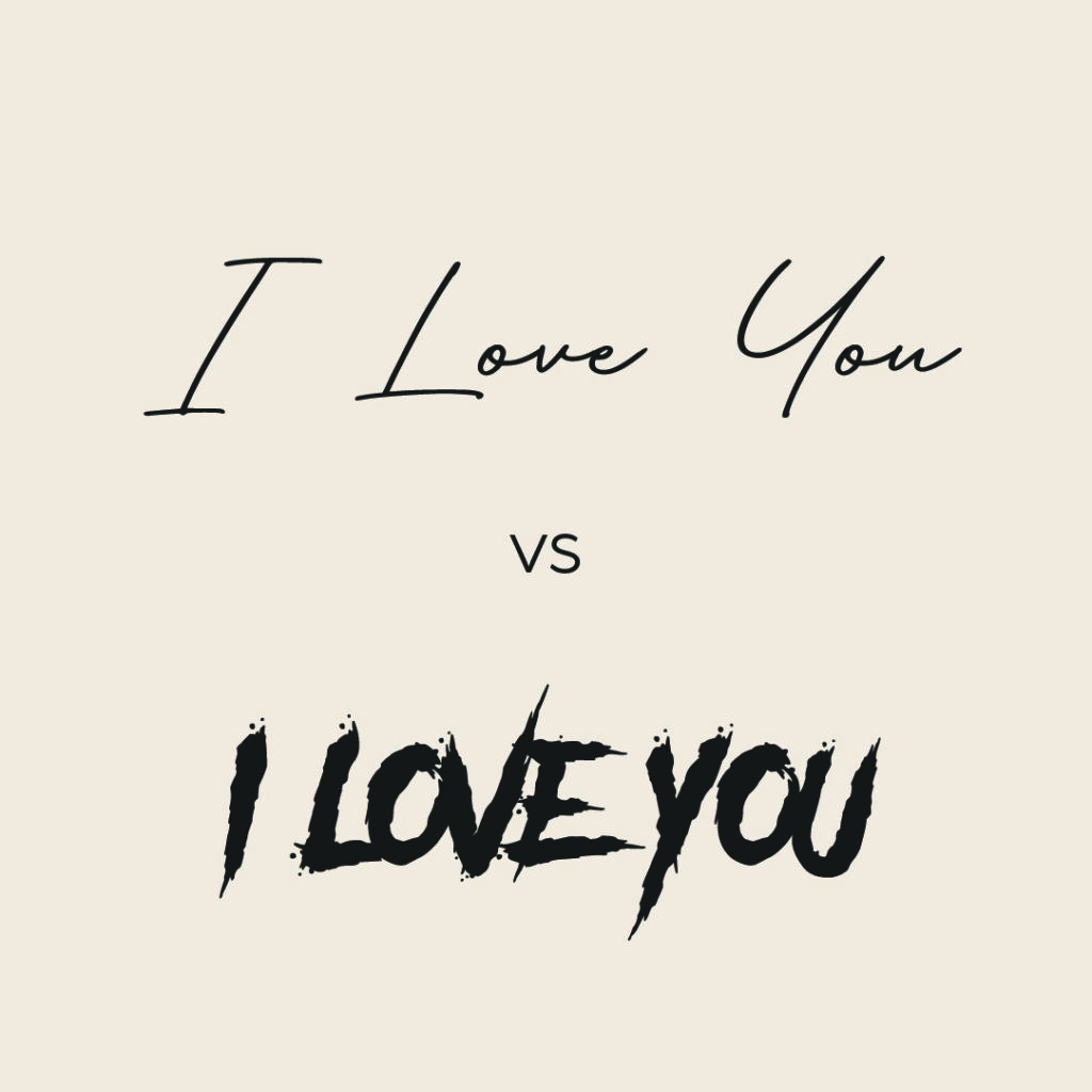
The easiest way to get a sense of this is to take one short phrase, say, “I love you” and toggle through different fonts to tap into the feeling. Are some sweet? Some over-the-top? Some creepy? Keep in mind that the words didn’t change, but suddenly the feeling it evokes did. All because you swapped the font.
Categories of Typefaces
There are multiple typeface categories: serif/slab serif, sans serif, script, and display. They all have the capability to evoke different feelings, and with that comes a great deal of power. Choose the right one for your brand, based on the vibe you want to go for (and the kind of resident you want to connect with).
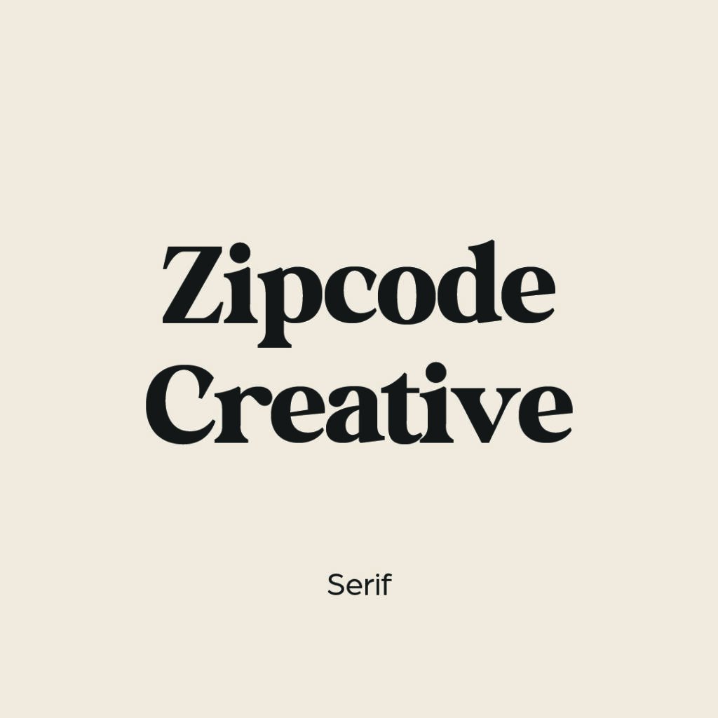

Serif / Slab Serif
A serif on a font is an additional detail on each letter—a small stroke at the end of each larger stroke.
Serif fonts are classic. They convey reliability, trust, and good old-fashioned formality and stability.
Example: Times New Roman is probably the most well known font out there, thanks to its wide and early use in newspapers. It was also the typical font setting for Microsoft Word programs, and generally accepted as readable and clear.
If you want your brand to feel like it will stand the test of time, go with a serif font. It gives the sense that it has been there forever, and always will be.
A slab serif is similar, but the serifs are more blocked off, giving the letters a boxier appearance. One of the most popular slab serif fonts is Sentinel.
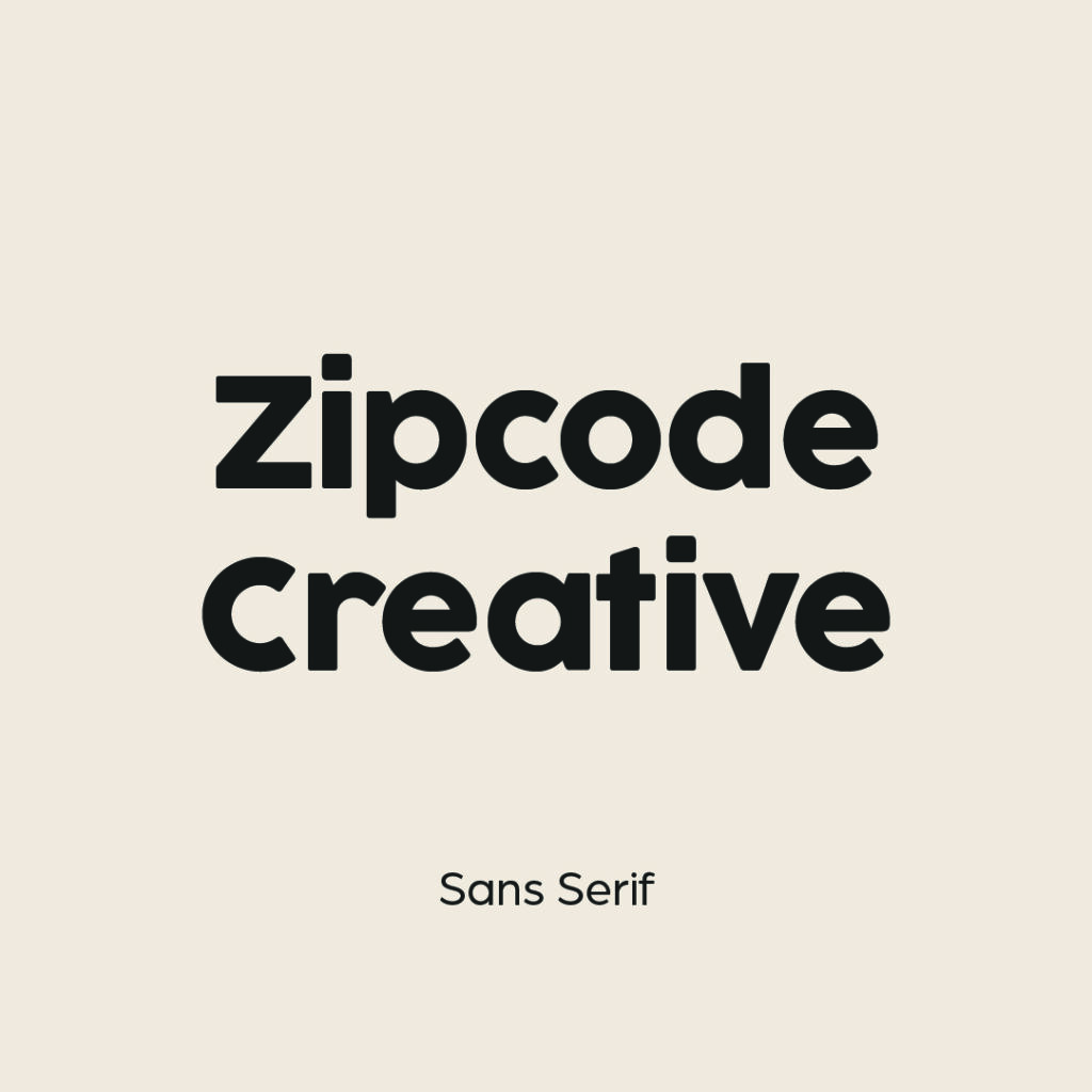
Sans Serif
As you might expect, sans serif is a typeface that does not use serifs. Each letter only uses the stroke itself to identify the letter, and no extra ornamentation. These are generally considered minimal, modern, and much more straightforward than their detailed counterparts.
Example: Arial is one of the most popular sans serif fonts. It’s often the default in plenty of programs, including Google docs.
If you want your brand to feel clean, modern, no-nonsense—sans serif is likely the way to go. Sometimes you can also angle into more geometric versions of sans serif, or lean into a robot-age style with some interesting futuristic sans serif fonts.
Script / Handwritten
Like handwriting, but more consistent and tidy. This can mean a script that flows from one letter to the next, or it can have a more handwritten vibe, whether somewhere between cursive and manuscript.
Example: Pacifico is a popular handwritten style font. It’s light and breezy but has a sturdy readability to it, as long as it’s used in larger sizes, sparingly and not in body text.
There is a large variety of script and handwritten fonts out there. It’s worth finding one that may work with your brand as an accent font, but not as body text. Determine whether you want something fancier (a more calligraphic look) or if something scribbly works best. Either way, it will definitely stand out.
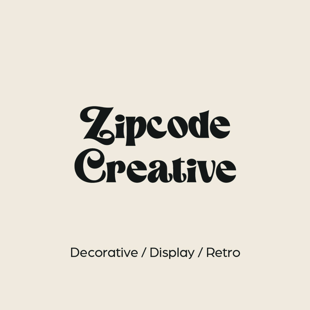
Decorative / Display / Retro
Similar to some handwritten and script fonts, decorative fonts are meant to be just that: fancy for the sake of being fancy, to create a vibe, or to keep with a theme. It certainly manages to catch one’s eye! But be sure to have something additional in your brand guidelines for body text to get the full message across.
Display fonts are typically used for headings and other large sized text to grab attention.
Retro fonts are fonts that harken back to another time, whether bubbly 70s letters that make you think “Groovy, baby, yeah!” or a creatively thick-to-thin sans serif that brings an old New York City delicatessen to mind.
Example: This could be anything from Thriller to Playbill to a collegiate looking block style font.
Choose carefully and check the vibes before you move forward finalizing that one for your brand guidelines.
Where to Find Fonts
Go behind the scenes with Stacey Feeney, our founder and chief creative director as she gives you the best resources for finding fonts and how to use them!
Fonts for Brands—Best Practices
First off, let’s address a quick misconception: “Your font should match your logo.” Nope! We’d actually argue the opposite. The logo should stand out. It should identify your brand, be recognizable and eye-catching and work with your vibes. However, the fonts you choose should compliment your logo instead of match it. Fun fact: most logos (if made well) don’t even use a font. Instead, they’re custom-designed lettering and imagery and won’t have a font that matches anyway.
Now, onto best practices of fonts for brands.
RULES OF THUMB
Couple rules we like to live by at Zipcode Creative:
- In most cases, body copy should be simple and sans serif. It’s clean and easy. Save your fancy styles for headlines and other shorter info blocks (think taglines and call outs.) Note: Books typically use serif fonts, but for apartment brands, we’re not getting too much more content than 1 paragraph at a time.
- Don’t go higher than 4 font types—if you’re using an accent font. If you’re not using an accent font, 3 is the maximum number of fonts you should be juggling. When you have too many fonts, the reader will feel confused and the design will appear cluttered and chaotic. Plus, they won’t know where to look, and your branding and identity will get lost in the (visual) noise.
BUT WHAT ABOUT TEMPLATE DEFAULTS?
We talked a bit about the defaults that happen in Google docs, in Microsoft word—and often defaults will appear in your website and email builder as well, whether Mailchimp or WordPress or Squarespace. It’s not uncommon for your very specific font choice to be unavailable in these templates.
Besides feeling special about your very custom brand font, you might feel panicked that it won’t match. Get as close as possible. Many fonts are very similar, with minute differences only obvious to the hyper-trained (graphic designer) eye.
Now that you understand typefaces, you’ll be able to identify the category (serif, sans serif) and choose something that will be similar to what you’ve already outlined in your brand guidelines as The Font.
(Don’t you dare choose Comic Sans or Papyrus.)
Lease a
