How to Get Creative with Limited Apartment Brand Guidelines
Stacey Feeney
When brand guidelines are short and sweet, it doesn’t mean your creativity has to stop with it. A restricted color palette can make it feel like your hands are tied for marketing collateral and generally making things pretty. If you think your content has to be boring and your branding and signage is going to be one-note over and over, think again! Marketing teams at property management companies can work creatively—even with limited apartment brand guidelines.
A brand color palette with two colors means consistency is a lot easier to achieve. But it can also lack the punch needed to capture attention.
Get a little further with your limited branding guidelines while balancing what’s required and what will work best. Think outside the box with us:
Expanding the Color Palette
Dealing with a two-color palette? You’re not fully painted into a corner. Consider customizing it a few different ways.
Modify the Main Colors – Keep your main colors, but use a tint of it. A shade of it. Or a tone of it. You know how paint sample cards have a family of colors or they go lighter and darker? Use those for inspiration. You’re not changing the color palette, you’re adding to it.
Complement It – Whites, grays, blacks and beiges could be the missing piece. Offer up a little extra contrast and interest, even with neutral colors, to set off the original colors that much more.
Accent Colors (Why and How) – Accent colors may require permission for use from your head of marketing, depending on how much you’re going to use them. For now, think of them as a secondary color palette. Using accent colors in branding should be only an accent. They can set off something important, or pep up designs you already have. Remember: accent colors aren’t the main thing, so they can’t replace your brand’s color palette. And don’t go overboard. One or two accent colors works well.
Visual Hierarchy and Layout
THE SPACE BETWEEN
Color isn’t the only thing at play here. Just like jazz is about the notes you don’t play, graphic design is also about the space you don’t take up: the white space. This helps a design breathe, and adds focus where it needs to be.
PLAY WITH SCALE AND LAYOUT
Check your logo usage rules for this one (you don’t want to upset the graphic designers), specifically for border rules. But if you can play a bit with proportion, it can make certain aspects of your brand grab attention more easily. Use layout to improve the visuals of a piece—it’s one more trick. Move things around. Use the rule of 3s. Basically, when you can’t budge on the colors you have, move everything else around.
Typography Can Be Atypical
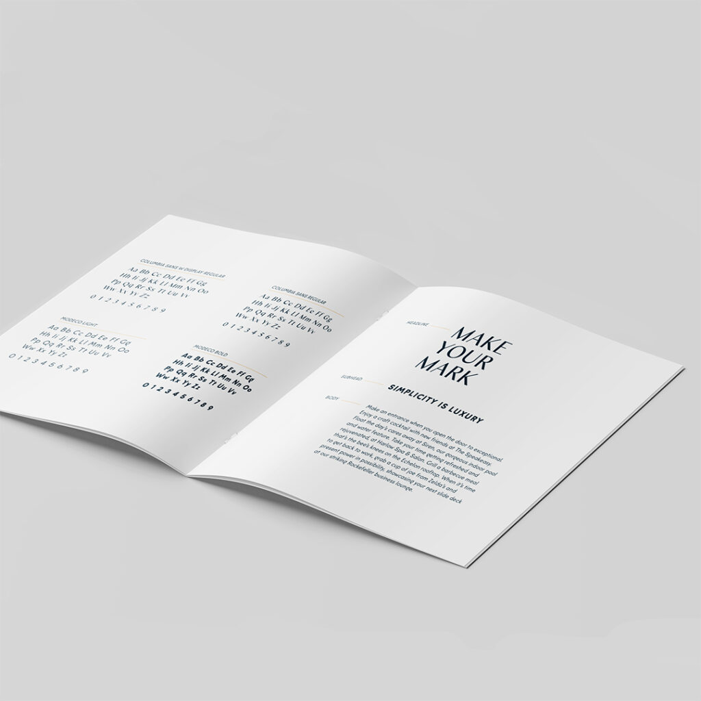
This doesn’t mean brands should go wild and crazy (see also: ransom notes) with fonts. Instead, fonts can be used strategically. Change out the weights, going light or bold, change up the size, and try different styles—and it all makes some sort of impact. Ensure you’re not introducing too many new fonts, or you’ll risk visual overwhelm.
As we’ve covered, visual interest isn’t just about color. It’s also about layout and placement and accents. Creative typography treatments are a good hit of interest in any marketing piece. Whatever you do, keep this in mind: in order to maintain brand integrity, fonts should be selected and paired with the existing brand in mind. A font can look good, but may not make sense for your brand. Consider brand attributes and established brand fonts before you select a complementary font.
Photos and Images
Photos and imagery are the next piece of the puzzle. Photos can distract or deter, but chosen well, they can complement the brand and make it more interesting. Pair them with the (limited) color palette and they bring an extra layer of interest. Plus, by editing the photos maybe with effects or filters, you can help most photos fit into a specific set of guidelines for the brand vibe—like an orange-tinged beachy retro style photo, for example.
Using images and photos can break up the monotony of a limited brand guideline without breaking it. It’s more like bending the brand guidelines to allow for more variety.


Alternative Design Elements
A LITTLE BIT OF THIS AND THAT
Creating repetition with the brand color palette can help, too. Think: patterns, textures, icons, illustrations. Every one of these can add to the visual language and bring in more brand recognition. Taking what does exist in the limited brand guidelines and drawing them into abstract shapes and extending them into design elements still falls within the brand. For example, one color in a color palette can be shaped into a background or motif for the website and marketing collateral. Still on brand!
BONUS: ON THE WEBSITE
If the goal is getting attention and keeping it, interaction plays a role. On a website, small animations can help keep eyes on the brand. And none of these microanimations should require a new color, which helps for any limitations in your brand guidelines.
Take Action
These ideas are good and all, but how can they be applied to limited apartment brand guidelines?
Create a brand extension guide – Identify the pieces that can be added on, and how to use them. That way they’ll still be the same the next time you reach for the accent color.
Build a visual library of approved elements – Got approval on the photo filter? Save the settings, and make a note.
Set up an approval process – Who needs to approve these creative solutions? How long does it take? What is the typical rubric for approved vs. rejected add-ons? Identify it all and keep it handy the next time the brand guidelines need a little boost.
Develop templates – This is the quickest way to help others follow the newly expanded look and ensure consistency on all collateral with the new options.
Limited brand guidelines don’t need to squash creativity. Work with them, add on to them (within reason) and use the existing colors and fonts to level up your brand.


