


Brand Repositioning: The Red Road Commons Case Study
Stacey Feeney
When a community gets a facelift, that can shift their goals and priorities—and their brand, ideally.
After Red Road Commons in South Miami, Florida underwent renovations, they came to Zipcode Creative to modernize their brand (without too many dramatic changes) in order to reach a demographic they really wanted to tap into: students.
With plenty of competition nearby, Red Road Commons (RRC) was looking to boost their lease-up numbers. Having noticed their younger target residents’ growing attraction to newer properties, they took on the work of modernizing some of their spaces. The next step: Refresh the brand.
RRC’s traditional mid-rise is not specifically student housing (and is not rented out by-the-bed), but it is in the area locally known by University of Miami students as “the place to be” after freshman year.
The Opportunity: Brand Repositioning after Renovations
The class-B midrise wanted to focus on University of Miami students. And after their renovations, it made sense for them to bring more of their attention to students—who more than anything, just want to go where their friends are. The proximity to the university was helpful, and the variety of floor plans (1, 2, and 3-bedroom) helped with options for prospective residents.
Red Road Commons came to Zipcode Creative to help reposition the brand. After the older property’s renovations were complete, they needed a partner to help them shift their target demo more fully to students. All this while pivoting toward a streamlined aesthetic that was white, clean, and attractive to more independent students. They were locked in with their name, but they knew their look and feel needed to attract a new target customer.
Our team took a look at the signs: the shift in the target demographic and needing community repositioning and the need to keep up with competition—every one of these pointed to what Red Road Commons already knew: Time to hit refresh.
Brand repositioning after renovations is becoming increasingly common in the multifamily industry. According to recent industry research, properties that align their brand with physical improvements see better lease-up performance and can command higher rents. Understanding what branding means for multifamily properties is crucial when considering this type of strategic shift.
Research & Strategy: Modernizing the Brand for The Audience
In working with RRC’s team, we took a relatively simple approach—but still looked at the whole picture. We considered the interior design. Having just been renovated, the common areas were streamlined and modernized. So we echoed that in the rest of the look, and brought in some pops of color to attract the younger demographic RRC was aiming for.
Instead of going overboard with too much color and fun, we balanced the look out with a level of sophistication that (newly, fiercely) independent college kids would likely appreciate and aspire to.
Student housing branding requires a different approach than traditional apartment marketing. College students—especially upperclassmen—want to feel mature and independent while still having fun. They’re influenced heavily by social media and where their friends choose to live. For University of Miami students specifically, the Miami lifestyle and coastal vibe play important roles in their housing decisions.
Though modernizing or refreshing a brand can be a solution for some brands, it’s not for all—some need a complete rebrand instead of a brand refresh. But with simply adjusting their focus, and taking inspo from their interiors, RRC was able to do a simpler brand repositioning to capture the audience they needed. Authentic branding in multifamily means creating something that genuinely reflects both your property’s personality and your residents’ lifestyle aspirations. For RRC, this meant balancing sophistication with approachability.
Implementation: How it Turned Out
Working with RRC, we crafted a number of pieces for their brand refresh that would help set them up to pivot and refocus on their student demographic:
Logo – We created both a primary and secondary logo along with usage guidelines. The streamlined and modern new look gave off the exact vibe RRC was aiming for.
Color Palette – The colors include white, black, two blues, and a contrasting melon color. It’s vaguely seaside, with a hint of the fun pink tones of Miami, without going overboard. All understated and modern.
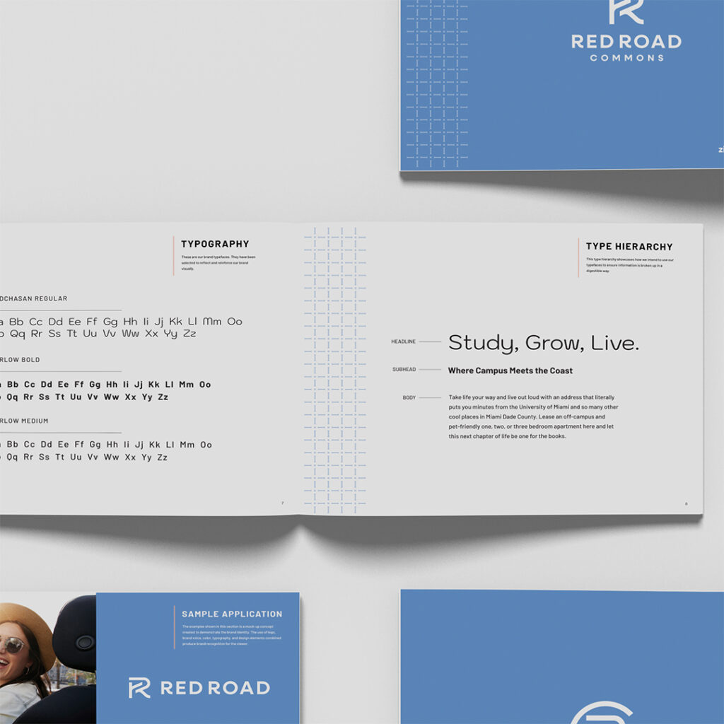
Typography and Hierarchy – Two different typefaces, with one using two weights (regular and bold) helped keep an easy consistent feel with an attention-grabbing font (Kodchasan Regular) perfectly suited for headings.
Stock Imagery – Examples of lifestyle photos with tones that work well in the color palette, reflect the vibe that aligns with RRC’s ideal (student) resident.
Pattern – This stately grid pattern gives a little more texture to the brand, and creates more interest around the edges.
Sample Application – Seeing it all come together helped our client see the full brand on display—and how it would look to their residents and prospects when put into practice. (Pretty as a picture and refreshing as a dip in the pool.)
The key to successful student housing brand positioning is understanding that these residents are in a transitional phase. They’re moving from dorm life to more independent living, so the brand needs to feel grown-up without being intimidating. RRC’s refresh struck this balance perfectly.
Implementing brand guidelines for multifamily on-site teams becomes especially important with student housing, where staff interactions heavily influence resident satisfaction and referrals.
Brand Elements That Work for Student Demographics
Student housing branding success depends on understanding what drives this demographic. Unlike traditional apartment residents, college students make housing decisions based on:
Social proof and peer influence – Students want to live where their friends think is cool Instagram-worthy aesthetics – The space needs to look good in photos Lifestyle aspiration – They want to feel more sophisticated than dorm life Authenticity – They can spot fake or trying-too-hard branding immediately
RRC’s color palette worked because it felt authentically Miami without being cliché. The blues evoked the coastal location, while the melon accent added just enough pop to feel youthful without being juvenile. The sophisticated base of white and black kept it feeling elevated.
The pattern element was particularly smart—it created visual interest that would work well across marketing collateral from business cards to large-scale signage, giving the brand flexibility while maintaining consistency.
Florida Market Considerations
South Florida’s student housing market has unique characteristics that influenced RRC’s brand positioning. University of Miami students often come from affluent backgrounds and have higher lifestyle expectations than typical college markets. The Miami location also means competing with the allure of the broader Miami lifestyle—beaches, nightlife, and cultural diversity.
RRC’s brand refresh acknowledged these realities by incorporating subtle Miami references without going full South Beach. The result feels authentic to the location while appealing to students who want to experience Miami’s sophisticated side.
For properties in competitive Florida markets like Miami, Tampa, or Gainesville, brand positioning needs to account for both the university culture and the broader regional lifestyle expectations. Corporate branding for multifamily companies operating in multiple Florida markets often need to balance consistency with local market nuances.

Measuring Success: The Results
Now that South Miami’s Red Road Commons has a newly refreshed brand, they can get a fresh start on marketing to the student population. Fully rebranding a property is a big lift—so if a community can get away with a brand refresh instead, they may find the opportunities it affords them may be well worth it.
The success of brand repositioning in student housing can be measured in several ways:
Improved marketing efficiency – Brand-aligned marketing materials typically see better engagement rates and lower cost-per-lead Enhanced social media performance – Students share content that looks good and feels authentic to their lifestyle Stronger word-of-mouth referrals – When current residents feel proud of where they live, they’re more likely to recommend it to friends Better lease renewal rates – A brand that residents connect with emotionally tends to improve retention
While we can’t share specific metrics for RRC, industry data shows that properties with strong, targeted brand positioning typically see 15-25% improvements in lease-up velocity compared to properties with outdated or misaligned branding.
Current trends in multifamily branding and design show that residents increasingly expect brands that feel authentic and lifestyle-focused rather than purely functional.
When to Refresh vs. Rebrand Your Community
The Red Road Commons project illustrates an important decision point for property managers: when does a brand refresh make more sense than a complete rebrand?
Choose a brand refresh when:
- Your community name still works for your target demographic
- The core positioning is sound but needs visual updating
- Recent renovations have elevated your property but haven’t fundamentally changed it
- You have some brand equity worth preserving
- Budget or timeline constraints favor a more targeted approach
Consider a complete rebrand when:
- Your current name or reputation has negative associations
- You’re shifting to a completely different demographic
- Major repositioning requires new messaging and positioning
- The property has undergone dramatic physical changes
- Management or ownership changes call for a fresh start
For RRC, the refresh approach worked because their name wasn’t problematic, their location remained their biggest asset, and they weren’t changing what they offered—just who they were targeting and how they presented themselves.
If you’re curious about a rebrand or a refresh to help you stay competitive and relevant, or to match your renovation vibe or pivot to a new audience, reach out. We’d be happy to help you get a new look.
Considering brand repositioning for your community? Whether you’ve completed renovations or want to attract a new demographic, the right brand refresh can make all the difference in your lease-up success. Let’s explore what’s possible for your property.
Lease a
