


Apartment Branding: Our Top 7 Favorite 2024-2025 Projects
Stacey Feeney
It’s been a YEAR! 2025 has been good to us, and we’ve had a ton of fun creating logos for a bunch of amazing multifamily companies. We also included 2024 logos because, why not?– we never properly shared them like this last year! We have the lineup, including full brand vibe concepts for you below, but first we wanted to provide a quick logo lesson. Because if we’re just putting cool logos out there, are we keeping to our mission of showing brand value in the multifamily industry as a whole? Maybe? Just to make sure, I think we have to answer a few questions before we get to the designs!
First up for review:
What makes a logo “good”?
A good logo takes careful consideration. Pay attention to what matters: the meaning, the brand personality, how practical it will be. Do the research to determine who your audience is, and what they’ll resonate with. Use the logo to elevate your brand above the competition, and ensure it’s clear enough to leave a lasting impression. Not specific enough? Follow this mini checklist:
- Don’t let the whole brand rest on the logo—it should be part of a larger brand identity
- Let it have meaning (get inspired)
- Allow it to convey the message you want (vibes)
- Base it on brand strategy (which should be done before you do your logo)
- Consider real-word application: Ensure it’s readable and versatile
Next (and finally, we know you want to get to the pretty stuff, we don’t blame you):
What does a logo do and what doesn’t a logo do?
A great, well-designed logo does this (beautifully):
- Create interest
- Capture attention
- Represent your community brand (shows and tells who the community is)
Even a great, well-designed logo CANNOT (on its own):
- Keep prospect attention
- Boost extended social media engagement
- Generate new leads
- Lease up more units
It can help! But it’s all part of the bigger brand picture.
Create a functional, strategic brand identity, and keep your brand promise. Then you’ll be on the right path.
Until you get there, look at our top 7 favorite logo and visual concepts we crafted for our clients over the last two years– in no particular order.
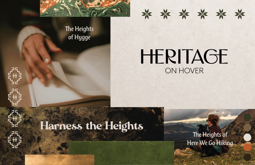
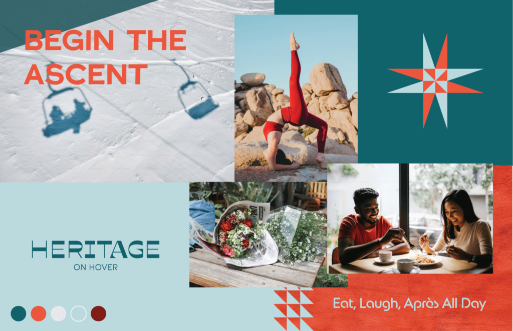
Apartment Branding in Longmont, CO
Heritage on Hover is a class A multifamily community being developed by Thompson Thrift– read the case study on this project. For a quicker view, see how the final brand turned out here.
CONCEPT 1
CONCEPT 2
CONCEPT 3
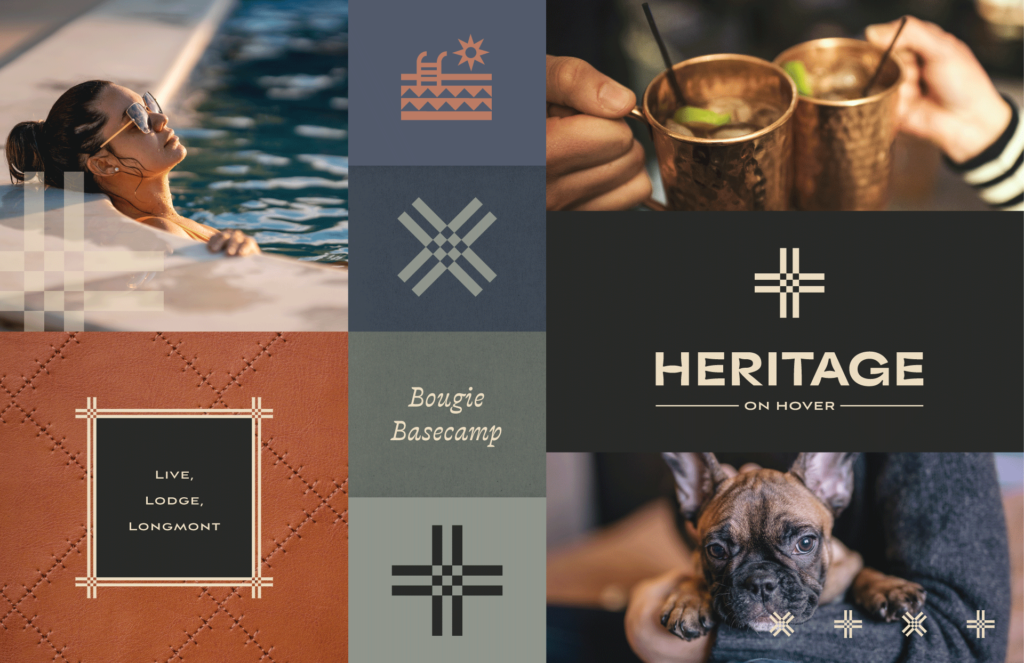
Which of these brand concepts would have been your top choice? Our client chose: #3
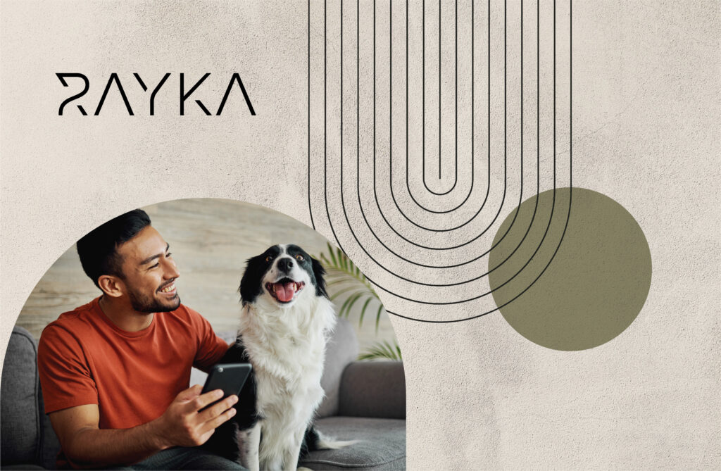
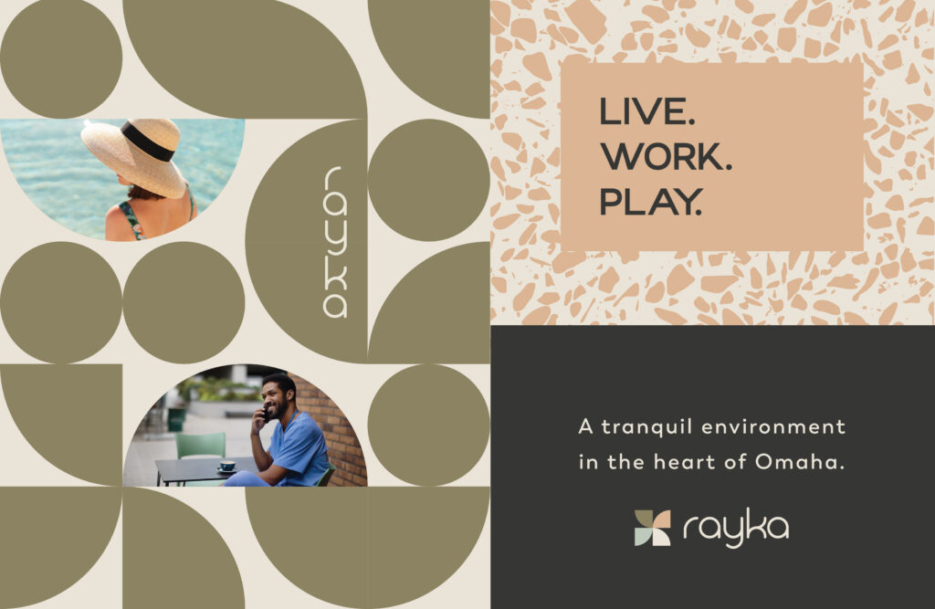
Apartment Branding in Omaha, NE
Rayka is a class A multifamily community being developed by CIP Communities– see how the final brand turned out!
CONCEPT 1

CONCEPT 2

CONCEPT 3


Which of these brand concepts would have been your top choice? Our client chose: #2
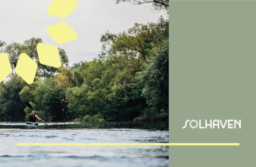
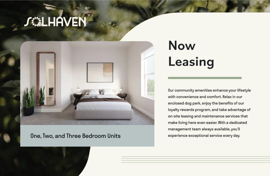
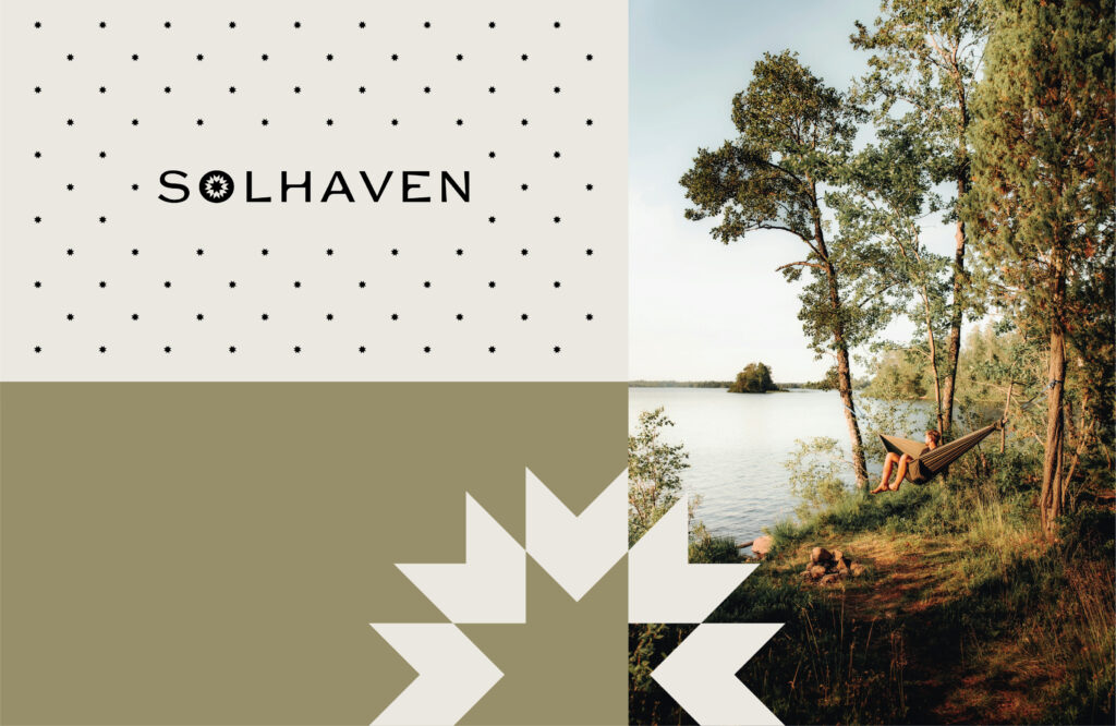
Community Portfolio Branding in Wisconsin
Solhaven is a new brand of apartment communities that will become a portfolio of community as they are built by Wangard.
CONCEPT 1
CONCEPT 2
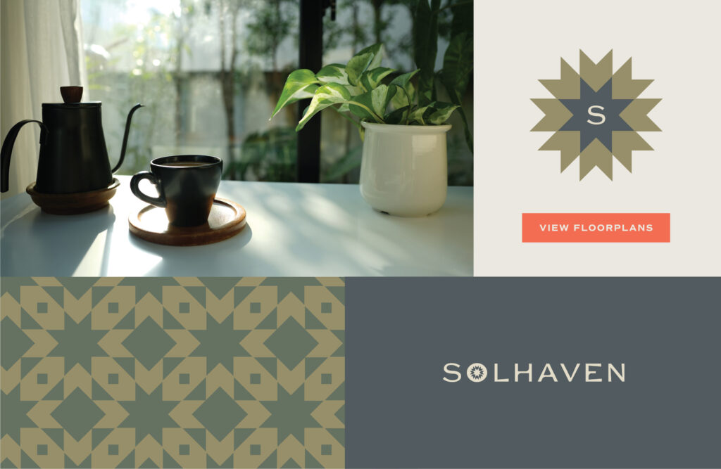
Which of these brand concepts would have been your top choice? Our client chose: #2
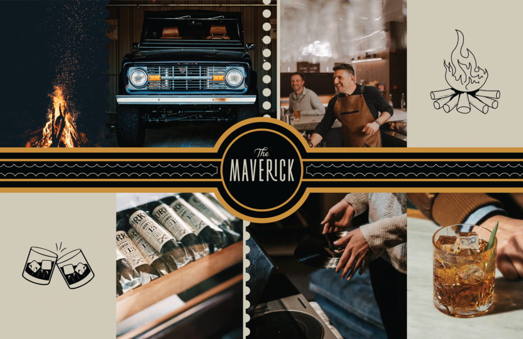
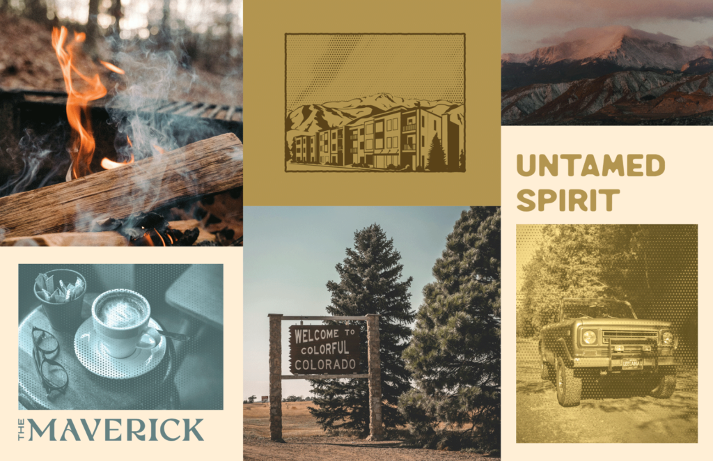
Apartment Branding in Colorado
The Maverick is a class A multifamily community being developed by Thompson Thrift in Monument, CO.
CONCEPT 1
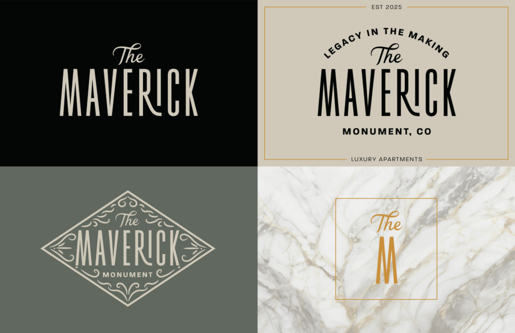
CONCEPT 2

CONCEPT 3
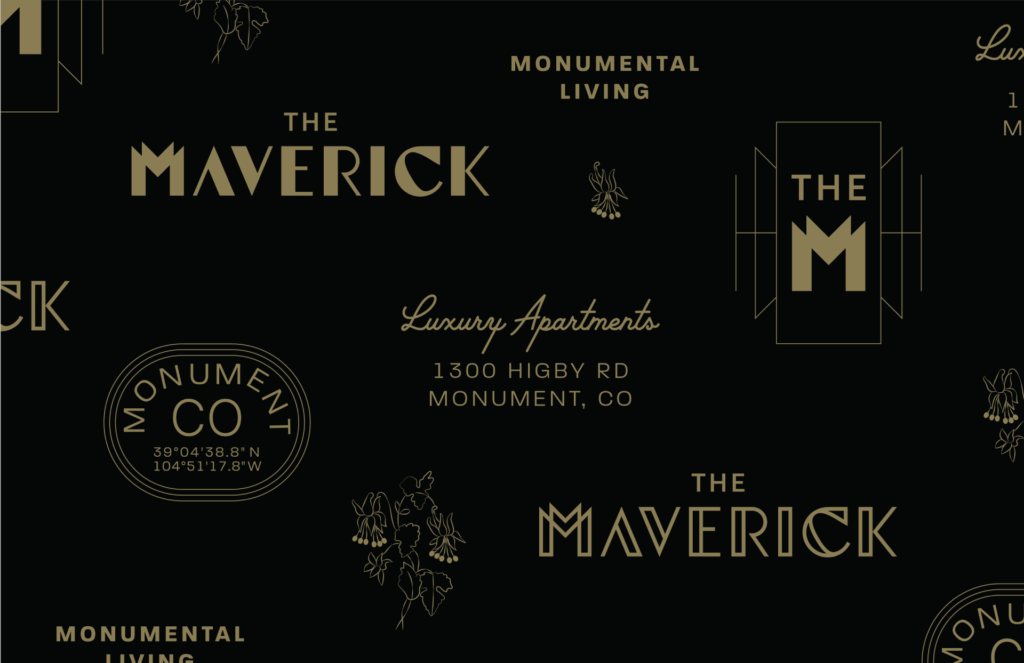
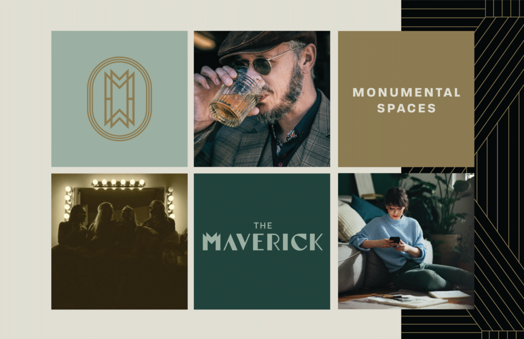
Which of these brand concepts would have been your top choice? Our client chose: #1
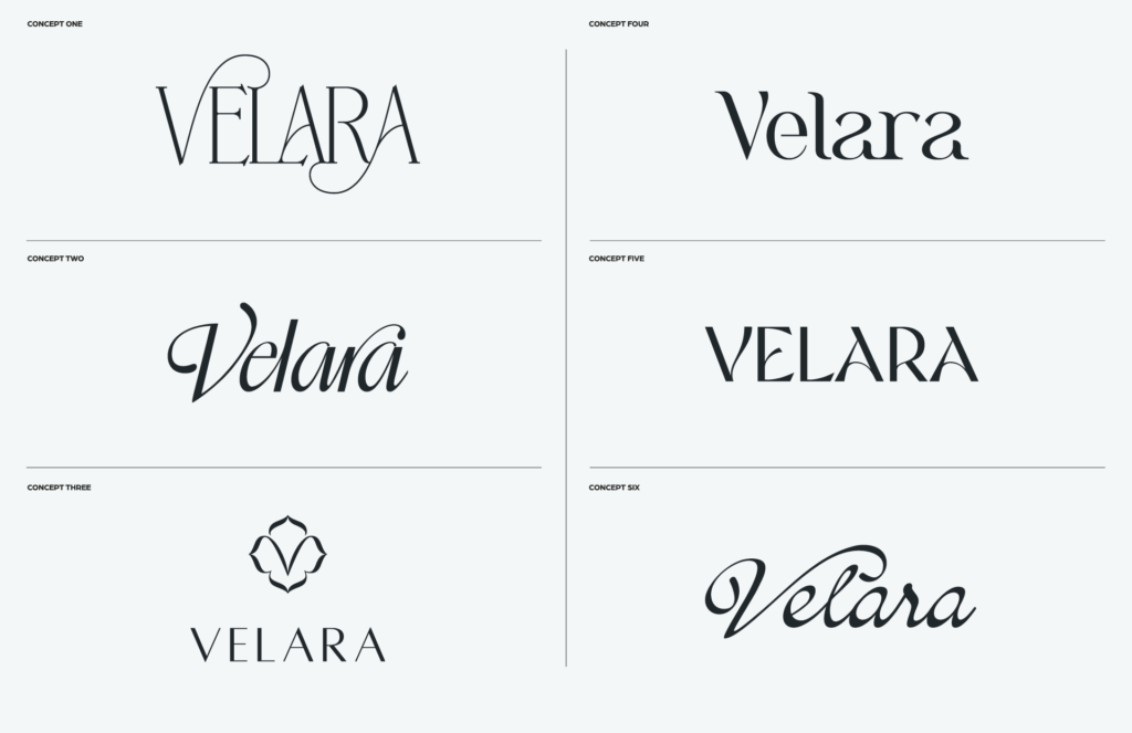
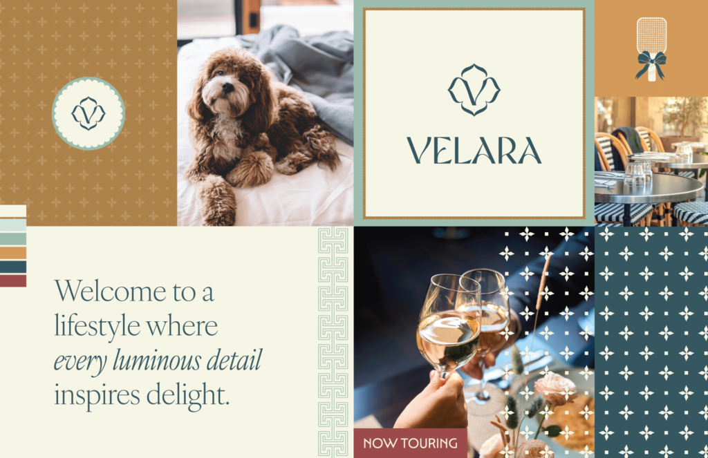
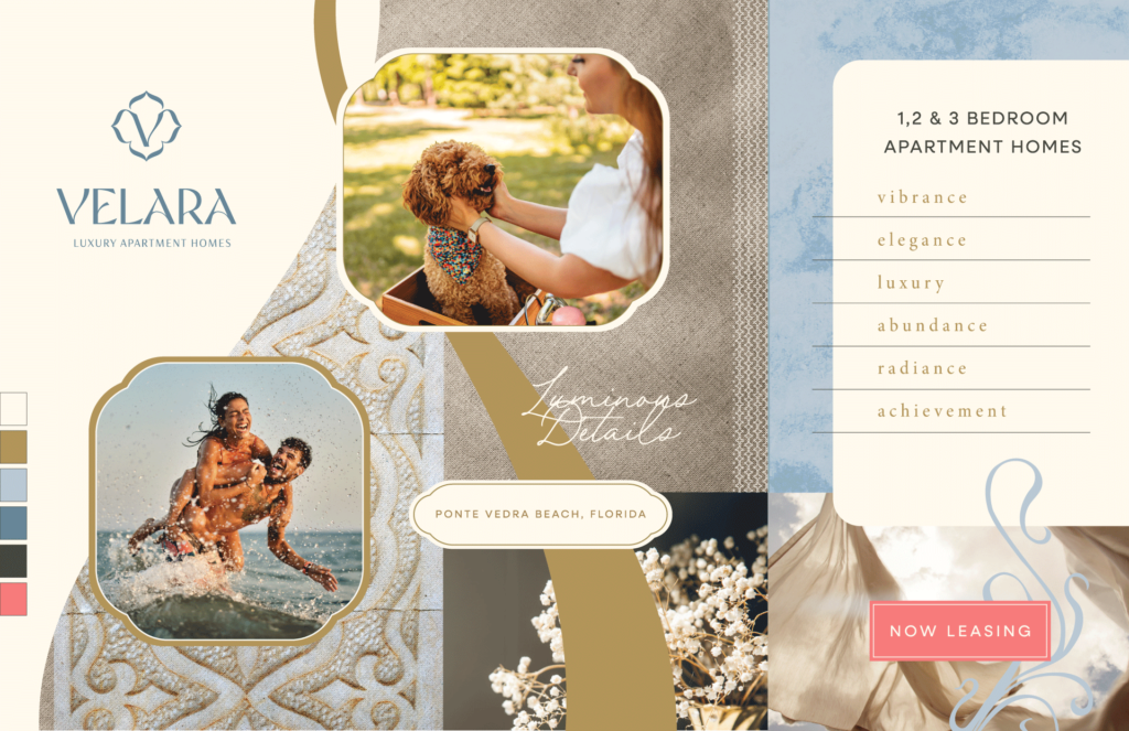
Apartment Branding in Florida
Velara is a class A multifamily community being developed by Thompson Thrift in Ponte Vedra Beach, FL. See the full case study and how we approached naming this community or take a quick look at how the final brand guidelines turned out!
LOGO OPTIONS
CONCEPT 1
CONCEPT 2
CONCEPT 3
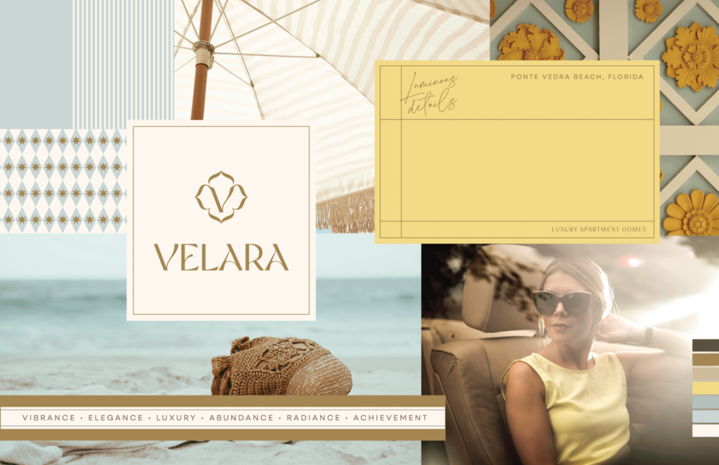
Which of these brand concepts would have been your top choice? Our client chose: #1
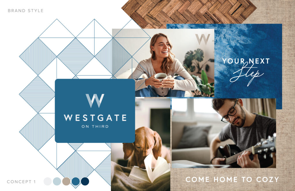
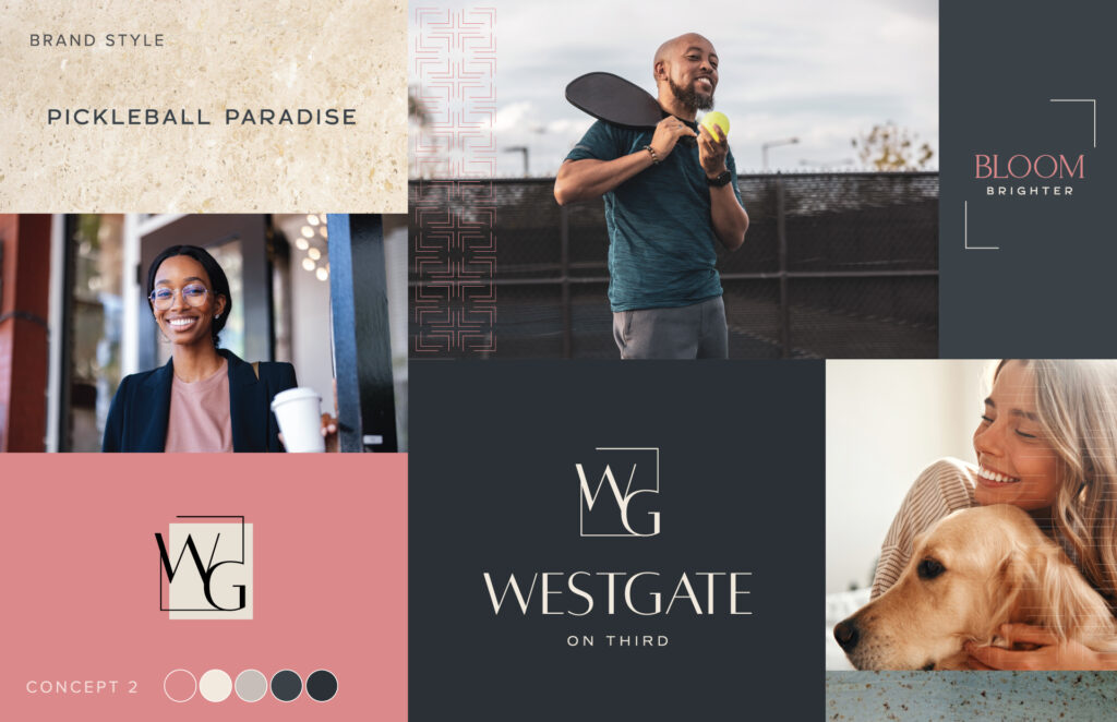
Apartment Branding in Bloomington, Indiana
Westgate is a class A multifamily community being developed by BAM Companies with a heavy student demographic being that Indiana University is nearby. See our case study on how we approached brand development for a student demographic but for conventional, market-rate apartments. You can also view more of the final brand identity here.
CONCEPT 1
CONCEPT 2
CONCEPT 3
CONCEPT 4
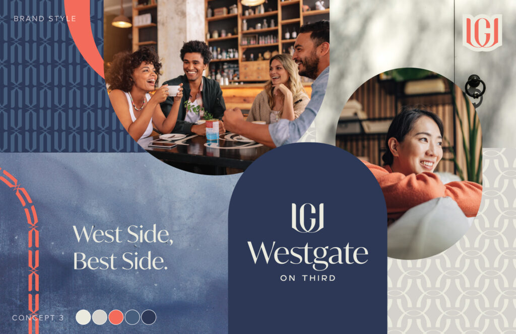
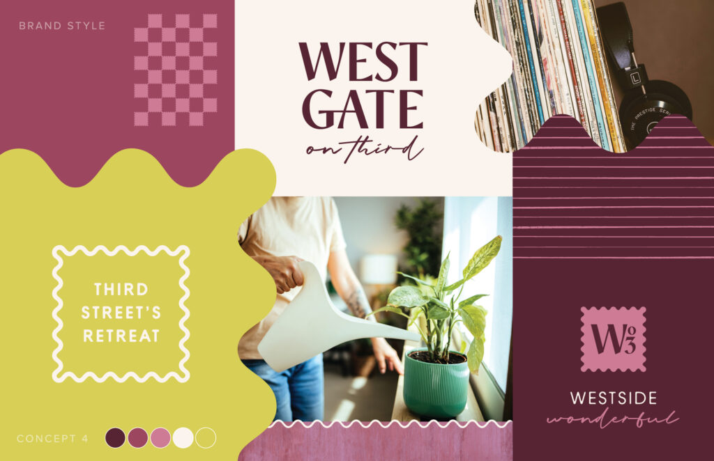
Which of these brand concepts would have been your top choice? Our client chose: #3
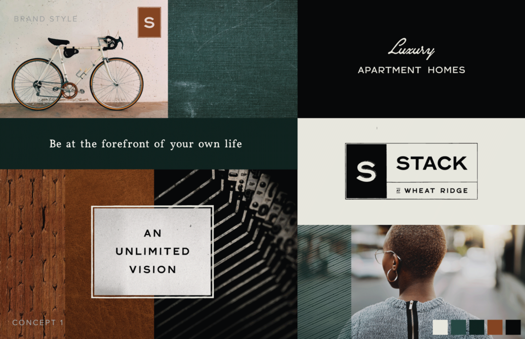
Apartment Branding in Wheat Ridge, Colorado
Stack is a class A multifamily community being developed by Thompson Thrift– learn more about this brand by reading our full case study or browse through more images to see how the final brand guidelines were developed.
CONCEPT 1
CONCEPT 2

CONCEPT 3
CONCEPT 4
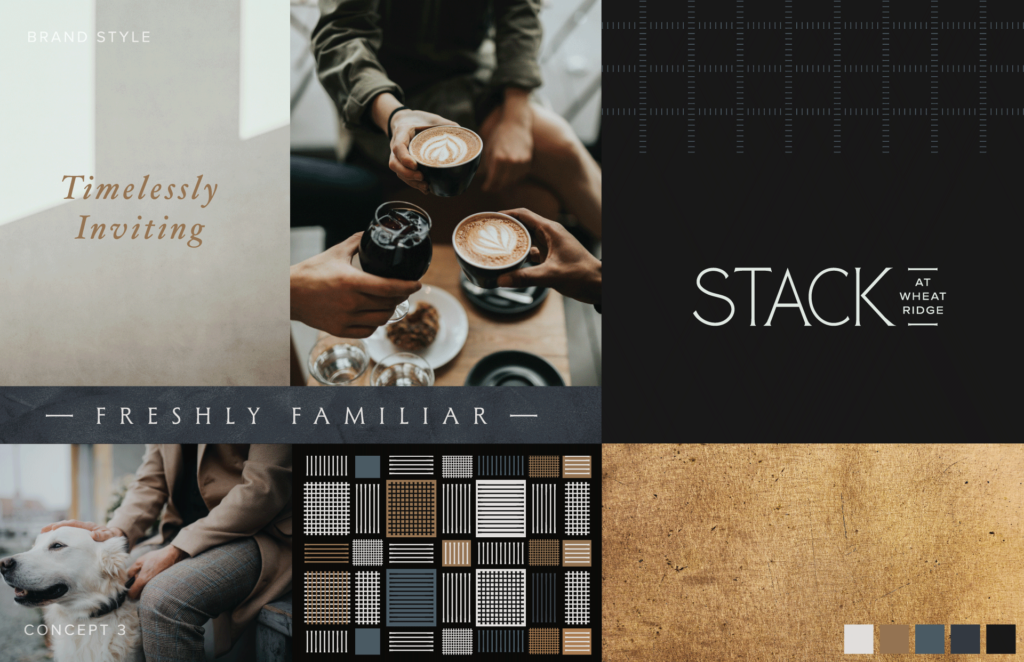
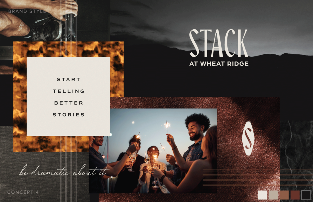
Which of these brand concepts would have been your top choice? Our client chose: #4
Ready to make 2026 the year your apartment community gets a brand that actually turns heads? Whether you’re launching a new development, repositioning an existing property, or just tired of blending in with every other apartment logo out there, we’d love to chat. At Zipcode Creative, we specialize exclusively in multifamily branding—which means we know exactly what works (and what doesn’t) when it comes to making your community stand out in a crowded market. Let’s create something memorable together. Get in touch to start the conversation.
Lease a
